Thursday, March 29, 2012

Morning Market Analysis

Today I want to focus on the Asian and Australian market to show how "China-centric" these regions equity markets have become.  Over the last month or so, there has been increased talk and analysis to the effect that China is slowing down.  And while the US market is rallying, Asian markets are focusing on China's decreased activity, thereby keeping them lower, or at least preventing them from participating in the US market's rally.


The China ETF hit a high in the 40.5/40.75 area in early February.  After that it moved sideways for a month and is now drifting lower.  Notice that prices are now trading between the 50% and 38.2% Fib level and are in a "lower low and lower high" pattern.  The shorter EMAs (10 and 20) have crossed below the 50, the CMF has dropped and momentum is decreasing.


The Australian ETF has hit the 24 area twice since early February, but is now drifting lower.  However, prices have found support at the 200 day EMA and the shorter EMAs are less bearish.  Plus, the volume and momentum indicators are now slightly bullish -- although prices still have the previous resistance around 24 to get through.


The Hong Kong market hit resistance around the 18.5 handle and is now also drifting lower.  But this chart is more like the Australian chart, which means it is hardly in a "super bearish" stance.  Prices are moving more sideways than down.  The shorter EMAs are tangled, but are still above the 50.  The volume indicators are slightly bullish, but momentum is still decreasing.


The Japanese ETF is forming a loosely configured triangle consolidation pattern.  There is resistance at the 10.2/10.3 level, but we also have a rising trend line supporting prices.  The shorter EMAs are still in a bullish configuration, while the volume indicators are bullish.  Although the MACD is decreasing, it is about to give a buy signal. 


The South Korean market is drifting higher.  There is some solid resistance at the 61 area.  The shorter EMAs are still moving higher, but barely so.  However, the volume indicators are still bullish, although momentum is still weak.

Some of these charts (South Korean and Japan) could be viewed as consolidating after gains, with the others (Hong Kong and Australia) simply moving sideways/slightly higher.  But that has to be seen against the backdrop of the Chinese market, which is clearly moving lower.  There is also the issue of a clearly weakening yen and the possible negative effects that might have on the region. In short, this part of the trading world is not caught up in the US market's latest move higher, which should concern US traders.

Wednesday, March 28, 2012

Bonddad Linkfest

  1. OECD urges EU overall (FT)\
  2. Springtime for US Housing (Marketwatch)
  3. Pending home sales, starts and completions (Big Picture)
  4. The yen's looming day of reckoning (Marketwatch)
  5. Latest German Consumer report (GFK)
  6. Beef prices reach second highest ever (Drover's)
  7. Consumer confidence dips (Marketwatch)
  8. Case Shiller falls (Marketwatch)

Yen At Critical Support Levels; Japan's Economy May Be In the Balance

Consider the following chart:


The above chart is a 10 year chart of the yen.  For the last four years, it has been in an upward trend.  However, it is now just through crucial support levels.   Prices have moved through the 10 and 20 week EMAs and the MACD has given a sell signal.  In short, this chart is looking to drop sharply now.

So, why the move now?  It started when, "Bank of Japan Governor Masaaki Shirakawa indicated on March 13 that the central bank will keep using monetary policy as a tool to tackle deflation."  At that meeting, the bank announced:

The central bank also said it would broaden a lending program to growth enterprises by 2 trillion yen ($24.35 billion), bringing the size of the program to 5.5 trillion yen.

In addition, the lending scheme will be adapted to access U.S. dollar reserves held at the central bank for loans denominated in foreign currencies. The BoJ also announced an arrangement to help small lenders that were ineligible under the original rules of the Growth-Supporting Funding Facility.

Speaking at a news conference later in the day, BoJ Gov. Masaaki Shirakawa told reporters that the boost to the lending program was designed to work in conjunction with the credit-easing moves unveiled last month.
It's continuing because of their weakening trade surplus.  Consider the following charts:


The balance of trade turned negative after the earthquake over a year ago, as this forced Japan to import more oil.  The current account balance -- which is a broader measure of international trade -- just printed a negative number.  In short, one of Japan's primary international advantages may be going away, which means the the yen has to drop.
Japan has lost competitiveness in a swath of industries that it used to dominate. Its automobile industry is losing out to Germany, South Korea and the United States. Japan’s automobile industry used to be competitive in cost and far superior in quality to its global competitors. But the world has changed. The yen EURJPY +0.17%  has dropped below 110 from as high as 160 against the euro. The South Korean USDKRW +0.24%  won was about ten against the yen and is now 13. Cost-cutting cannot offset such a big change in exchange rates. The U.S. auto industry cut its labor costs and debt burden through the government bailout. It is now more competitive than Japan’s.

The automobile industry is the pillar of Japan’s economy. Its decline leaves Japan’s economy nowhere to turn. Indeed, if the auto industry leaves Japan, it will become a poor country
Japan’s electronics industry, still significant to its economy, is losing out big time to its Asian competitors. Nothing hot in electronics is made in Japan now. U.S. companies like Apple AAPL +1.13%  leverage China’s manufacturing sector to turn out hot products. South Korea is embracing the vertically integrated model and churning out competitive products like Japan used to.
Nothing symbolizes Japan’s decline like its electronics industry. It was the envy of the world and had all the ingredients to take the industry into the mobile internet era. Instead, it embraced insulation and made products just for the Japanese market. Now it is almost irrelevant to the outside world. 

.....

Japan has only one way out — a massive devaluation. If the stable national debt is 120% of GDP, the yen needs to be devalued by 40% because devaluation is ultimately equal to the nominal GDP increase. The devaluation is likely to sustain 2% to 3% of nominal GDP growth for Japan beyond the repricing induced increase, which is necessary to restore Japan’s tax revenue. Deflation has caused Japan’s tax revenue to decline as a share of GDP. It can be only reversed through restoring nominal GDP. A devaluation of 40% can restore Japan’s competitiveness against Germany and South Korea, which will lay the foundation for Japan’s industrial recovery. 
Overall, it's not a pretty picture that is emerging.


ECRI unintentionally undercuts its own recession prediction

- by New Deal democrat

Several data series used in economic indicators may have special issues rendering thier signals misleading. Two important ones are both components of ECRI's Weekly Leading Index.

The first is purchase mortgage applications. Yesterday I wrote that the WLI would probably be more positive if ECRI were continuing to include its original real estate measure, the FRB's weekly H8 report. Beyond that, however, purchase mortgage applications, which have been flat to slightly declining for almost the last two years, are in stark contrast to housing permits and starts, which are at or near 3 year highs. For example, housing permits are 200,000 higher than their low point in early 2009.

The difference appears to be explained by the large number of all-cash sales, which ran at 33% in February. Purchase mortgage applications obviously don't pick up these cash sales. And it's housing itself, not mortgages, with which we are mainly concerned when we think of leading indicators. New houses have multiplier effects in construction, landscaping, appliances, tools, and maintenance which play out over several years. If there is an unusually large percent of cash sales, the multiplier effects from those are being completely missed by the WLI.

The other element of the index which may be giving a false signal, at least as far as the US economy is concerned, is the JoC ECRI industrial commodities index. This index plummeted beginning last April. It bottomed in December and has risen modestly since:


The question here is, is the index really measuring strength and weakness in the US economy, or is it actually a better barometer of the global economy? After all, prices, supply and demand for industrial commodities is set globally, not locally.

Ironically, the best evidence indicating that the JoC ECRI index is predicting an international rather than a US slowdown comes from ECRI itself, via its presentation on "Yo Yo economies" published last Friday, in which they opined:
The rising export dependence of these [suppliers of suppliers] economies, with growing involvement in global supply networks, makes it increasingly difficult for economies to decouple, especially for suppliers of early-stage goods that have embedded themselves further up the supply chain and farther away from the final consumer. This makes them highly vulnerable to the Bullwhip Effect and at the mercy of cyclical fluctuations in end-user demand growth.
[my emphasis]

First of all, the JoC ECRI index was developed 30 years ago when the US was the dominant factor in commodity usage. If the world has become much more intertwined, i.e., the market for commodities is global, and if supplier economies such as China are the largest purchasers of raw commodities, then it follows that the index is probably primarily measuring strength or weakness in these supplier economies, not in the downstream consumer economies.

Further, it is necessarily true that if supplier economies are especially vulnerable to cyclical fluctuations, then economies which are primarily consumers of end stage goods, like the US, are the least vulnerable. If supplier economies are especially unable to decouple, then it followers that consumer economies are the most likely to be able to approach decoupling.

ECRI makes this point more explicitly elsewhere in their presentation:
[D]eveloping economies are very much subject to the Bullwhip Effect, where small fluctuations in consumer demand growth get amplified up the supply chain into big swings in demand as we move away from the consumer. So, smaller shifts in end consumer demand growth translate into larger fluctuations in intermediate goods demand, and even bigger ones in input material demand, and especially, raw material prices.

Even a modest decline in consumer spending growth in developed economies like the U.S. and Europe can help trigger a significant downdraft in the level of demand from suppliers and, in turn, a serious downturn in the level of demand for “suppliers to suppliers.”
In other words, an absolute contraction in supplier countries can be caused by simply continued growth, but at a slower rate, in a consumer country. Which means that converse is also true: an observed contraction in supplier economies (like China) does not necessarily mean that there is a contraction in consumer economies (like the US). Rather, consumer economies may simply continue to grow, just at a slower pace.

As if that weren't clear enough, ECRI supplies this very helpful graph:


Unless I'm missing something, that arrow at the top for consumer countries in ECRI's diagram is still pointing UP.

So ECRI's own presentation suggests that their own indicator, the JoC ECRI commodities index, forecast a global downturn via its downdraft in the second part of 2011. But just as a recession in the US doesn't necesssarily mean a contraction in, say, Texas, so the global downturn measured by the commodities index may only have forecast slower growth in the US consumer economy.

ECRI's own presentation indicates as much. Oops!

Morning Market Analysis


Yesterday, the grain complex took a big hit, as traders dumped the corn contract.  Prices have now moved through the late October price level twice in the last two weeks, indicating weakness.  The big news for this market coming up is the crop report on Friday (shades of Trading Places, I realize).


Industrial metals are still bouncing between the 200 day EMA (right below 21) and the 50%/61.8% Fib level.  While we see declining momentum, the volume indicators are positive.  However, the shorter EMAs (10 and 20 days) are declining, while the 50 is just turning a bit negative.


The oil market has been trading between 104 and 110 for the last month.  Momentum is decreasing and the shorter EMAs are trading in a very tight range. 


While the other averages have broken through resistance, the transports have not.  Instead, they've been contained by resistance just north of 96.  While the EMAs are fairly shallow, the volume indicators are rising.


The treasury market is still rebounding from its low just north of 101.  Prices have moved through 38.2% Fib level and the 10 day EMA are are now right at the 50 day EMA.  The 104 price level is very important for this chart, as that is the support area of the trading range the IEFs were in for the first two months of the year.

The commodity charts should concern the bulls.  In a growing economy, we should be seeing these move through resistance -- especially the industrial metals.  However, they're treading water.  The good news is they're not falling sharply.  The bad news is they're not rallying.

The lack of confirmation from the transports is not fatal to the other averages, but it does add a sense of caution to any advance.  Finally, the rebounding treasury market can, so far, be attributed to short-term bottom fishing.  But, we need to keep an eye on where prices move.

Tuesday, March 27, 2012

How to make an economic index subjective: change it!

- by New Deal democrat

Over the last week I've been re-examining and updating my January forecast. While I believed there would be weakness in the first half of the year, I considered it unlikely that it would bring about an actual recession. This puts my view at odds with ECRI's (although it is right on point with the contrary viewpoint of the Conference Board, publishers of the official LEI's).

So why am I not persuaded by ECRI's latest arguments? A number of reasons. First of all, believing that the seasonal adjustments after the 2008 recession may be suspect isn't grounds for disregarding them and instead adopting a view based on more lagging year-over-year metrics. That simply means that the seasonal numbers MIGHT be wrong, not that they ARE wrong. So if the monthly and the YoY trends disagree, it only means that we can't be sure which is right, NOT that the YoY trend is correct.

Secondly, coincident indicators are coincident, period. They should not be interpreted as leading.

Finally, I believe that ECRI has changed the make-up over several of its indexes in the last 20 years. This reflects a subjective, editorial judgment. Where the two versions of the index diverge, extra caution is warranted. In fact, I believe ECRI is being misled by several series upon which it relies heavily, which either no longer mean what they used to for the US economy, or are having unique problems (more on which, tomorrow).

In his 1990 book, Prof. Moore listed the Federal Reserve Bank's H8 weekly release as one of the elements of the Weekly Leading Index, and it was included in the WLI as least as late as 1993 when it was publised in Business Week magazine. But by 2002 that had changed, with Achuthan telling CNN Money that
The WLI contains seven major economic indicators, including mortgage applications for purchase, money supply, sensitive industrial prices, bond yields, bond-quality spreads, stock prices and weekly jobless claims.
Does the substitution of the MBA's purchase mortgage index for the FRB's weekly H8 release make a difference? Absolutely.

Here's the PMA, currently used in the WLI. It's been flat for almost the last 2 years and has actually dipped into negative territory on a YoY basis for the last few months:


Now here is the YoY growth rate of the FRB's H8 release. It continued to decline at a decreasing rate until it turned up sharply three months ago:


This shows the H9's recent history in more detail, through February. It is now at 0 on a YoY basis.


If the FRB H8 release were still part of the WLI, there would have been a sharper decline in 2009, and the period of flatness would have ended a year ago, with an increasingly stronger move upward since.

An even more important change is the Conference Board's explicit dropping of Real M2 as a component of its index. Just as importantly, although Real M2 is included in both Professor Moore's 1992 list of the WLI, confirmed by its inclusion in the Business Week index in 1993, and reconfirmed by Achuthan in 2002, it now appears that ECRI has also either trivialized or completely dropped Real M2 as a component of its WLI in favor of credit spreads.

To show just how big a difference that makes, here is Real M2 YoY in blue, and credit spreads in red:


Here is a close-up of their wildly differing trajectories in last August and September:


Both of these were essentially caused by the same thing: Europeans fleeing European banks and making deposits in US banks and purchasing US treasuries. M1 and M2 skyrocketed, while credit spreads blew out.

Despite that, ECRI's WLI shows that it caught all of the negative blowing out of credit spreads, but apparently none of the moonshot in M1 and M2:


Indeed, if real M2 were still part of ECRI's WLI, it is hard to see how it could have gone negative at all. Add the difference in H8 to that, and it is very unlikely that ECRI would have made a recession call last year.

Beyond that, while the Conference Board deleted Real M2, it was at least transparent, and also the changes in the LEI did not change the ultimate direction of that set of indicators. In the case of the WLI, if I am correct, the decision DID change the direction of the indicators. Further, this decision was inherently subjective, a matter of human judgment.

So ECRI's recession call is not compelled by objective data. Rather, it is a function of a subjective *choice* as to which objective data were left in the index and which were not. When such a choice leads to conflicting outcomes, extra caution is warranted.

Yen Is At Very Important Levels Right Now; Japan In Trouble

Consider the following chart:


The above chart is a 10 year chart of the yen.  For the last four years, it has been in an upward trend.  However, it is now just through crucial support levels.   Prices have moved through the 10 and 20 week EMAs and the MACD has given a sell signal.  In short, this chart is looking to drop sharply now.

So, why the move now?  It started when, "Bank of Japan Governor Masaaki Shirakawa indicated on March 13 that the central bank will keep using monetary policy as a tool to tackle deflation."  At that meeting, the bank announced:

The central bank also said it would broaden a lending program to growth enterprises by 2 trillion yen ($24.35 billion), bringing the size of the program to 5.5 trillion yen.

In addition, the lending scheme will be adapted to access U.S. dollar reserves held at the central bank for loans denominated in foreign currencies. The BoJ also announced an arrangement to help small lenders that were ineligible under the original rules of the Growth-Supporting Funding Facility.

Speaking at a news conference later in the day, BoJ Gov. Masaaki Shirakawa told reporters that the boost to the lending program was designed to work in conjunction with the credit-easing moves unveiled last month.
It's continuing because of their weakening trade surplus.  Consider the following charts:


The balance of trade turned negative after the earthquake over a year ago, as this forced Japan to import more oil.  The current account balance -- which is a broader measure of international trade -- just printed a negative number.  In short, one of Japan's primary international advantages may be going away, which means the the yen has to drop.


Japan has lost competitiveness in a swath of industries that it used to dominate. Its automobile industry is losing out to Germany, South Korea and the United States. Japan’s automobile industry used to be competitive in cost and far superior in quality to its global competitors. But the world has changed. The yen EURJPY +0.17%  has dropped below 110 from as high as 160 against the euro. The South Korean USDKRW +0.24%  won was about ten against the yen and is now 13. Cost-cutting cannot offset such a big change in exchange rates. The U.S. auto industry cut its labor costs and debt burden through the government bailout. It is now more competitive than Japan’s.

The automobile industry is the pillar of Japan’s economy. Its decline leaves Japan’s economy nowhere to turn. Indeed, if the auto industry leaves Japan, it will become a poor country
Japan’s electronics industry, still significant to its economy, is losing out big time to its Asian competitors. Nothing hot in electronics is made in Japan now. U.S. companies like Apple AAPL +1.13%  leverage China’s manufacturing sector to turn out hot products. South Korea is embracing the vertically integrated model and churning out competitive products like Japan used to.
Nothing symbolizes Japan’s decline like its electronics industry. It was the envy of the world and had all the ingredients to take the industry into the mobile internet era. Instead, it embraced insulation and made products just for the Japanese market. Now it is almost irrelevant to the outside world. 

.....

Japan has only one way out — a massive devaluation. If the stable national debt is 120% of GDP, the yen needs to be devalued by 40% because devaluation is ultimately equal to the nominal GDP increase. The devaluation is likely to sustain 2% to 3% of nominal GDP growth for Japan beyond the repricing induced increase, which is necessary to restore Japan’s tax revenue. Deflation has caused Japan’s tax revenue to decline as a share of GDP. It can be only reversed through restoring nominal GDP. A devaluation of 40% can restore Japan’s competitiveness against Germany and South Korea, which will lay the foundation for Japan’s industrial recovery. 
Overall, it's not a pretty picture that is emerging.


Europe Isn't Looking Too Good Right Now

Consider the following information from Markit.  This is their respective PMI for the manufacturing and service sectors in Europe.


All countries dropped at the end of last year.  Only Germany has a positive PMI -- and that is a weak reading.


New orders have been declining for the last year and are now slightly negative.


Overall, employment is weak as well, with only German showing a positive number.


Above is the latest IFO Business Climate Number from Germany.  This number appears to have rebounded somewhat, but it is still showing a weak reading.

Let's look at a few macro level statistics for the region:


Overall, EU growth has been pretty low for most of the recovery.  We see a pattern of slowing for the last three quarters -- obviously not a good development.


The above five charts show a policy conundrum for the central bank.  First, inflation is right around 3% - not painfully high.  However, with oil prices rising, expect to see EU inflation pick-up a bit.  In addition, high oil prices are squeezing EU consumers, as noted by the Financial Times:


The IEA estimates that the EU will spend a record $502bn this year on net imports of oil, up from $472bn in 2011.

That represents 2.8 per cent of the bloc’s gross domestic product, whereas between 2000 and 2010 it was spending on average 1.7 per cent of GDP on oil imports.

“The current price levels are on average higher than the awful year of 2008 [when oil hit a record high of $147 a barrel], and as such have the capacity to tip the global economy back into recession,” Mr Birol said in a speech in London.

He noted that every recession in the industrialised countries since the second world war had been preceded by an oil price spike.

The oil import bill is creating an additional burden for Europe’s hard-pressed consumers.
European households will spend close to 11 per cent of income on heating, lighting, cooking and personal transport this year, compared with the historical average of 6-7 per cent and 9 per cent last year, Mr Birol said.
And consider this from the latest German Consumer Climate report:
Record prices for petrol and diesel at German petrol pumps have clearly affected the mindset of consumers in March. This is reflected by the indicator for income expectations, which decreased considerably, virtually negating the gains of the previous month
Ideally, the central bank would raise interest rates a touch to stave off inflationary pressures -- and given that rates are at 1%, there is plenty of room to raise.  But, overall EU unemployment is increasing, which is hurting retail sales on both a month over month and year over year level.

Unfortunately for the ECB, the best policy response is to hope that "high commodity prices are the cure for high commodity prices" -- that is, as oil increases in price, demand drops, thereby lowering commodity prices.  This is not the best option for a central bank.

Now, consider the equity averages of the three largest economies.


The French market is in the middle of a broadening triangle pattern, just above the 200 day EMA.  Momentum is dropping, but the volume indicators are rising.   The Bollinger Bank width is weak, indicating a period or rising volatility is probably closer than we want to think.  Prices are just above highs in the 22 area that the market reached back in late October.


The German market is very similar to the French market.  Prices have been trading in a two point range, but on declining momentum.


The British market is moving sideways, just about levels established in late October.   Here we see prices trading in a 1 point range on declining momentum.


The euro has been moving sideways since February, moving between the 130 and 134 area.   The EMAs are very tangled, preventing the drawing of any major conclusion about the future market direction.

The sum total of all the above charts is this.  Europe is weak. Unemployment is rising, which is lowering consumer spending.  This in turn is lowering overall demand, which is lowering service and manufacturing demand.  To make matters worse, interest rates are already low, so there is little the ECB can do from that end.  In addition, an oil price spike is hemming them in as well -- which is also lowering overall consumer demand. 

The lower growth environment is keeping the respective equity markets in check.  On the good side, the euro is inexpensive right now, making EU exports cheaper on the world market.  but with a weaker BRIC economic situation right now, there is the question of who would buy EU exports.  In addition, the bond markets of the largest economies are also yielding little more than the US right now, as shown in this chart:


The best chance for arbitrage above would involve the French market, but that's still not a great opportunity.

So, in conclusion, Europe is not looking that good right now.


Morning Market Analysis


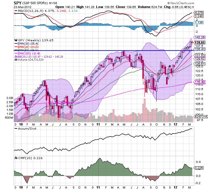
Let's start with the equity markets, where we see prices breaking through resistance, with the IWMs moving through the 82.6 level, the QQQs moving through 67.50 and the SPYs moving through 141.5.  All three are also showing rising A/D lines, along with positive CMF readings, telling us that people are moving into the market.


The weekly SPY chart shows that we're now gunning for the 143 area.  A move through there would be a post-recovery high and a very important market milestone. 


The QQQs are also showing a very strong weekly reading.  Prices are now at a post recovery high, with strong fundamentals.


The weekly GLD markets is still right at support.  The shorter EMAs are neutral -- the 10 and 20 day EMAs are moving sideways while the 50 week EMA is slightly bullish.  However, momentum is dropping, the A/D line is moving sideways and the CMF is beginning to print negative.

Dr. Ed uses the gold market as a proxy for runaway government spending/uncertainty/inflation.  I think that's a pretty good use of this commodity's chart, which of course leads to some interesting questions.  Why is gold weak now?  Are traders less uncertain?  Do they fear inflation less?  In short- - why is the GLD ETF trading at support right now?

Monday, March 26, 2012

Bonddad Linkfest

  1. India's economy; losing its magic (Free Exchange)
  2. German confidence rises (Bloomberg)
  3. New homes sales down; prices up (Marketwatch)
  4. Promoting the Economic Rebound (WaPo)
  5. Colleges are getting more competitive (CNN)
  6. EU Dryness concerns analysts (Agrimoney)
  7. Australian rain to help crop yields (Agrimoney)
  8. Chinese soft landing still a problem for exporters (BB)
  9. Bernake's speech on the labor market (FRB)
  10. Indian corruption scandal (Beyond BRICs)

In Response to Mish's Criticism of Bernanke's Gold Standard Arguments; Or, Why the Gold Standard Is A Really Bad Idea

A long time ago, I read Mish on a regular basis.  His analysis was great; it was in-depth and well argued.  However, he has been slowly losing credibility with me over the last few years as he has become more of a political writer than economic.  The final nail for me is his latest article, "Ben Bernanke: Inflationist Jackass, Devoid of Common Sense, and Clueless About Trade, Debt, History, and Gold." 

In a recent lecture, Bernanke explained why the gold standard is a bad idea.  He did so in a very convincing way, as highlighted by Joe Weisenthal and agreed to by Professor Brad DeLong.  (for background on this issue, please read Monetary Theory and Bretton Woods by Filippo Cesarano).  I would also encourage you to read Mr. Weisenthal's article. However, let me address Mish's love of the gold standard, or, more precisely, the fact he's never addressed the fundamental problems with the gold standard as expressed in the following identity:

MV = PQ

Where M=the money supply (gold), V=velocity, P=price and Q = physical volume of all goods produced.  In a gold based monetary system, the above equation explains how balance of payment equilibrium is achieved.  As a country runs a trade deficit, M decreases.  In order for the identity to maintain balance something must decrease on the other side of the equation.  This is usually prices (P), which in turn makes the country's goods more competitive in international trade, thereby leading to equilibrium once again being achieved.  Sounds simple, right?

Not really, as there are several problems.  Like most economic models, this one assumes that prices move freely; or, put another way, prices are not sticky.  This is hardly the case in the real world, where prices can remain at unrealistic levels for some time.  This makes the adjustment mechanism anything but instantaneous.  Secondly, "classical economists took the volume of final output to be fixed at the full employment level in the long run." (International Economics by Robert Carbaugh, Kindle Reference 6753-55).  Considering the US economy has been operating far below the full employment level for the last three years (as have a fair number of other economies), this "magic equation" wouldn't apply very well to the current situation.  In addition, a decrease in the money supply created by a trade deficit leads to an increase in the cost of money -- namely, interest rates.  While these should theoretically make the deficit country a more attractive place to send money (thereby lowering the trade deficit), higher interest rates will also slow economic growth in the deficit running country, making it less attractive from a foreign investment position. This slows the correction process even more.  There is also the issue that the gold standard does not survive war spending, which is what led to it's fall in the first place after WWI.  Finally, there is the issue that no one can futz with the system -- that is, there can be no government intervention in the currency markets for this to work.  Raise you hand if you think that will last longer than a few years in the current environment; I have a bridge to sell you.

In reality, the golden age of the gold standard only lasted about 30 years from the end of the 1800s to WWI.  Several countries tried to get back on the gold standard after WWI but to little avail (as an aside, Britain tried to get back on the gold standard.  However, Churchill set the conversion rate too high, a policy move critiqued by Keynes).  All of this led to the Bretton Woods agreement after WWII. 

Let me add three other points.

From Mish:
Weisenthal: The gold standard ends up linking everyone's currencies.

Mish: So what? Look what happened after Nixon closed the gold window. We have had nothing but problems, temporarily masked over by printing more money until things blew sky high, culminating in bank bailouts at taxpayer expense, and those on fixed income crucified in the wake.
Actually, being that inter-lnked means all economies rise and fall together, preventing one economy from taking a different approach to a problem and helping to prevent an economic free fall from occurring.  For example, during the last recession both China and Germany engaged in stimulus spending, which essentially saved both economies and helped to avert disaster for the world as a whole.  Had we all been inter-linked, that couldn't have happened.  I should also add that this level of currency inter-linking is a big problem in Europe right now -- a situation which Mish has written about extensively.
Weisenthal: [A gold standard] creates deflation, as William Jennings Bryan noted. The meaning of the "cross of gold" speech: Because farmers had debts fixed in gold, loss of pricing power in commodities killed them.

Mish: Hello Joe. Please tell me how many in this country would not like to see lower prices at the gas pump, lower prices on food, lower rent prices, lower prices on clothes? The fact of the matter is price deflation is a good thing. The only reason why it seems otherwise is debt in deflation is harder to pay back. That is not a problem with deflation, that is a problem of banks foolishly lending more money than can possibly be paid back. Fractional reserve lending is the culprit.
Deflation does not mean just lower prices; it also means unemployment, caused by a deflationary spiral that goes like this: demand drops, leading to lower production, leading to lay-offs, leading to lower demand ... you get the idea.   The Great Depression is the classic example of this phenomena. 
Weisenthal: The economy was far more volatile under the gold standard (all the depressions and recessions back in the pre-Fed days).

Mish: Really? On what planet? Did the collapse in the housing bubble affect your ability to reason? Except for cases like Weimar, Mississippi Bubble, and for that matter all bubbles, gold provided stability. The bubbles (and the subsequent collapses) were caused by fractional reserve lending, not the gold standard.
Actually, Mish, on this planet.  An inquiring mind would seek out a book such as A Brief History of Panics,  which shows that in the 1800s there was nearly a panic every 10 years.  As professor James Hamilton pointed out:
The graph below records the behavior of short-term interest rates over 1857 to 1937. Over much of this period, the U.S. maintained a fixed dollar price for an ounce of gold, and prior to 1913 (indicated by a vertical line on the graph) there was no Federal Reserve System. The pre-Fed era was characterized by frequent episodes such as the Panic of 1857, Panic of 1873, Panic of 1893, Panic of 1896, and Panic of 1907 in which even the safest borrowers would suddenly find themselves needing to pay a very high rate of interest. Those events were associated with significant financial failures and business contraction. After establishment of the Federal Reserve, the U.S. short-term interest rate became much more stable and exhibited none of the sudden spiking behavior that used to be so common

...

The pre-Fed financial panics were also accompanied by long contractions in overall economic activity, as indicated by the NBER dates for economic recessions noted in the graph below. Although of course we still had recessions after the Federal Reserve was established in 1913, they tended to be less frequent and shorter in duration.
Here is the accompanying chart:


In short, the gold standard argument doesn't hold up after a modicum of scrutiny.  Frankly, the old Mish wouldn't have bought an argument this shallow.  However, the new and greatly unimproved Mish clearly has.  While I'm sure his numerous acolytes will nod their heads in agreement at the simplistic "gold standards are the magic panacea to all your ills" argument, I lament the loss of a great critical mind and hope for the day when he returns.


Morning Market Analysis


The 30 minute chart of the SPYs really highlights last week's price action.  Prices rallied on Monday, but spent the last four days of the week consolidating, eventually trading between the 50% and 38% Fib levels on Thursday and Friday.   This chart has strong support at the 138 and 139 areas, with resistance in the 141/141.25 area.


 The weekly price charts gives us a good idea for the overall trend of the market right now.  Prices are still in an uptrend after breaking through resistance at the 135 level.  The EMAs are bullishly aligned (shorter above longer, all moving higher) and the secondary technicals (MACD, A/D and CMF) are signaling a continued move higher.  The logical price target for a pullback (which we have to keep in mind given the underlying fundamental situation) is the 135 price level, which is only about 3% below current price levels.


The treasury market has rebounded from its recent sell-off.  Reactions such as this are typical of a rapid movement in a particular direction, as traders think the market is either overbought or oversold.  Prices here have several areas of natural upside resistance: the Fibonacci levels and the EMAs. The decreasing volume over the last few days indicates we're probably nearing the end of the rebound.


The 30 minute IEF chart shows two important points, the first of which is the price rebound from last week.  Notice that after gapping higher at the open, prices didn't follow-through during the day.  This shows the overall weakness of the counter-rally, as traders did not keep the momentum going throughout the trading day.  In addition, the entire pattern that started on March 14 could be interpreted as a rounding bottom formation, which is a bottoming formation.

So, basically last week we see a counter-reaction to the bond market sell-off and equity market rally.  As always, this leads to the following question: is this simply a shorter time frame, counter move, or is it the end of the counter-move and the start of a new trend?

Obviously, it's too early to give a definitive answer.  However, last week's counter-reaction was the result of fundamental developments -- a slowdown in the EU, slower growth in China and weaker home sales in the US.  In addition -- as I'll show tomorrow -- the weekly charts for the developing markets are all showing a sell-off, indicating further weakness.  Like most situations, the real answer is, "let's see what the data says this week." 

Sunday, March 25, 2012

A Dick Cheney aside

- by New Deal democrat

Upon hearing of Dick Cheney's secret heart transplant, am I the only one who conjured up the image of an unwilling live donor, strapped down in terror to an adjoining gurney?

A blogging journey

- by New Deal democrat

It's been about 7 years since the pixels of my nom de blog, New Deal democrat, made their appearance. At the time, I needed a handle to log onto Daily Kos. Since I am a big fan of FDR and his New Deal, especially after reading Arthur Schlesinger's three-volume history, and couldn't come up with anything particularly clever, I chose "New Deal democrat." I was surprised that it wasn't already taken, which to me speaks volumes about the modern Democratic Party.

Although I blogged and commented about some general political issues, I quickly gravitated towards economic history and finally, simple economic reporting. As I saw it, the truth has a progressive bias. Simply report the truth well enough and the progressive platform will follow naturally. In an undeveloped or developed economy, left to its own devices without any counterweight, inevitably the rich will get richer and the other classes, poorer.

Further, economics as it is typically taught in college and even in graduate school is like learning to read blueprints for an exquisite castle in the air. No matter how eloquent the math, the assumptions completely undercut its legitimacy. Additionally, the criteria for optimization are incredibly conservative. If a small band of plutocrats have 99% of the wealth in the status quo, then that is accepted as optimal, and any improvement in everybody else's position must come from new growth. And the equations never admit of participants dying from privation - like cartoon characters they are assumed to spring back to life every new day. Otherwise the optimal economy would be the one in which most participants survive until the end of the period measured, and you know what that means ....

Anyway, I decided that progressives could use somebody spelling out as neutrally as possible what was going on deep down in the weeds of the economy. As 2007 progressed, I saw the economic reckoning at hand. Here's a very brief sample from August of that year:
Why we are "rhyming"

If we are at the beginning of the first full-fledged (but slow-motion) "bust" the economy has seen in 70 years, then we are "rhyming" with 1929.
One day before the Great Recession officially began, I wrote The Panic of 2008?, saying:
This is NOT the Great Depression II. Nor is this the stagflationary 1970s. It is going to unfold as some other Beast. Only the broad outlines of this Beast appear discernable now: it will likely feature (1) increasing import prices; (2) wage stagnation (that does not keep up with price inflation); (3) real asset deflation; and (4) possibly a Japan-style "liquidity trap."
Check, check, check, and check.

Once the Beast showed itself and the Panic came to pass, I began to look for the bottom of the cliff. Most of you know the story there, so I won't rehash that entire episode, but here's just one cite from early May 2009:
This week's decline increases the likelihood that the recession is very close to bottoming to more than 50%.
One limitation of a politically partisan blog is that economic reporting is, relatively speaking, not a popular topic. I was invited to blog at the Economic Populist by Rob Oak, and I posted most of my material there in 2008 and 2009. While Rob has a noble cause, it is clear to me that popular recommendations for what gets highlighted is a prescription for the most extreme views to prevail. In late 2009, as the Bonddad wars reached a crescendo, he invited me to co-blog over here.

My typical post at Daily Kos took hours of research, was really wonky, and sank into the depths with 30 or 40 comments and 100 or 200 reads. Meanwhile I thought my co-blogger, Bonddad, could post his grocery bill and get on the Rec list! My reasons for leaving are quite different from his. One thing Bonddad and I agree on is that one nasty reply feels about the same as 10 plaudits. Since my wonky posts very rarely made the Rec list, there was no critical mass of supporters, and I was under no obligation to put a lot of effort into a post, only to see it mainly attacked in comments by retarded killer bees.

Nowadays in any given day only about 2 or 3 posts at Daily Kos have 2000 readers. Most pieces are derivative, regurgitating yesterday's punditry, in the format of "Pundit/politician says: '[copy-and-paste].'" By contrast, in the last year this blog has seen its readership grow, and more often than not my posts are picked up by Business Insider and/or Seeking Alpha, meaning that my typical readership has grown to and past 2000 reads. And the quality of the reads is generally very good. I also want to thank Bill McBride a/k/a Calculated Risk, Barry Ritholtz, Joe Weisenthal, Jeff Miller, Abnormal Returns, Real Clear Markets, and others for referring readers to my work.

So I am very comfortable with where I am now. I thank all of the readers and commenters (even if I don't have time to reply, be assured I do read them). I will continue to strive to dig down into the economic data and report as neutrally as I can what is going on now and what the near future is likely to be.