This week, the BLS issued CPI and PPI. Let's take a look at these numbers in more detail.
Let's start by defining what we're looking at with PPI
A family of indexes that measure the average change over time in selling prices received by domestic producers of goods and services. PPIs measure price change from the perspective of the seller. This contrasts with other measures that measure price change from the purchaser's perspective, such as the Consumer Price Index (CPI). Sellers' and purchasers' prices may differ due to government subsidies, sales and excise taxes, and distribution costs.In other words, what we're looking at is what people selling goods and services are getting for their goods and services.
Let's start by looking at overall PPI:
The Producer Price Index for Finished Goods increased 0.4 percent in October, seasonally adjusted, the U.S. Bureau of Labor Statistics reported today. This advance followed a 0.4-percent rise in both September and August. At the earlier stages of processing, prices received by manufacturers of intermediate goods moved up 1.2 percent in October, and the crude goods index increased 4.3 percent. On an unadjusted basis, prices for finished goods advanced 4.3 percent for the 12 months ended October 2010, their largest year-over-year gain since a 5.1 percent rise in May 2010.Here is a chart of the overall index

I've broken this down into three sections. (a) represents the month to month change in PPIs before the big commodity price spike in 2008. Section (b) represents the big spike and (c) shows where prices are now on a month to month basis. Notice that section (a) and (c) are fairly similar, but section (a) still has higher levels of month to month increases. So while we are seeing increases in producer prices, they aren't that large.

Above is a chart of the year over year percentage change in PPI. Notice it's more or less at levels that occurred in the last expansion.
Let's look at various stages of production.

I've also broken crude goods down into three sections like above. Notice that crude goods A and C sections are a bit more similar. Also note that we've seen bigger increases three of the last four months.

The (a) section of the intermediate goods chart is still more inflationary. However, notice that the last three months we've seen increasing PPI numbers.

PPI finished goods are still too low. Compare (b) with (a) -- (a) is still far higher.
In short, it looks as though crude and intermediate price increases are getting absorbed in the manufacturing process, leading to low finished goods readings. While the finished goods readings are still printing positive numbers, ideally we'd like to see these numbers a bit higher.
Let's turn to CPI:
The Consumer Price Index for All Urban Consumers (CPI-U) increased 0.2 percent in October on a seasonally adjusted basis, the U.S. Bureau of Labor Statistics reported today. Over the last 12 months, the all items index increased 1.2 percent before seasonal adjustment.
As has frequently been the case in recent months, an increase in the energy index was the major factor in the all items seasonally adjusted increase. The gasoline index rose for the fourth month in a row and accounted for almost 90 percent of the all items increase; the household energy index rose as well. The food index rose slightly in October with the food at home index unchanged.
The index for all items less food and energy was unchanged in October, the third month in a row with no change. The indexes for shelter and medical care rose, but these increases were offset by declines in an array of indexes including new vehicles, used cars and trucks, apparel, recreation, and tobacco.
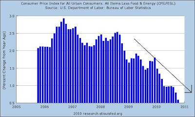
Over the last 12 months, the index for all items less food and energyhas risen 0.6 percent, the smallest 12-month increase in the history of the index, which dates to 1957. The energy index has risen 5.9 percent over that span with the gasoline index up 9.5 percent. The food index has risen 1.4 percent, with both the food at home index and food away from home index rising the same 1.4 percent.
Let's look at the data, starting with core CPI

The month over month percentage change in CPI is clearly moving lower. Also note how rare a decrease is -- we've seen four prints in the last five years.

The pace of change from year ago levels is clearly moving lower and is now in dangerous territory. This chart is very dangerous for the economy as a whole.

The index for all items is clearly printing at lower rates than the month to month pace before the expansion (compare sections a and b).

The year over year percentage change in overall CPI is also moving lower.
These charts indicate that prices are still a concern and need to be addressed quickly.