Friday, July 22, 2022

Coronavirus dashboard for July 22: the BA.4&5 wavette has (probably) peaked


 - by New Deal democrat

No economic news today, so let’s update the COVID situation.

As of yesterday, nationwide (dotted line below) cases declined slightly to 123,000. Cases have been slightly elevated from their previous 100-110,000 range for several weeks, but appear to have peaked. Deaths (sold line) rose slightly to 429, and are roughly 100 above their average for the prior 3 months:


The above graph for the past year shows that the death rate per infection has steadily declined, particularly when you take into account the massive number of cases in the past 6 months where people rely on home testing and so the cases are never confirmed (probably around 2.5x the number of confirmed cases). Note that since the beginning of February almost 6 months ago, the US has weathered the BA.2, BA.2.12.1, and now BA.4&5 variants without a big (compared with original Omicron) increase in cases, and in general the case levels have been below even Delta at its peak. Nor did any of the new variants in the past 6 months substantially increase the number of daily deaths.

Cases in all four census regions of the US are either flat or declining (the West, thanks to California):


That isn’t just the case for the US. The below graphs by Trevor Bedford for various countries all norm deaths to infections at 1:1 for the initial 2020 wave. In all countries there are many multiples more infections for each death by now:
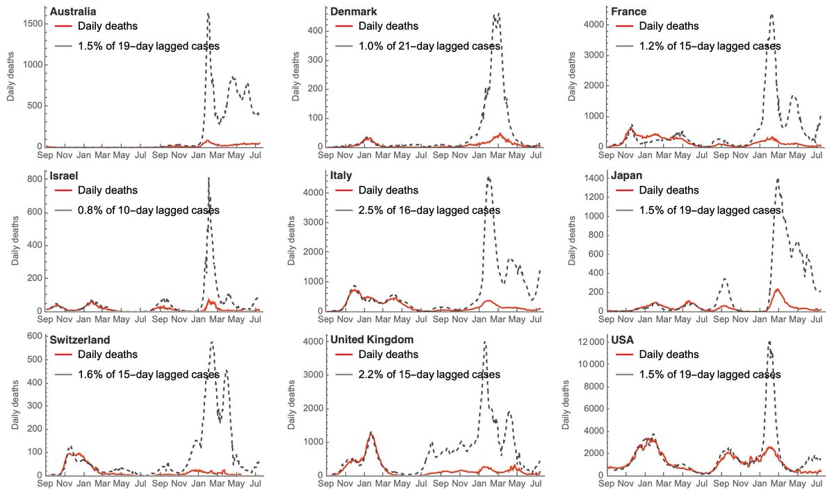


The situation isn’t quite so good as to hospitalizations, which have continued to rise in the US, to 45,200:


Dr. Eric Topol has highlighted a study out of Denmark that found worldwide higher hospital admissions due to BA.5, indicating it has more pathogenicity:


In the US, this may also reflect that most seniors have failed to get their second booster shot, so their protection has been fading even as the evidence has accumulated of the effectiveness of a second booster against this variant.

Speaking of variants, BA.4&5 constituted 91% of all new cases in the US by last Saturday, the remainder being almost all BA.2.12.1:


There was not much variation regionally:


Globally the BA.4&5 wave appears to have peaked in the large majority of big countries, and I suspect we are at or just past peak in the US (note: wastewater reporting has not been updated in the past 9 days, so it’s impossible to confirm with that data). In South Africa, where BA.4&5 first appeared, cases actually are currently *below* their pre-Omicron levels.

Finally, BA.2.75 continues to appear in more countries on an isolated basis, with no evidence of any waves outside India. If it proves to be a damp squid, the US could get another respite.

Thursday, July 21, 2022

Increasing trend in jobless claims continues; on track to give recession warning in November


 - by New Deal democrat

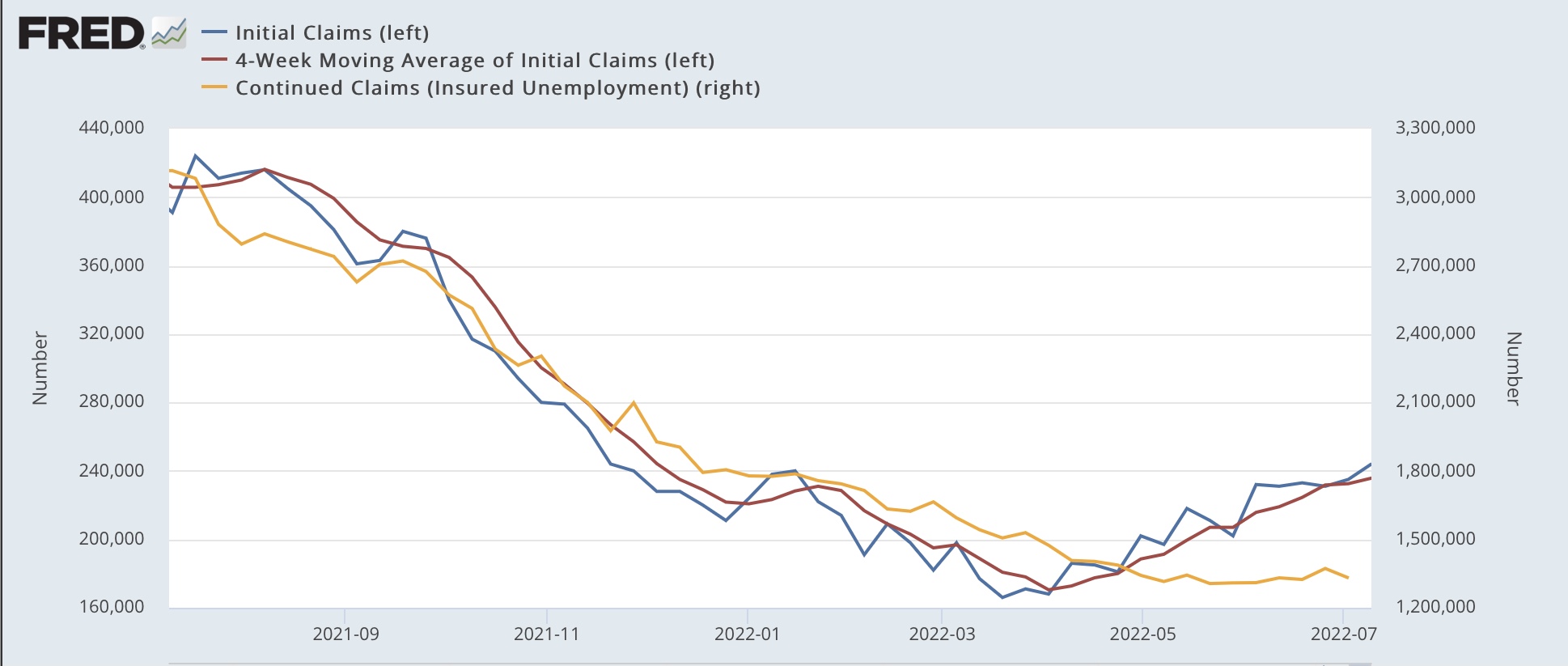
Initial jobless claims rose another 7,000 to 251,000 last week, an 8 month high. The 4 week average rose 4,500 to 240,500, a 7+ month high.  And continuing claims also rose 51,000 to 1,384,000, which is 78,000 above their 50 year low set on May 21:


Three weeks ago I noted that, reviewing the entire 50+ year history of initial claims, “there are almost always one or two periods a year where the four week moving average of jobless claims rises between 5% and 10%. About once every other year for the past 50+ years, it rises over 10%. Typically (not always!) it has risen by 15% or more over its low before a recession has begun. And a longer term moving average of initial claims YoY has, with one exception, turned higher before a recession has begun.”

There is now a clear uptrend in all three numbers. The 4 week average of initial claims is about 40% higher than its low. If the present trend continues till about November, initial claims will be higher YoY, which would signal an imminent recession.

Just speculating here, but an entire very speculative sector of the stock market - internet based delivery services - which boomed during the time of pandemic restrictions, has blown up. I suspect many of the increased layoffs are coming from that sector.  Meanwhile more and more businesses are probably learning to make do with being short-staffed as the result of being unable to fill job openings. In any event, the rising trend in layoffs is very much intact. Because initial claims lead the unemployment rate, I fully expect to see an uptick in that rate in the next month or two.

Wednesday, July 20, 2022

Existing home sales now down 25% from peak; but price increases keep steamrolling on


 - by New Deal democrat

Although existing home sales are less economically important than new home sales, what has been happening with their prices, given the experience of the housing bubble and bust 15 years ago, is of added importance.


The simple summary is that sales have declined precipitously, while price appreciation keeps stubbornly rolling on due to (still!) a severe lack of normal inventory.

Sales of existing homes declined 4.4% for the month, seasonally adjusted; 9.4% YoY; and 25% from their October 2020 peak. At 5.12 million annualized, sales were at the lowest level since June 2020:


In fact, pulling back 5 years, excluding the pandemic lockdown months, sales were at their lowest since January 2019 (note graph does not show this morning’s data):


This is very much a level consistent with an oncoming recession.

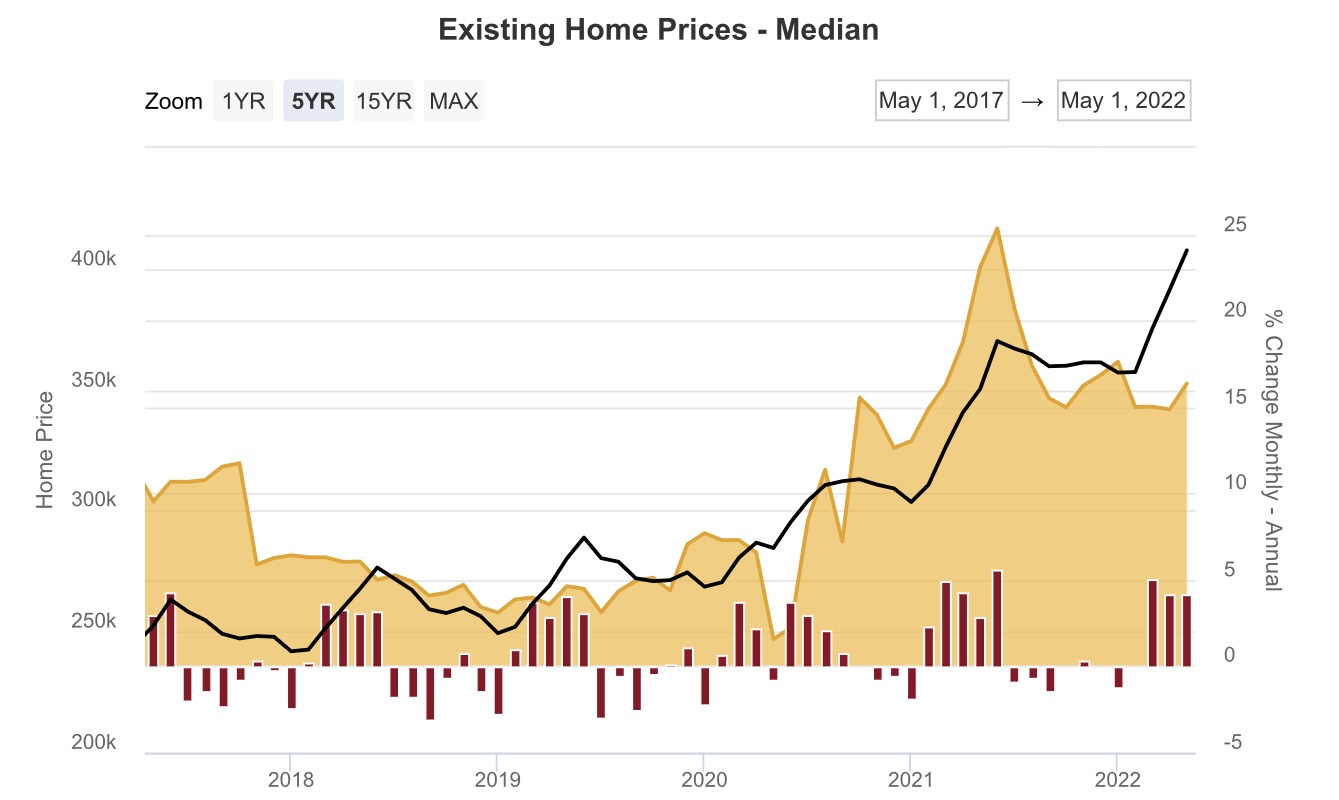
The story is completely different as to prices. At $416,000, the median price of an existing home increased 2.1% for the month, and 13.4% YoY (Note: prices aren’t seasonally adjusted, so the YoY view is the best measure; graph does not show this morning’s data):


The peak in YoY growth in prices was May 2021, where prices increased 23.6% YoY. The low this year was April’s 10.4% YoY growth. Since my rule of thumb as to non-seasonally adjusted data is that a decline of 1/2 of peak YoY change is necessary for a real-time peak, we still are not at the point where prices are actually declining - although there are lots of anecdotal signs that we may be close.

The reason for this is in inventory. Last month I wrote that. “in May inventory was still down -4.1% YoY. Importantly, the NAR’s weekly update showed inventory increasing YoY in the last week of May and the first several weeks of June, so this may be the last hurrah for that metric.”

And indeed it was, as inventory in June was up 2.4% YoY:


A longer term look from the NAR’s new and active listing data, which goes back 6 years (note: seasonal peaks have typically occurred in May) shows that while *new* listings in June were higher than in any previous June except for 2019, active listings are still only about at 50% of their typical pre-pandemic levels:


New listings were up 100,000 YoY in June, but they need to increase to about +600,000 YoY to make up the total shortfall in active listings. Needless to say, we have quite a ways to go. 

So price increases have rolled on. So far.

Tuesday, July 19, 2022

Sharp downturn in June housing starts confirms earlier negative signals from permits, sales, and mortgage applications


 - by New Deal democrat

For the last few months, I have highlighted the record number of housing units that had permits, but had not yet been started, pointing out that it distorts the economic signal. Last month I closed with the statement:


“The conundrum is whether the 50 year high backlog in units not yet started will delay the downturn until it clears - which might take another 6 to 12 months. Since starts are the actual economic activity, until I see an unequivocal downturn there, the massive negative signal from permits, mortgage rates, and mortgage applications remains open to question.”

I would say that today we got the signal. Both permits for single family units and total starts turned down sharply. In the month of June single family permits declined -8.0% to a 2 year low - a little more than a 20% total decline from their January 2021 peak (red in the graph below); and starts declined -2.0%, tying their one year low at 14% below their peak in April of this year. Since monthly starts are noisy, the quarterly average is a much better signal, and in Q2 starts did decline -4.0% (blue). The quarterly average for single family permits (gold) also declined over -12.0% (gold):


In other words, with permits continuing to fall, and starts now also in decline, we have a verified leading signal.

What about housing under construction? To put that in perspective, the below graph shows housing data as it “moves through the belly of the beast;” including total permits (red), units permitted but not yet started (gold),starts (blue), units under construction (black), and housing completions (gray), for the past 3 years:


Both permits and starts have peaked. Further, it appears that units not yet started also peaked several months ago. Housing under construction appears to be peaking now. Completions still appear to be in a slight uptrend.

Housing under construction is the ultimate coincident marker of housing economic activity. Once that begins going down, housing’s contribution to the economy is negative in real time. We are probably only a month or two from that point. In other words, the leading indicators will be joined by the coincident indicator.

Not to be totally Doomish, let me show you the same information as in the first graph above, for the period of time when the 2000s housing boom turned into a bust:


In that case, permits were down about 33%, and starts down 25%, at the point when the Great Recession began. In other words, this downturn to date is only about half as bad as the one that presaged the Great Recession.

The final housing domino to fall will be prices. We’ll get a very important read on them tomorrow when existing home sales are published.

Monday, July 18, 2022

A note on inflation and whether the Fed should continue to raise rates - and whether it is “behind the curve”


 - by New Deal democrat

No important economic releases today, and almost no reporting by States as to COVID counts over the weekend, so let’s back up and take a look at something that’s been simmering on my intellectual back stove, so to speak: should the Fed be raising rates to combat this inflation? Has inflation already peaked? Or is the Fed way behind the curve and needs to raise rates a lot more?


Menzie Chinn has a guest post up, indicating that if the Fed had been following their own rules, they would have started raising rates during 2021. At the end of the day, I agree. Here’s why.

To begin with, I agree that if the sole sources of inflation are supply-based (the same amount of money chasing a shortfall in products), there’s no real point in raising rates. You can raise rates to 10% or 100%, if there’s a supply bottleneck, it’s not going to solve your problem; it’s just going to create lots of unemployment. In other words, for supply bottlenecks the best strategy is to leave high inflation alone, and don’t try to bring down employment.

But if inflation is demand based (more money chasing the same amount of goods as before), then raising rates to tamp down on demand makes sense.

Which one - or how much of each - do we have?

One good part of the answer is that inflation is global phenomenon, it’s not just limited to the US, as this chart helpfully put up by Kevin Drum shows:


If the source of inflation were US domestic stimulus, we wouldn’t see that type of global chart.

That suggests that, at least globally, the primary source of inflation is supply-based bottlenecks.

In the US, there have been 3 major sectors of inflation: energy (oil and gas), vehicles, and housing. Let’s look at them in order.

In the case of the price of gas, that did get tight by late last year, rising to $4/gallon over autumn and winter.  But the real spike took place at the end of February, when Russia invaded Ukraine, and sanctions were imposed:


This is a supply shortfall, caused by a geopolitical event. Per my note above, the Fed shouldn’t be raising rates because of gas prices.

Next is motor vehicles:


These spiked due to a computer chip shortfall sourced to Chinese and Taiwanese factories, in large part due to those governments’ “zero COVID” or strict lockdown policies. Again, this is a supply shortfall and raising rates is not going to cause either jurisdiction to make more computer chips (If I were Biden, I would have invoked the Defense Production Act long ago to substitute US-made chips during the COVID emergency, but that’s another issue)

Finally, here is housing:


Housing appears to have strong elements of both supply *and* demand at issue. On the supply side, existing homeowners more or less stopped putting their houses up for sale even before COVID hit, and definitely during the teeth of the pandemic:


Only now is increasing inventory coming on the market.

Further on the supply side, the price of lumber in particular skyrocketed:


This caused a huge backlog of houses under construction that were not completed:


But on the other hand, it’s also clear that extremely low interest rates, with record low monthly mortgage payments in “real” terms spike a surge in demand:


As night follows day, the record surge in house prices in 2021 and so far in 2022 has spilled over into rent increases and thereby in “owners’ equivalent rent,” the official CPI measure of housing inflation (we’ll come back to the black line, real GDP, later):


Housing is 33% of the entire CPI, and over 40% of core CPI.

So, is the main driver a shortfall in housing supply, or a surge in housing demand?

To look at that, I compared the growth in the total US population since the turn of the Millennium with the total amount of housing stock available in the US, which is helpfully estimated by the Census Bureau:


And the answer is, the available amount of housing stock has indeed kept up with population growth (by the way, this would be true even if I had measured from the worst possible comparison point just before the Great Recession). While there are certainly particular areas where that has not been true, and prices have been nuts for a long time (California!), the simple fact is that, averaged over the country, that is not the case.

In other words, housing inflation is primarily a demand, not a supply, issue, and since it is the single biggest slice of the CPI, that should have started to be addressed by the Fed once real GDP caught back up to its pre-pandemic levels, which according to the black line in the graph above was Q2 of 2021.

Had the Fed started raising rates then, it would have been attacking a CPI level of about 4%, and would have had a much better chance of obtaining a “soft landing” than it has now. In fact, the only way I see of the US avoiding recession at this point is if gas prices move all the way back down to the $4/gallon level, very soon, and stay there or below.

Saturday, July 16, 2022

Weekly Indicators for July 11 - 15 at Seeking Alpha


 - by New Deal democrat

My Weekly Indicators post is up at Seeking Alpha.

We are at the point where I suspect that after the Q2 quarterly economic reports come out, and the Fed’s next meeting/rate hike, literally *all* of the long leading indicators will be negative.

But, wait! There is a ray of sunshine still. Oil prices went back down under $100/barrel yesterday, equivalent to where they were when gas was $4.10/gallon. Take away the Ukraine-related oil shock, and not only might consumers start spending more on other things again, but inflation might decline sufficiently to cause the Fed to ease up a little. Maybe.

As usual, clicking over and reading should bring you up to the virtual moment as to the state of the economy, and brings me a few pennies for my efforts.

Friday, July 15, 2022

June industrial production: second sharp monthly decline in manufacturng


 - by New Deal democrat

Industrial production declined -0.2% in June, and May was revised downward to unchanged. Even worse, manufacturing production declined -0.5% in June, and May was revised downward to -0.5% as well:


This corresponds to the sharp deterioration in the regional Fed new orders indexes, and the ISM manufacturing new orders index we have seen during that same time.

On a YoY basis, total production is up 4.2%, while manufacturing is up 3.6%. Compared with the last 40 years, and particularly the last 20, this remains pretty good growth:


The sharp deceleration in the past two months is not good, and two recessions - 1990 and 2007 - have started from these levels, but it has usually taken an even sharper downturn to coincide with the onset of a recession.


Real retail sales decline again slightly


 - by New Deal democrat

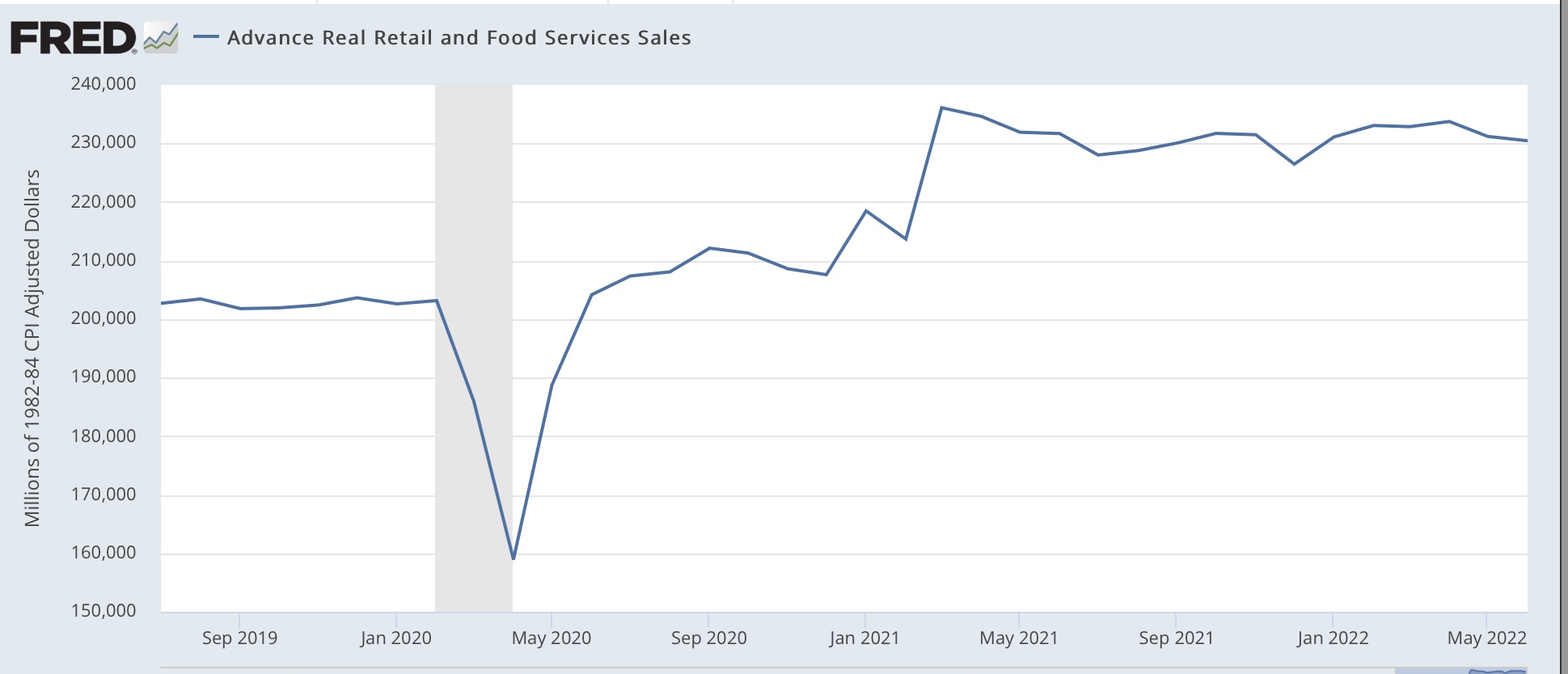
Nominal retail sales for the month of June rose 1.0%, and May was revised up by 0.2% from -0.3% to -0.1%. But since inflation was 1.3% in June and 1.0% in May, this makes the combined downturn in real retail sales -1.4% for the two months:


YoY real retail sales is down -0.5%. In the past 75 years, a decline in real retail sales YoY has frequently - but not always - indicated a recession. Here’s what the past 30 years look like:


To repeat what I said one month ago, not good news. 

Next let’s turn to employment, because real retail sales are also a good short leading indicator for jobs.

As I have written many times over the past 10+ years, real retail sales YoY/2 has a good record of leading jobs YoY with a lead time of about 3 to 6 months. That’s because demand for goods and services leads for the need to hire employees to fill that demand.  The exceptions have been right after the 2001 and 2008 recessions, when it took jobs longer to catch up, as shown in the graph below (note: sales averaged quarterly to cut down on noise):


II have been writing for months that I have expected the blowout job numbers of about 500,000 per month to slow down to a range of about 100,000-300,000 per month by early autumn. The last 3 months have averaged 383,000, so the slowdown has begun, but there is almost certainly more to go.

Thursday, July 14, 2022

Jobless claims continue to trend higher, but no recession signal yet


 - by New Deal democrat

Initial jobless claims rose 9,000 to 244,000 last week, a 7.5 month high. The 4 week average rose 3,250 to 235,750, a 7 month high.  But the news wasn’t all negative, as continuing claims declined 41,000 to 1,331,000, which is only 25,000 above their 50 year low set on May 21:


Two weeks ago I noted that, reviewing the entire 50+ year history of initial claims, “there are almost always one or two periods a year where the four week moving average of jobless claims rises between 5% and 10%. About once every other year for the past 50+ years, it rises over 10%. Typically (not always!) it has risen by 15% or more over its low before a recession has begun. And a longer term moving average of initial claims YoY has, with one exception, turned higher before a recession has begun.”

Both initial and, this week aside, continuing claims have been continuing to drift higher, and since that uptrend has lasted for more than 3 months, they are no longer a positive indicator. Indeed, initial claims are almost 50% higher than their low for the cycle, meaning they fulfill the first of the two above criteria to signal a recession is near. Further, if the present trend continues about 3 more months, initial claims will be higher than 1 year previous, which would fulfill the second criteria as well.

But we’re not there yet, so initial claims aren’t negative, signaling recession.

Wednesday, July 13, 2022

June CPI report: bad, bad, bad, bad, bad


 - by New Deal democrat

In case for some reason you haven’t already heard, the inflation news for June was uniformly bad.


Here is some of the carnage. For the month of June only:
  •   overall inflation was up 1.3%, the highest monthly increase since 2005
  •   energy inflation was up 7.5%
  •   inflation less energy was up 0.7%
  •   inflation in used cars and trucks was up 1.6%
  •   inflation in rents was up 0.8%, the highest since 1986
  •   owners’ equivalent rent, the CPI euphemism for house prices, was up 0.7%

Again, those were for the month of June *alone.* There was no respite anywhere.

YoY, overall inflation was up 9.0%, the highest since 1981:


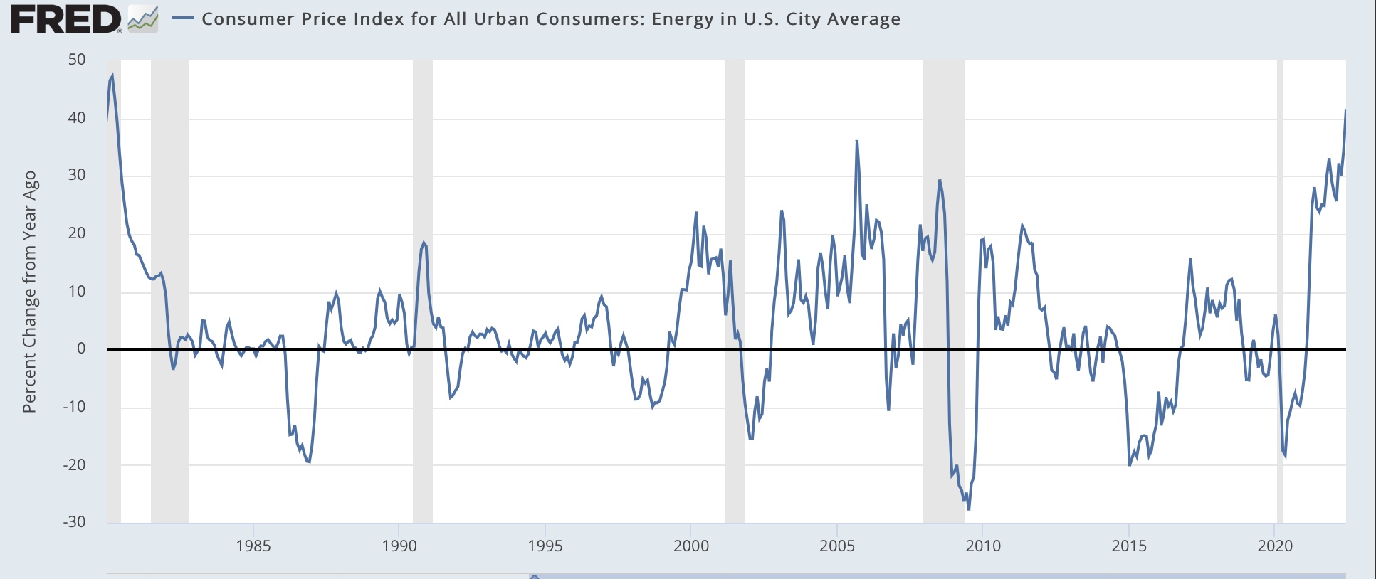
YoY energy prices were up 41.5%, the highest since 1980:


YoY prices less energy were up 6.6%, which is below the March peak of 6.8%, but still above any year previous since 1982:


The relatively bright spot is that YoY prices in used cars and trucks were “only” up 7.1%, compared with their June 2021 peak of +45.3%:


YoY rents increased 5.8%, the highest since 1986, and owner’s equivalent rent (red)(for houses) increased 5.5%, the highest since 1990. As I have been saying for 9 months, house prices (black) lead OER by 12-18 months, meaning we were likely to see the highest YoY% increases in OER ever. And we are well on our way:


I am sure everyone is expecting another 0.5% hike, if not a 0.75% hike, at the next Fed meeting.

Finally, this absolutely clobbered real wages in June. Average hourly earnings for nonsupervisory employees increased 0.5% in June, but with a 1.3% increase in consumer prices, real average hourly wages decreased 0.8% for the month. Real wages are down 2.9% from April 2021, and down 3.6% from December 2020:


It is going to take more than the recent 8% decline in gas prices to reverse this negative dynamic. Thus simply must be putting a real crimp in consumer spending, which raises the stakes for Friday’s retail sales report for June.

Tuesday, July 12, 2022

Coronavirus dashboard for July 11: BA.4&5 now over 80% of cases without creating a new wave, as COVID heads toward endemicity


 - by New Deal democrat

The CDC’s variant proportions data for this past week is out, and it shows that combined BA.4&5 made up slightly over 80% of all infections. BA.5 was at 65%, and BA.4 at 16%. BA.2.12.1 now only makes up 17% of all cases:


Regional disparities among the variants have all but disappeared with the slight exception of the Mid-Atlantic, where BA.4&5 make up a slightly lower percentage of cases, and BA.2.12.1 still makes up a slightly higher percentage:


The 12 week view of confirmed infections and deaths shows that the two new variants have almost completely supplanted both the original BA.2 variant as well as BA.2.12.1, but without giving rise to any new “wave” of increased infections or deaths at all:


Cases have been in the range of 100,000-110,000 for over 8 weeks, and deaths in the range of 275-350 for 10 weeks.
[Note: Oklahoma had a big data dump of deaths a few days ago; without that deaths would not have increased at all in the past week until yesterday, which was likely a result of comparison with non-reporting on July 4 one week prior.]

There has been plenty of information that, due to home testing, confirmed cases are undercounting actual cases by a large amount. But when we turn to BIobot’s graph of nationwide wastewater testing results, we see that, while “actual” cases as indicated by wastewater are 2.5x the number of “confirmed” cases, the trend of the two is similar:


In other words, between mid-May and the end of June, there was no increase in cases whatsoever. Since then wastewater has indicated that cases have increased by roughly 10%.

Since cases have almost always peaked by the time a variant reaches 90% of the total, which is likely to occur in about one week, BA.4&5 are not likely to be creating so much of a wave as a ripple.

The longer term view of deaths (solid line) compared with cases (dotted line) continues to show that each new variant has resulted in fewer deaths compared with cases than the previous variant:


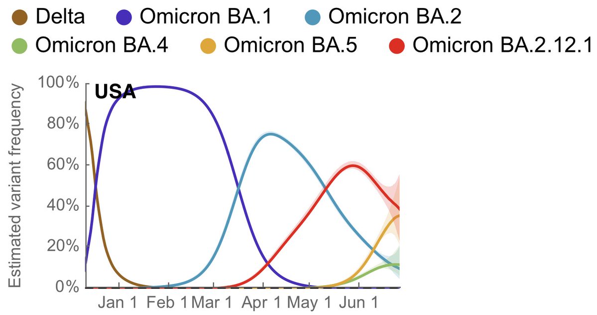
Similarly, below is a graph from Trevor Bedford, an epidemiologist who has been invaluable in estimated the impact of each variant as it has appeared. The graph shows that new variants are appearing with more rapidity, and is replaced by the next variant at lower levels of penetration by the previous variant:


What I see is a disease heading towards endemicity. Last year I was hopeful that, between vaccinations and previous infections, some approximation of herd immunity would be reached and the disease would fade into the background. Instead it is clear that the disease is evolving towards the ability to repetitively infect survivors.

Consider the following: if the first line defense of the immune system, antibodies, fade over (for example) 6 months; and there are two similarly infectious variants beginning to circulate; then the variant that is least like the variants circulating in the past 6 months is the one that is going to predominate. Because the variants most like the ones circulating in, say, the last 3 months, are going to be most susceptible to being neutralized by existing antibodies still active in peoples’ immune systems. The variant least likely to be neutralized by those antibodies, vs. antibodies that have already faded away over time, is the one that is going to take over.
And so we see a fairly rapid turnover of variants; but on the other hand, because B-cells and T-cells are relatively permanent, those lines of defenses are increasingly able to blunt serious disease among those whose immune systems are not weak or compromised. So the death rate is much lower than before, but remains concentrated among the elderly (of course, those elderly most susceptible to COVID probably already died of it in 2020 or 2021).

The next variant of concern appears to be BA.2.75, which started in India in May and has spread to many countries since, but has not yet become dominant in any other country. If it follows the pattern of BA.2.12.1 and BA.4&5, it will take over dominance in the next several months, but there will not be a big spike in the number of infections, as had been the case in 2020 and 2021.

Monday, July 11, 2022

Aggregate hours and payrolls of nonsupervisory workers and the onset of recessions


 - by New Deal democrat

An important reason I focus on whether or not the economy is heading into recession, is that during recessions income and jobs both decline for the middle and working classes as a whole.

In that regard, Jared Bernstein, a member of Biden’s Council of Economic Advisors, posted two graphs over the weekend contra the panic about a potential negative Q2 GDP reading. 

He tweets (slightly cleaning up his abbreviations):

“Macroeconomists have long recognized the high, + correlation between aggregate hours worked and real GDP. Here's a scatter[plot] of these two var[iable]s (ann[ualized] q[uarterly] growth rates”:


Here is his graph of real GDP vs. aggregate hours averaged quarterly:


Here is a longer term graph of the YoY% change in aggregate hours:


Over the weekend I had a question on Seeking Alpha about whether I was worried about another negative GDP print. I replied that the NBER themselves have written that they primarily weight real personal income and nonfarm payrolls, and that history shows they actually put a lot of weight on industrial production - all 3 of which have been positive all year so far.

Bernstein is essentially arguing that Q1 GDP was out of sync with hours, and Q2 hours were also very positive, which is very similar to my point above.

For the past 4 months, jobs have been added at a fairly steady pace of .25% per month, as shown in the graph below:


Historically, as shown in the next two graphs, with the exception of 1960 it has taken *at least* 6 months after such jobs readings for a recession to have begun (1970 and 1974)(note: subtracting -.25 so that the current level shows at the zero line):


While monthly readings are noisy, over a longer moving average basis the trend in jobs tends to be much smoother. And what the above suggests is that it is unlikely for there to be such small job gains, or declines, consistent with the onset of a recession through the end of this year.

On the negative side, one important indicator I track shows the aggregate income per capita available to working and middle class families at any time. I derive this by taking nominal aggregate income of nonsupervisory workers, adjusting for inflation, and then adjusting by the working age population (ages 16-64 in the above graph; I’d like to measure ages 0-65 but that isn’t available):


Real income per capita for workers is down -1.5% since the end of last year. As you can see, this isn’t good and has reliably happened - and *only* happened for more than a month or two - in the 6-12 months before the onset of all recessions in the past 50 years.