Saturday, August 6, 2022

Weekly Indicators for August 1 - 5 at Seeking Alpha


 - by New Deal democrat

My Weekly Indicators post is up at Seeking Alpha.

Several important metrics have reversed course in the past month. Interest rates, especially mortgage rates, have declined (in the case of mortgages, by 1 full % from their peak. As many have pointed out, gas prices have fallen by about $1/gallon from their peak as well. That is putting more money into consumers’ pockets for other things. And stock prices have also reversed, nearing a 3 month high.

While that doesn’t negative the message of the long or short leading indicators in the past, it certainly can change their forecasting meaning going forward. In other words, even if we have a recession - which looks nearly certain by now - it *might* be short and shallow.

As usual, clicking over and reading will bring you fully up to date, and reward me with a penny or two for my efforts.

Friday, August 5, 2022

July jobs report: in which an absolute positive blowout make me happily wrong; all pandemic job losses now recovered


 -  by New Deal democrat

As I wrote earlier this week, the short leading indicators for both jobs (real retail sales) and the unemployment rate (initial jobless claims) have each signaled that we should expect weaker monthly employment reports, with both fewer new jobs and a higher unemployment rate. I have been noting this ever since February, when consumption growth started to flag, It already had shown up by last month, as the 3 month average in new jobs decelerated from over 500,000 to 383,000.

Secondarily, as of last month we were only 550,000 jobs shy of the pre-pandemic level. Would we finally get there?

The complete opposite happened in July, as job gains surged and the unemployment rate declined further. Together with the upward revisions to the last two months, as of now there are 22,000 MORE jobs than there were just before the pandemic. Further, the skew of those jobs is away from lower paying sectors towards higher paying ones. Here’s my in depth synopsis:

HEADLINES:
  • 528,000 jobs added. Private sector jobs increased 471,000. Government jobs increase by 57,000. 
  • The alternate, and more volatile measure in the household report indicated a  gain of 179,000 jobs. The above household number factors into the unemployment and underemployment rates below.
  • U3 unemployment rate declined 0.1% to 3.5%, equal to the January 2020 low.
  • U6 underemployment rate was unchanged at 6.7%, tied for its all-time low.
  • Those not in the labor force at all, but who want a job now, rose 254,000 to 5.910 million, compared with 4.996 million in February 2020.
  • Those on temporary layoff declined -36,000 to 791,000.
  • Permanent job losers declined -107,000 to 1,166,000.
  • May was revised upward by 2,000, and June was also revised upward by 26,000, for a net increase of 28,000 jobs compared with previous reports.
Leading employment indicators of a slowdown or recession

These are leading sectors for the economy overall, and will help us gauge whether the strong rebound from the pandemic will continue.  These were completely positive:
  • the average manufacturing workweek, one of the 10 components of the Index of Leading Indicators, rose 0.1 hour to 41.1 hours.
  • Manufacturing jobs increased 30,000, and is at a level higher than it was before the pandemic.
  • Construction jobs increased 32,000. All of the jobs lost during the pandemic  have also been made up in this sector. 
  • Residential construction jobs, which are even more leading, rose by 2,900.
  • Temporary jobs rose by 9,800. Since the beginning of the pandemic, over 250,000 such jobs have been gained.
  • the number of people unemployed for 5 weeks or less declined by -182,000 to 2,080,000, which is also below its pre-pandemic level.

Wages of non-managerial workers
  • Average Hourly Earnings for Production and Nonsupervisory Personnel: rose $0.11 to $27.75, which is a 6.2% YoY gain, a further decline of -0.2% from last month and its 6.7% peak at the beginning of this year.

Aggregate hours and wages:
  • the index of aggregate hours worked for non-managerial workers rose by 0.3%, which is above its level just before the pandemic.
  •  the index of aggregate payrolls for non-managerial workers rose by 0.8%, which is below the average inflation gain of 0.9% in the past 3 months.

Other significant data:
  • Leisure and hospitality jobs, which were the most hard-hit during the pandemic, rose 96000, but are still -7.1% below their pre-pandemic peak.
  • Within the leisure and hospitality sector, food and drink establishments added 74,100 jobs, but are still about 635,000, or -5.1% below their pre-pandemic peak.
  • Professional and business employment increased by 89,000, which is about 1,000,000 above its pre-pandemic peak.
  • Full time jobs declined -71,000 in the household report.
  • Part time jobs increased 384,000 in the household report.
  • The number of job holders who were part time for economic reasons increased 308,000 to 3,924,000, above last month’s 20 year low.
  • The Labor Force Participation Rate declined another -0.1% to 62.1%, vs. 63.4% in February 2020.

SUMMARY

This report was an unexpected blowout, plain and simple. All of the pandemic job losses have been made up. We are near or at all-time lows in both the unemployment and underemployment rates. *All* of the leading indicators in the report were positive, meaning we should not expect the jobs sector to roll over anytime in the immediate future. Temporary layoffs declined. The only area still lagging is in the lower-paying leisure and hospitality sector, while there are almost 1,000,000 *more* higher paying jobs in the professional and business sector.

There were a few warts. Average hourly earnings once again did not keep up with inflation, a significant negative. The decline in unemployment was helped by a *lower* labor force participation rate. The number of full time jobs actually declined.

The strength of the jobs market has been the best reason why the US is not currently in a recession. This report added to that argument.

On the other hand, I want to caution that some of the great news in this report may be due to comparisons with the distortions of the last two summers, particularly with regard to temporary and education jobs. In other words, we might give this back come September. Leading indicators are still leading, and unless consumers use their new gas savings to spend on other stuff, I still expect job gains to flag in coming months. But for this month, I was very happily wrong.

Thursday, August 4, 2022

Jobless claims continue their relentless climb


 - by New Deal democrat

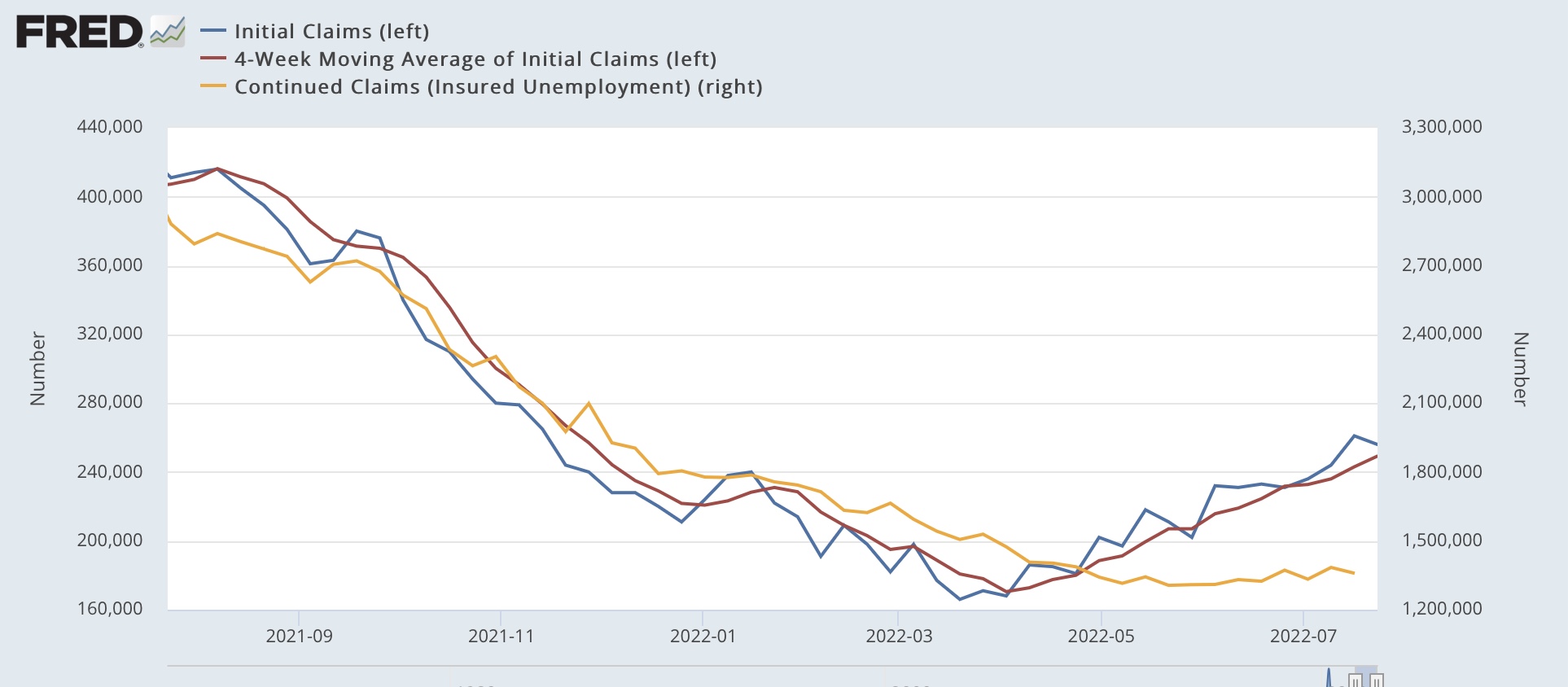
Initial jobless claims rose 6,000 to 260,000 last week. More importantly, the 4 week average, which has been rising relentlessly, rose another 6,000 as well to 254,750, an 8 month high.  Continuing claims also rose 48,000 to 1,417,000, the highest since April:


Initial claims have usually risen by 15% or more over its low, and turned higher YoY before a recession has begun.  There is a clear uptrend in all the numbers, with the 4 week average of initial claims over 50% higher than its low. Claims remain on track to turn higher YoY in November, which would signal an imminent recession.

To reiterate what I’ve said several times in the past two weeks, I anticipate (more likely than not) a slight upturn in the unemployment rate in tomorrow’s jobs report.

Wednesday, August 3, 2022

Coronavirus dashboard for August 3: is this what endemicity looks like?


 - by New Deal democrat

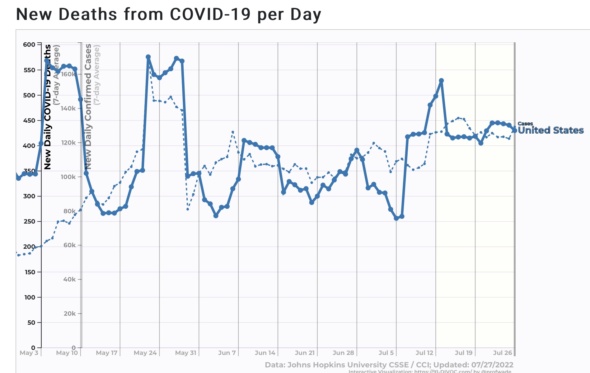
Confirmed cases nationwide (dotted line below) declined to 121,700, still within their recent 120-130,000 range. Deaths (solid line) are also steady at 431, within their recent 400-450 range as well:


Hospitalizations have plateaued in the past 10 days reported in the 45-47,000 range, and as of July 30 were 46,100. A commenter at Seeking Alpha who works in a hospital wrote to me that the big increase in the past several months has been people showing up with unrelated issues testing positive for COVID, I.e., “patients with COVID:”


Biobot has not updated since one week ago, showing as of then a 10% drop in COVID virus in wastewater, consistent with a “real” case count of about 360,000.

The CDC updated its variant tracker yesterday, showing BA.4&5 making up 97% of all cases. They also included a new subvariant, BA.4.6, in their analysis, indicating it constituted 4% of all cases, or 1/3rd of the BA.4 total:


It is primarily a factor in the northern Great Plains, where it makes up 9% of all cases.


But it has not been particularly growing in the past month, nor does it seem to be replacing BA.5. Similarly, while a few cases of BA.2.75 are showing up in most States, they are not showing up in the CDC data at all. I have not seen any medical commentary on either subvariant in the past week. 

Regionally there has been a small decline of confirmed cases in the West, while the other three regions are steady:


In fact, the only noteworthy changes in any State are that NY and NJ both show small declines:


Unless a new variant shows up imminently, I suspect we are entering a period of decline in cases and deaths.

Tuesday, August 2, 2022

JOLTS report for June amplifies likelihood of substantial downturn in job growth, upturn in unemployment


  - by New Deal democrat

Before we get to the JOLTS report for June, which was released this morning, I wanted to make a point about the overall trend in employment. Because, the two best short leading indicators for employment and unemployment are both pointing South.


First, as I have written dozens of times over the past 10+ years, consumption leads employment, not the other way around. More specifically, real retail sales tend to lead employment levels by about 3 - 6 months. Here is the history from 1994 until just before the pandemic:


Now here is the past two years:


Flat or even negative YoY changes in consumption have not historically been compatible with continued strong employment growth, to say the least. We have already seen some slowing, from an average of 550,000 to 380,000 jobs gained per month, in the past half year, and the above graph strongly argues for a much more significant deceleration.

Second, initial jobless claims are an excellent short leading indicator for the unemployment rate, also with a 3 - 6 month lead time. Here is the history since the 1960s until just before the pandemic:


And here is the past two years:


Since its end of March bottom, the average number of initial jobless claims has risen enough to suggest a 0.1% or even 0.2% increase in the unemployment rate is very close.

Which brings us to this morning’s JOLTS report, because I have been writing for the past number of months that, because of the pandemic, there have been several million fewer persons looking for work, leaving a huge number of unfilled job vacancies, particularly in the face of a roughly 10% higher jump in demand. This has created a sharp increase in wages, but more to today’s point, I have further posited that the dynamic would only slow down once some employers throw in the towel, and the number of job openings signficantly declines. 

Last month I wrote that “Openings likely peaked in March.” This morning we got confirmation, as job openings declined for the 3rd straight month, down -605,000 in June to 10.698 million; down -10% from March to an 11 month low; and only 8.6% higher YoY. In other words, they are very likely to be *down* YoY next month. Here’s the 2 year trend:


Actual hires declined -133,000 to a 10 month low as well. The decelerating trend is now easy to see:


Both quits and total separations also declined, by -37,000 and -86,000 respectively, to 8 month lows:


The deceleration in voluntary quits is now also apparent.

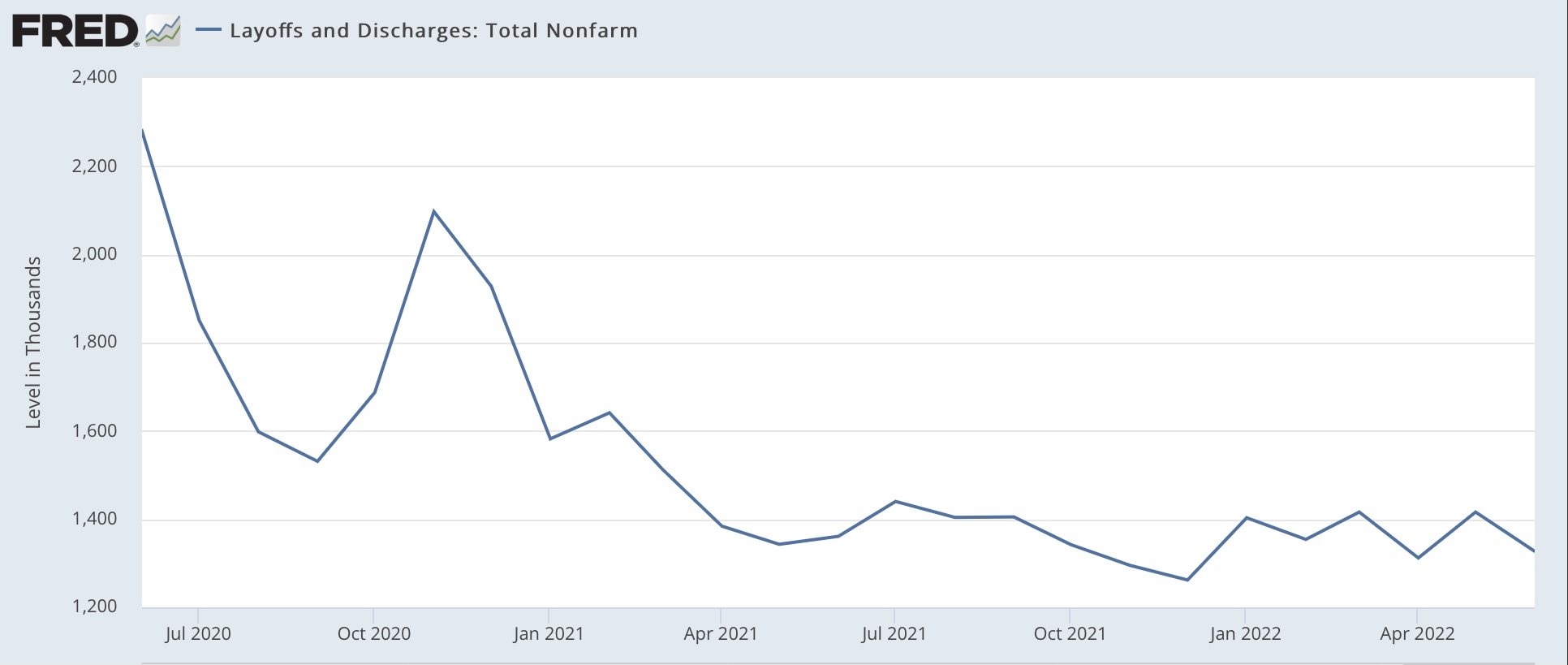
Finally, layoffs and discharges declined -89,000 to 1,327,000, about average for the past 12 months:


While any one jobs report can be noisy, it is much more likely than not that we are going to see a significant further slowdown in job gains, a likely small increase in the unemployment rate, and also a deceleration in wage gains, in Friday’s jobs report.


Monday, August 1, 2022

July manufacturing and June construction spending: leading components of both are negative


 - by New Deal democrat

As usual, the new month’s first data is for manufacturing and construction. Here’s a look at each.

The ISM manufacturing index, and especially its new orders subindex, is an important short leading indicator for the production sector. In July, for the second month in a row, the leading new orders index showed slight contraction, declining -1.2 from 49.2 to 48.0. The overall index - and all the other components, such as supplier deliveries, continued to show expansion, but also declined from 53.0 to 52.8:


This index has a very long and reliable history. Going back almost 75 years, the new orders index has always fallen below 50 within 6 months before a recession, and in three cases did not actually cross the line until the first month of the recession itself - although the recession did not begin until after the total index fell below 50, and in fact usually below 48.


In other words, this metric strongly suggests that it is likely that the economy will enter recession no later than Q1 of next year, and possibly much sooner (but probably not now).

Meanwhile, construction spending declined - 1.1% in nominal terms in June, while May was revised up slightly to +0.1%. The more leading residential sector declined -1.6%, although May was revised sharply higher, from -0.1% to +0.8%:


YoY nominally total construction is up +8.3% (down from +11.7% in February of this year) and residential construction is up +15.4% (down from +34% one year ago).

Adjusting for price changes in construction materials, which declined -0.6% for the month, “real” construction spending declined -0.5% m/m, and residential spending fell -1.0% m/m. Thus in absolute terms, since December 2020, “real” construction spending has declined by -20.4%, while “real” residential construction spending has declined -9.5%:


The decline in residential construction spending, while substantial, is less than its 2018-19 decline, and was nowhere near the -40.1% decline it suffered before the end of 2007. 

For the past few months I have been making the point that “it takes awhile for the downturn in mortgage applications, sales, and permits to filter through into actual construction, especially with record numbers of housing units permitted but not yet started.” In the past two months, it appears that has happened.

In sum, both reports - for manufacturing and construction - are negatives going forward.

Saturday, July 30, 2022

Weekly Indicators for July 25 - 29 at Seeking Alpha


 - by New Deal democrat

My Weekly Indicators post is up at Seeking Alpha.

There have been some interesting counter-trend movements in the indicators. For example, interest rates on mortgages have declined by more than 1% since their peak one month ago. Gas prices have declined by about $0.80/gallon, or almost half of their increase that coincided with Russia’s invasion of Ukraine invasion (remember my posts in 2010-14 about the “Oil choke collar?”).

It’s a reminder that, even as recessions potentially begin, the leading indicators may begin to foretell its end.

As usual, clicking over and reading will bring you up to the virtual moment on the data, and reward me a little bit for collating it for your benefit.

Friday, July 29, 2022

Real income continued to fall in June, while consumers dug deeper to spend


 - by New Deal democrat

In June personal income rose 0.6% nominally, and nominal spending rose 1.1%. The personal consumption deflator, i.e., the relevant measure of inflation, clocked in at 1.0%, meaning real income fell -0.4%, while real personal spending rose 0.1%.

I have been comparing both real personal income and spending with that with their level after early 2021’s round of stimulus. Accordingly, the below graph is normed to 100 as of May 2021:


Since then, real spending is up 2.2%, while real income has actually declined by -1.3%.

Comparing real personal consumption expenditures with real retail sales for May (essentially, both sides of the consumption coin) shows that both were close to flat:


Finally, the personal saving rate declined -0.4% to 5.1%, the lowest since right after the Great Recession in 2009 (note: below graph subtracts -5.1% to norm the current reading at zero):


Usually the savings rate tends to decrease as expansions grow longer, leaving consumers more vulnerable to shocks (e.g., gas prices); and June’s suggests that consumers are digging deeper into savings in order to make purchases. Which isn’t entirely bad news, since recessions typically start when consumers get spooked enough to increase their savings rate.

The bad news is that the last two months have been below the April peak in real personal spending; the good news is that this report confirms the very modest increase in Quarterly real spending that we saw in yesterday’s GDP report. 

In short, a very mixed report, as real incomes continue to fall, while consumers are sanguine enough to dig a little deeper and keep spending rather than pull back.

Thursday, July 28, 2022

Long leading indicators embedded in Q2 GDP suggest a recession is near at hand


 - by New Deal democrat

Where does the economy go from here?  If it’s not in recession, it isn’t doing much better. There are two components of GDP which are helpful in finding out what lies ahead: real residential fixed investment (housing) and proprietors income (a proxy for business profits). Both of these have long and good track records as helping forecast the economy one year in advance. 

Let’s start with real residential fixed investment. As was indicated in the BEA’s accompanying graph this morning, it was one of the two worst sectors of the economy in the 2nd Quarter, down -3.7%:


Nominal and real residential fixed investment as a share of GDP (the actual measurement that is part of the long leading indicators) also both declined sharply:


Recessions have typically happened on average 7 quarters after the last peak in this measure, which took place in Q1 2021. This puts the most likely onset of a recession in Q4 of this year.

The news is much more equivocal when it comes to proprietors’ income.

Frequently both corporate profits and proprietors’ income turn together, but sometimes proprietors’ income lags by 1 or 2 Quarters. But the actual leading metric deflates for unit labor costs, which also aren’t known yet for Q2. So here is a bar diagram for the last 21 months of the Quarterly % change in corporate profits (blue), proprietors’ income (dark purple), and unit labor costs (red):


If unit labor costs rise in accord with their last 3 quarters, then proprietors’ income will still be slightly positive for the Quarter, but still below their peak in Q2 2021. In other words, our proxy for corporate profits indicates that a recession could begin at any time, since the last peak was 1 year ago.

In addition to the above two long leading components of GDP, real money supply for June was reported on Tuesday, and the news wasn’t good there, either.

Recessions have typically occurred one year or more after real M1 turns negative, or real M2 is up by less than 2.5% from one year previous. Here’s what they look like now:


Real M1 and M2 are consistent with an onset of recession next spring.

In short, the long leading indicators that were updated this week suggest that a recession, if not here now, is nevertheless likely near at hand.


Increasing trend in initial claims continues; on track to signal recession in November


 - by New Deal democrat

Initial jobless claims declined 5,000 to 256,000 last week. But hold your celebrations, because that was because last week’s 251,000 was revised 10,000 higher! The 4 week average rose another 6,250 to 249,250, a nearly 8 month high.  On the positive side, continuing claims declined 25,000 to 1,359,000:


Typically, but not always, initial claims have risen by 15% or more over its low before a recession has begun. And a longer term moving average of initial claims YoY has, with one exception, turned higher before a recession has begun.

There is now a clear uptrend in all three numbers. The 4 week average of initial claims is now 50% higher than its low. Further, at their present rate, claims will turn higher YoY in November, which would be the signal for an imminent recession.

Finally, because initial claims lead the unemployment rate, it is likely that there will be an uptick in that metric in next week’s jobs report for July.

First comments on Q2 GDP: no, we’re not in a recession (yet)


 - by New Deal democrat

When the negative print on Q1 GDP first came out three months ago, I wrote:


yes, it was a negative GDP print. No, it doesn’t necessarily mean recession…. But the big culprits were non-core items. Personal consumption expenditures, even adjusted for inflation, were positive. The three big negatives were a big decline in exports vs. imports, followed in about equal measure by a decline in inventories and a downturn in defense production by the government.”

Lo and behold, the above is almost equally true about Q2 GDP! Here’s the helpful graph summary from the BEA in the official release:


I’ve also included the first bullet point explaining the inventory issue, which was the big negative in the report. Net exports minus imports wound up being a positive. Government spending was again negative, but this time was led by non-defense spending as, unsurprisingly, defense spending ramped up. The big negative addition was the big downturn in housing spending, about which I’ll have more to say later.

But I’ve made the point previously that the current expansion is very similar to the first two “Boom” expansions following the end of WW2. There was lots of inflation, but little change in interest rates. In fact, the Fed sat completely on the sidelines. It was when the “Bust” kicked in, as consumers were temporarily locked out of making durable purchases, that (shallow) recessions kicked in.

In fact, as Menzie Chinn wrote earlier this week, and Paul Krugman notes this morning, there were 2 consecutive quarters of negative real GDP in 1947, but no recession:


And Ben Casselman’s originating tweet points out that the negative and positive contributions to GDP at that time were very similar to the situation now:


My usual discussion of the long leading indicators in the GDP report will follow later.

Wednesday, July 27, 2022

Coronavirus dashboard for July 27: likely at or past the BA.4&5 peak


- by New Deal democrat

Let’s start with Biobot, since wastewater doesn’t lie. The bad news is, it shows a nearly 50% increase between June 29 and July 20. The good news is, in the last week of that period, between July 13 and July 20, it only increased less than 4%, suggesting that the BA.5/July 4 superspreader celebration wave has peaked, at a level equivalent to 500,000 “real” cases (from a starting point of 350,000):


The regional breakdown shows that the only region where wastewater has not plateaued is the Midwest:


Meanwhile, the CDC variant data indicates that by the end of last week, BA.4&5 constituted 95% of all cases:


This is consistent with infections from these variants being at or past peak. All regions of the country had similar variant profiles. There is no new variant (in particular, BA.2.75) making any appearance.

*Confirmed* cases (dotted line below) have remained between 120-130,000, with yesterday at 129,000. Deaths (solid line), at 429, have continued to plateau at roughly 100 more daily than in the April - June period (net the biweekly oscillations particularly in deaths are primarily an artifact of Florida’s reporting “system”):


Breaking down confirmed cases by Census region shows that only the Midwest shows a slight increase:


On the other hand, hospitalizations have continued to increase, to 46,700, consistent with evidence that BA.5 in particular is more virulent:


I think the BA.5 wavette has peaked, although whether we have a sustained plateau, or going into a substantial decline is completely unknown, but based on the experience of South Africa, which after the BA.4&5 wave declined to lows below even before the first wave of Omicron struck last November, I think the latter is more likely.

New home prices may have peaked after all


 - by New Deal democrat

Yesterday I wrote “The median price of a new home increased 1.7% in June (not seasonally adjusted), and remained sharply higher YoY at 15.1%.”


That’s true, but it wasn’t complete. The 15.1% figure is from the quarterly average. On a monthly basis, the YoY% change was 7.4%. Here are the monthly and quarterly figures together:


The monthly change is not seasonally adjusted, so my rule of thumb for peaks and troughs is that, when the rate of change is less than half the maximum YoY, the market has most likely turned. The biggest YoY% change in the past year was 24.2% last August, which means there has probably been a turn in the market.

But note that the monthly data, even YoY, is very noisy. For more confidence, we should at least average two months together. On that basis, the biggest YoY change was 23.7% for last July and August. This May and June together averaged 10.6%, so even on that basis it appears more likely than not that new home prices have peaked.

If so, this is the first of the four series (new home sales, existing home sales, the FHFA price index, and the Case Shiller price index) to have turned. 


Tuesday, July 26, 2022

New home sales continue to fall sharply, while prices for both new and existing homes continues to increase sharply


 - by New Deal democrat

New home sales declined further in June to 590,000 annualized and May was revised sharply lower as well:


This was the lowest number since the pandemic lockdown month of April 2020, and before that since December 2018. It is also over 40% lower than the peak reading of 1.036 sales annualized in August 2020. This is absolutely recessionary, as is easily seen in the above graph.

The median price of a new home increased 1.7% in June (not seasonally adjusted), and remained sharply higher YoY at 15.1%:


The FHFA and Case Shiller house price indexes were also released this morning. The also showed that house prices continued to increase sharply in May

The Case Shiller national index rose 1.0% for the month and 19.7% YoY, below last March’s 20.5%, which was the biggest YoY% gain ever. Meanwhile, the FHFA purchase only index rose 1.4% for the month, and 18.3 YoY, below its peaks of 19.3% in February, and 19.4% last July. The YoY% changes for both for the past 5 years are shown below:


While both are decelerating somewhat from their YoY peaks, they remain historically high.

Here is a longer term view, demonstrating that the current surge in house prices is the biggest in the past 30 years, surpassing even the housing bubble:


Owners’ Equivalent Rent (x2 for scale, black) is also shown above. As I have pointed out many times, OER follows house price indexes with roughly a 12-18 month lag. OER has also risen to a 30 year record YoY high, and can be expected to accelerate further for several more months at least.

We saw last week that the median price of an existing home sold in June also increased 13.4% YoY, indicating that sharp increases in those prices had not yet abated.

As I have frequently pointed out, sales lead prices. Prices can continue to rise for even a year after prices peak. But with this kind of sales decline, I fully expect outright price declines to follow, and soon.

Additionally, since OER plus rents contribute a full 1/3rd of the entire value of the CPI, and can be expected to accelerate further, I see very little reason to believe that, absent the Fed creating a recession, consumer inflation (outside of gas prices) is going to abate meaningfully anytime soon.

Monday, July 25, 2022

Book notes on Reconstruction


 - by New Deal democrat

No economic news of note today, and as usual insufficient Covid reporting over the weekend to make an update of that worthwhile, so let me dig out something from the back burner that I wanted to do for myself.

Last year I read Eric Foner’s 600+ page tome on Reconstruction, and this year read a treatment of “Lincoln and the Fight for Peace,” which described his final days and to the extent available his coalescing view of what Reconstruction should entail. I didn’t want to forget the main points, so I made a bullet-point synopsis:

1. John Wilkes Booth won. 

2. Why? Lincoln was replaced with Johnson, a loyalist Southern Democrat. Whereas Lincoln wanted to follow up the South’s complete surrender with a magnanimous peace for the masses, but to exclude the Confederacy’s leadership, and to require that the South accept the result of the war, Johnson’s intent was to restore Confederate States without restriction, i.e., to continue white supremacy, except with slavery technically outlawed. This poisoned the first several years of Reconstruction, until Congress wrested control.

3. The original sin of Reconstruction: no redistribution of all or at least some of Plantation land to the slaves whose uncompensated labor sustained it. Slaves were free but impoverished. Therefore no economic power.

4. Reconstructed Southern States went on a spending spree trying to attract railroads and other improvements. But in part because of the political fragility of Reconstruction, railroads and industry declined. Which created a vicious cycle, as it made Reconstruction even more fragile.

5. The North didn’t believe in racial equality either. Before the passage of the 15th Amendment, several Northern States defeated voting rights for Blacks, either Legislatively, or via failed ballot initiatives. As a general rule, the North wanted the racial issue settled, so they could move on.

6. In the final days of the lame duck period of his Presidency, Johnson issued pardons to all of the Confederate political and military leadership, enabling them to return to power, including both State and Federal elective office, which they subsequently did in droves - and also including 3 members of the Supreme Court that upheld segregation in Plessy vs. Ferguson. This was directly contrary to Lincoln’s plan, which would have specifically excluded them. In fact, Lincoln hoped Jefferson Davis would escape to South America, thereby depriving him of being either a martyr or a rallying point.

7. When white insurgency via the KKK and other insurgent groups started (many of them including those former Confederate military leaders), Reconstructed governments in the South were afraid to use military muscle, or to break “norms.” So white violence unpunished except in a few places where the Federal government stepped in.

8. On top of that, when the railroad investment bubble burst in the Panic of 1873, plunging the country into a deflationary recession, the North lost all remaining interest in expending energy on Southern Reconstruction. White insurgents pressed forward, toppling almost all of the Reconstructed Southern governments.

9. The contested Presidential election of 1876 was the final nail in the coffin of Reconstruction, as the Northern GOP traded the election of Rutherford B. Hayes to the Presidency in return for an end of Reconstruction in the South.

Had (at least large portions of) Plantation land been redistributed to the slaves who worked it, Freedmen would have had a base of economic power to hang on politically as well. They would have needed much less economic intervention and support from the Reconstructed State governments. 

It’s possible that the alacrity (between 1863 and 1869) with which freed Blacks were given full legal equality, but much more importantly, equal voting rights, was in large part responsible for the strength of the White backlash. In his final days, Lincoln seemed to favor a gradualist approach: immediate granting to voting rights to Black Union soldiers, plus those Blacks with property or education, with the remainder dealt with in some fashion later. *Maybe* had Black voting rights been phased in over a generation (with steps based on, e.g., education - as public schools, a priority for Freedmen, were one enduring legacy of the Reconstructed governments), with Federal protection in the interim, *perhaps* White fury would not have insisted in rolling back all of the progress made, and by 1900 Blacks would have been better off than they were under Jim Crow.

But the fact remains, the White backlash that reversed Reconstruction is a major example of a violent sustained insurgency that was successful, systematically rolling back rights that were explicitly guaranteed in the Constitution. That insurgency  remained successful for 80 years.

That opponents of the White violent insurgency now are making the same mistake of being afraid to violate “norms” in order to defeat it that the Southern Reconstruction governments made, makes me very pessimistic for the future of this country over the next few decades.

Sunday, July 24, 2022

Weekly Indicators for July 18 - 22 at Seeking Alpha


 - by New Deal democrat

I wasn’t able to get to this link yesterday, but my Weekly Indicators post is up at Seeking Alpha.

The situation with the leading indicators continues to ever so slowly deteriorate. But there is some good news as well, as gas prices continued to decline precipitously from their peak.

As usual, clicking over and reading should be educational for you, and slightly remunerative to me.