Tuesday, August 11, 2020

Coronavirus dashboard for August 10: some good news to balance the bad


 - by New Deal democrat

Total US cases:  5,060,880
Average last 7 days: 52,393/day
Total US deaths: 154,947
Average last 7 days: 1,045/day

Source: COVID Tracking Project

Let’s take a look at some good news as well as continued bad news today.

First, the bad news. Here are the top 10 States for coronavirus infections: 


And here are the top 10 States for deaths:
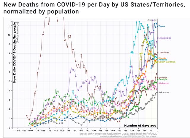

Note that with the exception of Nevada and Idaho, all of the top 10 States in both categories are from the Confederacy. About the best that can be said is that for most of them, cases and deaths may be leveling off. I can’t help but think that the racial demographics of who is getting seriously ill and dying plays a role in why these States are so recalcitrant.

But there is some good news as well.

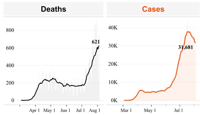
First, Arizona, which a month ago was turning into the poster child for renewed out of control exponential spread, has seen a drop of about 70% in new cases, and about 33% in deaths:
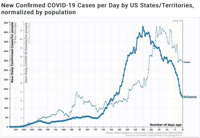


Not only did the State’s citizens react individually to curtail activities, but the governor issued a limited mask mandate, and allowed cities to issue more stringent ones, which the State’s major cities all did. Masks + social distancing work! Hoocoodanode!?!

Second, Texas, whole governor also issued a mask mandate several weeks ago, also has seen a 1/3 decline in new cases, and a leveling off in deaths:
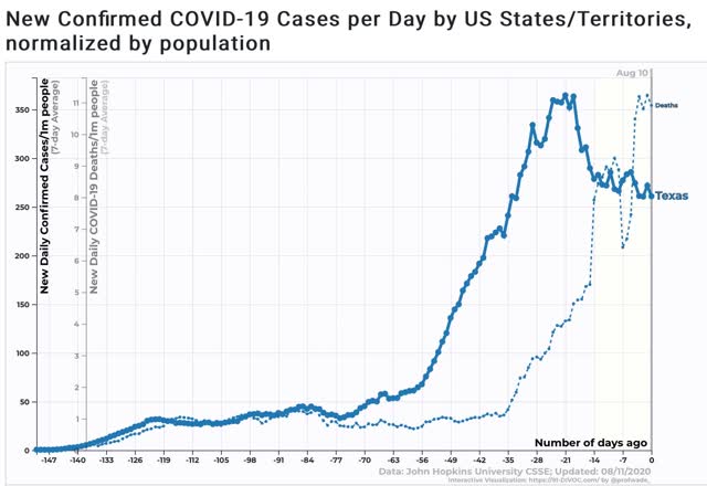


It’s too soon to declare this a success story, but signs are encouraging.

In short, even in the most culturally recalcitrant States, surging deaths eventually cause action to be taken. Will they keep up the progress, or once again rush to lift all restrictions and undo this preliminary success? We’ll have to wait and see.

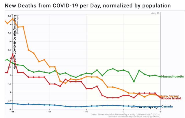
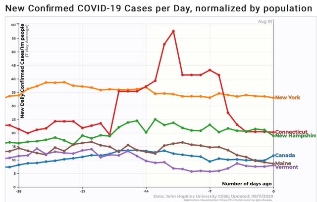
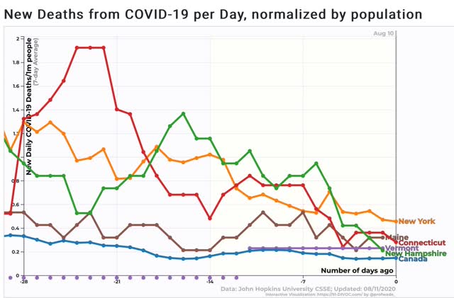
Next, let’s turn to the Northeast, the biggest success story in the US. In the below graphs, I’ll compare all of the States with next-door neighbor Canada.

Within that region, Massachusetts, Rhode Island, and New Jersey still have not brought their new case count down close to Canada, and in fact cases are increasing again:
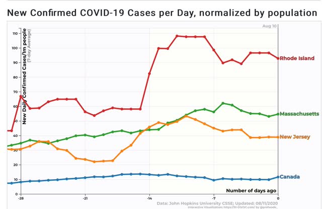


Deaths have leveled off at multiple the rate of Canada’s:


But northern New England, Connecticut, and New York are true success stories, with new infection rates either equivalent to, or 2 to 3.5 times that of Canada:


Deaths are also equivalent to, or up to 3 times that of Canada’s:


Governors of these 5 States ought to be lobbying Canada and the EU to allow travel restrictions to those countries for their residents.

Monday, August 10, 2020

Did July’s headline jobs number miss business closures, and so overcount job gains?


 - by New Deal democrat

A few issues arose with regard to last Friday’s jobs number; in particular, the effect of government jobs in the form of Census and teaching jobs, whether seasonal adjustments are unhelpful at this time; and whether the birth/death model used by the BLS has undercounted job losses (due to increased non-reporting by closed businesses). I’m going to examine this in two posts. Tomorrow (hopefully!) I’ll go into detail as to what withholding taxes can tell us about the employment numbers. Today I want to compare the BLS payrolls data with the Census’s household survey.
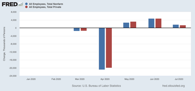
Let’s start with the issue of government employment. Since there were lots of layoffs in schools earlier, the lack of new layoffs in July meant that “seasonally” over 200,000 gains  of the 1.763 million jobs reported in July were included in the nonfarm payrolls number (Blue in the graph below). When they are taken out, however, you still get a gain of 1.462 million (red):


A second issue is whether the BLS has been undercounting job losses due to closed businesses. Let’s look at this together with the issue that the pandemic has rendered the seasonal adjustments counterproductive. Because the way to deal with both is to compare the Census Bureau’s household employment report, and compare both on a non-seasonally adjusted basis. So, all of the graphs below are *not* seasonally adjusted.

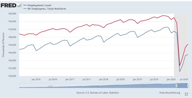
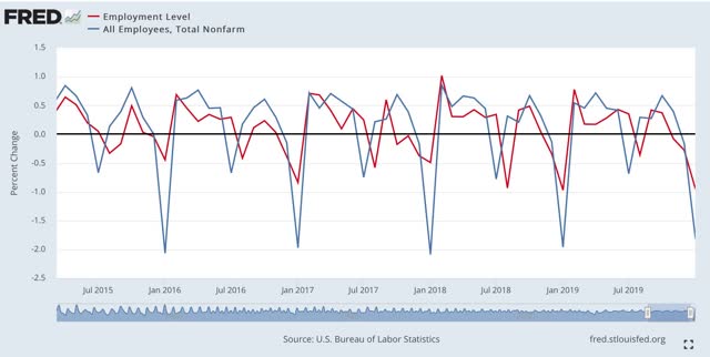
First, here are nonfarm payrolls (blue) compared with household employment (red) for the past 5 years:


There is always a big decline in January, and a secondary one in July. Needless to say, they have both been dwarfed by the effect of the pandemic. But also, notice that both measures have bounced back since April, in roughly equivalent amounts, and both showed gains in July (again, remember these graphs are not seasonally adjusted, so the lack of school layoffs last month is moot).

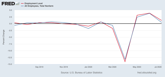
Here is a close-up of the last few months. Again we see that the improvements in both the BLS employer survey and the Census Bureau’s household survey have been comparable:


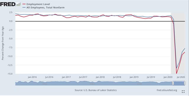
The same shows up in the YoY% measures of both the BLS and Census Bureau data:


Finally, let’s compare the monthly % change for both measures over the past 5 years through this past January:


Again, note the large January and smaller July declines. In the case of July, it’s not unusual for there to be a one month delay in the Census (red) vs. the BLS (blue) decline. It’s also not unusual at all for there to be a month to month deceleration in job gains in the Census figure.

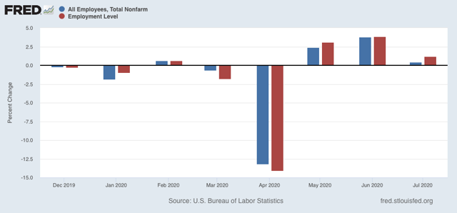
Now let’s show just this past year:


Notice that the scale of the % losses and gains is much larger. But the Census and BLS monthly changes are in line with one another.

In sum, comparing the Census Bureau’s household report data with the BLS’s employer survey strongly suggests that the official BLS jobs number has not been missing a significant number of job losses due to a spike in business closures.

Sunday, August 9, 2020

The 2020 Presidential election nowcast: polling trends favorable to Biden continue


 - by New Deal democrat

Here is my weekly update on the 2020 elections, based on State rather than national polling in the past 30 days, since that directly reflects what is likely to happen in the Electoral College.

Let me begin with a reminder that polls are really only nowcasts, not forecasts. There is nothing inherent in their current lean which tells you they will remain in the same category in early November. Which is why I take issue somewhat with the following tweets by forecaster Harry Enten:


This past week Prof. Allan Lichtman, who predicted Trump would win in 2016, predicted that Biden will win the election this year, based on his 13 “keys.” 

Lichtman said that 7 of the 13 keys favor Biden: 
1. The Democrats won more seats in the 2018 midterms than they held after the 2014 midterms. 
2. The economy is in recession. 
3. Per capita real income growth has been lower in Trump’s presidency than during Obama’s.
4. There has been significant social unrest. 
5. Trump has been tainted by major scandals. 
6. Trump has not had any major military or foreign policy successes. 
7. Trump lacks charisma.

Enten is correct that at least some of Lichtman’s ratings are subjective (e.g., on what basis does he decide whether or not Trump or Biden have charisma, or whether Trump has had significant foreign policy successes or failures? These aren’t quantified; they are inherently subjective). But properly speaking his 13 keys are a “diffusion model,” just like, e.g., the well-respected ISM manufacturing new orders index which has been a good economic leading indicator for over half a century.

Does it have shortcomings? Of course. But the first 3 “keys” favoring Biden are objectively quantifiable, and 2 of the remaining 4 (social unrest and scandals) are pretty clear. Number 6 looks correct as well.

In any event, the point is that polls DO NOT FORECAST; only fundamentals-based systems can do that - and even then are subject to the problem that decision makers and voters will react to the forecasts.

With that said, let’s turn to this week’s numbers.

Last week I noted that Trump’s approval was reverting to the mean, as were the Presidential polls. The former trend is continuing; the latter is not.

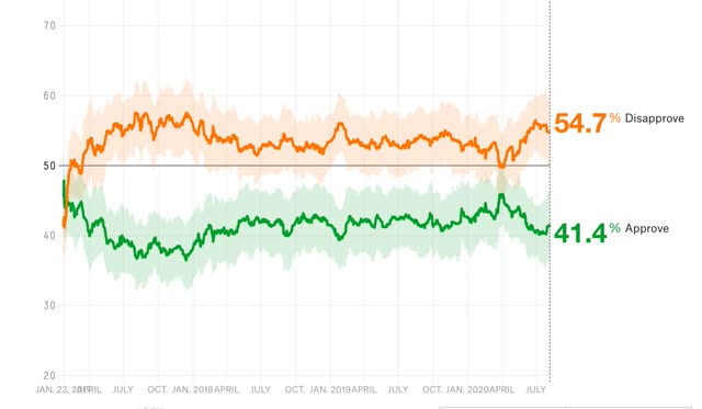
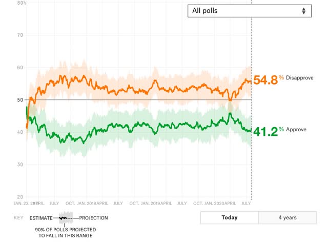
Here is Nate Silver’s Trump approval vs. disapproval graph:


After languishing at 40%, equivalent to the worst levels of his Presidency, Trump’s  partisans have come back to approving him, as they always have for the past four years.

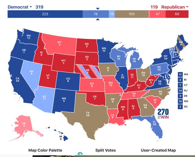
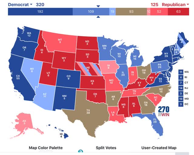
But this has not been reflected in the Presidential polling updated through this week. To refresh, here is how the below map  works:

- States where the race is closer than 3% are shown as toss-ups.
- States where the range is between 3% to 5% are light colors.
- States where the range is between 5% and 10% are medium colors.
- States where the candidate is leading by 10% plus are dark colors.

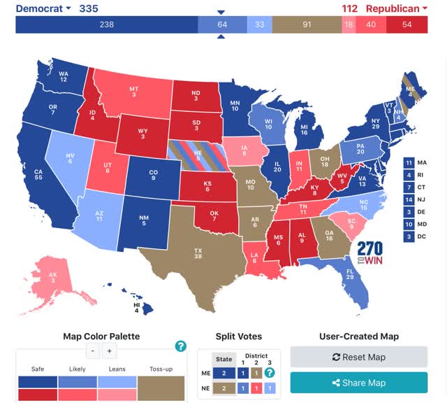
Here is the updated map through August 8:


The only significant improvement for Trump is in Maine’s 2nd Congressional district, which goes from “lean Biden” to toss-up. Several deep red “solid Trump” States, notably Montana and  Kansas, have lightened to “likely Trump.” More notably, Iowa has moved back to toss-up from “lean Trump,” and maybe more importantly, despite heavy polling, Georgia, North Carolina, Ohio, and even Texas remain in the toss-up category - and Florida remains firmly in the “lean Biden” category.

There are a few States where I have had to rely on older polling, and really need to be updated, notably Nevada, Arkansas, and West Virginia.

As it has indicated for the past month, per the current map Biden just has to win the “solid” and “likely” States, and need not win any of the “lean Biden” States, in order to win the election.

I continue to be of the opinion that Trump has 4 weeks left - until Labor Day - to work a miracle with the coronavirus pandemic. If it is about where it is now, then the economic fundamentals + the casualties from the pandemic indicate that Biden will win the popular vote in November, although the race seems likely to tighten somewhat, because the short leading economic indicators have been suggesting the economy will improve somewhat.

Saturday, August 8, 2020

Weekly Indicators for August 3 - 7 at Seeking Alpha


 - by New Deal democrat

My Weekly Indicators post is up at Seeking Alpha.

The indicators in the short leading and coincident timeframes have improved. In other words, if it were left to its own devices, the economy “wants” to get better.

But we are still at the mercy of the pandemic, and the federal and State responses to it. And on that score, I don’t see any meaningful progress that is going to be made in the next 5 months.

Friday, August 7, 2020

July jobs report: a very good *relative* gain - perhaps the last


 - by New Deal democrat

HEADLINES:
  • 1,763,000 million jobs gained. Together with the gains of May and June, this makes up about 42% of the 22.1 million job losses in March and April.
  • U3 unemployment rate declined -0.9% from 11.1% to 10.2%, compared with the January low of 3.5%.
  • U6 underemployment rate declined -1.5% from 18.0% to 16.5%, compared with the January low of 6.9%.
  • Those on temporary layoff decreased -1,300,000 to 9.225 million.
  • Permanent job losers decreased by -6,000 to 2.877 million.
  • May was revised upward by 26,000. June was revised downward by -9,000 respectively, for a net of 17,000 more jobs gained compared with previous reports.
Leading employment indicators of a slowdown or recession

I am still highlighting these because of their leading nature for the economy overall.  These were very positive: 
  • the average manufacturing workweek rose 0.7 hours from 39.0 hours to 39.7 hours. This is one of the 10 components of the LEI and will be a strong positive.
  • Manufacturing jobs rose by 26,000. Manufacturing has still lost 740,000  jobs in the past 5 months, or 5.8% of the total. Since the worst loss was 10.6% of the total, 45% of that loss has been regained.
  • Construction jobs rose by 20,000. Even so, in the past 5 months 444,000 construction jobs have been lost, or 5.8% of the total. Since the worst loss was 15.2% of the total, 59% of that loss has been regained.
  • Residential construction jobs, which are even more leading, rose by 16,300. Even so, in the past 5 months there have still been 26,700 lost jobs, or about 21% of the total.
  • temporary jobs rose by 144,000. Since February, there have still been -557,500 jobs lost, or 21% of all temporary help jobs.
  • the number of people unemployed for 5 weeks or less rose by 344,000 to 3.2 million, compared with April’s total of 14.283 million.
  • Professional and business employment rose by 170,000, which is still 1.648 million, or about 8% below its February peak.

Wages of non-managerial workers
  • Average Hourly Earnings for Production and Nonsupervisory Personnel: fell -$0.11 from $24.74 to $24.63, which is still a gain of over 2.8% in 5 months. This reflects that job losses were primarily among lower wage earners, who have been disproportionately recalled to work.

Aggregate hours and wages:
  • the index of aggregate hours worked for non-managerial workers rose by 1.5%. In the past 5 months combined this has nevertheless fallen by about -9.4%.
  •  the index of aggregate payrolls for non-managerial workers rose by 1.0%. In the past 5 months combined this has nevertheless fallen by about -6.9%.  

Other significant data:
  • Full time jobs were responsible for 591,000 of the gain.
  • Part time jobs were responsible for 803,000 of the gain.
  • The number of job holders who were part time for economic reasons declined by 619,000 to 8.443 million. This is still an increase since February of 4.125 million.

A special note: as expected, there were outsized seasonally adjusted gains in education of 245,000, as layoffs that normally happened in July didn’t, because they happened in earlier months. There were also 27,000 census hires.

SUMMARY

Based on some weekly data, it had been feared that there might be a significant decline in jobs this month. Instead, there was another - if smaller - rebound. Even excluding the 301,000 gain in all government jobs, the gain was 1.462 million jobs. Needless to say, this was very positive.

Gains in construction and manufacturing hours were particularly impressive, as were professional and business services. Even with those gains, however, aggregate hours and payrolls are now down from peak about what they were, percentage-wise, at the worst of the Great Recession. 

The distortion in average hourly earnings continues to show that the lower class of workers is still suffering the brunt of the economic consequences of the pandemic, and desperately need continued aid.

While this report was certainly very good in *relative* terms, in absolute terms the  economic devastation has continued. The increase this month was only 10% of the total percentage loss from peak of total employment. In other words, the “V” shaped jobs recovery some were hoping for has stopped materializing. Because initial jobless claims stalled out in 4 of the past 5 weeks, and nonfarm employment tends to lag this trend by a month or two, the outlook for continued job gains next month is very problematic.

Thursday, August 6, 2020

Initial and continuing jobless claims: back to being “less awful”


 - by New Deal democrat

This morning’s initial and continued jobless claims resume the trend of “less awful” numbers.

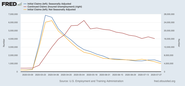
New jobless claims fell to under 1,000,000 for the first time on an un-adjusted basis - 984,192, to be specific (gold in the graph below). After seasonal adjustment, they declined 249,000 to a new pandemic low of 1,186,000 (blue), also a new pandemic low:


Continuing claims (red, right scale), reported for the prior week, also made a new pandemic low of 16,107,000.

All of these remain at far worse levels than even at their worst during the Great Recession. Further, that there are still 1 million *new* layoffs a week almost 5 months into the pandemic indicates that longer term damage is being done to the economy, I.e., if there were a vaccine tomorrow, there would be no “V-shaped” immediate recovery back to pre-pandemic levels. Almost all of which has been totally unnecessary, and has been caused by incompetent leadership at the very top.

But after about a month of stalling, on a very very very relative basis, I will take this “good” news.

Wednesday, August 5, 2020

Coronavirus dashboard for August 4: US regional breakdown


 - by New Deal democrat

US cases August 4: 51,568
Average last 7 days: 59,182
US deaths August 4: 1,176
Average last 7 days: 1,057

(Source: COVID Tracking Project)

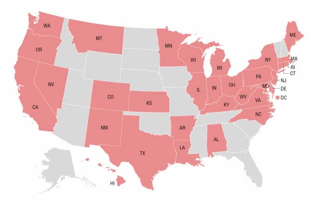
This is CNN’s latest map of States that require the wearing of masks (red):


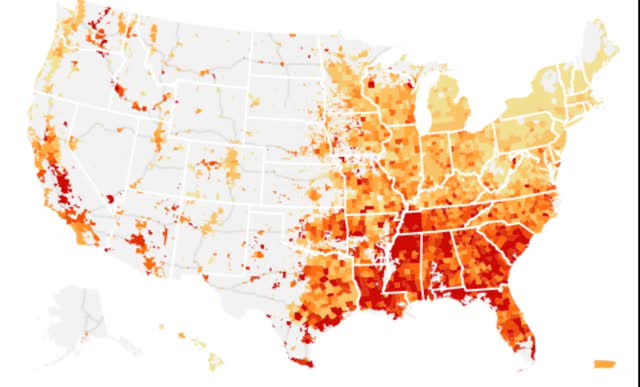
And here is the NYT’s latest map of counties based on the growth in new cases of COVID-19:


The two maps are very similar, with the notable exception of parts of Texas, which has had a mask-wearing requirement for the past month in most urban counties.

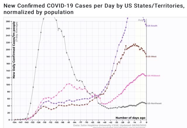
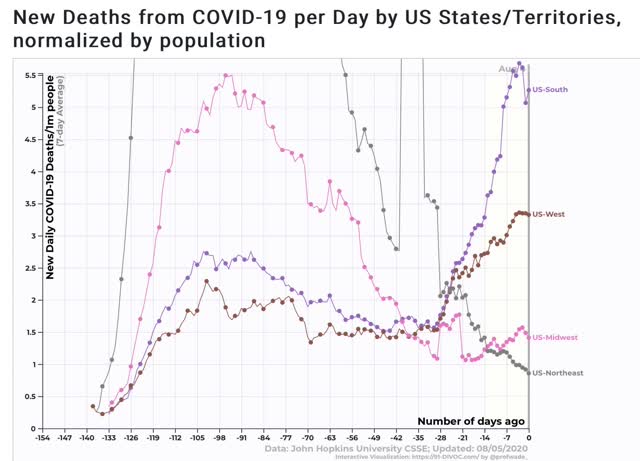
From 91-divoc.com, here is the breakdown in cases by region:


And here is the breakdown in deaths:


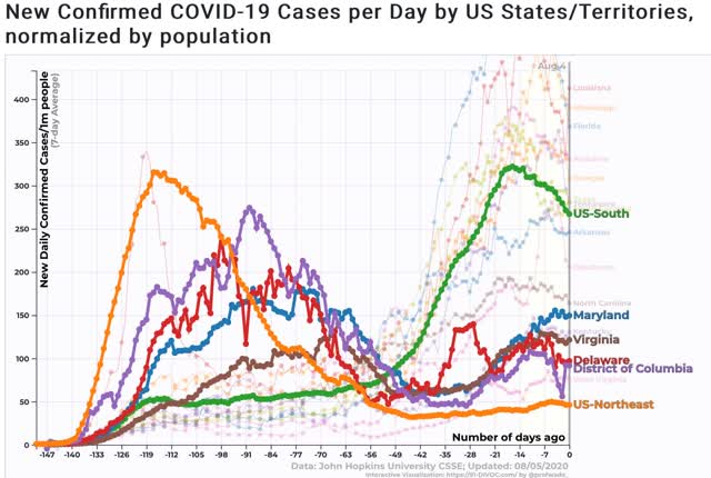
Because the above graphs place the Baltimore and DC metro areas in the South vs. the Northeastern megalopolis, below I have separately broken out DE, MD, DC, and VA and compared them with the two regions, first by cases per million:


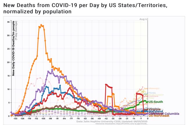
And by deaths per million:


The four jurisdictions are among the lowest in the South (only rural West Virginia does better), but DE and DC are also better than the midwestern region for cases and deaths, and only MD is worse than the Midwest in deaths (not shown).

Here is what the South ex-DE, DC, MD, and VA looks like for cases and deaths, from Conor Kelly’s tableau page:


Because the Federal government cannot force the Trumpist governors in the Deep South and Arizona to take adequate precautionary measures, any Biden Administration is going to have to confront the problem of making sure those States do not continue to seed outbreaks, via returning vacationers, in the States that are willing to act responsibly. That may mean quarantining as NYS is doing; it may mean going further to establish a cordon sanitaire.

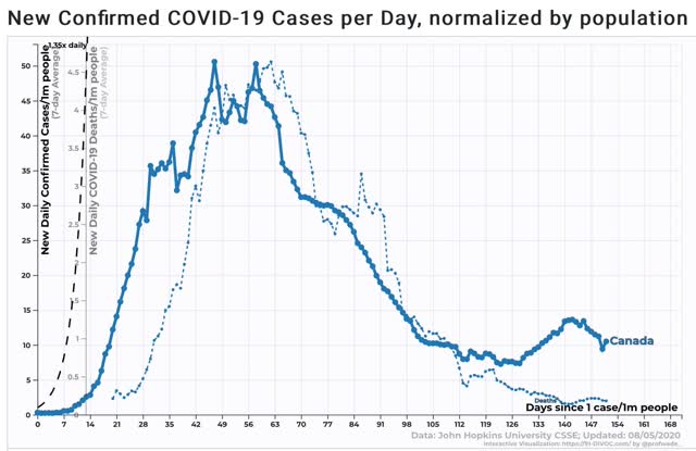
Finally, before anyone gets too excited about how well the Northeast is doing, here is the same graph of cases and deaths per million in immediately adjacent Canada:


The US Northeast is currently running about 4x as many cases and deaths per million than Canada.

Tuesday, August 4, 2020

Manufacturing, housing, vehicles: the economy “wants to” recover


 - by New Deal democrat

Yesterday we got two of the three typical leading data metrics that start the month: the ISM manufacturing index and construction spending. The third, vehicle sales, will be reported later today but is much less important than it used to be because US manufacturers only report actual numbers at the end of the quarter.

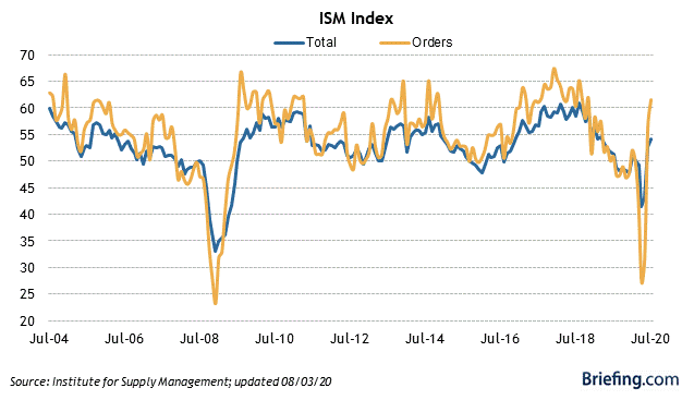
The ISM manufacturing new orders index is a good short leading indicator for the producer side of the economy. And it roared back to very positive in July:


The overall ISM index came in at a solid 54.2 (any number above 50 shows expansion), and the new orders sub-index rose from June’s 56.4 to 61.5, which isn’t just positive, but can be considered a “booming” number.

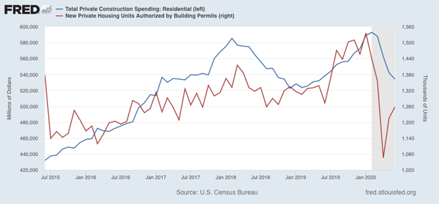
Meanwhile, residential construction spending (blue in the graph below), which is the least volatile of all the housing metrics, continued to show a decline in June, with construction now off -9.9% from its February peak:


Housing permits (red) lead residential construction spending generally by several months (because the expenses in actually building a house come after the permit is granted), and these have decisively rebounded in the past two months. So I expect construction spending similarly to rebound in a month or two. 

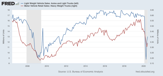
Finally, although vehicle sales reported by the manufacturers is much less valuable now, the BEA did report June’s sales several days ago. These also showed a rebound, rather large for passenger cars and light trucks, and a small one for the usually more leading heavy weight truck sales:


The picture sketched by these three metrics of leading sectors of the economy is a strong rebound in manufacturing, a decent rebound taking shape in housing and  cars, and a more slight rebound in trucks. Left to its own devices - I.e., if there were competent leadership executing policy containing the coronavirus - the economy wants to recover.

Sunday, August 2, 2020

The 2020 Presidential and Senate elections nowcast: reverting towards the mean


 - by New Deal democrat

Here is my weekly update on the 2020 elections, based on State rather than national polling in the past 30 days, since that directly reflects what is likely to happen in the Electoral College.

The theme this week is that Trump’s approval is reverting to the mean, and so are the Presidential polls. 

Here is Nate Silver’s Trump approval vs. disapproval graph: 


For most of the past month, Trump approval has been languishing at 40%, equivalent to the worst levels of his Presidency. But as always been the case before, his partisans come back to approving him after the immediate moment has passed.

This is reflected in the Presidential polling. To refresh, here is how the below map  works:

- States where the race is closer than 3% are shown as toss-ups.
- States where the range is between 3% to 5% are light colors.
- States where the range is between 5% and 10% are medium colors.
- States where the candidate is leading by 10% plus are dark colors.

Here is the updated map through August 1:


While there have been no outright flips, note that North Carolina has gone back to being a toss-up. Nevada plus several States in the midwest are less strongly pro-Biden. Meanwhile South Carolina and several other States in the Deep South have turned more pro-Trump.

Even so, as has been the case for nearly a month, if Biden simply wins the States in which he leads by 5% or more in the polling, he would win the Electoral College, without even winning a single “toss-up” or “lean Biden” State as shown on the map.

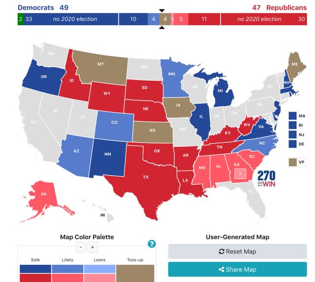
Here is what the 2020 Senate map looks like based on the same metrics, with the following changes:
 - where there is no polling in the past month, I have used the most recent poll
 - where there has been no polling at all this year, I am using the Presidential polling as the best guess.


Note that there has been no polling at all this year in the following States: Oregon, Idaho, Wyoming, South Dakota, Nebraska, Louisiana, Arkansas, Rhode Island, and West Virginia.

Most importantly, note that Maine has tightened back to a toss-up. This is likely to be the race that determines whether or not the Democrats achieve a majority in the Senate.

I am quite concerned about what reversion to the mean will do in Senate races. In the Presidential race, I continue to believe that Trump has until Labor Day - about 5 weeks - to pull off a miracle as to the pandemic. More likely we will start to see outbreaks in schools among teachers and students, and then their parents, by about September 20. Hospitalizations based on those outbreaks will start to increase in early October, and deaths in late October, just in time to be the last big story before Election Day.


Saturday, August 1, 2020

Weekly Indicators for July 27 - 31 at Seeking Alpha


 - by New Deal democrat

My Weekly Indicators post is up at Seeking Alpha.

The two most noteworthy short leading indicators, stock prices and initial jobless claims, have started to go in two different directions in the past several weeks.

As always, clicking over and reading should bring you right up to the moment, and put a little coin in my pocket as thanks.

Friday, July 31, 2020

Catching up with wages, income, and layoffs


 - by New Deal democrat

Yesterday and today have seen several significant data releases. Let’s catch up.

Wages

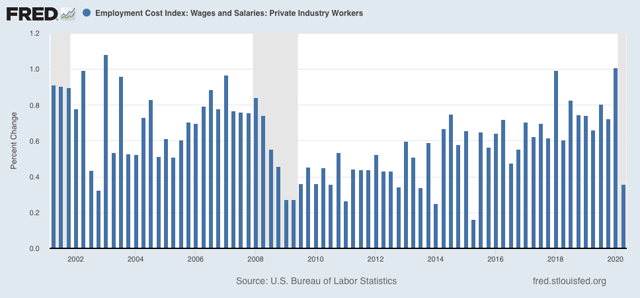
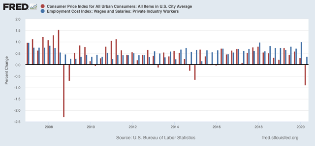
The Employment Cost Index was released for Q2 this morning. This is a particularly important release, because unlike the monthly “average hourly wages” number, this report normalizes by job category, e.g., it compares clerks’ wages in Q1 with clerks’ wages in Q2. So if clerks have experienced widespread wage cuts, it should show up here. Given the many anecdotes of wage cuts I have read and heard about since the pandemic began, I have been waiting to see what this number would be.

And the answer is . . . Wages did rise, albeit at one of the slowest rates in over 10 years, less than 0.4%, in Q2:


Because consumer prices fell close to -0.9% in Q2, in real inflation adjusted terms wages for equivalent jobs rose even more for the quarter:


I was expecting very bad news, so I will take this “less good” news with a sigh of relief.

Income

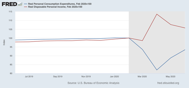
Personal income and spending for June were also released this morning. The bottom line is that income declined slightly, while spending rose:


Boosted by the $1200 relief check in April, and supplemental unemployment assistance of $600/month, income remains 5% higher than in February. Spending, meanwhile, has made up more than 1/2 of its April decline. This is also a positive - but for one month ago. Since the supplemental payments end as of today, this picture is likely to change in the high frequency data beginning in a week or two, although it won’t show up in the monthly data until August’s is released at the end of September.

Layoffs

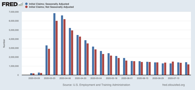
Yesterday’s initial and continuing claims continued the recent string of bad news. While the important non-seasonally adjusted initial claims did make a pandemic low, these were still over 1.2 million for last week. On an adjusted basis, initial claims rose again:


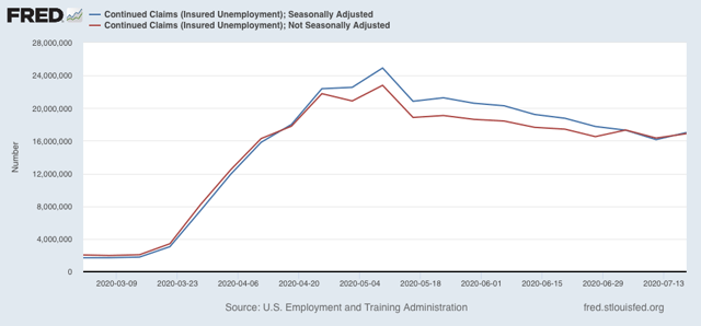
Continuing claims for two weeks ago also rose on both an adjusted and non-seasonally adjusted basis:


In other words, both layoffs and unemployment are likely increasing. We’ll find out next week with the July employment report whether new hires and rehires continued to outpace layoffs, as they have in the past two months, or not.

So the good news - at least for now - is that we do not appear to be in wage-deflationary spiral. The bad news is that the underpinnings of the good news has started to go away in the past few weeks.

Thursday, July 30, 2020

Q2 GDP does not bode well for early 2021


 - by New Deal democrat

There are two components of quarterly GDP that are long leading indicators, giving us information about the economy 12 months from now. If you think, as I do, that it is likely there will be a new Administration in Washington next year, which will competently follow the science, then there is every reason to believe that by 12 months from now the pandemic will have been contained, and so the long leading indicators are more likely to be valid.

In that regard, this morning’s Q2 2020 GDP was not grounds for optimism.

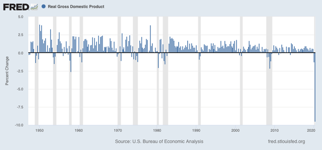
As an initial matter, the GDP decline of -9.5% annualized was the biggest decline since the Great Depression:  


The two forward-looking components of GDP are (1) private fixed residential investment, and (2) corporate profits. Because corporate profits are delayed by one more month, I use proprietors income as a temporary proxy. Let’s look at each in turn.

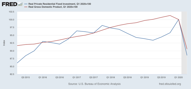
Real private residential fixed investment decreased over 10% q/q. Real GDP decreased a little less than 10%:


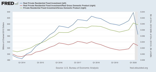
Thus real private fixed residential investment as a share of GDP declined slightly (red in the graph below) as did nominal investment as a share of nominal GDP:


This is a negative.

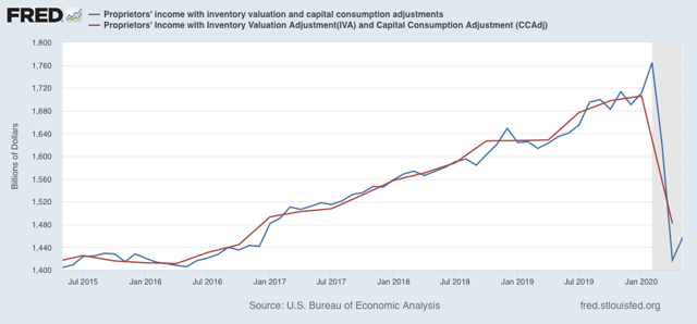
Meanwhile, proprietors income declined -13.2% in Q2:


Since the GDP implicit price deflator declined -2.1%, this was also a large negative.

In sum, both long leading indicators in the GDP report suggest that the economy will not be doing that well by summer 2021, even if the coronavirus is contained.


Wednesday, July 29, 2020

Three long-shot Senate races worth polling: Idaho, Nebraska, and South Dakota


 - by New Deal democrat

On Sunday I wrote that it would be really helpful to have statewide polling in some Senate races that look on the surface like safe bets for the GOP, but might actually be worth contesting.

The reason for this is that, not only are the 4 Senate seats most likely to flip from GOP to Democrat — Colorado, Arizona, Maine, and North Carolina — all showing consistent leads for the democratic challenger in the past two months, but in several other States — most notably Iowa and Kansas — the democrat has *also* taken the lead, in the case of Iowa, a small but consistent one. In several other States — Alaska and South Carolina — the democrat has polled within striking distance in one or more recent polls.

Because there is no Senate polling available in other States, I have created the below spreadsheet showing the 2016 Presidential result, and 2020 Presidential and Senate polling both in the contested States that we know of, and the States where we are flying blind. The final column is the direction of change comparing 2016 vs. 2020 Presidential polling followed by 2016 Presidential result vs. 2020 Senate polling. Discussion follows below the chart (numbers are %-ages):

State 2016
Presidential
Result
2020 
Presidential
Polling 
2020
Senate
Polling
2020
Change from
2016
AlaskaT+14.7T+3D-9D+11.7, D+5.7
IowaT+9.4T+1D+2D+8.4, D+11.4
KansasT+20.5T+12D+1D+8.5, D+22.5
MontanaT+20.2T+9EvenD+11.2, D+20.2
Nebraska-2^T+2B+7N/aD+9, N/a
S. CarolinaT+14.3T+5D-4D+9.3, D+10.3


IdahoT+21.7N/aN/aN/a
NebraskaT+25.0N/aN/aN/a
N. DakotaT+45.7T+17*(*Mar)N/aD+28.7, N/a
S. DakotaT+29.8N/aN/aN/a
West VirginiaT+42.1T+35*(*Jan)N/aD+7.1, N/a
WyomingT+46.3N/aN/aN/a


^Congressional District

Generally speaking, note that in all States where available, there has been roughly a 10% swing in the Presidential vote from Trump to Biden +/-1.7%. The Senate results have been much more volatile, ranging from +5.7% to +22.5%, suggesting that they are much more candidate-specific.

While most other States are out of reach, Idaho’s Trump margin from 2016 is very close to that of Montana and Kansas, and Nebraska is not too far behind. South Dakota might even be at least worth a look. The other States look out of reach under almost any scenario.

Bottom line: based on the surprisingly positive result in one poll in Alaska, money has already flowed into that race to assist the Democrat getting on the air. At very least it would be worth polling in Idaho and Nebraska, and maybe even South Dakota to see if it would be worthwhile to take a long shot and make those candidates more viable as well.

Tuesday, July 28, 2020

Coronavirus dashboard for July 28: the “pain threshold” exists, and leads to a decline in new cases


 - by New Deal democrat

Total US coronavirus cases: 4,275,188
Average daily cases last 7 days: 65,896
Total US coronavirus deaths: 140,309
Average daily deaths last 7 days: 1,004

(Source: COVID Tracking Project)

Several months ago I wrote:
my forecast over the past month [has been] that the population of the US as a whole lacks the political and social will to beat the coronavirus. As a result, the outbreak will continue to wax and wane as complacency alternates with fear generated by big new outbreaks.
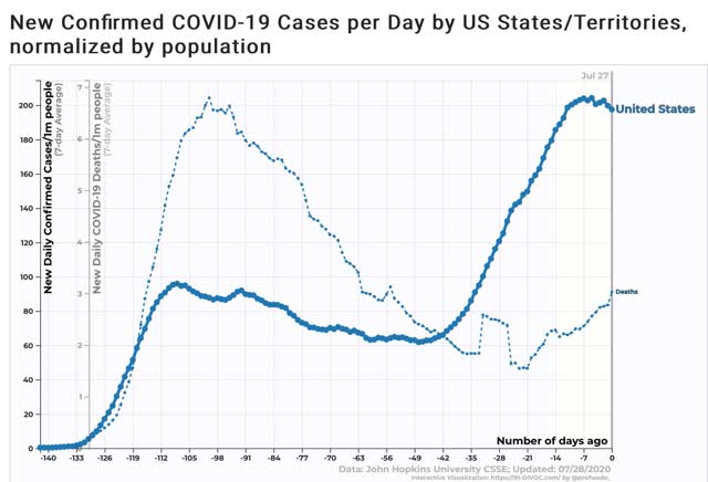
 The complacency of May gave rise to new outbreaks that showed up in June and deaths that have showed up in July. Case statistics over the past week show that the surge in cases and deaths in turn has caused the fear to kick back in, as shown in the below graph of the 7 days average in cases (solid line) and deaths (dotted line, separate scale) per capita for the US:


While deaths are still increasing, growth in new cases started to slow down about 12 days ago as the effects of new mask requirements in many States, the re-closing of bars and restaurants in others, and simple fear by people at first slowed the increase, followed by  an apparent peak on July 22.

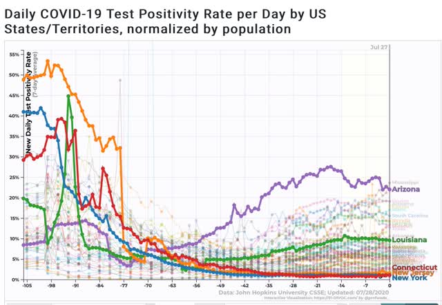
Josh Marshall has speculated, correctly I think, that an important reason why the “cases” and “deaths” scales trends look so different isn’t just demographics, but the fact that testing was so pitiful in March and April that a much larger percentage of cases were missed, citing the % of positive tests which was as high as 47% for NY in April. In other words is there had been more testing available, the trend line for cases would look much more similar to the trend line for deaths. The supporting graph makes the case quite compellingly:


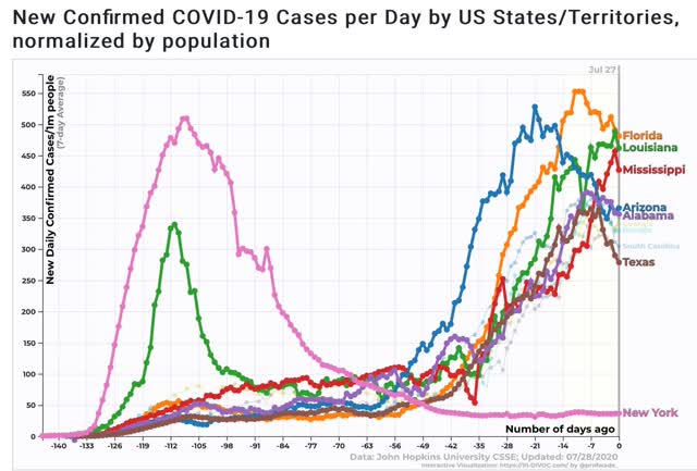
Next, here is the graph of the 10 worst States for new cases, highlighting the top 5 plus Texas, which has declined to #10, and plus NYS for comparison to the early outbreak:


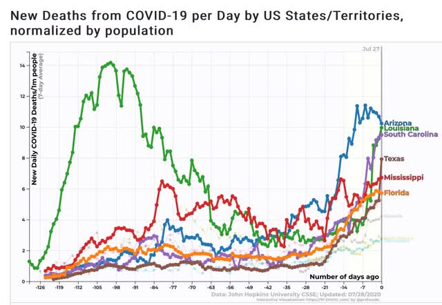
Note that, as I speculated several months ago, once the outbreaks gets about as bad as it was in NY and NJ back in March and April, the “pain threshold” kicks in, and both the State and ordinary citizens take action to curb the outbreak.

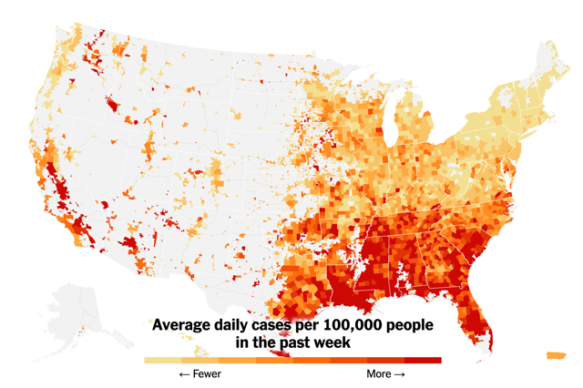
Here is the latest county by county map of cases per capita from the NYT:


It is manifest that those States which recklessly reopened and/or did not require masks at least in interior spaces have suffered far more in the renewed outbreak than States, like NY and NJ, which were more responsible.

As my German grandmother used to say, “Those who cannot see must feel.”

Finally, here is the graph of the 7 day average of deaths per capita, again highlighting the top 5 States, plus Florida, which is #6:


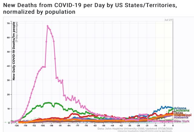
For perspective, here is the same graph plus NY for purposes of scale comparing the present per capita death rate in the current worst States vs. NY’s at its peak:


So there is some actual, if very slight and relative, “good news” in that the pain threshold has led to a decline in cases nationally and in some of the worst hit States. But because national leadership is the same, I expect that any period of waning will give rise to new complacency (vis. a party in Jackson NJ with 700 guests!) and new calls for forced reopening.

Monday, July 27, 2020

June durable goods orders continue rebound


 - by New Deal democrat

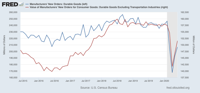
Last week I wrote a synopsis of the short leading indicators and what they suggested about the ultimate Presidential election result in November. Basically they have improved over the last several months, and suggested the polls would tighten compared with the present.

Among the missing June indicators were durable goods. They were reported this morning, and continued their sharp rebound from May, making up in total about half of their pandemic decline:


This adds to the evidence that the economy is likely to be better in November than it was in Q2, so adds incrementally to the idea that the race will tighten somewhat compared with recent polls.

Sunday, July 26, 2020

The 2020 Presidential and Senate polling nowcasts: we need more small State polling!


 - by New Deal democrat

For the past five weeks I have posted a projection of the Electoral College vote based solely on State rather than national polls (since after all that is how the College operates) that have been reported in the last 30 days, using the following formula:

- States where the race is closer than 3% are shown as toss-ups.
- States where the range is between 3% to 5% are light colors.
- States where the range is between 5% and 10% are medium colors.
- States where the candidate is leading by 10% plus are dark colors.

As I emphasized last week, polls are really just nowcasts, snapshots in time that will change as circumstances change.

To cut to the chase, there are no changes this week compared with last week. Biden is leading comfortably in the Electoral College vote, not even counting States that are only “leaning” in his direction:


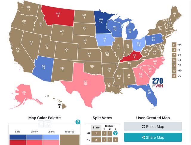
But there has been a fair amount of polling in the past week or so. The below map shows only those States that have been polled in the last 10 days. The only change in the color coding is that any “lean” of even less than 1% is shown in the appropriate color (to differentiate polled from non-polled States):


As I’ve been anticipating, it looks like there is a small “reversion to the mean” particularly occurring in the States of the Confederacy, but also note Ohio, which was just polled for the first time in several months, and showed a slight Biden lean.

Next, last week I wrote that I would very much like to see more State polling in the red States, because there are GOP Senators who should be targeted that we don’t even know are vulnerable as of this point.

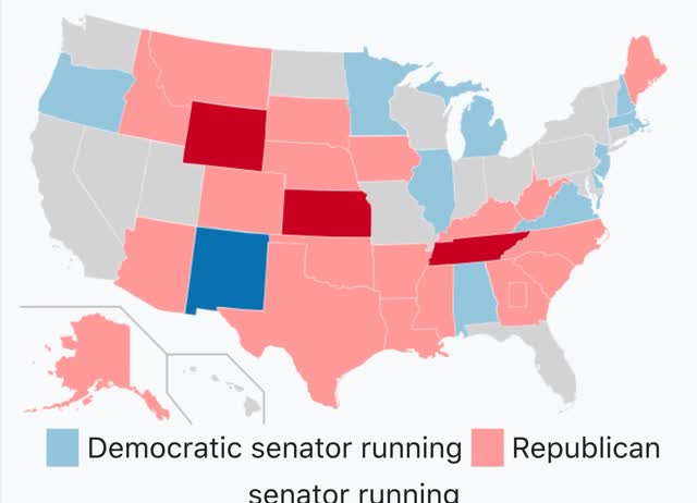
To demonstrate that, below are two maps. The first shows those Senate seats that are up for elections in 2020:


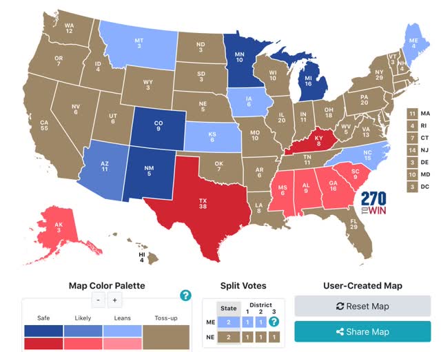
Now here is a color coded map based on all Senate polls in those States for the last 60 days (again, coding even very slight “leans” in the appropriate color to differentiate from non-polled States):


I want to emphasize several things about this second map. First of all, with the exception of Montana and Kansas, which are *extremely* tight, all of the other races have shown *consistent* leans in the same direction. As a result, I am not terribly sanguine about any Democrat’s chances in the Deep South, even though Georgia and South Carolina have been polling relatively close. It is also pretty clear that Democrats donating to the Texas and Kentucky races are throwing their money away. That same amount of money would go a long way in Maine, Iowa, Montana, and help in North Carolina as well.

But most importantly, note the almost complete lack of polling in the High Plains and Mountain West. These are small States in terms of population and cost of media markets, but their Senate votes count just as much as the largest States. Where there has been polling - Iowa, Montana, and Kansas — the Democratic candidates are extremely competitive. 

So there is a crying need for more polling in these States, and also New Hampshire, and maybe even West Virginia. If there is going to be a “blue wave” Presidential election, we are needlessly flying blind as to potential inexpensive pick-ups in an expanded Senate map.