Thursday, February 6, 2025

Initial and continuing claims join the “steady as she goes” parade


 - by New Deal democrat

Let’s take our typically weekly look at jobless claims. I do this because there are a very good and timely short leading indicator for the labor market. 


Initial claims rose 11,000 to 219,000. The four week moving average rose 4,000 to 216,750. With the typical one week delay, continued claims rose 36,000 to 1.886 million:


On the YoY% basis which is more important for forecasting purposes, initial claims were up 2.8%, while the four week average was up 1.6%. Continuing claims were up 4.0%:


This continues the spate of neutral, “steady as she goes” numbers. The labor economy is expanding, but not at any robust rate.

Here is our final look at the forecast trend in the unemployment rate, which will be updated in tomorrow’s January jobs report:


On a monthly basis, initial claims are up 2.8% from one year ago, and initial + continuing claims are up 4.7%. Since the unemployment rate was 3.8%, this suggest the unemployment rate should be trending towards 4.1% or 4.0%. As it was 4.0% in December, this suggests it will be unchanged or decline -0.1% when we get the report tomorrow.

Wednesday, February 5, 2025

Economically weighted ISM services + manufacturing indexes forecast continued growth


 - by New Deal democrat


Because that services are about 75% of the economy, even if goods production is contracting, since the turn of the MIllennium that has not necessarily meant a recession is in the offing. The economically weighted average to the ISM services and manufacturing indexes has been much more accurate since then.

To wit: the ISM services report for January, released this morning, was weaker than December, but still well into expansion territory, with the total index at 52.8, and the more leading new orders component (not shown) was at 51.3:


The three month average of each is 53.2 and 53.0 respectively.

Since the three month total average in the manufacturing index was 49.5, and for the new orders subindex 52.7, that means the economically weighted average for the two is 51.0 for the total, and 51.6.

For contrast, here is the three year record of the manufacturing index:


Things were touch and go this past summer, when several times the services index did fall below 50, but the three month weighted average of the two indexes never did so.

In summary, the economically weighted average of the two ISM indexes forecasts somewhat slow growth in the months ahead.

Tuesday, February 4, 2025

JOLTS report for December shows mild improvement in most metrics, anticipates stabilization in wage increases


 - by New Deal democrat


The monthly JOLTS reports give us a more granular look at the employment sector, but are delayed by one month vs. the jobs report. Like the jobs reports, most JOLTS series have shown deceleration for several years. The question last year and this year is whether they level off or continue to decelerate towards outright declines in net job creation, or stabilize in a “soft landing.” 

I additionally look at this data because it is a slight leading indicator for both initial jobless claims and unemployment; and for wage growth as well.

The JOLTS report for December released this morning was generally mildly positive. The “soft” statistic of job openings fell sharply close to its post-pandemic low, but the hard data of hires and quits rose, while layoffs and discharges declined, all good things. The below graph norms the series above (expect for quits) to 100 as of just before the pandemic:


As I suspected, and wrote last month, he trend in openings has been lower, the improvement in openings during October and November was probably just noise. Meanwhile hires and quits appear to have stabilized during the second half of 2024.

On the other hand, when we look at hires and quits on a YoY% basis, there has been only modest improvement in the decelerating trend; in other words, there remains little solid evidence that there has been any leveling off:


The news on layoffs and discharges was also modestly positive, as the higher level of the last few months was maintained. Below I plot this data YoY compared with th e monthly average of initial claims, which has had some residual seasonality issues. And it suggests that the YoY increases in initial jobless claims that we saw during December have not been a fluke, and are more likely than not to continue:


They also look similar to the absolute trend in continuing claims:


Finally, the quits rate (blue in the graph below) has a record of being a leading indicator for YoY wage gains (red). In the post-pandemic view, the quits rate stabilized earlier in 2024 before resuming its decline, but has stabilized at 2.0% +/-0.1% since June, and continued at that rate in December:


This suggests that on a YoY basis wage gains may stabilize in the months ahead as well, which is good news as long as inflation does not pick up.

Monday, February 3, 2025

ISM manufacturing index in January the strongest since 2022


 - by New Deal democrat


Although manufacturing is of diminishing importance to the economy, (it was in deep contraction both in 2015-16 and again in 2022 without any recession), the ISM manufacturing index remains an important indicator with a 75+ year history of accurately describing that sector and forecasting it over the short term. 

Any number below 50 indicates contraction. The ISM indicates that the number must be 42.5 or less to signal recession. I use an economically weighted three month average of the manufacturing and non-manufacturing indexes, with a 25% and 75% weighting, respectively, for forecasting purposes.

As has been suggested by recent improvements in the regional Feds’ indexes, the ISM report for January was the strongest since the second half of 2022. The total index rose 1.7 to 50.9, and the more leading new orders subindex rose 3.0 to 55.1.

Including this month, here are the last six months of both the headline (left column) and new orders (right) numbers:

AUG 47.2. 44.6
SEP 47.2. 46.1
OCT 46.5. 47.1
NOV  48.4. 50.4
DEC 49.2. 52.1
JAN 50.9  55.1

The current three month average for the total index is 49.5, and for the new orders subindex 52.7.

Here is the last three years for the total index looks like:


And here is the same for the new orders index:


As I said above, these are the strongest levels since 2022.

The non-manufacturing headline has been very positive in the past few months. So needless to say, the combined indexes strongly suggest continued growth in the months ahead. I guess I need to add, if the economy is left to it own devices. I.e., tariffs and other political interventions could knock this forecast into the proverbial cocked hat.

Saturday, February 1, 2025

Weekly Indicators for January 27 - 31 at Seeking Alpha


 - by New Deal democrat


My “Weekly Indicators” post is up at Seeking Alpha.

Several of the trend indicators that had been languishing, namely real money supply and manufacturing new orders, have turned up. But that is being offset by an overly strong US$. Once the Dollar increases in value relative to other currencies by 5% or more, it has a significant negative effect on the economy, becuase it makes exports more expensive and imports cheaper (which, not coincidentally, pretty much offsets the effects of tariffs. 

addendum: Here is a special bonus graph of the US$ vs. major currencies, both YoY(red, left scale) and in absolute terms (blue, right scale), show the surge to over 5% YoY that occurred immediately after the November election:

As usual, clicking over and reading the details will bring you up to the virtual moment as to the state of the economy, and bring me a $ or two for my lunch money.

Friday, January 31, 2025

Personal income and spending for December: more “steady as she goes” but with late cycle characteristics


 - by New Deal democrat


The December personal income and spending report showed that for the huge consumption sector of the economy, “steady as she goes” continued, as both nominal and real personal income and spending rose again in December. But as I emphasized one month ago, there are many signs of a late cycle configuration.


Specifically, nominally personal income rose 0.4%, while spending rose 0.7%. Since the deflator increased 0.3%, real income rose 0.1%, and real spending rose 0.4%, continuing their consistent trend since mid-year 2022:


Real income less government transfers, one of the metrics that the NBER looks at to determine economic expansions vs. recessions, also increased, by 0.2%, in December, continuing its uptrend as well:


In the last few months there has been a debate about whether inflation has returned. My position was that there was no persuasive evidence. But this month’s increase of 0.3% was the hottest since April, suggesting that perhaps inflation has returned to some extent. On the other hand, as the below graph makes clear, the disinflation of earlier this year was mainly about the complete lack of inflation in October and November 2023. With those out of the comparisons, it is not a surprise that the YoY comparisons have increased:


Last month I wrote that since April, prices had only risen a total of 0.9%, for a 1.6% annual rate, below the Fed’s target. With the addition of this month, those figures increase to 1.2% and 1.8% respectively:


so whether we get a burst of inflation in January and February, as we have in the past several years, will make all the difference. 


On a full YoY basis, prices increased 2.6%, up from 2.1% in September (blue in the graph below). Services (gold) were up 3.8% YoY. Inflation in this sector has been flat for the past 12 months, varying between 3.7% and 4.2%. What has happened in the past few months is that the *delfation* in goods (red) has ended, as they were unchanged YoY in December:


Note that the long term graph of the YoY inflation in services (normed so that the current 3.8% level shows at the 0 line) shows that these remain quite elevated compared with the last 30 years:


It is noteworthy that goods inflation increasing, and services inflation remaining elevated, is a typical late cycle configuration.

Further, the personal saving rate continued its year-long decline from 5.5% last January to 3.8%. This is the lowest number since December 2022:


Although I won’t bother with the long term historical graph this month, excluding 2022 this is the lowest saving rate ever with the exception of 1999 and 2005-07. As you probably know, those two episodes occurred at or approaching the peaks of each of those two cycles. In other words, as the expansion continued, consumers get further out over their skis, and so more vulnerable to an adverse shock.

Finally, the PCE price index is used to calculate real manufacturing and trade sales (with a one month lag), another metric used by the NBER to determine if the economy is in recession or not. These sales rose 0.3% in November, continuing their post-pandemic uptrend:


In sum, the good news continued to be  is that the consumption sector remained healthy and positive in December, consistent with its trend since June 2022. But as I wrote last month, the decline in the saving rate, together with both the increase in goods prices and the continued elevation in services inflation, suggest that we are later in this expansion cycle.


Thursday, January 30, 2025

Long leading components of GDP suggest continuing if sluggish expansion through 2025


 - by New Deal democrat


As per usual, my focus in reporting on GDP is not the headline number, but the aspects which serve as leading indicators for the economy in the next few quarters.


But to get it out of the way, real GDP increased at a 2.3% rate in the last quarter of last year (red). Since inventories wax and wane, when we take them out and focus on real private sales, real GDP increased at a better 3.2% rate (blue):


This is right in line with average real GDP since the beginning of 2023. The message of the nowcast is “steady as she goes.”

But that doesn’t tell us what to expect going forward. Two metrics, real private residential fixed investment (a proxy for housing) and proprietors’ income (a proxy for corporate profits) do. And there, the news was positive, if tepidly so.

Starting with housing, nominally private fixed investment rose 0.7% in Q4. In real terms, it was up 0.3%:


As you can see, both in nominal and real terms investment in housing has been increasing since the beginning of 2023.

But the actual best way of calculating is housing investment as a percentage of GDP. Here are the nominal and real measures of each:


Nominally, housing investment rose 0.6% as a share of GDP, while in real terms it rose 0.7%. Both of these are average shares since the beginning of 2023, while slightly down from their recent (slight) peak during Q1 2024.

Corporate profits for Q4 will not be reported for another month. Proprietors’ income typically turns simultaneously with or one quarter after corporate profits, so serve as a good placeholder. Here is the long term view (in log terms to better show the historical numbers):


Both of these metrics typically turn down at least one year before the economy as a whole.

Now here is the quarterly change in nominal (light blue) and real (dark blue) proprietors’ income, compare with corporate profits (red):


In Q4, nominally proprietors’ income rose 0.7%. In real terms they rose a meager, but still positive, 0.1%.

Finally, here is the post pandemic close up of the absolute value of each metric, normed to 100 as of Q3 2022:


Since Q3 of 2022, real proprietors income has only risen 0.9%. By contrast, real corporate profits has risen 4.3% through Q3 of last year.

The bottom line is that both of our long leading components of GDP for Q4 came in positive, if only weakly so. A number of indicators have suggested rising recession risk for later in this year, but these two suggest the economy will continue to expand throughout 2025.

Continuing jobless claims trend telegraphs weak but still expanding economy


 - by New Deal democrat


I’ll report on the Q4 GDP release later this morning. But first, let’s get up to date on jobless claims. These have been trending higher YoY, but with lots of seasonal noise, which should now be over.


For the week, initial claims declined -16,000 to 207,000. The four week moving average declined -1,000 to 212,500. With the typical one week lag, continuing claims declined -42,000 to 1.858 million:


Most significant about the above is that continuing claims, as revised, remained at 1.900 for the first time since the pandemic. There is definitely a weakening trend that began last June and intensified during the autumn.

As usual, the YoY comparisons are more important for forecasting purposes. So measured, initial claims were lower for the first time in two months, down -8.0%. The four week average was up 1.4%, and continuing claims were up 1.6%:


This continued the 5 month string of higher YoY comparisons in the latter two measures. These continue to qualify as neutral readings, consistent with a tepid but growing economy, so long as we don’t go above 10% YoY.

Finally, here’s this week’s update of what this might mean for the unemployment rate when January’s jobs report comes out:


Last week I changed this format slightly, by including the total of initial + continuing claims in gold, since the unemployment rolls include people looking for work on both new and continuing basis. Note also as usual that the unemployment rate data is rendered as the % change in a %. Since in the months around one year ago the unemployment rate averaged 3.8%, this suggests that it ought to be tending towards a 4%-5% increase in that, or approximately 4.0%, vs. December’s unemployment rate of 4.1%. 


Wednesday, January 29, 2025

Interstate COVID dashboard: first, preliminary report for the week of January 19


  - by New Deal democrat


In one of his first acts in office, T—-p effectively shut down the entire US public health apparatus, for all intents and purposes turning this country into a third world backwater lagging such developing countries like India and South Africa. 

Despite this termination, a workaround exists by using the combined information generated by the States, many of which still have their own public health “dashboards,” as well as reference to similar statistics still kept by Canada. 

This is my first, bare-bones “Interstate COVID Dashboard” which I hope to update at least biweekly, using the above to estimate the data that is missing due to the termination of CDC information.

For this initial installment, the last CDC estimate of wastewater levels, which somehow did get published last Friday, is still helpful in estimating deaths for the next few weeks, since deaths follow infections by about 4 weeks. In that regard, I should note that - ominously - BIobot has also “paused” its reports due to “maintenance,” which very much looks like it is bending the knee to avoid retaliation from T—-p.

This first, preliminary report only covers COVID deaths and makes use of data generated by a total of 9 States: CO, IN, MA, MI, NJ, NY, OH, OR, and TX. Only 4 of these States have data available for each week for the past 2 years. Some have data for the last year only. One State - OH - lags the others by 2 weeks, but should continue to update. And one - CO - only keeps death *rates* per 100,000 for the past 12 months, but that is still useful for calculating trends. Additionally, I suspect that like the CDC, data for the last few weeks may be preliminary. I will watch over the next few weeks to see if that is the case or not.

With all that out of the way, here is the data:

In week three of 2023, the 4 States which have kept weekly statistics available since 2023, reported 66 deaths. This compares with 79 in week 2 of this year, and 105 in week 1. One year ago in week 3 of the year, these same States reported 238 deaths, a 72% decline YoY. The CDC reported that nationally there were 2,364 deaths in week 3 of last year. This suggests about 700 deaths nationwide in week 3 of this year.

In week 3 of 2024, CO reported 1.8 deaths per 100,000. This year so far it is running at only 0.2 per 100,000, a nearly 90% decline.

A further comparison can be made with this past summer’s wave. At that peak, deaths in reporting States totaled 183. Since we know that infections peaked during the first week of January at a level only 64% of that peak, and per the CDC’s prior reports deaths peaked at 1361 within the next month, that suggests a peak in the next several weeks of roughly 870 deaths nationwide.

Additionally, the last preliminary number reported by the CDC, for the week of January 11, was 445 deaths. Final totals have typically been 2* to 2.5* that number. That suggests the final number for that week will be 900-1100 deaths.

Finally, Canada’s national infection and death data showed that in the past 6 months, the rate of infections has been close to that we know of from the US, i.e., a spike in late summer to 9 deaths per 100,000, and a smaller spike right after the holidays to approximately 6, and only 4 per 100,000 in week 3 of this year. This also suggests a death toll of less than 50% of one year ago; which translated to the US is approximately 1,050 deaths.

Putting all of the sources together, the most likely range of deaths in the US during the week ending January 19 was between 900-1000. Which means that the death toll from COVID during the entire 12 month period through then was about 45,000-46,000.

Finally, as I wrote at the outset, this is a preliminary, bare-bones report to show proof of concept. Several of the States I already checked also publish updates on variant proportions, wastewater data, and hospitalizations. So I hope to expand this report to include that information. In the meantime, I hope that any readers in “Blue” States, or at least States with Democratic governors like KY, who previously discontinued their data reporting, will contact their representative and other officials and ask them to reinstate their respiratory disease dashboards.

Tuesday, January 28, 2025

Repeat home sales indexes for November show YoY deceleration, m/m stabilizing


 - by New Deal democrat


This morning we got the final housing reports for the month, the repeat house price indexes from the FHFA and Case Shiller. Both continued to show deceleration from one year ago, but conflicting signals for the last few months.

On a seasonally adjusted basis, in the three month average through November, U.S. house prices according to the Case-Shiller national index (light blue in the graphs below) rose 0.4%, and the somewhat more leading FHFA purchase only index (dark blue) rose only 0.1%, the lowest monthly increase since June [Note: FRED hasn’t updated the FHFA data yet]:


On a YoY basis, the Case Shiller index accelerated 0.2% to a 3.8% gain, while the FHFA index decelerated -0.3% to a 4.2% YoY increase. both of these are reversals from their October directions:


Because house prices lead the measure of shelter inflation in the CPI, specifically Owners Equivalent Rent by 12-18 months, here is the updated calculation of its trend. There is every reason to believe that OER should continue to trend gradually towards 3-3.5% YoY increases in the months ahead:


The most leading rental indexes, including the Fed’s experimental all new rental index, continue to indicate that YoY rent increases should decline further, which adds to the evidence for further deceleration in that huge component of consumer price inflation.

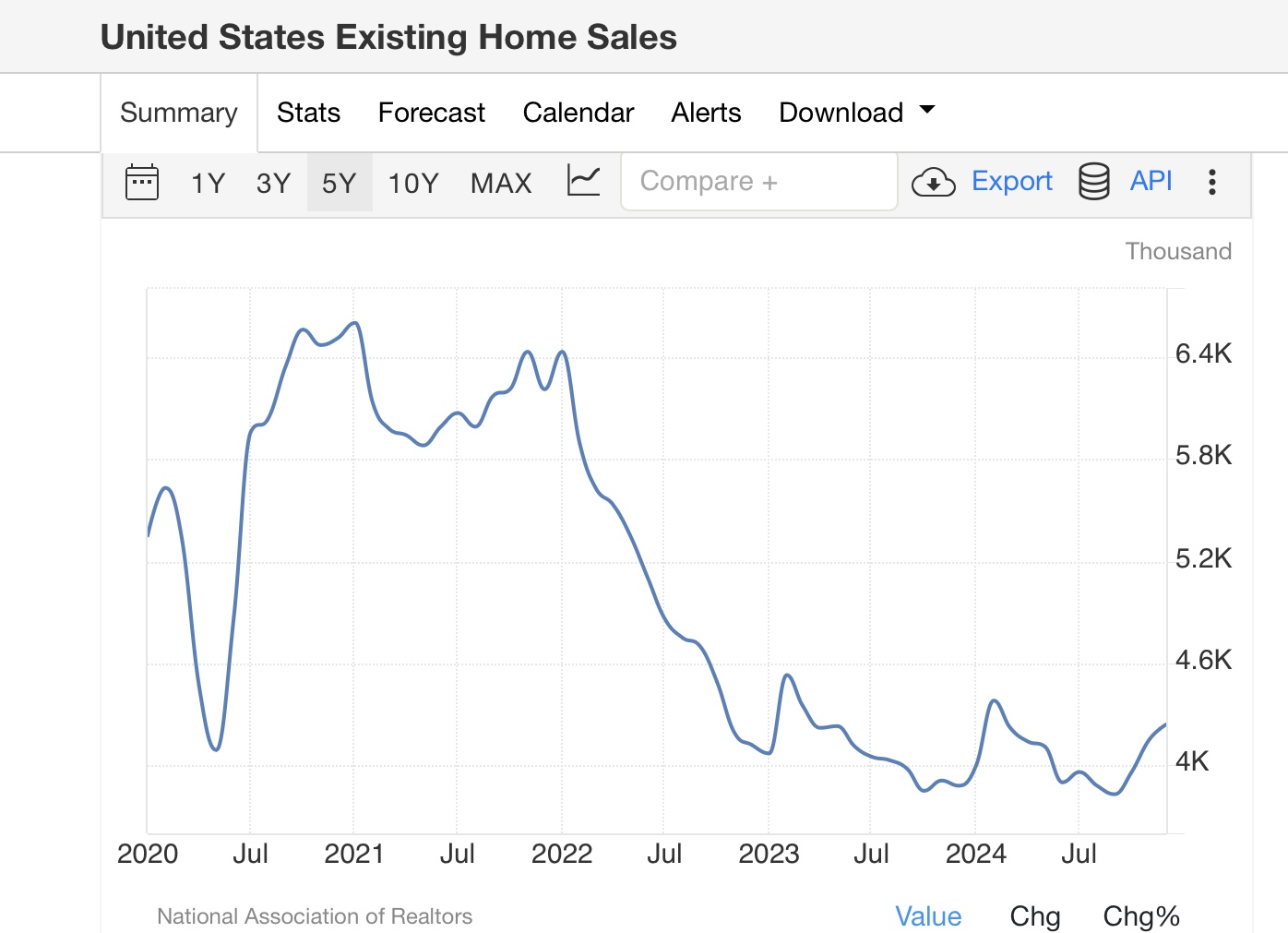
Because prices generally follow sales, and in the past few months existing home sales have risen close to the upper limit of their range in the past 2 years, as per the updated graph below:


An open question is whether the increased price pressure in the existing home market that we saw in the December report earlier this week will persist. If the FHFA and Case Shiller Indexes stabilize near the recent YoY levels, then the trend of slowly abating shelter inflation in the CPI may slow even further.


Monday, January 27, 2025

In December, the theme for new homes was “steady as she goes” in sales, price, and inventory trends


 - by New Deal democrat


To reiterate my theme from the past few months, Ive been looking at new and existing home sales more in tandem, with a rebalancing of the market in mind. For that to happen we need price to abate in existing homes, to compete with new houses where prices have been slightly declining for over a year. Along with that, we should see inventory of existing homes increasing, reflecting softness in that market. This morning’s report on new home sales in December continued that metric.

As usual, let me start with the caveat that new home sales are very noisy and heavily revised, which is why I usually compare them with single family permits, which lag slightly but are much less noisy.

In December new home sales rose to 698,000 annualized, about average for the past 12 months. The below graph shows the last seven years, to put the number in wider context. Except for the surge in 2021 when we had 3% mortgage rates, the 2024 average was on par with the best levels during the long expansion prior to the pandemic:


Housing permits have also been relatively stable in 2024, and probably will remain so for a few months more.


Sales lead prices, which are best viewed in a YoY% comparison. The below graph shows sales, single family permits, and median prices of new homes in that format:


You can see that prices followed sales higher with about a 12 month lag, and settled in to a slightly declining trend with a similar delay. As shown in the graph, on a YoY basis in December, the median price of a new home was 2.1% lower than it was one year ago. But as the below graph of non-seasonally adjusted prices shows over the past several years, the slightly declining trend is intact:


Finally, the inventory of new houses made yet another 15+ year high in December. This is actually “good” news for the moment because as the below long term historical graph shows, recessions have in the past happened after not just sales decline, but the inventory of new homes for sale - which also consistently lag - also decline (as builders pull back):


In sum, December was a “steady as she goes” month for new home sales, with the recent trends in prices and inventory also continuing. Because mortgage rates increased back to 7% in the past several months, I am expecting at least a slight pullback in the next couple of months.


The other fly in the ointment to the rebalancing scenario is that, as I reported last week, sales of existing homes increased in the past several months, and perhaps more importantly, YoY price increases have been accelerating. 

In other words, while the economic news is “good,” in terms of housing being affordable for average Americans, the sector is still out coming up short.

Saturday, January 25, 2025

Weekly Indicators for January 20 - 24 at Seeking Alpha


 - by New Deal democrat


My “Weekly Indicators” post is up at Seeking Alpha.

Seasonality continues to be an important issue in dealing with high frequency indicators - this time because the observance of MLK Day was moved into the following week compared with last year. That’s one of the trade offs you have to make to get data very quickly.

Nevertheless, while the long leading indicators continue to be problematic, the short term and coincident indicators most emphatically are not.

As usual, clicking over and reading will bring you up to the virtual moment, and reward me with a little pocket change for my efforts.

Friday, January 24, 2025

Sales, prices, and inventory in existing home market all up YoY in December


 - by New Deal democrat


There was some tepid good news as to existing home sales in December, which have been flat in the general range of 3.85 -4.10 million annualized for almost two years. Three months ago they made a 10+ year record low of 3.83 million. They have increased in each month since, and in December they rose to 424.4 million annualized, a 9 month high:


This is likely secondary to the relatively low mortgage rates we saw several months ago in September.


The bad news is that the moderation in the YoY% change in prices from the earlier this year has reversed in the past several month, and in December was up 6.0% (below graph shows non-seasonally adjusted data):


On a YoY basis, in response to the longer term decline in inventory, existing home prices have risen consistently since 2014, and accelerated during the COVID shutdowns. After briefly turning negative YoY in early 2023, troughing at -3.0% in May, comparisons accelerated almost relentlessly to a YoY peak of 5.8% in May of this year. Thereafter the YoY% comparisons declined to 2.9% in September, but here the comparisons since:

October 4.0%
November 4.7%
December 6.0%


Finally, while inventory declined seasonally in December (along with January, typically the lowest level of the year) to 1.15 million, it is the highest inventory for that month since 2019 (note: December data is not shown):


This contrasts with the low of 880,000 in December 2021, vs. the best December level in the past 10 years of 1.86 million in 2014.

In summary, on a non-seasonally adjusted basis sales, prices, and inventory were all up from one year ago. This tells us that the market is continuing to slowly recover from the pandemic collapse, but the re-acceleration of YoY price growth indicates that the now-chronic overall shortage of supply in the housing market continues.


Thursday, January 23, 2025

Jobless claims: seasonality and neutrality continue


 - by New Deal democrat


The week’s first meaningful data is jobless claims. These have been trending higher YoY, but with lots of seasonal noise. And that trend continued this week.


Initial claims increased 6,000 to 223,000. The four week moving average (especially more important right now to filter out seasonal noise) increased 750 to 213,500. With the typical one week lag, continuing claims increased 46,000 to 1.899 million:


Th unresolved seasonality in the adjustments for the past couple of years really stands out right now, as we see claims rising from year end lows towards summer peaks, and then back to year end lows in both of the last two years.

Also because of seasonality (in this case having to do with the week in which MLK day is observed), YoY comparisons have added importance, in addition to their being the basis for forecasting. So measured, initial claims were up 0.9%, the four week average up 5.3%, and continuing claims up 3.8%:


This continued the nearly 5 month string of higher YoY comparisons. But since we don’t even get to yellow flag territory until the comparisons hit 10%, these continue to qualify as neutral readings, consistent with a tepid but growing economy.

Finally, let’s take a look at what this might mean for the unemployment rate when January’s jobs report comes out:


Note that I’ve changed this format slightly this week, by including the total of initial + continuing claims in gold, since the unemployment rolls include people looking for work on both new and continuing basis. Also the unemployment rate data is rendered as the % change in a %. Since in the months around one year ago the unemployment rate averaged 3.8%, this suggests that it ought to be tending towards a 5% increase in that, i.e., 2.8 * 1.05 = 4.0% approximately. In December the unemployment rate was 4.1%, so this suggests it should tend slightly lower, leaving aside any continuing upward pressure from new immigrants seeking employment.