Wednesday, September 20, 2023

Using the stock market and unemployment as an easy and timely coincident recession indicator


 - by New Deal democrat

My fellow forecaster Bob Dieli has a measure he calls “DeltaDelta,” basically an average of the YoY% change in the stock market and the unemployment rate (which hopefully he won’t mind me mentioning here). It called to mind that occasionally in the past I have noted that a YoY decline in stock prices is a yellow flag for a potential recession, although there are many false positives. I wondered whether the signal might improve if, rather than averaging the two, for a signal I insisted that each of the measures be negative YoY. So here’s where that led me.


First, here’s what the YoY% change of the average of the two measures - stock market and unemployment rate - goes back to the beginning of the Wilshire 5000 total market index over 40 years ago (S&P only lets FRED publish the last 10 years of that measure, but since on a YoY basis it is virtually identical to the Wilshire 5000, there’s no loss):


This measure occasionally leads and occasionally lags by several months, but overall is a good coincident indicator. There are a few false positives, notably two months in autumn 1988, and one month each in 1992 and early 2019. Interestingly, it was also negative last December and this past March.

Now let’s see what it looks like divided up, and also divided into pre- and post- pandemic lockdown sections:


The false positives all go away, as do the two below 0 readings in the past year. On the other hand, this look misses the 1980 recession. It occurred to me that adjusting stock market returns for inflation might take care of that, and it did:


Interestingly, it also indicates a slightly below 0 readings from this past April.

Finally, because initial jobless claims lead the unemployment rate, I substituted the former for the latter, and here’s what I got:


It doesn’t improve the model, partly because I need to adjust initial claims by 10%, and partly because stock market returns often don’t turn negative YoY until after a recession begins.

Still, I think tracking both stock market returns as well as either the unemployment rate or initial claims YoY does add value. That’s because the former generally provides a measure of the broad producer side of the economy (vs. for example the ISM manufacturing index, which only measures one slice of it), while the former provides a measure for the consumer side. At present what it is telling us is that the consumer is likely weakening, while producers still see clear sailing in the months ahead.

Since the stock market bottomed at the beginning of last October, for the next several months YoY comparisons will be easy:


In my weekly updates, to avoid noise and being whipsawed, I look at the last 3 months to see if the stock market has made a new high or low. At the moment the market is a positive, given the 12 month high it made at the end of July. Unless the market makes a new 3 month low, that rating will continue until at least the end of October.

Tuesday, September 19, 2023

The long awaited downturn in multi-family construction may finally have happened


 - by New Deal democrat


With the relative fading of manufacturing in importance to the US economy, the leading construction sector has assumed even greater importance. And the most important data about construction are the leading, and long leading, data about residential housing construction.


To give a little additional framework, typically the first data to turn are new home sales. But that data series is extremely noisy and heavily revised. The next data to turn are housing permits, and the subset with the least noise and most signal are single family permits. Next are housing starts, which are much noisier than permits, although they represent actual economic activity. Perhaps surprisingly, next in line are housing completions. Bringing up the rear, but representing the actual sum of economic activity in housing, are housing units under construction. 

And as I have pointed out almost every month for the past year, because of pandemic bottlenecks in production of relevant materials, units under construction have lagged by a particularly long time.

That may finally have changed this month.

Let’s start with permits (Note: In each of the graphs below, blue represents the total (on the right scale), gold single family units, and red multi family units). Permits have rebounded since their bottom in January, and made a 10 month high:


Single family permits, which convey the most signal, participated in that increase, rising to their highest level since May 2022. This is good news (but we’ll come back to that below). Meanwhile, while they did rise, multi-unit permits continued to languish near their 3 year low set in June.

Starts, on the other hand, declined sharply in August. Perhaps most significantly, multi-family starts declined to their worst level since August 2020 (not shown):


Because starts are so noisy, take this with a big grain of salt.

But the biggest news was what happened with units under construction. The total declined slightly, as did single family units. But most significantly, for the first time since February 2021, multi-family units under construction also declined, albeit only by 2,000 units annualized:


Why is this so important? Because, as this long term historical graph shows, total housing units under construction, although the most lagging of housing construction statistics, have also had to turn down before recessions begin:


Even moreso, as shown above multi-family units under construction, which typically turn after single family units, have also usually (except for 2008 and the pandemic) turned down before recessions have begun.

So the fact that multi-unit dwellings under construction may finally have made their turn is significant in terms of meeting the conditions for a recession to begin. If this continues, the final thing to look for is if total units under construction decline 10%, which is the average decline before the onset of recession.

In that regard, finally let’s return to permits. As I have written dozens of times in the past decade, mortgage rates lead permits. Here’s the 40 years between the beginning of the modern data and the end of the Great Recession:


With the exception of the housing bubble (where everyone “knew” that “housing only goes UP!” so continued to buy housing even after mortgage rates increased) and the mirror-image bust, permits for housing reliably followed mortgage rates.

Here’s the subsequent 10+ years through the present:


The typical leading / lagging relationship re-asserted itself. And as you can see, with mortgage rates reverting to over 7%, on a YoY% basis they are forecasting permits to turn back down perhaps by 20% or more from already depressed levels YoY as well.

It will take another couple of months’ worth of data to be more confident, but it certainly appears that the turn I have been waiting for in the housing market has finally happened. This is an important reason why, while I have removed the “recession warning” from the end of last year, the “recession watch” remains, pending a return down of several short leading indicators like vehicle sales and the stock market.

Monday, September 18, 2023

The 2 big reasons (one obvious, one subtle) why real median household income declined in 2022


 - by New Deal democrat


Last week, with its usual very big lag, median household income was reported by the Census Bureau for 2022. If, given big wage gains and hiring in 2022, you were expecting a significant increase, well, that didn’t happen. Instead, real median household income declined -2.3% from $76,330 in 2021 to $74,580:


Unsurprisingly, the WSJ was out of the box with an article crowing that it showed the failure of Bidenomics. And maybe more surprisingly, there has been little debunking from the progressive side.

Since I am all about the data, and letting the chips fall where they may, I decided to take my own in depth look. So, why did real median household income fall last year? There were two big reasons, one glaringly obvious, the other surprisingly subtle.

1. There were no COVID stimulus payments in 2022.

In 2020 and 2021, there were 3 rounds of COVID stimulus payments to almost all households. That’s a big reason why in 2020, despite massive job losses, real median household income only declined -2.0%. There were smaller stimulus payments in spring 2021, that helped real median household income hold up, relatively speaking, declining only -0.4%.

The stimulus payments in 2021 were $1400 per household member up to $2800. Even the smaller amount was equivalent to 1.8% of real median household income in 2021.

In 2022, those disappeared. So right off the bat, a decline in real median household income in the range of -1.8% to -3.6% might be expected.

And the Census Bureau confirmed the same, right on page 1 of its report:

“Real median post-tax household income exhibited a substantial decline in 2022 from 2021. This was due in part to the expiration of policies introduced in response to the COVID-19 pandemic, such as Economic Impact Payments and the expanded Child Tax Credit.”

It would be nice to know what real median household income would have been leaving aside the stimulus payments, but unfortunately that information is not contained in the report. But a -2.3% decline after payments of 1.8% or more of income ended is hardly out of the ballpark.

But the Census Bureau’s report does provide important further detail, because they *also* calculated real median household income based on wage and salary payments alone. Here’s what the page 1 summary said about those:

“The real median earnings of all workers (including part-time and full-time workers decreased 2.2% between 2021 and 2022, while median earnings of those who worked full-time, year round decreased 1.3:”
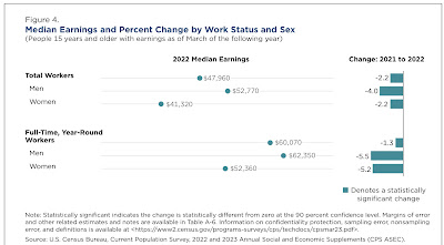


This is more problematic at first, but leads us to the second, surprising big reason that median income declined: 

2. The -6.1% decline in the broad stock market.

A big stock market decline is exactly what we *wouldn’t* expect to be behind a decline in earnings. But it comes in through the back door via a big decline in the vesting of stock options.

The first clue is that the lower quintiles of households generally did *better* in 2022 than 2021:
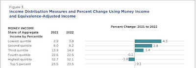


Here’s how the Census Bureau defines “income” on page 19 of the report (with some summary headers by me):

“[Wages, salaries, and other employment compensation:]
1. Earnings.

[Govenment transfer payments:]
2. Unemployment compensation.
3. Workers’ compensation.
4. Social Security.
5. Supplemental Security Income.
6. Public assistance.
7. Veterans’ payments.
8. Survivor benefits.
9. Disability benefits.

[Deferred employment compensation:]
10. Pension or retirement income.

[Investment income:]
11. Interest.
12. Dividends.
13. Rents, royalties, and estates and trusts.

[Other transfer payments:]
14. Educational assistance.
15. Alimony.
16. Child support.

[Miscellaneous others:]
17. Financial assistance from outside of the household.
18. Other income.”

First and foremost, note that investment income (but not capital gains) are included in the calculation of household income. While interest payments of *existing* investments generally did not benefit from the increase in rates, so did not raise income, the big decline in the stock market certainly *did* affect some dividend payments, as firms that are not doing well tend to cut or even forego dividends. That is going to take a chunk of income out of the leisure class, which did the worst in 2022.

But that isn’t the whole story, because remember that “earnings” alone declined in 2022. But it turns out that regular wage and salary payment omit a significant chunk of “earnings.” That’s because the vesting of stock options are frequently counted as earnings, as indicated by the IRS:

You have taxable income or deductible loss when you sell the stock you bought by exercising the option. You generally treat this amount as a capital gain or loss. However, if you don't meet special holding period requirements, you'll have to treat income from the sale as ordinary income. Add these amounts, which are treated as wages, to the basis of the stock in determining the gain or loss on the stock's disposition.”

When the stock market goes down, as it did in 2022, fewer stock options meet vesting requirements, which are usually tied to an increase in the company’s stock price. Less vesting means less cashing in, which means less income reported.

How big a deal was that in 2022? While we don’t have national figures, California does keep track of this, and its Department of Revenue noted how important it was last year. Let me give a little background first.

As you probably recall, I keep close track of tax withholding payments, which are based on earnings and, because of Social Security and Medicare caps, are not as distorted as other measures might be by billionaires’ compensations.

And in the last 4 months of 2022, tax withholding payments were virtually unchanged, even in nominal terms (i.e., before the 7.9% CPI increase), from the equivalent months in 2021, as shown in the below graph of the monthly YoY% changes for the past serval years:


Matt Trivisonno helpfully keeps track of the YoY% change of the entire previous 365 days of withholding payments, and as you can see from the below graph, for the entirety of 2022, withholding payments were only about 6.5% higher than 2021, i.e., about a -1.4% decline:


Additionally, the QCEW is a virtual census of all job gains and losses, and wage and salary payments for all employers. It is updated quarterly. For the 4 quarters of 2022, in chronological order the YoY% changes in payments were: +6.7%, +4.3%, +6.7%, and -2.3%. The 4 quarter average was +3.85%, well below the inflation rate.

Now let’s go back to California. Its Department of Revenue periodically updates how well its income tax withholding collections are doing in comparison with previous budget estimates. And in the last quarter of 2022, they fell off a cliff:


The Department of Revenue looked into the sudden falloff, and determined that the most likely reason was a huge shortfall in the vesting of stock options. As they explained:

 Some private sector employers pay employees bonus salary at different times of the year. Some bonuses reflect the overall business climate—notably holiday and year-end bonuses—while other bonuses are based on productivity. Productivity bonuses are often paid more frequently, typically at the end of each month or quarter. So far this fiscal year, income tax withholding during the last few days of each month, when bonuses are typically withheld, is far below 2021 levels. Specifically, the figure below shows that withholding during the final week of each month is 12 percent lower this year, despite withholding from the first three weeks of each month being higher in 2022. This dynamic reflects growing employment overall but a potentially sharp drop-off in month-end bonuses.”

It’s reasonable to suggest that California’s experience was not unique. And if the failure of stock options to vest caused a big shortfall in income tax withholding in the 4th quarter of last year, that would be very much in accord with the QCEW experience, and the poor YoY nationwide income tax withholding results late last year.

And that is in exact accordance with the income distributional chart supplied by the Census Bureau as to median earning income, shown above.

The final persuasive evidence comes from the below graph, in which I show the YoY% changes in average hourly earnings, aggregate nonsupervisory payrolls, nominal median household income, and inflation for the past 10 years:


Note the significant divergence of household income from jobs and payrolls in 2013 and 2014, and the large divergence in 2019. None of those years featured any huge economic upturn or downturn. But they *did* feature changes in tax law. The former featured the ending of the 2% withholding tax holiday, causing an increase in withholding in 2014 vs. 2013. The latter featured the taking effect of the pro-Billionaire tax law of 2018, but which also included a near doubling of the standard tax deduction and a slight decrease in many tax brackets.

In other words, significant changes in earnings income have on multiple occasions are Ibsen from either tax law changes and/or the behavior of financial markets.

One final caveat: nevertheless, the big increase in gas prices in early 2022 certainly did not help. As shown in the below graph of median real hourly wages, after the initial pandemic distortions higher (because mainly lower wage workers got laid off), after service workers were largely hired back, real hourly wages declined through mid-2022 before gradually rising back to trend:


Because aggregate payrolls rose so strongly, this probably was not enough without the additional downturn in the cashing in of stock options to translate into an actual decline in real median household earnings in 2022, but it certainly didn’t help.

Conclusion

The big decline in real median household income in 2022 was hardly a failure of “Bidenomics.” If anything, it reflected the success of Congressional stimulus payments under both the last year of Trump’s presidency, as well as the first year of Biden’s, in keeping the nation from a deeper downturn during the worst of the pandemic.

Further, the stock market decline of 2022 - which was largely responsible for the failure of stock options to vest - was more than anything else about the Fed’s aggressive rate hike policy, which was widely anticipated, and further widely anticipated to cause a recession, not because of any fiscal policies by Congress or the Administration.

Saturday, September 16, 2023

Weekly Indicators for September 11 - 15 at Seeking Alpha


 - by New Deal democrat


My Weekly Indicators post is up at Seeking Alpha.

The only significant change in any metric is that manufacturing, as measured by the average of the new orders sub-indexes of the regional Feds’ monthly reports is on the very cusp of improving from negative to neutral, due to a big improvement in the New York region.

That improvement probably reflects the continued benefit of the big decline in commodity prices from mid-2022 until a couple of months ago. But the latest PPI, as well as the action in commodity indexes, suggests that has likely ended.

As usual, clicking over and reading wlll bring you up to the virtual moment as to the economy, and reward me a little bit for my efforts.

Friday, September 15, 2023

Has industrial production, the King of Coincident Indicators, been dethroned?


 - by New Deal democrat


Industrial production in the post-WW2 era was the King of Coincident Indicators. In the past 20 years, it may have been dethroned.


To wit, in August production increased 0.4% to a new post-pandemic high, but only 0.1% above its previous high last September. Meanwhile manufacturing production also increased, by 0.1%, but is still -0.9% below its post-pandemic peak last October:


Motor vehicle production (blue in the graph below) has been playing an outsized role in the recent improvement. Below I show it normed to 100 as of its 2017-2019 average. Production declined as much as -80% during the months immediately after the pandemic hit, and averaged -14% for all of 2020 and another -8% in 2021 before returning to 100% beginning in April 2022. Only since April of this year has the shortfall actually begun to be reduced, as production has averaged 10% higher than its 2017-19 average since then:


Meanwhile sales of light vehicles (red, including imports, so not directly comparable) are still running about -10% below their 2017-19 average.

In short, manufacturing ex-motor vehicles has been hit by the effects of Fed rate hikes, while vehicle manufacturing has been counterbalancing, and perhaps overcoming those effects, at least so far this year.

On a YoY basis, both total and manufacturing production are virtually unchanged:


In the past, this would almost always have meant a recession:


But note that since the 1980s, and especially since the Great Recession, such downturns in production have not been enough to tip the economy into recession. Construction and services are of greater importance now, which is one big reason I am paying so much attention to housing under actual construction, which will be reported next week.

Thursday, September 14, 2023

Real retail sales continue to be weak; continue to forecast weakening jobs reports


 - by New Deal democrat


As usual, retail sales is one of my favorite metrics because it tells us so much about the consumer and, indirectly, the labor market and the total economy.


Nominally, retail sales rose 0.6% in August. So did consumer inflation, and the difference rounded to -0.1% for the month. Here’s what the past 2.5 years since the 2021 stimulus look like (blue) compared with personal spending on goods deflated by the PCE goods deflator. Both are normed to 100 as of just before the pandemic:


Nominally both usually track close to one another; the difference is in the deflators. In any event, you can see that the trend in real retail sales for the past 12 to 16 months is flat to slightly declining. 

And it isn’t solely a function of gas prices. Nominally motor vehicle and parts sales (gold) rose 0.4% in August (note: in the graph below they are /2 for scale), and retail ex-gasoline (red) only rose 0.2%:


As a result, real retail sales are down -1.2% YoY. Although I won’t bother with a graph, over the past 75 years such YoY declines have more often than not occurred during a recession. Even so, despite being negative YoY for most of the past 12 months, needless to say no recession has occurred, at least not yet.

Finally, although there is a great deal of noise, the percent change in real retail sales YoY/2 typically forecasts the trend in monthly jobs reports. For over the past 18 months, that trend has been marked deceleration:


Needless to say, the forecast from real retail sales is that monthly gains in nonfarm payrolls will continue to decelerate further. It will be interesting to see if real spending on goods (gold) continues to diverge from retail sales. My bet would be on more of a convergence instead.

The economic tailwind from falling commodity prices has likely ended


 - by New Deal democrat


[Note: I’ll post on the August retail sales report later today.]

Two days ago in my PPI and CPI overview, I wrote “I am most interested in whether the producer price report tells us that the big decline in commodity prices is over. There have only been two increases in commodity prices in the past 12 months [ ] I suspect we’ll get #3 [on Thursday]. If producer prices have stopped declining, then the tailwind I have described above has ebbed, and maybe ended.”


As anticipated, that is just what happened. Commodity prices (blue below) rose 1.5% in August. July was also revised slightly so that it rounds to unchanged rather than a decline. The PPI for finished goods (red) also rose 2.1%:


PPI for finished goods is now up YoY by 2.2%, and is only -1.2% below its June 2022 peak:


And it isn’t only energy which has contributed to the end of the decline. Excluding energy, both intermediate and final goods production costs rose slightly:


My strong suspicion has been that the tailwind of declining commodity prices, typified by the big decline in gas prices in late 2022 is what allowed the US economy to grow so well so far this year, blunting the effects of major Fed interest rate hikes. If this tailwind is indeed over, only the accumulating headwinds will remain going forward.

Initial jobless claims maintain renewed yellow caution flag


 - by New Deal democrat


Some post-pandemic unresolved seasonality may be affecting the weekly claims figures, as just like last year, they are declining sharply compared with early August. But on a YoY basis, they are not nearly so positive.

Initial jobless claims rose 3,000 last week to 220,000. The 4 week average declined -5,000 to 224,500. With a one week delay, continuing claims (gold, right scale) rose 4,000 to 1.688 million:


On the YoY basis more important for forecasting purposes, initial claims are up 14.6%, the 4 week average up 11.8%, and continuing claims up 29.6%:


Remember that the “red line” is +12.5% sustained for 2 months. While the 4 week average has been up more than 10% for 3 weeks, justifying a “yellow” caution signal, it has not crossed 12.5%.

The most important metric of all for forecasting the unemployment rate is the monthly percentage change. Two weeks into September, it is up 14.8%. Should this be sustained for the month, that would imply the unemployment rate rising to 4% (about 1.15*3.5%) in the next few months:


This would come very close to triggering the Sahm rule. By no means are we there yet.

Wednesday, September 13, 2023

August consumer inflation confirms “Goldilocks” “soft landing” may well be “transitory”


 - by New Deal democrat


Let me start by quoting from my post yesterday:

“As to consumer prices, I am most interested in the relative weights of decelerating shelter increases (which as I have written many times are well-forecasted by the more current home price indexes and new rent indexes) vs. increasing gas prices 

“I suspect that the increase in gas prices is going to outweigh the deceleration in fictitious shelter inflation. If so, that will mean that there is an actual slight increase in a headwind in consumer prices.”

Not only did this happen, but the big increase in energy prices overwhelmed the continued slow decline in fictitious shelter. Further, the fallout from distortions in motor vehicle production also continued.

Let’s start with headline vs. core inflation. The former rose by 0.6% for the month and 3.7% YoY, up from 3.2% last month. The latter increased 0.3% for the month and 4.3% for the year, down from 4.7% last month:


As anticipated, the reason for the increase in headline inflation was a 5.6% monthly increase in energy (not shown), which is nevertheless still down -3.3% YoY.

But take out fictitious shelter, and prices are only up 1.9% YoY:


This is nevertheless higher than several months ago, when gas prices were at their most benign YoY.

Turning to fictitious shelter, it rose 0.3% for the month, including 0.4% for Owners Equivalent Rent. YoY shelter is up 7.6% and OER is up 7.3%, which continues its slow deceleration from 8.1% this past spring. In fact OER rose by the least monthly in two years:


Here is the update of OER compared with the Case Shiller and FHFA house price indexes (although I won’t show it, recall that apartment rent indexes are also now slightly *negative* YoY):


OER has been declining YoY at the leisurely pace of -0.2% per month, and the declines are going to continue. Still, if this rate of decline were to continue, it won’t return to 2% YoY for another 2 years, but I suspect there will be at least some acceleration in this rate of decline.

The other big distortion in inflation has been motor vehicles. I’ll discuss this further when industrial production is reported, but suffice it to say cumulative vehicle production since the pandemic struck is still probably about by about 10,000,000. While new vehicle prices rose 0.3% for the month, and are only up 2.9% YoY, and used vehicle prices declined once again, by -1.2% for the month, and are down -6.6% YoY, cumulatively they are up 20.5% and 39.9% since February 2020):


Because of the spike in vehicle prices, people have been holding on to their existing vehicles for longer and longer, and these older vehicles need more and more repairs. The gold line above shows that the costs of vehicle maintenance and repair is up 29.5% since February 2020. And it continues to rise at a rapid clip, up 1.1% in the last month alone and up 12.0% YoY (not shown). This is now the hottest single sector for inflation.

Since the Fed is focused on “sticky” prices, here’s what core, core minus shelter, and total less shelter look like YoY:


Excluding shelter, even “sticky” prices are only up 3.8%. Core “sticky” prices also excluding shelter are up 3.3%.

Finally, let’s update how inflation affected aggregate consumer wage income. Aggregate payrolls for nonsupervisory employees rose 0.5% in August, but since CPI rose 0.6%, real aggregate payrolls declined -0.1%, and are even with June. They remain up 2.0% YoY. Here’s what they look like normed to 100 one year ago:


This dynamic is what I have been concerned about. Namely, that wage gains will continue to decelerate, while consumer inflation as officially measured will at very least flatten if not re-accelerate with increasing gas prices. Once real aggregate payrolls peak, a recession has typically followed in about 6 months, coincident with their turning negative YoY. Additionally, any re-acceleration of CPI will give Fed hawks more ammunition to demand further rate hikes, which won’t even have their full effect for another year.

Tuesday, September 12, 2023

PPI and CPI preview: why Paul Krugman’s “Goldilocks” economy is likely to prove “transitory”


 - by New Deal democrat

Sorry for the lack of posting yesterday. Every now and then, real life intrudes and, well, yesterday was one of those days.

All of the economic data this week is going to be crammed into tomorrow through Friday. 

Most importantly for present purposes, I am very interested in dissecting both the producer and consumer price reports.

To give some background, I have taken the position that what has been, indeed, “very different” this time is that the very big - close to 10% - YoY decline in commodity prices has not been due to demand destruction, but rather to the unclogging of the post-pandemic supply pipeline.

Two graphs showed up yesterday in support of that proposition. First, Mike Konczai of the Roosevelt Institute decomposed sectors of the GDP to see whether each showed price declines, and if so, whether there was more or less demand. Less demand would mean demand destruction. More supply would mean an increase in quantity supplied. And here’s the result:


Particularly when it comes to goods, he wrote that 2/3’s of sectors showed increased demand. In short, the main driver of price declines was increased supply, not demand destruction.

Kevin Drum picked up on that with the below graph comparing the 3 month average of core inflation with the Goldman Sachs supply chain pressure index:


As he points out, inflation was already high before the 2021 stimulus ever took effect. And as supply chain pressure turned negative (below 0), the rate of inflation declined. 

This is simply very persuasive evidence that a great deal of the improvement in the economy in the past year has been the sharp disinflation due to the end of supply chain pressures (except possibly in the motor vehicle sector, which is its own story).

To return to the inflation reports, I am most interested in whether the producer price report tells us that the big decline in commodity prices is over. There have only been two increases in commodity prices in the past 12 months:


I suspect we’ll get #3 tomorrow. If producer prices have stopped declining, then the tailwind I have described above has ebbed, and maybe ended.

As to consumer prices, I am most interested in the relative weights of decelerating shelter increases (which as I have written many times are well-forecasted by the more current home price indexes and new rent indexes) vs. increasing gas prices (/10 for scale in the graph below):


I suspect that the increase in gas prices is going to outweigh the deceleration in fictitious shelter inflation. If so, that will mean that there is an actual slight increase in a headwind in consumer prices. Put that together with the fact that the effect of most of the Fed’s interest rate hikes have not been fully manifested in the economy yet, and the “immaculate disinflation” or “Goldilocks” economy as described by Paul Krugman in this morning’s NY Times is going to prove to be very, ahem, transitory.

Saturday, September 9, 2023

Weekly Indicators for September 4 - 8 at Seeking Alpha


 - by New Deal democrat


My Weekly Indicators post is up at Seeking Alpha.

The tug of war between the headwind of high interest rates and the tailwind of low commodity and consumer inflation continues.

As usual, clicking over and reading will bring you right up to the present on the data and bring me a smal $$$ reward for my efforts.

Friday, September 8, 2023

Coronavirus update: the virus is back; everyone should return to their prior precautions and get boosted this fall


 - by New Deal democrat

At the beginning of this year, I indicated that I anticipated only writing about Covid if something significant was happening.  It is, so let’s look at the data.


Almost all State and Federal testing data is gone, but we do have a very good source in Biobot’s waste monitoring. Here’s the long term view (truncated to eliminate the huge original Omicron spike):


The number of particles per milliliter has nearly quadrupled since late June, from 165 to 618. In the past, this has equated to roughly 125,000-150,000 new cases per day.

All 4 Census regions of the country are affected:


Through one week ago, daily new hospitalizations - which in the past lagged infections by about a week or so - have nearly tripled, from 6,300 to 17,400, the highest level in almost 6 months, and only about 5,000 below last autumn:


And weekly deaths, which in the past has lagged several weeks behind hospitalizations, have also increased from below 500 to over 600:


It is very important to note that the last reliable deaths data (blue in the graph above) is from a full month ago. We already know that the following two weeks (gray) had higher death tolls, but we don’t know by how much. If deaths quadruple as cases have, then we will probably find out by Halloween that by the end of September there were about 2,000 deaths per week, which is back in the range of much of the earlier part of the pandemic.

Why has the wave that started this summer persisted? It does not appear because any of the new subvariants, particularly EG.5 and BA.2.86, are particularly virulent. Indeed, indications are that the next round of boosters, which were tailored to XBB, are highly effective against these variants as well. Rather, as explained in the linked CNN article, tests have indicated that “The people with the highest neutralizing antibodies were those who had recently recovered from an XBB infection.”

In other words, very few people have had new booster shots within the past 6 months, and we know that resistance from mRNA boosters wanes after 4-6 months. The very fact that there were so few new infections in the spring and early summer means that many more people have less resistance now.

The bottom line is, everyone should be going back to their Covid safety precautions, like wearing masks in indoor public places, and everyone eligible should sign up for the new booster this autumn.