- by New Deal democrat
Sorry for the lack of posting yesterday. Every now and then, real life intrudes and, well, yesterday was one of those days.
All of the economic data this week is going to be crammed into tomorrow through Friday.
Most importantly for present purposes, I am very interested in dissecting both the producer and consumer price reports.
To give some background, I have taken the position that what has been, indeed, “very different” this time is that the very big - close to 10% - YoY decline in commodity prices has not been due to demand destruction, but rather to the unclogging of the post-pandemic supply pipeline.
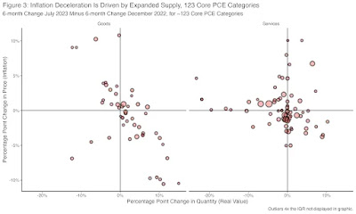
Two graphs showed up yesterday in support of that proposition. First, Mike Konczai of the Roosevelt Institute decomposed sectors of the GDP to see whether each showed price declines, and if so, whether there was more or less demand. Less demand would mean demand destruction. More supply would mean an increase in quantity supplied. And here’s the result:
Particularly when it comes to goods, he wrote that 2/3’s of sectors showed increased demand. In short, the main driver of price declines was increased supply, not demand destruction.
Kevin Drum picked up on that with the below graph comparing the 3 month average of core inflation with the Goldman Sachs supply chain pressure index:
As he points out, inflation was already high before the 2021 stimulus ever took effect. And as supply chain pressure turned negative (below 0), the rate of inflation declined.
This is simply very persuasive evidence that a great deal of the improvement in the economy in the past year has been the sharp disinflation due to the end of supply chain pressures (except possibly in the motor vehicle sector, which is its own story).
To return to the inflation reports, I am most interested in whether the producer price report tells us that the big decline in commodity prices is over. There have only been two increases in commodity prices in the past 12 months:
I suspect we’ll get #3 tomorrow. If producer prices have stopped declining, then the tailwind I have described above has ebbed, and maybe ended.
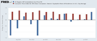
As to consumer prices, I am most interested in the relative weights of decelerating shelter increases (which as I have written many times are well-forecasted by the more current home price indexes and new rent indexes) vs. increasing gas prices (/10 for scale in the graph below):
I suspect that the increase in gas prices is going to outweigh the deceleration in fictitious shelter inflation. If so, that will mean that there is an actual slight increase in a headwind in consumer prices. Put that together with the fact that the effect of most of the Fed’s interest rate hikes have not been fully manifested in the economy yet, and the “immaculate disinflation” or “Goldilocks” economy as described by Paul Krugman in this morning’s NY Times is going to prove to be very, ahem, transitory.


