Tuesday, April 5, 2022

Coronavirus dashboard for April 5: BA.2 likely only causes a ripple; and on track for record low daily deaths


 - by New Deal democrat

This is a good time to look at the impact - or, better speaking, the lack thereof - of the BA.2 Omicron variant in the US.

Nationwide the 7 day average was 28,961 yesterday:


This is the lowest since last July, and lower than all but about 3.5 months since the end of March 2020. Only late spring 2020 and from mid-May through mid-July in 2021 were lower. In other words, on a national level, there is no BA.2 wave whatsoever yet.

The above graph comes from The NY Times, because the State of Kentucky decided to make an enormous data dump yesterday (like 190,000 cases and 2900 deaths!) yesterday, which is ruining the comparisons on my typical data source, 91-Divoc.

Omitting the South (and so KY), here are the regional breakdowns in cases, as well as NY, NJ, and MA, 3 of the States in the Northeast where there *has* been something of a BA.2 wave:


Note that for the Northeast as a whole, and NY in particular, cases are beginning to level off after 3 weeks. I mention this, because the BA.2 wave in Europe has set the pattern for BA.2 impacts. Below are cases in the 5 big countries in Europe, as well as the EU as a whole:


The BA.2 waves started between the end of February through the first week in March. In every country but Germany, they have already peaked. And Germany is misleading, because they had a data dump 6 days ago. Without it, cases there would only be where they were 2 weeks ago. In other words, in Europe BA.2 waves, where they occurred, have only lasted 2.5-3.5 weeks.

Further, in Europe, the BA.2 waves generally peaked once the variant reached the level of 80%-90% of all cases. With that in mind, here is today’s update from the CDC of variance prevalence in the US, showing that BA.2 is no 72% of all case, having risen about 15% in each of the past two weeks:


And here their map of the regional breakdown:


BA.2 makes up 75% of all cases on the West Coast (where there has been no discernible wave whatsoever) and 84% in the Northeast (New England + NY and NJ).

The Northeast is going to hit 90% or more BA.2 prevalence within a week. Above I mentioned that cases in the Northeast look like they are beginning to level off. I expect a peak to be obvious there within a week to 10 days. The rest of the country is probably about one or two weeks behind that.

Turning to hospitalization admissions, they are at their lowest level ever during the pandemic, averaging 10,744/day during the past week:


And finally, here are deaths, currently averaging 604:


This is the lowest level since last August, and lower than all but 4 months of the past two years.

In conclusion, it now looks nearly certain that, on a national level, at worst there is going to be just a BA.2 ripple, and maybe just a long tail of a very slow decline from 30,000 cases daily.

Further, while deaths have declined at a far slower rate than cases, because cases are down over 96% from their Omicron high, and at peak there were only 2600 deaths a day from Omicron, a 96% decline in deaths would take us down to only about 100 per day. And because victims are typically hospitalized before they succumb, and hospitalizations are at new record lows, this further supports the hypothesis that we are perhaps only a month away from a new record low in daily deaths from COVID.

Monday, April 4, 2022

Manufacturing positive, but no longer red hot; inflation-adjusted construction spending is flat


 - by New Deal democrat

[Programming note: I’ll discuss some of the innards of the March jobs report in further detail in the next day or two, as well as update the Coronavirus dashboard, with particular emphasis on the likely trajectory of BA.2. Since most States don’t bother any more to report on the weekends, there’s no point in doing that today.]

In addition to the jobs report, Friday gave us updates on manufacturing and construction.

The ISM manufacturing index, and especially its new orders subindex, is an important short leading indicator for the production sector. While the index remained positive, its more leading new orders component stumbled.

In March the index declined from 58.6 to 57.1, and the new orders subindex declined from 61.7 to 53.8, the lowest since 2020. Since the breakeven point between expansion and contraction is 50, these remain positive, (note the graph below does not contain the latest numbers):


This forecasts a continued expansion on the production side of the economy through summer.

Meanwhile, construction spending for February rose 0.5% in nominal terms for overall spending including all types of construction, while the leading residential sector also rose 1.1%, both thus making new highs:


Adjusting for price changes in construction materials, which for the first time in six months actually declined, by -1.2%, “real” construction spending rose 1.7% m/m - also the first increase since last August. In absolute terms, “real” construction spending has declined sharply - by -17.8% - since its peak in November 2020,  while “real” residential construction spending has declined -12.6% since its post-recession peak in January of last year:

Blah


While total construction spending has declined by more than the -10.4% it did before the Great Recession, the decline in residential construction spending, while increasingly substantial, remains nowhere near the -40.1% decline it suffered before the end of 2007.


There were some positive revisions to the past several months which helped out these comparisons this month, and reinforced that while down, they are not recessionary at this point. But with mortgage rates rising to nearly 5%, I would expect these metrics to deteriorate further later this year, after new home permits, starts, and sales.

Saturday, April 2, 2022

Weekly Indicators for March 28 - April 1 at Seeking Alpha


 - by New Deal democrat

My Weekly Indicators post is up at Seeking Alpha.

The big news of the week was the spreading yield curve inversion in the Treasury market.* Needless to say, that puts another bullet in the body of the long leading forecast - but it’s still not negative.

As usual, clicking over and reading will bring you up to the virtual moment on the economic data, and my forecast both the short and long term, and I’ll get rewarded with a penny or two.


*Not to get into too much detail here, but just how negative an indicator a yield curve inversion is depends on (1) how long along the yield curve does it extend? (2) how deep is it? And (3) how long does it last.

Well, it just happened, and it’s pretty shallow for now. But it has definitely spread out along the yield curve. The entire curve from the 3 to 10 year maturity is inverted. The 2 to 10 year spread inverted yesterday. The 2 through 7 year maturities are even inverted vs. the 30 year.

Friday, April 1, 2022

March jobs report: yet another strong showing for jobs and unemployment; while strong wage growth nevertheless likely lags inflation


 - by New Deal democrat

Here are the three main trends I was most interested in this month:

1. Is the pace of job growth beginning to decelerate? 
2. Is wage growth holding up? Is it accelerating?
3. Are the leading indicators in the report beginning to flag?

The answers were:
1. The 6 month average of monthly gains, which was running at 585,000 in the prior 6 months, increased by 2,000 in March to 587,000, although, pending revisions - which have almost all been upward in the past year - this month’s number was the lowest in the last 6 months.
2. Wage growth, which averaged 5.9% in the 2nd half of 2021, for the 2nd month in a row has been up 6.7% YoY. Aside from April 2020, this is the highest wage growth in *40 years.* 
3. A majority of the leading indicators within the report were positive. There is no sign yet of any major impending slowdown in the economy, particularly in the goods producing sector.

We still have 1.579 million jobs to go, or 1.0%, to equal the number of employees in February 2020 just before the pandemic hit. At the current average rate for the past 6 months, that’s 3 more months.

Here’s my in depth synopsis of the report:

HEADLINES:
  • 431,000 jobs added. Private sector jobs increased 426,000. Government jobs increased by 5,000 jobs. The alternate, and more volatile measure in the household report indicated a gain of 736,000 jobs, which factors into the unemployment and underemployment rates below.
  • U3 unemployment rate declined -0.2% to 3.6%, just 0.1% above the January 2020 low of 3.5%.
  • U6 underemployment rate declined -0.3% to 6.9%, equaling the January 2020 low of 6.9%.
  • Those not in the labor force at all, but who want a job now, rose 382,000 to 5.737 million, compared with 4.996 million in February 2020.
  • Those on temporary layoff declined -101,000 to 787,000.
  • Permanent job losers declined -191,000 to 1,392,000.
  • January was revised upward by 23,000. February was also revised upward by 72,000, for a net gain of 95,000 jobs compared with previous reports.
Leading employment indicators of a slowdown or recession

These are leading sectors for the economy overall, and will help us gauge whether the strong rebound from the pandemic will continue.  These were mainly positive:
  • the average manufacturing workweek, one of the 10 components of the Index of Leading Indicators, rose +0.1 hours to 41.7 hours.
  • Manufacturing jobs increased 38,000. Since the beginning of the pandemic, manufacturing has still lost -128,000 jobs, or -1.0% of the total.
  • Construction jobs increased 19,000. All of the jobs lost during the pandemic, plus another 4,000, have now been made up. 
  • Residential construction jobs, which are even more leading, fell by 2,600. Since the beginning of the pandemic over 50,000 jobs have been gained in this sector.
  • temporary jobs rose by 4,900. Since the beginning of the pandemic, almost 250,000 jobs have been gained.
  • the number of people unemployed for 5 weeks or less increased by 158,000 to 2,289,000, which is 164,000 higher than just before the pandemic hit.
  • Professional and business employment increased by 102,000, which is about 700,000 above its pre-pandemic peak.

Wages of non-managerial workers
  • Average Hourly Earnings for Production and Nonsupervisory Personnel: rose $0.11 to $27.06, which is a 6.7% YoY gain. 

Aggregate hours and wages:
  • the index of aggregate hours worked for non-managerial workers rose by 0.1%, which is a  loss of -0.7% since just before the pandemic.
  •  the index of aggregate payrolls for non-managerial workers rose by 0.5%, which is a gain of 11.7% (before inflation) since just before the pandemic.

Other significant data:
  • Leisure and hospitality jobs, which were the most hard-hit during the pandemic, rose 112,000, but are still -1,474,000, or -8.7% below their pre-pandemic peak.
  • Within the leisure and hospitality sector, food and drink establishments added 61,300 jobs, and is still -819,900, or -6.6% below their pre-pandemic peak.
  • Full time jobs increased 912,000 in the household report.
  • Part time jobs increased 101,000 in the household report.
  • The number of job holders who were part time for economic reasons increased by 35,000 to 4,170,000, which is still below their level before the pandemic began.

SUMMARY

This was another very good jobs report. There is no sign of any significant slowdown in hiring at this point. Leading sectors like manufacturing, construction, and temporary help continued to improve. Also, wage gains among non-supervisory workers continued to rise sharply. Aside from 3 months in 2019 and 2020, the unemployment rate was the lowest (or equal to it) in over 50 years. Similarly, the underemployment rate was the lowest for its entire 28 year history except for two months.

There were a few blemishes, most notably the decrease in residential construction jobs (more evidence of a housing slowdown) and the likely real, inflation-adjusted decline in aggregate payrolls, which means that probably real aggregate payrolls for the American working class have only risen by 1% or less in the last year in total.

Two months ago I wrote that “Because real sales and income have not improved in over half a year, I expect the pace of job gains to slow considerably in the coming months.” For the second month in a row, I have been wrong - and happily so! But I continue to think job gains will slow (but not reverse) shortly.


Thursday, March 31, 2022

Consumer spending continues OK, while income continues its seemingly relentless decline


 - by New Deal democrat


Nominally personal income rose 0.5%, and spending rose 0.2% in February. That’s the good news. 

The bad news is the personal consumption deflator, i.e., the relevant measure of inflation, rose 0.6%, so real income declined -01%, and real personal spending declined -0.4%.

While both real income and spending are well above their pre-pandemic levels, I have stopped comparing them with that, but instead with their level after last winter’s round of stimulus. Accordingly, the below graph is normed to 100 as of May 2021: 


Since then spending is up 2.3%, while income has declined -1.4%.

Comparing real personal consumption expenditures with real retail sales for February (essentially, both sides of the consumption coin) reveals small declines in each:


Meanwhile, the personal saving rate increased 0.2% to 6.3% in February. The below graph of the last 30 years subtracts 6.3% from all months, so that the current reading is shown as 0 (before then all values were higher than 6.3%): 


Note that the savings rate has tended to decrease as expansions grow longer, leaving consumers more vulnerable to shocks (e.g., vehicle and gas prices). The current value is the lowest since 2013 (when a different stimulus program ended). In other words, so far consumes are making up shortfalls by digging into savings or tapping a source of credit.

One of my recession models - the “consumer nowcast” - is based on such a shock that is unable to be made up from increased real income, or an increased source of wealth to be cashed in. Income has clearly faltered, and stocks have not made a new high in almost three months. That leaves housing equity. Whenever the housing price spiral ends, unless something reverses, consumers are in trouble.


Jobless claims continue near or at record lows


- by New Deal democrat


Initial claims (blue) rose to 14,000 to 202,000, just above last week’s 50 year low. The 4 week average (red) declined 3, 500 to 208,500 (vs. the pandemic low of 199,750 on December 25). Continuing claims (gold, right scale) declined 35,000 to  1,307,000, the lowest number since December 1969:


With Omicron in the rear view mirror, and BA.2 more of a ripple so far, we are having a COVID respite, and basically nobody is getting laid off. 


As once again demonstrated in the February JOLTS report released earlier this week, the number of jobs available relative to the number of applicants remains tight, meaning there will be continuing upward pressure on wages.


Wednesday, March 30, 2022

The Camel’s Nose is in the Tent


 - by New Deal democrat

I have a new post up at Seeking Alpha.

The US Treasury yield curve is fully inverted between the 3 and 10 year maturities.

And you probably have an idea what that means, dearest readers.

As usual, clicking over and reading should be educational for you (if nothing else, by teaching you what the title saying means!) and help inform you of what is likely ahead at some point in 2023. 

And reward me with a penny or two for my troubles.

Tuesday, March 29, 2022

February JOLTS report: the game of musical chairs in the jobs market goes on


 - by New Deal democrat


This morning’s Census Bureau JOLTS report for February shows that the game of musical job chairs continues.  

As a refresher, several months ago I introduced the idea of a game similar to musical chairs, where employers added or took away chairs, and employees tried to best allocate themselves among the chairs. Because of the pandemic, there are several million fewer players trying to sit in those chairs, leaving many empty. As a result, wages have continued to increase sharply, as employers attempt to attract potential employees to sit in the empty chairs.

This pattern has continued, indicating if anything a general plateauing of all the numbers.

Layoffs and discharges (violet, right scale in the graph below) declined 17,000 to 1.386 million, slightly above their record low of 1.262 in December. Total separations (blue) rose 48,000 to 6.092 million (graph starts in June 2020 for reasons of scale):


Layoffs continue to be extremely rare.

Meanwhile, job openings (blue in the graph below) declined 17,000 to 11.266 million, a small decline from their record peak of 11.448 million in December. Openings had been gradually increasing to repeated record highs in the previous 6 months, but now appear to have leveled off. Voluntary quits (the “great resignation,” gold, right scale) rose 94,000 to 4.352 million, 158,000 below November’s record high, and again, possibly leveling off. Actual hires (red) rose 263,000, to 6.689 million, only 16,000 below November’s record high of 6.705 million:


In summary, we continue to have near-record high job openings, hires, and quits, together with near-record low layoffs - but we now see evidence that the numbers are no longer increasing or decreasing. Little progress is being made towards establishing a new equilibrium, but on the other hand, the situation is not getting more *out* of equilibrium.

Finally - again as I have been pointing out for the last few months - because of the continuing yawning gap in job-takers vs. job openings, wages have continued to soar. Below is a graph of job openings divided by actual hires (blue, right scale). This gives the rate at which openings are above or below hires, where 1.0 represents the level at which the number of openings and hires are equal. As you can see, this rate increases as expansions go on, and in the last 18 months has repeatedly made new all-time high, the last of which was in December.

YoY wage gains for non-managerial workers (red, left scale) are a “long lagging” indicator, typically turning up well after an expansion is underway, and typically when the U-6 underemployment rate falls below about 9.0% (currently at 7.2%, the lowest except for the year 2000 at the end of the tech boom, the last 8 months before the pandemic, and in February):


In short, wage growth has responded to the favorable game of employment musical chairs by spiking to 6.7% YoY. I expect wages to continue to rise at this strong rate until potential employers can no longer make any profit from hiring potential employees.

I expect strong wage gains to continue until we see a *significant* decline in the ratio of openings to hires; and at the same time, or shortly thereafter, a significant decline in voluntary quits. As indicated above, while the situation is no longer getting more extreme, it isn’t getting any less extreme yet either. So the game of musical chairs in the jobs market continues.


Monday, March 28, 2022

Coronavirus dashboard for March 28: I’ll take the “under” for the severity of any BA.2 wave


 - by New Deal democrat


Very few US States reported over the weekend. The decline in new cases has stalled at roughly 30,000 per day. Deaths are still declining, and currently just below 800 per day.

Since the BA.2 variant continues to generate new headlines, with just about everybody warning of a new wave in the US, let’s take a look at what actually happened in Europe (and remember: there was no new BA.2 wave in South Africa, the Philippines, India, and a number of EU countries where BA.2 took over from BA.1 early).

BA.2 started a new wave in Europe beginning in the last week of February through the first week of March:


A week or two ago, the poster children for Europe’s big outbreak included countries like the UK, Germany, Belgium, Austria, the Netherlands, and Greece. Here’s what they (plus the other major countries of Italy and Spain, plus Portugal), look like now:

Declines everywhere. Italy just peaked earlier during last week, and the UK probably did as well (there was a data dump last Monday which will go out of the average tomorrow).

Here is where BA.2 is still increasing in Europe:


In short, four weeks after Europe’s BA.2 wave started, cases are already declining everywhere except France, Ireland, Luxembourg, Cyprus, and Malta. The last 4 countries have a combined population of 6.5 million. There may be a few small countries I’ve missed, but they wouldn’t materially affect the result.

Last Tuesday, the CDC reported that the BA.2 variant was a majority of new cases in the Northeastern Census region, 40% along the West coast and the upper Midwest, and 30% or below everywhere else. Here’s what cases in the US Census regions look like as of now:

Remember that the appropriate comparison with the CDC report is cases one week ago. Since then, the percentage of BA.2 infections has probably risen by about 15% (but we won’t know until at least tomorrow). One week ago cases were flat to declining everywhere except for the Northeast, where they were up 10%. Cases are still declining in the West, flat in the Midwest, and rising in the South and Northeast now.

For the EU as a whole, cases rose 50% from their bottom since then, and appear to have peaked in the last week. In the US, that would translate to 45,000 cases per day in about 2.5-3 weeks. The worst case countries saw their cases roughly double, which in the US would be 60,000. I’m more inclined to go with the former estimate than the latter.

And since, as of now, there is no new variant on the horizon, I expect a fast decline from peak just as we are seeing in the European countries now.

Saturday, March 26, 2022

Weekly Indicators for March 21 - 25 at Seeking Alpha


 - by New Deal democrat

My Weekly Indicators post is up at Seeking Alpha.

The walls closed in a little more on the long leading forecast this week, as now real money supply is beginning to falter.

As usual, clicking over and reading will bring you thoroughly up to date, and will reward me a little bit for giving you a heads up as to what awaits, economically, in the future.

Friday, March 25, 2022

An update on the yield curve


 - by New Deal democrat


This is an update on my yield curve post from earlier this week.


As had happened in the previous few days, the 3 to 5 year Treasury yield spread, which was inverted intraday, un-inverted by the close of the trading day. Here is what the US Treasury yield curve looked like yesterday:


As you can see, it is kinked at the 7 and 20 year maturities. Aside from that, from Fed funds out through 30 years it has a more normal shape. As I pointed out earlier, the 10 and 30 year maturities are typically where investors go to hide in a “flight to safety,” so that they have lower yields than some earlier maturities in those circumstances is not the classic yield curve inversion that has historically forecast trouble. That only happens when maturities in the short to medium range from 3 months out to 5 years start to invert.

For example, here is the historical 30 year minus 20 year spread:


It has spent half of its existence inverted, including through most of the 1990s Boom.

Here is the 10 year minus 7 year spread (blue) v. The 10 year minus 2 year spread (red, /4 for scale):


The 7 to 10 year spread gave a false signal in 1984, briefly in 1995, and spent virtually the entirety of the late 1990s tech Boom inverted. By contrast, the much more followed 2 to 10 year spread did not falsely signal in 1984 and 1995, but only missed during the 1966 near-recession and in 1998. It also properly gave a positive signal prior to the 2008-09 Great Recession, unlike the 7 to 10 year which just touched being flat for several days.

It is when we get closer to the short end of the curve, at 3 years, when things get more interesting. Below is the 3 to 5 year spread (blue) vs the 3 to 10 year spread (red, /2 for scale):


The result is very similar to the 2 to 10 year spread discussed above: the only misfires are during 1966, most of 1967-68, and briefly during 1998. 

During the past week, the 3 to 5 year spread has not closed with an inversion, but the 3 to 10 year spread has twice. By contrast, the 2 to 10 year spread has not closed below 0.15%.

In summary, while the yield curve certainly merits heightened awareness, we haven’t seen the short to medium term inversions which in the past have demonstrated important signal vs. noise value.


Thursday, March 24, 2022

Jobless claims: I feel like humming psychedelic tunes from the 1960s


  - by New Deal democrat

Initial claims (blue) declined 28,000 to 187,000, yet another new pandemic low (pending revisions!), and the lowest of all time going back nearly 60 years except for weeks during 1968 and 1969. The 4 week average (red) declined 11,500 to 211,750 (vs. the pandemic low of 199,750 on December 25). Continuing claims (gold, right scale) declined 67,000 to  1,350,000, also the the lowest number in over 50 years, since January 1970 (the 1960s were uniformly lower):

Well, I am now pleasantly wrong about having said that “we have probably seen the lows in initial claims for this expansion.” With the Omicron wave all but over (I am increasingly less concerned about BA.2), claims have resumed their downturn, as basically nobody is getting laid off. 


What I have been saying for several months, that is still true, is: the record tightness in the jobs market isn’t going away. The number of jobs available relative to the number of applicants will remain tight, meaning there will be continuing upward pressure on wages.


Wednesday, March 23, 2022

The housing market’s downward turn begins: new home sales in February, plus a comment about affordability


 - by New Deal democrat

As of this morning Mortgage News Daily shows the 30 year mortgage rate up to 4.72%, 1.9% higher than their lows 15 months ago, and the highest in four years. That means the housing market is in some serious trouble. Let’s take a look at that via this morning’s new home sales report for January.
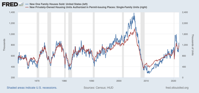
First, a reminder, that new home sales: (1) are the most leading of all housing reports, leading even permits, so much so that it is more of a mid-cycle indicator rather than a long leading indicator, and (2) are very noisy, and heavily revised, so much so that it is less useful than single family permits in particular.  

So first, here  is new home sales (blue) vs. single family permits (red) for the past 5 years:


It’s easy to see that the trend in sales led permits - but also that sales are much more noisy. 

Here is the longer term view of same (excluding the most recent data):


Sales and permits both increased with lower mortgage rates late last year, and after a month in which new buyers locked in sales before rates when higher, both have now backed off  again.

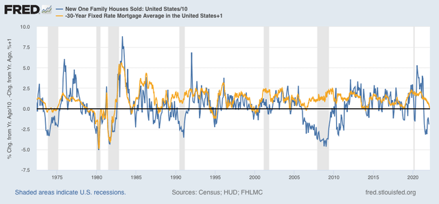
Next, as I always say, interest rates lead sales. Here is the long term view of the YoY% change in mortgage interest rates (gold, inverted, so that an increase in rates shows as a decrease) vs. the YoY% change (/10 for scale) in new home sales for the past 10 years> Note that I have added 1% to the YoY change in mortgage rates so that only increases in mortgage rates of more than 1% show as a negative:


Here is a close-up of the past 10 years:


It is easy to see that interest rates lead sales by 3-6 months. Note that sales were generally more buoyant that interest rates in the past decade, due to the demographic tailwind of the big Millennial generation, a tailwind that is now abating. 

Further, *every* time mortgage rates were higher by more than 1% YoY, new home sales declined YoY at least briefly. But they only correlated with an oncoming recession about 50% of the time. So the increase in interest rates to date by itself does not necessarily signal a recession next year.

Next, sales lead prices. The below graph compares the YoY% changes in sales with that of prices (green):


The YoY change in sales peaked from summer 2020 through spring 2021; prices followed from spring through autumn 2021. Price increases are now clearly decelerating.

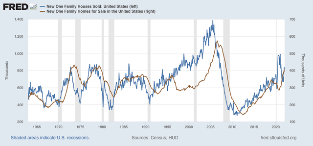
Finally, in the case of new houses, prices lead inventories. The below graph compares sales with new homes for sale (brown), minus the most recent months:


Here is a close-up of the past five years:


The inventory of new single family houses for sale increased to 407,000 in February, the highest number since summer 2008, and before the housing bubble previously exceeded only during the 1970s.

The housing market has begun its turn downward. In keeping with my mantra, we should expect the continued rise in mortgage rates to lead to a renewed decline in new home sales and construction, continued deceleration with price increases (and an increasing chance of outright price *decreases*), and a continued increase in the inventory of new houses for sale.

Finally, the double whammy of continued price increases, and the sharp rise in mortgage rates has major ramifications for overall housing affordability. I wrote about this already over a month ago, and mortgage rates have only continued to rise since. How close are we to housing-bubble style nosebleed territory? I plan on addressing that on Friday.

Tuesday, March 22, 2022

The US Treasury yield curve is on the verge of inverting


 - by New Deal democrat


My graphing issue hasn’t resolved yet. Fortunately there is no big new economic news today, and there is something I’ve been following with particular interest in the past week that doesn’t require any graphing: namely, the Treasury bond yield curve is on the verge of inverting.

Normally, we should expect to see increasing yields the longer the maturity. This is pretty simple stuff: if I lend you money for a longer period of time before you have to pay it back, I’m taking a bigger risk, so I should get paid more in interest to take that risk. An inverted yield curve means that there are shorter maturities yielding higher interest than longer maturities. It’s well-documented that when the yield curve inverts, especially over a broad range from a few months out to 10 or more years, it is a harbinger of an economic downturn, typically 12 to 24 months later.

As of this morning, here are the yields on US Treasuries from 3 months to 30 year maturities. The curve is inverted at 3 maturities, marked with asterisks:

30 year: 2.570%
20 year: 2.693%*
10 year: 2.337%
7 year: 2.381%*
5 year: 2.360%
3 year: 2.365%*
2 year: 2.170%
1 year: 1.364%
6 month: 0.973%
3 month: 0.563%

I’m not terribly concerned about the 20 year (paying less than the 30 year) or 7 year (paying less than the 10 year) inversions. Neither the 7 nor 20 year bonds are heavily traded. At the moment we’re having a flight to liquidity due to the Ukraine invasion, so the 10 and 30 year bonds have lots of increased buying.

By the way, if you want to see what the yield curve looks like at the moment (since I can’t show you the graph), you can see it at this link.

The 3 to 5 year (and 10 year) inversion will be more concerning - if it sticks. For the past week, the 3 year Treasury has paid more than the 5, or for that matter, 7 or 10 year Treasury multiple times *during* the day, but at the end of the day has always settled at a yield lower than the longer maturities. I am writing this during the morning, so once again there is an intraday inversion.

A 3 to 5 year inversion has historically been one of the earlier maturities to invert, and more often than not, heralds an inversion spreading out along the midrange of the curve. This means, basically, that buyers expect Treasuries to pay more over the next several years than the anticipated long term norm, i.e., the Fed will continue to tighten, credit will be tight, and interest rates will ultimately recede due to slackening consumer demand, typically brought about by higher unemployment and a recession.

We’re not there yet. But stay tuned.

Monday, March 21, 2022

Coronavirus Dashboard for March 21: the likely course of BA.2 in the US


 - by New Deal democrat

[Note: I am having a major issue with formatting photos today, which will be readily apparent. I will fix this as soon as I am able.]

This is the second part of my discussion of the likely US trajectory of the BA.2 Omicron subvariant. Part one was Friday, and if you missed it, here is the link.

First, a brief update. Cases in the US are now slightly below 30,000. This is the lowest since last August except for two days after Thanksgiving. Deaths have declined to 866. If deaths, like cases, decline over 96% from their Omicron peak, that will mean there will be only about 100 deaths per day in about a month.

To quickly refresh, there have been many warnings about the new BA.2 wave which has overtaken much of Europe, specifically including the UK, and warning that the same is in store for the US. 

The truth appears to be more complicated.  As I wrote on Friday, “the data she has collected demonstrate that BA.2 is very much an Omicron, rolling in and out like a tsunami. Like BA.1, the BA.2 variant causes peak infections by or very shortly after it approaches 100% of all infections.” To cut to today’s chase, the course of BA.2 in any given area depends on the level of previous infection by BA.1:

- Where BA.2 overtook BA.1 very quickly, there was only 1, more intense and longer lasting, wave. 
 - Where BA.2 only overtook BA.1 after a long time, there were relatively few people left who BA.2 could reach, resulting in a “long tail” of declining cases, but no new wave.
 - Only where BA.2 overtook BA.1 after its peak, but - probably because of better mitigation efforts - there were lots of people left who BA.2 could reach, has there been a new wave. The 

Let’s start with the 26 countries in the EU. Like me, you’ve probably seen the graph showing cases rising sharply in some EU countries. Here’s what the entire Union, plus the UK, looks like:

1. There are a number of countries in the EU - Norway, Sweden, Denmark, Poland, Lithuania, Latvia, Estonia, Hungary, Bulgaria, Czechia, and Spain - where no increase has happened at all, and in fact cases are decreasing.

2. There are 15 countries where cases bottomed and started increasing between February 24 and March 9, the majority of which were between March 1 and March 3.

3. Of those 15, 6 - Ireland, Belgium, the Netherlands, Cyprus, Finland, and Portugal - appear to have already peaked, generally about 2 to 2.5 weeks after the increase began. Their increases varied but generally were in the range of a 75% to 100% increase from a low level (I.e., don’t freak out over the percentages).

4. That leaves 9 of 20 European countries still increasing, less than 3 weeks after the new “waves” began. In several of those - the UK, Germany, Austria, Greece - the rate of increase appears to have slowed substantially. In the remaining 5, notably in France and Italy, the wave is continuing in full force.

So let’s be clear: BA.2 has not started a new “wave” everywhere. And where it has caused a new wave, it appears to be short, as in 2 to 4 weeks from trough to new peak.

Like Friday, I am indebted to Emma Hodcraft, Ph.D. of the Institute of Social and Preventive Medicine at the  University of Bern, Switzerland, on whose data of infection prevalence by variant for many countries and for all jurisdictions in the US is found at Covariant.org, for the below information, including graphs.

Let’s start with Scenario 1: Where BA.2 overtook BA.1 very quickly, there was only 1, more intense and longer lasting, wave.

Here is a graph for Denmark, in which the BA.2 variant almost completely replaced BA.1 no later than the end of February, after only a short time (about 1 month) during which BA.1 was dominant:


Now, here is the graph of cases in Denmark:


As you can see, the uptrend lasted longer than in most countries. But Denmark has had an uninterrupted downtrend since.

Similarly, here is her graph of the US territory of Guam in the Mariana Islands:


And here is Guam’s case graph (note that Guam only peaked at the end of January, and its peak lasted 3 weeks, vs. the shorter, sharper peaks in states that will be discussed below):

G

Similar trends occurred in the Nordic countries of Sweden and Norway, and in India and the Philippines.

But perhaps the poster child for this is South Africa, which famously was the first country in which BA.1 was identified. The wave lasted a slightly longer time, but was supplanted by BA.2 two months ago:


Here are cases for South Africa:


South Africa hasn’t experience a new wave, either; just a “long tail” of a slow decline in cases which remains significantly above their level before BA.1 struck.

This brings us to Scenario 2: Where BA.2 only overtook BA.1 after a long time, there were relatively few people left who BA.2 could reach. A good example of this is Spain:


Spain’s experience with BA.1 has lasted over 3 months, and BA.2 is only gradually taking over:

Here is Spain’s level of cases:


Spain is still experiencing a slow decline, with no sign of a BA.2 wave, even though BA.2 currently makes up over 1/3rd of all cases.

Next, let’s look at Scenario 3: where BA.2 overtook BA.1 after its peak, but - probably because of better mitigation efforts - there were lots of people left who BA.2 could reach, has there been a new wave.

This is best demonstrated by one of the present scary examples, the UK. According to the most recent UK government data I have seen, BA.2 accounts for 90% or more of all new COVID infections. It should be essentially 100% within about a week. Here is the relevant graph:


And here is the UK’s case count:


Here is the week over week change in average daily cases:


As you can see, the rate has slowed already in the past few days. In the last 5 days, cases are only up 10%, vs. 50% 5 days ago.

In other words, the countries of Europe where there is a new, identifiable BA.2 wave are ones where the BA.1 wave did not last as long, or was not as intense, as others. BA.1 had peaked, but had not yet burned through the vulnerable population.

In contrast, the original Omicron wave began in the UK only about 5 days before that in the US. But the UK’s peak began 8 days before the US, and lasted only about 6 days before beginning a sharp decline, vs. 15 days in the US:


And here is the US’s graph of the prevalence of BA.1 and BA.2:


BA.1 hit hard and lasted 3 months before BA.2 started to kick in. In other words, the US’s graph looks closest to Spain’s, where there has been no BA.2 wave, just a long tail of slow decline.

Let’s look at a few US States. BA.2 is already a majority of cases in Connecticut:


After a brief uptick almost two weeks ago, Connecticut has fewer cases than at anytime except for summer 2020 and summer 2021.

Currently BA.2 is running over 33% in NY:


New York has begun to show an increase in cases over the past week:


Finally, here is Florida:


BA.2 has barely begun there, and cases continue very low:


Put this together and I am expecting BA.2 to result in an experience between that of the UK and South Africa: an increase in cases, but not so pronounced as in the UK, where cases doubled in the first half of March. Once BA.2 becomes virtually 100% of all US cases, probably around late April, cases will recede again.