Thursday, February 17, 2022

Housing permits jump; the last hurrah before mortgage rates bite?


 - by New Deal democrat


This morning’s report on January housing permits and starts highlighted the unique divergence between the two. As I have often pointed out, permits are the more leading and less noisy of the two reports, so I usually highlight them, especially single family permits.

But in the past year there has been a marked divergence in trend between the two data sets, as permits soared then sank, while starts have been much more steady. The explanation for the divergence is the huge number of housing units for which permits have been taken out, but on which construction has not started. In January that was 280,000 on a seasonally adjusted basis (red), the highest such number since non-seasonally adjusted records (blue) began in 1974:
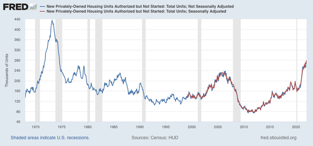

There are simply a huge number of units that *could* be started, but haven’t, probably because of a shortage of some necessary materials (I’ve heard, e.g., that windows are particularly in short supply).

With that in mind, below are total housing permits (blue), total starts (gray), and single family permits (red, right scale):
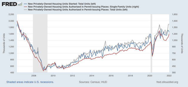

As you can see, there was a surge in permits one year ago, which then declined sharply. Total permits have risen again, to 1.899 million annualized, the highest number since September 2005. Single family permits also rose to 1.205 million, a one year high, but below January 2021’s high of 1.268 million.  

Starts, on the other hand, declined to 1.638 million. I deal with that by averaging the last 3 months, which makes the number much less volatile. That average, 1.683 million, is the highest number since September 2006. A close-up of the three series since 2019 is below, better to show that actual starts have varied around 1.600 million in the past 12 months:
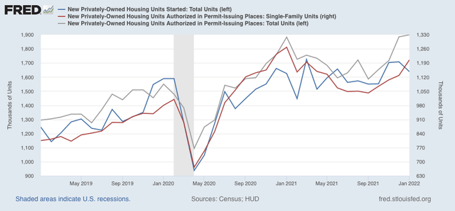

Since starts are the actual, hard economic activity, this indicates that housing is still a positive for the economy looking out ahead 12 months.

A big surge in housing permits in the face of rising mortgage rates, at least initially, is not really a surprise. The same thing happened several times in the past decade, notably in early 2014 and 2016, as potential buyers rush to close before rates climb even higher. Housing (blue and gray below, /10 for scale) does follow mortgage rates (red), but with a 3 to 6 month lag as shown in the graph of the YoY% change in each for the past 10 years, which I have run many times in the past:
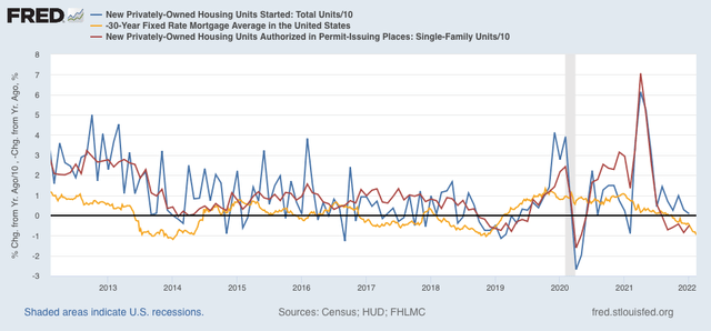

After this surge, which may persist another month or so, I fully expect housing starts and permits to decline, and substantially, in accord with the big increase in mortgage rates to over 4%, about 1.3% above their 2021 lows.

Jobless claims essentially steady; we have probably seen the low for this expansion


 - by New Deal democrat

[Programming note: I will post about housing permits and starts later this morning.]

Since the crisis in jobless claims is long past, I will keep this note brief.


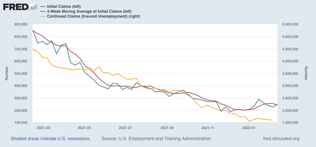
Initial claims (blue) rose 23,000 to 248,000 (vs. the pandemic low of 188,000 on December 4). The 4 week average (red) declined 10,500 to 243,250 (vs. the pandemic low of 199,750 on December 25). Continuing claims (gold, right scale) declined 26,000 to 1,593,000 (vs. the pandemic low of 1,555,000 on January 1):


It is possible there is some unresolved seasonality due to the pandemic that affected the November and December numbers. It is also likely that the Omicron wave has led to some increased layoffs - which should pass as the wave continues to recede sharply to pre-Omicron levels.

Still, I suspect we have seen the lows in initial claims for this expansion. The increase isn’t enough to be of concern, but on the other hand this is consistent with job growth decelerating this month and the next several months.

Wednesday, February 16, 2022

Retail sales and industrial production both positive for January; but expect an employment slowdown in the coming months


 - by New Deal democrat

Over the past few months, one of my repeated refrains has been that a sharp deceleration beginning with the consumer sector of the economy is more likely than not. In December, that showed up in spades in retail sales, although that was clearly influenced by people front-loading Christmas purchases into October and November.

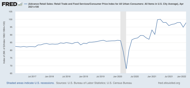
This month it completely reversed. Retail sales, one of my favorite “real” economic indicators, rose sharply in January, up +3.8% for the month before inflation. After inflation, “real” retail sales were still up +3.1% for the month, although they are still down -2.2% from last April’s peak: 


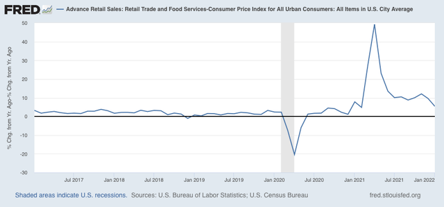
On a YoY basis, real sales are up 5.4%. This is the lowest comparison since last February, but still a very good number over the long term:


Note that these comparisons almost certainly will turn negative in March. Probably more important is that, as shown in the first graph above, they have been esssentially flat since last April. That’s not recessionary, but it’s not good either.

In short, this report remains consistent with a slowdown in the consumer sector of the economy.

Next, let’s turn to employment, because real retail sales are also a good short leading indicator for jobs.

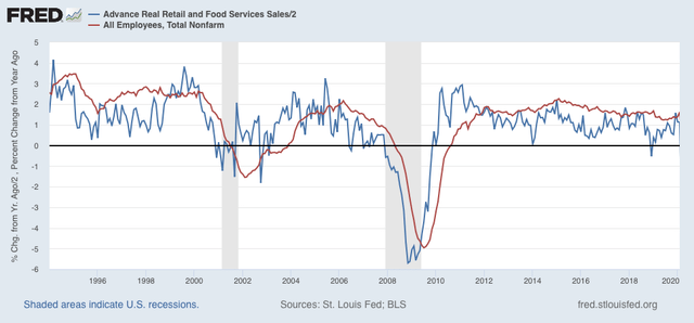
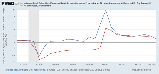
As I have written many times over the past 10+ years, real retail sales YoY/2 has a good record of leading jobs YoY with a lead time of about 3 to 6 months. That’s because demand for goods and services leads for the need to hire employees to fill that demand.  The exceptions have been right after the 2001 and 2008 recessions, when it took jobs longer to catch up, as shown in the graph below, which takes us up to February 2020:


Now here is the same graph since just before the pandemic hit:


The two had been right in line during the latter half of 2021. With real retail sales slowing down considerably in the last two months - and with the expectation that they will go negative for at least a couple of months in March and April - I expect the string of monthly jobs reports averaging 500,000 or more will shortly end, although maybe not for several more months. Whether we get a negative print at some point in spring or early summer will depend on whether sales, measured from last April, continue to go sideways, improve, or deteriorate.

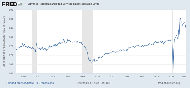
Finally, real retail sales per capita is one of my long leading indicators. Here’s what it looks like for the past 30 years:


With a -3.0% decline since April, this remains a negative signal, and reinforces the long leading forecast of a stall or near-stall in the economy by about the end of this year.

—-

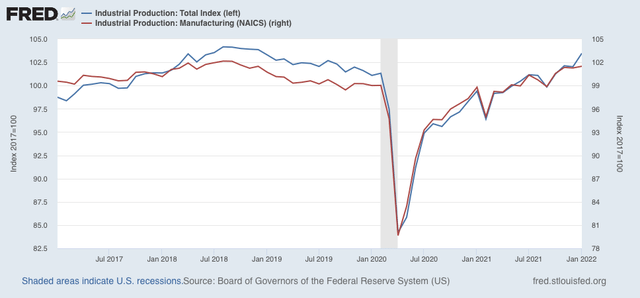
Let’s also take a look at this morning’s report on January industrial production. This was also positive, as total production increased 1.4%. However, the big increases were in utilities and secondarily in mining. Manufacturing production only increased 0.2%. Here are the index values for the past 5 years:


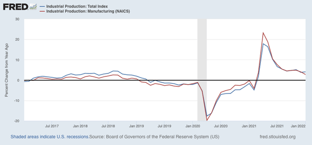
Both are significantly higher than they were just before the pandemic, but slightly below their 2018 peaks. The YoY% comparison shows a slight deceleration trend:


Industrial production is the pre-eminent coincident indicator, telling us that at present the economy is performing fairly well.

Tuesday, February 15, 2022

Coronavirus dashboard for February 15: the most optimistic I have been in months


 - by New Deal democrat

The current trend in both cases and deaths in the US has me the most hopeful I have been in over 6 months. Here’s why.

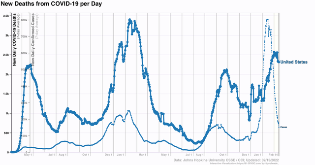
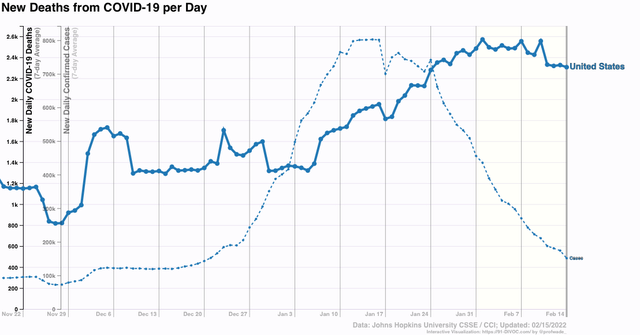
Nationwide, cases have declined to 150,000, only 30,000 above their level just before The Omicron wave started, and about 10,000 less than their Delta peak:


The Omicron wave has been almost completely symmetrical. Cases started to rise exponentially roughly on December 15. They peaked about 4.5 weeks later. Now, about 4.5 weeks after that, if the current trend continues the US will be below its level of December 15 within a week from now. Meanwhile, deaths have declined slightly to 2300 from their peak of roughly 2500 a week and a half ago. Further, in a comparative sense only, Omicron has been mild-er than previous waves, with more than 3x the number of infections at the US’s previous peak one year ago, but 25% fewer deaths, and only about 20% higher than their Delta peak. Still, as the graph shows, the US currently is at a level far above its summertime 2020 and 2021 levels.

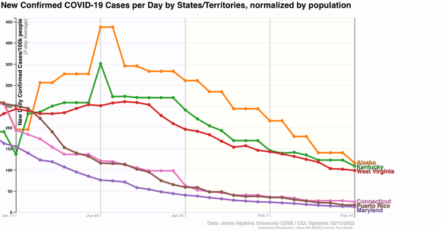
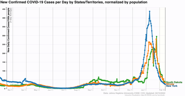
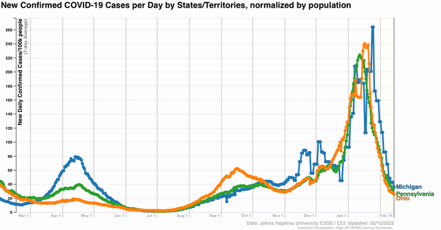
As usual, there is a big divergence among the States in the course of the current wave. The worst States are still reporting over 100 cases per 100,000 population daily. the best, plus Puerto Rico, are between 12 to 25 cases per 100,000:


More granularity, here’s a list, plus relevant exemplar graphs, of where the 50 States plus DC and Puerto Rico fit in.

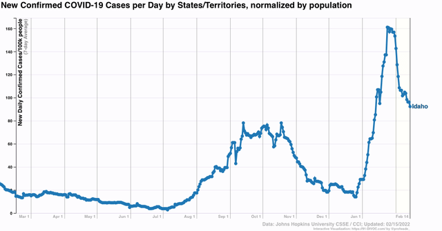
(1) State with less than a 50% decline: ID


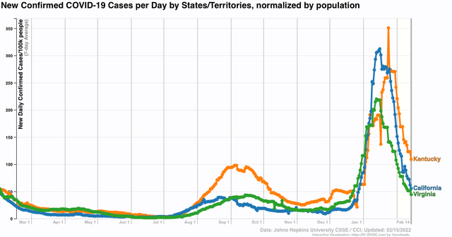
(9) States with greater than 50% declines, but still above their Delta peak: AZ, CA, KY, MT, NM, NC, OR, VA, WA


(22) States below their Delta peak, but not below their level pre-Omicron: AL. AK, AR, CO, FL, GA, HI, KS, LA, MN, MS, MO, NV, ND, OK, PR, SC, TN, TX, UT, WV, WY


(16) States below their level pre-Omicron: CT, DE, DC, IL, IN, IA, MD, MS, NE, NH, NJ, NY, RI, SD, VT, WI 


(3) States below both their pre-Omicron and pre- Delta onset levels: MI, OH, PA


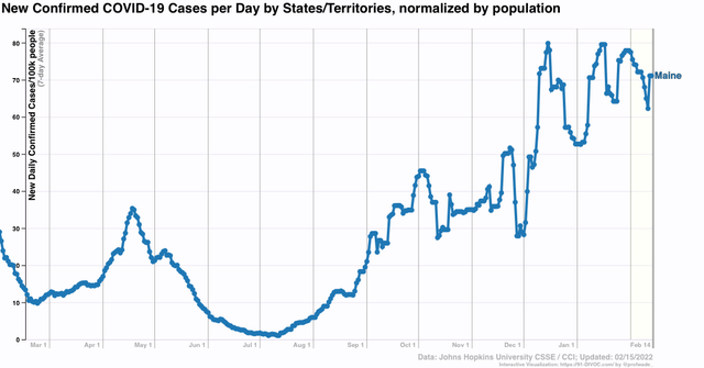
(1) sui generis: ME, which never really had an Omicron wave, but was caught in the middle of its Delta wave when Omicron hit:


Finally, let’s take another look at cases and deaths per capita in the US focused on the last 8 weeks:


Cases have been declining at roughly 40% per week. *If* they continue to decline at that rate, the US is going to be completely below its pre-Omicron level within a week, and back to its summertime 2020 and 2021 levels within 3 weeks.

Further, the CDC’s latest report shows that Omicron has all but eliminated Delta, which was responsible for 0.0% of cases (!) in their latest weekly report. In other words, there is every reason to believe that deaths, which have lagged cases by about 3 weeks or so since the onset of Omicron, are going to fall all the way to about 500 per day by March 10.

This is about the best, most hopeful data trend I have seen since the Delta wave started last July. Half a year ago, I thought that once Delta had burned through all the dry tinder, and once vaccinations increased enough, by this spring we might be returning to something at least close to normal. It may very well be that Omicron wound up doing the deed instead. If so, I certainly expect more variants and more waves; but it could very well be that future waves are going to be significantly smaller than either Delta or Omicron, especially in terms of deaths.

A note on producer prices and (possibly) cooling inflation


 - by New Deal democrat

[Programming note: I will hopefully have an updated Coronavirus dashboard up later today.]

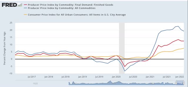
One point I make from time to time is that, with seasonally adjusted data, YoY comparisons can miss, or at least lag, turning points. We *may* have such a situation developing with producer prices as evidenced by this morning’s report.


On a YoY basis, producer prices for finished goods (red in the graph below) are up 12.5%, while commodity prices are up 19.3%. Consumer inflation, released last week, is up 7.5%:


Commodity and producer price inflation is off slightly from its level of 13.5% in November.

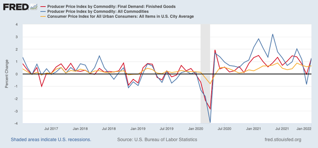
When we look at the month over month increases, we see that there has been a decided cooling in the price increases in the past several months compared with last spring, summer, and early autumn:


*If* this continues, then YoY inflation is going to decelerate sharply in the next few months, back towards more “normal” levels. And since commodity prices tend to lead producer prices, which frequently (but not always!) lead consumer prices - which unlike commodity and producer prices were still rising on a YoY basis in January - then we could see a return to more normal consumer inflation later in the year.

Which means the Fed shouldn’t overreact and slam on the brakes this spring.

Monday, February 14, 2022

The return of the “Oil Choke Collar”!


 - by New Deal democrat


For the first five years after the end of the Great Recession, one of the staples of my analysis was the concept of the “oil choke collar.” By that I meant that typically recessions had occurred after there was a sudden and sharp upward spike in the cost of gas, inflicting such pain that consumers cut back drastically on other spending - causing a prompt economic downturn. But what if, instead, gas prices rose more gradually to the pain threshold? Then we could expect consumers to react less drastically, cutting back marginally on other purchases. The economy would slow, gas prices would retreat, the pain would go away, and consumers would resume their prior purchases. And repeat. 

In other words, gas prices would act as a “choke collar” on the economy, biting and relaxing as consumer purchases waxed and waned. There would be no recession, but no great growth either.

And then, in 2014, gas prices fell precipitously from $3.75 to just over $2 a gallon. That put an end to the oil choke collar!

Is it coming back? Last week I wrote that gas prices had increased almost 30% above their average level of the past 5 years, And so I anticipated some consumer distress.

I mentioned the idea in my “Weekly Indicators” column, which caused several long-time readers to pipe up and ask about the status of the “oil choke collar.”

So let’s take a look.

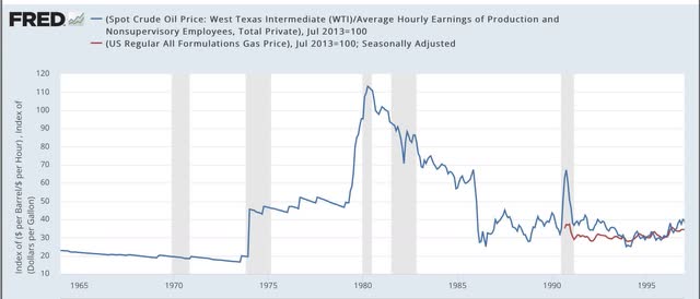
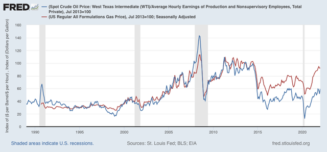
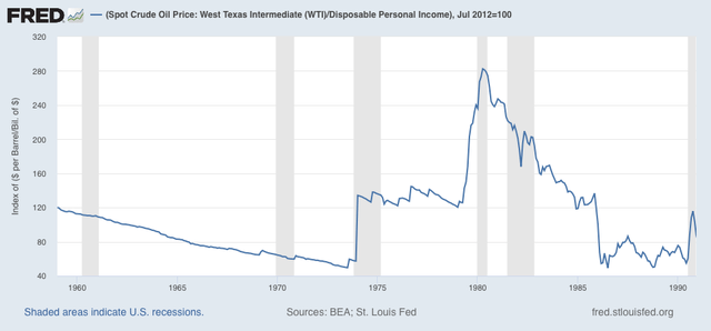
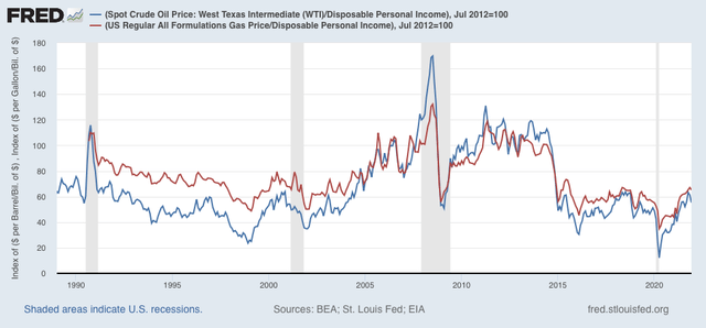
The “oil choke collar” does not depend upon the absolute price of gas, but rather it’s relationship to spending. There are at least 3 ways of comparison: (1) to average wages, (2) to disposable income, and (3) to GDP. The first two are measures of the hit gas purchases make to consumers’ wallets, and the third measures against the entire economy. Below I’ll look at each in turn. Note that weekly gas prices weren’t compiled until after 1990, so for the period before that I use Texas crude spot prices only.

1. Vs. wages

1972-97:


1997-2022:


The OPEC oil shocks of the 1970’s, the Kuwait invasion shock of 1990, and the 2006-08 shocks stand out. In addition to the 2010-14 period, the 1975-79 period also stands out as a period of a “choke collar,” with consistent elevated prices that mainly went sideways, operating as a depressant on the economy without causing recessions.

Measured in terms of gas prices (not oil prices), we are about 10% below the price where the “choke collar” would take effect.

2. Vs. Disposable personal income

This is an even better comparison than just against hourly wages, since it measures the hit to discretionary spending.

1957-90:


1991-2022:


Note that I’ve normed both graphs to 100 as of July 2012, a typical month of the “oil choke collar” period. We see that any sudden sharp move substantially above 100 has been consistent with a recession, while periods oscillating about 100 are eras of subpar growth. The current value is just over 65% for gas prices, meaning they would have to rise to about $4.25 a gallon for the “choke collar” to engage.

3. Vs. GDP


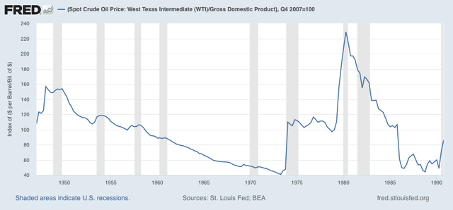
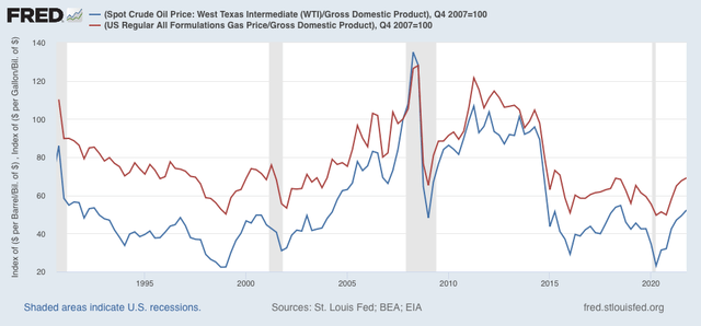
Oil analyst Steven Kopits in the past has written that every time Oil prices rise to a level of 4% or more of GDP, a recession has followed. The below graphs norm that to 100 as displayed.

1957-90:


1991-2022:


Once again we see that every time this metric shoots suddenly past 100, a recession has occurred. The two times it has oscillated around that point - in the later 1970s and 2010-14 - there has been no recession, but growth has suffered.

The metric for gas prices currently measures at roughly 70. Again, gas prices of roughly $4.25 a gallon would engage the “choke collar,” equivalent to about oil prices at $125/barrel.

As I write this, oil prices are about $93/barrel, and gas prices are about $3.50/gallon. As I wrote last week, because this is a big jump compared with the last 5 years, I expect there to be some consumer distress. But we aren’t at the point of engaging the “oil choke collar” yet.

Saturday, February 12, 2022

Weekly Indicators for February 7 - 11 at Seeking Alpha


 - by New Deal democrat

My Weekly Indicators post is up at Seeking Alpha. 

Last year my task was easy, because the issue was whether to describe the economic Boom as “red hot” or “white hot.” With interest rates having risen between 1/2% or 1%, depending on which type being measured, and inflation having eaten up wage increases, the task this year is more challenging.

But the end of a Boom does not mean the onset of a recession. The DOOOMers are already out and baying; as usual they will be wrong.

To see where we are at now, and where we are headed over the near term, click on over and read. It will inform you and invest me with a couple of $$$.

Friday, February 11, 2022

Real wages continued to stall in January, portending a consumer slowdown, but don’t reverse


 - by New Deal democrat

Let me follow up on yesterday’s post about the January CPI by talking about “real” wages.

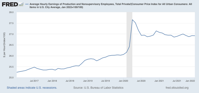
Since both average real hourly wages and consumer inflation increased in January by 0.6%, real hourly wages for non-supervisory workers were flat month over month:


Real wages have been essentially flat since June 2020, with the exception of last winter and September. That isn’t good, but it isn’t recessionary either.

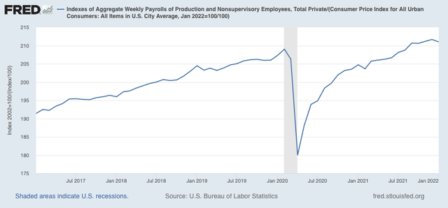
Now let’s turn to real aggregate payrolls, which are an overall measure of consumer health. These declined by -0.3% for the month. But, due to the annual revisions in the household survey from which they are derived, December 2021 was their new all-time high:


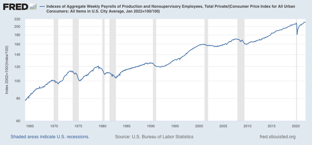
For the past 50+ years, only when aggregate real wages have retreated from peak for 3 to 9 months, has recession typically followed:

So, a blip, but not bad news.
The conclusion I have written for the previous 2 months continues to be true now, with only slight modifications: while real wage growth has halted, depending on which measure we use, it has not gone into reverse. This is consistent with taking a near term recession off the table for now. On the other hand, we certainly are at a point where a deceleration beginning with the consumer sector of the economy is more likely than not.


Thursday, February 10, 2022

Jump in January consumer prices seals the deal on Fed interest rate hikes


 - by New Deal democrat

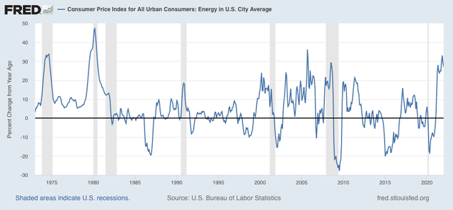
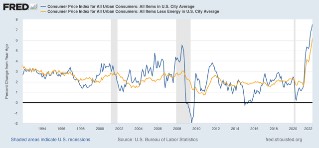
Consumer prices increased 0.6% in January, the third time in four months that it has come in over 0.5%. Energy increased 0.9%, which isn’t a horrible monthly rate, but YoY energy prices for consumers are up 27%, just below their YoY peaks in 1974, 1979, 2005, and 2008 - not coincidentally 3 out of 4 of which coincided with deep recessions: 

YoY inflation is now 7.5%, the highest rate since 1982. My favorite measure, CPI ex energy, is also up 5.6% YoY, and tied for the worst since the 1981-82 recession as well:


My rationale for tracking CPI ex-energy is that, unless energy costs filter through into the broader economy, there is no cause for alarm. But if the wider economy shows a sharp increase, then there is likely to be aggressive action by the Fed to bring the rate of inflation down, and that means slowing the economy, or even putting it into reverse.

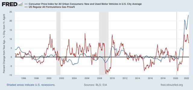
Inflation in new and used vehicle prices rose 0.9% in January, and 23.3% YoY, an all-time high (compared with gas prices, red):


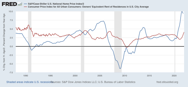
As I have forecast for months, house price increases (blue, /2 for scale) have continued to feed through into rents and “owners equivalent rent”(red), which constitutes 1/3rd of the entire inflation index, and in turn has also continued to increase, and is now up 4.1% YoY:


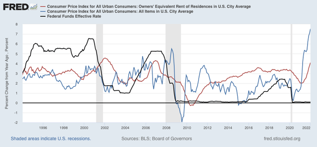
What happened in the case of both prior cases where owners equivalent rent surged after house prices did - 2000 and 2006 - the Fed stepped in and raised rates aggressively, in both cases resulting in recessions, which in turn caused the rate of overall inflation to decline:


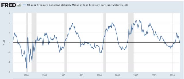
This report all but seals the deal on the Fed raising interest rates in March. It increases the odds of a more aggressive .50% increase rather than a baby-steps .25% increase. I hasten to point out that, so long as the yield curve does not invert, the Fed can still achieve its desired result of a decline in inflation, without causing a recession - and the current spread between the 10 year and 2 year bond is consistent with an economy 2 or 3 years before a recession hits:


Unfortunately, hindsight being 20/20, the Fed allowed itself to fall behind the curve. When house prices increased over 10% YoY consistently in early 2021, it should have realized that this was going to filter through into the broader measure this year, and begun laying the groundwork for tightening then, and probably begun to tighten slowly by the end of last summer.  Now it is probably too late. But the Fed, like me, probably assumed that the US population would be fully or nearly fully vaccinated by last autumn, bringing the pandemic to an effective end, thus bringing labor and supply shortages to an end as well. 
 
I’ll discuss the effect of this report on wages tomorrow.

Jobless claims bounce along near their bottom


 - by New Deal democrat

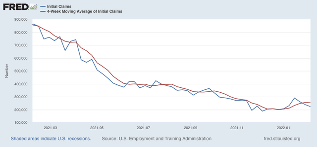
New jobless claims declined 16,000 to 223,000 last week. This is still 35,000 higher than the low of 188,000 set on December 4; but on the other hand is remains among the lowest weekly figures for the past 50 years. The 4 week average declined 2,000 to 253,250, which is 53,500 above its 199,750 low set on December 25:
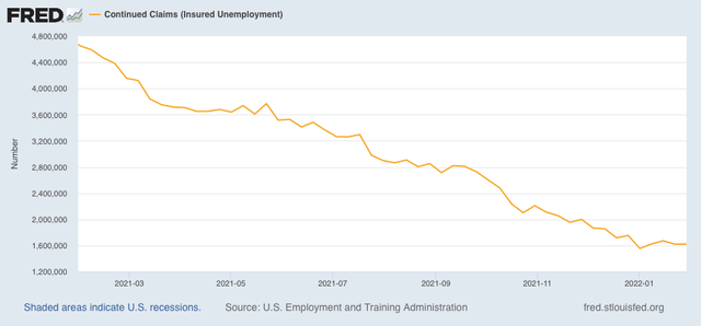


Continuing claims were unchanged at 1,621,000, 66,000 above their low of 1,555,000 set on January 1:


I suspect we have set the lows for this economic cycle. On the other hand, I don’t see any particular reason for jobless claims to rise out of their recent range below 250,000 anytime soon, pandemic permitting.
Programming note: I’ll report on the January consumer inflation number later this morning.

Wednesday, February 9, 2022

Gas prices sound a consumer warning


 - by New Deal democrat

I got a note yesterday from a fellow forecaster pointing out that crude oil prices have once again made new 7 year highs. This is something I also highlighted in my “Weekly Indicators” column on Saturday. As I write this on Wednesday morning, West Texas Intermediate Crude trades at slightly under $90/barrel, yet another new 7+ year high. 


How much trouble does this portend for the economy? Potentially, a lot.

Prof. James Hamilton (of Econbrowser) pointed out over a decade ago that big increases in gas prices had preceded 10 of the 11 recessions in the US since the end of World War 2. Although I can’t find the article right now, my recollection is that Hamilton’s model is calibrated to gas prices to spiking to a new all-time high. Obviously, at about $3.40/gallon right now, we’re nowhere near 2008’s $4.25/gallon, when average hourly wages were 33% lower than they are now.

But it strikes me that the model shouldn’t *require* new all-time highs. Suppose prices had been $2/gallon for 20 years, and then rose to $3/gallon suddenly? That obviously would be nowhere near a new all-time high, but many consumers would long ago have come to accept $2 as the “normal” price, and probably would react almost as strongly as if prices had made a new high.

So I went back and calculated current gas prices now, and in the half-year coinciding with past recessions vs. the 5 year previous average of prices. Before I show you how that came out, let’s look at a historical graph.

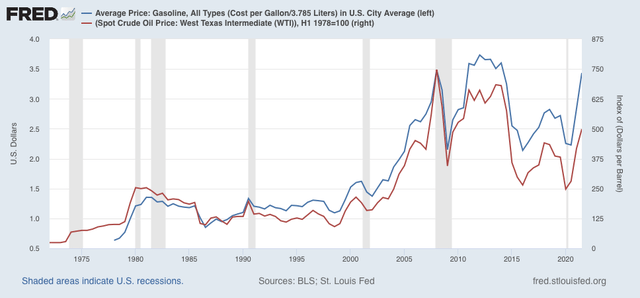
Gas prices have been published only since 1978. In order to include the oil shocks of 1974 and 1979, we need to use oil prices, the records of which go back to World War 2 and before. Here’s what the semiannual prices of each look like:


When we compare gas prices in the 6 months just before past recessions vs. their 5 year previous average, here’s what we get:

1990: $1.33 vs. $1.01, up 32%
2000: $1.48 vs. $1.13, up 31%
2008: $3.45 vs. $2.21, up 52%

We don’t have 5 full years of gas prices before 1980, but using the data from its beginning in January 1878, we get:

1980: $1.27 vs. $0.74, up 71%

Since we can see from oil prices that gas prices were on par or even lower than 1978 during the 3 previous years, the shock in 1980 would be higher than 71% (from personal recollection, gas prices doubled or more after the 1979 oil shock started, which is also what they did in 1974).

Now let’s look at the current comparison:

2021: $3.25 vs. $2.53, up 28%
January 2022 vs. previous 5 years: $3.32 vs. $2.58, up 28%

The current increase of 28% compared with the previous 5 years is very close to the 30%+ that coincided with the onset of previous recessions. It’s important to point out in that regard that the 1990 recession just barely coincided with a new all-time high, since at $1.33, they were only $.04 higher than 1980’s $1.27.

Generally, the way we would expect gas prices to trigger a consumer recession is by consumer’s cutting back on non-gas purchases, perhaps even to a greater amount than the added $$ spent on gas. The below two graphs show that two ways.

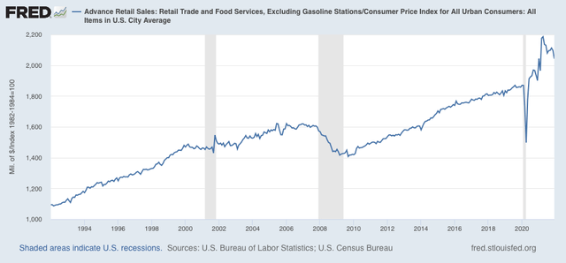
First, here are retail sales ex-gasoline adjusted for the overall consumer price index (note this series only begins in 1994):


Non-gas purchases turned flat in the year just before both the 2001 and 2008 recessions. They didn’t do that for the sui generis pandemic recession.

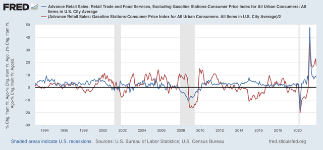
Next, here is the YoY% change comparison between non-gas (blue) and gas (red, /2 for scale) purchases:


Before both the 2001 and 2008 recessions, YoY non-gas purchases, adjusted for inflation, were down, while gas purchases YoY were still higher.

At the moment, both are still significantly higher YoY. But that is going to change drastically starting in March, with the comparisons against last spring’s stimulus-fueled spending.

Just one indicator, and none of my indicator arrays are forecasting recession this spring. But they are forecasting a slowdown by summer, so at very least if gas prices remain at these *relatively* high levels, or increase further, I expect significant consumer distress to show up.

Tuesday, February 8, 2022

Coronavirus Dashboard for February 8: Omicron declines sharply; did Delta provide protection against the worst outcomes?


 - by New Deal democrat

As I mentioned yesterday, I haven’t posted a Coronavirus dashboard in awhile, and with Omicron in rapid retreat, it’s time for an update.


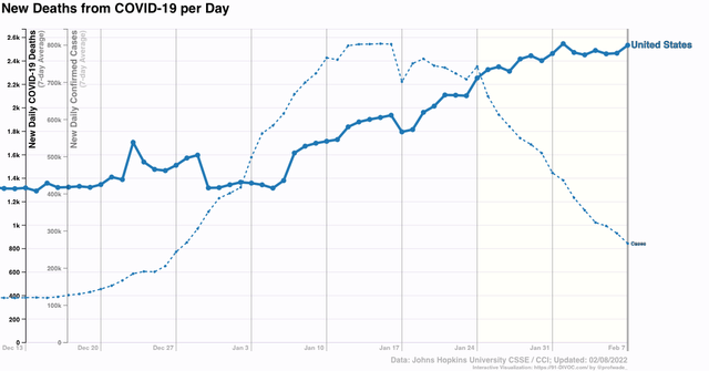
To begin with, deaths are presently peaking at roughly 2450 a day, while nationwide cases are down almost 2/3’s:


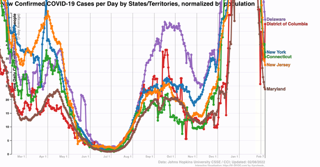
There are over a dozen States where numbers are now down close to, at, or even below their pre-Omicron outbreak levels. In particular, the Northeast region and Puerto Rico down over 85%. NY, NJ, CT, DC, DE, and MD  are at the same level as they were last April, well below their winter 2020-21 peaks, and as of yesterday were still declining with no signs of stopping. *If* the current rate of decline of 50% per week is maintained, they will be at last June’s lows in about 4 weeks:


One thing that is somewhat surprising is that the relative rates of cases from Omicron does not correlate that strongly with previous vaccination rates. To cut to the chase, a previous bad Delta outbreak may have provided some protection against Omicron.

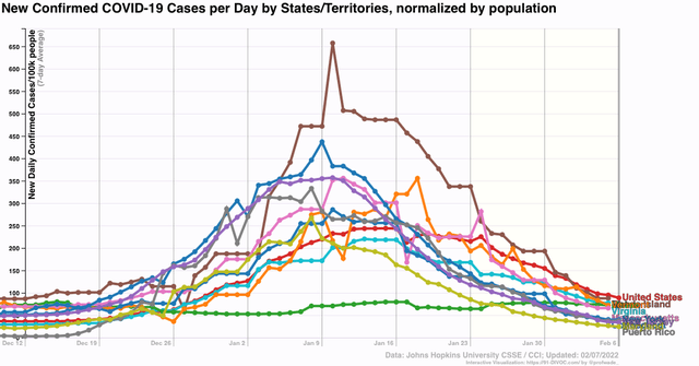
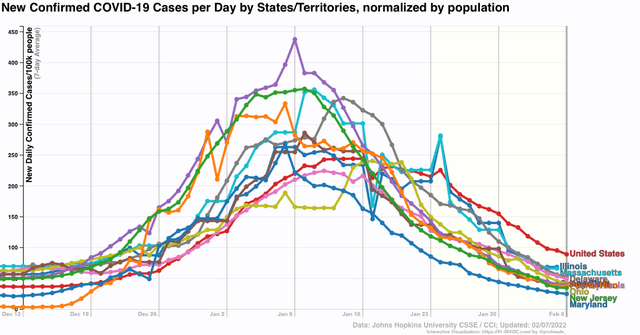
Here are the last 8 weeks (basically the time since Omicron hit) for the 10 most vaccinated (with 2 or more doses) jurisdictions, compared with the nationwide level (in red):


Note that many of them had substantially worse Omicron outbreaks than the average.

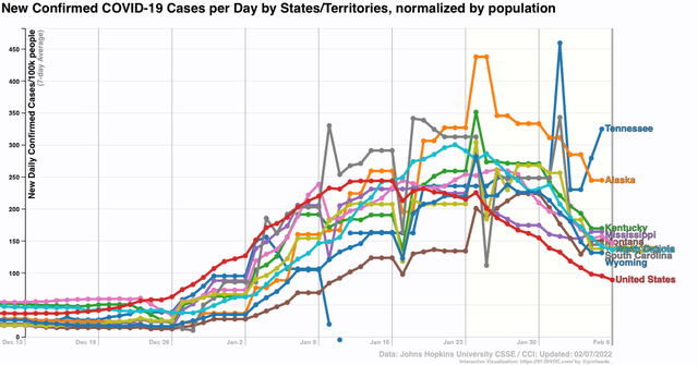
And here are the 10 least vaccinated jurisdictions:


Many of these had *lower* numbers than the national average.

It appears that the heavily vaccinated jurisdictions, being urban travel hubs, were exposed to Omicron first, and are further along in their declines, while the least vaccinated jurisdictions tend to be more rural, were hit later, and are declining less so far (and Tennessee is still increasing!). This pattern is more evident when we compare the jurisdictions with the lowest current rates of infection:


With those having the highest current rates of infection:


Again, urban areas were hit earlier, and have declined from peak more sharply than more rural areas.

The pattern is similar when we turn to deaths. For the US as a whole, total deaths in the past 8 weeks average 31.3 per 100,000.

Here’s the death rates for the 10 most vaccinated jurisdictions (including PR, but not DC):

PR (80% vaxxed) (20.9 deaths per 100,000)*
VT 80% 19.4*
RI 79% 37.5
ME 78% 31.0
MA 77% 39.5**
CT 77% 33.3
HI 76% 11.9*
NY 75% 39.0
NJ 73% 38.2 
MD 73% 40.8**

And here is the same for the 10 least vaccinated jurisdictions:

AL 49% 22.6
WY 50% 30.8
MS 50% 31.0
LA 52% 22.1 
AR 53% 32.6
TN 53% 47.8**
GA 53% 24.3
IN 53% 54.9**
ND 54% 24.7
MO 55% 35.1

*among 10 best rates
** among 10 worst rates

Other States included in the 10 best rates of deaths are:
CA 14.7 
UT 16.7
WA 18.5 
OR 19.7
MT 19.7 
FL 19.8
NC 20.3

Other States included in the 10 worst rates of deaths are:

MI 59.7
PA 54.1
NM 50.7
AZ 49.3
WV 42.6
OH 41.4

While some highly vaccinated States - CA, OR, WA - have among the best records, others - PA - do not. And while some of the least vaccinated States - WV, MI - have terrible records, several others - FL, MT, UT - have among the best records.

To sum up, Omicron seems to have hit highly urbanized areas first and hardest, and more rural areas later on. In the urban areas, cases are declining sharply, while in rural areas deaths are still at or nearer their peaks. Vaccination status seems to be only weakly correlated with Omicron outcomes. This probably doesn’t have anything to do with any shortcomings in the vaccines, but rather the effect of recent bad Delta outbreaks (concentrated in the poorly vaccinated States) providing some protection against the worst outcomes from Omicron.

Monday, February 7, 2022

Programming note: not playing hooky!


 - by New Deal democrat

The economic calendar is *really* sparse this week: initial jobless claims and CPI on Thursday are the only releases of note.

But I am not playing hooky! I haven’t posted a Coronavirus Dashboard in awhile, and with cases coming down, usually sharply, almost everywhere, I thought it was worth a look to see where Omicron hit hardest and where it was not so hard, in particular depending on vaccination status.

So far, the results are not necessarily what you would expect. I’m still working to complete the update, which is pretty extensive, and which should be posted tomorrow morning.

See you then!

Saturday, February 5, 2022

Weekly Indicators for January 31 - February 4 at Seeking Alpha


 - by New Deal democrat

My Weekly Indicators post is up at Seeking Alpha.

There is an old market saying that “the cure for high prices is, high prices.” Well, commodity prices, and in particular industrial commodities and oil, are at new multi-year highs. The latter is going to feed right through into higher gas prices that will be very much noticed by consumers.

And if there is one thing the Fed knows how to do, it is how to bring down (with lots of attendant discomfort) high consumer prices.

For the details on where we are in all of the relevant timeframes, click on through. Which will also reward me a little bit for bringing you all the detailed information.

Friday, February 4, 2022

January jobs report: huge gain in wages, huge upward revisions to past few months, limited Omicron impact


 - by New Deal democrat

Here are the three issues I was looking to see addressed in this jobs report: 
1. Would last month’s “poor” 199,000 number of new jobs be revised higher? 
2. Is wage growth holding up? Is it accelerating?
3. In December, big decreases in the number of initial jobless claims were not reflected in a better jobs number. Would the big increase in initial jobless claims in the past month due to Omicron similarly not be reflected? Or would they show up as an actual decline in hiring, as indicated in ADP’s -301,000 decline reported earlier this week?

The answers were:
1. The 6 month average of monthly gains which declined significantly in December from about 600,000 to 500,000, increased to 547,000, . We still have 2.9 million jobs to go to equal the number of employees in February 2020 just before the pandemic hit. At the current average rate for the past 6 months, that’s about 5 more months.
2. Wage growth exploded even higher than before, now up 6.9% YoY! Aside from April 2020, this is the highest wage growth in *40 years.*
3. There were *huge* upward revisions (included as part of the annual revisions) to the last 2 months. November increased 398,000 to 647,000, and December increased 311,000 to 510,000. So much for those poor numbers!

Here’s my in depth synopsis of the report:

HEADLINES:
  • 467,000 jobs added. Private sector jobs increased 444,000. Government jobs increased by 23,000 jobs. The alternate, and more volatile measure in the household report indicated a gain of 1,199,000 jobs(!), which factors into the unemployment and underemployment rates below.
  • The total number of employed is still 2,875,000, or -1.9% below its pre-pandemic peak. 
  • U3 unemployment rate rose 0.1% to 4.0%, compared with the January 2020 low of 3.5%.
  • U6 underemployment rate fell -0.2% to 7.1%, compared with the January 2020 low of 6.9%.
  • Those not in the labor force at all, but who want a job now, declined -9,000 to 5.704 million, compared with 5.010 million in February 2020.
  • Those on temporary layoff increased 147,000 to 959,000.
  • Permanent job losers declined -73,000 to 1,630,000.
  • November was revised upward by 398,000, and December was also revised upward by 311,000, for a net gain of 709,000 jobs compared with previous reports.
Leading employment indicators of a slowdown or recession

These are leading sectors for the economy overall, and will help us gauge how strong the rebound from the pandemic will be.  These were mixed:
  • the average manufacturing workweek, one of the 10 components of the Index of Leading Indicators, declined -0.1 hour to 40.2 hours.
  • Manufacturing jobs increased 13,000. Since the beginning of the pandemic, manufacturing has still lost -240,000 jobs, or -1.9% of the total.
  • Construction jobs decreased -5,000. Since the beginning of the pandemic, -125,000 construction jobs have been lost, or -1.6% of the total.
  • Residential construction jobs, which are even more leading, rose by 3,600. Since the beginning of the pandemic, 43,500 jobs have been *gained* in this sector, or +5.2%.
  • temporary jobs rose by 26,300. Since the beginning of the pandemic, 156,400 jobs have been gained.
  • the number of people unemployed for 5 weeks or less increased by 440,000 to 2,888,000, which is 949,000 higher than just before the pandemic hit.
  • Professional and business employment increased by 86,000, which is 511,000 *above* its pre-pandemic peak.

Wages of non-managerial workers
  • Average Hourly Earnings for Production and Nonsupervisory Personnel: rose $0.17to $27.91, which is a 6.9% YoY gain. This continues to be excellent news, especially considering that a huge number of low-wage workers have finally been recalled to work.

Aggregate hours and wages:
  • the index of aggregate hours worked for non-managerial workers fell by -0.3%, which is a  loss of -1.9% since just before the pandemic.
  •  the index of aggregate payrolls for non-managerial workers rose by 0.3%, which is a gain of 9.9% (before inflation) since just before the pandemic.

Other significant data:
  • Leisure and hospitality jobs, which were the most hard-hit during the pandemic, gained 151,000 jobs, but are still 1,750,000, or -10.3% below their pre-pandemic peak.
  • Within the leisure and hospitality sector, food and drink establishments increased 108,000 jobs, and is still -984,700, or -8.0% below their pre-pandemic peak.
  • Full time jobs increased 973,000 in the household report.
  • Part time jobs increased 136,000 in the household report.
  • The number of job holders who were part time for economic reasons decreased by -212,000 to 3,717,000, which is a decrease of -673,000 since before the pandemic began.
  • Health care employment rose by 18,000, a YoY gain of  174,900, or 1.1%, despite being the most critical sector during the pandemic.
  • State and local education jobs, another hard hit sector by the pandemic, increased 28,500.

SUMMARY

With the exception of some short term negative numbers caused by Omicron layoffs, and a further decline in average manufacturing hours, which is getting to the level of concern, this was an excellent report, buoyed in part by annual benchmark revisions. 

Monthly gains continue at a clip in excess of 500,000. At the current rate, we will have regained all jobs lost due to the pandemic by the 4th of July. The slight increase in the unemployment rate was because so many people entered the labor force. There was also some welcome news on education jobs. Only the leisure and hospitality sector remains really hard hit by the pandemic.

Perhaps the biggest news of all was the even bigger increase in average hourly wages by non-supervisory workers. A month ago I described the JOLTS report as being analogous to a reverse game of musical chairs, with jobs being the chairs and potential employees those wanting to sit in them. With a chronic shortage of people being willing to sit in the chairs on offer due to the pandemic, jobs are going unfilled, while virtually nobody is getting laid off. As a result, wages haven’t just increased, but they *continue* to increase and that rate of increase is even accelerating. Workers haven’t had it this good in decades.

So, a few clouds on the horizon (manufacturing), but another excellent jobs report.

Thursday, February 3, 2022

Jobless claims: Omicron still rules the roost, but effects abating


 - by New Deal democrat

It is clear that Omicron has continued to result in increased layoffs, but the effect is probably abating.

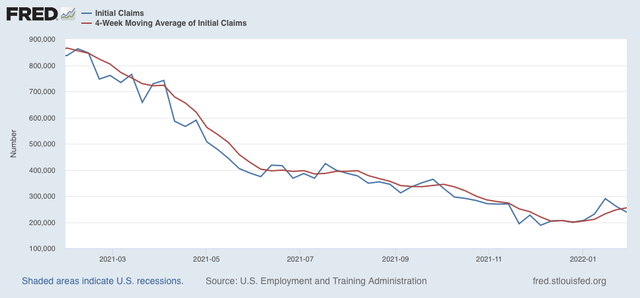
New claims declined 23,000 last week to 238,000 - still well above its pandemic low of 188,000 set early in December, but also a big retreat from 290,000 two weeks ago. The 4 week average of new claims increased 7,750 to 255,000:


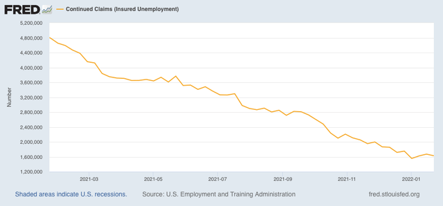
Continuing claims for jobless benefits declined by 44,000 from 1,672,000 to 1,628,000, an increase of 73,000 from its 50 year low of 1,555,000 three weeks ago:


As I have written for several weeks, the effects of Omicron are going to continue for at least a few more weeks. At this point it’s pretty clear that Omicron has had a significant impact, and may even result in a negative jobs number for January in tomorrow’s nonfarm payrolls report. 


But with cases nationwide down by over 50% from peak as of today, I still suspect Omicron will be mainly behind us by the end of February. So I still do not see a big reason to overreact to the recent increase in claims. After all, in comparison with the past few decades or even past 5 years, 238,000 is a darn good number.