Monday, November 22, 2021

Existing home sales and prices, increase slightly; nventory declines slightly


 - by New Deal democrat

[Programming note: There will be at least 4 significant reports tomorrow: jobless claims, personal income and spending, new home sales, and corporate profits for Q3. Then nothing for the rest of the week. I may or may not report on everything tomorrow. I may hold some for Wednesday or Friday. Also I will probably put up a Coronavirus Dashboard Wednesday or Friday. There may (or may not!) be something significant happening in the Midwest, similar to something that happened last year. And I want to give an optimistic and pessimistic projection for what the winter wave will unfold like.

All that being said, I suspect there will be a day or two this week vacation for me!]

Meanwhile . . . 

While existing home sales are about 90% of the market, they are much less important for the economic cycle than are new home sales, which will be reported tomorrow.


Last month I wrote that “I suspect new home sales will increase, since interest rates stabilized at very low rates earlier this year, and the increase in existing home sales is some confirmatory evidence.” So October’s increase of 0.8% was further confirmatory evidence. 

Realtor.com doesn’t all FRED to produce data more than 12 months old, so here is the last 12 months for both new and existing home sales, seasonally adjusted and normed to 100 as of October 2020:


Both declined earlier this year, but new home sales much more deeply.

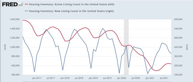
Realtor.com does provide FRED with both new and total (“active”) listing counts for the past 5+ years. Here’s what that looks like (note, new listings are on right scale):


Note that new listings declined precipitously in late 2019 even before the pandemic - and the pandemic certainly hasn’t helped.

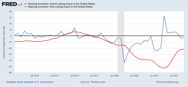
Since neither series is seasonally adjusted, comparing them YoY is more useful:


While new listings have rebounded this year, they continued slightly lower YoY in October. More importantly, they are down 10% since October 2019, which was when the big decline started, while total listings are down over 50% since then.

In the “the cure for high prices is, high prices” department, YoY median price gains have decelerated over the last 5 months:

Jun +23%
Jul +20%
Aug +15%
Sep +13%
Oct +13%

While these are not seasonally adjusted either, my rule of thumb is that a deceleration of 50% typically marks the top for any such statistic. We are 1.5% above that mark, but on the other hand, there was no changed from September.

If the YoY% changes continue above 12%, that would be consistent with prices continuing to rise. If on the other hand, YoY price changes continue to decelerate, then the market is probably close to or at its peak, consistent with my rubric is that sales peak first, followed by prices.

Saturday, November 20, 2021

Weekly Indicators for November 15 - 19 at Seeking Alpha


 - by New Deal democrat

My Weekly Indicators post is up at Seeking Alpha.

From time to time here, I put up a post including “you’re reading the right blog” in the title.  This week was similar at Seeking Alpha. In the past week or so, there have been a number of articles in the mainstream financial media about how the shipping bottleneck is at least beginning to ease, and gas and oil prices have begun to decline.

But that is something I started to write about in my “Weekly Indicators” columns almost in real time beginning 5 weeks ago.

This is exactly the kind of thing tracking high frequency indicators is designed to accomplish; a heads-up alert about a change in trend almost as soon as it starts, and well before monthly or quarterly data shows it, let alone the mass media reporting about it.

And reading today’s article will continue to provide you with that information, and reward me just a little for being ahead of the pack.

Friday, November 19, 2021

Coronavirus dashboard: As the winter wave takes hold, how much will resistance from prior infections hold numbers down?


 - by New Deal democrat

In Europe and North America, the winter wave is underway. While vaccinations clearly work, in most countries of the West there is a reservoir of defiant antivaxxers, who are not going to get vaccinated unless they are absolutely forced to. What does that mean for the present, immediate, and longer term future of endemic COVID?

In the US, nationwide average cases have increased from just over 70,000 3 1/2 weeks ago to nearly 95,000 yesterday, but about 5,000 of that is probably because Veterans Day went out of the weekly average. Deaths increased slightly from their roughly 1150 plateau  as well:
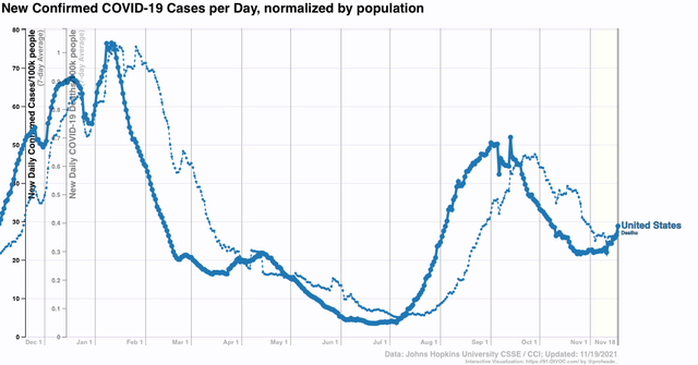

In the graph above, it is interesting to contrast the current situation with that of one year ago cases. With similar weather, but no vaccinations, and several subsequent huge waves of infections, in the first 2 weeks of November US cases had more than doubled to roughly 170,000. How much of that is vaccinations, and how much if any is increased seroprevalence among the population due to having already been infected?

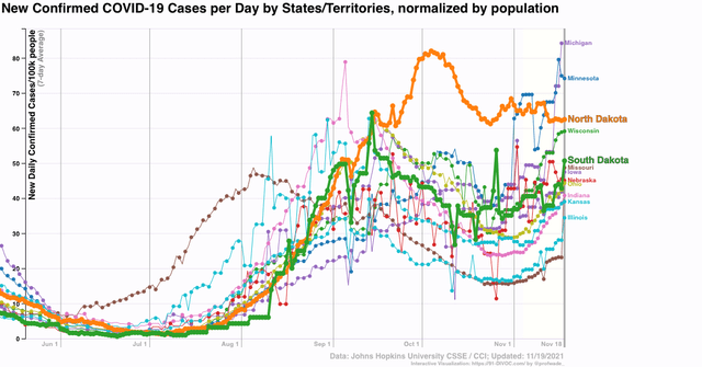
Domestically among US States, one year ago there was the worst outbreak of the entire disease that was centered on the Dakotas, and started with the Sturgis motorcycle rally in early August. South Dakota went from 9 cases/100,000 to 165 per 100,000 at the peak in mid-November. This year it went from 4 cases/100,000 just before the rally to a peak of 64 per 100,000 5 weeks later, and has since declined to as low as about 35 per 100,000. As of today with very noisy data it is between 45 to 50/100,000. 

Even now only 54% of South Dakotans are fully vaccinated. In North Dakota, only 48% are. By contrast, a similarly populated rural State, Vermont, is 72% fully vaccinated.

So let’s compare both North and South Dakota with Vermont. First, here are average weekly cases for all three States since the start of the pandemic:
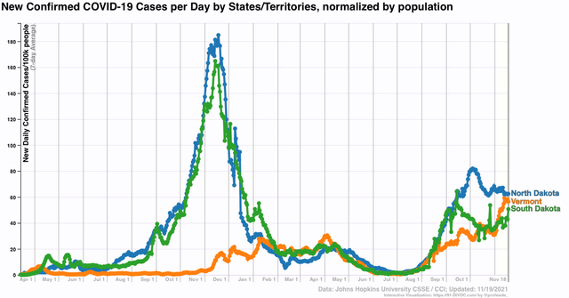

Vermont had been a star, up until the last 45 days, with the lowest % of infections of all States throughout 2020. More particularly, since their massive outbreaks one year ago, it is particularly noteworthy that the Dakotas and Vermont tracked virtually identically up until the Sturgis rally this August, despite their radically different vaccination levels.

Here is the cumulative number of confirmed cases in all 3 States:
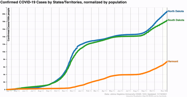

Since February 1 of this year, 5.5% of Vermonters have had confirmed infections. Only slightly more, 6.1%, of South Dakotans have, while in North Dakota the numbers are worse, at 7.9% of the population newly infected since then.

In short, it certainly does seem, at least in the case of South Dakota, and maybe in North Dakota as well, that the massive outbreak last autumn has acted to depress cases ever since - although Delta still made a substantial impact.

This also seems to be borne out by the MIdwestern numbers as a whole, as States immediately adjacent to the Dakotas are seeing much bigger increases - among the biggest of all States, while the Dakotas by contrast are like the calm in the eye of a hurricane:

Next, let’s look at the the US States in the lower Mississippi valley and Deep South, where Delta first struck:
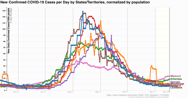

MO and AR have increasing trends, while FL, LA, MS, and AL look flat except for the Veterans Day comparison. Florida, with fewer than 7 new cases per 100,000, now has the lowest rate of all 50 US States (although Puerto Rico, with 4 cases per 100,000, is doing even better). I emphasize that this is not to praise Florida in the slightest, as it has among the highest total infection and death rates among the entire country, but rather to point out that, Delta having burned through the dry tinder, and with weather now more favorable to outdoor activities, there are fewer susceptible people left.

In short, when we look domestically within the US, it certainly does appear that prior outbreaks, particularly more recent outbreaks of Delta, have provided substantial resistance to the spread of new infections.

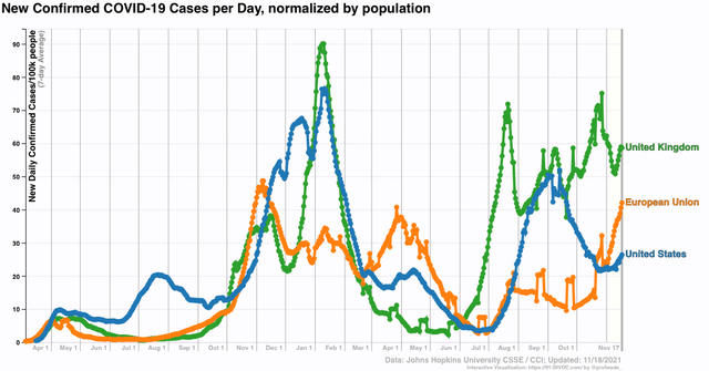
Some interesting international numbers tell as similar tale. The UK, after a quick 2 week decline of 40% from Delta’s original peak, has had numbers see-sawing generally between that peak and trough for the past 3 months, and is currently averaging 60 cases/100,000. With a few exceptions the EU, by contrast, largely escaped Delta’s summer wave, but in the past 7 weeks has seen it really take hold, jumping from 10 to 45 cases/100,000. *If* present trends continue, the EU could overtake the UK in 10 to 14 days:

On the other hand Canada, immediately adjacent to some of the currently worst hit US States, has only had a slight increase from 6 to 7 cases/100,000 in the past 2 weeks. This is particularly noteworthy since 76% of Canadians are fully vaccinated, only a little above New England’s 70%+, and less than 10% higher than Germany, currently having a huge outbreak. Also, needless to say Canada’s weather is not particularly balmy compared with the northern tier of US States.

Here is what Canada’s numbers look like compared with the adjacent Northeastern US, which has similar if slightly lower vaccination numbers:
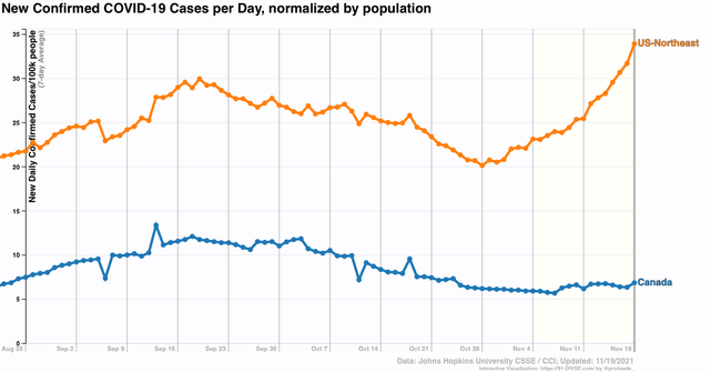

I suspect there are two explanations for this. One presumably is more universal compliance with public health measures in Canada. I suspect the other has to do with there being significant pockets of anti-vaxx resistance even in the heavily vaccinated States of New England. In other words, once you cross a certain threshhold - say, 70% - of vaccinations, maybe there is little additional benefit in terms of limited spread, while substantial pockets of 50% or 60% vaccinations still allow major outbreaks, with some leakage into the more heavily vaccinated regions.

I continue to think that this year’s winter wave will be substantially lower than last year’s - although it may exceed this summer’s Delta wave - and that each wave thereafter will echo, at increasingly lower levels, similar waves from one year previous, as both vaccinations increase, and resistance from prior infection among the unvaccinated population increases as well.

Thursday, November 18, 2021

Nobody is getting laid off: the continuing saga


 - by New Deal democrat

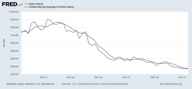
Initial claims declined another 1,000 this week to 268,000, and the 4 week average declined 5,250 to 272,750, both - yet again - new pandemic lows:

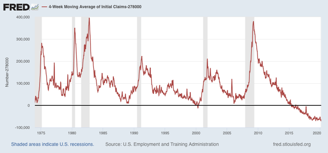
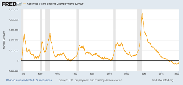
For the past 50 years, initial claims have only been at these levels for 2 months at the peak of the late 1990’s tech boom, and from late 2015 to just before the pandemic in 2020.


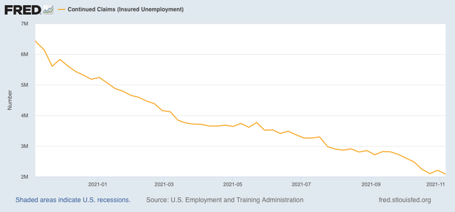
Continuing claims also declined 129,000 to a new pandemic low of 2,080,000:


Similarly, only a few weeks in the late 1980s, plus 2 months in 1999, plus the last 4 years of the last expansion were below this number:

I am a happily broken record: once again, the labor market remains extremely tight. For all intents and purposes, nobody is getting laid off. 


Wednesday, November 17, 2021

Housing construction continues to stabilize, but with record bottleneck in starts


 - by New Deal democrat

Last month I highlighted that housing constructions was stabilizing, following the stabilization in interest rates. This month continued that trend. 

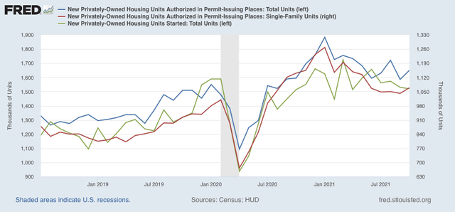
In October, housing starts (green in the graphs below) decreased -0.7% m/m, while the more leading total permits (blue) increased 4.0%. The less volatile single family permits (red) increased 2.7%. As a result, the overall trend for all three metrics for the past several months is generally flat:


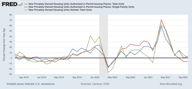
On a YoY% basis, starts are up 3.5%, permits barely up 0.4%, and single family permits down -6.3%:


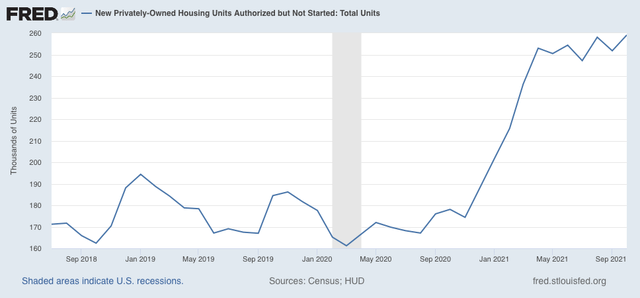
The YoY increase in starts continues to be noteworthy because it highlights an unusual event which has taken place over the past year; namely, a record number of permits were issued for houses that were not promptly started. Here’s a graph of such housing for the past 3 years:


The current level is the highest since the 1970s (not shown).

In other words, the actual on-the-ground economic activity in housing construction hasn’t declined that much, presumably because housing materials at reasonable prices constrained the actual building of houses authorized by permits. On a rolling 3 month average basis, housing starts are only down -4.4% from their year end 2020 peak. This suggests much less of a real economic downdraft than would otherwise be the case, as typically it has taken a downturn of about -20% to be consistent with a recession.

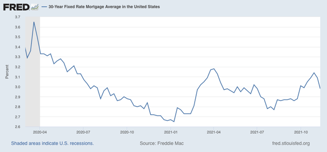
As I have repeated many times, interest rates lead housing construction. And the evidence from mortgage rates is that housing should be (and is) stabilizing. In the past 6 months rates have stabilized between the 2.75%-3.15%:


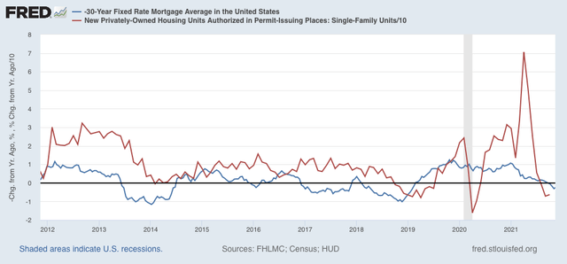
As a result, I would expect stabilization or a moderate increasing trend in response. This is  shown when we compare the YoY% changes in mortgage rates (inverted) and single family housing permits over the past 10+ years:


In October, Mortgage rates only were increased 0.14% YoY, and for all intents and purposes have been flat YoY for the past 4 months. 

Since housing construction is a long leading indicator, this series continues to suggest that the economy, after a period of cooling early next year, will also stabilize later on.

Tuesday, November 16, 2021

. . . And Industrial Production isn’t too shabby, either


 - by New Deal democrat

Industrial production, the King of Coincident Indicators, was reported for October this morning in addition to real retail sales, discussed already in my last post. - and it was also quite positive.


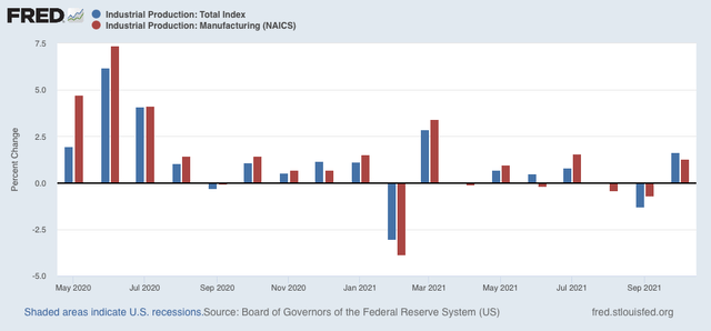
Total production increased 1.6% during the month, and manufacturing production increased 1.3%. This was the biggest monthly increase for total production since March of this year, and except for that month, also the biggest increase in over a year:


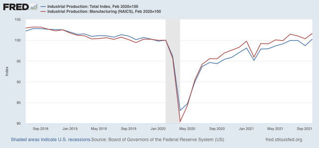
Both total and manufacturing production have returned to being higher than their immediate pre-pandemic levels, and also the highest since the onset of the pandemic:


The former is up 0.3% compared with February 2020, and the latter up 1.6%.

I wrote yesterday that, despite my real concern with inflation going forward, my array of indicators did not forecast a recession, and this morning’s reports on both retail sales and industrial production confirmed that point of view.

Now *that’s* good news: another blockbuster real retail sales report


 - by New Deal democrat

Yesterday I wrote that the financial and production sides of the economy still looked very positive, and that today’s retail sales number would be especially important.

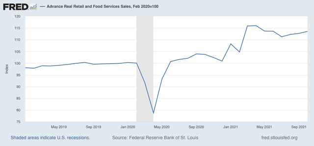
Well, they were very positive, clocking in at up 1.7% month over month in October. Even after inflation, “real” retail sales were up 0.7%. September was unrevised. Although real retail sales are down -2.2% from their April peak, they are +13.5% higher than they were just before the pandemic hit, and 4.9% higher than January of this year: 


In September I wrote that ”while the recent decline from April is consistent with a slowing economy ahead, if sales stabilize here I don’t see this as a harbinger of an actual downturn.” That still looks correct, particularly as real retail sales are up over 2% since then, and 9.5% higher YoY. 

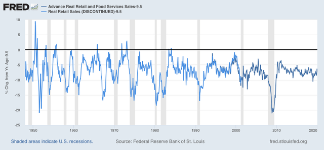
How extreme is that? The below graph subtracts 9.5% YoY growth from retail sales from 1948 through 2019:


With the exception of 2 months in 1983 and 1984, real retail sales haven’t been this strong since the early 1970s! That’s the last time the US had such a worker-favorable economy.

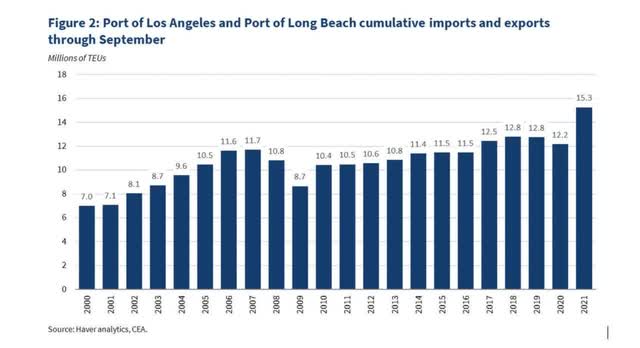
This also explains a great part of the supply chain bottleneck, since it is incapable of handling such a sudden jump in consumer demand. Here’s a graph I came across a couple of weeks ago showing activity at the two big California port facilities:


In other words, even though the ports are processing record volumes, they *still* can’t keep up with the increased import demand.

Now let’s turn to employment, because real retail sales are also a good short leading indicator for jobs.

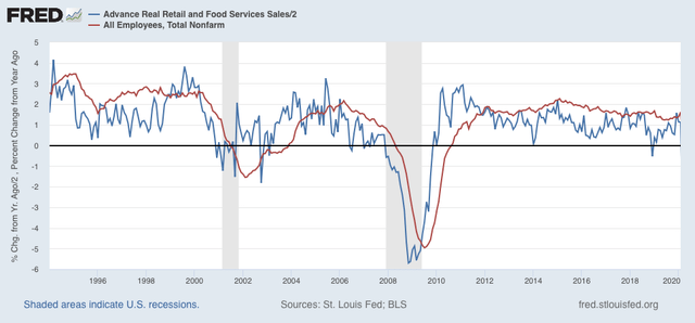
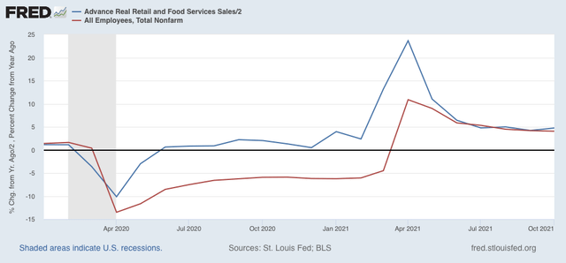
As I have written many times over the past 10+ years, real retail sales YoY/2 has a good record of leading jobs YoY with a lead time of about 3 to 6 months. That’s because demand for goods and services leads for the need to hire employees to fill that demand.  The exceptions have been right after the 2001 and 2008 recessions, when it took jobs longer to catch up, as shown in the graph below, which takes us up to February 2020:


Now here is the same graph since just before the onset of the pandemic. Note the scale is much larger due to the huge downturn during the lockdowns and the comparisons one year later:


Last month I argued that, despite the lackluster initial jobs reports for August and September, this “argues that we can expect jobs reports in the next few months to average out about even with those from one year ago, which averaged about 500,000 per month.”

Well, two weeks ago those months were revised well higher, and October came in at 531,000 jobs added - which means that job growth indeed has continued to average about 500,000 per month. And should continue to do so in the next few months.