Saturday, March 21, 2020

Coronavirus dashboard for March 22


 - by New Deal democrat

This is a new daily or nearly daily update I hope to post, including the most important metrics to show how controlled - or out of control - the cononavirus pandemic is. Hopefully the numbers will move ever closer to the tipping point where the epidemic is under control. 

In order to bring this pandemic under control, and prevent both health and economic catastrophes, in my opinion the US needs 2 weeks of China (total lockdown, preventing community spread) followed by 1 month of South Korea (extremely aggressive testing). The metric to be watched for testing is a ratio of 15 tests administered for every infection found (the ratio at which South Korea turned the corner). 

Here is the update through yesterday (March 21) 


Number and rate of increase of Reported Infections (from Johns Hopkins via arcgis.com)
  • Number: up +5,374 to 19,624 
  • Rate of increase: day/day: 38% (vs. 34.6% baseline exponential average per Jim Bianco) (and vs. 51% on March 20)
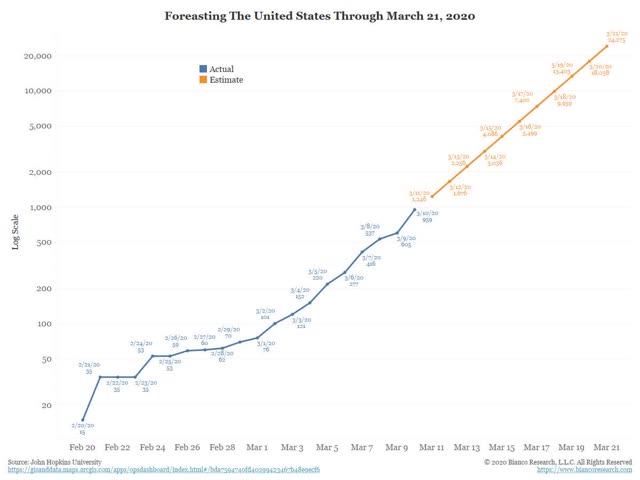
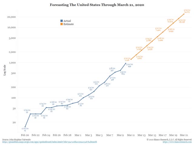
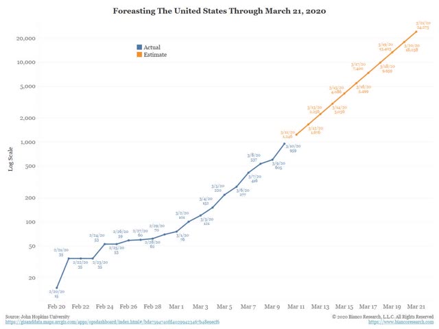
Jim Bianco’s excellent exponential projection from March 10, of a daily 34.5% growth in reported infections for the next 10 days has been almost exactly correct. I am using this as a baseline against which we can tell how well “social distancing” strategies are working as well as State-mandated partial and total lockdowns.  
In the last few days, the rate of exponential growth has actually risen from about 28% to 40% and even 50%, probably due to increased testing being able to uncover more infections.
Number and rate of increase of testing (from COVID Tracking Project)
  • Number: 34,654, up +7,282 day/day
  • Rate: increase of 27% vs. number of tests previous day
Comparison of rates of increase in documented infections vs. testing  
  • Infections +38% vs. Tests +27% day/day
Result: Infections continue to increase a faster rate than tests: i.e., we are falling further behind in testing.

Ratio of tests to positives for infection (from COVID Tracking Project)
  • Number: 34,654 new tests vs. 5315 new infections 
  • Ratio: 6.5:1 
In South Korea, where aggressive testing has led to a near-total disappearance of new cases, the inflection point where the number of new daily cases plateaued was reached when the ratio of tests to new cases found reached 15:1. Any ratio less than that suggests that not enough testing is being done. Yesterday’s ratio of 6.5:1 is poor. We are way behind in the number of tests we are administering.
Number of States (+DC and Puerto Rico) in total lockdown, business lockdown, and partial restrictions
  • Total lockdown (personal + business): 5 (CA, CT, IL, NY, PR)
  • Business lockdown: 2 (NV, PA)
  • Partial restrictions on business: 21
  • School closure only: 11 
  • No mandatory restrictions:13 (AL, AK, AZ, FL, HA, ID, MI, MS, NE, ND, OK, TX, WY) 
Almost all of the States with no restrictions or only school closures are “red” States, and mainly rural with the notable exceptions of Texas, Florida, and Tennessee. These States will learn the hard way about the meaning of “exponential growth.” Five of the 7 jurisdictions with total or nearly total lockdowns are heavily populated “blue” States plus Puerto Rico.
Number and percent of US population in total lockdown, business lockdown, and partial restrictions
  • Total lockdown: 78.5 million, 23.7%
  • Business lockdown: 15.9 million, 4.8%
  • Partial restrictions on business: to be updated
  • School closure only: to be updated
  • No mandatory restrictions: 25.0%
As the above totals show, most States are still taking half-measures. Less than 1/4 of the country is on total lockdown, and even in those States I am not sure how inbound travel by air, ship, train, or vehicle is being controlled. I think we need at least half of the total US population under almost total lockdown to have a chance of following China’s successful strategy for beating back the pandemic.
Bottom line: as of March 21, the pandemic is nowhere near being brought under control. 

Weekly Indicators for March 17 - 21 at Seeking Alpha


 - by New Deal democrat

A vignette....

Cognoscenti: “It’s impossible to forecast the economy.”

Forecaster: “Actually, if you rely upon a tried and true series of long and short leading indicators, you ca-“

Deity: “OH YEAH??? TRY FORECASTING THE GIANT SCREAMING METEOR OF DEATH!!!!!”

G.S.M.O.D.: [BOOM!]

Forecaster [poking head through rubble]: “Y’know, Deity, that really wasn’t very fair.”

Sigh. At least, the high frequency indicators have been the first to show the economic impacts of the coronavirus, as opposed to waiting around for monthly data. The Weekly Indicators post is up at Seeking Alpha.

Clicking through and reading will bring you as up to date as possible on the economic carnage, as well as reward me a little bit for my efforts.

Friday, March 20, 2020

The best US solution to the coronavirus pandemic: SHUT.IT.DOWN — two weeks of China + one month of South Korea


 - by New Deal democrat


For the last few weeks, I have been screaming at the top of my lungs about “exponential growth.”   That’s because so few people realized the impact such growth could have in a pandemic, over the course of just a few months, even weeks.

I first began thinking about this as soon as I read a Tweet by Trevor Bedford a month ago about how coronavirus had probably been circulating, undetected, in Washington for three to six weeks. I immediately thought, with a jolt, about what that meant in terms of exponential growth.

Looking back over my private correspondence, I see where I first voiced the likely impact back on February 27. Here’s what I wrote then:
——-
“The CDC only has 250 working test kits. They have *none* to spare to check for community spread. Thus the virus will spread for several weeks undetected until tests are administered among the first very sick. By then it will be too late.

“Meanwhile the Administration has clamped a gag order on the government scientists. To my knowledge, it has taken no action to obtain the thousands of test kits that are needed from other countries.

“In short, malpractice by the Buffoon in chief could easily lead to tens of thousands of unnecessary deaths.”
——-
And so I started shouting from the rooftops about exponential spread. Nothing since then has caused me to change my mind.

By now, at least among those who are able to listen and comprehend, exponential growth has been accepted as the immediate course of the pandemic. Steps have been taken, of greater or lesser effect, in a number of countries to stop it.

Today I want to switch gears. Because I am congenitally predisposed to thinking about what we are able to control - how to come up with a solution to when we cannot avoid being rolled over by a bulldozer.

So, here’s what I think we need to do to stop the exponential spread of this disease:

SHUT. EVERYTHING.DOWN.

Unlike South Korea, but very much like China, the US waited too long to test for the spread of this virus. In the past 24 hours, the number of diagnoses of coronavirus infection has grown by almost *5000.*  Just for one day. 

In South Korea, they had one central focus - an extreme religious sect -for the spread of the virus. Even so, it took a ratio of 15 tests to 1 positive result over a period of about a week for South Korea to bring its pandemic under control.
15 x 5000 positives = 75,000. That’s the number of tests the US would have had to administer yesterday to bring it up to South Korea’s standard. Actually, yesterday there were only 27,000 tests.

In short, the US is continuing to *lose* ground.

Barring a stellar, Herculean effort, we’re simply not going to get to the level of testing we need to get ahead of the exponential spread of this virus. Within a few days, the number we need to be testing will grow to 100,000/day, and then 150,000/day, and then .... You get the idea.

To be blunt, to prevent a worst case scenario - one which will be upon us in a matter of several months, if not several weeks, the US needs to take more drastic action.

The ultimately voluntary “social distancing” that has been put in place has been violated constantly by the Young Invulnerables, as we have seen from photos of packed bars and restaurants last weekend, to packed beaches in Florida earlier this week. We might slow down the exponential spread of the virus, but frankly, I think this approach is ultimately going to fail.

THE US NEEDS TO TAKE THE CHINESE APPROACH. China’s national government shut down virtually the entire country for about two weeks. During that time of enforced national quarantine, the spread of the virus was brought to a halt. Since the virus’s latency period is one to two weeks, that was all it took to break the chain of transmission.

The Federal government in the US almost certainly lacks the Constitutional authority for such a national lockdown. But the Constitution reserves all powers not granted to the Federal government to the States, and the States have what is called “police power.” “Police power” is why Massachusetts was able to completely shut down the Boston metropolitan area while they searched for the Tsarnaev brothers. It’s why Gov. Gavin Newsome had the authority to completely lock down California effective last night.

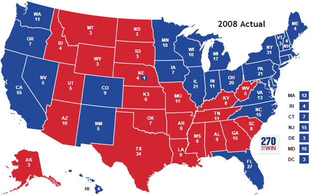
California’s example should be followed immediately by every other State in the Union. the federal government can offer the services of the National Guard to help enforced the lockdown. If some States (mainly “red” States) refuse to go along, then governors on a regional basis need to form their own “cordon sanitaire.” I am thinking such a map, of two or possible three such regions, would look very similar to the 2008 Electoral College map:


In addition to the above, I can easily see Kentucky and Kansas  (New Democratic governors), and also Arizona, Utah, and even Texas (which shut down its bars and restaurants yesterday) potentially joining in the interstate shutdown. 

In such a case, each governor should contribute their own State’s national guard units to make sure that there is no entry from other, non-locked-down States, into the area.

While the two week regional or national lockdowns are in effect, ICU facilities and more than anything else, testing, needs to be ramped up and available in large numbers for when the lockdown ends and inevitably a few new hot spots start to emerge.

In short, two weeks of China followed by one month of South Korea is the US’s best chance of bringing this pandemic under control without a ghastly number of fatalities, and catastrophic economic damage.

Thursday, March 19, 2020

The Coronavirus Recession has begun


 - by New Deal democrat

This morning we got two reports that confirm the beginning of the Coronavirus Recession: initial jobless claims and the Philadelphia Fed manufacturing index.

Initial claims rose to 281,000 one week ago. They are now 15% higher than their low last April, as well as almost 15% higher preliminarily on a monthly basis than last March, and the 4 week moving average is just shy of 5% higher than one year ago.  This meets two of my three “recession warning” triggers for this metric.

The Philadelphia Fed’s new orders subindex came in at -15.5, a big decline from last month’s +33.6, that clearly represented manufacturers’ trying to lock in new supplies. Together with the Empire State’s big decline to -9.3 earlier this week, the average of the new orders subindexes for the five regional Feds is -4.

Other high frequency indicators have also tightened or turned neutral this week: credit conditions from the Chicago Fed, the spread between Treasuries and corporate bonds, the Harpex shipping index, the US$, and of course the stock market, which has continued to crash.

I’ll have the full report up this Saturday, but the bottom line is that with this morning’s reports, it is clear in the data that the Coronavirus Recession has begun.

Two final notes:

1.  When I checked a short time ago, reported cases of coronavirus in the US had jumped 45% in a single day to 9415. This is only -6% below Jim Bianco’s exponential forecast from one week ago. Yes, much of this increase can be put down to increased testing, but the point is, that increased testing keeps finding an increased number of infections. This pace of increase is likely to continue for at least one more week.

2.  On the other hand, I will not leave you with DOOOM. I am working on a piece detailing what data to look for to know when we are turning the corner on this crisis.


Wednesday, March 18, 2020

Coronavirus: 30% exponential average daily growth - forward projections


 - by New Deal democrat

A week ago, I posted a projection by Jim Bianco of the growth in US coronavirus cases through March 21. We are 7 days into that 10 day period. Let’s update the status.

First, here’s another copy of Bianco’s graph:


Below, I give the day by day projection, the day by day actual number (pulled from the Johns Hopkins site each morning), the growth rate in the actual numbers, and the deviation from Bianco’s estimate:

Date Projection Actual Growth rate Deviation
Mar 11   1246.    1326.      38%.         +6%
Mar 12   1676.    1701.      28%.         +1%
Mar 13   2256.    2174.      28%.         -4%
Mar 14   3036.    2952.    36%.         -3%
Mar 15   4086.    3774.     28%.         -8%
Mar 16   5499.    4661.     24%.         -15%
Mar 17   7400.    6496.     39%.         -12%

The “good” news is that Bianco’s projections were too pessimistic, and the percent of deviation to the downside has generally been growing.

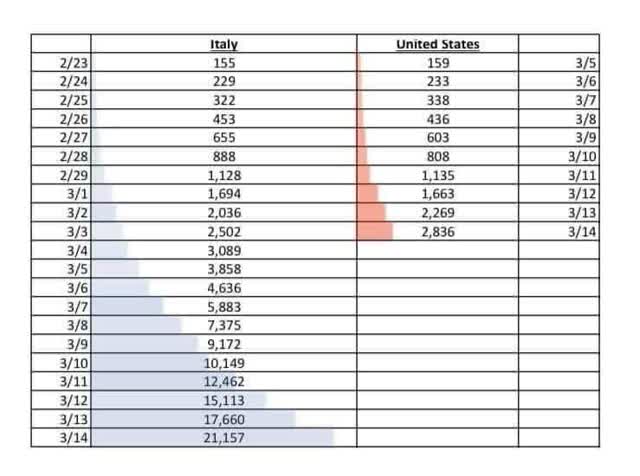
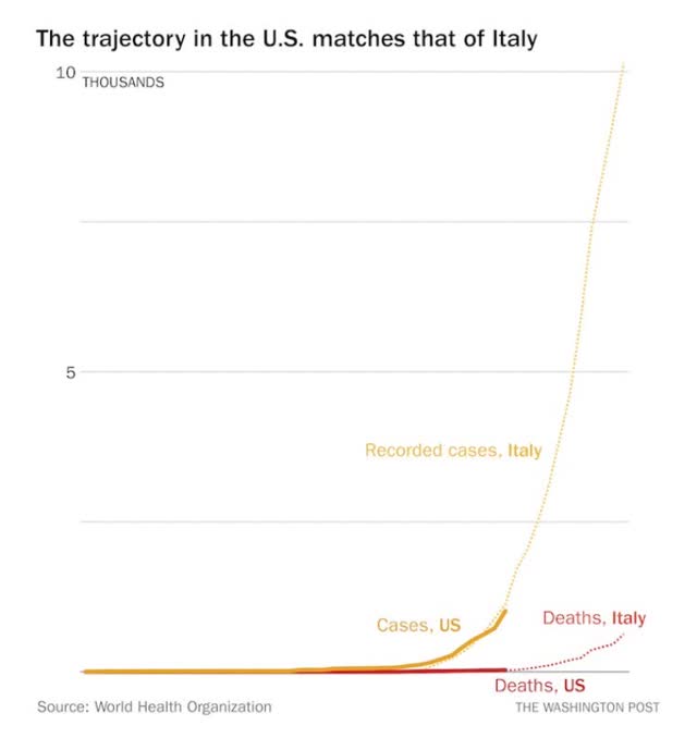
Here is another projection I found at a health policy profession’s site (sorry, I forgot where and don’t have a link),comparing US numbers with Italy’s 11 days previously. The actual cases above are actually *higher* than the 3 day forward projection through March 17:


In any event, as indicated in my chart, in the past week the number of reported infections has grown by, on average, a little over 30% each day (the low is 24%, the high 39%). Some of this is the ability to test, etc., but I decided to see what would happen if the rate of increase doesn’t change.

Basically, the number of actual, reported infections has increased by 10x in a little under 9 days. Starting from this morning forward, here’s what each 9 day increment would look like if the current rate of increase continues. Keep in mind that the *actual* number of infections is probably, at minimum, 10x the reported number, partly due to the inability to test, and partly due to people with mildly- or even non-symptomatic cases not getting tested:

March 18 6,500
March 27 65,000
April 5 650,000
April 14 6.5 million
April 23 65 million
April 29 (6 days) 313 million

Obviously this will be factually incorrect, because of measures that have already been taken, plus measures that will be taken as the impact increases even further. Also as the virus “burns through” the population, the rate of infection spread will diminish. 

But probably the next 9 days are still baked in the cake. And the number of people who have been exposed to the virus, vs. the number tested and reported, is probably at least 10x higher. So by March 27, probably at minimum there will be 650,000 infections. I’ve seen estimates that it could be 40x higher; if so, that would be 2.6 million infections by March 27.

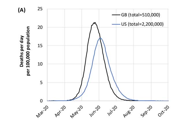
Now here is the truly scary graph. This comes from the UK’s Imperial College of Medicine. It is the graph that apparently finally frightened both Donald Trump and Boris Johnson into some semblance of action:


Take a look at the April 20 date in the above graph. It is indistinguishable from zero. In other words, as bad as we think things are now, and as bad as they could be a month from now, they are figuratively only a slight foretaste of how bad things could be by the Fourth of July unless effective action is taken.

Tuesday, March 17, 2020

In the quaint, pre-coronavirus world of February, the economy was already very weak


 - by New Deal democrat

I have a post up at Seeking Alpha, taking a look at this morning’s retail sales and industrial production reports for February, and briefly considering their implications for employment in the coming months, even before the impact of coronavirus.

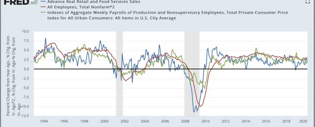
Here’s a graph that didn’t make it into that post, showing the past 25+ years of real retail sales (red), jobs (blue), and real aggregate payrolls (green):


For the past 11 months, real retail sales in February were only up +0.9%. We’ll never know for sure, but it is entirely possible that, even without coronavirus, real retail sales might have turned negative YoY this month, suggesting that job growth might screech to a halt in the next few months.

Also, in the more current weekly data, we got two important reads on chain store sales this morning. Both Redbook and the Retail Economist recorded surges in chain store sales last week, as consumer rushed to stockpile supplies.

Monday, March 16, 2020

The Coronavirus Recession (probably) begins


 - by New Deal democrat

Looks like today is going to be an interesting one at the Wall Street casino. As I write this, futures are down -10%. Does this mean Trump has to take back his autographed copies of the surge in the indexes Friday afternoon? 

I’ve expected this, since the reality that Trump was, as usual, lying in his Friday afternoon announcements didn’t occur until after 4 p.m. when the markets were already closed. Yesterday’s announcement by the Fed of an emergency rate cut to zero was also appropriately recognized as a sign of panic. And until people feel safe again getting out into public to do their business, it won’t matter.

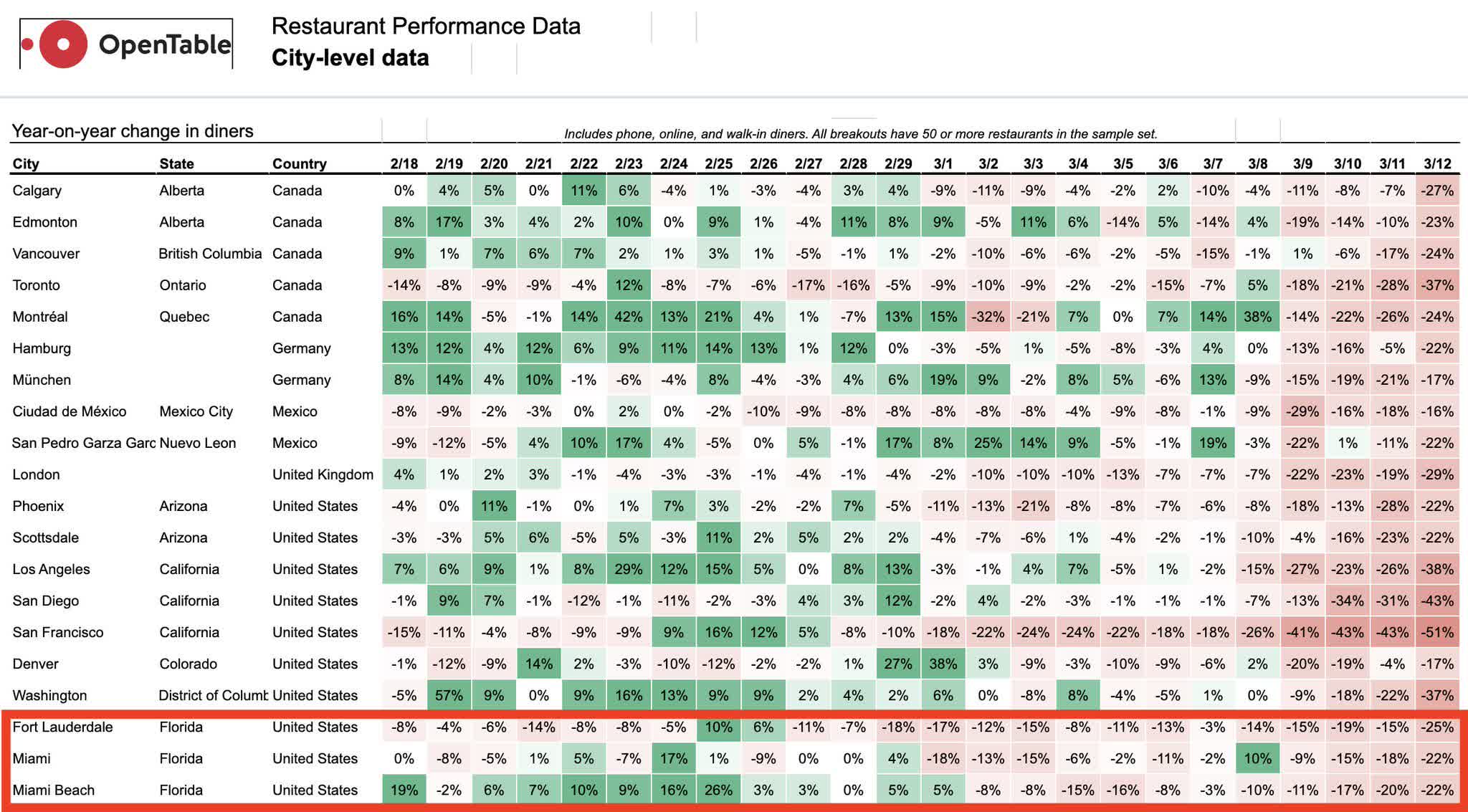
In the meantime, I’ve been waiting on hard data to document a downturn in producer and/or consumer behavior due to the coronavirus. Up until now we’ve only had intermodal railroad shipments (showing the impact of China’s shutdown) and, last week, Open Table’s reservations collapse. 

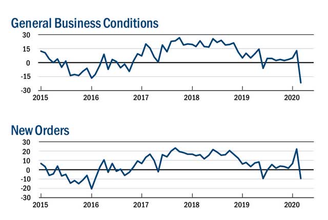
Last month I noted the spike higher in new orders in the regional Fed manufacturing reports, and have suggested that it might represent manufacturer’s locking in supplies in advance of a shortage. This morning’s Empire State Manufacturing Survey appears to have confirmed that idea in spades.

The index had its biggest m/m decline ever, from +12.9 to -21.5. New orders also declined from +22.1 to -9.3. Here’s what that looks like graphically:


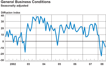
For comparison, here is what the Empire State Manufacturing Index looked like back in June 2008, six months into the Great Recession. The first, big drop below zero occurred in February 2008, two months after the recession began:


Only one regional Fed, of course, but this certainly looks like an economy that has come to a sudden stop. Although I won’t “formally” say so until there is more confirmation in the data, it certainly looks like a recession has begun this month.

——
P.S. I always hate not sharing a little good news. So here is something that is at least “less bad.” 

For the past week, I’ve been highlighting Jim Bianco’s exponential projection of documented cases of the coronavirus in the US. Today, on day 5 of the projection, for the first time there was a meaningful divergence, to the good side:

Mar 15 Projected: 4086 Actual: 3774

The more voluntary “social distancing” and mandatory shutdowns ordered by States and localities (since the federal government is hopeless right now), the more the curve will be bent away from its previous exponential path.

Sunday, March 15, 2020

Coronavirus update: reason for alarm; (small) reason for hope


 - by New Deal democrat

This weekend has continued the discouraging news: reports just about everywhere that the Young Invulnerables packed the bars Friday night; the Petri dishes of airport security lines packed with Americans returning from Europe; and personally, two friends who I have known for almost 40 years getting very sick this past week and not able to be tested for coronavirus (one of whom by the way went in to work Friday to drive school buses full of kids because so many other drivers called out). All of these are going to be vectors for continued transmission of the virus.

In that regard, let me repost the graph from Jim Bianco that I ran last week. Because we are now 4 days into his linear projection of an exponential curve of coronavirus transmissions. Here’s the graph: 


And here is how his projections compare with the actual numbers I pulled each day from the Johns Hopkins site:

Date Projection Actual
3/11      1246          1326
3/12     1676          1701
3/13     2256         2174
3/14     3036         2952

So far Bianco’s projections have been almost exactly correct.
If reality follows his projections, in 4 days there will be 10,000 cases.
In 7 days there will be 25,000 cases.

I have not seen any government action significant enough to stop this exponential projection being correct.

And by the way, if the diagnoses continue to climb thereafter at the rate of 2.5x every 3 days as shown in Bianco’s graph, here are the next 30 days after March 22:

3/28 62,500 cases
4/3 156,250 cases
4/9 390,000 cases
4/15 977,000 cases
4/21 2.4 million cases

If that is cause for grave alarm, there is at least some reason to suspect that the disease will at least slow it spread, as hotter weather arrives. 

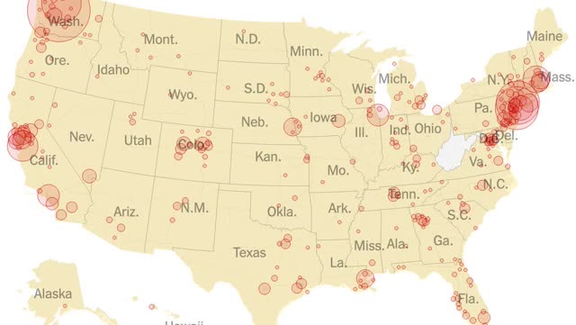
Below is a map of coronavirus cases by metro areas in the US:


Note that all of the most affected areas are in the North. Despite LA’s deep economic and immigrant ties to Asia, it is not nearly so affected as San Francisco or Seattle. And despite Florida’s huge elderly population, it is not nearly so affected as New York or Boston.

This is what economists call a “natural experiment.” It will be worth watching to see if the North/South dichotomy continues. *IF* the more optimistic scenario happens, that will give the US 4 to 6 months of relative breathing space to adopt more effective measures, and possibly at least a partially effective vaccine might be developed to be used on those most at risk.

Finally, I should note that I am a fan of K.I.S.S. metrics. They are easy to follow and test, and can yield results close to those of far more sophisticated models. 

Also, as I often point out, whenever human behavior is observed, the humans observe back - and change their behavior as a result of their knowledge of what was observed in them previously. If the American public becomes convinced that the epidemic is out of control, they are likely to self-isolate without any government action at all. And that would change the exponential spread.

Saturday, March 14, 2020

Weekly Indicators for March 9 - 13 at Seeking Alpha


 - by New Deal democrat

My Weekly Indicators post is up at Seeking Alpha.

There is no clear evidence yet of a drop-off in consumer spending due to the coronavirus in the series I have been tracking, although there is evidence on the producer side.

After I posted, I ran across this chart of daily reservations made at OpenTable for various metro areas:


There has clearly been a big decline that began about March 2nd.

As usual, clicking through and reading will help bring you up to date, and rewards me a little bit for my efforts.

Friday, March 13, 2020

Three related metrics of coronavirus


 - by New Deal democrat

Here are three different but ultimately related updates about the coronavirus pandemic.

1. It is 100x more lethal than the 2009 H1N1 swine flu

The latest right-wing disinformation is that Obama waited 6 months to declare the 2009 swine flu an emergency, and 1000 people died. As others have pointed out, his Secretary of Health and Human Services did so only 11 days into the US outbreak.

So why don’t we remember a big health emergency in 2009? Because the swine flu was 100x less lethal than coronavirus. According to the CDC’s final estimates:
from April 12, 2009 to April 10, 2010 approximately 60.8 million cases (range: 43.3-89.3 million), 274,304 hospitalizations (195,086-402,719), and 12,469 deaths (8868-18,306) occurred in the United States [were] due to pH1N1.
That is a mortality rate of 0.02%, or 2 in 10,000. The total number of deaths, spread out over a year, were 10% of average seasonal influenza deaths.

By contrast, coronavirus appears to have a 2% (some estimates are coming in more like 3%) mortality rate. If 60.8 million Americans were to contract coronavirus, that would mean about 1,200,000 deaths.

2. Exponential projections of the spread of the virus are holding up so far.

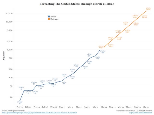
Two days ago, Jim Bianco of Bianco Research posted the following linear projection of coronavirus infections for the next 10 days if they continued to increase at an exponential rate:


For the first two days of that projection, his numbers have not only been close to accurate, they have actually been slightly low:

March 11 projection: 1246  actual: 1300+
March 12 projection: 1676  actual: 1700+

At the current rate, we will have more than 10,000 cases only 4 days from now.

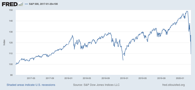
3. The stock market’s big declines can be seen as reactions to rational projections of exponentially increasing impacts with each passing day.

Take Bianco’s graph above, and project 7 days in advance, as in each passing day the federal government fails to do what is necessary to get in front of the pandemic. Each such day means not just an increased impact, but an increasing *rate* of those economic impacts.

Since the date of Donald Trump’s inauguration, as of this morning the market is only up 9.2%:


This does not mean that the market will continue to fall in a straight line, or ad infinitum
.
But if I had to guess, it would be that the ultimate bottom will take place once the market senses that adequate steps have been taken to contain the outbreak, even if that means the entire economy shuts down for 2 or 3 weeks.  

Thursday, March 12, 2020

Coronavirus:Donald Trump::The Terminator:Sarah Conner


 - by New Deal democrat

For the past few weeks I have said that, when it came to coronavirus, the news would outrun the data. The last 24 hours seem to have been a watershed moment for that news. 

Both an NBA player and a major Hollywood star have tested positive for the virus. The entire NBA season has been shut down. Many universities are suspending classes and sending their students home. Large public activities, like St. Patrick’s Day parades in major cities, have been canceled. 

Meanwhile, as I write this, stocks on Wall Street look set to open over 5% down, after having fallen over 20% in just the past 3 weeks - the fastest descent from all-time highs to a bear market in history (yes, even faster than in 1929).

This is what exponential growth looks like. Everything seems normal until all of a sudden, it isn’t.

The renewed crash in stocks this morning is a thunderous lack of confidence in Donald Trump. Wall Street may not be “the economy,” but in the aggregate traders are pretty shrewd. What happened last night is that Trump gave an ill-thought-out, slapdash major speech in which he said among other things, that he was effectively halting all commerce with Europe. That would be nearly catastrophic for the economy. The fact that his surrogates have since “corrected” his error does not help at all - it simply reinforces that he is completely winging it.

In terms of Trump winging it, the allegory that comes to mind is

Coronavirus:Trump::The Terminator: Sarah Conner

Trump is trying to BS his way through a pandemic, like (to mix metaphors) the guy from Die Hard tries to schmooze Hans Gruber, while, to go back and quote from the Terminator: “It can't be bargained with. It can't be reasoned with. It doesn't feel pity, or remorse, or fear! And it absolutely will not stop, ever....”

Meanwhile, even the high-frequency economic data is one week old, which may as well be an eternity. Initial jobless claims, at 211,000, are nearer the *low* end of their two year range. Rail cars ex-intermodal units and coal actually *increased* over a year ago. Only intermodal rail units continued their accelerated decline, down -14.1% YoY.

Finally, a bunch of graphs demonstrating the exponential growth rate of coronavirus in the US have come out in the past several days. 

First, here’s Jim Bianco of Bianco research:


If the present growth rate continues, he expects to see 25,000 cases by March 21.

And this is from the WHO:


By way of hope, I can only offer two things: (1) since the federal government under Trump is going to be useless or worse, some States may seize the initiative and run competent containment programs; and (2) the most important things you can do are completely within your own power - wash your hands, don’t touch your face, avoid public gatherings, practice social distancing.

But in the aggregate, expect exponential growth - meaning sudden worsening by orders of intensity - to continue.

Wednesday, March 11, 2020

Real average and aggregate earnings for February 2020


 - by New Deal democrat

Let me take a little break from discussing how one of the four horsemen of the Apocalypse is riding into town, to the quaint business of how middle and working class wages are doing through February.

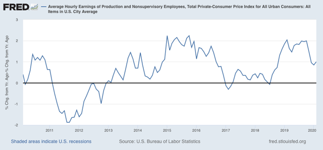
Consumer inflation for February only rose 0.1%. Since wages rose 0.3% nominally in February, that means real average wages for non-supervisory workers rose 0.2%. YoY the gains rose to 1.0%:


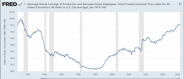
Real average hourly earnings have risen to 98.1% of their January 1973 peak:


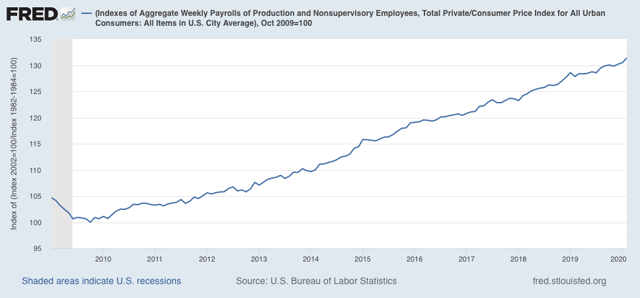
Because total hours worked rose significantly in February, real aggregate earnings - i.e., the total buying power of the middle and working class - also rose to 31.4% above its October 2009 low:


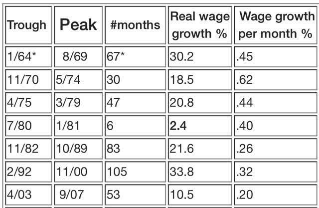
Below is a chart I haven’t shown in a long time, comparing real aggregate earnings in past expansions over the past 50+ years. At 31.4%, this expansion now only trails the 1990s for the total improvement in average workers’ real incomes:


On a monthly basis, however, dividing that 31.4% by the 124 months since the bottom gives us a little over .25% real average earnings growth per month. That’s ahead of the 2000s and just slightly below the 1980s, but well behind all other periods, and shows the weakness in labor’s bargaining power.

Because CPI is normally all about gas prices, and they have cratered in the past week, it’s a fair bet that March will show actual DEflation, and the YoY measures will decline substantially. This would be good for consumers, except that normally consumers don’t want to take the risk of dying by going out in public to consume. Which means I expect layoffs to be in full swing by April.

Tuesday, March 10, 2020

This is what exponential growth looks like


 - by New Deal democrat

I’ve placed an added emphasis on high frequency indicators, as they will be the first to show the impact of coronavirus on the economy.

This morning chain store sales for last week were reported. They were:

 - Redbook +6.0% YoY
 - Retail Economist unchanged w/w, +0.9% YoY

Needless to say, there was no impact at all on the Redbook number. While the Retail Economist number was definitely weak, there have been other, similar weak weeks earlier this year, so that number is equivocal. I suspect that this situation will change in no more than two weeks.

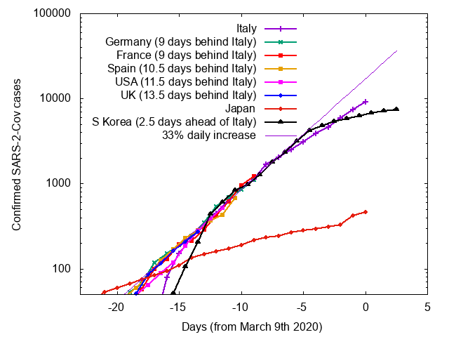
Meanwhile, here is a graph of the number of coronavirus cases in a number of countries including the US, compared with Italy, the epicenter of the outbreak in Europe (via Mark Handley, a Professor of Networked Systems in the UK):

Notice that the graph is in log scale, where exponential growth is shown as a straight line. South Korea and Japan, both of which have taken very aggressive testing and quarantine measures, show a slow spread, and in South Korea the number of *new* cases has actually declined in the past few days, leading to the total number shown above to level out. The US, by contrast, is on track to have the same number of cases Italy has now in about a week and a half.
This is what exponential growth looks like. The spread of the disease looks manageable, until all of a sudden it very much is not. This is why, even if the disease abates with warmer weather, exactly *how* warm the weather has to be makes an important idfference between a contained and a calamitous  outbreak. 


Monday, March 9, 2020

Whatever will I write about on a no-data Monday? I won- WTF?????


 - by New Deal democrat

Yesterday I was wondering what I might write about today, as there is absolutely *no* data being released. And then I woke up and turned on the intertoobs . . . .

OK. Deep breaths. For those of you who wonder what the h#/! Is going on, here’s my take.

1. Until resolute government action is taken, the coronavirus situation is going to continue to worsen. As of yesterday, we passed 500 known cases. There were probably about 5000 other people walking around the US last week infecting others. As I wrote yesterday, as a working model I expect all metrics to double roughly each week - or, add a digit before the decimal point about once every 25 days. 

China and now South Korea have shown that intensive testing, treatment, and mandatory social distancing can beat back the virus. We have Trump. Based on that, if you were trying to measure what might happen to business sales and profits over the next 3 months, how would you act as every day passes without the necessary action?

2. Putin - ever cold-bloodedly shrewd - has chosen this moment when he senses his adversaries have enhanced vulnerability to make a power play in the oil market. His targets are (1) the Saudis, who he wants to see invest $$$ in Russia, and bend to Russia’s Middle East ambitions, and (2) the US fracking industry, that he would like to weaken and maybe have his oligarchs take a big stake in.

As in 2016, this will benefit US consumers in the aggregate even as it delivers pain to the Oil Patch. If it continues, paradoxically it will help defeat Trump, for the same reason that the weak economy helped him in 2016.

Because the oil move is a contest between two actors - Putin and Muhammad bin Salman - its outcome, and the timing of that outcome, depends on how they behave. They could make peace tomorrow. Or next week. Or next month. Or next year. Or not at all.

3. Even in the worst case scenarios, both of the two issues above are temporary moves. How temporary, and how bad it gets in the meantime, it is impossible to say.  As I’ve been writing for the past few weeks, I expect the news to outrun the data. Every rational scenario strongly indicates we are probably heading into a recession right now. But the data does not show that yet.

That being said, the move in stocks and bonds is obviously very emotional, and could reverse at any time. Emotional moves like this tend to be close to a bottom. It is driven by short term traders rather than long term investors. People whose investment horizons are longer than a couple of years should not panic.

Sunday, March 8, 2020

The BSing of the Red Death: and a K.I.S.S. model for the coronavirus pandemic


 - by New Deal democrat

A Reuters/Ipsos poll this past week found that only 2 in 10 Republicans, vs. 4 in 10 Democrats, say the coronavirus poses an imminent threat to the United States. In keeping with that lack of concern, fewer republicans are taking any steps to prepare, such as washing their hands more frequently.

Anecdotally, from several GOPers in my neighborhood as well as from the proverbial table of old white men at the coffeeshop in the morning, I have overheard conversations all but trumpeting that “coronavirus is a hoax.” I think it was Chris Hayes who has said that Trump is trying to “BS his way through a pandemic.”

This derisive lack of concern reminded me Edgar Allen Poe’s story “The Masque of the Red Death.” In case you’ve forgotten your high school reading, in the story, during a plague known as the Red Death, a masquerade ball is thrown by Prince Prospero for numerous wealthy nobles, as they all hide in an abbey.  Despite this, during the revelry, a mysterious figure - presumably a personification of the Red Death itself - enters and all of the revelers die.

So, how many people might die as a result of Trump’s treating the coronavirus outbreak as a PR and re-election campaign issue, rather than a public health emergency, and when will it likely happen?  Just to give myself some markers, I did what I normally do: try to game this out.    

So far, it seems that serious coronavirus cases have been increasing 10-fold every three or four weeks. Put another way, doubling about once a week. If there are currently 10,000 such cases worldwide, including 200 in the US right now (the latter being Pence’s most recent number), how quickly does this spread?

Further, let me use 3 possible scenarios: one where warm or hot weather does not drive the virus into hibernation, and two where it does, using April 1 and Memorial Day weekend as bookends. Here are the dates of 10-fold increases:

March 6: 200 serious US cases
March 28: 2,000
April 17: 20,000
May 7: 200,000
May 27: 2,000,000
June 16: 20,000,000
July 6: 200,000,000 

Under the no-hibernation model, if we figure that there are 4 non-serious infections for every serious infection, that would mean that by the 4th of July, virtually everyone in the US will have been infected. I won’t even tally how ghastly a 2% fatality rate would be.

Under the Memorial Day hot hibernation model, about 1 in 30 in the US population will have been infected, two million seriously so, and there will be about 200,000 deaths at a 2% mortality rate. That’s twice the normal seasonal flu fatality count. 

Under the April Fools Day warm hibernation model, there will only be about 3,000 serious US infections of 15,000 total infections, with 300 deaths.

Given the extreme difference in outcomes from the three different hirbernation models, tracking the outbreak in tropical regions and also the global south - where it has been summer - will give us important information.

I am cautiously encouraged by the fact that two developing countries in the tropics close to China - Vietnam and the Philippines, respectively - have only reported 18 and 2 cases, respectively. Neither has recorded any deaths. Neither have any local community clusters. The majority in the Philippines have been travelers from China. On the other side of the globe, Brazil has eight cases, with one case with local transmission. The rest are travelers who returned from China or Europe.

Meanwhile in the global south, where summer is just ending, Australia has 53 cases, most of which were travelers from overseas. South Africa has only two cases, both of which are travelers who returned from Italy. Chile has three cases, all of whom recently returned from Europe. Argentina has eight cases, all of whom also recently returned from Europe.

In fact the only tropical or southern country that has reported over 100 cases is Singapore, according to the latest Johns Hopkins interactive chart.

I don’t mean to give false hope, and assume that hotter weather will help. But it’s a possibility worth exploring. All of these could simply represent the immediate onset of a pandemic and/or underreporting. Within two to three weeks, we ought to have enough information to make a better guess which of the three hibernation models is closer to the truth.

And keep in mind, even in the most benign warm hibernation model, coronavirus returns next winter. This is what happened with the Spanish Flu a century ago. It took three years for the disease to infect virtually every person on the globe, ultimately killing 2% of the entire world population.

Saturday, March 7, 2020

Weekly Indicators for March 2 - 6 at Seeking Alpha


 - by New Deal democrat

My Weekly Indicators post is up at Seeking Alpha.

The financial markets - stocks, bonds, and commodities - are groping for a bottom as they try to gauge the impact of coronavirus on the economy. Meanwhile as I wrote earlier this week, so far there only looks like one area of “hard” evidence of coronavirus impact.

As usual, clicking over and reading rewards me a little bit for my efforts, and brings you as up to date as possible as to the state of the economy.

Friday, March 6, 2020

February jobs report: a blowout


 - by New Deal democrat

HEADLINES
  • +273,000 jobs added
  • U3 unemployment rate declined -0.1% to 3.5%
  • U6 underemployment rate rose 0.1% to 7.0%
Leading employment indicators of a slowdown or recession

I am highlighting these because many leading indicators overall have strongly suggested that an employment slowdown is here. The following more leading numbers in the report tell us about where the economy is likely to be a few months from now. These were mixed to slightly negative: 
  • the average manufacturing workweek rose 0.2 hours to 40.6 hours. This is one of the 10 components of the LEI and will be a strong positive.
  • Manufacturing jobs rose by 15,000. Manufacturing has gained only 31,000 jobs in the past 12 months.
  • construction jobs rose by 42,000. In the past 12 months construction jobs are up 223,000, a strong acceleration even from 2018 levels. Residential construction jobs, which are even more leading, rose by 9400.
  • temporary jobs fell by -3300. 
  • the number of people unemployed for 5 weeks or less declined by -46000 from 2,059,000 to 2,013,000. This is a new expansion low.

Wages and participation rates

Here are the headlines on wages and the broader measures of underemployment:
  • Not in Labor Force, but Want a Job Now: rose by 58,000 to 4.962 million.
  • Part time for economic reasons: rose  by 136,000 to 4.318 million
  • Employment/population ratio ages 25-54: fell -0.1% to 80.5%
  • Average Hourly Earnings for Production and Nonsupervisory Personnel: rose $.08 to $23.96, and is up +3.3% YoY. This is a deceleration from last fall. (Note: you may be reading different information about wages elsewhere. They are citing average wages for all private workers. I use wages for nonsupervisory personnel, to come closer to the situation for ordinary workers.)  

Holding Trump accountable on manufacturing and mining jobs

 Trump specifically campaigned on bringing back manufacturing and mining jobs.  Is he keeping this promise?  
  • Manufacturing jobs rose an average of +2750/month in the past 12 months vs. the last seven years of Obama's presidency in which an average of +10,300 manufacturing jobs were added each month. This is a sharp deceleration.
  • Coal mining jobs fell by -500, and an average of -125 jobs/month in the past year vs. the last seven years of Obama's presidency in which an average of -300 jobs were lost each month
December was revised upward by 37,000. January was revised upward by 48,000, for a net change of 85,000.

Other important coincident indicators help  us paint a more complete picture of the present:
  • Overtime rose 0.1 hour to 3.2 hours
  • Professional and business employment (generally higher-paying jobs) rose by 32,000 and is up 285,000 YoY, a deceleration from 561,000 in 2018. 
  • the index of aggregate hours worked for non-managerial workers rose by 0.5%
  •  the index of aggregate payrolls for non-managerial workers rose by 0.8%  
Other news included:            
  • the alternate jobs number contained  in the more volatile household survey rose by 45,000  jobs.  This represents an increase of 1,893,000 jobs YoY vs. 2,409,000 in the establishment survey. 
  • Government jobs rose by 45,000 (38,000 if census jobs are omitted).
  • the overall employment to population ratio for all ages 16 and up declined -0.1% to  61.1% and is up 0.4% YoY.    
  • The labor force participation rate was unchanged at 63.4% and is up 0.3% YoY.

SUMMARY

Needless to say, this was a very strong report. Only a few items were negative, including a slight increase in the underemployment rate, involuntary part time employment, and those not in the labor force who want a job now. There was also a slight decline in the employment to population ratio, and a decline in the leading sector of temporary jobs. Wage gains decelerated slightly from peak.

But there were blowout gains in government jobs and construction in particular. Revisions to the past several months, a leading indicator, were extremely positive. Aggregate hours and payrolls increased strongly.

My important cautionary note is that we had a mild winter in the entire lower 48 states, so the seasonal adjustments to sectors like construction may be playing an outsized role. If so, there will be payback in the next few months. Also, the comprehensive numbers from actual tax reporting for the Third Quarter of last year just got reported two days ago, and it showed the slowest YoY gain bar one quarter since early 2011 at 1.1%, vs. 1.3% for nonfarm payrolls. In short, there are important reasons to suspect that the gains shown in recent monthly job reports  have been overstated. 

Thursday, March 5, 2020

Consumer durable goods orders decline further


 - by New Deal democrat

Normally I don’t pay much attention to durable goods orders. They are simply too volatile to distill signal from noise on most occasions. But since I’ve been watching for signs that the producer turndown has spread to consumers, it definitely merits a mention this month.

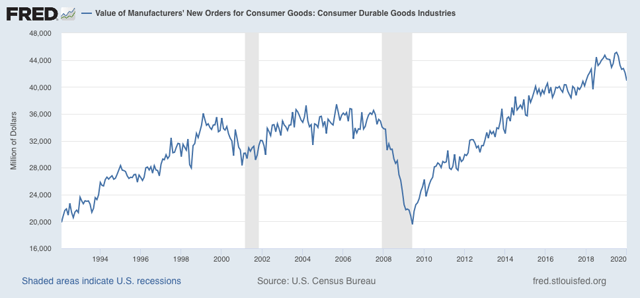
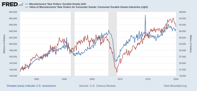
That’s because new consumer durable goods orders declined -2.8% in January. They are now down -9.3% from their July peak:


Even so, note that in the months leading up to the producer-led 2001 recession, consumer durable goods orders were down over -20% for several months. There have been several slowdowns - 1995, 1998, 2006, and 2015 - where 10% declines similar to this decline have not led to recessions.

Below I show manufacturers’ durable goods orders (blue, left scale) vs. consumer durable goods orders (red, right scale):


The 2008 recession was consumer-led and started out with a spike in gas prices from $3 to $4 a gallon, on top of a steep decline in housing, and a significant decline in motor vehicle sales.

While the January decline in consumer durable goods orders takes us a step closer to recession, barring a big downward revision in January retail sales and payrolls, it still is most consistent with a slowdown only. Of course, coronavirus may make all of this irrelevant.

First indication of likely producer side coronavirus impact


 - by New Deal democrat

First, an update on jobless claims: neither initial jobless claims nor continuing claims met either of my thresholds for concern this week. Both are below their levels a year ago, and the four week average of initial claims is less than 5% above its lows for this expansion.

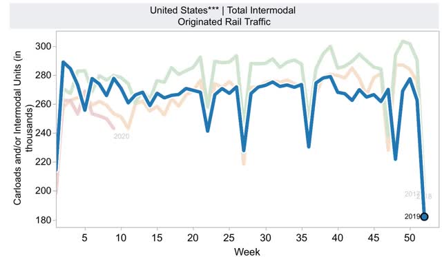
I have thought that on the producer side, the first indication we would have of an impact of the coronavirus on the supply chain or production would come via railroad loads and/or steel production. While steel production was up +1.2% YoY last week, railroad loads - and specifically intermodal units, by which most imports are shipped from Asia - are another story.

Intermodal rail loads were down -12.5% YoY last week. Except for two weeks right after Thanksgiving, at least one of which was clearly due to seasonality, this was the first time that intermodal transport by rail was down -10% or more since its initial decline 12 months ago. In other words, the ongoing decline didn’t just continue - it intensified.

Here’s a look at a multi-year graph of intermodal traffic from the AAR site. I’ve highlighted 2019 data. For YoY comparisons, 2018 is the faded green line; 2020 so far the faded red line:


It’s not unusual seasonally for rail traffic to decline w/w this time of year, but this does not affect the YoY comparisons. 

While correlation does not mean causation, in this case it is clearly entitled to the first pass. Coronavirus has infected the producer supply chain in a significant way.

Wednesday, March 4, 2020

Vehicle sales for February continue to show mixed picture


 - by New Deal democrat

Let’s take a look at February car and heavy truck sales. Putting this in perspective of economic cycles, typically, after housing turns, consumer purchases of vehicles and then other durable goods (like major appliances) turn down. Broader consumer purchases are the last to turn down before a recession.

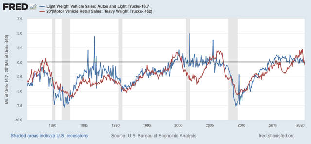
Light vehicle sales in February were estimated by the BEA at 16.7 million annualized (blue in the graph below, subtracting 16.7 so that February = 0). This is slightly below January’s level, but not nearly so much as would presage a recession. For that I would expect to see a number below 16.25 million:


Meanwhile heavy truck sales came in at 0.462 million annualized (red, also normed so that February = 0). Although this is slightly higher than January’s level, it is the fourth poor reading in a row, and demonstrates the producer downturn - although it is consistent with previous slowdowns and is not quite as severe as before the last two recessions.

There is no coronavirus impact in these numbers. They continue to show a producer downturn and a reasonably healthy consumer expansion.

Tuesday, March 3, 2020

US consumers . . . still consuming


 - by New Deal democrat

Aside from sitting around twiddling our thumbs waiting for partial motor vehicle sales from February to be reported later, there’s no economic news of note today.

But Tuesday mornings each week we do get chain store sales from the previous week. And if you’ve been paying attention, you know that I have been paying particular attention to these for signs that the producer downturn is spreading to consumers. That has taken on more urgency as we wait to see if coronavirus fears cause people to self-quarantine.

And the answer is . . . not so far!

Redbook chain store sales for last week were up +5.9% YoY.
Retail Economist chain store sales for last week were up +2.1% YoY.

Both of these numbers are right in line with each survey’s typical YoY growth for the past few months. 

On the producer side, we might see some impact in YoY rail and steel numbers later this week. 

But on the consumer side, people continue to look on the bright side of life.

Monday, March 2, 2020

February data starts with a positive note


 - by New Deal democrat

First of all, let’s all acknowledge that all of this data is likely to be big-footed by the effects of coronavirus. But it is still good to know the underlying state of the economy.

And in that regard, we got two decent numbers this morning.

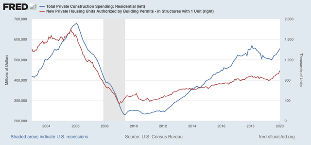
First, construction spending for January rose 1.8%. Even better, private residential construction spending rose 2.1%, as show below (blue) in comparison with single family housing permits (red):


These are the two least volatile number in the very forward-looking housing sector. Note that construction spending does lag permits, but it nevertheless leads the economy overall. This is a positive for the second half of this year.

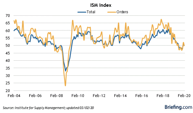
Second, the ISM manufacturing report for February was the second (ever so slightly) positive month in a row, at 50.1 (over 50 means expansion). The new orders component  did contract, also very slightly, at 49.8:


This is a short leading indicator, suggesting the producer side of the economy treading water in the next few months.

If we didn’t have one of the four horsemen of the apocalypse galloping into the picture, these would both be signs of no worse than a slowdown in the economy as we go later into 2020.

Saturday, February 29, 2020

Weekly Indicators for February 24 - 28 at Seeking Alpha


 - by New Deal democrat

My Weekly Indicators post is up at Seeking Alpha.

What happened in the past week certainly fits the definition of a crash - a loss of more than 10% in just five days - in my mind anyway. Not just stocks, but commodities also crashed.

Perhaps surprisingly, in the “hard” data of actual production and consumption, there doesn’t seem to have been much of an impact. In any event, clicking over and reading will bring you fully up to date, and put a penny or two in my pocket.

Friday, February 28, 2020

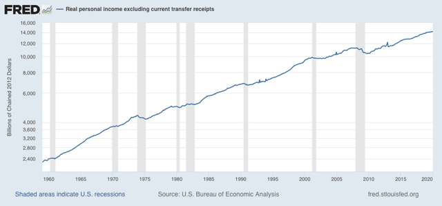
January real personal income consistent with either slowdown or incipient recession


 - by New Deal democrat

Real personal income (less government transfers) is one of the four coincident indicators the NBER looks at in determining recessions. Since January’s numbers were reported this morning, let’s take an updated look.

Truth be told, real personal income is actually a short lagging indicator. It frequently continues to improve a few months into a recession - and occasionally never turns down, as shown in the graph below which is rendered in log scale so that data from a few decades ago doesn’t just show up as microscopic squiggles:


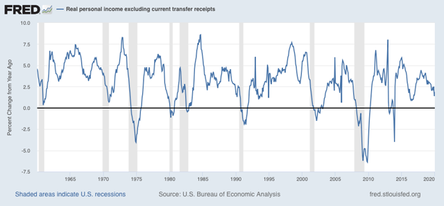
What historically *has* happened as a recession approaches is that the rate of increase decelerates sharply, by 40% or more from the recent peak:


As of December, this threshold was breached. Although real personal income improved by +0.6% in January, once transfer receipts are subtracted the monthly gain shrank to +0.3%. Thus, YoY this metric “improved” to +1.9% YoY, or just -39% below its 12 month peak of +3.1% from last February. 

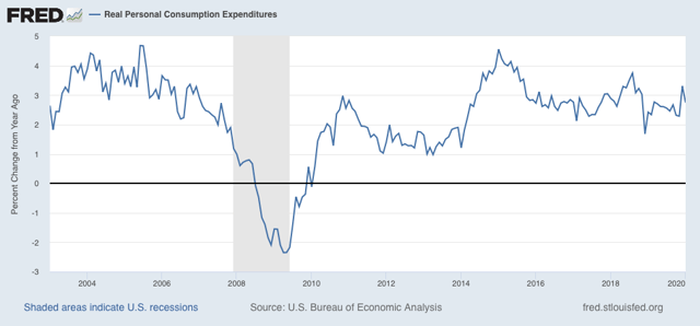
Meanwhile real personal spending rose only +0.1%, while YoY growth, at 2.7%, is in line with spending for the past four years:


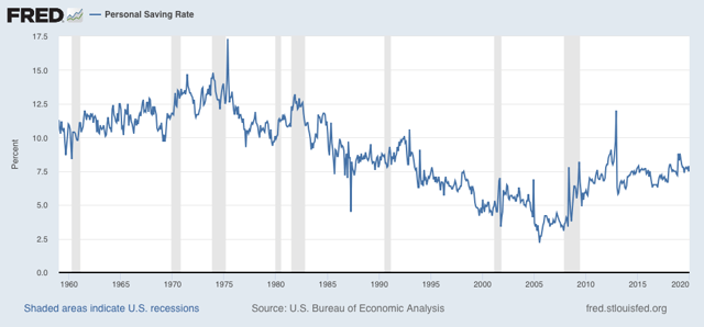
Finally, in the immediate prelude to a recession, consumers have typically decided to increase their savings rate. There was a small uptick in January, but no significant change compared with the past several years:


Bottom line: this coincident measure, just like real sales, is consistent with either a slowdown or an incipient recession. Industrial production continues to show an actual decline. Of the four most important coincident measures of the economy, only jobs growth is unambiguously positive. Any further knock to the economy (like, for example, the fear of a pandemic), could easily tip a slowdown into an outright downturn.