Wednesday, January 22, 2020

Why negative transportation indexes don’t support a recession call


 - by New Deal democrat

Every month for at least the past half year there is a spate of bearish economic commentary that relies upon one or both of two metrics: AAR rail carloads and/or the Cass Freight Index.

I have a post up at Seeking Alpha showing why the first measure is not a representative slice of transport as a whole, and the second has a history of being very volatile and with a slew of negative readings in the teeth of continuing expansions.

As usual, clicking on the link and reading helps reward me with a $ or two for my efforts.

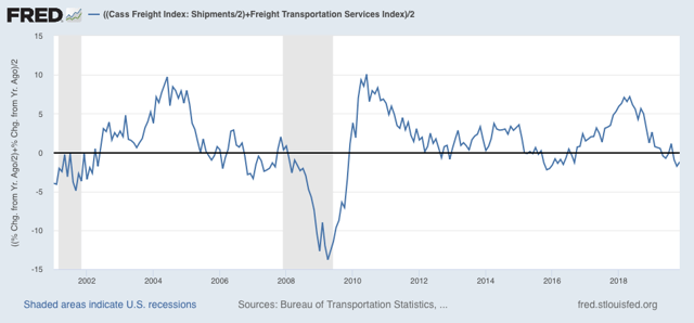
Addendum: after I put together and posted the article, I came up with the idea of averaging the Cass Freight Index and the Dept. of Transportation’s Freight Index after adjusting for the former’s volatility (shown below). It gives us an even less noisy overview of the transportation sector, although it still does go negative during slowdowns without there being a recession. In any event, none of the current negative readings are sufficiently below zero to accord with recessionary readings over the indexes’ short history:


Tuesday, January 21, 2020

Catching up: November JOLTS report


 - by New Deal democrat

Let me catch up on some data I didn’t examine last week: the November JOLTS report.
It decomposes the jobs numbers into a number of metrics, but is less than 20 years old, so only covers one full business cycle, so is of limited forecasting use.

To reiterate, here is the order in which the JOLTS series peaked during the 2000s expansion:

  • Hires peaked first, from December 2004 through September 2005
  • Quits peaked next, in September 2005
  • Layoffs and Discharges peaked next, from October 2005 through September 2006
  • Openings peaked last, in April 2007 

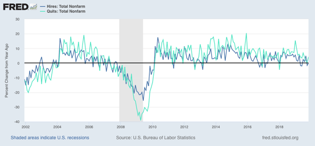
So to start, here are YoY hires and quits for the entirety of the series, measured YoY:


Hires has turned negative for some months in the past year, while quits remain positive YoY.

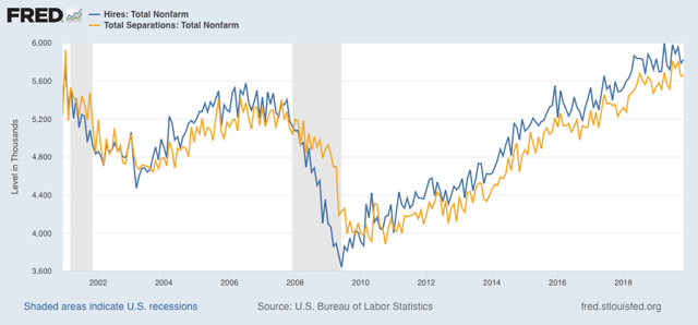
Next, as I have often said, hiring leads firing (actually, total separations). Here’s what that looks like for the entire series, first measured absolutely:


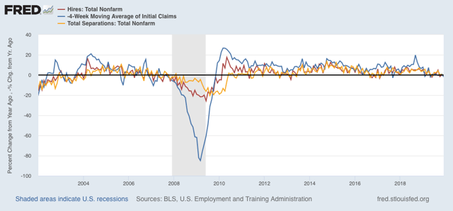
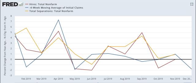
And here is the YoY change, plus the 4 week average of initial jobless claims (inverted) in red:


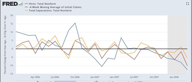
These aren’t as negative as prior to the 2007 recession, as compared in the two graphs below:

Present:

2007:

In 2007, both hires and initial jobless claims (inverted) were negative by as much as -5% YoY. In 2019, they’ve only been negative by about -2% at the worst.
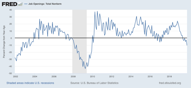
The biggest difference between this cycle and the last has been in job openings, which I consider “soft data.” But because the difference is noteworthy, here it is, again shown YoY:


This series is consistent with its 2008 recessionary readings.
Again, analyzing with lots of caution, my take remains: slowdown, not recession at this point.

Monday, January 20, 2020

For MLK Day: unemployment by race


 - by New Deal democrat

In observance of Martin Luther King’s birthday, almost all US markets are closed and there is no economic data.

So on this day let’s see the extent to which economic opportunity in several neutral metrics has improved since the passage of the Civil Rights Acts in the 1960s.

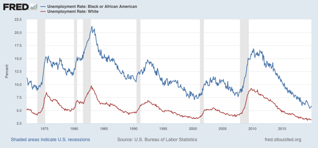
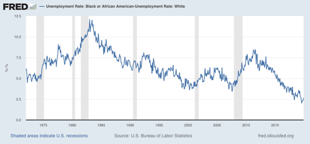
Here in unemployment for African Americans (blue) vs. whites (red) since the former began to be measured in 1972 (white unemployment had been measured since the 1950s - interesting that black unemployment wasn’t even deemed worthy of being separately measured before the 1970s!): 


Unemployment for whites made a 50 year low at 3.1% earlier in 2019. It was only lower, at 3.0%, in 1969 (not shown). African American unemployment made its all time low, at 5.4%, in August of last year.

To get a clearer picture how the two measures compare, here are two other ways to look at the same data.

First, here is the % by which the black unemployment rate has exceeded the white unemployment rate:


At the worst of the 1970s and 1980s, while white unemployment was bad, black unemployment exceeded it by over 10%! There has been general improvement in each expansion since, with black unemployment exceeding white unemployment by only 2% by last year.

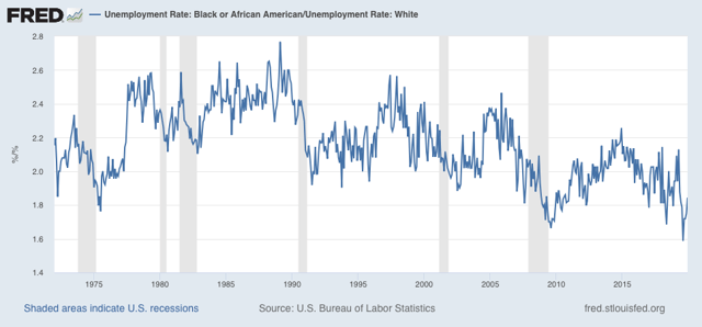
Another good way to look at this is the black unemployment rate as a multiple of that for whites:


At its worst, black unemployment was more than 2.6x that of whites. The multiple has gradually improved so that last year it was only 1.6x that of whites.

The bottom line here is: progress over the past 50 years, but still a long way to go. At their rates of improvement over the past 40 years, the former measure will reach parity in about another 30 years; but at its historical rate of improvement the latter multiple would require about another 80 years.

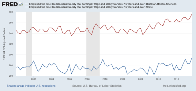
Finally, when it comes to wages, these have only been measured since 2000, and there is still roughly a 25% gap in average weekly wages:


Saturday, January 18, 2020

Weekly Indicators for January 13 - 17 at Seeking Alpha


 - by New Deal democrat

My Weekly Indicators post is up at Seeking Alpha.

The short term forecast has been volatile recently - and was again this week.

As usual, clicking over and reading rewards me a little bit for the effort I put in.

Friday, January 17, 2020

Housing BOOM! 2


 - by New Deal democrat

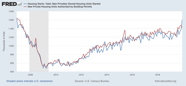
Housing is a very important long leading indicator, and it reflects both the consumer and producer sides of the economy. And this morning, at least in terms of starts, it hit a grand slam.

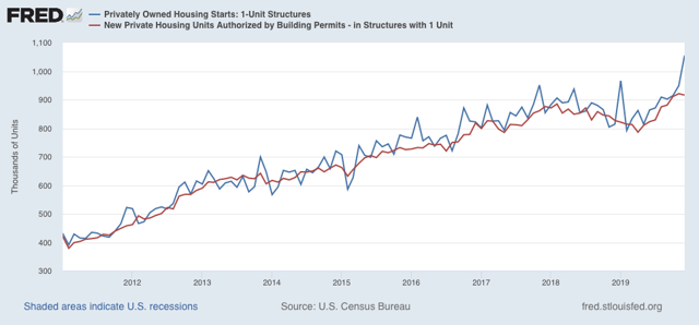
Total housing starts were 1.608 million units annualized, the highest number since the end of 2006. The less volatile and slightly more leading permits declined slightly to 1.416 million units annualized, but the three month average of each made new expansion highs:


The story is the same with the less volatile single family starts and permits:


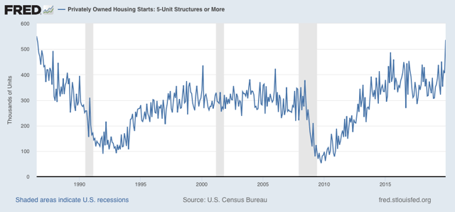
Finally, one point of difference I have had with That Other Blogger who writes about housing is that, because multi-unit housing, especially for younger buyers, can be something of a “substitution good” where single family house prices are beyond reach, I have suspected that multi-unit housing had not yet made its high for the cycle. And in terms of starts, that’s what this morning showed (permits made a huge spike high about 5 years ago the month a special housing program in NYC expired). Not only that, but multi-unit starts made a nearly 25 year high last month:


Lower mortgage rates have done what I expected them to do. It is an important reason why I expect the overall economy to improve later this year. And it is a *very* big argument against the producer slowdown turning into a full-blown recession.

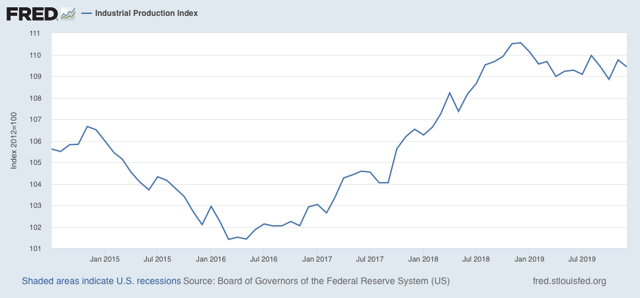
UPDATE: We also got December industrial production this morning, down -0.3%. Industrial production is the King of Coincident Indicators. Here’s what it looks like since July 2014:


Note that, while it is down (in fact it is down -1.0% YoY), it hasn’t gotten any worse since last spring.  And it isn’t down nearly as much as it was during the 2015-16 shallow industrial recession. This is one more brick in the wall of slowdown vs. recession. 

Thursday, January 16, 2020

The consumer is (probably) still alright: initial jobless claims and retail sales


 - by New Deal democrat

While the producer side of the US economy is almost certainly in a shallow recession, the consumer side has been holding up pretty well.  That was confirmed in two important releases this morning.

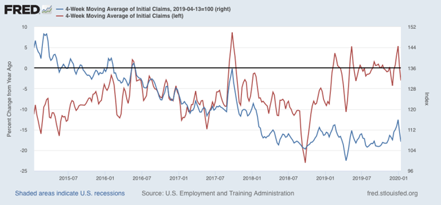
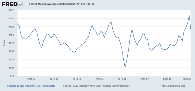
First, initial jobless claims declined to 204,000, one of the lowest numbers during this entire expansion. As a result, the 4 week average, at 216,250 is only about 7% higher than its lowest point during that time, and the first two weeks of January, at 209,000, are more than -10% lower than the January average last year. In short, both of my metrics for rating jobless claims have flipped back to positive. Here are both metrics, with the YoY measure in red, left scale, with the measure normed from the April bottom at 100 on the right scale:


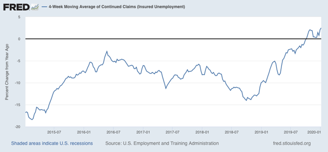
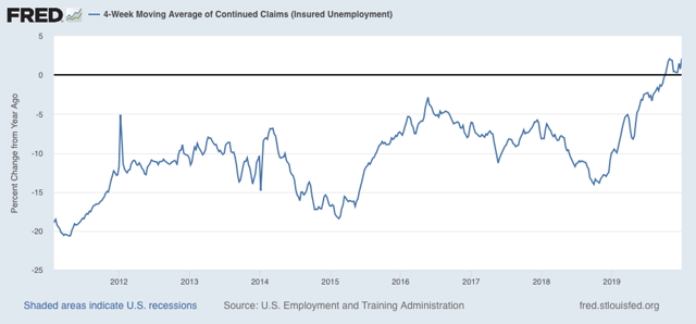
Only continuing claims, less leading but less noisy, continue to flash yellow: the 4 week average, at 1,755.5 million, is 2.5% higher than one year ago (I would need a reading of 5% higher or more YoY for this to flash red):


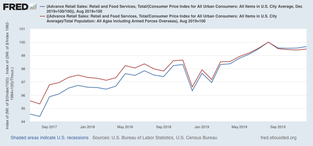
Second, nominal retail sales increased by +0.3% in December, and November was revised slightly higher to +0.3% as well. Since consumer inflation averaged a little less during those two months, real retail sales increased +0.1%.  On a per capita basis, they were flat.

Here are both measures, normed to 100 as of their most recent peak in August:


We’ve had similar periods of flatness previously during this expansion, for example late 2018 as shown in the above graph. It would take two more months of readings below the August peak for me to flip this to neutral. For now it remains a weak positive.

The bottom line is that, while there is some flatness, there are no signs of the consumer actually rolling over. Without that, a shallow downturn on the producer side is not enough to tip the whole economy into recession.

Wednesday, January 15, 2020

Producer sales not keeping up with producer price inputs


 - by New Deal democrat

Not much economic news today, and I normally don’t spend time on the producer price index, but considering the shallow producer recession and whether it will get deeper or not, as it happens the PPI does play into one metric.

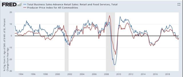
Below is a YoY graph of *nominal* manufacturing + wholesale sales (blue) since the inception of the series 25+ years ago vs. the PPI for all commodities (red):


There have only been three times that commodity prices have outpaced producer sales for longer than 2 months during that whole period: late 2002 when economists were worried about a “double dip” recession after 2001, and leading into and during the 1991 and 2008 recessions.

In other words, when commodity price increases outpace sales increases, the producer side of the economy is in trouble.

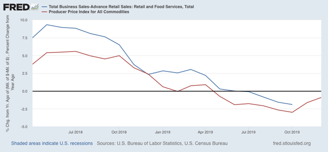
Now here are the last 20 months including December producer prices:


We’ll get manufacturing and wholesale sales for *November* tomorrow. But the obvious point is, unless we get significantly better sales numbers than we got one year ago (and November and December 2018 stunk, so it’s certainly possible!), producer sales won’t have kept pace with producer prices, yet another sign after poor ISM manufacturing and YoY heavy truck sales readings, that the producer side recession has taken hold.

Tomorrow will also give us retail sales, the gold standard for the consumer sector, so stay tuned.

Tuesday, January 14, 2020

Real wages declined slightly in Q4 2019; nearly flat since last January


 - by New Deal democrat

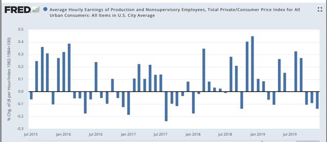
In December consumer inflation was +0.2%. Since in last Friday’s jobs report average hourly earnings also increased +0.1%, real average hourly earnings declined slightly:  


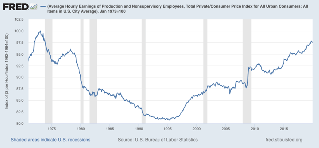
In a longer term perspective, this means that real wages also declined from 97.8% to 97.5% of their all time high in January 1973:


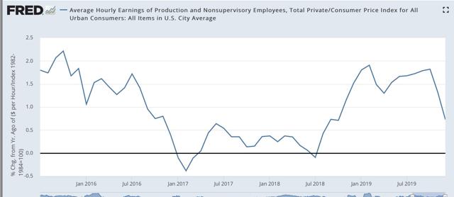
The YoY measure of real average wages also declined sharply from +1.6% to +0.7%: 


[Note however that this is subject to the same quirks as I discussed yesterday in terms of YoY nominal wage growth for December, so a rebound in January would hardly be a surprise]  

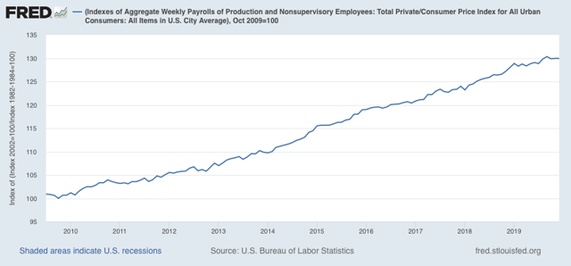
Aggregate hours and payrolls improved significantly between July and September, but have declined slightly in the three months since, so real aggregate wages - the total amount of real pay taken home by the middle and working classes - have declined from 30.4% to 30.0%  above their October 2009 trough at the beginning of this expansion:


Real aggregate wage gains have only been +0.8% in the past 11 months. As with so much other data, this is on the cusp of warranting at least a yellow flag.  I’ll have more to say once retail sales are reported later this week.

Monday, January 13, 2020

Scenes from the December jobs report: leading jobs sectors and wages


 - by New Deal democrat

Let’s take a more detailed look at last Friday’s December jobs report.

First, as usual for the past few months, let’s look at the more leading jobs sectors. This month, let’s also take a more detailed look at wage growth and why it may have suddenly decelerated. 

As an initial note, revisions going back to late 2017 are going to be available next month, and preliminarily it was already indicated that these will be strongly negative to the tune of several hundreds of thousands overall. In short, as weak as some of the numbers look now, they are likely to be even weaker when we see them next month.

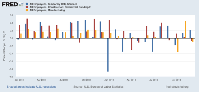
Here is this month’s update to the three leading sectors of employment that I have been tracking: temporary help (blue in the graph below), manufacturing (gold), and residential construction (red). Here’s what they look like compared with 2018, showing the slowdown this year (remember that the GM strike is responsible for the big swings in manufacturing in October and November):  


In November, residential construction had looked like it had rebounded from its losses earlier this year, more confirmation of the rebound in the long leading housing sector - but that was revised away this month!

Temporary help had seemed to defy the gloomy weekly statistics that have been worsening this year in the American Staffing Association report - except that, month after month for 12 months, there has been a consistent pattern of downward revisions. Below are the original number for the last six months on the left, followed by the first and then final revisions to the right:

JUL +2200 -7300* -10,500 (Net -12,700)
AUG +15,400 +14,500 +9500 (Net -5900)
SEP +10,200 +20,100 +9900 (Net -300) 
OCT -8100 +3800 -5400 (Net +2700)
NOV +4800 +4000* (Net -800)
DEC +6400
*1st revision only

A similar pattern has emerged for manufacturing employment (initial and final numbers only):

APR +4. +3 (-1)
MAY +3 +2 (-1)
JUN +17 +10 (-7)
JUL +16 +4 (-12)
AUG +3 +2 (-1)
SEP -2  +2  (+4)
OCT -36 -45 (-9)
NOV +54 (+4)*
DEC -12
*1st revision only

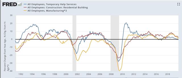
Here are the same three sectors but measured YoY for the past 30+ years:


Note that all three turned negative months before either of the past two recessions (the  manufacturing and residential construction  jobs series existed before then; they were both negative YoY before the 1991 recession as well). Only temporary help is negative YoY right now.

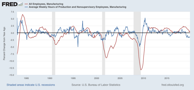
Next, the average manufacturing workweek is now down a full 1.0 hour per week YoY from its peak. Although I only show data from 1983 onward below, going back 70 years there have only been 2 occasions where such a decline lasted longer than one month without a recession happening (1953 and 1966). In the modern era shown, only in 1985 and 1995 for one month apiece were there 1 hour declines without a recession following. A look at the YoY% change in manufacturing hours for the past 35 years also shows that such losses have *always* led to actual YoY losses in manufacturing jobs:


In short, in 2019, manufacturing only added 46,000 jobs, or less than +0.4%, and we should expect more and significant actual losses in manufacturing jobs going forward.

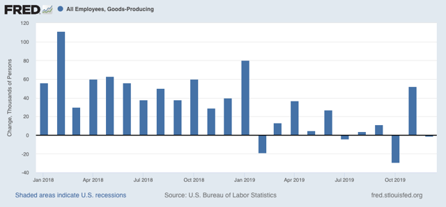
More broadly, only 176,000 jobs were added in the entire goods-producing sector all year (and 80,000 of those were in last January):


There were YoY losses in goods-producing jobs before all of the past 3 recessions, and going back 70 years, counting 12 recessions, in all but 3 there has been steep deceleration before and actual losses no later than two months into the recession, with only 2 false positives (1966 and 1985). Thus the current situation is consistent with at very least a severe slowdown.

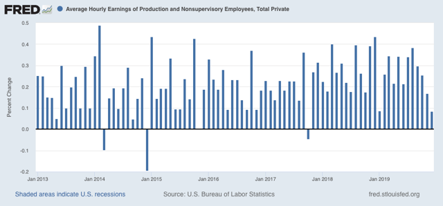
Now let’s turn to wages. December’s nominal growth of +$.02 per hour, or less than +0.1%, was one of the weakest readings in the past 7 years:


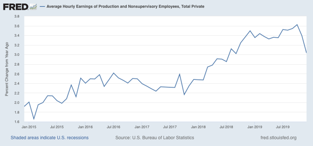
As a result, nominal YoY wage growth for non-managerial workers declined sharply to +3.0% from a peak of +3.6% only two months ago:


This has already received a lot of attention since Friday, but let me call your attention to two points. The first is that, as you can see from the first graph above, there is something of an anomaly in that not only did December replace an exceptionally strong reading from December 2018, but January 2019’s wage gains were also very week. In other words, if we get a decent number next month, the YoY% change will rebound significantly.

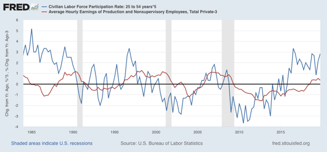
Secondly, there seems to be something of an inverse relationship in the short term (I.e., over a year or less) between big gains/declines in labor force participation and wage growth. Here’s what the two look like, averaged quarterly to cut down on noise, for the past 35 years:


While *cyclically* the two move in the same direction, with a significant lag between participation and wage growth (wage growth being a long lagging economic indicator), over the shorter term we can see where a big decline in participation coincides with or precedes with a few month delay a stabilization in wage growth, while a big increase in participation coincides with or precedes with a few month delay a halt or decline in wage growth. It’s possible this is due to the mix of jobs being different, if lower-paying jobs grow more than other job categories. It may also be that the increased competition for jobs due to more participants acts to suppress wage growth. 

In any event, we had a surge in participation in the latter part of last year, and so it is not a big surprise that there would at least be a pause in wage growth.

Sunday, January 12, 2020

The 2020 Electoral College playing field expands for Democrats


 - by New Deal democrat

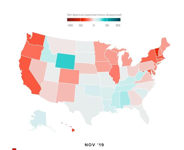
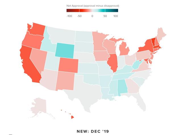
Polling firm Morning Consult has an interactive graph measuring Trump approval by State for each month since January 2016. You can visit it here.

The map has some interesting insights for the 2020 Presidential election race. In the first place, while it would be too cumbersome to show here, in general Trump’s disapproval has spread and intensified over the course of his term. As the latest map, for December, does not include reaction to his reckless warmongering with Iran, I am going to guess that January’s map will be worse for him.

Anyway, while there is obviously some variation from month to month, the latest two months shown below in chronological order, November and December, show - in shades from light pink to red - all of those States that the Democratic candidate has the most decent chance of carrying: 

November:


December:


Most of the States are obvious, but in addition to several known battlegrounds: Arizona and North Carolina in particular; there are a few States that you wouldn’t expect:  Alaska, Montana, Nebraska, Iowa, and Georgia. Note also that Ohio has returned to the Democratic fold. The only negative surprise is that Florida remains pretty elusive (although for a few months in the past it has shown net disapproval).

I suspect that the impact of tariffs is the reason for the western States in the list above showing net disapproval. If the Democratic nominee pledges to take action to resolve the trade wars, it seems like there is an opening.

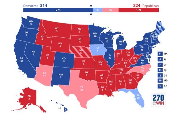
Just for comparison, here is the map of total votes by party in Congressional races for each State in 2018:


As I’ve pointed out before, in North Carolina really about 52% of all votes were cast for Democrats, so that ought to be shown in blue. But we’ve seen a further expansion of the playing field in 2019.

Saturday, January 11, 2020

Live-blogging the Fifteenth Amendment: January 7 and 11, 1869


 - by New Deal democrat

January 7:  Remarks by Rep. Benjamin M. Boyer, Democrat from Pennsylvania:

Mr. Chairman, the issues supposed to have been settled by the election of General Grant to the Presidency formed the subject of an elaborate speech by the honorable gentleman from Maine [Mr. Blaine] a few days before the adjournment of the Congress for the holidays* in December..... I propose to make [a few brief remarks] upon this the first occasion I have had for reply.  [*Note: oh noes! The War on Christmas in 1869!] 
The late Presidential election decided, of course, that the Republican Party should continue to administer the government through the elected Chief Magistrate of their own choice and a majority of the Forty-First Congress. But it settled scarcely anything else .... 
The gentleman lays it down as an inevitable consequence of General Grant’s election that negro suffrage must be accepted as a permanent establishment in the southern States, ‘and at no distant day throughout the entire Union.’ Yet if negro suffrage, which is the very corner-stone of the entire Radical reconstruction, had been divested of all other issues and had been fairly submitted to a vote of the whole people, what man acquainted with the national sentiment will deny that its defeat would have been overwhelming? No other proof is needed to establish this proposition than the decisive vote upon this question when lately presented by itself in several of the great Republican States of the North and the continued exclusion of negroes from the polls in nearly all of them? 
It is said, however, that negro suffrage ‘is of necessity conceded as one of the essentials of reconstruction.’ But has the Radical policy of reconstruction itself been so approved and established that it can never be disturbed by future elections? Is there nothing to be apprehended from the continual violation of natural laws and a possible collision of races? Are the reconstruction laws themselves so firmly entrenched upon constitutional grounds that a general revulsion of feeling upon the superior race might not find a ready excuse for sweeping from its foundations the whole work of Radical reconstruction? 
.... Those caricatures of republican government imposed by the stranger and the negro upon the disenfranchised white race of the South had become abhorrent to the public mind of the North long before the late presidential election....

Congressional Globe, 40th Congress, 3rd Session, pp. 269-270

This speech was a response to that of Rep. James Blaine on December 10, 1868, previously reported in this series. Of course, with 150 years of hindsight, we can see that Boyer’s prognostication was accurate: as soon as the opportunity presented itself, “a ready excuse for sweeping from its foundations the whole work of Radical reconstruction” was found and was adopted as the law of the land by the Supreme Court.

_______________________

January 11: Congressman George S. Boutwell (shortly thereafter to become Pres. Grant’s Treasury Secretary):

I desire for a moment to get the attention of the House to a report from the Judiciary Committee of a joint resolution proposing an amendment to the Constitution of the United States, and also a bill as a substitute [for a prior House bill] ... 
Article __. 
Sec. I. The right of any citizen of the United States to vote shall not be denied or abridged by the United States or any State by reason of the race, color, or previous condition of slavery of any citizen or class of citizens of the United States. 
Sec. 2. The Congress shall have the power to enforce by proper legislation the provisions of this article.

Congressional Globe, 40th Congress, 3rd Session, pp. 285-286.

Unfortunately, no record exists of the debates or deliberations of the Judiciary Committee. But here we see that the expansive “right to vote” proposals have been set aside in favor of the more limited “no discrimination based on race” language that was ultimately adopted. 

Several more weeks yet remain before the whole of the Congress will take up the Committee proposals.

Weekly Indicators for January 6 - 10 at Seeking Alpha


 - by New Deal democrat

My Weekly Indicators post is up at Seeking Alpha.

How week - or not - the next six months are going to be remains the primary issue.

As usual, clicking over and reading should bring you right up to date, as well as rewarding me a little bit for the effort I put in.

Friday, January 10, 2020

December Jobs Report: an emblematic end to 2019


 - by New Deal democrat

HEADLINES
  • +145,000 jobs added
  • U3 unemployment rate unchanged at 3.5%
  • U6 underemployment rate declined -0.2% from 6.9% to 6.7%
Leading employment indicators of a slowdown or recession

I am highlighting these because many leading indicators overall have strongly suggested that an employment slowdown is here. The following more leading numbers in the report tell us about where the economy is likely to be a few months from now. These were mixed:
  • the average manufacturing workweek was unchanged at 0.1 hour at 40.5 hours (up +0.1% with revision). This is one of the 10 components of the LEI and is positive including the revision.
  • Manufacturing jobs declined by -12,000. Manufacturing gained 46,000 jobs in 2019, a sharp deceleration from 2018’s pace of 264,000.
  • construction jobs rose by 20,000. In 2019 construction jobs were up 151,000, also a deceleration from 207,000 in 2018. Residential construction jobs, which are even more leading, fell by -1100.
  • temporary jobs rose by 6400. 
  • the number of people unemployed for 5 weeks or less increased by 39,000 from 2,020,000 to 2,065,000.

Wages and participation rates

Here are the headlines on wages and the broader measures of underemployment:
  • Not in Labor Force, but Want a Job Now: unchanged at 4.832 million
  • Part time for economic reasons: decreased by -140,000 from 4.322 million to 4.182 million 
  • Employment/population ratio ages 25-54: rose +0.1% from 80.3% to 80.4%
  • Average Hourly Earnings for Production and Nonsupervisory Personnel: rose $.02 to $23.79, up +3.0% YoY - a sharp deceleration from recent YoY growth. (Note: you may be reading different information about wages elsewhere. They are citing average wages for all private workers. I use wages for nonsupervisory personnel, to come closer to the situation for ordinary workers.)  

Holding Trump accountable on manufacturing and mining jobs

 Trump specifically campaigned on bringing back manufacturing and mining jobs.  Is he keeping this promise?  
  • Manufacturing jobs rose an average of 4000/month in 2019 vs. the last seven years of Obama's presidency in which an average of +10,300 manufacturing jobs were added each month. This is a sharp deceleration.
  • Coal mining jobs decreased by -1200, and an average of -58 jobs/month in the past year vs. the last seven years of Obama's presidency in which an average of -300 jobs were lost each month
October was revised downward by -4,000. November was also revised downward by -10,000, for a net change of -14,000.

Other important coincident indicators help  us paint a more complete picture of the present:
  • Overtime was unchanged at a +0.1 upwardly revised 3.2  hours
  • Professional and business employment (generally higher-paying jobs) rose by 10,000 and  was up +397,000 in 2019, a deceleration from 561,000 in 2018. 
  • the index of aggregate hours worked for non-managerial workers rose by 0.1%
  •  the index of aggregate payrolls for non-managerial workers rose by 0.2%  
Other news included:            
  • the alternate jobs number contained  in the more volatile household survey rose by 267,000  jobs.  This represents an increase of 1,778,000 jobs YoY vs. 2,180,000 in the establishment survey. 
  • Government jobs rose by 6,000.
  • the overall employment to population ratio for all ages 16 and up was unchanged at 61.0% and was up 0.4% in 2019.    
  • The labor force participation rate was unchanged at 63.2% and was up 0.2% in 2019.

SUMMARY

This report was emblematic of all of 2019. There was deceleration or decline in most of the leading sectors, adding up to a sharp deceleration for the year. Meanwhile the headline coincident data was positive or at least equal to the best levels of the expansion. Prime age work force participation continued to increase. 

If there was a surprise, and it was a nasty negative one, it is that average hourly wages for non-managerial personnel suddenly declined to +3.0% YoY.

Basically, the jobs market is in pretty good shape at the moment - except for the sectors which have historically led the rest. There is nothing in this report to suggest any imminent recession, but also nothing to suggest an acceleration from the recent slowdown.

Thursday, January 9, 2020

As seasonality abates, initial claims return to more normal level


 - by New Deal democrat

As you know, I’ve been monitoring initial jobless claims closely for the past few months, to see if there are any signs of a slowdown turning into something worse. Simply put, if businesses aren’t laying employees off, those same people are consumers who are going to continue to spend, which is 70% of the total economy. So the lack of any such increase has been the best argument that no recession is imminent.
This morning’s report of 214,000 initial claims returns us to the 2018-19 average, while the 4 week average of 223,500 remains slightly elevated (possibly due to seasonality issues). 

To reiterate, my two thresholds for initial claims are:

1. If the four week average on claims is more than 10% above its expansion low.
2. If the YoY% change in the monthly average turns higher. 
I’ve also added a threshold for the less leading, but also much less volatile 4 week average of continuing claims at 5% higher YoY.

At 223,500, the 4 week average is 11.2% above the lowest reading of this expansion, which occurred last April: 


On a YoY% change basis, the 4 week average is on +250, or +0.1% higher:


The latest monthly average remains December, which was +4.6% higher than December 2018: 


Only one of the two thresholds is crossed, and that is probably due to seasonal quirks having to do with Thanksgiving being one week later in 2019 vs. 2018.


This removes the “red flag” of the past two weeks, but the cautionary “yellow flag” remains.


Meanwhile, the less volatile 4 week average of continuing claims is 2.1% above where it was a year ago: 


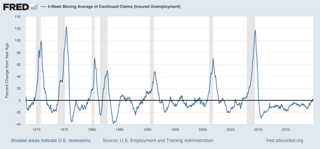
Here is the longer term graph:

This remains consistent with a significant slowdown. But there have been similar readings in 1967, 1985-6, 3 times in the 1990s, and briefly in 2003 and 2005, all without a recession following. So the threshold for continuing claims being a negative (vs. neutral) has not been met.
   
Bottom line: unless initial claims are reported in the 230’s without seasonal flukes (or 15%+ higher than their lows), and continuing claims continue to trend  higher, into the 1.750 million range or higher, there is no recession flag.  The slowdown hypothesis vs. recession remains the most likely outcome. 

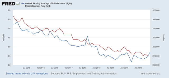
ADDENDUM: Since tomorrow is jobs day, let me haul out the graph of initial jobless claims (averaged monthly, blue) vs. the unemployment rate (red):


In the long term historical view (not shown), the unemployment rate lags initial jobless claims by about 1-3 months. So I’m not expecting any further decrease in the unemployment rate, and there is a fair probability of an increase in tomorrow’s report.

Wednesday, January 8, 2020

Crosscurrents at the start of 2020


 - by New Deal democrat

Here’s a potpourri of points on a Wednesday without important data.

1. The “quick and dirty” system for the short term forecast, comparing initial jobless claims vs. the stock market, which typically move in the same direction, is showing its biggest disconnect in over 10 years. Stock prices “melted up” in Q4, while initial jobless claims turned worse YoY. 

This post went up at Seeking Alpha. As usual, clicking over and reading rewards me a little bit for my efforts as well as hopefully being educational for you.

I think part of this is that the stock market reacted too quickly and violently to the downside in response to the yield curve inversion, and 0.25% Fed rate hike in December 2018, and has reacted in the opposite direction to the un-inversion in the curve and Fed rate cuts in autumn 2019.

2. Really, if it weren’t for the stock market record highs, the short term forecast would be on the doorstep of recession. As I’ve written over the past couple of weeks, in addition to jobless claims, the ISM manufacturing index and truck sales are all very close to crossing their respective recession thresholds. Yesterday’s durable goods report was also negative. On the other hand, consumer purchases of motor vehicles specifically and consumer durables broadly, while flattish, aren’t at the threshold as of now.

3. In Friday’s employment report, I will continue to watch for declines in manufacturing and temporary employment, and revisions to previous months’ numbers. If last year’s pattern holds, the initial numbers will be positive, but there will be downward revisions to past months.

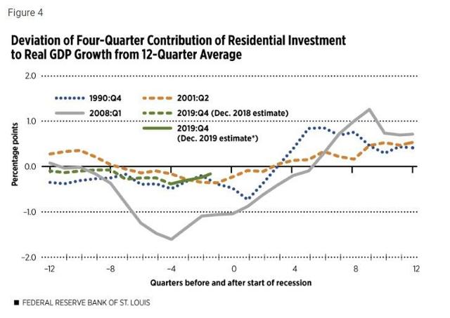
4. Via Mish, I read a St. Louis Fed study that said that housing metrics are “consistent with” a “broader slowdown” this year. An interesting study, but let me highlight one graph, housing as a share of GDP, to make a point. Here’s the graph:


Now here’s the quandary. It looks to me like the green line, representing the present, could just as easily be moved 2 to 4 quarters forward (I.e., Q4 2019 being 2 quarters after the onset of a recession, as 1 or 2 quarters before the onset). Since the 1991 and 2001 recessions lasted between 2 and 3 quarters, this number appears as consistent with the economy on the cusp of *exiting* a slowdown as entering one. Note also that when this metric crosses the 0 line from the downside, the recession has always been over. It could do that as of when Q4 GDP is reported at the end of this month.

5. All of which leads to the point that, at any given time, there will be indicators that point to expansion, and indicators that point to contraction. Lots of people cherry-pick the indicators that fit their prior opinions. What I try to do, in addition to reporting on about all of them, is to ferret out on which side of the scale the lion’s share of the indicators are. For example, as of now the lion’s share of the long leading indicators are on the *expansion* side of the scale. As I’ve pointed out above, the short leading indicators are almost in equipoise. And just in terms of nothing ever being perfect, despite the negatives in the short leading indicators, the new lows in corporate bond interest rates last autumn have an excellent (but not perfect!) 100 year record of negativing an oncoming recession.

6. Finally, a reminder that a recession in an election year is very bad for the candidate of the incumbent party. Further, according to the “Bread and Peace” election model, so is an unpopular war (just ask Harry Truman in 1952, Hubert Humphrey in 1968, and John McCain in 2008).
 

Tuesday, January 7, 2020

December vehicle sales confirm deepening producer recession, consumer wobble


 - by New Deal democrat

The BEA finally released its preliminary report on December motor vehicle sales yesterday, and it is yet more confirmation of the trends I’ve been discussing recently: there is a deepening producer recession, but the consumer is alright - although with some signs of wobbling.

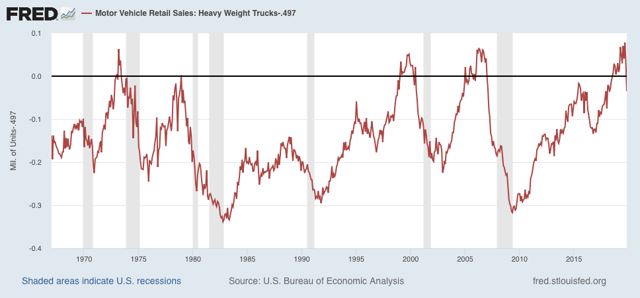
Let’s look at heavy truck sales first, which tells us about the producer side of the ledger. These were estimated at .497 million annualized. FRED won’t update their graph until the final numbers are in later this month, so in the meantime I have subtracted .497 from the annualized number so that December would be 0 in the below historical graph:


This confirms that November’s steep plunge was not an outlier. The average of the past two months is more than 15% lower than September’s peak of .575 million annualized sales. 

More often than not, this scale of decline has meant a recession within the next 6 to 12 months. There are six true positives (1973, 1979, 1981, 1991, 2001, 2007), vs. 5 false positives (1976, 1985, 1996, 2002, and 2016). There is also one false negative (1969). The longer the decline goes on, the truer the signal. 

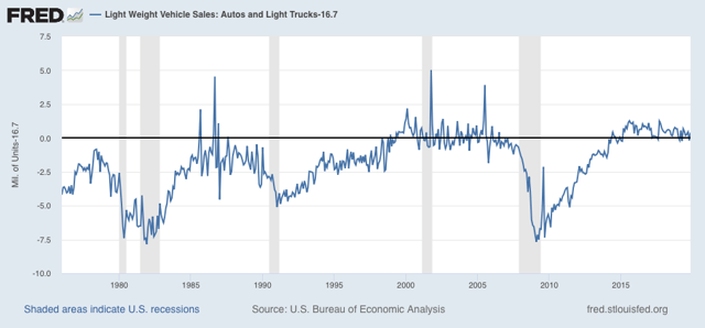
 Now let’s turn to light vehicle sales, which tell us about the consumer side of the ledger. These came in at 16.7 million units annualized. As with trucks, I’ve subtracted that number so that December would show at 0 in the below FRED graph:


This is about 7% off the recent peak of just below 18.0 million units annualized. In the past, it has typically taken a 10% decline off peak to signal a recession. Also, please note that  there is a lot more noise in this metric compared with heavy truck sales.

The takeaway is that we have yet more evidence (on top of the worsening ISM manufacturing numbers) that there is a producer recession, and it is has been deepening. The consumer remains alright, but the trend is weakening there as well.

Monday, January 6, 2020

January’s reports start out with a decidedly mixed picture for 2020


 - by New Deal democrat

We have our first bits of forward-looking data for the year: November residential construction, December ISM manufacturing, and December light vehicle sales. They paint a decidedly mixed picture. Let’s take a look in order.

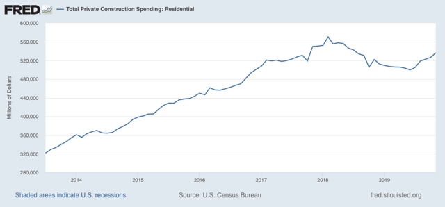
Residential construction spending improved by a strong 1.9% in November. Further, October, which had originally been reported as a decline, was revised to a 0.7% increase:


Housing is recovering from its early 2019 slump thanks to the decline in interest rates. This is a tailwind for the economy as we get into the second half of this year.

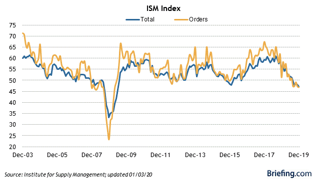
On the other hand, the ISM manufacturing index, and its more leading new orders component, declined to critical levels in December, at 47.2 and 46.8 respectively:


Over its 70+ year history, a decline below 48 in the overall index for two months has historically indicated that a near-term recession is more likely than not. Note, the ISM says that a reading below 42 is consistent with a *concurrent* contraction. So, Q4 GDP is forecast to improve by this metric. What I am saying is that we are very close to the tipping point where a Q2 or Q3 2020 contraction is forecast.

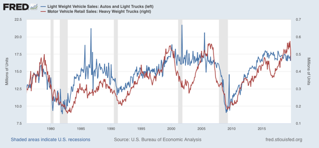
Finally, with the important exception of Ford, which will report today, we got December car and light truck sales on Friday. The reports I’ve seen have this variously between an annualized 16.7 and 17.0 million vehicles, which would put the number in the middle of the last 12 months in the blue line in the graph below (through November):


That’s mediocre, but not at the -10% off peak that has typically occurred before the onset of recessions in the last 40 yeas.

Note that the more leading and decisive heavy truck sales took a major spill in November. That might be a one-off due to the GM strike. I have seen no reports at all for December yet. Hopefully we’ll get that number today, and if so, I’ll update this post.

In short, January starts out with a forecast for some tough sledding in the first half of this year, but improvement in the second half (subject of course to catastrophic actions taken by the buffoon in the White House).

Sunday, January 5, 2020

Republics and the war-making power


 - by New Deal democrat

In view of the military carrying out Trump’s order to kill an Iranian general, I thought I would weigh in on the issue of the war-making power historically by republics.

I don’t have much to add to the substance of the immediate debate. Killing an Iranian general was certainly an act of war. It was also a big escalation on the US side. At the same time, the US’s economic blockade of Iran, which it has been attempting to enforce against third parties as well, has been if not an act of war itself, at least tiptoeing up to the very line. Similarly, Iran’s conducting of low-grade hostilities by proxies against the US has also really been an act of war. So I’m not sure that the line-crossing is as bright as it may appear at first blush.

That being said, it seems obvious that the consequences of the strike were not well-thought out, and there almost certainly is no strategic follow-up plan.

Additionally - and what I want to focus on here - is that also almost certainly, there was no imminent emergency requiring immediate action by the President rather than consultation with an approval by the Congress, as mandated by, you know, the Constitution. This event has been at least equal to the most blatant usurpation of Congress’s power in decades (Reagan’s reprisals against Libya and George HW Bush’s capture of Noriega in Panama were probably in the same league).

This got me to thinking: how historically have republics vested their war making power? Since recently I’ve read two books on the Roman Republic, histories of medieval Venice and Genoa, and am now reading about the Dutch Republic, that’s something I can contribute — because their systems had a common theme. 

Simply put, none of the four allowed the Executive, even when that Executive commanded armies as well, to go to war of their own accord.

In the Roman Republic, it was the Senate that decided whether or not to go to war. Only once that decision was made did the Senate assign a consul (or a praetor) a theatre of action to command. 

In Venice, it was the Arengo or Great Council that decided whether or not to go to war. Only then would the Doge or other citizens or mercenaries be assigned command.

In Genoa, it was the Commune that decided whether or not to go to war. Only then would the consul, doge, or podesta (the executive at various stages of the Republic) be authorized to command himself, or assign command to others, to make war.

In the Netherlands, it was the States General that decided whether or not to go to war. Only then would the Stadthouder(s) be authorized to take action.

Why? It helps to think of young republics in particular as merchant, profit-making enterprises (if you are an aficionado of Star Trek, the Ferengi would be precisely on point).  Unless there are compensating gains in territory and/or booty, wars are a strain on a society’s resources. Whereas monarchs would make war for personal aggrandizement, with only secondary thought about their realm’s resources, for republics the economic loss and benefit calculations were very much in their forefront of thought (here I have to make the important exception of the crusades, which Venice and Genoa participated in primarily for religious reasons, although when the crusades were successful, trading opportunities certainly did open up).

So republics generally have been careful to ensure that wars of aggression were only undertaken where there was a clear benefit to the State. Recall that we also seen that when that broke down - when the executive functioned as commander of their own private army in the late Roman Republic - the republic did not last that much longer. Similarly, in the Dutch Republic the Stadthouders of the House of Orange, in their quest to become monarchs (briefly successful before the line died out) engaged in a protracted struggle for war-making power against the States General.

The last example is especially noteworthy because supposedly it was the Dutch Stadthouder that was the model for the US Presidency as envisioned by the founders. And just as in the Netherlands, the Executive has engaged in a protracted struggle with the Congress to arrogate the power to itself.

An Executive which can make war on its own accord is going to think much more of their personal glory and benefit than the economic gain or loss to the State. And that is exactly what we have seen in the past week. Needless to say, such an Executive is a danger to the republic. 

If I were re-founding the republic, I think I might vest the emergency commander-in-chief powers to go to war, rather than with the President, with the Senate majority leader, who would have proven themselves as a shrewd political calculator, and would be thinking about their status within the Senate. In the meantime, to restore its authority it will require that the Congress successfully impeach and remove at least one President for arrogation of the war-making power.

Now wouldn’t be a bad time to start.