- by New Deal democrat
Here’s a potpourri of points on a Wednesday without important data.
1. The “quick and dirty” system for the short term forecast, comparing initial jobless claims vs. the stock market, which typically move in the same direction, is showing its biggest disconnect in over 10 years. Stock prices “melted up” in Q4, while initial jobless claims turned worse YoY.
This post went up at Seeking Alpha. As usual, clicking over and reading rewards me a little bit for my efforts as well as hopefully being educational for you.
I think part of this is that the stock market reacted too quickly and violently to the downside in response to the yield curve inversion, and 0.25% Fed rate hike in December 2018, and has reacted in the opposite direction to the un-inversion in the curve and Fed rate cuts in autumn 2019.
2. Really, if it weren’t for the stock market record highs, the short term forecast would be on the doorstep of recession. As I’ve written over the past couple of weeks, in addition to jobless claims, the ISM manufacturing index and truck sales are all very close to crossing their respective recession thresholds. Yesterday’s durable goods report was also negative. On the other hand, consumer purchases of motor vehicles specifically and consumer durables broadly, while flattish, aren’t at the threshold as of now.
3. In Friday’s employment report, I will continue to watch for declines in manufacturing and temporary employment, and revisions to previous months’ numbers. If last year’s pattern holds, the initial numbers will be positive, but there will be downward revisions to past months.
4. Via Mish, I read a St. Louis Fed study that said that housing metrics are “consistent with” a “broader slowdown” this year. An interesting study, but let me highlight one graph, housing as a share of GDP, to make a point. Here’s the graph:
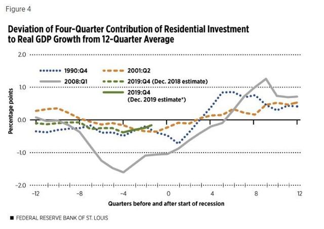
Now here’s the quandary. It looks to me like the green line, representing the present, could just as easily be moved 2 to 4 quarters forward (I.e., Q4 2019 being 2 quarters after the onset of a recession, as 1 or 2 quarters before the onset). Since the 1991 and 2001 recessions lasted between 2 and 3 quarters, this number appears as consistent with the economy on the cusp of *exiting* a slowdown as entering one. Note also that when this metric crosses the 0 line from the downside, the recession has always been over. It could do that as of when Q4 GDP is reported at the end of this month.
5. All of which leads to the point that, at any given time, there will be indicators that point to expansion, and indicators that point to contraction. Lots of people cherry-pick the indicators that fit their prior opinions. What I try to do, in addition to reporting on about all of them, is to ferret out on which side of the scale the lion’s share of the indicators are. For example, as of now the lion’s share of the long leading indicators are on the *expansion* side of the scale. As I’ve pointed out above, the short leading indicators are almost in equipoise. And just in terms of nothing ever being perfect, despite the negatives in the short leading indicators, the new lows in corporate bond interest rates last autumn have an excellent (but not perfect!) 100 year record of negativing an oncoming recession.
6. Finally, a reminder that a recession in an election year is very bad for the candidate of the incumbent party. Further, according to the “Bread and Peace” election model, so is an unpopular war (just ask Harry Truman in 1952, Hubert Humphrey in 1968, and John McCain in 2008).