Monday, December 3, 2018

Why this Friday I'll pay particular attention to the temporary jobs number


 - by New Deal democrat

With the long leading indicators outside of corporate profits and ease of credit having turned neutral to negative, at least for now, my attention is turning more and more to the short leading indicators. And one of those -- temporary employment -- is of particular importance to the overall employment situation. It is reported as part of the overall monthly jobs report, and I will be paying particular attention to it when the November jobs report is issued this Friday.

Since the BLS started to report the series in 1991, temporary employment has tended to peak roughly 6 to 9 months before overall employment, and to bottom roughly 3 months in advance:


Here is the same information graphed as the YoY% change (note I've divided temp growth by 4 for purposes of scale):


and here is a close-up since 2012. The lead and lag times have certainly been variable, but they are nevertheless clear:


The simple takeaway from the above is that temporary employment is still growing, which is positive for the jobs market in the coming months. BUT, while it hasn't turned negative, that growth began to decelerate one year ago, and has slowed substantially in the last six months, causing YoY growth to be cut in half.

As a result, I am expecting the slowdown in growth to begin showing up in the overall employment numbers. Here's what the monthly numbers look like since a little over a year ago:


Over the three months beginning last November, monthly jobs growth averaged a little under 190,000. While the monthly numbers a way too volatile, a slowdown to under 175,000 job gains per month in the next few months looks reasonable.

For completeness' sake, I've also frequently noted that real retail sales, while very noisy m/m, has a good track record of leading employment by several months. Here's the YoY% look at that since 2010:


This has also moderated as September 2017's +1.7% monthly gain has disappeared from the YoY comparisons. It's too soon to know for sure if real retail sales are confirming the recent slowdown in temp hiring.

In any event, on Friday I'm going to pay particular attention to the temp hiring number, and if that slowdown continues, I'll start highlighting it in my monthly post on the jobs report.

Saturday, December 1, 2018

Weekly Indicators for November 26 - 30 at Seeking Alpha


 - by New Deal democrat

My Weekly Indicators post is Up at Seeking Alpha. Yet another long leading indicator has slipped into negative territory.

As usual, clicking over and reading should help you understand the current situation in the economy, and helps me out with a little $$$ jingle for the holidays.

Friday, November 30, 2018

The recent rise in initial jobless claims: signal or noise?


 -  by New Deal democrat

Yesterday initial jobless claims for the prior week were reported at 234,000, a six month high. That's 32,000 above the recent one week low. The four week moving average rose to 223,250, more than 15,000 higher than its recent low:


Is it cause for concern? After all, the long leading indicators have been neutral for half a year, and in the last several weeks their more volatile high frequency version turned negative, so it is reasonable to expect short leading indicators to start to follow suit. 

To cut to the chase, while it is certainly possible that it is the beginning of something worse, we aren't anywhere near the point where we can rule out it simply being noise (although it certainly suggests that the monthly unemployment rate isn't going to decline any further in the next few jobs reports, since initial claims lead the unemployment rate by several months). I've arrived at a formulation for distilling signal from noise, which will be the subject of a longer post, but consider this an introductory sketch.

While I won't go into all the details here, the simple fact is that there is almost always one or two periods a year where the four week moving average of jobless claims rises between 5% and 10%. About once every other year for the past 50+ years, it rises over 10%. Typically (not always!) it has risen by 15% or more over its low before a recession has begun. And a longer term moving average of initial claims YoY has, with one exception, turned higher before a recession has begun.

As of yesterday, the four week moving average is only 8.4% above its September low of 206,000,  so we are still well within the range of normal fluctuations during an expansion.

Another way to look at this is the quarter over quarter percent change in the average of weekly initial claims:


You can see that, even in the middle of expansions, increases of 5% are not uncommon.

Here's the close-up of this expansion:


For the first 8 weeks, this quarter is running between 4% and 5% higher than last quarter. 

A second way to parse signal from noise is to look at readings YoY.  With the sole exception of 1981, when the Fed was drastically raising rates, the number has always been higher YoY by the time a recession begins:


As shown above, this is true whether we measure on a monthly (blue) or quarterly (red) average. The monthly YoY average signals first, but results in many more false positives. The 13 week moving average gives one or two months less warning, but is much less likely to give a false positive.

As of yesterday, initial claims are -7.5% lower YoY, so are nowhere near cause for concern.

I'll lay out a more detailed explanation of what it would take for me to hoist a yellow or red flag, or "neutral" or "negative" reading on initial claims, in the next week or two, but for now, suffice it to say that since I am anticipating a slowdown next year, I am not anticipating initial claims making any significant new low compared with September, but on the other hand, it would take an increase in the four week moving average to nearly 240,000 for a yellow caution flag to be triggered.

Thursday, November 29, 2018

October personal income and spending strong


 - by New Deal democrat

In October personal income increased 0.5%, and personal spending increased 0.6%. These are both very strong increases. Further, as the graph below shows, real inflation adjusted income and spending both also rose:


These are coincident indicators that form part of the quintessential nowcast. Real personal income adjusted by transfer payments and real personal spending are two of the very series the NBER looks at to determine the onset and ending of recessions.

As a result, they don't tell us anything about where we are going vs. where we've just been. Further, because these have been subject to very dramatic and very late (as in, years later) revisions, I'm putting even less stock in them. Still, I'd much rather they be strongly positive than negative, so this is evidence that the consumer economy remained strong in the first part of this quarter.

Wednesday, November 28, 2018

October new home sales plummet -- but take it with a big grain of salt


 - by New Deal democrat

As you may have already read elsewhere, new home sales plunged -8.9% in October to the seasonally adjusted annual rate of 544,000. Here's the accompanying graph:


BUT ... take this with a big grain of salt. The reason I rely on building permits, espectially single family permits, is their much smaller volatility, and *much* smaller rate of revisions.

To put this in context, here's the graph from one month ago:


September new home sales were originally reported at 553,000. One month later, they've been revised upward to 597,000! That's an 8% upward revision. So, who's to say what this month's number will look like one month from now.

Nevertheless, it certainly adds yet more evidence to the case that home sales have peaked for this cycle, barring a Fed reversal.

Q3 corporate profits increase


- by New Deal democrat

Third quarter corporate profits were released as part of the first revision of GDP this morning.  Since corporate profits deflated by unit labor costs are a long leading indicator, let's take a look.

Here is the raw corporate profits table released by the Bureau of Economic Analysis:


Lines #3 and #11 are the two we are interested in. Both measure corporate profits after tax, with and without inventory adjustments. The first increased quarter over quarter by +3.3%; the second by +0.7%. Note that this q/q result (as opposed to YoY) is not affected by the tax cut enacted last December.

A few weeks ago, unit labor costs were reported to have increased by +0.3% in the third quarter.

As a result, regardless of which way we measure, corporate profits increased in Q3.

Between increased corporate profits and loose lending, as reflected in the Senior Loan Officer Survey several weeks ago, the producer side of the economy continued to do very well through September.  Although several other long leading indicators, most importantly interest rates and housing turned negative by the end of September, this is enough to confirm that, left to its own devices, the economy should not roll over into recession in the first three quarters of next year.

The "left to its own devices" part in the above sentence, however, is an important qualifier right now, because it does not include the effect of Trump's tariffs. This is an ongoing and generally haphazard public policy intervention into the market, and the early results, as measured by rail traffic in particular, have been negative. It is simply impossible for me to do anything more than guess how much that might change the conclusion. At the most, I would hazard that Trump will continue to add tariffs, and that it *could* take a weak economy, such as I already foresee for next summer, and tip it into contraction.

Tuesday, November 27, 2018

Remember! Home sales lead; house prices follow


 - by New Deal democrat

Remember: home *sales* peak first; house *prices* peak later! That's because it  is reduced sales themselves that give sellers the signal to reconsider their asking prices, and buyers to consider becoming more aggressive.

This morning two important measures of house prices were released, both for September.

First, the Case Shiller indexes all rose:
Before seasonal adjustment, the National Index posted a month-over-month gain of 0.1% in September. The 10-City and 20-City Composites did not report any gains for the month. After seasonal adjustment, the National Index recorded a 0.4% month-over-month increase in September. The 10-City Composite and the 20-City Composite both posted 0.3% month-over-month increases. In September, nine of 20 cities reported increases before seasonal adjustment, while 18 of 20 cities reported increases after seasonal adjustment 
Second, the FHFA house price index also rose, both for the month of September and the Third Quarter as a whole:
U.S. house prices rose 1.3 percent in the third quarter of 2018 according to the Federal Housing Finance Agency (FHFA) House Price Index (HPI).  House prices rose 6.3 percent from the third quarter of 2017 to the third quarter of 2018.  FHFA's seasonally adjusted monthly index for September was up 0.2 percent from August. 
.... 
“Home prices continued to rise in the third quarter but their upward pace is slowing somewhat," said Dr. William Doerner, Supervisory Economist.  “Rising mortgage rates have cooled down housing markets—several regions and over two-thirds of states are showing slower annual gains."
While the YoY increases are decelerating, they are still positive. More importantly, where we have seasonally adjusted monthly data, that is the most forward-looking measure.

In short, while home *sales* by any measure peaked no later than this past March, house *prices* have been continuing to increase. Barring a sudden Fed reversal of course, so long as prices continue to increase, expect the dynamic of declining sales to also continue.

I'll update with graphs once available. I'll also post my comprehensive monthly update at Seeking Alpha after new home sales are reported tomorrow.

UPDATE: And, here we go. The below graph features the house price indexes (blue and green, left scale) vs. housing permits (red, right scale) since just before the peak of the housing bubble:


You can see that permits peaked first both times, and troughed first as well. With each new piece of housing data, I become increasingly confident that, barring a prompt reversal of course by the Fed, the housing market, in terms of sales, has peaked.

Monday, November 26, 2018

Yield curve update


 - by New Deal democrat

The yield curve has gotten tighter across more maturity levels. I have an update, and what this means for my forecast for weakness as next year progresses over at Seeking Alpha.

As usual, clicking over and reading hopefully informs you as well as tossing a few pennies my way.

As a bonus, the yield curve today (dark red) looks very similar to how it did in Novmeber 2005, about a month before it inverted, and two years before the last recession (light red):


Sunday, November 25, 2018

"On my wall, the colors on the maps are running"


 - by New Deal democrat

Two years ago in a post entitled "Those who cannot see must feel", I wrote:
That's the translation of an old German saying that I used to hear from my grandmother when I misbehaved.  It is pretty clear that, over the next four years, the American public is going to do a lot of feeling ....  The results will range somewhere in between bad, disastrous, catastrophic, and cataclysmic, depending on how badly foreign affairs are bungled .... 
I have some hope ... because both China and Russia are smart enough to figure out that they can get what they want by bribing Trump without resorting to armed conflict.
Although I never published it here, below is the conclusion of an email I sent to several correspondents six months ago:
Ever since Trump's election, the lyrics of Al Stewart's song about the 1937 Spanish Civil War, "On the Border," have been going through my mind:
"On my wall, the colors on the maps are running ..."
and I have thought that 2019 is the time of maximum peril to Taiwan and Ukraine.
The midterms were less than three weeks ago. Today Russia blocked the Kerch Strait, entrance to the Sea of Azov, effectively cutting off one of Ukraine's ports. Ukraine says its navy is leaving port.

Between now and the end of 2019 is the most dangerous time, because any potential U.S. Foe will want to have any aggressive move be a fair accompli by the time the 2020 U.S. Elections are underway, let alone by the time a replacement for Trump can be inaugurated.

Good luck to us all.

[UPDATE: In case you've never heard it, here's a link to the song.]

Saturday, November 24, 2018

Weekly Indicators for November 19 -23 at Seeking Alpha


 - by New Deal democrat

My Weekly Indicators post is up at Seeking Alpha. Conditions among the long leading indicators continue to slowly deteriorate.

As usual, clicking over and reading not only is educational as to the current and future state of the economy, but helps reward me with a few $$$ for my efforts.

Friday, November 23, 2018

A belated Happy Thanksgiving and a note about the Index of Leading Indiators


 - by New Deal democrat

The past few days have been spent entertaining and gorging on turkey et al., so I haven't been posting, but there wasn't much in the way of economic data, so really nothing has been missed.  I hope you, your family, and your loved ones had a happy Thanksgiving!

One item that did get reported on Wednesday worth a quick mention was the Conference Board's Index of Leading Indicators, up +0.1%.  Here's what the monthly readings look like over the last two years since the last Presidential election (h/t Briefing.com):


Note the huge spike in October of last year, that was just replaced YoY, and the continued readings above +0.6% through February with the exception of one month. Sine the LEI forecast about 6 to 8 months ahead, that is consistent with the strong growth we've had generally throughout this year.

While the readings are certainly still positive, they have decelerated since then, and are more on the order of what we saw earlier in 2016. In short, they're forecasting somewhat slower growth in the first half of next year. They're not quite at the point of validating - or not - my forecast of a significant slowdown about next summer.

Tuesday, November 20, 2018

October housing permits and starts flat vs. trend


 - by New Deal democrat

This morning's report on housing permits and starts will do nothing to stop the now-received wisdom that higher interest rates, higher prices, (and the impact of the cap on the mortgage tax deduction) has caused this most important cyclical market to cool. On the other hand, they aren't evidence of any intensifying downturn.

While we wait for FRED, here's the Census Bureau's graphic representation of permits, starts, and completions:


Here are the basic important numbers:
  • single family permits  down -0.6% m/m -0.6% YoY
  • total permits -0.5% m/m -6.0% YoY
  • total starts -+1.5% m/m -2.9% YoY
  • 3 month average of total starts +1.0% m/m +3.2% YoY
As usual, let's start with single family permits, which are the least volatile of all the leading housing indicators. These last made a new high 8 months ago, and for the first time since April 2014 they are down YoY. Before that, the last time they were down YoY was in 2011 after the expiration of the stimulus tax credit. They are also down about -4.1% from their peak. While negative, this is not a decline that is consistent with a recession.

Total permits are off -7.6% from their peak, in March .This isn't recession watch territory either.

The 3 month average of housing starts smooths out this much more volatile series. They are down -6.1% from their March peak. The single month peak, due to revisions, is now back in January.

Two months ago I wrote that the poor data had gone on long enough and was deep enough enough to turn this important long leading indicator negative. In the last two months, more data series, such as purchase mortgage applications, have also turned down. This remains true, but the *relatively* good news is that both single family permits and the three month average of housing starts have improved from their August lows of 827k and 1214k, respectively. In other words, there's been a decline from peak, but the trend - for now - is sideways since then.

Since interest rates have risen further in the last several months, I do not expect housing to improve over the next 3-6 months. To the contrary, it will probably worsen at least slightly. In short, this morning's data only reinforces my call that, absent a change of course by the Fed, housing has peaked for this cycle.

Monday, November 19, 2018

Good payroll reports will probably coninue until next spring


 - by New Deal democrat

One of my continuing mantras over the years has been that spending leads hiring. It is simply demonstrable fact that, going back over 50 years, upward or downward changes in trend in consumer spending as revealed by retail sales, happen before similar changes in trend by jobs.

It turns out that there's an even close correlation when we substitute aggregate payrolls (jobs x hours x pay) for the number of jobs alone. Here's what that looks like over the past 50+ years. Real retail sales are in red, real aggregate payrolls in blue, YoY, and averaged quarterly to cut down on noise:


The only exceptions to the rule are the two oil shocks in the 1970s, the Fed-induced recession immediately thereafter in 1981, and the laste 1990s tech boom. Even in two of cases, there is a very slight lead time when we look monthly:


So now let's zoom in on the last 5 years, measured monthly:


The surge in retail spending that started at the time of the hurricanes last year and lasted through this past spring has not completely worked its way through the system. Thus I anticipate that total payrolls in real terms will continue to increase at a good clip for the next several months at least. If I am right that the last couple of months show the beginning of a slowdown in sales, that should become apparent in payrolls by about next spring.

Saturday, November 17, 2018

Weekly Indicators for November 12 - 16 at Seeking Alpha


 - by New Deal democrat

My Weekly Indicators piece is up at Seeking Alpha.

If my reference frames are well- constructed, economic trends ought to start out in the long leading forecast, then start to show up in the short leading forecast, and finally make it through to the coincident nowcast.

Almost 6 months ago, the long leading forecast changed from positive to neutral for the first time.  It's been flirting with further deterioration ever since.  Well, this week ....

As usual, clicking through and reading is a way to help support my putting in the effort to describe and forecast the economy for you.

Friday, November 16, 2018

Credit remains loose, but big borrowers aren't interested; real consumer spending may be stalling


 - by New Deal democrat

We interrupt this coverage of the ongoing Trump Boom (c) to advise you that two more long leading indicators, while still positive, are showing at least some weaknesses.  This story is up at Seeking Alpha.

As usual, reading the story over there is both informative for you and a little $$$ revwarding for me.

Also, as an aside, once corporate profits for Q3 are reported in two weeks as part of the revised GDP report, that will be a good time to do a comprehensive update of the long leading forrecast through 2019.


Thursday, November 15, 2018

Initial markers for a manufacturing slowdown now hit


 - by New Deal democrat

I have a new article that hopefully will get posted by Seeking Alpha later today.  In the meantime ...

Two weeks ago I wrote an article establishing a manufacturing baseline for my forecast of an economic slowdown by about the middle of next year. I concluded that by saying:
the first thing I am looking for is decelerating growth which will show up in a reading below 15 in the average of  Regional Fed reports, and below 60 in ISM new orders.
The ISM new orders index did fall below 60 to a new nearly 2 year low (but still positive!) at the beginning of this month.

As of this morning, the average of the five Fed regional new orders indexes also declined from 18 to 15*, as the Empire Fed index fell slightly (from 22.5 to 20.4), and the Philly Fed index fell substantially (from 19.3 to 9.1).

This could of course all be noise, but I've made a forecast, I've laid down some markers, and the data is - at least on an initial basis - hitting those markers.

*(okay, technically not "below" 15, but close enough).

Wednesday, November 14, 2018

Real wages unchanged, real money supply increases in October


 - by New Deal democrat

With October consumer price inflation reported, let's update a few metrics.

First of all, while the YoY% growth in real wages increased:


real wages were unchanged month over month, as both nominal wages and consumer inflation both increased by +0.3%:


Real wages have still not even increased 1% in the last 2 1/2 years.

Because, as I noted yesterday, so much of consumer inflation, and therefore real wages, depends on gas prices, and oil prices have been - well - crashing for the past several weeks:


we are likely to see a further decrease in inflation, so consumer purchasing power should increase.

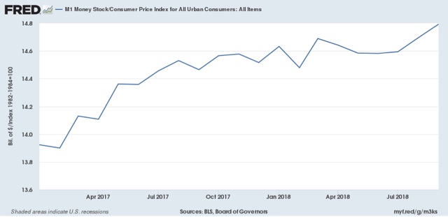
Another measure worth updating for business cycle purposes is real M1, which rose to a new high in October:


as the nominal increase in M1 surpassed inflation handily.

Growth in real M1 had been decelerating, and was on the cusp of turning negative throughout the summer.  But in the last two months it has rebounded. This is a good lesson in not simply projecting the trend in leading indicators forward -- because we never know when that trend may change.

Tuesday, November 13, 2018

Changes in labor bargaining power take up to a decade to be fully effective


 - by New Deal democrat

Sorry for the recent lack of posting on economic matters. Partly it is ennui, and partly it is a near total dearth of data in between the employment report a week ago Friday and tomorrow's CPI report.  Even a couple of quarterly series I usually report on have been inexplicably delayed.

In the meantime, here is a graph from Jared Bernstein that is worth some extended comment. It is the YoY% change in real wages, adjusted by the full CPI (blue) and CPI less energy (gold):


It is worthwhile to remember that, since 1980, YoY inflation has been decelerating on a secular basis:


Bernstein uses this graph to make the point that the changes in "real" wages in the last decade or so have been, more than anything, about the change in gas prices. Very true, but I think we can add some further comments.

1. Generally speaking, in the 1970s and 1980s, YoY real wages kept pace with CPI including gas prices. Beginning with the run-up in gas prices that started in 1999, they didn't. This tells us a lot about the presence of labor bargaining power in the 1970s vs. the absence of labor bargaining power in the last 20 years.

2. Note that YoY real wage gains started to decelerate in the mid-1960s before turning negative in about 1974. Thereafter the negative trend intensified, and only finally ended in the mid-1990s. This is powerful evidence that the massive entry of women into the labor force had a big depressing effect on wages.

3. The depressing effect on wages of a surge in the labor force serves as a natural experiment that powerfully contradicts the narrative by those like Matt Yglesias who incessantly reiterate the claim that immigration raises wages. If that were true, why shouldn't women's participation have had the same effect?

4. Note that renewed long term decelerating trend in real wage growth ex-gas since the late 1990s.

5. The above show us that the trend in "real wages ex-gas prices" gives us two further lessons in how long it takes for the lessons of changes in labor bargaining power to be internalized by both labor and management. It took almost 10 years from the time when women started entering the labor force en masse for the trend in real wages to actually turn negative (vs. deceleratingly positive).  Once that secular force ended, as a whole employers only gradually learned that they could continually reduce annual raises. All of which suggests that it will take up to a decade of increased labor bargaining power for employers to internalize the necessity for bigger wage increases.

Sunday, November 11, 2018

A baseline road map for the 2020 elections


 - by New Deal democrat

Now that the 2018 midterm elections are behind us, let's take a preliminary look at 2020.

It occurred to me that a decent baseline for that election is to simply take the total 2018 House votes for each state, assume that the Presidential vote in 2020 in each state will be the same, and apply that to the Electoral College. Alternatively, you could use the results of the 2018 Senate races in those states where there were races in 2018, and apply those results for those states. That's because the midterm turnout approached Presidential election levels, and Trump is going to engender the same intensity in two years as he did this past week.

So, using the 2018 results as the template for 2020, who wins?

It turns out that I wasn't the only one who had that thought. Nate Silver already had the same idea and did that for the House vote. Here's what that hypothetical 2020 Electoral College map looks like:


If you apply the 2018 House votes to the Presidency in 2020, the Democratic candidate wins handily.  As Nate Silver points out, it is a virtual duplicate of the 2012 map.

[Before I go further, let me just note that the above House map has a few glitches. Florida only went Democratic when the votes in House districts where there was no GOP candidate are added. Conversely, in North Carolina, there was a House district without a Democratic candidate. If we were to add just 2/3's of the typical democratic vote in other GOP-dominated districts in NC to that district, then NC flips to the democratic column.]

Next, here's what the 2018 Senate map looked like a couple of days ago. Since then, it appears that the Democratic candidate won in Arizona. For now, let's leave Florida alone:


The only changes in the map for 2020 are that Florida flips to the Republican column, and Montana, Arizona, and West Virginia flip to the Democratic column. Again, the 2020 Democratic candidate wins if we apply this layer over the House map.

In fact, even if we give Florida to the GOP, and don't give Montana, Arizona, and West Virginia to the Democrats, the democratic candidate still wins! 
In short, if the 2020 electorate is the same as the 2018 electorate, Donald Trump is going to be defeated.

What this also tells us is that the upper Midwest is not lost to the democrats, and that the "blue wall" states that Hillary Clinton lost -- Pennsylvania, Michigan, and Wisconsin -- plus Iowa, are the states that the 2020 candidate most needs to focus on. Secondarily, states like Arizona and North Carolina should be targeted for insurance. Florida probably should get demoted to a "plan C" state.

And "urban cosmopolitanism" isn't going to win back the upper midwest. A similar mix of economic issues (e.g., improving, expanding, and enhancing Obamacare) and social issues (particularly those issues most aggrieving women about the Trump-GOP party) are going to be necessary.

 By the way, winning the Presidency in 2020 is not the ball game. There is every reason to believe that a Mitch McConnell-led GOP Senate will engage in maximum obstruction of Presidential appointments. So let's look at the 2020 Senate map (showing which party won those seats in 2014):


There are a slew of seats all over Dixie and the high plains that simply aren't competitive for Democrats.  They will probably need to flip at least 3 of the following 6 seats: Colorado, Iowa, North Carolina, Maine, Montana, or West Virginia. That is probably going to remain an uphill climb.

Saturday, November 10, 2018

Weekly Indicators for November 5 - 9 at Seeking Alpha


 - by New Deal democrat

My Weekly Indicators post is up at Seeking Alpha.

Interest rattes rose even further this past week, portend further erosion in the housing market.

As usual, not only does reading this post give you of the up-to-the-moment view of the economy, but it also put a little extra $$$ in my pocket.

Friday, November 9, 2018

Big producer price increase in October - if a trend - is a problem


 - by New Deal democrat

In a light data week, this morning's report on producer prices is certainly worth mentioning.  As you may have read elsewhere, headline producer prices rose +0.6% in October, the highest reading in 6 years. The below graph compares that (blue) with commodity prices (red):


As you can see, commodity price increases were within the normal range.

The difference happens when we break down final demand by goods (first graph below, in red) vs. services (second graph):


Producer prices for services were among the 4 highest monthly readings in the past 6 years.

This is important for several reasons.

First of all, producer prices tend to bleed over into consumer prices. But even more importantly at this point, is the potential reaction from the Fed.

If I am right and the economy slows next year, then it is important whether or not the Fed feels free to react by lowering interest rates. That is what happened in 1984, 1995, and 1997. But if the Fed thinks that inflation is beginning to accelerate, it will probably feel that it has no choice but to continue raising rates, even in the face of economic weakness.

In that regard, it is worth pointing out that, despite the monthly increase, YoY producer inflation does not appear to be accelerating on any basis:


Thursday, November 8, 2018

Setting markers for a 2019 slowdown in the jobs market


- by New Deal democrat

How might a slowdown (not a recession, but a decline in growth to the 1%-2% YoY range in GDP) that I've been forecasting for around midyear 2019 manifest itself in the employment arena?

One of my mantras is that "hiring leads firing." In other words, companies slow or stop their hiring plans, or cut back on hours, before they actually start laying people off.

So, one natural place to look is the "hires" component of the Job Openings and Labor Turnover (JOLTS) survey. Here's what the *rate* of hiring looks like over the nearly 20 year life of that survey:


If there is a slowdown, I would expect this rate to plateau, in the 3.7%-3.9% range, similar to its plateauing in 2015-16, when we had the "shallow industrial recession." Obviously there's not enough there to make a call at this point, but this is a data point I'll be watching.

On the "firing" front, the easiest place to look is the weekly initial jobless claims report, particularly in the less volatile 4 week moving average.  Here's what that looks like over the past 5 years:


Again, note that from roughly spring 2015 through spring 2016, the decline in weekly jobless claims almost stalled out.  Here's what the same data looks like measured as a YoY% change:


During the "shallow industrial recession," the YoY% decline in new jobless claims rose from roughly -10% to -5%, with a fair amount of noise.  I would be looking for a similar move over the next 8 months, to the range of -5% or even flat YoY. [Note: the spike upward in late 2016 was due to the hurricanes, leading to a similar spike downward one year later.]

On a weekly basis, this means I am looking for initial jobless claims to stay above 200,000, except for an occasional weekly outlier, and for the 4 week average, which at midyear this year was in the 220-225,000 range, to be in the range of 207,500 to 220,000 at midyear 2019.

Needless to say, I am also looking for monthly employment gains to decline back significantly below 200,000 by that time.

Wednesday, November 7, 2018

Final thoughts on the 2018 midterms


 - by New Deal democrat

Here are six takeaways from last night's results:

1. It *was* a wave election in the popular vote, but it was blunted by gerrymandering:

Here's a tweet by Sam Wang:


Even though Democrats won the popular vote by 9.2%, they only eked out 12 seats over a majority, and came about 4 seats short of Nate Silver's median projection:


By contrast, in 2010, a smaller vote advantage led to a 63 seat gain for the GOP.

 2. The Senate races were effectively nationalized

Here's a current map of the state of the Senate (except we know Feinstein won re-election in California):


With the exception of Joe Manchin in West Virginia, all of the incumbent Democratic Senators in red states either lost, or are slightly behind, in their races. The blue vs. red re-alignment is nearly complete in the Senate.  This is going to be an ongoing problem if the GOP remains the party of old white rural people, since rural states are vastly over-represented in the Senate.

3. Governorships were *not* nationalized, although the upper midwest returned "home" to the Democrats

Three of the New England staes, plus Maryland, elected GOP governors. Meanwhile Wisconsin, Michigan, and Illinois returned to Democratic governors.

I expect the true 2020 battlegrounds to be the 3 "blue wall" states that have possibly returned to the fold, plus North Carolina, if that state's Supreme Court, now controlled by Democrats, throws out the GOP's gerrymander on state Constitutional grounds.

4. Florida is red. Virginia is blue.

Democrats keep losing close races in Florida, because the influx of old, white retirees from the midwest to the Gulf coast outweighs the growth of the minority vote. It's possible that felon re-enfranchisement will make up the difference, but I'm not holding my breath.

Meanwhile the Democrats have both Senate seats, the Governorship, and 3 more House seats in Virginia. Last year they roared back to a tie (minus one vote!) in VA's lower state house. If they pick up the upper chamber next rear, Virginia's re-alignment will be complete.

5. White voters lie about their intentions when an African-American candidate is running.

In both Florida and Georgia, the black candidate came in 3%-5% under their polling. I do not believe that was an accident.

6. Finally, beware the lame duck "smash and grab"

Like jewel thieves making a quick getaway, I expect the GOP to inflict as much damage as possible on the budget, Medicare, Medicaid, Social Security, Obamacare, and anything else they can get their hands on, between now and December 31, figuring that voters will forget by 2020.  It's going to be bad, so brace yourself.

And now, back to the boring economy.

Tuesday, November 6, 2018

Live-blogging the 2018 Democratic ripple? Wave? Tsunami?


 - by New Deal democrat

I'm close to calling it a night, maybe one more post.  The summary is that there was no blue wave, just enough of a high blue tide to apparently take control of the House. the GOPers wone the lion's share of the close races. But the Democrats won just enough to flip the House.

And white voters lie to pollsters about their voting intentions when a black person is on the ballot.

Hopefully we'll pick up the governorship in Wisconsin, so that we get most of the upper midwest back.

---------

11:05 - NBC calls two bellwetherupstate NY races for the Democrat, Brindini and Faso.
---------11 pm - In Maine, GOPer Poliquin holds a small lead over Democrat Golden.
In North Carolina, GOPer Ted Budd leads Democrat Kathy Manning with a majority of votes counted.-------
10:40 - Mixed results in NY and NJ so far. In upstate NY, with about 34% of the vote in, Democrat Faso leads GOPer Delgado by a substantial margin. The situtation is reversed in NJ, where GOPer MacArthur leads Democrat Kim. In PA, GOPer Brian Fitzpatrick also leads Democrat Scott Wallace.
------

10_30 - Georgia, along with Florida, look like the dark spots for the Democrats tonight.  In the House: in Georgia, Lucy McGrath  (D) has apparently lost against Karen Handel (R).

If the Dems can knock out Scott Walker in Wisconsin, the recompense may be the upper midwest coming back. And beating Kris Kobach in Kansas is also pretty sweet.

-----------
10:20 - In NC,  GOPer holds a slight lead over Demovrat McCready.
-----------
10 PM - EVERY VOTE COUNTS. With 94% of the vote in, about 250,000 total votes, in VA's 2nd District, Democrat Elaine Luria leads Republican Scott Taylor by 40 votes.

AAAAAND, NVC says she has won!
----------

9:45 - It looks like a VA House district may flip after all.  With 97% of the vote counted, Spandberger leads Brat by about 2,000 votes. Brat would have to pick up something like 70% of the remaining votes to pull back ahead.
------------

9:40 - With 34% of the vote in, MacArthur (r) leads Kim by over 20% in NJ.
_________

9:30 Aaaand, not so fast in Virginia. Spanberger has just pulled slightly ahead of Brat, and Luria has pulled even with Taylor, each with about 90% of the vote counted.

Also, do the elctecion boards in NY, NJ, and PA know that this is election day and maybe they should start couting, you know. votes?
---------

9 pm - More bad news out of Florida: it looks like Rick Scott is going to defeat incumbent democrat Bill Nelson. He is ahead by 1% with 80% of the vote counted.

And now NBC says the R's have also picked up the Indiana Senate seet by defedating Democrtic incumbent Joe Donnelly.
_____________

8:50 A little good news: NC-9 Dan McCready (D) vs. Mark Harris (R) - McCready holds a slight lead with 15% of the vote in.

And Menendez won the "vote for the crook, it's important" election in NJ
_______

8:40 This is big, and it's bad news: it looks like DeSantis is beating Gillum in Florida.

UPDATE 8:30

FL-26 Debbie Mucarsel-Powell vs. Carlos Curbelo (R) - Democrats projected to flip the seat. This was a D slight lean.
__________

UPDATE 8:20 -- all 3 of the close Virginia races are breaking against the Democrats:

VA-2 Elaine Luria (D) vs. Scott Taylor (R) - 8:15 with 60% of the vote in, Taylor leads 52%-48%
VA-5 Leslie Cockburn (D) vs. Denver Riggleman (R) -UPDATE 8 pm EST: NBC projects Riggleman victory. 8:20 with 80% of the vote in, Riggleman leads by 10% 
VA-7 Abigail Spanberger vs. Dave Brat (R) - Brat leading by 1% with 80% of the votes counted
___________________

Here are the East Coast races I am especially keeping an eye on.

It'll be a bad night for the Democrats if they don't win the following races:

NJ senator - Bob Menendez (D) vs. Bob HUgin (R)

Maine governor- Janet Miils (D) Shawn Mills (R)

In the House:
ME-2 Janet Golden (D) vs. Bruce Poloquin (R)
NY-19 Antonia Delgado (D) vs. John Faso (R) 

On the other hand, it'll be a long night for the GOP if they don't win these races:

In the House:
GA-8 Lucy McGrath  (D) vs. Karen Handel (R) 
NC-13 Kathy Manning (D) vs. Ted Budd (R) 
VA-2 Elaine Luria (D) vs. Scott Taylor (R) 

Here are the toss-ups and slight leans:

Toss up
Georgia - Stacey Abrams (D) vs. Brian Kemp (R)

D-slight favorite
Florida governor - Andrew Gillum (D)  vs. Ron DiSantis (R) 

Senate
D-slight favorite
Florida senator -  Bill Nelson (D) vs. Rick Scott (R)

House of Representatives

D-slight favorite
FL-26 Debbie Mucarsel-Powell vs. Carlos Curbelo (R)

Ties
NY-22 Anthony Brindisi (D) vs. Claudia Tenney (R)
NJ-3 Andy Kim (D) vs. Tom MacArthur (R) 

R-slight favorites
VA-5 Leslie Cockburn (D) vs. Denver Riggleman (R) -UPDATE 8 pm EST: NBC projects Riggleman victory
NC-9 Dan McCready (D) vs. Mark Harris (R) 
VA-7 Abigail Spanberger vs. Dave Brat (R) 
PA-1 Scott Wallace (D) vs. Brian Fitzpartrick (R) 
FL-15 Kristen Carlson (D) vs. Ross Spano (R)

I'll update these as we start to see results.


Monday, November 5, 2018

Trump's final pre-midterm job approval


 - by New Deal democrat

As promised, following up on yesterday's post, here is Gallup's final Trump job approval rating, as of the last weekend before Election Day:


At very least, it sure looks like his fear-mongering about immigrants hasn't helped, and it may have backfired.

I will blog on the election results tomorrow night. Regular economist blogging should resume Wednesday.