Thursday, December 22, 2011

1950: Employment and Income

1950 was a very good year for employment.  Consider the following charts:


The unemployment rate dropped over 2% - moving from 6.5% to a little over 4% by the end of the years.  And the employment growth was split between manufacturing and employment:


Manufacturing employment increased over 2 million while


service sector growth increased over 1 million.


Government employment also increase about about 400,000.


As a result of this activity, we see real disposable personal income increase on a YOY basis of over 9%.

Below are some charts on wages and savings from the 1951 Economic Report to the President that show the above information, but in 1950s econ style.


Morning Market

After using Quotetracker for the better part of 10 years, I've made the switch to Stockcharts.com as my source for stock charts.  I'm still getting used to the format, but so far I'm really impressed.  


Copper is still at low levels, and is currently trading in slightly downward moving channel.  Prices are still below the 200 day EMA, and the MACD is simply moving sideways.


The euro is in a downward sloping channel.  Also note the massive move from the security in the form of a declining A/D line and CMF.  The EMAs are bearishly aligned with all moving lower.  For the last five days, we've seen prices print very small bars as they consolidated after the move through early October's low.  


In contrast to the euro is the dollar, which has clearly benefited from the euro's sell-off.  Prices have moved through resistance and are now selling off in small candles as traders consolidate positions.  Unlike the euro, note the volume inflow into the dollar. 


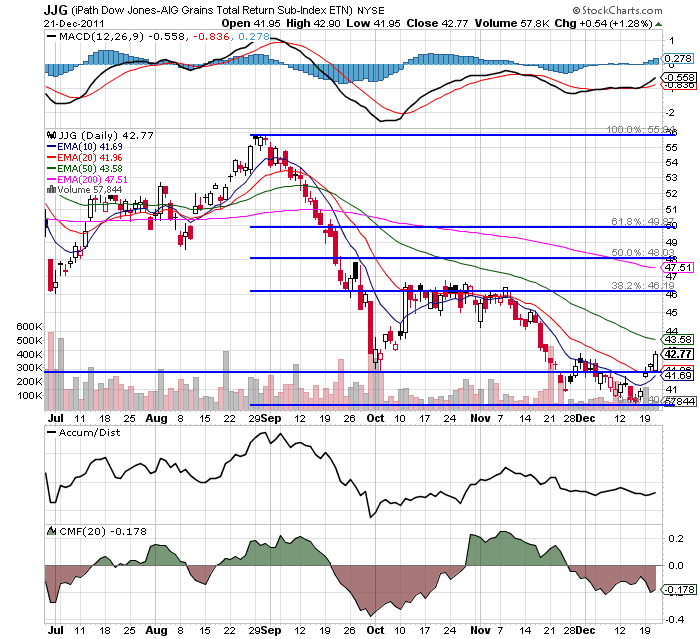
The grains complex (wheat, corn and soy beans) appear to have bounced off a bottom and are looking to hit resistance at the 20 day EMA.  However, the EMA picture is still bearish and the MACD is still in negative territory.  If this is a rebound in anticipation of a strong 2012, expect the next resistance level to be the 20 day EMA followed by the 38.2% Fib level.


The SPYs are still consolidating, and most likely won't break out in either direction until the new year.

Wednesday, December 21, 2011

1950s: The Discount Rate and 1950 Inflation


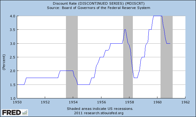
The above chart shows the Federal Reserve's Discount Rate for the 1950s.  Note that in the middle and end of the decade we see the Fed increasing rates to such a degree that they create a recession.  Then we see the Fed lower rates during the recession to spur growth.  This is what most people think of when they think of "recession and recovery."

That being said, let's take a look at inflation in the year 1950, as it explains the increase in the discount rate.


PPI continued to increase on a YOY rate, eventually reaching nearly 15%, while CPI continued to escalate as well, eventually hitting hear 6%.  So -- what caused these price increases?

1.) Massive demand.  PCEs increased at incredibly strong rates for the first three quarters of the year.  This led to a classic case of demand pull inflation.  Food prices were a big reason for the increase (which increased 4.8% from December 1949 to November 1950), as was an increase in house hold furnishings (which increased 9.1% from December 1949 to November 1950).

2.) The Korean War outbreak led to massive increases in raw material prices.  As the ERP notes, 75% of industrial goods had increased in price by mid-October, 44% had risen 10% or more, and 26% were up 20% or more above the pre-Korean war levels.

As an aside, here are the charts from the Economic Report to the President for both Whole
sale and Consumer prices.


Is Manufacturing Making a Comback?

Over the last 6-9 months, we've seen various regional manufacturing surveys drop.  However, two surveys released last week show improvement.  First is the Empire State survey:
The Empire State Manufacturing Survey indicates that manufacturing activity improved in New York State in December. The general business conditions index rose nine points to 9.5, its highest level since May. The new orders index climbed above zero, to 5.1, and the shipments index advanced eleven points to 20.9. Input price increases steepened, with the prices paid index rising six points to 24.4. Selling prices increased only modestly, with the prices received index inching down to 3.5. Employment indexes were mixed, showing a slight increase in employment levels but a slight decrease in the length of the average workweek. Future indexes rose sharply for a second consecutive month, with the future general business conditions index climbing thirteen points to 52.3, suggesting a return to the high levels of optimism seen earlier in 2011.
While the numbers are still low, they are improving.

Then there was the Philly Fed index:
Responses to the Business Outlook Survey this month suggest that regional manufacturing continued to improve in December. All of the broad indicators remained positive and suggest a modest expansion of activity. Increases in input prices were more widespread this month, and there was an uptick in the number of firms reporting increased prices for their own goods. The broadest indicator of future activity reflected a trend of increased optimism about growth over the next six months.

The diffusion index of current activity, the survey’s broadest measure of manufacturing conditions, remained positive for the third consecutive month and increased from 3.6 in November to 10.3 (see Chart). The percentage of firms reporting increases in activity (25 percent) exceeded the percentage reporting decreases (15 percent). The index for current new orders showed a similar improvement, increasing 8 points. The shipments index, at 6.7, was mostly flat. Twice as many firms reported declines in inventories (30 percent) as reported increases (15 percent) and the current inventory index fell 22 points to -14.9.

Labor market conditions continue to show overall improvement, but indexes edged down this month. Twenty percent of the firms reported an increase in employment; 10 percent reported a decrease. The current employment index remained positive at 10.7, only 1 point lower than in November. The average workweek index also remained positive but fell nearly 9 points.
Again, the numbers are low, but they did improve.  

Tuesday, December 20, 2011

Morning Market


Gold's technical collapse over the last few days has been extraordinary.  Prices have moved through key support -- a long-term trend line -- and are now right about the 50 week EMA.  Also note that the MACD has dropped as well, showing a complete lack of momentum.


 The 6-month chart shows prices have moved through technical support, and have rebounded, hitting resistance at the 200 day EMA.  The CMF shows a move out GLD and the MACD shows declining momentum. 


I've boxed off the sharp drop in GLD prices on the 5-minute chart.  Prices at first gapped lower by a wide margin, consolidated sideways, and then continued to move lower.  For the last three days, prices have moved a bit higher, but not in a strong rally; instead, prices have simply gapped a bit higher and then held on.


Bonddad Linkfest

  1. The meme that refuses to die: government debt must be paid back
  2. Happy birthday, terrible Meredith Whitney call
  3. The XLF is walking a think line, too
  4. Don't know much about history, debt edition
  5. German business confidence rises
  6. Sweden cuts rates
  7. House Republicans push for new talks
  8. ECB warns of contagion

Year In Review: Where Did Growth Come From?

Let's continue looking at the year in review and see where we grew:


1.) PCEs continued to contribute fairly consistently all four quarters.
2.) Investment was a bit lackluster; it contributed some, but not in as a large a way as we would like.
3.) Exports played a very important role; while they were not the primary driver of growth, they contributed in three out of four quarters.
4.) Government spending (or the self-imposed austerity) actually contracted from growth.


Note the strong contributions of durable goods for the first two quarters.  My guess is the first quarters pulled some growth forward from the third quarter -- which was also negatively impacted by the debt ceiling debacle.  Service spending greatly accelerated in the third and fourth quarter.


First note that investment in equipment and software was strong throughout the last four quarter period.  If businesses are scared to invest because of massive regulation, it sure doesn't show in the numbers.  In two quarters massive contractions in inventories greatly effected the overall number.  Note that residential investment is non-existent.  In a solid recovery, we'd be seeing a heck of a lot more investment in this area.  Finally, non-residential structures contributed in three out of four quarters.


Finally, note that government spending took away from growth, with a big  bite  coming from national defense contractions and state and local cutbacks. 

So, looking at these numbers, we see the following;

1.) Consumer spending is still increasing, although not as strongly as we would like.
2.) Lack of residential investment is really hurting the overall numbers.
3.) Business is still investing in a variety of equipment and software.
4.) The contraction in state and local budgets is also hurting overall growth as well.
5.) Exports are also playing a pretty important role in the expansion to date.

This is the beginning of the end of the housing bust

- by New Deal democrat

A month ago when housing starts and permits were reported, I wrote: Psst: Is this the beginning of the end of the housing bust? With this morning's report of 681,000 permits issued, I believe we can affirmatively answer, YES.

As I said last month, housing construction is a long leading indicator, indeed along with interest rates probably the most important one. So those commentators who say that we won't get housing improvement until we have job improvement have causation exactly backwards. Rather, it is much more likely that we won't get more meaningful job improvement until we have more meaningful housing improvement. Further, the decline in housing starts and permits after the expiration of the $8000 housing credit was probably an important factor in the slowdown in GDP earlier this year, and as I wrote last week, probably plays a role in ECRI's recession call.

This morning's report of 681,000 housing permits is with the exception of the month when the $8000 housing credit ended, the highest in 3 years [note: the St. Louis FRED hasn't updated its graphs yet, so the 4 graphs below do not include today's report]:


In the past it has typically taken an improvement of 200,000 housing starts from the bottom to signal that a housing-led expansion has begun:


With November's report we are 85% of the way there from the March 2009 bottom of 513,000.

Another way of looking at housing and expansions is to measure the YoY improvement in the raw numbers. Typically in expansions there have been sustained periods of 200,000+ growth YoY:


With today's number we are 60% of the way there, for the first time without help from the housing credit:


Additionally, per Bill McBride a/k/a Calculated Risk, there is a strong leading relationship between housing starts and the unemployment rate, so a confirmed uptrend should mean a reduction in the unemployment rate.

While by no means are we at the end of the housing bust, today's number serves as confirmation that we are at least at the beginning of the end.

1950: GDP and Contributions to Growth


1950 was a year of incredibly strong growth.  We see percent changes from the preceding quarter of 17.2%, 12.7%, 16.6% and 7.2%.  For the entire year, we see investment and PCEs alternating as the primary driver of growth.  The incredibly strong increase in PCE's in the third quarter was caused by mass buying in anticipation of shortages because of the Korean War.


Delving deeper into the gross private domestic investment numbers, we see that inventory stockpiling was one of the primary drivers.  Interestingly, this reminds of this latest expansion when inventory rebuilds were part of the growth story, which was vehemently denied as being real economic growth by many commentators.  Also note there was a pick-up in fixed investment in the second and third quarter.


PCes were growing strongly in the first two quarters, but really accelerated in the third quarter, as consumers stocked up on durable goods -- again, in anticipation of coming shortages.  PCEs contracted strongly in the fourth quarter.  It makes sense to look at the strong third quarter numbers as pulling fourth quarter numbers forward.

Helping spur the PCE binge was an increase in consumer credit, which had been increasing for the preceding two years.  From the 1951 Economic Report to the President:


Morning Market

Despite yesterday's price action, the SPYs are still in a consolidation pattern with the daily chart giving us no real clues as to what direction the ultimate break will be in.


The 5-minute chart shows an overall, slightly downward motion for the last 20 days.  We see a pattern of lower highs and lower lows through last Tuesday with prices consolidating right above 121.5 for the last three days.  Yesterday, prices broke below this level in the AM and then consolidated their move for most of the remainder of the day before moving sharply lower at the close.


In contrast, we see the long-end of the Treasury market moving sharply higher over the last 5 days, with prices advancing in two waves.


In contrast to the SPYs, the TLTs daily chart shows a decent rally taking place, with the chart printing fairly strong bars along with a bullish EMA and MACD picture. 

So, in short, we're back to the situation of a few weeks ago; as stocks sell-off, the treasury market rises as it catches a safety bid.


This is the real winner of all the latest movement in the markets: the dollar.  After breaking through resistance, it has consolidated its gains, but not fallen sharply enough to fall below the EMAs -- all of which are rising.  Momentum is also positive.


Morning Market -- Beware False Breakouts


Over the last few months, the markets have been consolidating.  However, in the low volume environment of holiday trading, it appears we may have a break-out. 


On the weekly chart, we see a strong candle breaking through upside resistance.  The MACD is increasing (and is just about to move into positive territory) and the volume indicators are slightly bullish. 


On the daily chart, we see more detail of the break-out.  First, the move is on very low volume on a weak candle.  The volume indicators are weakly positive and the MACD is weakly bullish.  In short, there is nothing on this chart to show a strong break-out, but there is technical confirmation.


The big reason for the move was a strong surge at the end of trading which was most likely technical buying.

In addition, we see money moving out of the treasury markets:


The IEIs have broken key support.


The IEFs have broken support -- although weakly, as have


the TLTs.

So, we have a major equity index weakly breaking resistance, and some money moving out of the treasury market, although doing so weakly.  Notice that on both ends of this situation, I'm using he work "weak."  What we're not seeing is a strong surge into the SPYs or out of the treasury market; the movement is far more technical.  That does not mean it's not real, or couldn't lead to profits; but it does mean we need to look under the hood at various market sectors to see where the growth is coming from.  And this is where the break-out runs into serious problems.


The move higher is coming from defensive sectors -- consumer staples, utilities and health care.  These are sectors that we would expect to rally when investors are concerned about what lies ahead. 

This is not to say these are not important sectors.  Combined, they comprise 27.8% of the S and P 500. And this is also not to say a real break-out could not be happening.  It's just the evidence does not lead me to conclude the markets rose because people are excited by the future.  Instead, it looks like the rally was caused by people saying, "we are scared about the future and want to put our money into market sectors that are safer when things get tough."


Monday, December 19, 2011

Bonddad Linkfest

  1. Payroll tax deal falls apart
  2. Agricultural futures price outlook for 2012
  3. Commodity prices set to rebound in 2012?
  4. Keynes was right
  5. Older Baby Boomers Face Jobs Bust
  6. Companies still sitting on tons of cash
  7. Italy approves austerity

Household deleveraging stalls

- by New Deal democrat

The Federal Reserve's report on household debt burdens was released last week, covering the July - September quarter of 2011. According to the bank,
The household debt service ratio (DSR) is an estimate of the ratio of debt payments to disposable personal income. Debt payments consist of the estimated required payments on outstanding mortgage and consumer debt.

The financial obligations ratio (FOR) adds automobile lease payments, rental payments on tenant-occupied property, homeowners' insurance, and property tax payments to the debt service ratio.

With one important exception, both measures had declined almost relentlessly since the end of 2007 -- until now. Here is the updated graph:


Debt service payments (blue line, left scale) for the second quarter, which had been initially reported at 11.09%, were revised upward to 11.13%. In the third quarter they fell back to 11.09%. Total financial obligations (red line, right scale) for the second quarter, which had been initially reported at 16.09%. were revised upward to 16.15% and remained there for the third quarter.

While the debt service ratio, as presently reported, is still slowly declining, total financial obligations have completely stalled -- for a very interesting reason: as the Fed reported, total obligations for homeowners did continue to decrease, but rents have actually increased! Since the housing bust has pushed at least several million people out of houses and into rental units, for the last year rents have been rising. The YoY increased peaked in August at +4.6%, and as of Friday's November CPI report, is still +2.8%. Needless to say, this is going to continue to change the rent vs. own calculation in favor of ownership. If prospective home buyers become convinced that house prices are close to bottoming, that market could change quite swiftly.

I have no idea if this is merely a pause, or whether this will establish a multi-year bottom in household deleveraging. In the longer term, for a sustainable economic expansion, there must be adequate deleveraging by households, housing prices must bottom at least nominally as well as new housing construction begin to pick up, and the Oil choke collar must be broken. It does appear that very slowly all of those things are beginning to happen.

Year End Review: GDP and Its Macro Components

It's nearing the end of the year, which seems to be an appropriate time to look back at the last year (actually 5 quarters) to get a sense of where we are and what the future might hold.  Let's start with a look at GDP and it's macro level components.


The above chart tells us an awful lot of information.  First, we're growing but at a lackluster pace.  The strongest quarters we've seen in the last five quarters is a little under 2.5% -- hardly anything to get excited about,  In addition, the first quarter of this year was just strong enough to keep us positive, but not much more.  Finally, the third quarter number still has one more revision to go through.


PCEs have been increasing at a decent but not strong rate.  The highest rate we've seen in the last five quarters is 3.5%, but the other numbers in the chart indicate the average and median PCE number for the last 5 quarters are actually fairly low.  In short, people are spending, but not a lot.


Gross private domestic investment has bounced around a great deal -- expanding over 7.5% in 3Q10, but than contracting nearly that amount in 4Q10.  We'll look at this number in more detail this week to see what caused these gyrations.


 First, remember the chart above is for quarters, not single months.  In short, the U.S. is still a net importer, although the rate of imports has steadied over the last 5 quarters.


Government spending has also gyrated pretty wildly over the last 5 quarters, with a fairly extreme contraction at the beginning of this year and a mild contraction at the end of last year.