Thursday, April 22, 2010

Yesterday's Market

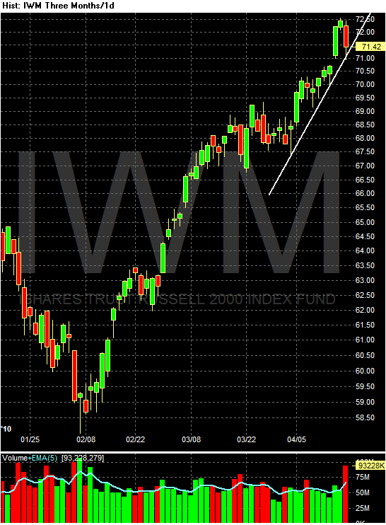
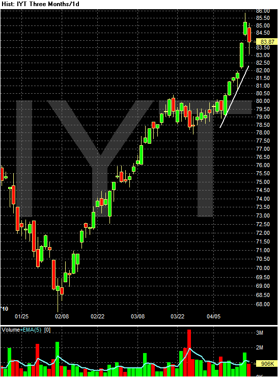
The main issue this week is will the markets hold to their trends? There is a tremendous amount of downward pressure right now, largely from the Greek situation. So far, we've held, but the futures are trading lower as of this writing....


Thursday Oil-Market Round-Up


a.) Prices broke this uptrend three days ago, in the correction that started with the SEC's Goldman suit.

b.) This line of resistance is important for prices right now.

c.) Prices are currently in a downward sloping pennant pattern.

d.) The EMA picture is still bullish -- the shorter EMAs are above the longer EMAs. But there are important caveats now. Prices are below the 10 and 20 day EMA, both EMAs are moving lower and the 10 day EMA is about to cross below the 20 day EMA. This is not as important a development as you might think. largely because the 10 and the 20 day EMA are obviously more sensitive to price action. But it is definitely something to keep in mind as both now provide upside resistance.

e.) Momentum is moving lower but

f.) There is still money flowing into the market.

Wednesday, April 21, 2010

Welcome to Abnormal Returns Readers

We are glad you are here and pleased to be linked to from such an important blog.

Good News For the Bond Market

From Reuters:

Rising tax receipts will likely reduce U.S. government borrowing needs in the rest of this fiscal year and fiscal 2011, Morgan Stanley said on Wednesday.

Less supply may end up hurting bonds because it signals an improving U.S. economy -- which is typically negative for Treasuries, the U.S. investment bank's analysts said in a research note.

They predicted U.S. long-dated Treasury supply would fall by $52 billion for the remainder of fiscal 2010 and by $589 billion in fiscal 2011.

"While we are encouraged by this improvement it's hard to get too excited because it's like drowning in 75 feet of water instead of 100 feet of water," they wrote in the note.

Read This Now

Over at Macroblog there is a great discussion on bank size. As always, the issues are incredibly complicated.

Foreclosures: New wave or Crest (and is it bad or good)?

- by New Deal democrat

I got into a little debate with another blogger who viewed the March increase in foreclosures over February as the beginning of a new "tsunami." You can read his diary here if you wish. Mish also breathlessly reported that:
Foreclosure activity of all types spiked in the first quarter of 2010 according to RealtyTrac. Activity is now at an all time record of 932,234 properties.
[N.B.: Mish has been a reliable contrary indicator for the last year, unintentionally telegraphing turning points in data. Keep in mind below his contention that foreclosures "spiked" in the first quarter.]

In any event, I went back and dug out prior Realty Trac press releases, which suggest the new tsunami ain't necessarily so. I thought I'd share that data here, since it is worth tracking over the remainder of the year.

The genesis of this story goes back to this graph and others like it that made the rounds beginning in 2006:

showing that mortgage recasts and resets were coming in two waves: the first in 2007-08, and the second this year and 2011.

While we certainly have had a tremendous numbers of foreclosures, I have always been a little chary of the notion that the 2010-11 "back end of the hurricane" as Russ Winter once called it, was going to be nearly as big as advertised. That's because, while in 2006 lots of people were still deluding themselves that "real estate only goes up!" by 2008 and certainly 2009, they had been disabused of that notion. Thus, I expect that a lot of those homeowners, who are probably deeply underwater, already let their houses go into foreclosure, or else worked out a refinancing before now.

So, here are the year over year changes as measured in the last 12 months:


MonthYoY % changeactual foreclosures
04/2009+32 342,038
05/2009+18 321,480
06/2009+33 336,173
07/2009+32 360,149
08/2009+18 358,471
09/2009+29 343,638
10/2009+19332,292
11/2009+22 306,627
12/2009+15 349,519
01/2010+15 315,716
02/2010+6 308,524
03/2010+8 367,056

Did anybody see that "spike" that Mish claimed happened in the first quarter? I don't think so. Note that my interlocutor said that the decline in percentage increases should be dismissed, because the actual numbers involved were so large. That doesn't appear to be the case either. So, contrary to March's increase being the beginning of a second wave, it seems more likely that this is the crest of the foreclosure wave

To be fair, though, our data up until now could be consistent with there being a lull during the "eye of the hurricane" in the graph above (that would have taken place early last year, so would be showing up in the last 5-12 months). If there is a new wave, or a "back side of the hurricane", then the percentages and the raw numbers of foreclosures ought to start increasing quickly. If, on the other hand, the 2nd derivative continues to be negative, then we ought to see foreclosures tip over into YoY negative percentages in the next few months, or certainly by the end of the year.

Of course, some people think that part of the increase we are seeing in retail sales (see my post below) is due to underwater homeowners "strategically defaulting" on their mortgage. If so, it is entirely possible that, on balance, an increase in foreclosures might be a net positive for the economy, as it means house prices aligning more closely with wages, and disposable consumer income increases. I happen to know of one young person who is doing exactly that after his bank refused to renegotiate his mortgage rate from 7% to 5%, on the grounds that he was a "poor risk" for the mortgage amount (Funny, the bank doesn't seem to feel that way about the mortgage at 7%).

In any event, I will update this graph from time to time. We ought to have a decent preliminary answer within the next 3 to 6 months.

Yesterday's Market


Consider the following on the QQQQ chart.

There is a head and shoulders pattern already formed along with a head that is a triple bottom.

On the DIAs, we have:


A double bottom.

Does this mean a move higher is guaranteed? Not at all. But it does tell us what other traders see for today's trading set-ups.

Wednesday Commodities Round-Up


In thinking about the housing market, I realized I haven't talked about lumber futures in -- well, a very long time. So, here are the charts:


Starting in 2005, lumber prices started a 4-year downward sloping channel line. In retrospect, this should have been a dead giveaway of problems in the US housing market.


On the weekly chart, notice that prices have clearly moved through key resistance areas.


a.) Prices are now in a clear uptrend.

b.) Prices have gapped higher in several situations

c.) The EMA picture is very bullish - all the EMAs are moving higher, the shorter EMAs are above the longer EMAs and prices are above the EMAs and are using the EMAs as technical support.

Tuesday, April 20, 2010

Is Deflation the Real Problem?

This is a follow-up to a post on Friday. This originally appeared at fivethirtyeight.com on Sunday.

Last week, the FT had a very interesting column
which stated:

There is a growing risk that deflation will be seen as the gravest threat to the US economy by the end of the year, warns Nick Beecroft, senior FX consultant at Saxo Bank.

He notes that the minutes of last month’s Federal Reserve policy meeting show the US central bank becoming increasingly concerned with the fall in inflation.

And the latest consumer price data will have reinforced these worries, he says. “As the year progresses, the output gap – exemplified by the still chronically weak labour market and very low levels of capacity utilisation – will lead inflation inexorably towards zero.”


In addition, the minutes of the most recently released Federal Reserve Minutes had the following observations about deflation:

Meanwhile, a sizable increase in energy prices pushed up headline consumer price inflation in recent months; in contrast, core consumer price inflation was quite low.

.....

Although rising energy prices continued to boost overall consumer price inflation, consumer prices excluding food and energy were soft, as a wide variety of goods and services exhibited persistently low inflation or outright price declines. On a 12-month change basis, core personal consumption expenditures (PCE) price inflation slowed in January 2010 compared with a year earlier, as a marked and fairly widespread deceleration in market-based core PCE prices was partly offset by an acceleration in nonmarket prices. Survey expectations for near-term inflation were unchanged over the intermeeting period; median longer-term inflation expectations edged down to near the lower end of the narrow range that prevailed over the previous few years. With regard to labor costs, the revised data on wages and salaries showed that last year's deceleration in hourly compensation was even sharper than was evident at the January meeting.

.....

Headline consumer price inflation picked up around the world over the past two months, principally reflecting increases in food and energy prices. Excluding food and energy, consumer prices were generally more subdued.

.....

Reflecting these developments, inflation compensation--the difference between nominal yields and TIPS yields for a given term to maturity--declined over the period, a move that was supported by the somewhat weaker-than-expected economic data and the publication of lower-than-expected readings on consumer prices.

.....

Recent data on consumer prices and unit labor costs led the staff to revise down slightly its projection for core PCE price inflation for 2010 and 2011; as before, core inflation was projected to be quite subdued at rates below last year's pace. Although increased oil prices had boosted overall inflation over recent months, the staff anticipated that consumer prices for energy would increase more slowly going forward, consistent with quotes on oil futures contracts. Consequently, total PCE price inflation was projected to run a little above core inflation this year and then edge down to the same rate as core inflation in 2011.

.....

Participants saw recent inflation readings as suggesting a slightly greater deceleration in consumer prices than had been expected. In light of stable longer-term inflation expectations and the likely continuation of substantial resource slack, they generally anticipated that inflation would be subdued for some time.

.....

Participants referred to a wide array of evidence as indicating that underlying inflation trends remained subdued. The latest readings on core inflation--which exclude the relatively volatile prices of food and energy--were generally lower than they had anticipated, and with petroleum prices having leveled out, headline inflation was likely to come down to a rate close to that of core inflation over coming months. While the ongoing decline in the implicit rental cost for owner-occupied housing was weighing on core inflation, a number of participants observed that the moderation in price changes was widespread across many categories of spending. This moderation was evident in the appreciable slowing of inflation measures such as trimmed means and medians, which exclude the most extreme price movements in each period.

In discussing the inflation outlook, participants took note of signs that inflation expectations were reasonably well anchored, and most agreed that substantial resource slack was continuing to restrain cost pressures. Measures of gains in nominal compensation had slowed, and sharp increases in productivity had pushed down producers' unit labor costs. Anecdotal information indicated that planned wage increases were small or nonexistent and suggested that large margins of underutilized capital and labor and a highly competitive pricing environment were exerting considerable downward pressure on price adjustments. Survey readings and financial market data pointed to a modest decline in longer-term inflation expectations over recent months. While all participants anticipated that inflation would be subdued over the near term, a few noted that the risks to inflation expectations and the medium-term inflation outlook might be tilted to the upside in light of the large fiscal deficits and the extraordinarily accommodative stance of monetary policy.


So, the obvious question to ask is this: is the US economy facing an increasing possibility of deflation? To answer that question, I will look at overall CPI, along with the largest price components of CPI -- housing (41.960%), transportation (16.685%), and food and beverages (14.795%). I will also look at the GDP derived personal consumption expenditures' (PCE) price deflators (both overall and core), to see what conclusions the data leads to.

First -- what is deflation? Deflation is a situation where overall prices decline. While this might seem like a great idea, it is in fact one of the most dangerous situations an economy can face. As an example, at the start of the Great Depression, consumers greatly reduced their consumption. Therefore, to get consumers to start buying again, retailers lowered the prices of goods in their stores. These two events -- a drop in demand and a lowering of prices -- led to two problems. First, lower demand means fewer products are sold, which lowers the supply of a variety of goods. Secondly, lower prices lower retailers' profits. Lower supply of manufactured goods and lower profits at retailers leads to lower employment, which in turn leads to lower demand. This process becomes a self-perpetuating cycle. This process is called a deflationary spiral, and economists consider it one of the most damaging events an economy can face.

Secondly, what is core CPI and non-core CPI? Core CPI is a measure of prices without including food and energy. While this may seem counter-intuitive, there is a reason why it is an important measure. Food and energy prices are volatile and in some cases seasonal. For example, a series of spring-time thunderstorms in the mid-west could delay planting certain crops for a few weeks, leading to a spike in wheat and corn prices which would then drop when planting began. Or, a political development in the Middle East could lead to a spike in energy prices.Additionally, oil prices typically rise in the spring and summer because of the "summer driving season" -- the time of the year when Americans spend more time driving longer distances on summer vacations, thereby consuming more fuel. However, in all of the previously mentioned situations, prices typically return to a statistically "normal" level. In addition, by looking at the "core" CPI, FOMC policy makers are attempting to discern if commodity price swings are bleeding into other, non-core price areas, or whether commodity prices are isolated.

Finally, a little inflation is a good thing. It indicates that either producers have the ability to raise prices, or there is enough demand to increase prices or wages are increasing, leading to increased demand and therefore higher prices -- or a combination of the preceding three events. The first situation is referred to as supply push inflation, and it occurs when suppliers or producers have "pricing power" -- the ability to increase prices without seriously impacting demand. The second situation is "demand pull" inflation, and it occurs when more and more people demand the same amount of goods, thereby pulling prices higher. How much inflation is actually good is debatable. However, some inflation indicates the economy is growing.

The charts that follow are from the St. Louis Federal Reserve's FRED system. Please click on all charts to see a larger image. All charts use seasonally adjusted data.

Let's start with a look at seasonally adjusted CPI:


While the overall price level is increasing, the rate of month to month increase is very small. That means that overall prices are increasing at an incredibly low rate.


The year over year rate of change is running around 5%. However, note that level is in comparison to a negative year over year number a year ago. In other words, the year over year number is skewed. This is especially important in relation to the very low rate of change in the first chart which shows incredibly modest price changes.

Let's turn to the core CPI (CPI without food and energy prices) levels:


Core CPI has more or less stalled -- it dropped at the beginning of this year and has since risen a bit, but the rate of increase is incredibly low.


The year over year rate of increase is still positive, but the rate of the year over year increase is falling, and has been since roughly the third quarter of 2008. While the number is still positive, consider this chart in conjunction with the first core CPI chart that shows prices are barely increasing. The year over year rate increase will most likely continue to move lower (although still be positive) in the near future.

Let's look at some of the largest CPI component price indexes in the order of the largest to the (in comparison) smallest.

Housing related prices have stalled for nearly two years. Given the current state of the housing market, this is to be expected (see the discussion on the housing market here). But housing accounts for 41.960% of the overall CPI index, leading to a conclusion that these prices are having an incredibly negative impact on overall CPI.


The year over year rate of change for housing prices is negative. This is obviously having a very negative impact on the overall price level.


Transportation costs (16.685% of CPI) bottomed at the end of 2008, but have since been rising.


While the year over year number had a large drop at the end of 2009 that lasted through about mid-2009, the number has rebounded.


Food and beverage prices (14.795% of CPI) -- like housing prices -- have been pretty stagnant over the last two years.


And the year over year rate of change dropped into negative territory at the end of last year, but has been moving up since. It just turned slightly positive.

Let's now turn to the price deflator for personal consumption expenditures, which is found in the gross domestic product report.


The PCE deflator has increased from it's late 2008 lows, but has moved sideways for the last few months.


The year over year percentage change shot higher at the end of last year, but the reason for the increase is its rise from an incredibly low level in previous years. Considering that prices were declining for most of 2009, I would expect the year over year number to continue moving lower.


The core level has started to move sideways.


In addition, the core year over year rate of change has been moving lower since mid-2008.

The data indicates that deflation is not a problem -- yet. However, there is a tremendous amount of information indicating that deflationary concerns are well-founded. Housing related prices have been under pressure for the last two years. And considering there is no evidence of a massive housing rebound, this area of the CPI index will continue to move the index lowed. After spiking in 2008, the price charts for corn, wheat and soy beans have been in a sideways pattern. The only major CPI component that might provide upward pressure is transportation prices, but some of those effects will probably be seasonal. In addition, there is little reason to think the economy will experience either demand pull or supply push inflation in the near future. High unemployment means there will be little inflationary pressure from rising wages and the low rate of capacity utilization indicates there is little possibility of supply push inflationary pressures.

In short, deflationary pressures can't be ignored.

Finally -- and completely unrelated to this article -- IBLS has published a book I wrote, titled A Practitioner's Guide to U.S. Captive Insurance Law. It is available in their April 2010 Tax Law Review. For more information on this topic. please see this website.

Retail sales imply strong job growth for remainder of 2010

- by New Deal democrat

Introduction. Now that Jobs have bottomed, the question becomes, how quickly do they return?

In the last couple of weeks, we have gotten some economic data that is so strong it is almost scary. For example, just yesterday March Leading Economic Indicators were reported up 1.4%, meaning for the last 12 months the LEI are up ~12%! This is the strongest reading in two decades:

This implies a much stronger Recovery than either of the two "jobless recoveries" of 1992-3 or 2002-3.

Last week, retail sales were reported up 1.6% including autos due in large part to Toyota's rebates (blue line), and up 0.6% ex-autos (red line). This accelerates the return of the consumer since the bottom a year ago:

Since the consumer is 2/3 of the economy, and consumer spending is necessary for job growth, in the past I have pointed out just how important retail sales adjusted for inflation (a/k/a real retail sales) are. With the strong showing last week, there are major implications for job growth for the rest of this year, and that is what i discuss in this diary.

I. More than any other economic indicator, real retail sales have over the long run tracked consistently with payrolls

It is certainly true that any number of economic series have a correlation with payroll gains and losses. But none of them -- not GDP, not personal consumption, not person income, nor others -- over the long term tracks so closely with payroll growth. This first graph tracks real GDP (blue), real personal consumption (yellow), real personal income (purple), and real retail sales (green), along with jobs (red) since 1959, a period of over 40 years. It is easy to see that the red and blue lines track very close to one another, while over time the other three (GDP, consumption, income) all outpace job growth.


This second graph zooms in on the last 10 years. For a while, retail sales did diverge (demonstrating the impact of the "house ATM" or home equity extractions during the housing bubble).

But it alone has come back to earth, once again tracking the long term (lack of) growth in payrolls during the last decade.

In the past I have looked at GDP and compared it with payroll growth, noting that YoY percentage changes in GDP (minus two percent) appears to lead payroll growth:


The problem is that GDP is only reported quarterly, so by the time you learn the GDP for a quarter (like Q1 2010, you already know what the payroll growth was. At best, YoY GDP when initially reported, can give guidance about payroll growth over the next couple of months.

Similarly, Personal income (blue line below) seems to correlate well, but unfortunately as this graph shows it is not a leading indicator for jobs (red line) but only a coincident one -- the peaks and troughs occur simultaneiously:


In other words, it can confirm an already-reported jobs number, but cannot help us look at the future trend of job growth.

II. Real Retail Sales is the "Holy Grail" of Leading Indicators for Jobs

To the contrary, not only do real retail sales correlate closely with payrolls over the long term, but they are the "Holy Grail", consistently leading turns inthe job market. Here let me repeat something I have said in several prior diaries.

Contrary to the commonly held belief, historically it has not been the case that job growth leads to consumption. Rather, it is the other way around. Consumer spending typically leads jobs with a lag of about 5 months. Here is a graph showing that point as an average of all post-World War 2 recessions (0 = the month a recession ends):


Real retail sales (that is, retail sales adjusted for inflation) are the "Holy Grail" of Leading Indicators for job growth. They have consistently turned at both tops and bottoms, an average of 3-5 months before job growth or losses turned. Depending on the revisions to February's jobs report, and when the NBER decides to date the end of the Recession, this time around real retail sales, smoothed on a 3 month basis, bottomed either 8 or 10 months before jobs bottomed, longer than usual but not nearly with so much a lag as in the 2002-03 "jobless recovery."

In order to show you this relationship in the most comprehensive way, I am reproducing here graphs showing the entire 60 year record of real retail sales compared with jobs. With the sole exception of the 1961 recession, Real retail sales (the blue line) has consistently made peaks and troughs ahead of payrolls (the red line) ...

in the postwar period from 1948 through the 1962:


as it did during the 1970s recessions (ex the 1970 trough):


as it did during the 1991 and 2001 recessions and "jobless recoveries":


as it has just done with regard to the "Great Recession:"


Needless to say, this last graph strongly implies that, now that we have turned the corner and actually added 114,000 jobs in March, we will continue to have job growth.

III. Real retail sales suggest that we will have strong job growth for the remainder of this year.

But how much? For that, let's examine another way of looking at the relationship between real retail sales and jobs; namely, to graph the year-over-year percentage changes in each. That is what the next series of graphs show. Because real retail sales are historically much more volatile, these graphs take the YoY percentage change in real retail sales and divide by 2 (blue line), which historically yields a very close fit with YoY payroll changes (red line).

Here it is for the immediate postwar period:

And here it is for the 1970s recessions and recoveries:

And here it is for the two "jobless recoveries" and up until now:


Notice that the blue line turns both up and down first, before the red line. Also notice that the amplitude of the changes is usually very similar.

In fact, the weakest relationship by far occurred during the lame "Bush expansion." Real retail sales only went up more than 5% YoY (translating to 2.5% on our graph) for 4 months during that entire time: February and March 2004 and June and July 2006. It took 12 months thereafter for YoY job growth to peak at 1.7%. If our recovery winds up being as week as the Bush expansion, that would mean 2 million jobs added within the next 12 months, or an average of 165,000+ jobs a month.

On the contrary, following the deep 1974 recession, job growth lagged real retail sales in percentage terms by about 4-5 months. Following the severe 1982 recession, there was an average 8 to 9 month lag. In others, such as the 1992 recovery, there was only a 3 to 4month lag.

With regard to the "Great Recession", in percentage terms, real retail sales had their worst YoY decline in December 2008. Payrolls had their worst YoY percentage decline 6 months later, in June 2009. In the months since June, the YoY percentage of job losses/gains has continued to lag the YoY percentage losses/gains of retail sales by a median 6 months . If that relationship were to continue for the remainder of this year, then there would be 2.5% YoY job growth by September 2010, which translates into an average of almost 500,000 jobs gained for each of the next 6 months!!!

But let's be more conservative, and figure that, while this jobs recovery will be more robust than the awful "Bush expansion," it will not continue to be so V-shaped in percentage terms as it appears now. If we figure instead that the economy will grow by 2.0% jobs (not 2.5%) YoY by the end of this year (i.e., a 9 month rather than a 6 month lag), that means that in 2010, 2.5 million jobs will be added to the economy. Three months in, only 114,000 non-census jobs have been added. That means that beginning this month, the next nine months would average 250,000+ jobs a month, to grow the remaining 2.4 million. In comparison, that didn't happen until 1993 following the 1990 recession, and only happened at all sporadically during 2004-06 during the last decade.

Very few people have been calling for a job recovery that strong. It even gives me pause. And yet, that is what the data suggests, and so that is what I am reporting to you.

Yesterday's Market


Going into yesterday's market, the main concern was whether prices would hold at important support levels. As the charts below indicate, with the exception of the IWMs everyone held.


Treasury Tuesdays


a.) The IEFS are in a good uptrend that started at the beginning of April

b.) Prices have consolidated by forming flag patterns.

c.) The EMA picture is mixed. The overall configuration is bearish because the shorter EMAs are below the longer EMAs. However, the 10 and 20 day EMAs have turned positive and it appears the 10 day EMA is about to move through the 20 day EMA.

Monday, April 19, 2010

Anatomy of a Doom and Gloom Economic Blog Post

THE SKY IS FALLING!!!!! THE SKY IS FALLING!!!!!

I just read a post at another blog and it says we're all doomed

Cited passage from another economics blog which says the economy is in fact headed straight to hell. The citation also includes at least one basic mathematical error and/or one misunderstanding of a basic economic concept or number which a simple reading of the data explanations would have avoided. For example, "not in the workforce" has a very specific meaning -- or, more specifically, it does not mean that everyone who "left the workforce" simply ran away from the job market screaming to the hills. As another example, the unemployment rate is a lagging economic indicator.


Because this above referenced web site said we're doomed, it must be true.

In addition, all government economic numbers are wrong.

But wait -- this number (also issued by a government agency) is correct! Why? Because it's a bearish number, and we all know that all bearish numbers are correct! So, I'll trumpet this one from the hills.

And -- here is a link to a person in an important federal job position who says we're all going to hell:

Link to a news story from a major news source such as Bloomberg or CBS.Marketwatch which states that a person in the Federal government indeed said something bearish about the economy.


Of course, the fact that I routinely call this same person a shill for corporate interests does not in any way lower his/her credibility. In fact -- it makes it more credible. Why? Because I say so!!!!!!

And if you question my authority, I will be forced to make-up a resume to impress you, and thereby add further credibility to my statements!!!!

Here's the deal with what Bonddad is really saying here.

The economic blogsphere -- in general -- did a really good job of pointing out and calling the recession. A lot of people (myself included) noted the huge amount of leverage in the system and publicly stated there was no way the economy could handle that level of debt. Score one for the blogsphere.

But then the economy started to get better. GDP started growing. Manufacturing picked-up. Retail sales started to increase. The market started to rally. In short -- things started improving. But a ton of people were wedded to a negative perception. As the numbers got better they continued to argue the economy was on the brink of a collapse. And the blog posts became more and more ridicules.

Here's the basic deal about where we are. The economy has generally turned the corner. But, we face three primary issues that need to be addressed.

1.) Most of the jobs (over 70%) lost during the recession were in manufacturing and construction. Neither of these areas is coming back at anywhere near previous levels. The housing market is still trying to recover and manufacturers are replacing employees with technology. These long-term unemployed need policies to get them working again. This is the most important issue the economy faces. Sometime ago, New Deal and I proposed starting a modern day WPA program. Considering the poor shape of the US' infrastructure, this is a sure-fire way to get at least the construction portion of the work force going again.

2.) The housing market is healing, but needs further help. The tax credit should be extended indefinitely. Mortgages need to be modified en masse. Banks need to take the hits (which their bottom lines should be able to handle now).

3.) Financial regulation needs to be passed. In this area, we basically have two choices. Either we accept large institutions with a powerful regulator, or we break up the large institutions. Either way is fine, but make up your mind and get to it. In addition, CDS' need to be traded on an open exchange.

Dealing with the above three points will go a long way to helping the economy continue to heal.

As for the blogsphere, look where the numbers have been headed for the last 9-12 months and you'll see a positive direction. Does that mean it will continue? Who knows. But let the data tell you instead of your preconceptions.


On Goldman

By now, everyone has heard that the SEC has brought charges against Goldman Sachs. In this post, I'm going to put my lawyer hat on and walk you through my thoughts on the complaint (here's a link to the complaint) to explain what's there and why it's important.

First, the document filed by the SEC is a complaint. The purpose of this document is to define the issues for trial. Usually, the person filing the complaint has done a lot of investigation before filing the document -- so much so that they can more or less anticipate what the defendant will do.

The government is arguing Goldman committed fraud under the securities laws. More specifically,

(a) Use of interstate commerce for purpose of fraud or deceit
It shall be unlawful for any person in the offer or sale of any securities or any security-based swap agreement (as defined in section 206B of the Gramm-Leach-Bliley Act) by the use of any means or instruments of transportation or communication in interstate commerce or by use of the mails, directly or indirectly—
(1) to employ any device, scheme, or artifice to defraud, or
(2) to obtain money or property by means of any untrue statement of a material fact or any omission to state a material fact necessary in order to make the statements made, in light of the circumstances under which they were made, not misleading; or
(3) to engage in any transaction, practice, or course of business which operates or would operate as a fraud or deceit upon the purchaser.


The second law the government is alleging Goldman broke is similar to the first:


It shall be unlawful for any person, directly or indirectly, by the use of any means or instrumentality of interstate commerce or of the mails, or of any facility of any national securities exchange—
(a)
(1) To effect a short sale, or to use or employ any stop-loss order in connection with the purchase or sale, of any security registered on a national securities exchange, in contravention of such rules and regulations as the Commission may prescribe as necessary or appropriate in the public interest or for the protection of investors.
(2) Paragraph (1) of this subsection shall not apply to security futures products.
(b) To use or employ, in connection with the purchase or sale of any security registered on a national securities exchange or any security not so registered, or any securities-based swap agreement (as defined in section 206B of the Gramm-Leach-Bliley Act), any manipulative or deceptive device or contrivance in contravention of such rules and regulations as the Commission may prescribe as necessary or appropriate in the public interest or for the protection of investors.

In addition, the government has asked for a jury trial. This is a good idea, considering that Wall Street is yery unpopular right now.

There are several good points to mention here. First, by making this a fraud case, the government is avoiding a discussion about complex financial instruments. Instead, this is a case that is essentially about one party lying to another person. Remember -- the best cases are simple stories that everyone can understand. Lying is about as basic as it gets.

Second, it appears as though the government has done a great deal of investigation regarding this matter. The complaint presents a specific time line of events which the government has copiously documented. I don't know under what authority the investigation was constructed, but it was very thorough.

Third, in government based litigation, the government is going to argue more or less the same thing in a line of cases. Therefore, they usually bring their best case first to set a precedent for other jurisdictions to follow (this is what the IRS does in anti-avoidance litigation). I'm guessing this is the government's best case in this area. In correlation, the SEC is desperately trying to re-establish itself as a potent enforcement arm. I don't think they would bring a case right now unless they thought they had as close to a slam dunk case as possible.

Fourth, the government has brought allegations against Goldman and Fabrice Tourre, a Goldman employee who more or less was the primary mover behind the transaction in question. My guess is the SEC is going after Tourre directly to get him to flip on Goldman. I have no basis in fact for thinking that, it's just that he's the only person specifically mentioned in the complaint and he was intimately involved in the transaction.

Fifth, this is a civil rather than criminal case. This goes to the burden of proof. In a criminal case, the government must prove the facts beyond the shadow of a doubt. In a civil case, the government must prove the facts by a preponderance of the evidence -- a much lower burden.

Sixth -- why wasn't Paulson named? Largely because Paulson doesn't seem to have done anything illegal. Goldman was the company that lied about the contents of sales literature, not Paulson.

Finally -- the complaint lays out a very easy to understand time line of events. I have no personal knowledge of the team of lawyers trying this case for the SEC, but a good trial lawyer would have a pretty easy time telling this story. It comes down to greed, hubris and lying -- all committed to essentially screw people out of a lot of money. Assuming counsel stays of track, keeps the water clear from too much defendant laid chum, the SEC has a good case.

Market Monday's


The big news last week was the SEC complaint filed against Goldman Sachs. We'll be dealing with that in much more detail later. However, this was the premier fundamental event last Friday -- and probably all week. But, notice that despite the large sell-off on Friday, all upwards sloping trend lines are still in place. The question going forward is will this hold or will the Goldman case create a strong enough shock wave to fundamentally alter the current basic market equation?