Saturday, July 29, 2023

Weekly Indicators for July 24 - 28 at Seeking Alpha


 - by New Deal democrat


My Weekly Indicators post is up at Seeking Alpha.

While there continues to be evidence of the normal progression of weakness from long leading to short leading to coincident indicators, there has also been an anomalous major positive resurgence in some of the short leading indicators.

By normal historical standards, we “ought” to be well into a downturn. And yet consumer spending continues strongly, as we saw yesterday in the personal income and spending report, and as was reflected in Thursday’s Q2 GDP.

As the mid year data rolls in, I will be shortly updating all of my systems, starting with a comprehensive look at the long leading indicators (probably!) this week.

In the meantime, the high frequency report will bring you up to the virtual moment on the data, and bring me a small reward for the effort I put into it.

Friday, July 28, 2023

Driven by the hurricane force disinflationary tailwind, real personal spending and income, and real sales, all increase nicely


 - by New Deal democrat


In the current economy the personal spending and income report is just as important as the jobs report. That’s because, despite the downturn in manufacturing production and many parts of the housing market, consumer spending especially on services has continued to power the economy forward.


Today’s report was more good news in that regard, as every important metric was positive.

Let’s start with real personal income (red) and spending (blue), which in the below graph are normed to 100 as of the onset of the pandemic. Real income rose 0.1% in June, while real spending rose a solid 0.4%:


One of the 4 important coincident measures for the NBER, real personal income less government transfer receipts, also rose 0.2% to another new high. It is now up 2.4% (vs. only 1.3% two months ago) YoY:


As you can see, this is the kind of rebound you would expect to see coming out of a recession, not heading into one.

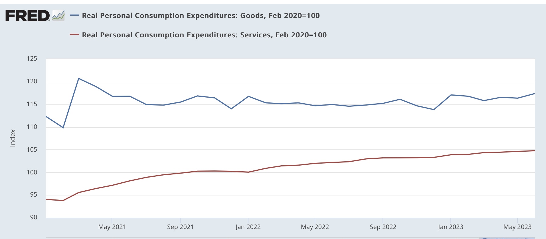
On the spending side, here’s how goods vs. services spending compare:


Real spending on services continued to rise at a steady clip (roughly 2.6% YoY), while real spending on goods, which had been flat, had a nice +0.9% pop. Outside of this past January, this is one of the strongest readings in 2 years.

Real spending on goods can be decomposed further into durable (red) vs. no durable (blue) goods, showing that the big increase was in durable goods:


We know that motor vehicle sales have recently finally increased to over 15 million announalized. My suspecion is that is what is reflected in the big increase in durable goods consumer spending in June.

The personal saving rate - income that isn’t spent - declined -0.1% for the month, although it is still elevated compared to its 2.7% level at its low water mark last June:


Consumers tend to get cautious and save more in the advance of a recession. That has occurred in the past year, but this month was a small positive.

Additionally, the personal consumption deflator gets used in the calculation of real manufacturing and trade sales, which is another important coincident indicator monitored by the NBER. These rose 1.1% in May, but they are still below their recent January peak:


Finally, note that almost all of the good news reported above had to do with “real” i.e., inflation adjusted metrics. The good news was greatly assisted by the continuing decleleration in the personal consumption deflator, up only 0.2% in June, and is up 3.0% YoY:


This is a very sharp deceleration from its peak of 7.0% YoY twelve months ago. But as shown by the month over month % changes below:


There will be much more challenging YoY comparisons beginning with next month’s report.

To sum up: almost everything about this report was positive. If you are cheering on a “soft landing,” then this report is potent ammunition. And it is all-around good news for average American consumers.

On the other hand, as noted above, last June was an inflection point. Gas prices in particular, along with a host of other commodities, declined in price thereafter. If that tailwind is ending - and I suspect it is - what happens next? 

Thursday, July 27, 2023

Q2 GDP indicates continued good expansion now, but more storm clouds gathered ahead


 - by New Deal democrat


Now let’s deal with this morning’s big news: real GDP improved at a perfectly respectable 0.6% over the first Quarter of this year:


This works out to a 2.4% annualized rate. Although it continues the slowdown from the white hot 2021 numbers, it would be average for the economy since the turn of the Millenium.

As per my usual practice, though, I want to focus on those parts of the report which tell us where the economy is likely headed: real private residential investment (a proxy for housing) and proprietors income (a placeholder for corporate profits, which won’t be reported for another month).

And the bottom line is, both were negative - housing for at least the 5th Quarter in a row..

Professor Edward Leamer gave a famous lecture almost 20 years ago showing that nominally, housing as a share of GDP turned down on average 7 quarters before a recession began. As indicated above, that metric (blue in the graph below) has now been down for 5 quarters. Measured in real terms (red), it has been considerably longer than that:


Taken strictly by itself, this metric argues that the most likely time for the onset of a recession is autumn (Q4) of this year.

The second long leading indicator, according to a lengthy history discussed several decades ago by Prof. Geoffrey Moore, is corporate profits deflated by unit labor costs. We con’t have unit labor costs yet for Q2, but these have been rising sharply in this expansion. And corporate profits themselves won’t be reported for one more month. So I make use of the placeholder of proprietors’ income, which typically turns either several quarters later than, or simultaneously with, corporate profits.

Here’s their historical record:


And here’s what they look like so far in this post-pandemic expansion:


Corporate profits turned down in Q2 or Q3 of last year, depending on how you measure. Proprietors’ income, as reported this morning, declined -0.3% in Q2, after peaking nominally in Q1.

Finally, let me take a look at a very important coincident indicator, real personal consumption expenditures. The monthly numbers, especially for services, have continued to rise sharply YoY. For the first two months of Q2, they are only up 0.2% from Q1, and will be updated tomorrow.

But the GDP report shows that real PCE’s rose 0.4% in Q2, suggesting that tomorrow’s personal consumption report is going to be very positive:


While there’s lots more that can be discussed, today’s preliminary GDP report for Q2 indicates an economy that continued to perform very well, but is going to come under increasing pressure in the quarters just ahead. In short, we’re not in recession now, but one continues to look like it is on the table for the very near future.

Continuing improvement in new jobless claims re-sets the clock


 - by New Deal democrat


Let’s get the easy part of this morning’s slew of data out of the way first:  initial jobless claims declined -7,000 to 221,000. The 4 week average declined -3,750 to 233,750. With a one week lag, continuing claims declined -50,000 to 1.690 million:


All of these are generally 5 month lows.

The more important YoY% change for forecasting purposes also declined, to 4.7% for initial claims, 9.1% for the more important 4 week average, and 28.3% for continuing claims:


With two more weeks to go, for the month of July so far, m/m claims are up 8.7%:


My discipline requires that there be 2 months in a row of claims being higher than 12.5% YoY to warrant a red flag recession warning. At this point, it will be almost impossible for the monthly average to cross that threshold. Unless that happens, this re-sets the clock. In other words, if August is bad, that wouldn’t be enough. September would also have to cross the threshold as well.

Nevertheless, although II won’t put up a separate graph, that claims remain higher YoY does suggest that the unemployment rate is also going to climb higher by several tenths of a percent in the next few months - just not enough to come close to triggering the Sahm Rule for recessions.

Wednesday, July 26, 2023

Prices for new single family homes down YoY,, while sales fluctuate; apartment rent changes YoY are zero


 - by New Deal democrat


June’s new home sales, and Apartment List’s Rent Report, this morning rounded out our view of this important leading sector through June.


New single family home sales are the most leading of all the government housing reports, but they are very noisy and heavily revised. That was on full display this morning, as the original spike higher in May to 763,000 units was revised sharply lower to 715:000. June’s initial number came in lower than that at 697,000:


I’m showing the last 30 years in the above graph because, while we’ve made up half of the decline since just before the Fed started raising rates, this remains a very moderate pace of home building when measured over the longer term.

Meanwhile prices (red in the graph below), which follow sales with a lag, are -4.0% lower than they were a year ago:


Prices are not seasonally adjusted, so YoY is the best way to measure. Note that with sales having picked up, we should expect prices to follow suit shortly, ending the anomaly I discussed yesterday of new and existing homes selling for the same median price.

Also, yesterday I neglected to show the updated house price indexes compared with owner’s equivalent rent, so here they are now:


Owners equivalent rent is going to continue to decelerate on a YoY basis, but how soon? In the housing bust, it took three full years (2010 vs. 2007) for OER to follow prices into outright decline.

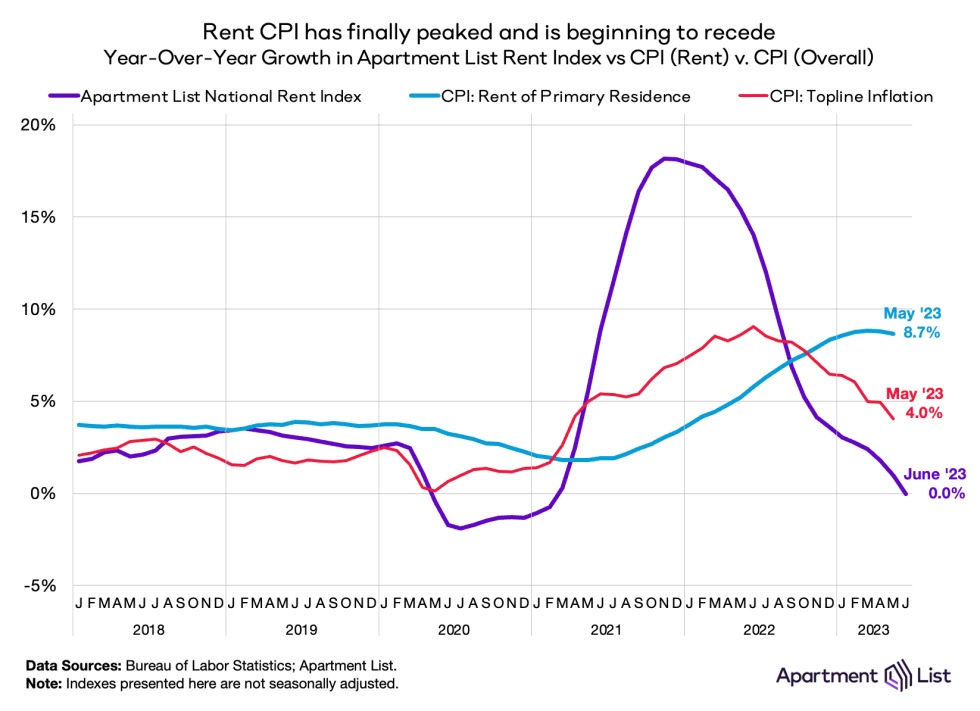
One clue is that CPI for rent of primary residence (gold in the graph above) was on the same trajectory as OER, turning negative finally with almost the same 3 year lag.

Which brings us to the final update in this post, new apartment rents through June as reported by Apartment List. These rose 0.4% in June, but that is not seasonally adjusted. Compared with pre-pandemic years, it is very low:


So again we need to compare YoY, and here the increase in rents was precisely 0:


This is the lowest since the series’ inception except for the pandemic year.

Because we have a record number of multi-family housing units under construction, there is every reason to believe that this downward trend will continue for awhile. Which means I don’t expect anything like a 3 year delay before the official CPI measure of rents hits 0 as well. And by inference that suggests OER is going to come down a lot faster than it did in 2007-10, when even at peak apartments were being built at less than half the pace they are now.

Tuesday, July 25, 2023

House prices stabilize (or even increase!) for existing homes, while prices have been slashed for new homes. What’s going on?


 - by New Deal democrat

Both the Case Shiller and FHFA housing price indexes were reported this morning through May. To quote each in turn:

“The S&P CoreLogic Case-Shiller U.S. National Home Price NSA Index, covering all nine U.S. census divisions, reported a -0.5% annual decrease in May, down from a loss of -0.1% in the previous month….
“Before seasonal adjustment, [it] posted a 1.2% month-over-month increase in May…. After seasonal adjustment, [it] posted a month-over-month increase of 0.7%.”

Meanwhile, according to the FHFA, “U.S. house prices rose in May, up 0.7 percent from April, according to the [ ] seasonally adjusted monthly House Price Index. House prices rose 2.8 percent from May 2022 to May 2023.”

Wait a minute! With higher interest rates and a decline in permits and starts for new homes, shouldn’t prices reflect that weakness and be declining? Which is a good way to segue to the post I was oriingally going to put up yesterday, about the fundamental bifurcation in the housing market between new and existing homes. I am indebted to Wolf Richter, who covered this very well at this post.

To cut to the chase: the two sectors are behaving very differently because builders have been able to cut prices sharply, while existing homeowners, wedded to 3% mortgages are unable or unwilling to cut prices and absorb a doubling of their monthly payments due to interest rrat3 increases.

In view of this mornings’ data, let’s look at existing homes first. The median price for an existing home, per last Thursday’s report, was only down -1.2% (Realtor.com only allows FRED to show the last year. Meanwhile, as indicated above, YoY prices as reflected in the Case Shiller report were down only -0.5%, and for the FHFA they actually showed an increase of 2.8%:


If you’re not going to cut your price, and housing is near record unaffordable levels with a doubling of interest rates from 3% to over 6%, sales are going to suffer pretty drastically. And they have, declining over 35% from peak to new lows as of last Thursday’s report on sales:


Normally I would expect inventory to pick up as a result, but partly because existing owners don’t want to or can’t part with their existing 3% mortgage rates, and partly because of what’s happening with new homes, inventory is at a new record low for June:


Which brings me to new homes. These are more important for the economy, tending to lea it by about 18 months. Here is the exact same graph of new single family home sales over the past 2 years to compare with that for existing home sales as shown above:


These are only down -9% from peak (vs. -36% for existing homes).

Part of the reason why new house prices spiked was low mortgage rates, but part wa also a sharp increase in commodity prices like for lumber involved in home building. Those peaked in or near June of last year, and are down between 4% and 10% depending on which measure you use. Meanwhile ew home prices followed commondity prices higher, and peaked in October of last year. Since then, the price of the median new home has declined by over 15%! (Shown in black below):


In fact as of the dates of their respective last reports, the median price of a new single family home is only about 0.1% higher than the cost of the median existing home (graph from Wolf Richter):


As you can see from the above graph, typically new homes demand a significant price premium over existing homes - but not now!

Put this all together, and your can easily imagine that buyers are fleeing existing family homes and flocking to new homes. As a result, these 20% price cuts have resulted in permits for single family homes making up about 40% of their decline from their pre-interest rate hike peaks:


This increase in permits has coincided with a decline to 2.5 year lows in permit for multi-family housing, while the previous surge continues to be reflectedi\ in the record number of multi-family units under construction:


It is very unlikely that this situation will last very long. Either the prices at which existing hojmes are offered is going to decline, or that for new single family homes is going to increase again. And if it’s the latter, there will be a further decrease in new homes being built


Monday, July 24, 2023

A “Big Picture” summary of why a recession still looks likely, even if it hasn’t occurred yet


 - by New Deal democrat


The below started out as a comment somewhere else, but it is too good a “big picture” summary of where the economy is today not to post it here. I still intend also to take a more detailed look at the housing market, but since the below lays the groundwork for that, I’ll post it later (maybe later today, maybe not).

What follows is hopefully an as dispassionate as possible very, very summarized version of why there is still ample reason to see a recession ahead, while explaining why it hasn’t occurred yet.

Let me start by saying that while a few people called for a recession last year, most did not. That’s because the downturn in GDP was largely inventory driven (so very transitory) and also by the gas price spike, which was geopolitical and speculative. When the West figured ways around Russian energy, that situation abated.

The situation this year is different. The easiest way to see it is for me to point you to the graphs of the Index of Leading Indicators. The index is the best K.I.S.S. method to forecast the economy, having the very inconvenient habit of being correct much more often than the average pundit:


[source: Conference Board via Advisor Perspectives]

The LEI is now down almost -10% - as much as it has been at the very bottom of all but the deepest recessions.

And yet we’re not in a recession, at least not yet. So something *is* different this time.

What’s different is that we are still dealing with the reverberations from the pandemic, in two ways.

The first is the resolving disconnect between sales and employment. When sales increase, you need more employees to handle them. Typically in expansions sales have grown faster than employment by 0-5% YoY. In the first year after the recession, sales grew by over 6%, and real retail sales a whopping 20(!) (thank you, stimulus) while employment initially declined by about 15% and was still down 6% one year later, the biggest disconnect ever. Below I divide real total sales by employment, to show how even with labor-cutting efficiencies in the production and sales processes over time, the 2020-21 surge was the most extreme divergence on record:


Payrolls have been closing the gap ever since - by growing sharply - but by my best estimate are still about 1.5 million below where they would need to be to catch up to trend sales growth (this was the essence of my post Friday). My best guess is that will take another 6-12 months.

Because of this, aggregate wage growth has outpaced inflation. 60 years of history says no recession occurs until inflation (red) outpaces aggregate payrolls growth (blue), which as a “fundamentals” manner which causes households in the aggregate to start cutting back spending:


As shown above, for the past year, payrolls growth has decelerated sharply, but inflation has decelerated even more sharply. Hence the aggregate “real” buying power of the American middle/working class has increased.

Going forward, with the tailwind of declining gas prices behind us, as trend job growth catches up with trend sales growth, my best guess is that inflation will trend more sideways, while aggregate payroll growth will continue to decelerate, meaning inflation may very well outpace payrolls very soon.

The second difference is also pandemic related. If you go back to your Econ 101 supply and demand curves, stimulus spending pushed the demand line to the right, increasing the amount demanded and also increasing prices. On the flip side, there were very significant supply bottlenecks that most especially affected vehicle production and housing construction. This created shortages, which going back to your Econ 101 supply and demand curves, pushed the supply line to the left. This decreased the amount demanded, but also drove up prices. 

As these supply chain kinks are being resolved, prices are becoming more stable, but both industries are taking a long time compared with previous expansions to make up the backlog, as shown by light vehicle sales (blue, left scale) and housing under construction (red, right scale):


Even though manufacturing as a whole has turned down (not shown), the vehicle production sector continues to show expansion. Similarly, even though housing permits and starts (not shown) turned down well over a year ago, it is taking an extremely long time for that to work its way through construction.

The above analysis is far from complete. It’s barely a summary of a summary. But while no method is perfect, my preference is to mechanically be on the K.I.S.S. side of the Index of Leading Indicators. Even if this time really is different in some respects, I would prefer *not* to reverse-engineer from a conclusion backwards of why they are wrong. 

Saturday, July 22, 2023

Weekly Indicators for July 17 - 21 at Seeking Alpha


 - by New Deal democrat


My Weekly Indicators post is up at Seeking Alpha

At least when it comes to weekly measures of consumer spending, the “waiting for godot” recession seems to have finally arrived. Meanwhile other metrics have been picking up steam as to the near future. This suggests a period of wobbling ahead.


As usual, clicking over and reading will bring you up to the virtual moment, and reward me a little bit for my efforts.

Friday, July 21, 2023

How long until the historically tight jobs market reverts to trend?


 - by New Deal democrat


There are some very unusual cross-currents going on in the housing sector, revealed by yesterday’s existing home sales report. But it will take some time-intensive organization to present it to you, so I’m saving it for (hopefully) Monday.


In the meantime, let’s take another look at the job market and how it compares with consumer spending.

One of my favorite long-time graphs has been that the YoY% change in real retail sales, /2, forecasts the YoY% change in jobs growth, with a delay of some months. Here’s the latest update of that:


Works like a charm, until the pandemic. Then there’s a disconnect, first on the downside (2020) for jobs, as they declined over 5% vs. over 2% growth in sales), and then on the upside (2022-23), with an actual decline in sales vs. over 2% growth in jobs.

When will the disconnect resolve itself? For that, let’s take a different look at the same data. The above implies that sales grow faster than jobs,  vs. their long-term trend in the first part of an expansion, and sales grow slower than jobs in the last part. To show that, I’ve normed both real sales and job growth to 100 as of the mid-point for jobs growth in the last expansion in mid-2014. Because sales historically have tended to grow almost twice as fast as jobs, I account for that mathematically in the sales data.

Here’s what the last 30 years look like:


This shows that sales exploded in 2020 and 2021 with the pandemic stimulus, while jobs initially plummeted and then grew back strongly.

Now let’s zoom in on the post-pandemic era:


Real sales have been flat to slightly declining over the past 2 years. Meanwhile jobs have almost entirely caught up, and are now only 1% (about 1.5 million jobs) under trend compared with their pre-pandemic norm. This can be resolved by a further decline in sales, a further increase in jobs, or both.

Which brings me to the job openings data from the latest JOLTS report:


Over the past 16 months, job openings have declined about 50% towards their pre-pandemic level. If that trend continues, in about another 16 months the anomaly will have disappeared. 

The sales vs. jobs data highlighted previously above suggests that it will be quicker than that, on the order of 6 to 12 months. At that point the historically tight labor market will revert to mean, and an actual downturn in jobs in response to flagging sales would become much more likely.

Thursday, July 20, 2023

Jobless claims: close but no cigar for the red flag


 - by New Deal democrat


Initial claims declined -9,000 to 228,000 last week, and the four week average declined -9,250 to 237,500. Continuing claims, with a one week delay, rose 33,000 to 1.754 million:


More importantly for forecasting purposes, initial claims are up 7.0% YoY, the four week average up 10.6%, and continuing claims up 30.8%:


Just as importantly, the average for July so far is about 233,000, only about 8.4% above last year’s average for the month.

My discipline requires 2 straight months, or 8 weeks in a row, of comparisons higher by 12.5% or more YoY. Otherwise, the spike could just be transitory noise. Thus, with this week’s number, the chain has been broken. Unless there are sharp increases in new claims in the remaining weeks of July, there is no red flag recession signal.

Despite that, since initial claims lead the unemployment rate, a slight increase in the unemployment rate during the next few months is still forecast:


Keep in mind that the unemployment rate in the above graph is rendered as a “percent of a percent,” so even a 10% YoY increase from 3.5% would sill only be about 3.9%, not enough to trigger the Sahm Rule.


Wednesday, July 19, 2023

June housing report: a tale a two diametrically opposed sectors


 - by New Deal democrat


Yesterday I wrote that housing under construction, along with new vehicle sales, were two important reasons that no economic downturn had occurred yet. Today’s report on housing construction for June showed two almost diametrically opposed trends: single family houses had a sharp increase in permits and starts, while units under construction made a 12 month low. Conversely, multi-family dwellings had sharp declines in permits and starts, while units under construction were at multi-decade highs.


So let’s break this month’s report down into those two categories: single-family vs. multi-family dwellings.

Permits (red in the graph below) are the most leading of the metrics, and single family permits have the least noise and most signal of any metric. These increased 20,000 annualized to a new 12 month high. Starts (blue) declined -70,000 annualized, but were nevertheless close to the 12 month high set last month. But units under construction (gold, right scale) declined -6,000 to a new 12 month low:


The story was completely reversed for multi-family dwellings. Permits (red) declined -73,000 to a new 12 month low, and starts (blue) declined -63,000 to the 3rd lowest level in 12 months. But units under construction (gold, right scale) increased 7,000 to not just a 12 month, but another all-time high:


It’s easy to see in the above how the data progresses from permits to starts to units under construction. Since mortgage rates lead permits, below are mortgage rates averaged monthly (inverted) vs. single family permits (red, right scale):


You can see that last year’s big increase in mortgage rates led to a big decrease in permits. The decline in mortgage rates earlier this year has led to an interim increase in permits. I suspect permits will decline slightly again as the recent increase in rates back to 7% filters through the system.

But the actual economic impact is via units under construction. Below I show total units under construction (blue, right scale)), as well as the single-family (red) and multi-family (gold) units components:


In total, units under construction have fallen slightly from their peak (meaning a very minor effect on the economy), while single-family units have declilned at a recessionary pace. But that has been almost totally offset by the record increase in multi-family units under construction. Undoubtedly the dominant reason for that is the big surge in housing prices after the pandemic, which priced single family dwellings out of the price range of many younger potential buyers. Since multi-unit apartments and condos tend to be less expensive, and thus somewhat of a replacement good, this is where the growth has been.

For forecasting purposes, most importantly, in the booming multi-family sector, permits have fallen to their lowest level since October 2020. Starts are close to their lowest level since the end of 2021. Units under construction have not peaked yet, and are probably several months away from peaking.  The exact reverse is true about single family units. Since multi-unit construction is over 60% of total activity, and more importantly because there is a much greater downside to multi-family construction if they follow permits, vs. limited upside for single family units, I anticipate downward pressure on the economy overall as a result.

Tuesday, July 18, 2023

Industrial and manufacturing production continue to falter


 - by New Deal democrat


I frequently call industrial production the King of Coincident Indicators, because so often the turning point in this metric has been at the peaks and troughs of the economy as a whole. That has not been the case since last September, when this indicator last peaked.


And it continued its declining trend in June. Total production declined -0.5%, and manufacturing production declined -0.3%:


On a YoY basis, total production is down -0.4%, and manufacturing production is down -0.3%:


As you can see, up until the recent past, such declines had almost always been recessionary. But since the “China shock” that began in 1999, there have been similar production declines that have not spread out into the wider economy.

Finally, here’s a look at the sub-sector of motor vehicle production:


This series is noisy, so while the big decline played a role in the declines in both total and manufacturing production in June, there is simply no way to know if this is simply one bad month, or the beginning of a downward trend.

The bottom line is that this important indicator continues to be negative. Recession as been avoided - at least so far - because of resolving supply bottlenecks in vehicle production and housing construction, and robust spending on services. As we saw above, June was a poor month for vehicle production. We’ll find out about housing construction later this week.

June retail sales continue to falter, with the important exception of motor vehicles


 - by New Deal democrat


As usual, retail sales is one of my favorite indicators, because it tells us so much about the 70% of the US economy that is consumption, as well as being a short leading indicator for employment. It has been faltering for the past year, and June was no different.


Last month retail sales increased 0.2% nominally, but because consumer prices also increased 0.2%, real retail sales were unchanged:


In real terms, retail sales remain -3.1% below their 2021 peak.

The YoY comparisons, which have been very negative, continued to be negative, although slightly less so. The below graph also shows real personal consumption on goods, which tends to closely track real retail sales, although with a different deflator which tends to make it more positive:


Although I won’t show the long term graph, the simple fact is that, going back 75 years, with rare exception a YoY decline of 2% in real retail sales has been recessionary.

Since real retail sales tend to lead the trend in employment by several months, nonfarm payrolls are also shown above in gold. The indication is that the deceleration in YoY employment gains is going to continue in the coming months.

Finally, because a unique aspect of the current economic environment is the outsized role played by motor vehicle sales, which had been severely constrained by supply shortages - leading to outsized price increases as well - here is the comparison among nominal total, motor vehicle, and sales ex-motor vehicles for the past several years, all normed to 100 as of just before the pandemic recession of 2020:


Note again that the above graph is nominal, not real, and is shown for comparison among the sectors. Real sales of motor vehicles increased 0.1% in June. This sector continues to be a boon for the economy, and - along with robust real spending on services, which aren’t part of retail sales - an important reason why no recession has occurred yet.