Saturday, May 13, 2023

Weekly Indicators for May 8 - 12 at Seeking Alpha


 - by New Deal democrat


My “Weekly Indicators” post is up at Seeking Alpha.


There was more slow deterioration in the coincident indicators, but interestingly a bounce in several of the short leading indicators, particularly in the weakness of the US$ (which paradoxically is a positive, because it helps exports and crimps imports).

But the biggest news was in one of the twice a month indicators, consumer confidence from the University of Michigan, which did this:


As I wrote yesterday, in 2011 all of the indicators cratered at once, and in particular consumer confidence, so the sudden downturn in consumer expectations in the past couple of weeks is a bad sign.

Friday, May 12, 2023

Real hourly and aggregate wages update; plus further comments on consumer and producer inflation


 - by New Deal democrat


Let’s update some inflation-related information.


First of all, real hourly wages for non-managerial personnel increased less than 0.1% in April. They are up about 3% from just before the pandemic, and also up a little over 1% since their June low last year:


Note the graph above is normed to 100 as of the long-time previous high for wages in January 1973.

Next, real aggregate payrolls for non-supervisory workers tell us how much money the middle/working class is earning in total, adjusted for inflation. This declined -0.1% in April, but is 4.4% above its pre-pandemic level:


But the overall trend remains a very slow increase. Here’s what the YoY% change looks like historically:


Note that when real aggregate payrolls go negative, that has *always* been a coincident indicator of recession. At 1.7% higher YoY, this is about average for previous expansions, and is an important positive sign.

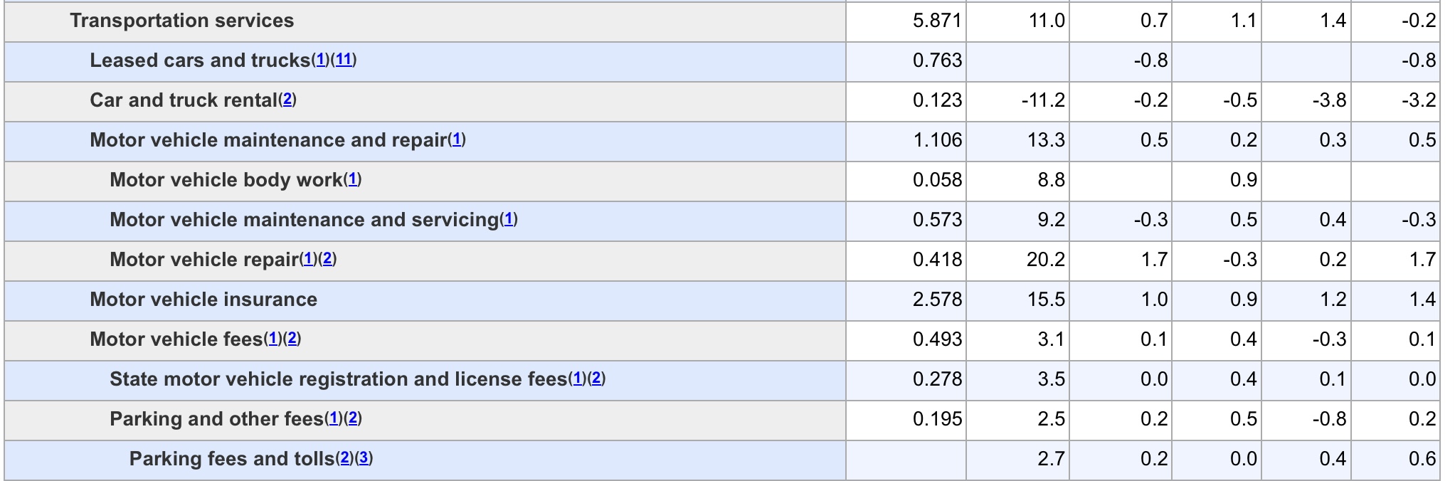
Digging a little deeper in the CPI report, aside from shelter, the big YoY increases have been in food (13.5% weighting of the total, unchanged in the last 2 months but up 7.7% YoY, down from a peak of 11.3% last August); new cars (4.2% weighting, down -0.2% in April, but up 5.4% YoY vs. a peak of 13.2% in April last year); and something called “transportation services,” (5.9% weighting, down -0.2% in April, but up 11.1% YoY, down from 15.3% last October).

So, exactly what are “transportation services”? Here’s the detailed breakdown from the CPI report:


The two big items are motor vehicle insurance and repairs. This is telling me that we still have a bottleneck in vehicle parts, which are impacting both the manufacture of new cars and the repair of older ones - especially since so many people are holding on to their older cars, given the prices of the new ones.

Finally, the producer price index for raw commodities rose 0.1% in April, after declines in both February and March. Producer prices for final demand goods rose 0.2%. If this sounds well-contained to you, that’s because it is. YoY commodity prices are down -3.0% and finished goods prices are up only 0.8%:


An important difference between the PPI and the CPI is that there is no “shelter” component in the former. Below are two long term graphs of both producer and consumer prices, ever since the end of WW2:


With the notable exception of the 1980s and 1990s, when the work force was swelling both due to the entry of the Boomers and women, a downturn in YoY producer prices has always resulted in a deceleration of consumer prices as well. Since our present period most resembles the immediate post-WW2 Booms through the Korean War, as well as 1981-82, when the Fed continued hiking rates into a decreasing inflationary environment, this argues strongly that consumer prices will follow producer prices this time as well, despite producers’ efforts to maintain their recent price hikes in consumer products.

Thursday, May 11, 2023

Yellow flag from initial jobless claims turns a little more orangey


 - by New Deal democrat


Initial jobless claims rose 22,000 to 264,000 last week, while the 4 week average rose 6,000 to 245,250. Continuing claims, with a one week lag, rose 12,000 to 1.813 million:


Note that both measures of initial claims are at their highest levels since late 2021. Continuing claims are also at those levels, although slightly down from three weeks ago.

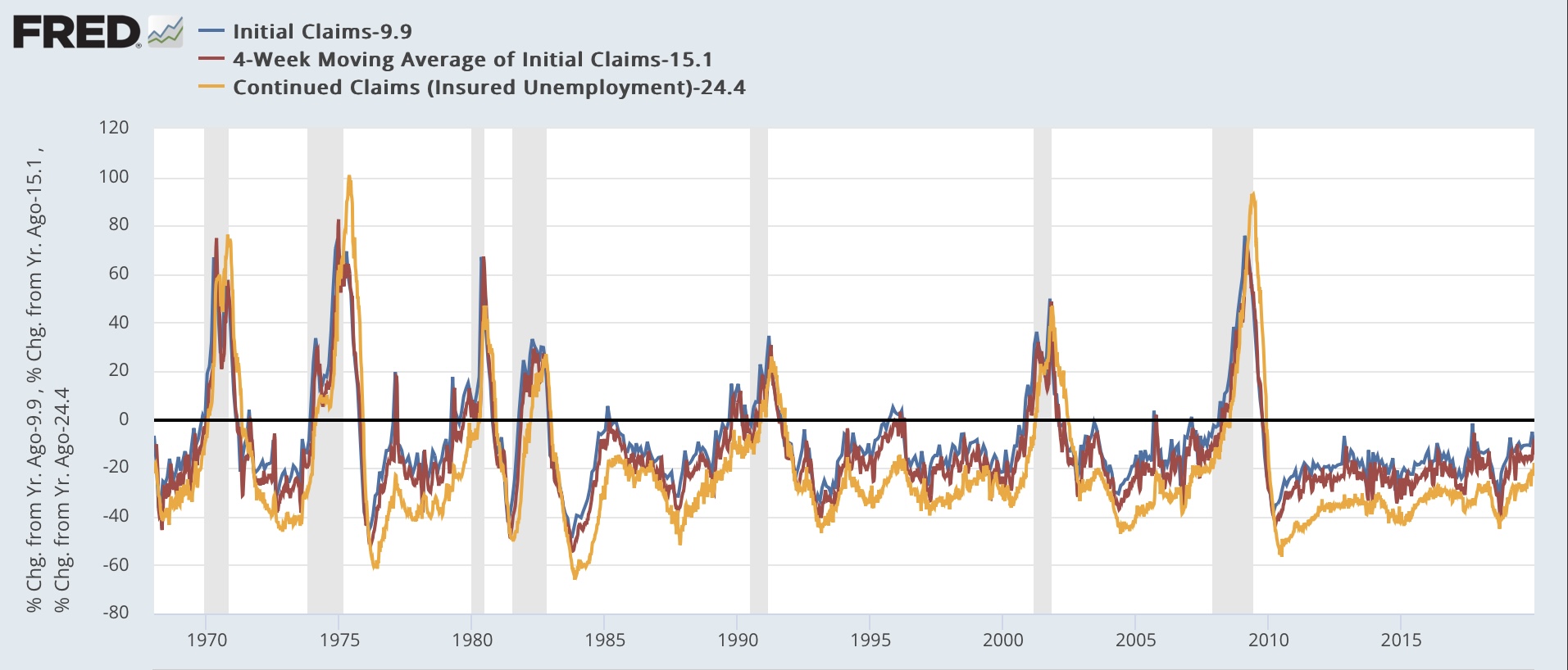
On a YoY basis, initial claims are up 25.7%, the 4 week average up 15.1%, and continuing claims up 24.4%:


If these YoY comparisons persist for another month, that would be sufficient to hoist the “red flag” recession warning. So this is a good time to reiterate that weekly data can be noisy, and this week’s spike could be the start of a trend - or it could just be an outlier. Many times in the past there have been brief crossings of the 12.5% YoY threshold that reversed quickly and did not signal a recession.

Here’s what the historical record of YoY readings in the three metrics have looked like (all normed to 0 as of this week’s reading, 1 week’s claims averaged by month):


In 4 of the 7 recessions before the pandemic, claims did not hit this level YoY until after the recession actually started. In 2 they hit this level 6 months or less before the recession, and in 1 (1990) 9 months before. But there were also 7 false positives: August 1971, February 1977, March 1979, February 1985, October 1995-June 1996, March 2005, and February 2007. Note that only one of these lasted longer than a month.

So this week the yellow flag caution turned a little more orangey.

Wednesday, May 10, 2023

Inflation ex-shelter increasing at 1.0% annualized rate since last June; core inflation with actual house prices only up 3.0% YoY


 - by New Deal democrat


Two months ago, I “officially” took the position that inflation had been conquered, and that, properly measured, the economy had actually been experiencing deflation since last June. With revisions, the “actual deflation” is no longer the case; but for the second month in a row since then, this morning’s CPI report indicates that it is only because of the lagging and fictitious nature of the measure of shelter prices that inflation is considered elevated at all.

The primary reason, as I have been pounding on for almost 18 months, is that the shelter component of official inflation, which is 1/3rd of the total, and 40% of the “core” measure, badly lags the real data - as in, by a year or more.

Before we get into all that, let’s look at the headlines, with the monthly and YoY rates of change:

Total CPI up 0.4% m/m and 5.0% YoY (tied for lowest since May 2021)
Core CPI up 0.4% m/m and 5.6% YoY (lowest since January 2022)
CPI less shelter up +0.3% and 3.4% YoY (lowest since March 2021)
Core CPI less shelter up +0.4% and 3.8% YoY
Energy up 0.6% m/m and down -4.9% YoY
Food unchanged m/m and up 7.6% YoY (lowest since January 2022)
New cars down -0.2% m/m and 5.4% YoY (lowest since June 2021)
Owners Equivalent Rent up 0.5% m/m and 8.1% YoY (all time YoY high)

Notice the pattern with the above? “Lowest since…” for almost everything *except* shelter, which is at an all-time YoY high.

Simply put, at this point both core and headline inflation are being driven almost exclusively by Owners’ Equivalent rent (shelter), with a secondary assist by food and new cars - and even those two are decelerating substantially. It is only because shelter is such a large component of the aggregate that inflation is an issue. Even including new cars and food leaves consumer inflation at a YoY rate that ought to be in the Fed’s comfort zone. Only core inflation ex-shelter remains somewhat elevated, at 3.8% YoY.

Let’s start with the YoY% changes in headline inflation (blue), core inflation (red), and inflation ex-shelter (gold):


All 3 have been in declerating trends since last June (headline and ex-shelter) or last September (core).

Next, because of the importance of shelter to my analysis, here is an updated long term YoY graph of the big culprit, Owner’s Equivalent Rent (blue), which increased another 0.5% in April, with the FHFA house price index (red, /2.5 for scale), which has been declining since last June and was up 4.0% as of its last reading for February:
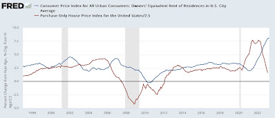


Exactly as I have been saying for the past 18 months, house prices dragged OER higher and with it the CPI indexes, with about a 12 month delay. House prices on a YoY basis plateaued for a year between late spring 2021 and mid year 2022, and now it appears OER is finally plateauing as well.

Here’s what core inflation ex-shelter would look like:


This measure is significant, because in the last several months it has stalled at roughly 4.0% YoY. But it only goes partway, because we really ought to include the true measure of shelter inflation - house prices - in the calculation.

As noted above, the FHFA index is only up 4.0% YoY as of February. If it has continued to decline in the 2 months since then at the same rate, it is only up about 1.7% YoY currently, vs. 8.1% for OER. If the FHFA index were substituted for OER, then total YoY CPI for April would only be 2.8%. Core inflation, which ex-shelter is up 3.5%, would only be up 3.0%. Neither of these warrants restrictive interest rate policy.

Additionally, because of the importance of gas prices, which peaked last June at over $5/gallon, to headline inflation, if we measure since last June, then headline inflation ex-shelter has only increased 0.8%, or at a 1.0% annualized rate:


Which means, as I said above, food and new car prices are also worth looking at.

Here are food prices both m/m (blue, left scale) and YoY (red, right scale):


Inflation in food prices has rapidly decelerated. In the past 6 months, inflation has been 2.0%, or a 4.0% annualized rate.

Meanwhile, while used car prices increased 4.4% for the month, on a YoY basis inflation in both new cars (red) is also decelerating, albeit slowly, now at 5.4%, while YoY used car prices (blue) have actually turned over into deflation:


But to reiterate: properly measured inflation is no longer a significant issue. Inflation is only heightened because of the fictitious, and lagging, measure of Owner’s Equivalent Rent. If actual house prices were used, even core inflation would only be up about 3.0%. Even if OER is a valid way to measure inflation, because of the serious lag the Fed should be relying on house prices, and declare victory. It won’t, but it should.

Tuesday, May 9, 2023

Credit conditions worsen, and likely to worsen further due to Debt Ceiling Debacle II


 - by New Deal democrat


The Senior Loan Officer Survey, which measures credit on offer by banks, and the demand for credit by their customers, was released yesterday afternoon for Q1, and the news - unsurprisingly - was not good.


Credit conditions not only tightened, but they tightened at a higher rate than they had in previous quarters, as about half of all banks tightened terms for credit (in the below graph, a positive number means tightening, i.e., is worse for the economy):


Note that in the past, more often than not credit conditions were at their most tight even before recessions began. 
Not only that, but more than half of all banks reported that demand for new loans by commercial customers had declined:


The number of banks reporting reduced demand is on par with the worst of the last few recessions.

What this report tells us is that the economy has been continuing to grow based on the “catching up” on supply chain bottlenecks both on the producer and consumer sides. New demand for and offers of credit for capital projects is drying up.

There’s one other ominous sign, at least for the short term. Below is a graph of several weekly measure of financial conditions by the Chicago Fed. In these indexes, like the data above, a positive number is poor. Typically these reasonably approximate, and give advance notice of, the quarterly data in the Senior Loan Officer Survey.

The leverage subindex (red), touted by the Chicago Fed as the most leading, has done exactly that, as it is presently at levels that more often than not in the past have occurred shortly before or during recessions. The Adjusted Index, which leads but with a less variable record, is still below zero:


Here’s the ominous note: the two times that the leverage subindex has been as poor as it is now, but not associated with recessions, were:
(1) the stock market crash of 1987.
(2) the debt ceiling crisis of 2011.

That the leverage index is at those levels, as we appear headed for yet another debt ceiling train wreck, is as I said above, ominous.

I went back and checked my posts from that period in 2011. In August and September, all of the monthly data - long leading, short leading, coincident, you name it - tanked in unison, to the point where it appeared a recession may have already and suddenly started. It should not be surprising at all if the same occurs as we approach the brink of a debt default again.

Monday, May 8, 2023

Scenes from the April employment report: the Fed just can’t kill the employment beast


 - by New Deal democrat


There’s no economic news this morning, so let’s take a closer look at some important trends from last Friday’s April jobs report.


As I and many others wrote, an important theme was that the deceleration in job gains continued, as shown in this graph since January 2021 (note 222,000 is subtracted so that latest average is at zero level):


The last 3 months have averaged 222,000 jobs, the lowest since the pandemic recovery began in 2020.

But on an absolute scale, in the past 40 years, an average of 222,000 jobs per month over a 3 month period has been better than about 80% of all Quarters (graph subtracts 222,000*3 so that quarterly average equivalent to last 3 months shows at zero):


So, on an absolute scale, all that has happened is that the white hot jobs growth of 2021, which slowed to red hot jobs growth in the first half of 2022, has now cooled to simply hot jobs growth.

All of which has resulted in the highest employment to population ratio among the prime age population since the 1990s tech boom (current level of 80.8% is subtracted to show as zero):


And I won’t even bother to show the current unemployment rate, which is equivalent to the lowest in nearly the past 70 years.

As I also pointed out on Friday, there was some mixed data among the leading employment sectors: temporary (gold) and residential construction (red) did decline, but manufacturing (blue) increased to a new post pandemic high:


If all three have or are in the process of rolling over, in the past 30+ years that has typically occurred many months before the actual onset of ensuing recessions:


Why is employment holding up so well in the face of the turning down of so many other indicators - not just leading indicators, but also things like industrial production or real retail sales?

I believe it has to do with employment still having a ways to go to “catch up” with the huge increase in total consumption, including consumption of services, in real terms. Here is what growth in real consumption and employment look like since the end of the Great Recession. Since generally consumption of goods (but not services) increases faster than employment, I have normalized the trend line in consumption to best show the comparison during the last expansion:


There remains a large gap between the growth in consumption, and the growth in employment to service that consumption. To paraphrase “Hotel California,” the Fed keeps stabbing the economy with their steely knives, but they just can’t kill the employment beast.

Saturday, May 6, 2023

Weekly Indicators for May 1 - 5 at Seeking Alpha


 - by New Deal democrat


My “Weekly Indicators” post is up at Seeking Alpha.

Stock prices had been in an uptrend since last October, but on a three month basis that trend has now been broken. Meanwhile several measures of income and consumption have softened even further, without quite rolling over.

As usual, clicking over and reading will bring you up to the virtual moment as to all of the important economic trends, and reward me a tiny little bit for collating and organizing the information for you.

Friday, May 5, 2023

April jobs report: deceleration continues, with sharp downward revisions to previous months’ gains


 - by New Deal democrat


My focus for this report continued to be whether the leading sectors and other indicators  continued to decline, and whether the pace of growth continued to decelerate.

While the deceleration in growth did occur - and substantially so - the leading sectors were decidedly mixed, with some - notably the unemployment and underemployment rates - actually improving.

Here’s my in depth synopsis.


HEADLINES:
  • 253,000 jobs added. Private sector jobs increased 230,000. Government jobs increased by 23,000. 
  • BUT, February was revised down by -78,000, and March by -71,000, for a total of -149,000. At +165,000, March is now the lowest reading since December 2020, and the three month moving average of growth declined by over -100,000 from 345,000 before revisions to 222,000, again the lowest since the end of 2020.
  • The alternate, and more volatile measure in the household report rose by 139,000 jobs.
  • Despite this, the U3 unemployment rate declined -0.1% to 3.4%. This is because the civilian labor force, the denominator in the figure, declined by -43,000
  • U6 underemployment rate also declined -0.1% to 6.6%.

Leading employment indicators of a slowdown or recession

These are leading sectors for the economy overall, and help us gauge how much the post-pandemic employment boom is shading towards a downturn.  These were decidedly mixed:
  • the average manufacturing workweek, one of the 10 components of the Index of Leading Indicators, was unchanged at 40.6, down -1.0 hours from February peak last year of 41.6 hours.
  • Manufacturing jobs increased by 11,000.
  • Construction jobs increased by 15,000.
  • Residential construction jobs, which are even more leading, declilned by 1,800. It appears likely that January was the peak for this sector.
  • Temporary jobs, which have generally been declining late last year, declined further, and sharply, by -23,500.
  • the number of people unemployed for 5 weeks or less declined -436,000 to 1,866,000.

Wages of non-managerial workers
  • Average Hourly Earnings for Production and Nonsupervisory Personnel increased $.11, or +0.5%, to $28.62, a YoY gain of 5.0%, the lowest YoY gain since June of 2021.

Aggregate hours and wages: 
  • the index of aggregate hours worked for non-managerial workers declined -0.2%.
  •  the index of aggregate payrolls for non-managerial workers rose 0.3%, but continued its deceleration to 6.7% YoY, the lowest since March 2021, although still 1.7% higher YoY than inflation as of the last reading.

Other significant data:
  • Leisure and hospitality jobs, which were the most hard-hit during the pandemic, rose 31,000, -402,000, or -2.4% below their pre-pandemic peak.
  • Within the leisure and hospitality sector, food and drink establishments added 26,800 jobs, and are now only -87,100, or -0.7% below their pre-pandemic peak. 
  • Professional and business employment rose 43,000. This series has also been decelerating, and is now up 2.3% YoY.
  • The Labor Force Participation Rate was unchanged at 62.6%, vs. 63.4% in February 2020.
  • The number of job holders who were part time for economic reasons declined -199,000.
  • Those not in the labor force at all, but who want a job now, increased 346,000 to 5.271 million vs. its best level of 4.761 shortly before the pandemic.


SUMMARY

This was a very mixed report. The biggest positives were the increases in manufacturing and construction jobs. Nominal wage growth, while decelerating, continues to be strong. And both the unemployment and underemployment rates tied their multi-decade lows.

The negatives included the reasons *why* the unemployment and underemployment rates were so low: the labor force itself declined, while those who weren’t in the labor force but want a job increased. Temporary jobs and residential construction jobs continued to decline, the former sharply. And perhaps most important of all: for the second month in a row, we have had sharp downward revisions to the previous two months’ numbers. This is something that tends to happen as a recession is about to start, or has already started.

The theme remains deceleration, but no downturn yet.

Thursday, May 4, 2023

Jobless claims hoist yellow flag again; employment and unemployment likely to show further deceleration tomorrow


 - by New Deal democrat


Initial jobless claims rose 13,000 to 242,000 last week, while the 4 week average rose 3,500 to 239,250. Continuing claims, with a one week lag, declined -38,000 to 1.805 million:


This is right in the range of the past 2 months.

YoY initial claims are up 11.0%, the 4 week average is up 10.8%, and continuing claims are up 20.5%:


This is enough to reinstate the “yellow flag” caution, but not across the 12.5% boundary where I would begin to hoist the “red flag” recession warning.

Tomorrow morning we will get the April jobs report, and since initial claims are a leading indicator for the unemployment rate (red in the graph below), here’s what that looks like for the past 18 months:


Initial claims are clearly forecasting an increase in the unemployment rate by 0.2%-0.3% over the next few months, but whether or not there will be an increase tomorrow is impossible to know. But they do certainly suggest there will be no *decrease* in the unemployment rate.

Meanwhile, since real retail sales (showing consumption; blue in the graph below) are a leading indicator for employment (red), here’s the latest update on that comparison:


The gold line represents the quarterly change (*4 to estimate the annualized rate) in job growth.

Real retail sales are plainly forecasting continued deceleration in jobs growth. Deceleration in the YoY rate, as well as deceleration in q/q growth suggests a gain of less than 325,000 tomorrow. A negative outlier would be anything less than 200,000.

Additionally, tomorrow I’ll be looking for continued deterioration in the leading sectors of manufacturing, construction, and temporary employment, along with the manufacturing workweek and an increase in short term unemployment. 

Wednesday, May 3, 2023

The un(der)employment rate leads wage growth: 2023 update


 - by New Deal democrat


I had already planned on taking an updated look at wage growth today, but there was a little flutter on twitter about job openings and last week’s Q1 wage and benefits data, so that sealed the deal.


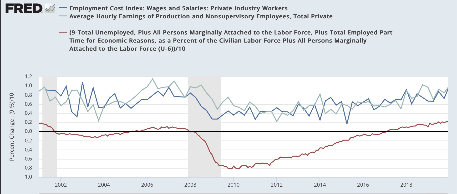
To wit: as I used to write many times during the last expansion, wage growth is a long lagging indicator. It tends to increase only after unemployment (or even better, underemployment) falls to a level where labor begins to have some bargaining power. For the underemployment rate, this was about 9%. It took over half a decade after the Great Recession for the U6 rate to hit that marker:


So the below graph subtracts the U6 rate from 9% (red), so that any rate lower than 9% shows as a positive, compared with the YoY% change in  average nonsupervisory wages (light blue) and wages measured by the quarterly employment cost index (dark blue):


Because the underemployment rate went to over 20% in the first few months of the pandemic, the below continuation graph eliminates those months and picks up in the last quarter of 2020:


As the labor market got tighter, wages growth continued to accelerate.

Economist Jason Furman made a similar point several days ago comparing the job openings rate with wage growth. Here’s his graph:


A graph of the quarterly % changes in wage growth in nonsupervisory wages and the employment cost index does not particularly correlate with the quarterly % change in job openings:


But the YoY% change in wages do correlate with the absolute level of job openings:


As the level of employment continues to reach post-pandemic equilibrium, the level of job openings will continue to decline, and the underemployment rate will likely increase. This will cause wage growth to decelerate as well.

Tuesday, May 2, 2023

March JOLTS report shows labor market about halfway to pre-pandemic normalization


 - by New Deal democrat


The title of this piece is an important to clue the relative nature of this morning’s Job Openings and Labor Turnover report for March.


For the last several years, the jobs market has been a game of “reverse musical chairs,” where there are always more chairs than participants. Those employers whose chairs weren’t filled had to increase their wage and/or benefits offerings, or go without. This was good for labor, but certainly put pressure on prices as well.

Because the jobs market has remained so strong, it has been unlikely that a recession would start unless the situation with job openings returned to at least close to its pre-pandemic levels. Only then could there be enough layoffs to actually be consistent with a negative monthly jobs number.

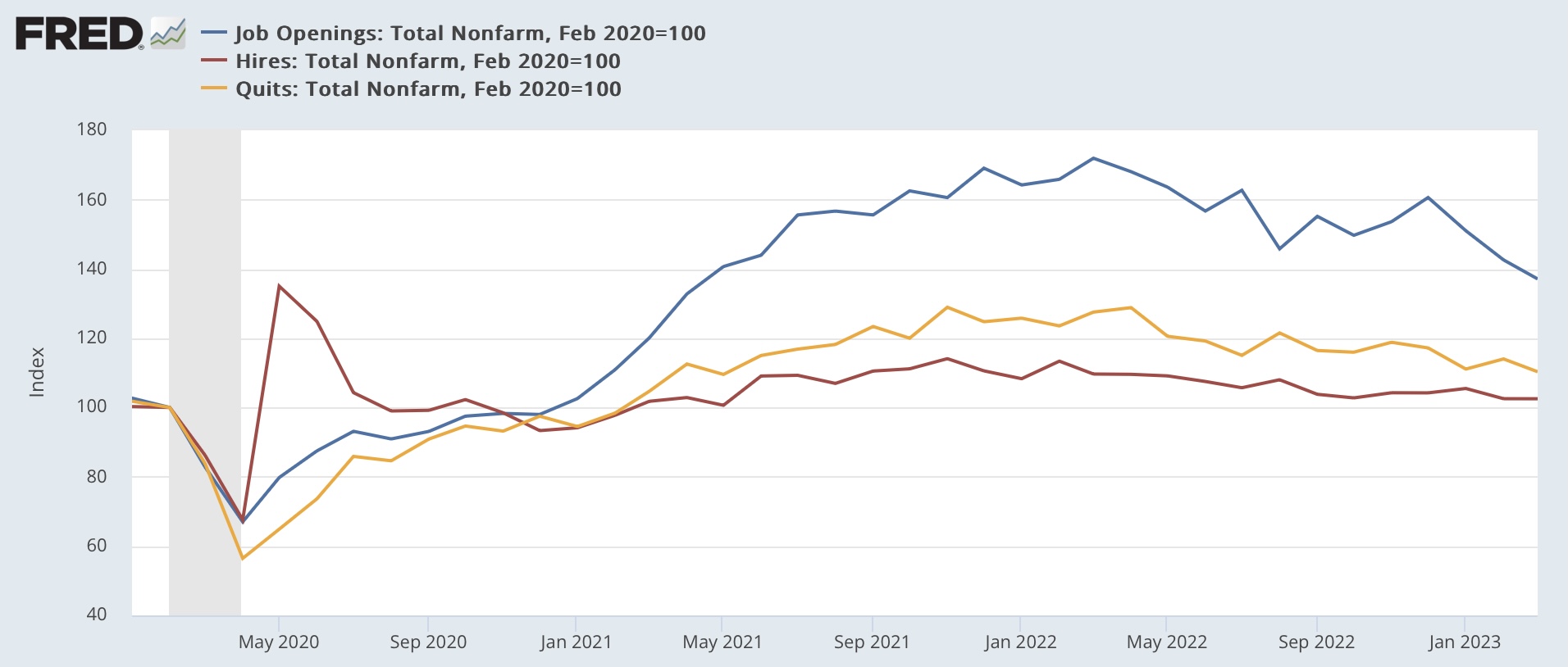
This morning’s report, as indicated in the title, indicates we are about half the way there. Job openings (blue in the graphs below) declined -384,000 to 9.590 million annualized (from a peak of 12.027 million 12 months ago, vs. 7 million just before the pandemic), while actual hires (red) declined a whopping -1,000 to 6.149 million (vs. a peak of 6.843 million in November 2021 and 6 million just before the pandemic), and voluntary quits (gold) declined -129,000 to 3.851 million (vs. a peak of 4.501 million in November 2021 and 3.5 million just before the pandemic:


All of the above are at roughly 2 year lows. 

Here is the longer term view of all 3 metrics from the series inception, better to show the current situation with the historical one before the pandemic hit:


All three remain at levels higher than at any time before the pandemic hit.

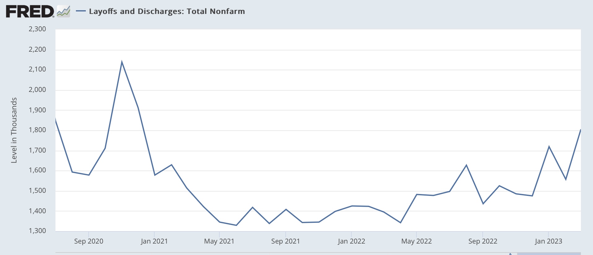
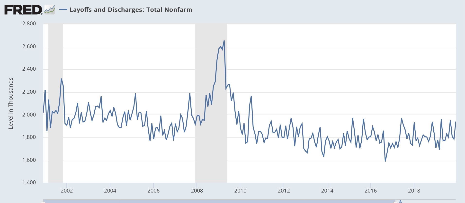
Additionally, layoffs and discharges increased 248,000 to 1.805 million annualized, also roughly a 2 year high):


Here is the longer term historical record for layoffs. Note that before the pandemic, the current level would be quite low:


It would be wrong to simply project this month’s declines forward, but the overall trend is very clear.

All of the above remains consistent with a positive, even strong jobs report this coming Friday by historical standards. But, together with the increase in initial jobless claims (which are a leading indicator for the unemployment rate), it is likely that the report will be weak by the standards of the past 12 months, and the unemployment rate is more likely than not to increase.


Monday, May 1, 2023

Manufacturing and construction start out the month’s data to the negative side


 - by New Deal democrat


As usual, we start the month with reports on last month’s manufacturing, and construction from two months ago.

The ISM manufacturing index has a 75 year record of being a very reliable leading indicator. According to the ISM, readings below 48 are consistent with an oncoming recession. And there, the news is not good. Not only has the index been below 50 for the past 6 months, it has been below 48 for the past 5, even though in April it rose from 46.3 to 47.1. Just as bad, the new orders subindex, which is the most accurately leading component, has been in contraction since last summer, although it too rose in April from 44.3 to 45.7:


Needless to say, this indicator has been forecasting and continues to forecast recesion.

Construction was mixed, but the most leading component continued to contract as well. Total construction rose 0.3% nominally in March, but only after February was revised significantly downward. But residential construction spending declined -0.2%:


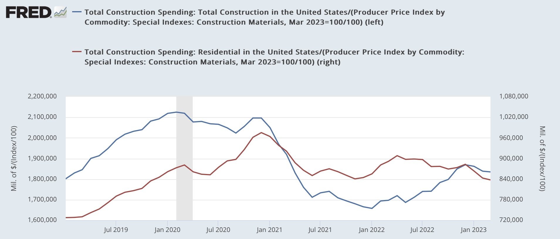
For the past several years, I have been adjusting the nominal numbers by the PPI for construction materials. This had been declining, but rose 0.5% in March, which means that the deflated number for total construction declined, and that for residential construction declined even more:


Not an auspicious start to the month; with the significant caveat that these two sectors make up less of the economy than they used to several decades ago, and as we saw last Friday, consumer spending on services, while decelerating, remained historically strong.


Saturday, April 29, 2023

Weekly Indicators for April 24 - 28 at Seeking Alpha


 - by New Deal democrat


My Weekly Indicators post is up at Seeking Alpha.

Several important short leading indicators rallied this week. In particular, the stock market seems to think the worst is over (for the moment!).

At the same time, several important coincident indicators of taxation and employment are on the cusp of rolling over again.

As usual, clicking over and reading will bring you up to the virtual moment on all of the crosscurrents in the economy, and reward me a little bit for collecting and organizing all of the metrics.

Friday, April 28, 2023

A mixed picture on real personal income, savings, and spending in March, and real total sales in February


 - by New Deal democrat


As I’ve indicated a number of times recently, right now I consider the report on personal income and spending co-equal to the employment report as the most important monthly data. For March, it was a mixed bag.


Nominally, personal income rose 0.3%, and personal spending was unchanged. Because the applicable deflator rose 0.1%, real personal income rose 0.2%, and real personal spending declined less than -0.1% (also rounding to unchanged) for the month.


Since the pandemic began, real income is up 4.0%, and real spending is up 7.6%. Because much of this was distorted by several rounds of stimulus, here’s the view normed to 100 as of July 2021:


Real personal spending has risen fairly consistently, while real personal income fell and then rose again with the rise and fall of gas prices last year:


Additionally, the pesonal savings rate rose slightly again to 5.1%, which is good for individuals, but due to the “paradox of saving,” bad for the economy as a whole.

Digging in to some further details, there was much dancing around the maypole yesterday that real spending in the Q1 GDP report was up 3.4%, a very healthy number. But I noticed that the quarterly increase was well below both the January and February monthly increases, so I suspected we would see either a big decline or some significant downward revisions today - and we did, especially for February, as shown below:


Basically, extra seasonal distortions around the post-pandemic Holidays gave us a big downdraft in November and December, and a big updraft in January. Compared with September and October, February and March were only up +0.6%.


Further decomposing real personal spending by types of purchase, we see that real spending on non-durable goods since July 2021 has actually declined, while total spending on goods is only up 1%. The big increases since July 2021 have been on services, and on durable goods (mainly cars), which declined sharply in November and December and then rose sharply in January:


In other words, the lion’s share of the big quarterly jump in consumer spending in yesterday’s GDP report was a spending spree on cars in January, driven by seasonal distortions.

Finally, let’s turn to the indicators that the NBER uses to determine the onset of and end of recessions, two of which were updated this morning.

The good news is that real personal income less government transfers (red in the graph below) rose 0.3% in March to a new high. The bad news is that real manufacturing and trade sales (blue) for February declined -0.4% from their recent high in January:


Note that industrial production, perhaps the most important coincident indicator, remains down about -0.5% from its September peak. On a YoY basis, real personal income less government transfers is up 2.1%, real manufacturing and trade sales are up 0.1%, and industrial production is up 0.5%:


The historical record going back over half a century shows that when all three of these coincident indicators have been at the YoY levels they are now, with one exception we have already started a recession:


The sole exception was 1989, when we were 6 months away.

To sum up: there was good news on real personal spending on services, and on real personal income less government transfers. Depending on further revisions, it is unlikely that the NBER will ignore growing nonfarm payrolls and declare that there was a cyclical peak in January.

But the news of real personal spending on goods was negative, as were real manufacturing and trade sales for February. Personal savings increased, consistent with consumers becoming more cautious in advance of a recession. And yesterday’s good Q1 GDP news on consumer spending turns out mainly to have been a car-buying spree in January.