Saturday, December 24, 2022

Weekly Indicators for December 19 - 23 at Seeking Alpha


 - by New Deal democrat

My Weekly Indicators post is up at Seeking Alpha.

Coincident indicators continue to ever so microscopically worsen - but not yet in recession territory; while there is an increasing suggestion from the long leading indicators that a recession could be relatively short. Provided, of course, that the Fed takes the hint.

As usual, clicking over and reading will bring you up to the virtual moment as to the economic situation, and reward me slightly for my efforts.

Also, this programming note: Merry Christmas to all who celebrate! There will be a few economic releases in the next week, but don’t be surprised if I take a few days off.

Friday, December 23, 2022

New home sales for November: at last, a bright spot! (relatively speaking)


 - by New Deal democrat

New home sales are very volatile, and heavily revised. But they frequently are the first housing metrics to turn. And November’s new home sales report suggests that they may indeed have made their low.


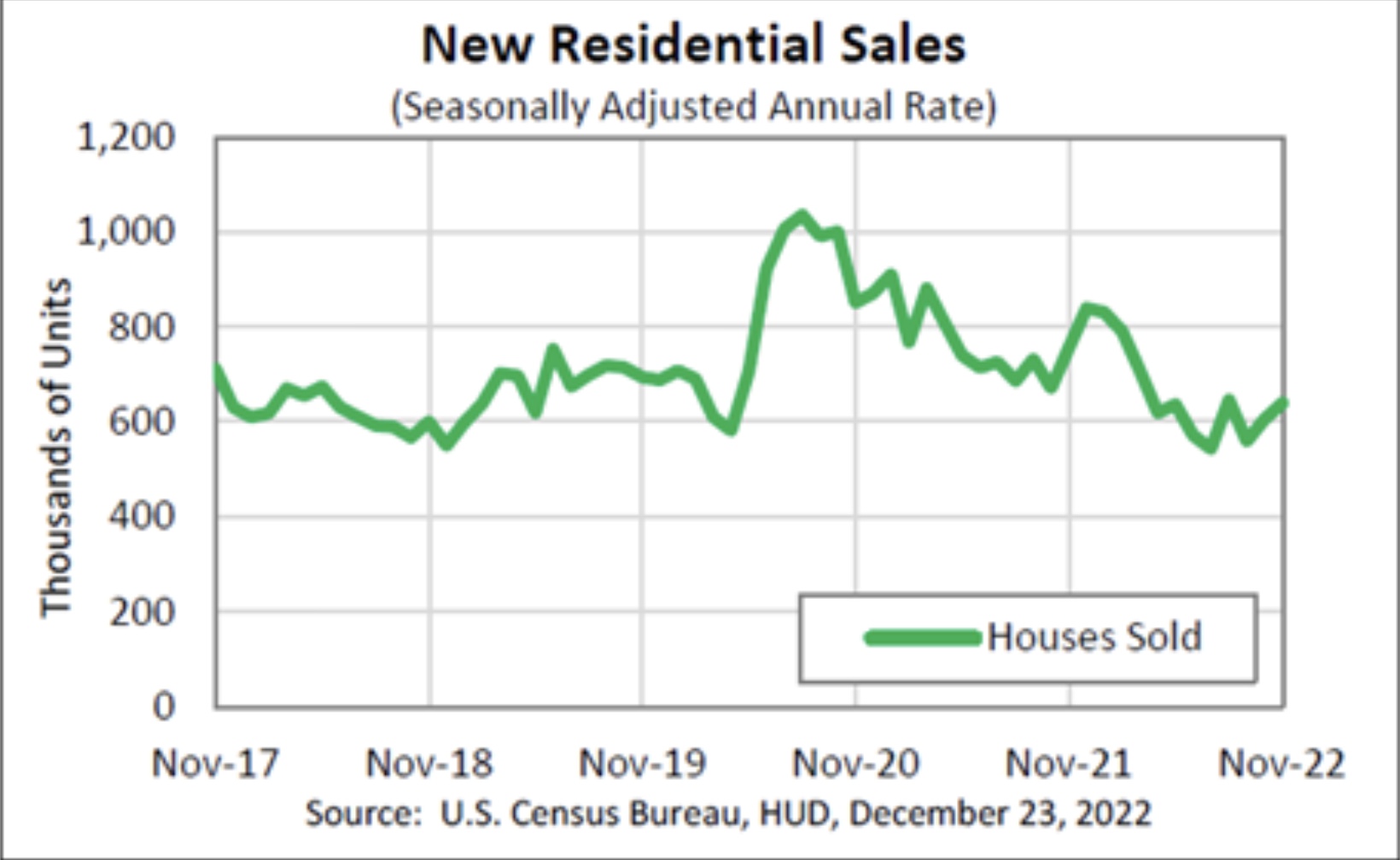
Last month new home sales increased to 640,000 annualized, from a downwardly revised 607,000 (vs. the original 632,000) in October. Here’s what the past year looks like (FRED hasn’t updated, so here’s the Census Bureau’s graph):


The preliminary read for November is the highest number since March, with the exception of August’s 661,000.

Now, a word of caution, but also a word of caution *about* that caution: we know that cancellation rates for new home contracts have increased sharply since springtime. So, that has made the *actual* sales numbers worse than the reported numbers. BUT, even taking them into account, as of October, the low point was July. I don’t have this month’s number for cancellations, so that might change. But also, there is no reason to think that there weren’t similar levels of cancellations during any of the other historical housing downturns brought about by increased mortgage rates. In other words, new home sales this year should have a comparable pattern to previous downturns.

Finally, YoY prices were up 9.5% (this data is not seasonally adjusted) (again, FRED hasn’t updated, so here is the YoY% change through October:


Since this is less than 1/2 the highest % growth in the past 12 months, per my heuristic this indicates that house prices, if we could seasonally adjust, have actually started to decline.

As I’ve mentioned a number of times recently, I am on the lookout for long leading indicators that might suggest how long (or short) a recession we might be in for. At the moment, new home sales is suggesting the downturn may not be that long (Fed willing, of course).


Real personal income and spending hold up (thank you, lower gas prices!) but still consistent with onset of recession


 - by New Deal democrat

This morning’s report on personal income and spending for November shows why I pay more attention to real retail sales as a forecasting tool.


First, to the data: personal income increased nominally by 0.3% in November, while nominal spending increased only 0.1%. Since the deflator for the month was 0.1%, that means real income increased 0.3% and real spending was unchanged. Since the end of stimulus spending in May 2021, real spending is up 4.1%, while real income has declined -1.7%:


The personal saving rate increased 0.2% to 2.4%, which is just above its all time lows, as shown in the below graph which subtracts -2.4% so that the current reading shows as 0:


Real personal income less transfer receipts is one of the 4 monthly data series heavily relied upon by the NBER in dating recessions. This increased in November and is less than -0.1% below its all time high of exactly one year ago. The big decline in gas prices since June is a major driver of the recent improvement:


Which means that the YoY reading is just below 0. Why is this significant? Because in the past this metric has only declined to 0 or negative during - frequently late in - recessions:


This lag in the performance of real income and spending is why I pay more attention to real retail sales. Here is the 50+ year look at the YoY% changes in real personal spending (blue) vs. real retail sales (red):


Note that real retail sales have *always* turned negative YoY before recessions start, whereas real personal spending either turns late, and sometimes does not turn negative at all.

Here is what that looks like for the past 12 months:


Real retail sales have been flat to slightly negative ever since this past March with the exception of July and August, while real spending is still higher by 2.0% - although in the past such a low positive level has also been consistent with the onset of a recession.

At the moment, the labor market is the only segment of the economy that does not appear to be actively rolling over into recession.


Durable goods orders appear to have peaked

 [Note: I’ll post about personal income and spending, as well as new home sales, later.]

 - by New Deal democrat

I normally don’t pay much attention to the monthly durable goods report, but this morning’s report for November appears significant.


That’s because durable goods spending has been one of the few short leading indicators to have continued to improve - until now. Here’s the long term view:


New factory orders for durable goods declined -2.1% in November, while “core” durable goods orders excluding aircraft and defense increased 0.2%. Here’s what the last 12 months look like:


Durable goods orders have been essentially flat since June, and are now below that level. “Core” orders last made a high in August. They appear to be in the process of rolling over.

That leaves consumer durable goods spending and initial jobless claims as the only remaining positive short leading indicators.


Thursday, December 22, 2022

Initial claims continue in range; why they will give us a lead on when the Sahm rule for recessions may be triggered


 - by New Deal democrat

Initial claims ticked up 2,000 last week to 216,000. The 4 week moving average declined 6,250 to 221,750. Continued claims, with a one week delay, declined 6,000 to 1.670 million:


To state the obvious continued good news, it remains the case that almost nobody is getting laid off. 

Also continued good news is that claims, and in particular the 4 week moving average, remain lower than their level one year ago:


So long as this remains the case, we can be confident that the economy remains in expansion. I’ll hoist a yellow cautionary flag if and when claims turn higher YoY, and a recessionary red flag if they turn higher by 10% YoY.

I’ve seen some commentary that no recession can start so long as initial claims remain very low.

Historically this is not true. There has been no “magic level” of initial claims correlating with increased or decreased employment or unemployment levels. Sometimes it has taken 400,000 or more (1980, 1981), sometimes as low as 250,000 or less (1970, 1974). In 2001, it took about 370,000; in 2007, it took 340,000. The key has been a sufficient increase from the expansionary lows.

Confirmation of the above can be found indirectly via the Sahm Rule, which holds that we can be confident that a recession has started if the 3 month average of the unemployment rate has risen 0.5% from its previous 12 month lows. (Note in some cases the actual start of recessions has not required this much of an increase. Rather, the rule is one of sufficiency rather than necessity).


With that rule in mind, it has also been the case for 60 years that initial claims lead the unemployment rate. Here’s the graph that plainly shows the leading/lagging relationship from 1966 through 2019:


And here is the continuation of the graph for the past 2 years:


So the fact that initial claims made their low last March and remain slightly higher continues to indicate that the unemployment rate would make a subsequent low (it did, in July and September), and has also risen slightly since.

If and when the 4 week average is 10% above its previous low YoY, we can be confident that the unemployment rate will similarly follow higher (keeping in mind that a 10% increase from 3.5% unemployment is 3.85%). So initial claims will give us a good heads up as to when the Sahm rule might be triggered in the near future.

Wednesday, December 21, 2022

November existing home sales: prices have unequivocally turned down


 - by New Deal democrat

Existing home sales do not have much actual economic impact, since the primary economic activity generated by housing is the construction. But they do help tell us a great deal about pricing.


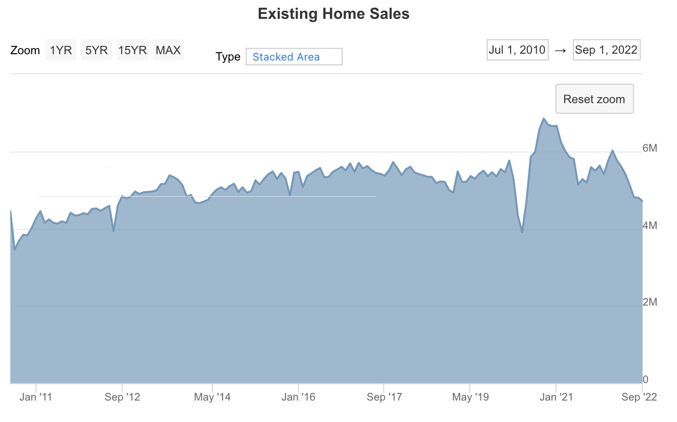
For the record, sales continued their relentless decline this year, down to 4.09 million on an annualized basis, down almost 1/3rd from their recent February peak of 6.02 million:


This is in line with the 35% declines we saw yesterday in single family housing permits and the 30% decline in total permits. Only housing starts, off 20% from their peak, are “less bad.”

The longer term view (note: graph only goes through September) shows that November sales were the lowest since November 2010, with the exception of May 2020 and June 2012:


But the real importance of existing home sales is in their price signal, and here that signal was unmistakable. At $370,700 for the median existing home, prices are only up 3.5% YoY (the NAR does not seasonally adjust, so this is how we have to measure):


Here is a 5 year graph through September from Mortgage News Daily, showing that peak YoY appreciation within the past 12 months was 17.6% last January:


My rule of thumb is that data which can only be measured YoY has peaked when the YoY increase is less than 1/2 of its highest rate in the past 12 months. So any YoY increase of less than 8.8% would indicate a peak. Needless to say, 3.5% is well below that.

My mantra for the housing market is that sales lead prices. This year, sales turned in the Jan-Mar time frame for all of the various measures like permits, starts, and new home sales, as well as existing home sales. We now know to a virtual certainty that prices peaked at some point during the summer. 

The sales data is, as I said yesterday, recessionary. But the old saw is that “the remedy for high prices, is high prices.” Now that we are seeing prices come down, the groundwork is being laid for the economic turnaround to come - the timing of which is yet to be determined.


Tuesday, December 20, 2022

November housing permits and starts: the biggest news is not in the headlines


 - by New Deal democrat

The report on housing construction for November was very much a tale of two very different trends - and the most important one will almost certainly be under-reported.


Housing permits issued declined to 1.342 million annualized, the lowest number since June 2020, and before the pandemic the lowest since July 2019. The even more reliable single family permits declined to 781,000 annualized, the lowest since May 2020, and before that November 2016! Finally, the more volatile housing starts declined to 1.427 million annualized, the lowest since August 2020. Here’s the graph showing all three:


Those are all big declines, and definitely recessionary. But they’re not the biggest story.

For one thing, the backlog of housing units authorized but not yet started declined only slightly to 293,000, only slightly below its March peak:


This most likely is much affected by cancellations, which have soared in recent months.

But the big story, in my opinion, has to do with the metric that measures the actual economic activity in the housing sector; namely, housing units under construction. This remained at 1.709 million, tied with last month and at its peak. In the below graph, I also show the number of residential construction workers from the recent jobs report:


In other words, in terms of actual economic activity, housing isn’t yet contributing to a decline. Since units under construction and the number of construction workers typically move in tandem, note that employment has not declined yet either.

There was some slight movement, in that single family units under construction declined to 777,000, an 11 month low, while multi-unit construction increased to a new high:


This reflects buyers being priced out of the single family market.

Finally, note that mortgage rates have come down significantly in the past eight weeks:


If this persists, we may put in a bottom in housing permits in the next few months, which of course would be good news for 2024.

But, to emphasize again, despite the big declines in the headline numbers, actual economic activity in housing construction remains at its peak.


Monday, December 19, 2022

Job growth beginning in Q2 looks to be substantially revised downward


 - by New Deal democrat

Last week the Philadelphia Fed published a working paper suggesting that in the second quarter of this year only 10,500 jobs were actually added, rather than the 1,047,000 as indicated by the monthly Establishment survey. 


Here’s their graph:


Here’s what you need to know about the QCEW (Quarterly Census of Employment and Wages): 

The late Jeff Miller, a portfolio manager who was extremely popular at Seeking Alpha, and was previously a college professor who taught public policy courses and quantitative methodology at the University of Wisconsin-Madison and Lawrence University, had this to say:

“ Each quarter the BLS reports data from state employment agencies. Since no one pays insurance premiums on phantom employees, we can expect conservative information. The only problem is that it takes about nine months to get these actual counts.

“Any honest observer of the market would circle the date of this release….” 

The QCEW is generated by more than 95% of all employers, essentially all who pay unemployment insurance; versus the monthly Establishment survey, which is generated by a sample of 650,000 employers.

In order to understand how the Philadelphia Fed arrived at its result, I have gone back and crunched the numbers for Q2 job growth (or losses) in the QCEW since the beginning of the database in 2001. In the below chart, the first line is the year, the 2nd is the non-seasonally adjusted number of jobs added in Q2 in the QCEW, in millions, and the 3rd is the non-seasonally adjusted Establishment survey number:


Year QCEW PAYEMS
2001 2.0* 1.62
2002 2.5 1.79
2003 2.4 1.74
2004 2.9 2.76
2005 3.0 2.81
2006 2.9 2.58
2007 2.7 2.43
2008 1.9* 1.55
2009 0.7* 0.14
2010 3.1 2.61 
2011 2.7 2.71
2012 2.7 2.46
2013 2.8 2.61
2014 3.2 2.83
2015 3.2 2.75
2016 2.7 2.62
2017 2.9 2.58
2018 2.9 2.70
2019 2.6 2.44
2020 -12.0* -16.3
2021 3.6 3.25**
2022 2.1 2.91

*=lower than Q2 2022 QCEW
**=higher than Q2 2022 CES

I then went back and compared with the seasonally adjusted Q2 numbers in the CES. Every year that the NSA QCEW numbers for Q2 were below 2.0 showed actual job losses in the seasonally adjusted CES. The three years with the next higher numbers compared with Q2 2022 - 2007, 2012, and 2019 - generated seasonally adjusted CES job gains of 90,000/month, 85,000, and 165,000.

So at this point it very much looks like the Philadelphia Fed’s paper has a lot of merit: the NSA QCEW data shows a very serious slowdown in job growth in Q2. And since the QCEW isn’t a survey sample, but rather collects about 95% of the entire data, it needs to be taken seriously (with the caveat that it is preliminary data).

It’s also in accord with the Household survey, which shows only 12,000 jobs added since March:


and payroll tax collections by the US Treasury, which show a sharp slowdown that is first apparent in June’s +0.5% YoY growth. Here’s my recapitulation of YoY payroll tax payments to the US Treasury for each month of this year through November:

  • January 2022/21: up +21.3%

  • February 2022/21: up+11.6%

  • March 2022/21: up +6.2%
  • April 2022/21: up +11.5%
  • May 2022/21: up+17.2%
  • June 2022/21: up +0.5%
  • July 2022/21: up +5.4%
  • August 2022/21: up +10.2%
  • September 2022/21: up +1.7%
  • October 2022/21: up +12.2%
  • November 2022/21: down -2.5%

Saturday, December 17, 2022

Weekly Indicators for December 12 - 16 at Seeking Alpha


 - by New Deal democrat

My Weekly Indicators post is up at Seeking Alpha.

The coincident indicators, especially employment, are hanging on by the proverbial skin of their teeth.

I don’t think they roll over until gas prices stop declining.

In any event, clicking over and reading will bring you up to the moment on the status of the carnage, and bring me a little reward for the effort I put in.

Friday, December 16, 2022

The status of the coincident indicators


 - by New Deal democrat

In addition to real GDP, which is only updated quarterly and with a lag, the NBER has indicated that it relies upon four other datapoints in determining the onset month of a recession: payrolls, industrial production, real income less transfer payments, and real manufacturing, wholesale, and retail sales.

The below shows all four, with the exception that, because real manufacturing and trade sales lag the publication of real retail sales by two months, I show the latter. Since real retail sales are the largest component of manufacturing and trade sales, and usually turn before the manufacturing and wholesale components, this is a little more leading anyway:


Real income peaked last November, real retail sales in April, and industrial production may have peaked in September. With the decline in gas prices, real sales and income have rebounded somewhat since June, but are still below their peaks. Only payrolls have continued to increase throughout the time period, and their growth continues to decelerate.

I suspect the actual recession will not begin until gas prices make a bottom; and we probably won’t know about payrolls until at least the yearly revisions kick in next March. But with the Fed hiking interest rates another 0.50% on Wednesday, my best guess is that there is a 95% chance we will be in a recession by the middle of 2023. 

Thursday, December 15, 2022

November real retail sales turn down, return to negative YoY


 - by New Deal democrat

Real retail sales is one of my favorite indicators for both the current economy and the jobs situation 3 to 6 months ahead.

This morning nominal retail sales for November were reported down -0.6%, which only takes back about 1/2 of October’s strong +1.3% increase. Since consumer inflation rose +0.1% for the month, real retail sales decreased by -0.5%. Here are the absolute values for real retail sales since the beginning of 2021:


Note sales remain -1.1% below their recent peak in April.

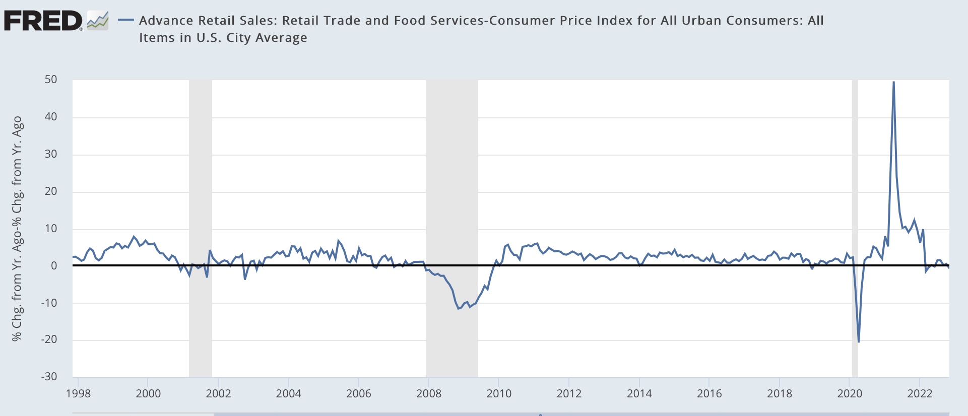
As I’ve noted many times, YoY real retail sales turning negative YoY for 75 years has been an excellent harbinger of a recession. With this morning’s data, they one again have turned negative. Below is the last 25 years of data:


I am willing to discount the negative numbers in the first half of 2022 because they are compared with the strong stimulus-induced spending spree of 2021. But the numbers since June are much more cautionary. In particular, it has been noted that consumer spending has shifted from goods to services this year. While that point has lots of merit, as pandemic related spending fades further into the background, I think the historical relationship will assert itself more and more.

As I’ve also noted many times, real retail sales /2 are a good albeit noisy leading indicator for jobs reports 3-6 months in the future. Here is the historical record since the beginning of the modern retail sales series until just before the pandemic:


And here’s what they look like since June 2021:


That they have continued to be near zero or even negative YoY for many months strongly implies continued deceleration in the monthly jobs numbers over the next few months.

November Industrial production: has the King of Coincident Indicators peaked?


 - by New Deal democrat


Industrial production declined -0.2% in November, and manufacturing production declined -0.6%, essentially returning both indicators to their levels of July:


I call industrial production the King of Coincident Indicators, because its peak most often coincides with the month of the onset of a recession as determined by the NBER. So the fact that total production has been close to flat for 4 months, and down -0.3% from 2 months ago is an important caution sign; especially since real retail sales, the primary component of total manufacturing and trade sales which is also relied upon by the NBER, also turned down significantly in November.

On a YoY basis, total production remains higher by 2.5% and manufacturing production up 1.4%. The below graph shows the past 50 years of this metric with both values normed to 0:


Back when the US was the world’s manufacturing powerhouse, these YoY values were recessionary. But in the past 30 years, as the US economy became more dominated by services, YoY readings like these also equated to slowdowns during expansions.

In any event, if the King of Coincident Indicators has truly peaked, then the report on personal income next week, which minus transfer payments is another important metric used by the NBER, assumes added significance.

Jobless claims: still weakly positive


- by New Deal democrat

My focus on jobless claims has shifted to when and whether they will turn negative, flashing a short leading warning for recession. A reminder that my criteria are a 10% increase from their low point (already in place) and an increase YoY for a yellow flag, and a 15% increase from their low point (also in place) and a 10% increase YoY for a red flag.

Initial jobless claims declined -20,000 to 211,000 last week. The 4 week average declined -3,000 to 227,250. Finally, continued claims, which lag by one week, rose 1,000 to 1.671 million:


All three still remain lower YoY, although the comparisons are getting much less positive:


Also the data is much more subject to seasonal distortions from Thanksgiving through early January, so extra caution is warranted.

Bottom line: for now, jobless claims remain a positive.

Wednesday, December 14, 2022

Real average and aggregate non-managerial wages for November


 - by New Deal democrat


With November’s consumer inflation report in the books, let’s update two of my favorite measures of how the working/middle class is doing - real average non-supervisory wages, and real aggregate payrolls.


Nominal average wages for non-supervisory workers rose a strong 0.7% in November. Inflation fell sharply to 0.1%. So real average wages rose 0.6% last month. Still, they are down -1.2% YoY, and down -2.2% since December 2020; but 1.9% higher than they were in January 2020 just before the onset of the pandemic:


The recent inflection point, as I pointed out yesterday, was in June; and the below graph of gas prices tells you just about everything you need to know:


With gas prices down almost $2/gallon from 6 months ago, putting 15 gallons of gas in your vehicle costs you almost $30 less than it did then, which can improve a heckuva lot of statistics.

Next, real aggregate payrolls for non-managerial workers measure how much wealth the middle/working class is earning as a whole. In the past 60 years, when that has outright declined on a YoY basis, it has almost always coincided, give a month or two, with the onset of recessions, so it is an excellent coincident indicator as well:


In November, aggregate payrolls increased 0.6%, so real aggregate payrolls increased 0.5%. YoY they were up 1.6%:


To signal an imminent recession, nominal payroll growth would have to decelerate significantly more than inflation. So long as gas prices keep declining, it is very unlikely that will happen. Good news for now.

Tuesday, December 13, 2022

November CPI: Thank you, gas prices! No thank you, owners’ equivalent rent


 - by New Deal democrat

Just like producer prices as reported last Friday, consumer prices for November confirm the inflection point of last June. Thank you, lower gas prices! Here’s what total and core (ex-food and energy) inflation look like, normed to 100 in June:


Since June, overall consumer inflation has increased 1.0%, so is increasing at a 2.2% annual rate. Core inflation has increased 1.9%, or a 4.7% annual rate. 

To cut to the sectorial chase, here is the breakdown of all the important categories, first m/m and second YoY:

Total: +0.1%, +7.1%
Core +0.2%, +6.0%
Shelter +0.6%, +7.1%
Food +0.5%, +10.6%
Energy -1.6%, +13.1%
New vehicles -0-, +7.2%
Used vehicles -2.9%, -3.3%

As you can see, there remain only two sources of major inflation: shelter and food. In particular, take shelter out of total inflation, and consumer prices since June are *deflating* by -0.3% at an annual rate, and core prices since June are increasing at a 2.2% annual rate.

Further, as I’ve been pounding on for more than a year, “owners’ equivalent rent,” which is how house prices are measured for the CPI, lags badly, i.e., by a year or more. Here’s this morning’s update on what YoY house prices as measured by the FHFA (/2 for scale) look like compared with YoY owners’ equivalent rent:


As I anticipated, YoY OER has continued to increase, and is now up 7.1%. Meanwhile the FHFA house price index, through its latest reading for September, was up 11.0%.

The YoY increase in the FHFA price index has decreased by 33% in the past 4 months. At that rate actual house prices will be unchanged YoY by next April. Meanwhile I expect OER to continue to increase to 7.5% or so through winter.

I also want to comment briefly about new and used vehicle prices. Nominally they have both increased sharply since the start of the pandemic, up over 20% and 40% respectively. However, since average hourly wages are up 17% since then, in real terms new vehicle prices are only up about 3%, while used vehicle prices are still up about 25%, despite their decline this year:


In shot, the big decline in gas prices is having a huge impact on consumer prices overall. Food and used vehicle prices in particular remain problems. But inflation remains distorted to the upside due to the way CPI measures house prices.

As I’ve said for the past several months, at this point the Fed, via interest rate increases, is chasing a phantom menace, needlessly causing a recession, or at least a deeper one than would be otherwise necessary to achieve its objectives.


Monday, December 12, 2022

A brief overview of the current state of the economy


 - by New Deal democrat

This week we get the final most important data of 2022, with consumer prices tomorrow and industrial production and retail sales Thursday. The Fed will also be making its final rate hike decision of the year. Next week and the week after, the only data will be housing construction and prices, plus personal income and spending.


So let’s take a look at few salient datapoints explaining where the economy is. Remember that my primary purpose in discussing expansions vs. recessions is their effect on jobs and income for middle and working class Americans.

To begin with, gas prices are now at their lowest level in the entire last year - even lower than last winter:


Just as sharply rising gas prices put a damper on the economy in the first half of this year, they are putting a floor under it now. Q4 GDP is expected to be good, and I it is very unlikely that the economy will roll over so long as gas prices continue to fall. But at some point they will bottom out, and that is when I would expect Trouble.

One good reason to expect Trouble is the much-discussed yield curve in Treasury bonds. The below graph shows nearly a complete inversion, with the shortest term yields paying the most:


The graph does not show the 6 month and 1 year Treasuries. If it did you would see that the 6 month Treasury is now the highest-paying, followed by the 1 year, with both paying more than the 2 year. In other words, only the Fed funds rate and 3 month Treasuries are not inverted.

This is a historic leading indicator of recession. At this point the inversions are so deep that it would be unprecedented *not* to have a recession soon.

Which brings us to the 4 monthly coincident indicators used to date recessions. Below all 4 - industrial production (blue), real retail sales* (red), real income less transfer payments (gold), and payrolls (gray) -  are normed to 100 as of June (*the NBER uses total real manufacturing and trade sales, but those don’t get reported timely, and real retail sales are their most leading component):


Industrial production, the King of Coincident Indicators, has gone nowhere. Both real sales and real income have increased (thank you, lower gas prices!), but are still lower than they were one year ago, and payrolls have continued to increase but at a decelerating rate.

As indicated above, we’ll get updates on two of those four coincident indicators later this week. If industrial production has started to decline, then the remaining shoes will probably drop once gas prices stop dropping. 

Sunday, December 11, 2022

Weekly Indicators for December 5 - 9 at Seeking Alpha


 - by New Deal democrat

My Weekly Indicators post is up at Seeking Alpha.

The most noteworthy trend over the past several months has been the almost relentless deterioration in the YoY measures of consumer spending and employment. That trend continued last week.

As usual, clicking over and reading will bring you up to the virtual moment as to the state of the economy, and reward me a little bit for my efforts.

Friday, December 9, 2022

November producer prices: YoY measures mask recent sharp deceleration to mainly tolerable levels


 - by New Deal democrat

Consumer prices for November won’t be reported until next Tuesday, but this morning we got the upstream producer prices. The news was mainly good, although not good enough to likely dissuade the Fed from its current course of interest rate hikes.


This is one of those cases where YoY measures give a false picture in comparison with seasonally adjusted monthly data.

YoY producer price growth decelerated, but is still very high: final demand prices increased 7.4%, “core” final demand less food and energy increased 8.1%, and commodity prices are up 8.2%:


That’s down from their respective peaks, but still very high compared with the last 40 years pre-pandemic.

But now let’s look at the seasonally adjusted monthly changes:


Since June there’s been a marked deceleration in final demand prices, and an outright decline in commodity prices.

So let’s norm June to 100, and see what we get:


Final demand prices are only up 0.4% in 5 months; less food and energy up 1.4%; and commodities are down -6.1%. Onan annualized basis, the first measure is trending at 1.0% rate, while the “core” second measure is slightly problematic, increasing at a 3.4% annualized rate.

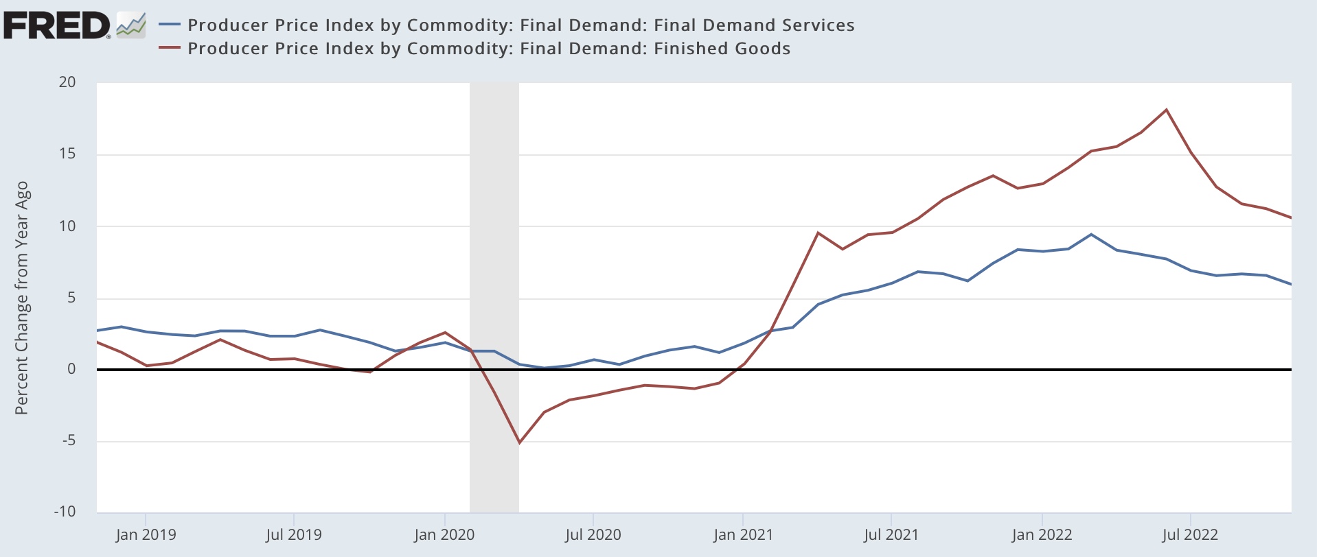
A similar pattern appears when we break final demand down into goods vs. services. While YoY goods prices are up 9.6% and services prices up 5.9%:


Final good services prices are up 1.5% in the past 5 months, while final demand goods prices are actually down -1.3%:


In short, most of the upstream inflation problem in producer prices has been abating rapidly. Only “core” services prices remain elevated above levels tolerated without alarm before the pandemic.