Saturday, May 21, 2022

Weekly Indicators for May 16 - 20 at Seeking Alpha


 - by New Deal democrat

My Weekly Indicators post is up at Seeking Alpha.

The yield curve tightened some more this week (but did not invert).

Meanwhile, I am seeing a fair amount of commentary suggesting that a recession is imminent. This is jumping the gun, and is mainly relying on the downturn in the stock market as well as the increase in gas prices. These are short leading indicators, but only signal correctly once the long leading indicators have been in place for a sustained period of time - which they have not.

As usual, clicking over and reading will bring you up to the virtual moment as to the economy, and will bring me a little beer money.

Friday, May 20, 2022

Coronavirus dashboard for May 20: signs of a peak in BA.2.12.1 in bellwether jurisdictions; is BA.4/BA.5 next?


 - by New Deal democrat

With no significant economic data today, let’s take a look at where the BA.2.12.1 COVID wave is.


Nationwide cases (thin line below) have increased about 3.5x from their bottom of roughly 26,700 five weeks ago, to just over 100,000. Meanwhile deaths (thick line) appear to still be in the process of making a bottom at under 300 per day:


A longer term perspective shows that, compared with the Omicron peak, both deaths and cases are comparatively very low:


The CDC variant update shows that, as of last week, the BA.2.12.1 variant was causing just under 50% of cases nationwide. Its share has been increasing by only about 6%-7% per week nationwide in the past month:


As usual, different regions of the country show very different progress of the BA.2.12.1 variant:


NY, NJ, and PR remain the epicenter, with BA.2.12.1 constituting a majority of cases along the rest of the East Coast and, surprisingly, in the central Plains. Meanwhile it constitutes a distinct minority of cases along the West Coast.

Focusing on the bellwether region, in NY, NJ, and PR, BA.2.12.1 made up almost 75% of cases last week:


And this week showed the first signs that BA.2.12.1 cases are peaking in the Northeast and portions of the upper Midwest that also began to rise early this spring:


Puerto Rico has been particularly hard hit, so I am showing it separately, but it too is apparently peaking:


New Jersey has still been rising, with a possible peak beginning to form in the past few days:


With the exception of PR, where cases increased 30x, and Vermont, where cases only increased roughly 2.5x, the other bellwether States increased roughly 5x from their March bottoms to their present peaks.

If we extrapolate the experience of the bellwether jurisdictions to the rest of the country, we can expect cases to continue to rise for about another month, with a peak of about 140,000 -150,000 cases. A similar increase in deaths would put a peak of roughly 1400-1600/day in about 2 months.

With ever more evidence that reinfections are becoming common, plus plenty of evidence that the Omicron variants can break through vaccinations (although it must be emphasized that cases in vaccinated people are typically much milder, with much less risk of poor outcomes), we meanwhile await the inevitable next variant, which may or may not be the BA.4 and BA.5 lineages from South Africa, which are now being found in almost every State albeit in very small amounts.


Thursday, May 19, 2022

Initial claims: a little cooling in the white hot employment market


 - by New Deal democrat

Initial jobless claims rose 21,000 to 218,000, continuing above the recent 50+ year low of 166,000 set in March. The 4 week average also rose by 8,250 to 199,500, compared with the all-time low of 170,500 set six weeks ago. On the other hand, continuing claims declined another -25,000 to 1,317,000, yet another new 50 year low (but still well above their 1968 all-time low of 988,000):


Initial claims have trended slightly higher over the past 2 months, which, while it shows some cooling in the white hot employment market, is nowhere near a cause for concern at this point. This continues to be the brightest spot in the entire economy.


Wednesday, May 18, 2022

Housing permits and starts decline slightly, but housing still an economic positive over the next 12 months


 - by New Deal democrat

Housing permits and starts declined, but not by much, in April.

Importantly, while typically permits, especially single family permits, lead these series, in the past year there has been a unique divergence between permits and starts due to construction supply shortages.  This has been reflected in the number of housing units authorized but not started increasing to 50+ year records. In April that number declined by a tiny 0.6 million annualized to 293.3: 


As a result, I am paying the most attention to the three month average of housing starts (blue in the graph below) for the time being, as these reflect actual economic activity, vs. permits (gold) which don’t. And that three month average increased slightly to 1.743 annualized, a new 15 year record:


Meanwhile, single family permits (red above, right scale) declined .53 million units annualized to a 5 month low of 1.110. This is -9% off from their peak in January 2021, and does give us the best signal as to where housing is going in the near future.


And what does that future hold? Below are the YoY% change in starts (blue) and single family starts (red), vs. the YoY change in mortgage rates (inverted, *10 for scale), showing that mortgage rates are higher by 2% YoY (shown as -20%). The last time this drastic an increase in mortgage rates YoY happened was in 1994. Note that housing permits and starts declined 20% in the next year, and changes in mortgage rates in 1999 and 2018 resulted in similar declines in permits in starts in 2000 and 2019.  At present the three month average of starts is still 13% higher YoY, while single family permits are now down -4% YoY:


The “demographic tailwind” that buoyed housing activity 5 and 10 years ago has dissipated, as the number of 25-35 year old first time buyers has stopped increasing. Thus I expect a 20% YoY decline in housing permits and starts to manifest in roughly the coming 12 months. But while ordinarily that would be a major negative long leading indicator, actual construction starts mean the downturn will be delayed until the 50+ year record backlog has been cleared - which might take another 6 to 12 months. Since starts are the actual, hard economic activity, this indicates that housing is still going to make a positive to the economy looking out ahead 12 months.

Tuesday, May 17, 2022

Industrial production continues to show excellent growth


 - by New Deal democrat

I call industrial production the King of Coincident Indicators, because it speaks volumes about where the economy is at any particular moment, and empirically is the indicator whose peaks and troughs coincide most definitively with NBER recession dates.

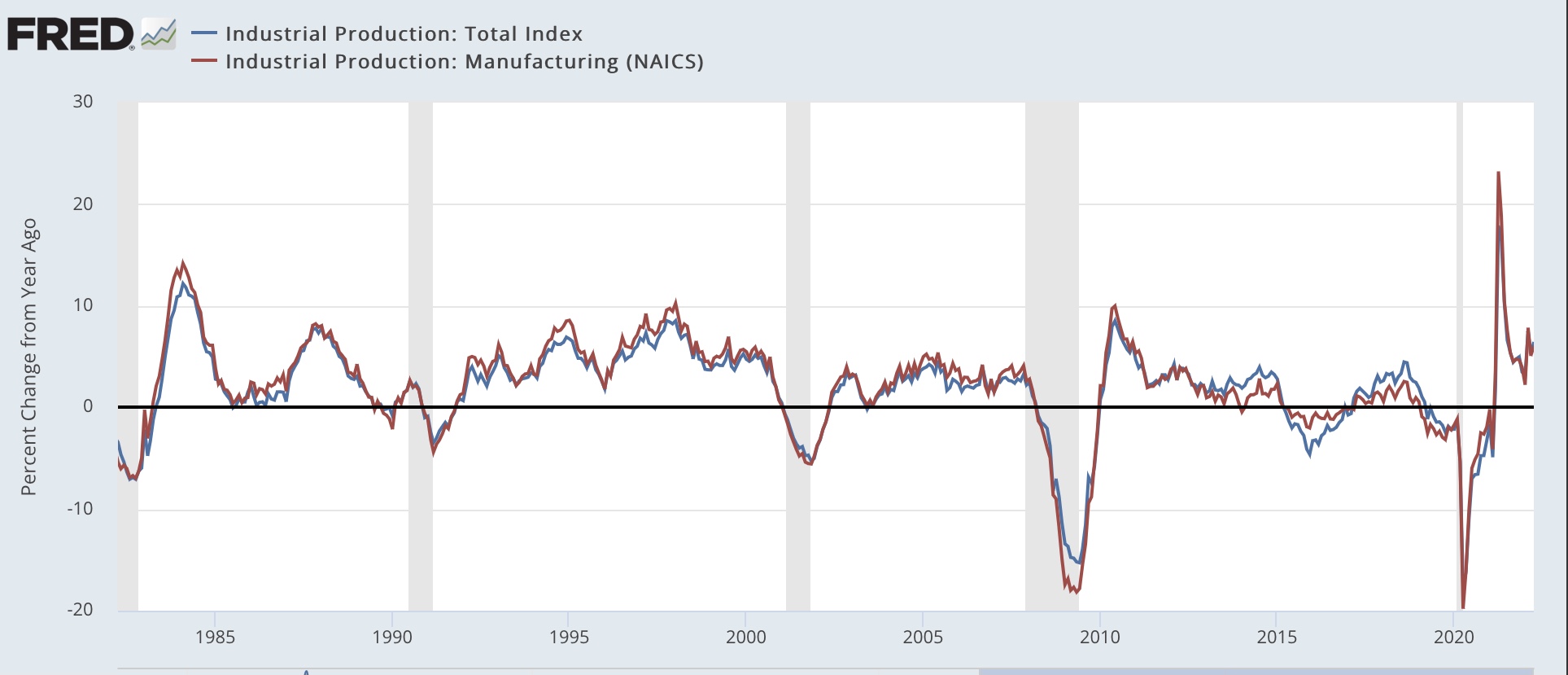
In April the story told by industrial production continued to be very positive, as total production rose by 1.1%, and manufacturing production rose by 0.8%.  The former made yet another new record high, while the latter has only been exceeded in a 12 month period from spring 2007 through winter 2008:


On a YoY basis, total production is up 6.4%, while manufacturing is up 6.0%. Compared with the last 40 years, and particularly the last 20, this is excellent  growth:


Taken together, this morning’s economic reports show us a consumer who is still doing OK, and a production sector that also continues to perform well.

Real retail sales signal further expansion, but also continue to suggest slower payrolls growth ahead


 - by New Deal democrat

Nominal retail sales for the month of April were up 0.9%, and previous months were revised higher. That means that , after inflation, real retail sales for April were up 0.6%, a very positive number.

Yesterday I wrote that, rather than a YoY comparison with last April, during the stimulus spending spree, the more important comparison was with last May. Although the direct YoY comparison is absolutely unchanged, vs. last May real retail sales were up 1.7%:


This is consistent with a relatively slow consumer-fueled expansion (a moderate expansion would be a number more like 2.5%-3.0% YoY), and not consistent with any imminent recession.

Next let’s turn to employment, because real retail sales are also a good short leading indicator for jobs.

As I have written many times over the past 10+ years, real retail sales YoY/2 has a good record of leading jobs YoY with a lead time of about 3 to 6 months. That’s because demand for goods and services leads for the need to hire employees to fill that demand.  The exceptions have been right after the 2001 and 2008 recessions, when it took jobs longer to catch up, as shown in the graph below, averaged quarterly through the First Quarter: 


Now here is the monthly YoY comparison through April:


The above graph is an excellent way to compare the relationship in a more normal expansion, viz., 2019, where real retail sales/2 was in the .3%-1.0% range, vs. last year, where they were in the 5% range. I have been expecting the blowout job numbers of about 500,000 per month to end in several months. This report is more evidence for that, since the comparison with last May is 0.85%. This suggests that monthly job gains are going to slow down to a range of about 100,000-300,000 per month by early autumn.

Finally, real retail sales per capita is one of my long leading indicators. Here’s what it looks like for the past 25 years:


These are up 1.4% since last May, and the highest of all time except for March and April 2021. While for that reason I can’t call these a positive, the recent rebound in no way resembles their declining pattern before the last two recessions, and switches the long leading signal from negative to neutral for this metric.


Monday, May 16, 2022

Will tomorrow’s real retail sales report forecast a recession, or just a continued slowdown?


 - by New Deal democrat

No economic data today of significance; but tomorrow one of my favorite economic indicators, retail sales, will be reported for April. Since real retail sales lead employment, and generally are a short leading indicator for the economy as a whole, I wanted to update on what I see as their importance right now.


Here are real retail sales per capita (red) vs. real aggregate payrolls per capita (blue), both normed to 100 as of last May (note: I chose May because of the stimulus fueled spending spree in March and April that abated by then):


As you can see, payrolls have continued to grow by about 10% since then, while real retail sales per capita have for all intents and purposes been flat for the 10 months since, up only 0.3% as of March.

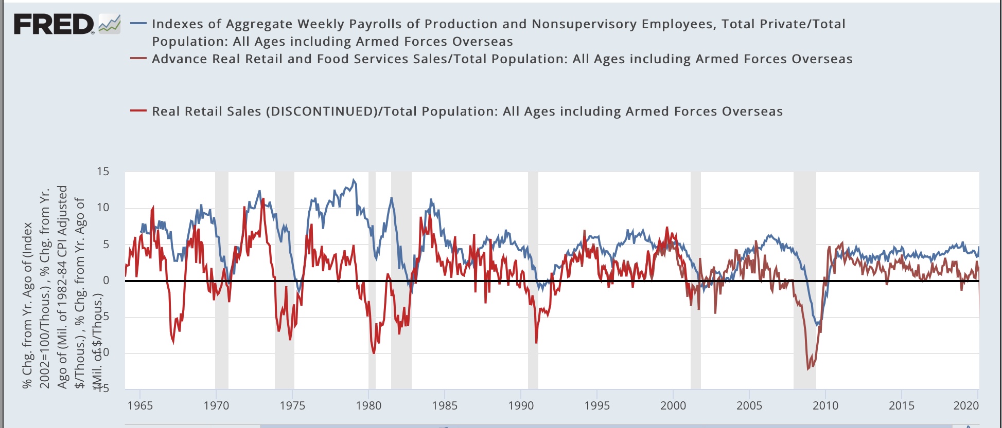
Why is this important? Here is a look at the same two metrics going back 60 years measured YoY:


Two important relationships ought to jump out. First, while the relationship is noisy on a monthly basis, over the longer term real retail sales lead payrolls, usually on the order of about 6 months. Second, real retail sales being negative YoY for any sustained period of time is an excellent harbinger of recession. Not only have they turned negative YoY in advance of every recession in the past 50+ years, but on the few occasions where a recession did not follow a negative number that was sustained for more than a month or two - 1966, 1987, 1994, 2002 - there was a marked economic slowdown that was not far off from recession.

Now let’s take a look at the same numbers for the past 3 years:


Note that payrolls were up 20% YoY in April 2021, and real retail sales jumped 50%! Since the biggest previous advance was about 12% YoY, had I included this data in the long term chart above, everything else would have been squiggles.

Note also that real retail sales per capita were negative YoY in March. They will presumably remain negative in April, because they are being compared with the stimulus spending spree last April.  For purposes of a pre-recession marker, the real marker is whether they will be down compared with last May, after the spending spree. Since consumer prices increased 0.3% in April, retail sales must increase 0.3% just to keep pace. A decline of -0.4% or more would make them negative compared with last May.

Because my suite of long leading indicators has not indicated a recession this year, I am expecting real retail sales to escape such a negative reading. But not necessarily by much. At the moment, they are forecasting a marked slowdown in the economy continuing this year. We’ll get the update tomorrow.

Saturday, May 14, 2022

Weekly Indicators for May 9 - 13 at Seeking Alpha


 - by New Deal democrat

My Weekly Indicators post is up at Seeking Alpha.

One measure of how the Russia-Ukraine war has been “normalized” globally, is that industrial commodity prices have declined sharply - on the order of 25% - in the past two weeks, taking back their entire sharp increase at the start of hostilities.

Meanwhile, the Treasury yield curve has “normalized” somewhat more in the past several weeks. Despite that, the majority of financial indicators outside of the yield curve are decidedly negative.

As usual, clicking over and reading will bring you up to the virtual moment on the economy, and reward me just a little bit financial for the effort I make putting the news together.

Friday, May 13, 2022

Coronavirus dashboard for May 13: the virus will gradually become less lethal - because you can only die once


 - by New Deal democrat

COVID-19 is still a pandemic, and is gradually going to transition to endemic. A year ago I thought that between nearly universal vaccinations and an increasing percentage of the population already infected, the virus would wane into a background nuisance by now.


No more.  I am now thoroughly convinced that there will be an unending series of variants that will create continuing waves of new infections and, increasingly importantly, RE-infections. The percent of the population fully vaccinated (not even counting boosters) has come to a screeching halt at 66%. And even in jurisdications with high percentages of vaccinated people, like Vermont, Puerto Rico, and Rhode Island, new infections have continued to run rampant (although the death numbers have steeply declined with vaccinations). 

Rhode Island is particularly instructive, because 35% of the population had already had *confirmed* cases of COVID two months ago (which means that probably double that percentage, or 70%, had *actually* been infected), and 83% of the population was fully vaccinated. In other words, probably 95% or more of the population had either been vaccinated or previously infected. And yet, that was no protection at all against the BA.2 and BA.2.12.1 wave that began over a month ago.

Nevertheless, let’s look at the numbers.

BA.2.12.1 has gradually been becoming the dominant variant, per the CDC’s variant “nowcast” through last Saturday:


In about another month, BA.2.12.1 should be 90% or more of all infections.

BA.2.12.1 is already dominant in NY, NJ, and PR, constituting 66% of all cases:


BA.2.12.1 is also nearly half of all cases along the rest of the East Coast and, oddly, the northern Great Plains, but a much smaller percentage elsewhere, especially along the West Coast:


In the bellwether jurisdictions of NY, NJ, and PR, cases are still rising by 20%-30% a week:


To the extent there is good news, is that in most areas of Upstate New York, cases are flat or already declining. This is particularly true in the Central NY region, where BA.2.12.1 was first identified:


Cases tripled between March and April, but are down 30% since then. Even at peak, cases were only about 20% of their previous Omicron peak.

Nationwide cases have tripled since their bottom 5 weeks ago, but deaths have only started to rise in the past week:


Deaths will probably be near 1000/day in about a month.

The long term picture of deaths vs. infections shows that, with the exception of Delta, each successive wave has been *relatively* less lethal than the wave before it (thick line is deaths; thin line ins infections):


This probably shows us the longer-term evolution of the virus. It will gradually move from pandemic to endemic. This is not necessarily because the virus will become intrinsically less deadly. It is more likely going to be because over time (several years) an increasing percent of the population will finally get vaccinated, and repeated re-infections will give the population more inherent resistance. Meanwhile the virus will continue to evolve to become ever more transmissible, as those mutations most capable of successfully infecting the vaccinated and the previously infected population will reproduce more. Meanwhile, to be blunt, that portion of the population most susceptible to lethal outcomes, like the institutionalized elderly, will already have been killed by the virus, and they can only die once.


Thursday, May 12, 2022

New jobless claims rise slightly, but continuing claims make another 50+ year low


 - by New Deal democrat

Initial jobless claims rose 1,000 to 203,000, continuing above the recent 50+ year low of 166,000 set in March. The 4 week average also rose by 4,250 to 192,750, compared with the all-time low of 170,500 set five weeks ago. On the other hand, continuing claims declined -44,000 to 1,343,000, yet another new 50 year low (but still well above their 1968 all-time low of 988,000):


The graph above shows a slight trend of increased new layoffs, which may or may not  just be noise. In any event, the tightest market for keeping a job in half a century continues. With so many other data points weakening, this is probably the brightest spot in the entire economy.


Wednesday, May 11, 2022

With the Fed already having begun to “stomp on the brakes,” inflation is still running very hot


 - by New Deal democrat

As promised, here is my second post on the April CPI number.

The YoY advance in consumer prices, +8.3%, is down from last month’s 8.6%, which was the highest 12 month rate since 1981. As I suggested last month, “the spike in gas prices may be - to use a recently dreaded word - transitory,” since gas prices had declined 5% month over month at the time of last month’s report. In the April report, energy prices declined -2.7%, and since they are 8% of the total weighted, that was certainly helpful. So far this month they have been more or less steady.

There was also good news in that the price of used cars and trucks fell -0.4% in April, after declining -3.8% in March. They constitute another 4% of the weighting of the CPI. As a result, the price of used vehicles was “only” up 22.7% YoY, vs. 41.2% YoY in February (which was the highest YoY increase in 70 years):


As I noted last month, used vehicle prices are down because they have become unaffordable for enough people that sales of such vehicles has also turned down.

Now let’s focus on the housing component of CPI, which constitutes 32% of the total input. There, both rent, and the much larger CPI component of owner’s equivalent rent, which is how house prices are figured into inflation, rose 0.6% and 0.5% respectively, for the month, and are up 4.8% YoY, respectively. This is the highest YoY rate of housing inflation for either measure in over 30 years:


I continue to expect the housing component of inflation to worsen considerably. That’s because, as I first pointed out half a year ago, the major house price indexes - the FHFA index and the Case Shiller index - lead owners equivalent rent by roughly 12 to 24 months, particularly in major moves.

The below graph shows the YoY% change in both house price indexes in shades of blue, compared with the YoY% changes in the CPI measures of rent of primary residence, and owners’ equivalent rent in shades of red:


There have been 3 major pulses of house price increases in the last 25 years: in 1997-98, 2004-06, and 2020-present. In each case, after roughly a 12-24 month lag, both CPI rent measures surged as well. That’s because big surges in house prices make renting more attractive (or necessary for those on more limited budgets); this drives more demand for apartments, which drives rent increases.  Further, the current rise in house prices of nearly 20% YoY, is significantly worse than either of the previous two - and has been up almost 20% YoY for the last 8 months running. With CPI housing inflation already at a 20 year high, we can further record CPI housing increases as this year progresses.

As I have also pointed out before, before owners equivalent rent is fully passed through into CPI, total inflation has normally cooled, as shown in the graph below:


That is because, faced with surging inflation, the Fed has embarked on a series of rate hikes (shown in black above) that culminated before owners equivalent rent peaked. The economy buckled, recessions started, and total inflation subsided as a result, before owners equivalent rent had fully peaked.

Unfortunately, even after the record surge in house prices was in full swing over a year ago, the Fed stayed on the sidelines. Now, as both rents and owners’ equivalent rents surge as well, and the Fed has so far only increased rates by 0.75%. Last month I wrote that “now the Fed is almost certainly going to stomp on the brakes, with a hard landing to follow;” and I would say that last week’s 1/2 point increase, the first in 28 years, was just the beginning of that stomping.

Let me conclude this month’s installment by exactly restating my closing paragraph from last month’s installment, because it certainly is the object lesson for the Fed:

It’s too late for this cycle. But with three examples of surging house prices feeding through with a delay into the CPI in the past 25 years, in the future the Fed simply *must* pay attention to house prices as reflected in those indexes. Better a small tamping down of the economy early than a major sudden stop later.

Real wages unchanged, real aggregate payrolls rose slightly in April


 - by New Deal democrat

Consumer inflation for April was +0.3%, the lowest monthly advance since last August. The number was helped by a big decline in energy prices, down -2.7% for the month, and also by used cars, down -0.4% for the month. In this post I’ll report on the impact on wages. I’ll put up a separate post with more general comments later.

Since nominal nonsupervisory wages rose 0.4% in March,“real” wages rose less than 0.1% (rounded to 0.0%) in April:


On a YoY basis, real wages are still down -1.7%, slightly above March’s -1.8% reading:


This remains a terrible number historically. Under ordinary circumstances, this would absolutely be recessionary.


But these are not ordinary circumstances, as inflation was goosed in part by stimulus payments last spring. This will be a more “normal” comparison in a couple of months, as a comparison with the stimulus months fades. 

The better measures is real aggregate payrolls for nonsupervisory workers, i.e., the total of payrolls for the entire country, normalized for inflation. These are up 2.7% YoY, a slight increase from last month:


Real aggregate payrolls turning negative YoY is frequently something that happens shortly before recessions (and likely is a causative agent), although there are some false positives. 

A closer look, however, shows that real aggregate payrolls are only up +0.5% in the past 6 months, and flat for the last 3 months:


In other words, unless wage increases actually accelerate from here (unlikely), we really need inflation to stay down for the rest of this year. Otherwise, consumer spending (70% of the economy) is going to flag and likely contribute to an economic downturn. Not to mention being a bad thing for working families.

Tuesday, May 10, 2022

Q1 Senior Loan Officer Survey: strong demand for loans, but accommodation ends


 - by New Deal democrat

The Senior Loan Officer Survey for Q1 was published yesterday, generally covering the supply of, and demand for, bank credit. It has two components that qualify as long leading indicators for the economy, as they have typically turned about one year before the onset of a recession over their 30+ year history.

First, the below graph is of the percentage of banks tightening standards for commercial and industrial loans for large and medium sized firms (blue) and small firms (red). Since tightening constricts credit, it typically happens in advance of a recession. Thus a positive number in the below graph is a negative for the economy:


As you can see, these moved towards absolute neutrality in the first quarter. In fact, the reading as to small firms is exactly 0, while that as to larger firms is -1.5, indicating a very slight tilt towards loosening.

Next, below is the percentage of banks reporting increasing demand for loans by larger (blue) and smaller (red) firms. In this case, more demand indicates a desire to build and expand on the part of firms, so a positive reading is also a positive for the economy:


Demand remains quite strong for both sized firms.

The survey includes a large number of other measures, but these are either too noisy, not very predictive, or of too recent a vintage (10 years or less) to be of much use.

The two above series together make for a weak positive. Demand for loans is still quite strong, but standards have stopped moving towards accommodation.

Note that the Chicago Financial Indexes measure credit conditions as well, but have the advantage of being reported weekly rather than once every three months. Interestingly, both the adjusted and leverage indexes significantly deteriorated just since the Fed started raising rates over a month ago. Below I include those two measures compared with the percentage of banks tightening standards for large firms (as above) for comparison:


It would not be surprising at all for next Quarter’s senior loan officer survey to cross the threshold into negative territory - but it’s not there yet.


Monday, May 9, 2022

A “Big PIcture” look at housing at Seeking Alpha; plus an in-depth look at existing home sales and inventory


 - by New Deal democrat

I have one of my periodic “Big Picture” looks at housing up over at Seeking Alpha.


Interest rates lead sales and construction, which lead prices, which (definitely in new homes) lead inventory. So you can probably guess where I think housing is headed over the next year or so.

In any event, clicking over and reading should be educational for you about this important and leading economic sector, plus reward me a little bit for my efforts.

One economic relationship - whether sales lead inventory for existing homes as well as new ones - has been extremely difficult to nail down, since for the past number of years the NAR has only allowed FRED to post the last one year of its data. 

Well, after much digging, including going back and re-reading an article I wrote eight years ago, plus some painstaking month by month reading of old NAR reports, I finally have some decent graphs, plus an answer. To wit, what is below . . .

First, here is a graph I created eight years ago, showing existing home sales, prices, and inventory for the decade between 2004-2014:


It’s pretty clear for the Housing Bubble and Bust: existing home sales led prices, which in turn led inventory.

What about since then? There’s no good single updated graph, but the below two on sales (from Wolf Street) and two on inventory tell just the tale.

Here are YoY sales from 2012-19:


And here is the update from 2017-21:


Here is existing home inventory YoY from 2012-20:


Finally, here is the update from 2018-22:


To comparison of existing home sales and inventory beginning in 2013 is as follows:

In 2013, sales turned negative YoY in December.
Meanwhile, inventory turned positive YoY in October (two months’ lead).

In 2014, sales turned positive YoY in October.
Inventory did not turn negative again until December (two months’ lag).

That situation continued through 2017.

In 2018, sales turned negative YoY in March.
Inventory did not turn positive until June (3 months lag).

In 2019, sales turned positive YoY in July.
Inventory turned positive YoY in July as well (coincident).

Next, in 2021, sales turned negative YoY in August.
Inventory is still negative YoY as of April 2022 (at minimum 8 month lag).

Overall, from 2004 to the present, existing home inventory more often than not lags sales, and in the case of major price advances and declines, it lags by many months.

The current situation looks close to, although not identical, to that of the Housing Bubble. There, inventory continued to decline slightly in 2004-05 even as sales growth decelerated and ultimately turned, but prices boomed. Now, Sales have already turned down, but with prices booming, inventory declines still exist, although they are abating and probably on the cusp of turning.

Sunday, May 8, 2022

On the self-government of prehistorical human settlements, whether empire-sized Republics can long survive, and the failure of judicial supremacy as a bulwark


 - by New Deal democrat

 Can an Empire-sized Republic long survive? This was the issue I pondered after Donald Trump was elected President in 2016. Once a country gets big enough, do elected officials ultimately fail, and people inevitably turn to an autocrat to lead them? 

That led me on a journey reading the histories of all of the larger Republics in human history, from Rome through Venice, Genoa, Florence, the Swiss Confederation, the Dutch Republic, and the Glorious Revolution that birthed the modern UK. 

It also caused me to realize that the most revolutionary part of the US Constitution, although the Founders did not realize it at the time, was the enshrinement of judicial supremacy over the other two branches of government, via the philosopher kings with life tenure who sat on the Supreme Court and who were allowed the last word on interpreting the US Constitution and the statutes of Congress. In so doing, the Founders broke a cardinal rule that had guided Republics for over 2000 years; namely, the greater the power of the office, the shorter period of time it should be held. Otherwise, the temptation of tyranny would be too great.

This was made bracingly clear this past week with the leak of Alito’s draft opinion overruling Roe v. Wade, and making quite clear that the majority of the present Court views entire “right to privacy” as illegitimate - which if it is close to the final opinion, is the biggest “crossing of the Rubicon” for the Court since Dred Scott. Judicial supremacy with lifetime appointments means that the entire basic structure of society, no matter how long entrenched, is subject to the whims of a bare majority of the members of that Court. The arguments of anti-Federalist Brutus, that the Supreme Court, once it recognized its power, would turn tyrannical, and whose essays I have highlighted in past posts, have at last been proven thoroughly correct.

To return to my main theme, I have also recently read “The Dawn of Everything” by David Graeber and David Wengrow, after which I compared it with Yuval Noah Harari’s “Sapiens.”

While I was unimpressed by most of “The Dawn of Everything” - most of it was  extrapolation and speculation every bit as valid as that by the drunk at the end of the bar - the part that was most convincing was the hard evidence of archeology. There are two important facts that jumped out about the excavations of ancient cities and settlements: (1) the brickwork and construction were every bit as exact and impressive as your best planned modern city or town. These were no hovels or shacks, but well-executed dwellings; and (2) as the authors point out, most of them show no evidence of palaces or any other outsized buildings we would expect to be occupied by rulers. In short, going back 10,000 years, the hard evidence of archeology suggests that most settlements were village-sized Republics, on the order of New England town halls.

Why did “civilization” begin? I think Harari has the better argument. Graeber and Wengrow think that civilization drives population growth; but the evidence is most consistent with the reverse causation, i.e., population growth drove the necessity for more organized and permanent food production, and for denser and permanent  living arrangements. Harari notes just how exponential long term human population growth has been. Only 2500 years ago, during the golden age of Athens or the first Chinese dynasty, human population was only about *1%* of what it is now.

In any event, there is a good argument that historically the default government for most human populations hasn’t been dynasty or autocracy, but rather small-scale Republics, with pre-set rules and public participation (Vindication for John Rawls!).

In the last 500 years, but especially the last 200 through 1991, the long-term political trend has been the displacement of heredity autocracies by Republics on a large, nation-state or empire scale (including those where there are still monarchs, but like QE2, they only reign but do not rule). Before that, only the Roman Republic, its opponent Carthage, and medieval Venice were republics which had ever governed very large or disparate land areas.

The first modern transformations were the Dutch revolt of the 1580s and the ensuing Republic,  followed by the Glorious Revolution in England in 1688. But the real turning point, where the transformation scaled up, were the American and French Revolutions, both of which established Republics on very large scales. It took 200 years, but by 1991, all of the *ruling* monarchies had been overthrown, and in almost the entire West, including Latin America and, briefly, Russia, but also in places like Japan, South Korea, and Taiwan, the rule of law - however shakily - was ascendant.

But - to return to my initial question - can Republics also be Empires? As I wrote above, the historical examples going back 1000s of years are few and far between - and two of the three came to bad ends (the exception, Venice, was fading ever since Columbus sailed the ocean blue in 1492, but was not finally overcome until Napoleon. Only 70 years later, it became part of Italy). The British Empire certainly qualifies, but there civic participation was most definitely *not* extended to the imperial vassal states. And now we come to the present, where the US and EU are the modern tests. 

Since 1989, with the crushing of the Tiananmen Square demonstrations, the alternative - Great Powers ruled as autocracies - has been gaining strength and become ascendant, by the entrenchment of Vladimir Putin in Russia, and a host of autocratic rulers in places like Hungary. And Trump’s (temporary?) failure in the US in 2017-21 wasn’t for lack of trying.

In other words, from a large scale historical perspective, to reiterate my opening remark, we have turned the page into an era where the question is, can liberal democratic Republics survive long once they reach the size of Empires; or must they inevitably fall into tyranny (the ancient cycle long ago proposed by the Greeks on the scale of city-states)?  From the internal viewpoint of the US in 2022, I am not too hopeful.