Saturday, January 15, 2022

Weekly Indicators for January 10 - 14 at Seeking Alpha


 - by New Deal democrat

My Weekly Indicators post is up at Seeking Alpha.

In addition to Omicron, commodity prices and interest rates are having an impact across the board on the long and short term forecasts and the nowcast. (Just for spite, two weeks ago some RW nut jobs had a fit about my including a meteor as the image for the article, so this week I including an even more graphic representation of the Giant Flaming Meteor of Death).

As usual, clicking over and reading will not only bring you fully up to date, but will pay my pizza tab for the week.

Friday, January 14, 2022

December real retail sales tank; industrial production also declines; consumer slowdown seems nearly certain


 - by New Deal democrat

Two days ago, in connection with consumer inflation, I reiterated that “we certainly are at a point where a sharp deceleration beginning with the consumer sector of the economy is more likely than not.”

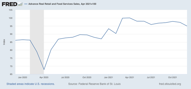
I didn’t expect to have it show up so soon! Retail sales, one of my favorite “real” economic indicators, took a nosedive in the month of December, declining -1.9% for the month even before inflation. After inflation, “real” retail sales declined -2.4%. Ouch! 

Thus real retail sales are down -5.1% from their April peak: 


Recall that real retail sales rose 1.8% in October. So I suspect a large part of the decline is that, fearing shortages on the shelves at Christmastime, many consumers advanced their purchases of Christmas gifts by several months. Still, the net decline since September has been -2.2%

Nevertheless they remain 9.2% higher than one year ago. In the past 70+ years before the pandemic hit, real retail sales were only higher YoY briefly in the early 1980s, as well as for about 16 months during the 1940s, 50s, and 60s.

Next, let’s turn to employment, because real retail sales are also a good short leading indicator for jobs.

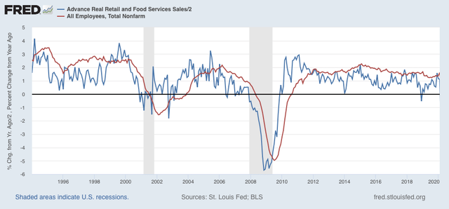
As I have written many times over the past 10+ years, real retail sales YoY/2 has a good record of leading jobs YoY with a lead time of about 3 to 6 months. That’s because demand for goods and services leads for the need to hire employees to fill that demand.  The exceptions have been right after the 2001 and 2008 recessions, when it took jobs longer to catch up, as shown in the graph below, which takes us up to February 2020:


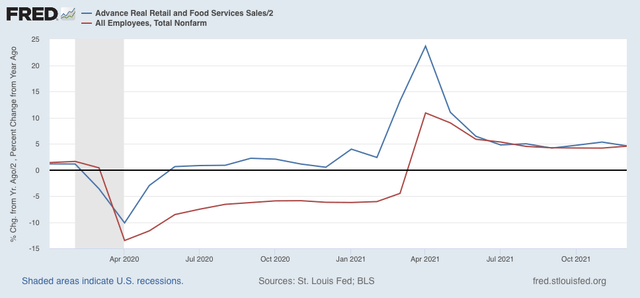
Now here is the same graph since just before the pandemic hit:


Note the two have been right in line for over half a year. I have written for the past several months that this “argues that we can expect jobs reports in the next few months to average out about even with those from one year ago, which averaged about 500,000 per month.” Although the last two jobs reports started out poor, November followed the pattern of upward revisions, and I expect more such revisions when next month’s jobs report is released. But comparisons will be very difficult YoY beginning in March, which means - to be consistent - that a big slowing of employment growth seems likely by about summer this year.

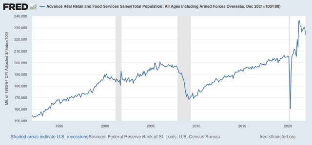
Finally, real retail sales per capita is one of my long leading indicators. Here’s what it looks like for the past 30 years:


With a -5.3% decline since April, this is a decidedly negative signal. Frankly, it’s recessionary looking out to midyear and beyond. Since it is only one indicator among the array, it isn’t a big concern yet. But it absolutely adds to the evidence that a big consumer slowdown as we go forward this year looks likely.

—-

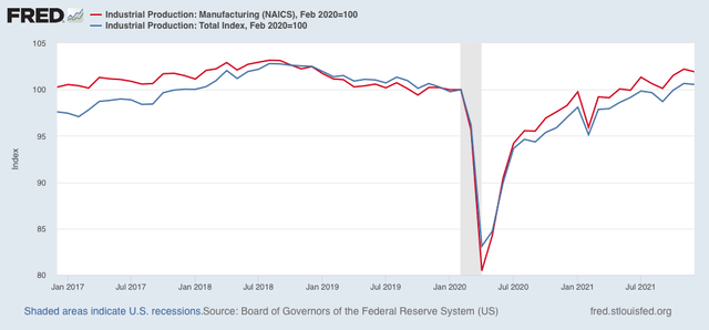
Before I go, let’s also briefly take a peek at industrial production, which also declined, by -0.1%, this morning. Manufacturing production declined -0.3%. Additionally, November was revised downward for both total and manufacturing production. Here’s the current view:


Both are still higher than they were just before the pandemic. While this isn’t good news, it is within the range of noise, but on the other hand, it is one more bit of evidence for a slowing expansion.

Thursday, January 13, 2022

Continuing unemployment claims make new 45+ year low


 - by New Deal democrat

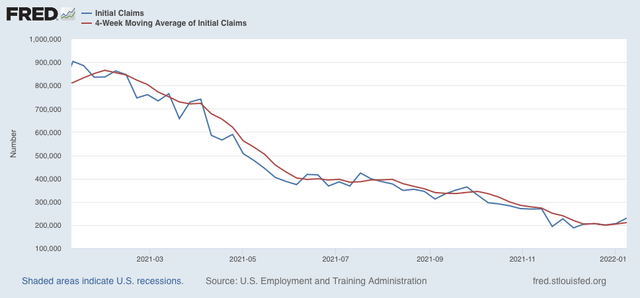
New claims increased 23,000 last week to 230,000. The 4 week average of new claims increased 6,250 to 210,750:


The big increase is likely affected by seasonality. It’ll be another week or two before we can tell if there is any real change in trend. If there is, it is likely to be a flattening in new claims rather than any significant increase. 

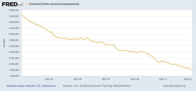
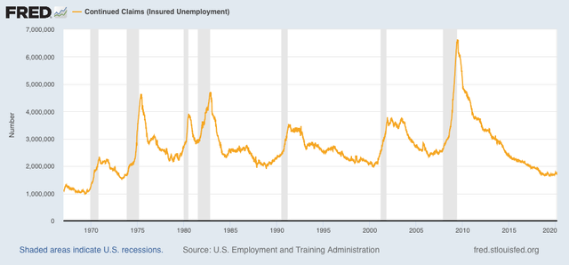
Continuing claims for jobless benefits, meanwhile, declined by 194,000, to 1,559,000:


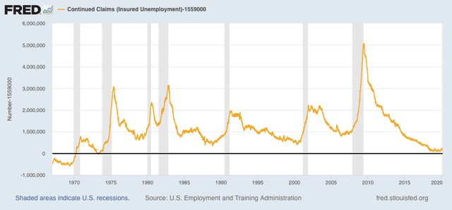
This is a new 45+ year record low. There haven’t been continuing claims this low since 1974, when the US population was half of what it is now, as shown in the graph below that subtracts 1,559,000 from the actual number:


Last week I wrote: “I don’t know if initial claims will go any lower, but I suspect continuing claims will continue to decline to or even below their 2018-19 levels.” Wow! Only one week later and the forecast is already correct. I expect even further declines in continuing claims, until the extreme tightness in the labor market brought about by the pandemic starts to loosen its hold.

Wednesday, January 12, 2022

Consumer inflation lessens in December; real wages increase, but a consumer slowdown remains likely


 - by New Deal democrat

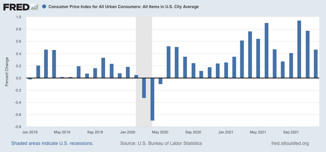
Consumer prices increased 0.5% in December, a deceleration from the past several months. But this is still well above the typical monthly increase in prices pre-pandemic: 


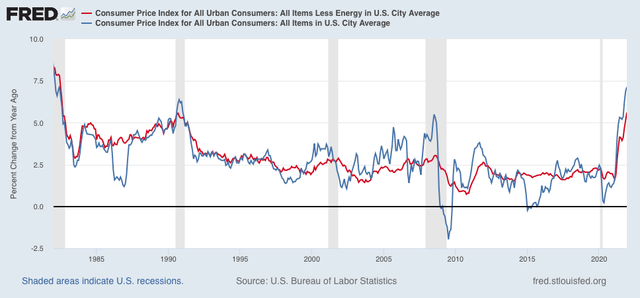
On a YoY basis, at 7.1% consumer inflation is the highest since the big Reagan recession of 1981-82. My favorite measure, CPI ex energy, is also up 5.6% YoY, and tied for the worst since the 1981-82 recession as well:


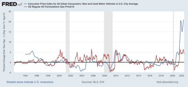
Inflation in new and used vehicle prices has risen again to over 20% YoY; and gas prices YoY are still up at levels that in the past have been associated with economic slowdowns or recessions:


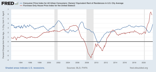
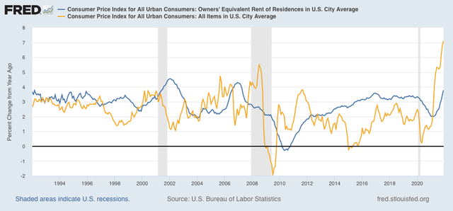
As I have been forecasting for months, house price increases have fed through into rents and “owners equivalent rent,” which has continued to increase:


Interestingly, in both prior cases where owners equivalent rent surged after house prices did - 2001 and 2006 - the surge in overall consumer prices (gold in the graph below) quickly ended and went into reverse:


In both cases, however, the Fed had aggressively raised interest rates in the meantime, helping to cause a slowdown (2006) or recession (2001), which in turn led to lower inflation.

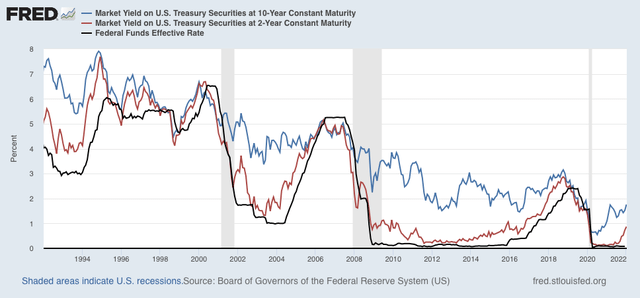
The bond market fully expects the Fed to do the same thing this year. Below I show the yield on the 10 year Treasury (blue), 2 year Treasury (red), and Fed funds rate (black):


Note that in recent decades bond market investors have almost always anticipated the Fed’s move, bidding up yields on the 2 year bond in advance of Fed interest rate hikes. There have been some false positives (1996, 2002, 2011) but more often the bond market has been right.

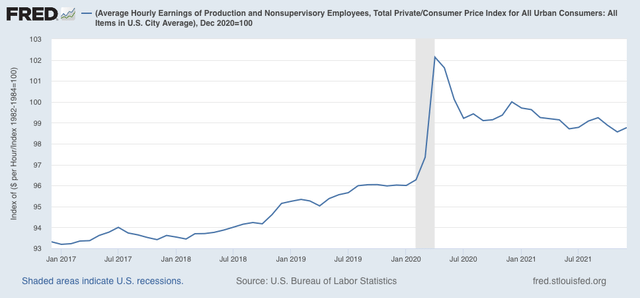
Now let’s talk about “real” wages. To cut to the chase, this month the news was positive.

Average real hourly wages increased in December by 0.2%, although they are still -1.2% below their interim peak last December:


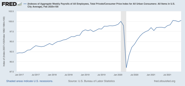
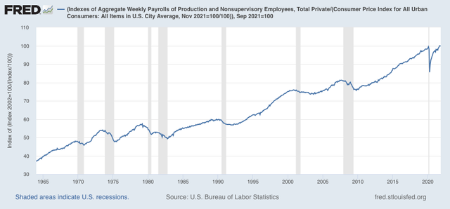
Additionally, real aggregate payrolls, an overall measure of consumer health, also increased 0.3% in December, and returned to equal their peak from September:


For the past 50+ years, when aggregate real wages have retreated from peak for 3 to 9 months, a recession has typically followed:


To sum up, while real wage growth has slowed down or halted, depending on which measure we use, they have not gone into reverse. This is consistent with taking a near term recession off the table for now. On the other hand, as I wrote last month, “we certainly are at a point where a sharp deceleration beginning with the consumer sector of the economy is more likely than not.” While perhaps I would modify that by dropping the descriptor “sharp,” a deceleration in the consumer sector remains supported by December’s inflation report.

Tuesday, January 11, 2022

Coronavirus dashboard for January 11: good news and bad news


 - by New Deal democrat

With no new economic releases today, let me give you a brief update on the fast-moving Omicron wave.


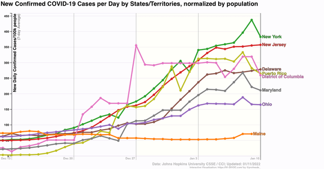
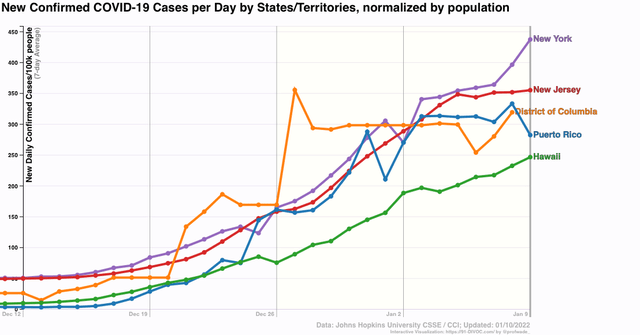
First, the good news: as I pointed out yesterday, several States that were hit hardest first by Omicron look like they are hitting or have already hit peak:


This is an increase from just several days ago. In fact, right now the only early hit State that has not peaked is Hawaii (not shown).

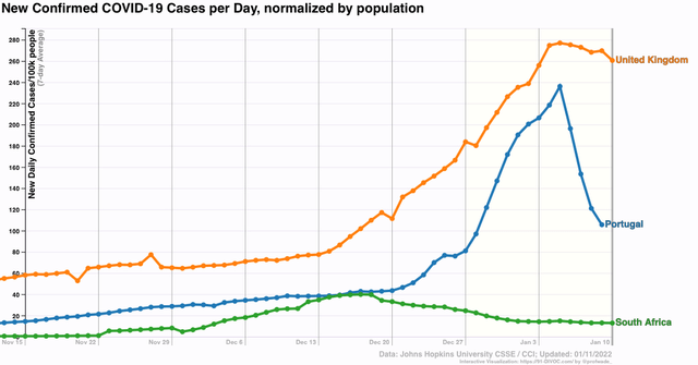
Several other countries that were hit hard early by Omicron also appear to have peaked: the UK and Portugal, in addition to South Africa, where the strain was identified first:


If the Omicron wave peaks in 30 to 45 days after onset, then the US as a whole is likely to peak between this coming weekend and the end of this month.

That’s the good news.

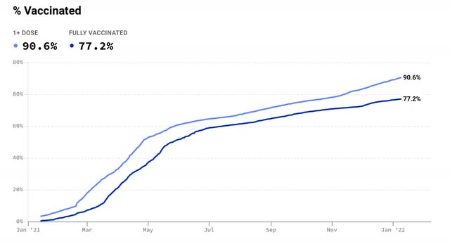
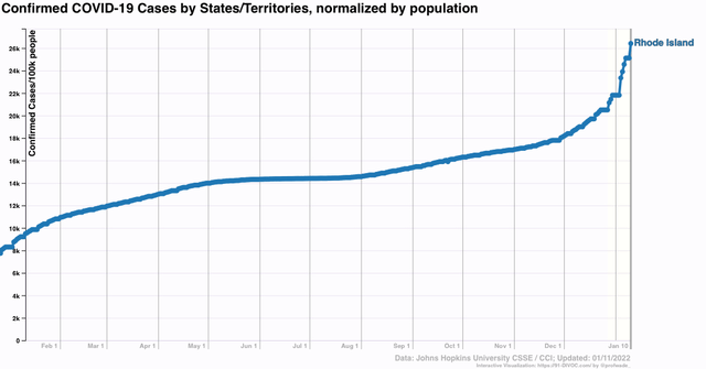
The question becomes, what happens next? I have been hopeful that between vaccinations and prior infections, we would reach a point where any subsequent wave would be much less in severity. The State that has been the best candidate for a bellwether of this hypothesis is Rhode Island, which has both a very high vaccination rate (1st graph below), and a very high rate of previous infections (2nd graph below).


Despite the fact that over 75% of Rhode Island’s population was fully vaccinated, and perhaps 40% or more of its population having been infected even before December, Omicron hit it hard, with over 8% of the entire State’s population having *confirmed* infections in the last 45 days. That in itself is not such a big deal. Portugal, with 90% of its population fully vaccinated, also got hit hard by Omicron infections.

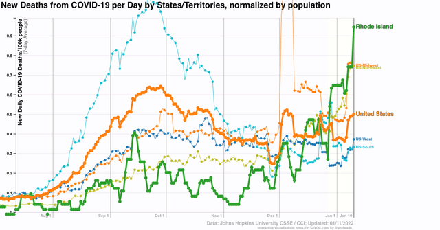
The problem is the next graph, which shows deaths:


Rhode Island has had a higher death rate in the past month than the US as a whole, or any Census Region. In fact, it is in the top 10 States for rate of deaths at the moment.

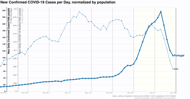
I should point out this has not been true of Portugal, which has not had any increase in deaths at all during the Omicron wave - at least not so far:


But if prior infections do not build up appreciable resistance to reinfection, at least over the medium term, then with about 1/4 or more of its population dead set against being vaccinated, the US is in some real long term trouble.

Monday, January 10, 2022

Coronavirus dashboard for January 10: how “mild” Omicron is depends upon how much you lag the data


 - by New Deal democrat

So, how “mild” or not, is Omicron? It depends on whether you lag the data on hospitalizations and deaths or not.


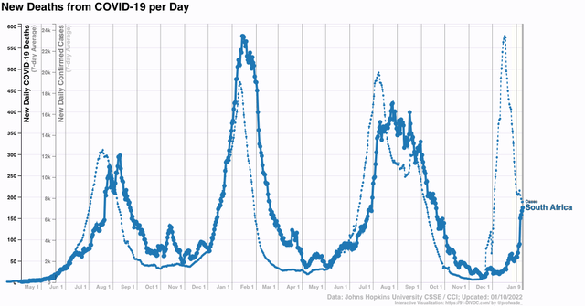
The original story out of South Africa was that Omicron was extremely mild. Despite a huge spike in infections, deaths barely budged. As Omicron took hold in Europe and the US, South Africa disappeared from the picture.  Which is too bad, because here is what has been happening with deaths: 


In the past week, deaths in South Africa tripled. Mind you, deaths - so far, anyway - at 13x their pre-Omicron low, are nowhere near the 80x+ increase in cases. But the point is, deaths lag cases, and until you wait about a month to see how deaths play out, you really don’t know how “mild” Omicron is.

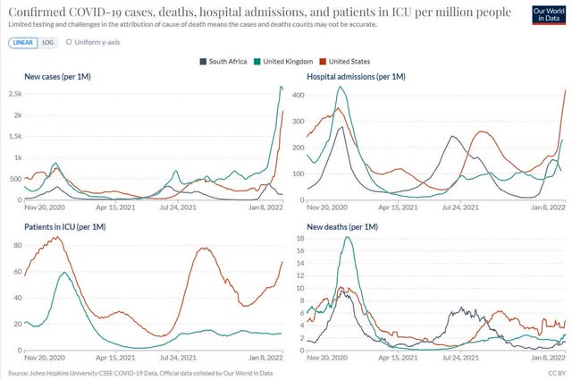
And the bad news for the US is, compared with South Africa and even the UK, Omicron hasn’t been as “mild” so far, as shown in the below set of graphs comparing cases, hospitalizations, ICU admissions, and deaths (again, so far):


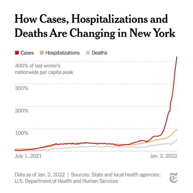
A week ago, the story in the US was still how “mild” Omicron has been, as shown in this graph of cases, hospitalizations, and deaths from New York City (perhaps the earliest hard hit metro area):


There’s just one problem with the above graph: hospitalizations and deaths aren’t shown with any sort of lag. Deaths on January 2 are compared with hospitalizations on January 2 and new cases on January 2.

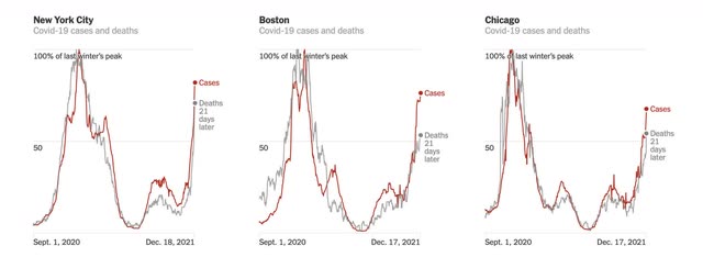
But when you put in an appropriate lag, the situation looks much different, as in the below graph in which deaths are lagged 21 days for NYC and two other metros:


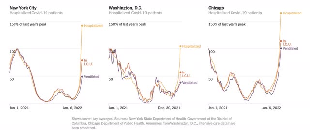
Or the below graph, including ICU patients with a 14 day lag compared with infections:


All of a sudden, Omicron doesn’t appear that much milder at all.

This is something I’ve been following since the onset of the Omicron wave. Since hospitalizations started to spike about 10 days after the onset of the wave, i crunched data with a 10 day lag. While I don’t have a graph to show you, I can tell you that each time I have done this, it gives me a result of hospitalizations increasing at a rate of between 65% to 80% of cases. ICU admissions lag hospitalizations by only a day or two, and have gone up at about 50% of the rate of cases. Because the Omicron wave only started in earnest on December 15, 3 1/2 weeks ago, we are only beginning to see the trend in deaths.

But we already have more hospitalizations for COVID than we have ever had before in the US, and the system is beginning to break down - and we haven’t even reached the peak yet. As a society, the US seems to have just given up.

Since I hate only passing on gloom and doom, let me give you a few rays of daylight.

First, the Omicron wave seems to have already peaked in several places where it hit early: Puerto Rico, DC, and New Jersey. In two other places, New York and Hawaii, it hasn’t peaked yet:


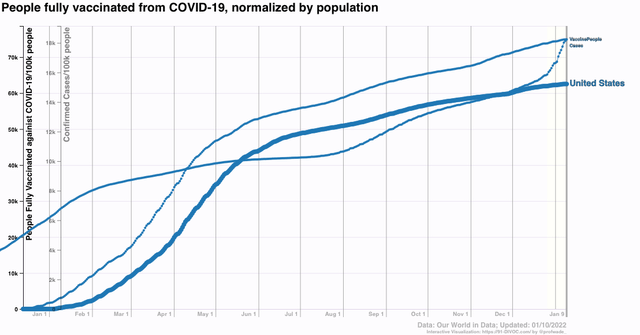
Finally, Omicron is infecting so many people that within a month or two it is going to be difficult for COVID to find a victim who doesn’t have at least some resistance via vaccinations or prior infection:


About 62% of the US population has been fully vaccinated (but only about 36% being boosted as well, according to the CDC). Another 12% have received at least one dose. And over 18% have had *confirmed* cases. The likelihood is that, including asymptomatic infections or infections of people who didn’t bother to get tested, at least double that percentage, somewhere on the order of 40% of all Americans, have been infected.

If we just randomly assign that 40% of infected people among all those vaccinated and unvaccinated, that’s roughly 85% of the US population that should have at least *some* resistance to renewed infection. Another month of Omicron is probably going to take that up to 90%.

It’s possible there is a doomsday variant out there, but it’s more likely that, as COVID becomes endemic, each wave displays less and less virulence, not because they are inherently “milder,” but simply because the vast majority of the population has some, increasing, level of immune resistance.

Saturday, January 8, 2022

Weekly Indicators for January 3 - 7 at Seeking Alpha


 - by New Deal democrat

My Weekly Indicators post is up at Seeking Alpha.

Surprisingly, Omicron has not had any wide impact on the coincident data - at least not yet.

On the other hand, the long leading forecast has become weaker, as interest rates have moved in the wrong direction.

As usual, clicking over and reading will bring you up to the virtual moment on where the economy is and where it is going, and will reward me a little bit for organizing that information for you.

Friday, January 7, 2022

December jobs report: more signs of real tightness, while new jobs added are (seasonally?) disappointing


 - by New Deal democrat

There were three big questions I had going into this jobs report: 
1. whether the big decrease in new jobless claims to a half century low would translate to another big top line number in the jobs report
2. is wage growth holding up? Is it accelerating?
3. Would last month’s “poor” 210,000 number of new jobs be revised higher? 

The answers were:
1. The 6 month average of monthly gains has declined significantly, from about 600,000 to 500,000 - still very good, but a significant deceleration in the past 2 months. We still have 3.6 million jobs to go to equal the number of employees in February 2020 just before the pandemic hit. At the current average rate for the past 6 months, that’s about 7 more months.
2. Wage growth is still very high, at 5.8% YoY, a slight deceleration from last month.
3. Both of the last 2 months were revised higher, but November’s revision was only +39,000, still disappointing.

Here’s my in depth synopsis of the report:

HEADLINES:
  • 199,000 jobs added. Private sector jobs increased 211,000. Government jobs declined by -12,000 jobs. The alternate, and more volatile measure in the household report indicated a gain of 671,000 jobs, the second very sharp increase in a row, and which factors into the unemployment and underemployment rates below.
  • The total number of employed is still -3,049,000, or -2,3% below its pre-pandemic peak.  At this rate jobs have grown in the past 6 months (which have averaged 508,000 per month), it will take another 7 months for employment to completely recover.
  • U3 unemployment rate declined -0.3% to 3.9%, compared with the January 2020 low of 3.5%.
  • U6 underemployment rate declined -0.4% to 7.3%, compared with the January 2020 low of 6.9%.
  • Those not in the labor force at all, but who want a job now, declined -106,000 to 5.713 million, compared with 5.010 million in February 2020.
  • Those on temporary layoff decreased -63,000 to 872,000.
  • Permanent job losers declined -206,000 to 1,703,000.
  • October was revised upward by 102,000, while November was revised upward by 39,000, for a net gain of 141,000 jobs compared with previous reports.
Leading employment indicators of a slowdown or recession

These are leading sectors for the economy overall, and will help us gauge how strong the rebound from the pandemic will be.  These were on balance positive:
  • the average manufacturing workweek, one of the 10 components of the Index of Leading Indicators, declined -0.1 hour to 40.3 hours.
  • Manufacturing jobs increased 26,000. Since the beginning of the pandemic, manufacturing has still lost -219,000 jobs, or -1.7% of the total.
  • Construction jobs increased 22,000. Since the beginning of the pandemic, -88,000 construction jobs have been lost, or -1.2% of the total.
  • Residential construction jobs, which are even more leading, rose by 700. Since the beginning of the pandemic, 46,600 jobs have been *gained* in this sector, or +5.5%.
  • temporary jobs declined by -1,600. Since the beginning of the pandemic, there have still been -57,100 jobs lost, or -5.3% of all temporary jobs.
  • the number of people unemployed for 5 weeks or less decreased by -8,000 to 1,977,000, which is lower than just before the pandemic hit.
  • Professional and business employment increased by 43,000, which is still -35,000, or about -0.2%, below its pre-pandemic peak.

Wages of non-managerial workers
  • Average Hourly Earnings for Production and Nonsupervisory Personnel: rose $0.12 to $26.61, which is a 5.8% YoY gain. This continues to be excellent news, considering that a huge number of low-wage workers have finally been recalled to work, and just below lat month’s high of +5.9% YoY.

Aggregate hours and wages:
  • the index of aggregate hours worked for non-managerial workers rose by 0.3%, which is a  loss of -1.5% since just before the pandemic.
  •  the index of aggregate payrolls for non-managerial workers rose by 1.1%, which is a gain of 9.4% (before inflation) since just before the pandemic.

Other significant data:
  • Leisure and hospitality jobs, which were the most hard-hit during the pandemic, gained 53,000 jobs, but are still -1,222,000, or -7.2% below their pre-pandemic peak.
  • Within the leisure and hospitality sector, food and drink establishments increased 43,000 jobs, and is still -653,000, or -5.3% below their pre-pandemic peak.
  • Full time jobs increased 803,000 in the household report.
  • Part time jobs decreased -275,000 in the household report.
  • The number of job holders who were part time for economic reasons decreased by -399,000 to 3,929,000, which is a decrease of 461,000 since before the pandemic began.
  • Health care employment declined by -3,100, a YoY gain of only 63,300, or 0.4%, despite being the most critical sector during the pandemic.

SUMMARY

Two days ago I described the November JOLTS report as being analogous to a reverse game of musical chairs, with jobs being the chairs and potential employees those wanting to sit in them. With a chronic shortage of people being willing to sit in the chairs on offer due to the pandemic, jobs are going unfilled, while virtually nobody is getting laid off. 

Today we learned that the dynamic continued in December, as the unemployment rate fell close to its 50 year lows, at a level only exceeded by one month in 2000, and during 2018-19. This also continued the dynamic of sharp wage increases for non managerial workers.

White collar professional jobs have almost fully recovered to pre-pandemic levels. Construction is not far behind. What are lagging are leisure and hospitality jobs most hard hit by pandemic issues, and - surprisingly - manufacturing. That health care is losing workers while the pandemic is at one of its worst levels is a demonstration of the failure of how the US has been dealing with the pandemic, as Trumpist courts and governors are refusing virtually all efforts at mitigation, and vaccinations are nowhere near the level needed for safety. The Biden Administration is not blameless, as its “vaccination-only” strategy has not worked.

It is also somewhat concerning that the last two months have only averaged a little over 200,000 jobs gained. But the household report, which tends to lead at inflection points, has been *very strong,* and October’s initial gain of 531,000 has since been revised up to 648,000. I suspect that seasonality has reared its ugly head, as the huge number of Christmas holiday jobs typically added has thrown a monkey wrench into pandemic calculations. If so, next month the report for this month (January) will reverse that.

All in all, the jobs sector continues strong, and is getting very tight, but still lagging in terms of filling job openings created by pandemic losses.

The final pieces of the employment picture will not resolve until the pandemic is resolved. 

Thursday, January 6, 2022

Initial and continuing jobless claims: 2022 starts out where 2021 left off


 - by New Deal democrat

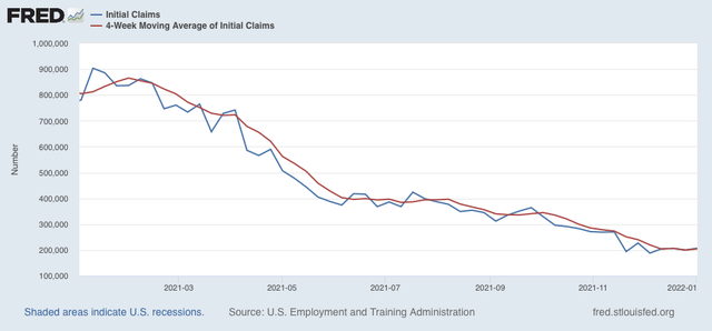
The labor market in 2022 started out where it left off in 2021, as new claims increased slightly, by 7,000, to 207,000. The 4 week average of new claims increased 4.750 to 204,500:


Readings this low haven’t been seen in half a century.

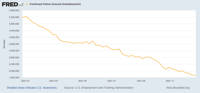
Continuing claims for jobless benefits also rose slightly, by 36,000, to 1,754,000:


Except for 2018-19, we haven’t seen continuing claims this low since 1974:


We can expect this situation to continue so long as the pandemic keeps many potential workers (on the order of 4,000,000 or so) on the sidelines. As I wrote yesterday concerning the JOLTS report, it’s like a game of reverse musical chairs where the holders of the chairs can’t get enough people to sit in them. In those circumstances, virtually nobody is going to get laid off. I don’t know if initial claims will go any lower, but I suspect continuing claims will continue to decline to or even below their 2018-19 levels.

In the meantime, I expect another good employment report tomorrow, and I will be really surprised if last month’s initial estimate of a gain of 210,000 jobs in November isn’t raised substantially higher.

Wednesday, January 5, 2022

November JOLTS report: imagine, if you will, a game of musical chairs


 - by New Deal democrat

Imagine a game like musical chairs, except that some players are the chairs (employers) as well as people who want to sit in the chairs (potential employees), and players, both sitters and chairs, are continually entering and exiting the game.

The game would be in equilibrium if the number of sitters and chairs are always equal. If there are more sitters than chairs, sitters will be unsuccessful (unemployed). If there are more chairs than sitters, the chairs will be empty (unfilled job openings). In the former case, we would expect wages to go down (or at least increase more slowly vs. inflation); in the latter, we would expect wages to increase more sharply.

The JOLTS report for November, released yesterday morning, continued to show that there are far more chairs than there are those wanting to sit in them. As a result, wages have continued to increase sharply - even accelerate a little more.

To the details . . .

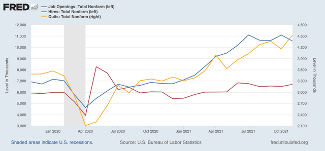
Job openings (blue in the graph below) decreased by -529,000 to 10.562 million, a little below the July peak of 11.098 million. Voluntary quits (the “great resignation,” gold, right scale) increased 370,000 to 4.527 million - a new record high. Actual hires (red) increased  191,000 to 6.697 million, in line with the past few months, and better than the early part of this year:


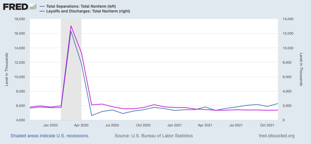
Layoffs and discharges (violet, right scale in the graph below) increased 19,000 from last month’s record low to 1.369 million. Total separations (blue) increased 382,000 to 6.273 million:


In summary, we continue to have near-record high job openings and low layoffs, new record high quits, with still-strong hiring and total separations; i.e., little progress is being made towards establishing a new equilibrium.

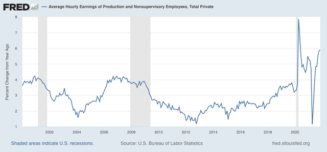
Further, as indicated in last month’s jobs report, wage gains YoY have continued to accelerate, up 5.9% in November, the highest since 1982 except for April and May 2020:


Returning to my rubric of musical chairs, due to the pandemic, there is a persistent shortfall - currently on the level of about 4 million - in the number of people willing to sit in the seats on offer from potential employers. They either are fearful of coming down sick, don’t want to face irate customers, or have to stay home to provide care to their children either due to lack of childcare options or closed schools.

Because of this persistent shortfall, those willing to sit in the chairs can “trade up” to a more desirable chair. As each potential sitter does so, the lowest 10% or so of chairs are consistently left vacant. To fill those chairs with bodies, employers have to offer more money. But so longs as the shortfall persists, there will always be rotating number of vacant chairs, and those potential employers with those empty chairs will have to continually offer more compensation to get people to sit in them.In other words, wages will continue to rise until the potential employer can no longer make any profit off the potential employee for that job.

Because the JOLTS data has only been around for 20 years, there are only two jobs recoveries with which to compare the present situation. 

In order for the situation to resolve, the first thing I want or expect to see is a further increase in monthly hiring. At the same time, or shortly thereafter, I would expect to see a significant decline in voluntary quits. Only after these two things have occurred would I expect to see a substantial downturn in job openings, and I would not expect to see any significant increase in layoffs until all of those other trends are in place.

In November, we didn’t get an *increased* surge in hiring, and far from declining, quits increased. In other words, we are nowhere near to resolving the current jobs market imbalance - the best situation for employees in half a century.
——
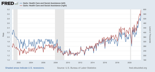
One postscript: I also want to make note of one specific jobs sector. Below is the quits rate (left scale) and number (right) for employees in the health care sector:


Both made new records, and are roughly 30% higher than at any time previous to the pandemic. In other words, employees in a critical sector are leaving their jobs in droves. To me, this points to the utter failure of a system which has been coddling defiant anti-vaxxers and their families. But more on that in my next Coronavirus Dashboard.

Tuesday, January 4, 2022

First data releases of 2022 confirm manufacturing strength, construction slowdown


 - by New Deal democrat

The first December data, the forward-looking ISM manufacturing report, has been released. Yesterday construction spending for November was also released. Let’s take a look at both.


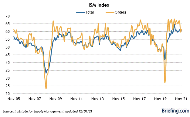
The ISM index, especially its new orders subindex, is an important short leading indicator for the production sector. In December the index declined from 61.1 to 58.7, as did the more leading new orders subindex, which declined from 61.5 to 60.4 (note the breakeven point between expansion and contraction is 50):


Both the total index and the new orders subindex ran extremely hot throughout 2021, and the moderate decrease in December remains consistent with a “hot” manufacturing sector. This continues to forecast a strong production side of the economy through mid year 2022.

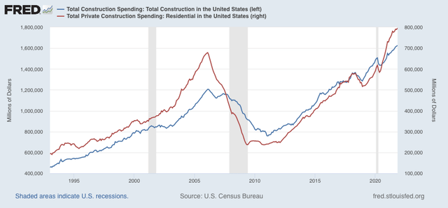
Turning to construction, during November in nominal terms overall spending including all types of construction rose 0.4%, from an upwardly revised 0.4% for October, while spending on the leading residential sector rose 0.9%. Both made new all-time highs:


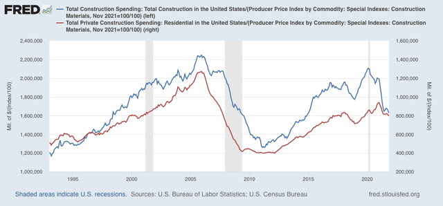
Adjusting for price changes in construction materials, which jumped 2.1% in November, “real” construction spending declined -1.6% m/m, and “real” residential construction spending declined -1.1%. In absolute terms, “real” construction spending has declined sharply - by -18.8%) - since its peak in November 2020,  while “real” residential construction spending has declined -15.1% since its post-recession peak in January of this year:


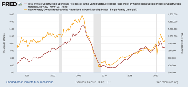
While total construction spending declined by more than it had before the Great Recession, the decline in residential construction spending, while increasingly substantial, remains nowhere near the big decline it suffered before the end of 2007, in this series that only dates from 1993. Comparing it with single family permits (gold), below:


confirms the slowdown since one year ago, but not a recession level decline.

Monday, January 3, 2022

Grading my 2021 forecasts


 - by New Deal democrat

Critical self-examination is, or at least ought to be, part of the process of making forecasts. After all, how can you learn if you don’t see how earlier hypotheses panned out? As I have usually done, let’s take a look back at how I forecast 2021 was going to look, to see how well I did.

To make a long story short, according to the long and short leading indicators I track, there was never any real doubt that the economy was going to continue to expand. The only issue was how strong or weak the expansion might be.

Last January, the  short term indicators suggested that the expansion would slow down in the first half of 2021: 

“the pandemic is still in control. The LEI has been consistently positive, but at a sharply decelerating rate, for the past 8 months. That suggests a continued but slowing expansion through spring into early summer.”

The long term forecast at that point for the latter part of 2021 was even better:

“There are 6 positives . . . There is 1 mixed indicator . . . [and] There is 1 negative . . . .

“In conclusion, the long leading indicators support a firm, even strong expansion through the remainder of 2021, the pandemic is controlled or resolved via vaccinations and intelligent Federal policy.”

At the same time, the housing market and corporate profits as reported in the Q4 2020 GDP report sounded a caution for later in the year:


“these [housing sales, real residential investment, and proprietor’s income] are a caution flag that, while the economy is likely to boom - or close to it - this year once the pandemic is contained, by year-end that growth may slow considerably

“Put the data points together and, while they are not a warning, they are a yellow cautionary flag that gains in the economy brought about by the 2020 housing boom may abate if not reverse by year-end 2021.”

At midyear, I updated the forecast for the second half of 2021 based on the short term indicators. The conclusion was again straightforward:

“with very few exceptions all of the indicators for the next 6 months of the economy, through and past the end of the year, are very positive, confirming in the short term the message of the long leading indicators in the second half of 2020.”

I updated that a little later in the teeth of the Delta wave:
 
“My base case for this year has been that with Federal stimulus and accommodating monetary policy, as the economy reopened from the worst levels of the pandemic, there has been an outright Boom. The pandemic - and the response thereto - remains an exogenous dispositive factor. But with 62% of adults fully vaccinated, another 11% partially so, and with final approval of one vaccine likely to lead very quickly to widespread public and private vaccine mandates, I expect its impact to wane considerably once the Delta wave crests and just as quickly recedes.


“And so, true to my "just the facts, ma'am" approach, I am forecasting that the economy will continue to expand broadly over the next 6 months.”

So, as fo the end of 2021, what do the coincident indicators look like for the year?

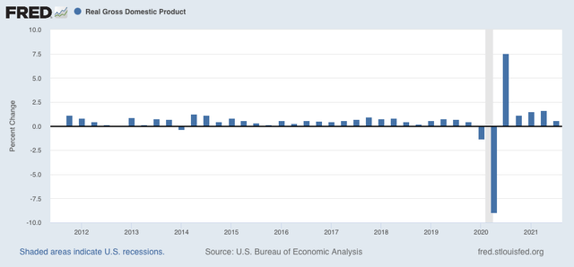
Here is real GDP growth measured quarter over quarter:


The economy did indeed continue to grow, and with the exception of Q3 of 2021 (which at +0.6% annualized was still average for the past 10 years), grew very strongly compared with the entire 10 year expansion that preceded the pandemic.

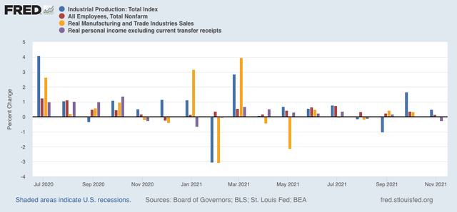
Here are the “big 4” coincident indicators, including industrial production, jobs, real income, and real sales through November:


With the exception of February and November, all of the months were positive, and especially so in spring and summer.

In conclusion, the long and short term leading indicators did their jobs very well in forecasting the expansion, even Boom, of 2021. The one portion where I fell short had to do with the course of the pandemic in the latter part of the year, as the stubborn minority of anti-vaxxers allowed COVID a large reservoir of available new victims to infect, especially as the super-infectious Omicron variant came along at year end.

In the next several weeks, I will post my short and long term forecast for 2022 using the very same methods that were so successful last year.

Sunday, January 2, 2022

Weekly Indicators for December 27 - 31 at Seeking Alpha


 - by New Deal democrat

The last edition of Weekly Indicators for 2021 is up at Seeking Alpha.

I have been watching restaurant reservations for the first signs of the economic impact of Omicron. Well . . . .

Additionally, interest rates are hitting an important milestone this week, that is changing some of their ratings, and with that the reading of the long leading forecast.

As always, reading the post should bring you up to the moment, and reward me a little bit for bringing the information to you in a cohesive, logical format.

Friday, December 31, 2021

Hopeful New Year


 - by New Deal democrat


In view of the continued conflagration of the COVID pandemic, I am eschewing the traditional “Happy New Year!” salutation as we end 2021 and begin 2022 in favor of the above “Hopeful New Year.” I always try to stick with the data - one of the favorite things anyone has ever said about my writing is that I appear to be “praeternaturally detached” - and that almost always staying away from the “We’re DOOOMED!!!” references, because there is always some sort of reason for hope out there, even in the darkest times.

Pandemics do not go on forever. Even before vaccinations, eventually sicknesses got around to infecting everybody who was susceptible, and ran out of quick kills. This one will be no different. As I wrote the other day, my best guess is that about 40% of the unvaccinated have already been infected. Omicron is almost certainly going to be awful in January, but on the other side, a lot more of the unvaccinated are going to have some resistance. More people will get vaccinated; better treatments will be found; and even more thorough and lasting vaccinations are likely to be ready. So I remain hopeful that 2022 will see the pandemic beginning to fade, maybe as early as this spring.

The economy is humming along nicely. We have a competent President, who displays empathy and common decency. 

So there is every reason to hope. And that is my getting: Hopeful New Year!


P.S. On a more prosaic note, my “Weekly Indicators” post will probably go up tomorrow, and my report card for my 2021 forecasts at some point by next week.  See you then.

Thursday, December 30, 2021

The labor market closes out 2021 on the best note yet


 - by New Deal democrat

The final economic data in 2021 was this morning’s report on initial and continued jobless claims. And the good news for workers continued.


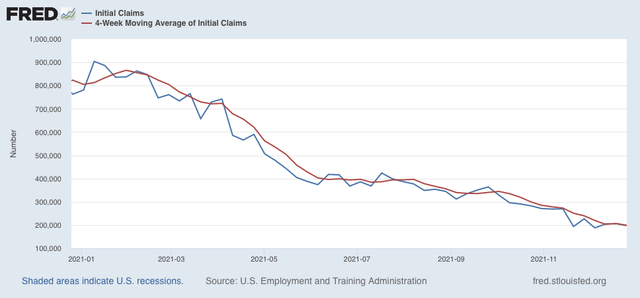
New claims declined back under 200,000 to 198,000, the best pandemic showing except for November 20’s 194,000, and December 4’s 188,000. The 4 week average of new claims declined to 199,250:


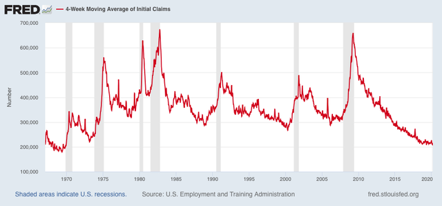
This is the best showing for the 4 week average in over 50 years, since the end of 1969:


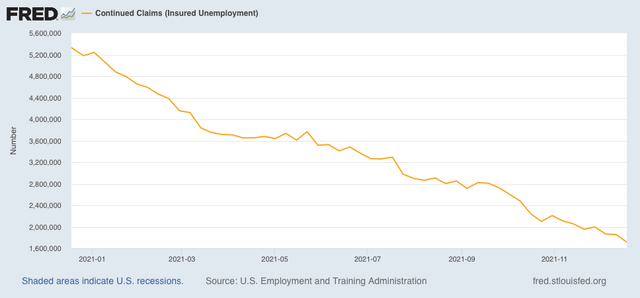
Continuing claims for jobless benefits also declined to a new pandemic low of 1,716,000:


Except for 2018-19, this is also the lowest showing since 1974:


This is essentially the tightest market for employees in nearly 50 years. It is no surprise that wages have been rising sharply. We can expect this situation to continue so long as the pandemic keeps many potential workers (on the order of 4,000,000 or so) on the sidelines.

In the next few days, I’ll post my retrospective report card on my 2021 forecasts from 6 and 12 months ago. Then next week I’ll be back at it again for 2022.

Wednesday, December 29, 2021

Coronavirus dashboard for year-end 2021: the Graph of the Year, where we are now, and where we are probably going


 - by New Deal democrat

At the end of the 2nd year of the pandemic, a little self-assessment of what I got right and wrong, where we are and where we are probably going.


The one thing I got wrong in a big way is explained by this Coronavirus Graph of the Year:
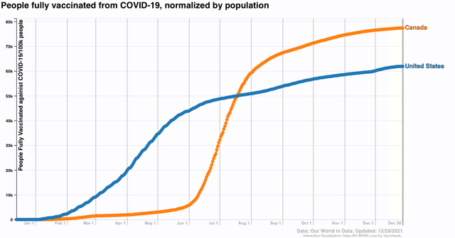

I thought sure that once the effectiveness of the vaccines was widely known, opposition and reluctance to taking them would sharply decline. I did not expect the volume and intensity and orchestration of the anti-science, anti-vax campaign by Fox News and RW nutjobs. As a result, since mid-April the number of people getting vaccinated steadily declined from 2 million per day in early April until by July it was only about 250,000 per day. Just stunning. And it never picked up meaningfully since, only hitting about 500,000 per day several times when new age groups were approved for the jab.

And as a result, when Delta and now Omicron appeared, they still had fertile ground in which to grow rampantly.

By contrast, our neighbor Canada started later, but much more quickly got to 2/3’s and then 3/4’s of their entire population being fully vaccinated. As a result, they had a much milder Delta wave:
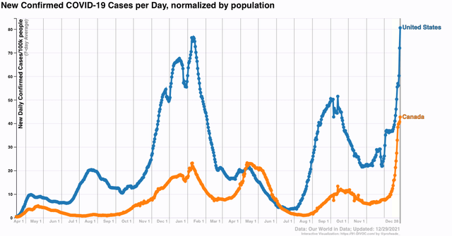

With Omicron, unfortunately, it would probably take something like 90% of the population being fully vaccinated to keep it from taking off. Canada may get there, but the sad truth is, the US *never* will.

By contrast, I just about nailed the trajectory of the Delta wave, using India, Israel, and the UK as my “leading indicators.” In all three, it appeared that Delta took 1.5-2 months to crest, and another 1.5-2 months to retreat. I used that as a template for what would happen in the US, and indeed in the US the Delta wave crested a little under 2 months after it started, and retreated for about 1.5 months thereafter. I was also in the ballpark very early about the number of daily cases and deaths at peak.

Now we are dealing with Omicron. I am hopeful (in a least-worst sort of way) that Omicron will do what Delta didn’t quite accomplish: infecting so many of the unvaccinated that a critical mass of the population builds up significant resistance to virulent repeat infections.

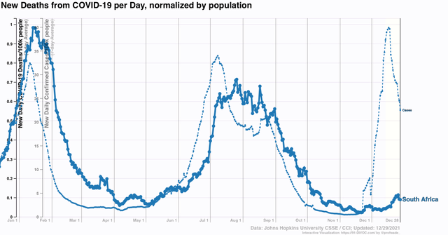
Here’s what the Omicron trajectory looks like in South Africa:

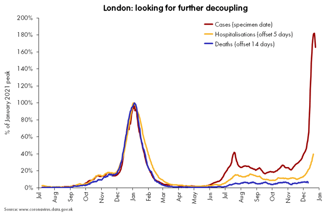
and here is London in the UK:

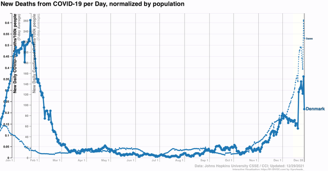
And here is Denmark, another early country where Omicron took off:

And finally, here is Puerto Rico, where over 80% of the population was fully vaccinated before Omicron:
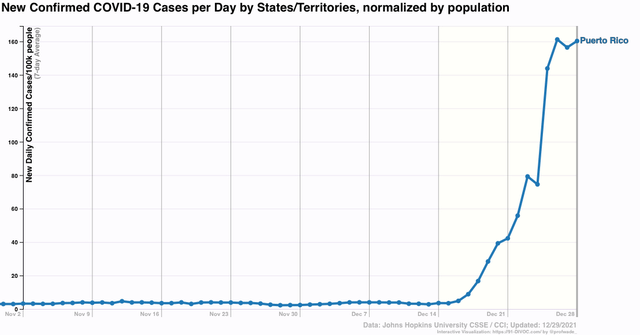

Puerto Rico, like Canada, shows that even 75% or 80% of a population fully vaccinated wasn’t enough to stop Omicron. But Puerto Rico, like South Africa, like London, and like Denmark, appears to show that Omicron rushes in like SuperDelta, peaking only 30-40 days after the initial cases. While it’s too soon to say for Canada or Puerto Rico, in the case of South Africa, and probably London and Denmark as well, there has been an order of magnitude fewer deaths than with prior similar waves of infection. The jury is still out on this, but as “leading indicators” these places give ample room for hope.

If the US as a whole follows South Africa and others, then Omicron will peak by early to mid-January, probably at 400,000 or more cases per day. But we might get lucky and never exceed the roughly 2200 mark of deaths daily set at the peak of Delta.

What then? The idea of eradication is long gone, not only because of how poorly so many humans have behaved in the US and elsewhere, but ultimately because the disease has ample additional animal reservoirs, such as deer and even house cats. Covid is going to become endemic. But as more and more people get infected with various strains, and more and more people are also vaccinated against those strains, it will find a smaller pool of people able to be infected. In other words, I expect successive waves to become smaller and smaller until ultimately COVID, while a big problem for people with poor immune systems, becomes part of the background noise of health.

Here again is the graph of the % of people fully vaccinated in the US, plus the total number of cases in the US, both on the same scale:
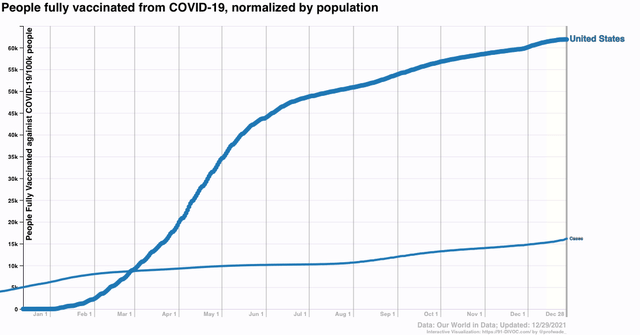

Since we know that about half of all COVID cases are asymptomatic, the likelihood is that 1/3rd or more of all Americans have been infected. And since the middle of the year, probably about 90% of those infected are among the unvaccinated.
On June 30, about 50% of people were fully vaccinated, and about 10% of the population had confirmed infections. Double that % of infections, and adjust for the fact that about 50% of prior infections were to people subsequently vaccinated, and you wind up with about 50%+10%, or 60% of the US population probably having some resistance. Fast forward to now, with about 62% of the population vaccinated, and another 6% of the population having subsequently been confirmed as infected, probably 90% of whom were unvaccinated, and you get 62% + 10% + (.9*2*6)% = 62%+10%+11%, or 83% of the US population with some resistance to COVID. 

I think by the end of winter that last number could approach 90%. We may also get the last batch of young children approved for vaccination. In short, in other words, I am not fatalistic, and remain hopeful that by spring, the reservoir of easy pickings for COVID in the US will have shrunk enough that subsequent waves will be progressively smaller, and progressively less fatal.