Saturday, April 14, 2018
Weekly Indicators for April 9 - 13 at XE.com
- by New Deal democrat
My Weekly Indicators post is up at XE.com.
The long leading indicators keep tiptoeing closer and closer to neutrality.


Friday, April 13, 2018
February 2018 JOLTS report: positive trend revised away
Last month I wrote that the January JOLTS report reflected very positive trends. Today they got revised away.
As a refresher, unlike the jobs report, which tabulates the net gain or loss of hiring over firing, the JOLTS report breaks the labor market down into openings, hirings, firings, quits, and total separations.
I pay little attention to "job openings," which can simply reflect that companies trolling for resumes, or looking for the perfect, cheap candidate, and concentrate on the hard data of hiring, firing, quits and layoffs.
The first important relationship in the data is that historically, hiring leads firing. While the one big shortcoming of this report is that it has only covered one full business cycle, during that time hires have peaked and troughed before separations.
And here, there has been an important revision. Here is the historical relationship on a quarterly basis between hiring (red) and total separations (blue) as it existed through the end of the third quarter of 2017:


The updated graph shows hiring exceeding its prior peak in the second halfof 2017 with its last monthly peak in October. Significantly, hiring for the previous month was revised downward below this peak.
Meanwhile separations actually peaked before then, in July of last year, with a clear downtrend since, another significant revision since last month. *if* both have made their expansion highs, needless to say that would be important.
Meanwhile separations actually peaked before then, in July of last year, with a clear downtrend since, another significant revision since last month. *if* both have made their expansion highs, needless to say that would be important.
Further, in the previous cycle, after hires stagnated, shortly thereafter involuntary separations began to rise, even as quits continued to rise for a short period of time as well:

[Note: above graph show quarterly data to smooth out noise]
Here are voluntary quits vs. layoffs and discharges on a monthly basis for the last 2 years:

If we have established the expansion peaks in hiring and total separations, I would expect quits to continue to improve for a short while (as they have) before also beginning to decline. As in the last expansion, separations appear to have bottomed.
This month's report acts as a caution about revisions, most importantly by the downward revision in hiring and separations. Last month the trend appeared clearly positive for both, but as revised it is more questionable as to hires, and looks negative as to separations. That being said, I don't even see a yellow flag until hires and separations go negative YoY, as they did before well before the last recession (quarterly through Q4 2017 in the graph below):

They haven't yet:

If three months from now we haven't established any new highs in hires and total separations, and they are hovering at or below zero YoY, then we can talk about a late-cycle trend.
UPDATE: And for those of you -- I'm looking at you, Dave Wessel and Matt Yglesias -- shouting 'Huzzah!' because the ratio of job openings to the unemployment rate is back where it was in 1999 and 2000:

If those job openings corresponded with actual hires, you'd have a point:

They don't, and you don't
Thursday, April 12, 2018
Real average hourly and aggregate earnings: March 2018 update
- by New Deal democrat
Here's a look at two more labor market measures, now that we have the inflation data for March as well.
First, here is real average hourly earnings for ordinary workers, normed to 100 as of its peak last July:

With -0.1% deflation for the month, and +0.1% nominal growth, there was a little improvement, but we are still -0.6% below the peak over half a year ago.
We are less than +0.1% better than one year ago, and truth be told, there hasn't been any significant improvement at all in over two years.
Second, here is real aggregate payrolls:

This tells us how much more income is flowing to workers as a whole in the expansion, by accounting for changes in hours worked and growth in the number of persons employed.
Real aggregate payrolls have still been growing, albeit at a slower pace in the last two years and in particular since last July.
Basically the economy is going to continue to be OK so long as consumers continue to buy new houses and purchase other durables like vehicles. Since 2016 they've gone into savings to do so. Meanwhile consumer credit standards generally have been slowly tightening:

although standards for GSE mortgage loans remain loose:

Due to a glitch, the last several quarters aren't shown on the FRED graph, but as of Q1 they remained a loose -8.3.
Next week we'll start to get the March data on housing.
Wednesday, April 11, 2018
Further decelerataion in several long leading indicators
- by New Deal democrat
Since the beginning of this year, I have noted the deceleration in real M1 and in purchase mortgage applications.
While neither has turned negative, there has been further deterioration in the positive readings of each.
This post is up at XE.com.
Tuesday, April 10, 2018
Is raising wages becoming a taboo?
- by New Deal democrat
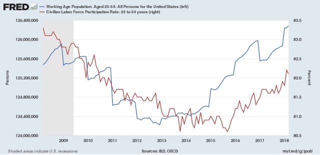
Yesterday I noted that, while the problem of lower labor market participation among the working age population hasn't *entirely* resolved, it is getting close to resolving due to the surge in entry into the jobs market in the last two years. As the graph below shows, not only has the prime age population grown by about 2 million in the last 2.5 years (blue), but nearly an additional 2 million (1.5% of 125 million) have entered the labor force (red):
But,while in accord with the last two expansions, nominal wage growth bottomed out once the U6 underemployment rate fell to roughly 9%, for nonsupervisory workers, it has languished at about 2.5%:

This is less than the roughly 4.5% peaks in the past 3 expansions.
Why?
MONOPONY VS. SKITTISHNESS VS. TABOO
One explanation is in the first graph above itself. All else being equal, even accounting for population growth, there are 2,000,000 more candidates for jobs in the prime age labor force than there were 30 months ago. More competition for jobs should act to hold down compensation.
But recently another explanation has been written about at length: monopsony in the labor market. In more plain english, this is a monopoly or at least oligopoly on the demand side for labor. Increased market power to hold down wages, it is argued, is having that exact effect:
[I]n recent years, economists have discovered another source: the growth of the labor market power of employers — namely, their power to dictate, and hence suppress, wages.....[I]n many areas of rural America, [where] large-scale employers that dominate their local economies[, w]orkers can either choose to take the jobs on offer or incur the turmoil of moving elsewhere. Companies can and do take advantage of this leverage.
Yet another source of labor market power are so-called noncompete agreements .... These agreements prohibit workers who leave a job from working for a competitor of their former employer.
Almost a quarter of all workers report that their current employer or a former employer forced them to sign a noncompete clause.....[S]tudies have found that employer concentration has been increasing over time and that this concentration is associated with lower wages across labor markets.
....{Monopsonistic f]irms [which pay less than "competitive" wages] bear the loss in workers (and resulting lowered sales) in exchange for the higher profits made off the workers who do not quit.
While the evidence appears compelling that employer market power is having *an* effect of holding down wages, I am not sure at all that it is the *primary* driver of low wages.
At least two other explanations for employers refusing to raise wages come to mind:
- employer skittishness about the durability of a strong economy.
- raising wages has become a taboo
Let me explain each.
Suppose I am an employer in competition with others. Suppose further, however, that I am skeptical that the current "good times" are going to last. After all, since 2000 there have only been about 4 years at most (2005-07 and 2017) where the economy has seemed to be operating at close to full throttle. If I raise wages now, I will attract more workers, but then when the good times end, I will be stuck with a higher paid workforce than my competitors who haven't raised wages. If I think that "bad times" are likely to exist more often than "good times" in the foreseeable future, then I might hold back on increasing my labor costs during the good times, leaving some additional profits on the table, because that will be more than offset by having relatively lowers costs during the bad times.
By an economic taboo, I mean a decision to leave profits on the table because they conflict with an even higher priority held by the employer (e.g., I refuse to higher a clearly more qualified black job applicant because I am a racist). Let's suppose that I am an employer who *does* believe that the good times are likely to last, BUT I also believe that people who come to work for me ought to be grateful to earn, say $10 per hour, and because of my firm ideological belief, I am not going to budge. If I am alone in my ideological belief, I will suffer. But if my ideological belief is shared on a widespread basis by my competitors and other businesses, I am *not* at a competitive disadvantage. Thus depressed wages may persist because raising wages has become a taboo,
USING THE JOLTS SURVEY TO DISCRIMINATE AMONG THE HYPOTHESES
So, how can we tell if the primary driver of employer decisions not to raise wages is monopsony, skittishness, or taboo?
The JOLTS survey appears to give us a good look at the likely answer. JOLTS measures job openings, actual hires, and quits, among other things. Let me show you how.
To begin with, if skittishness about the durability of a strong economy is the primary driver of lower wages, I would not expect those employers to even go looking for new employees to hire at higher wages. In other words, there wouldn't be an elevated number of job openings compared with actual hires, because skittish employers simply aren't in the market.
On the other hand, both in the cases of monopsony power and taboo, I *would* expect to see elevated job openings, as in either case those employers *do* want to hire new workers -- they just want to hire those workers at what they define as their "fair" price, And that is exactly what we see in the JOLTS data during this expansion compared with the last one:

That is pretty compelling evidence that it is not economic skittishness that is driving low wage growth.
Minneapolis Fed President Neel Kashkari appears to agree:
"Almost everywhere I go, businesses tell me they can’t find workers. I always ask them the same question: 'Are you raising wages?' Usually, the answer is ‘no.’ When you want more of something but won’t pay for it, that’s called ‘whining,’” he told the ninth Regional Economic Indicators Forum (REIF), founded and co-sponsored by National Bank of Commerce. “Until you’re paying more, I know you’re not serious.”
So, how can we decide between the other two hypotheses? The Wall Street Journal (via Fundera) seems to think that smaller firms are offering bigger wage inducements:
The WSJ says small businesses across the country are increasing their wages at a faster rate than medium-size or even large firms. All industries with businesses made up of 49 or fewer employees saw a pay bump of just over 1%.
But the evidence is anecdotal, not hard data.
Again, the JOLTS survey seems to provide an answer in two parts.
First, as mentioned in the monopsony piece above, such firms should have "higher profits made off the workers who do not quit."
So let's look at the "Quits rate" in the JOLTS survey:

Workers are quitting their jobs at virtually the same rate in this expansion as during the last one, during which wage growth was higher. There simply isn't a bigger pool of "workers who do not quit."
A second thing we ought to find, if monopsony is the primary driver of low wage growth, is that bigger firms with market power ought to have unfilled job openings at a much higher rate than firms in small, more competitive labor markets. This is backed up by a scientific study:
[I[n a competitive labor market, such “shortages” [of hiring compared with job openings as measured in the JOLTS report] should dissipate as employers competitively bid up wages to fill their vacancies. But counter to this prediction, Rothstein (2015) finds no evidence that wages have grown faster in sectors with rising job openings. Instead, the failure of hiring and wage growth to keep pace with the rise in job openings is consistent with the incentives faced by firms in an imperfectly competitive labor market; it suggests that companies have a strong interest in hiring workers at their offered wages, but have resisted bidding up wages in order to expand their workforces (Abraham 2015).
As it happens, we are able to able to infer a comparison in Rothstein's metric between large and small firms.
Above I showed job openings (blue) vs. actual hires (red) in the JOLTS survey. The National Federation of Small Business conducts a similar survey among its members. Here are their graphs of job openings and actual hiring from their most recent report:


Small business owners clearly started singing "Happy Days are Here Again" on the day after the 2016 Presidential election. And their job openings soared.
But their actual hires didn't. They are adding jobs at the same level as they did in 2014 and 2015. They are behaving as if they have a taboo against raising wages.
So in conclusion, while I have no doubt that the "monopsony" argument is measuring something real, I am more and more inclined to believe that raising wages is simply becoming an ideological taboo among businesses, a higher priority than maximizing net profits after costs.
Monday, April 9, 2018
Scenes from the March employment report: no change in ongoing trends
- by New Deal democrat
While it certainly has shortcomings, there is simply no other report that captures in timely fashion the factors that matter most to the vast majority of Americans' economic well-being than the monthly jobs report.
Let's take a look at a few of the things that stood out.
First of all, marking myself to market, last week I said I was expecting another good employment report. That didn't happen, as at least on the surface, neither of my forecasts panned out. So let's start there.
Historically, consumer spending leads hiring. I thought the surge in spending last autumn would continue to be felt in March. Not so as of the preliminary report!:
Let's take a look at a few of the things that stood out.
First of all, marking myself to market, last week I said I was expecting another good employment report. That didn't happen, as at least on the surface, neither of my forecasts panned out. So let's start there.
Historically, consumer spending leads hiring. I thought the surge in spending last autumn would continue to be felt in March. Not so as of the preliminary report!:

But even with the miss, Q1 hiring was the highest in a year. We'll see what revisions do (for example, last September's originally reported -33,000 job loss has been revised to a gain of +14,000), and I still do expect some further carryover from spending to hiring this quarter.
Incidentally, even with the surprisingly low monthly gain, it was enough so that YoY job growth still exceeds the increases in the Fed funds rate -- which would have been a "yellow flag" caution of an increased risk for a downturn in the economy under the simple employment model I have been toying with recently:

I also expected the unemployment rate to decline to a new low. That actually did happen, but not by enough when you round out to the nearest 10th, as the unemployment rate fell from 4.14% to 4.07%:

A favorable change of 40,000 in either or a combination of jobs or the civilian labor force would have been enough to lower the rounded number to 4.0%.
Until recently, the level of labor force participation has been a big issue. That isn't entirely abated, but it is abating (blue in the graph below):

What remains a big issue is the lack of wage growth (red in the graph above). Below are all wages YoY (blue) compared with wages of non-managerial workers YoY:

The 80% or workers who aren't managers or professionals are still seeing really mediocre wage growth (and virtually none at all if we factor in inflation).
We can use this to back into managerial wage growth, but that is best viewed on a quarterly basis, because the sample size is smaller (only 20% of the total) and so much noisier on a monthly basis:

I continue to believe that the surge of people back into the labor force during the last two years -- the biggest such surge in several decades -- is creating a bigger pool of job candidates and is thus at least one explanation for the poor wage growth of nonsupervisory employees.
Recently, an explanation for the quandary of poor wage growth has emerged that highlights the effects of monopsony -- that is, employers with the market power to hold down wages. I want to discuss that at some length, and consider at least two other potential explanations: skittish economic expectations and an emerging taboo against raising wages. I will do that in a separate post.
Saturday, April 7, 2018
Weekly Indicators for April 2 - 6 at XE.com
- by New Deal democrat
My Weekly Indicators post is up at XE.com.
Last week interest rates declined but spreads tightened. This week interest rates rose and spreads widened.
Friday, April 6, 2018
March jobs report: surprisingly weak
- by New Deal democrat
HEADLINES:
- +103,000 jobs added
- U3 unemployment rate unchanged at 4.1%
- U6 underemployment rate fell -0.2% from 8.2% to 8.0%
Here are the headlines on wages and the chronic heightened underemployment:
Wages and participation rates
- Not in Labor Force, but Want a Job Now: fell -35,000 from 5.131 million to 5.096 million
- Part time for economic reasons: fell -141,000 from 5.160 million to 5.019 million
- Employment/population ratio ages 25-54: fell -0.1% from 79.3% to 79.2%
- Average Weekly Earnings for Production and Nonsupervisory Personnel: rose $.04 from $22.38 to $22.42, up +2.4% YoY. (Note: you may be reading different information about wages elsewhere. They are citing average wages for all private workers. I use wages for nonsupervisory personnel, to come closer to the situation for ordinary workers.)
Holding Trump accountable on manufacturing and mining jobs
Trump specifically campaigned on bringing back manufacturing and mining jobs. Is he keeping this promise?
Trump specifically campaigned on bringing back manufacturing and mining jobs. Is he keeping this promise?
- Manufacturing jobs rose 22,000 for an average of +19,000/month in the past year vs. the last seven years of Obama's presidency in which an average of 10,300 manufacturing jobs were added each month.
- Coal mining jobs were unchanged for an average of +75/month vs. the last seven years of Obama's presidency in which an average of -300 jobs were lost each month
The more leading numbers in the report tell us about where the economy is likely to be a few months from now. These were mainly negative.
- the average manufacturing workweek fell -0.1 hours from 41.0 hours to 40.9 hours. This is one of the 10 components of the LEI.
- construction jobs decreased by -15,000. YoY construction jobs are up +228,000.
- temporary jobs decreased by -600.
- the number of people unemployed for 5 weeks or less decreased by -221,000 from 2,508,000 to 2,287,000. The post-recession low was set over two years ago at 2,095,000.
Other important coincident indicators help us paint a more complete picture of the present:
- Overtime fell -0.1 hours to 3.6 hours.
- Professional and business employment (generally higher-paying jobs) rose by +33,000 and is up +502,000 YoY.
- the index of aggregate hours worked in the economy fell by -0.2%.
- the index of aggregate payrolls was unchanged.
Other news included:
- the alternate jobs number contained in the more volatile household survey increased by +163,000 jobs. This represents an increase of 2,683,000 jobs YoY vs. 2,261,000 in the establishment survey.
- Government jobs rose by 1,000.
- the overall employment to population ratio for all ages 16 and up was unchanged at 60.4 m/m and is up +0.2% YoY.
- The labor force participation rate fell -0.1% to 62.9 m/m and is down -0.1% YoY
SUMMARY
This was a surprisingly weak report. While manufacturing employment continued to gain, and measures of underemployment fell (but not to new lows), most of the indicators fell. Some of these, like aggregate hours, the employment population ratio, and the labor force participation ratio, simply gave back last month's improvement.
But that three of the four leading indicators, plus revisions, in the report declined is not welcome news (although obviously only one month), and wage growth for ordinary workers remains tepid at 2.4%.
If the jobs boost from last autumn's spending by consumers is over, then the slow late-cycle deceleration in jobs growth can be expected to resume.
UPDATE:
Here is the quarter on quarter growth rate of jobs since the beginning of this expansion:

The last three months together were still the best in the past year. But my suspicion is that we will see a resumption of the downtrend that began in early 2015 going forward.
But that three of the four leading indicators, plus revisions, in the report declined is not welcome news (although obviously only one month), and wage growth for ordinary workers remains tepid at 2.4%.
If the jobs boost from last autumn's spending by consumers is over, then the slow late-cycle deceleration in jobs growth can be expected to resume.
UPDATE:
Here is the quarter on quarter growth rate of jobs since the beginning of this expansion:
The last three months together were still the best in the past year. But my suspicion is that we will see a resumption of the downtrend that began in early 2015 going forward.
Thursday, April 5, 2018
April reports of short leading indicators start out good
- by New Deal democrat
April reports started out this week with three positive readings of short leading indicators.
First, the ISM manufacturing index, and in particular its new orders subindex, pulled back slightly but remained at very strong levels:

Second, motor vehicle sales came in at a solid --- units annualized:

This series tends to broadly plateau during expansions. If it were to drop below 16.5 million units annualized, especially for longer than one month, that would be cause for concern.
With GM dropping out, the future of this data is uncertain. Vehicle sales ex-GM would still be a worthwhile metric, but unless that is calculated, it will only be useful on a m/m basis until at least there is one year's worth of data -- and that assumes other manufacturers don't follow GM's lead.
Finally, factory orders also increased. Below I am showing the core reading ex-aircraft and defense:

The last three months have seen the highest readings in nearly 4 years. Note that this data series is noisy, and wasn't leading at all in 2008, so it is of very low utility.
In terms of the economy over the next 3 to 6 months, so far, so good in April. Tomorrow we will get two more short leading indicators, manufacturing workweek and short term unemployment, as part of the jobs report.
Wednesday, April 4, 2018
Why I'm expecting a good employment report on Friday
- by New Deal democrat
ADP reported private payroll growth of 241,000 this morning, which prompted me to recall that two other short leading indicators of employment also suggest that we'll get another good employment report on Friday.
First, consumer spending leads employment. I began tracking this nearly 10 years ago during the Great Recession. In autumn 2008 real retail sales fell off a cliff, but when they landed with a ker-SPLATT!!! a few months later and stopped falling, it was a signal that economic growth would probably follow in a few more months - and it did. I have continued to note this occasionally during the last nearly 9 years of expansion.
Well, a few months ago -- probably due to repairs necessitated by the hurricanes, and the fires in California -- there was a surge in consumer spending. The below graph compares YoY real consumer expenditure growth (blue) vs. jobs growth (red):

You can see that consumer spending leads employment by generally 3-6 months. Here's a closeup of the last several years:

You can see the bump last autumn in spending. That ought to still be feeding through to some extra growth now.
Second, the unemployment rate is likely to decrease as well. This is because initial jobless claims lead the unemployment rate by about 1-3 months, as shown in the graph below (and although I won't bother showing this time, the relationship goes back 50 years!):

In the last two months, initial claims have dropped to yet more 45 year lows. The unemployment rate should be following.
While this doesn't change the longer term trend that we are in the decelerating part of the expansion, and the signs are that consumer spending growth has paused again in Q1 2018, in the short term of the next couple of months the jobs reports should be bearing good news.
Tuesday, April 3, 2018
Residential construction spending portends slowdown for remainder of2018
- by New Deal democrat
Yesterday's February report on private residential construction spending is of particular importance to the overall direction of the economy this year.
In terms of their order in leading the economy, the housing data I track runs in this order:
- new home sales (but these are very volatile and heavily revised, so the signal to noise ratio is low)
- permits (much less volatile)
- single family permits (even less volatile - signal to noise ratio is high)
- housing starts (more volatile than permits, but have the advantage of being "hard" economic activity)
- residential construction spending (the least volatile of all of the data, even though less leading)
- residential fixed investment (part of quarterly GDP, so the last reported)
There is also the weekly mortgage applications report, which recently has tracked new home sales better than the other series, but has had compositional issues in the past.
Here are the two least volatile series, single family permits (blue) vs. inflation-adjusted private residential construction spending (red) for the last 15 years:

You can see the relative advantages of each. Single family permits are more leading, but somewhat more noisy, while residential construction spending is not noisy at all, but follows a few months after permits.
Notice the flattening of the blue line for the last year or so. That becomes more apparent when we look at the q/q percent change in construction spending (nominal in the two graphs below):

Since we only have the first two months' data for 2018, let's look at the same data m/m for the last year:

Even nominally, so far the first quarter of 2018 is showing growth at a rate of +0.2% q/q.
While we had slowdowns even more than this in 1994, 1996, and 2010 without recessions following, actual downturns in 1999 and 2006-07 did presage the recessions.
A look on a YoY% basis through February shows that single family permits have increased at about a 10% YoY pace, while real residential construction spending is only up about 4% YoY:

Finally, residential construction spending tends to correlate closely with private residential fixed investment in the GDP report:

The good news is that real private residential construction spending is still positive, so that adds to the evidence that no actual downturn in the economy will happen in the next 9 to 12 months, but on the other hand the bad news is that this is "hard" evidence of an impending *slowdown* in growth for the remainder of this year.
Monday, April 2, 2018
An update on the yield curve
- by New Deal democrat
When the Fed embarked on its tightening several years ago, I likened it to trying to steer between the Scylla of higher long rates that would kill the housing market, and the Charybdis of an inverted yield curve.
So, how are they doing? This update is up over at XE.com.
Sunday, April 1, 2018
A thought for Sunday: 2018 arctic ice cover
- by New Deal democrat
The National Snow and Ice Data Center reports that the peak in arctic ice cover this winter was the second lowest on record, just slightly above that of one year ago. The three next lowest peaks were in the three years just prior:

All of these are something like three standard deviations below the norm from 1980-2010.
The biggest abnormality this winter was that the Bering Sea between Alaska and Siberia did not freeze until very late. This encouraged the formation of persistent low pressure over the area, sending the jet stream high into the arctic from the Pacific for most of the season. And since what goes up must come down, that it did east of the Rockies
Since this is a US government web site, I am surprised that it is still available.
Saturday, March 31, 2018
Weekly Indicators for March 26 - 30 at XE.com
- by New Deal democrat
My Weekly Indicators post is up at XE.com.
Long bond rates delined this week (YAAAY!!) but since short rates remained flattish, the yield curve flattened (BOOOO!!).
Thursday, March 29, 2018
A note on personal income and spending
- by New Deal democrat
Personal income and spending data from February intimates a weak Q1 GDP report, but doesn't suggest any imminent downturn.
The first graph below compares real personal spending with real retail sales:

Real retail sales have pulled back from their autumn surge, and real personal spending has also declined slightly from its last peak in December. But we've had similar small drawbacks before, as in early 2012 and early 2014 without it portending anything horrible.
Meanwhile the personal savings rate rose significantly:

This metric tends to have a steep decline, as it did in 2016, sometime around the middle to late middle of an expansion. While a subsequent upturn in savings does occur in the advent of recessions, the data is too noisy to say anything concrete.
I find it particularly useful to compare the YoY% change in real retail sales and real pesonal spending. Retail sales growth tends to outpace the more broad measure of personal spending earlier in expansions, and underperform later in expansions after the midpoint. That's what we have now:

Almost certainly it was the autumn spurt in spending (possibly related to hurricanes and the fires in California) that was the outlier, rather than the subsequent several months.
BUT, note that the YoY% change in both has declined sharply in advance of the last several recessions. We don't see that at all now. Real personal spending growth continues at roughly a 2.5% annual pace, and real retail sales growth at a 1.5% pace. While this is the umpteenth confirmation that we are later in the cycle, only if we see a deceleration to nearly or less than 0% change in YoY retail sales would I become concerned about any imminent downturn.
Wednesday, March 28, 2018
Updates: 2018 forecast, stock vs. bond trends
- by New Deal democrat
I have updates on several recent posts, on my long term 2018 forecast, and whether the "economic season" is changing, over at XE.com.
Tuesday, March 27, 2018
DOOOMers gotta DOOOM: no, a recession isn't close
- by New Deal democrat
An initial note: this is a pretty slow news week. I do plan on a housing roundup over at XE, and if something looks especially interesting in the personal income and spending report, I'll comment. Aside from that, expect sparse posting from me.
But because I am a curmudgeon, and the scourge of DOOOMERs, herewith a dissection of a post I read this morning that had me shaking my head.
Mish, who's called for recession about 3 or 4 times in the last 8 years, is at it again, this time claiming that "Recession is Close," making use of the Philadelphia Coincident Indicator Index. I've reproduced his annotated graph below:

So the first thing that caught my eye is that the index hasn't changed much in the last year. Here's a closeup of the same YoY information:

In December, as Mish highlights, the value of the index was +2.7. But beginning a year ago in January, it has *also* been 2.7 or even less in 8 of 12 months. So, by his own standard, shouldn't a "recession have been close" a full year ago? Did I miss the "Recession of 2017" or something?
Next, in 3 of the last 4 recessions the YoY value of the index was declining sharply in the six months or so before their onset. Not so in 2017. So rather than YoY, here is the m/m change in values of the Coincident Index (from which I've subtracted -.2 to show the deceleration prior to the onset of recession):

Typically the m/m change in the Index was declining from +.3 or above to below +.2 in the six months before the recessions started. Now here's a closeup of the more recent data:

No such sharp deceleration here. Pretty much muddling along at +.2 or +.3. Not spectacular, but not suggesting any big dip in the next few months.
Finally, he takes a potshot at the Leading Index for the United States. Here's a graph comparing the two series:

The most positive value of the Leading Index in the month before any of the last 3 recessions was +0.57, so I've subtracted that in the graph above. Note that the leading index is well above that level now.
He doesn't like housing permits as a leading indicator, but does like starts. So let's look at both of those:

Housing starts, after a decline in mid 2017, in the last five months have risen to their previous highs from late 2016-early 2017, so they give him no help either.
You're not going to get any help from people who flit from data series to data series in support of the same old thesis, only to forget about them when the data goes the other way. While every economic cycle is a little different, and political decisions can throw a monkey wrench into the works at any time, left to its own devices there's simply no evidence that the economy is close to a recession now or will be in one before the end of this year.
Subscribe to:
Posts (Atom)