Tuesday, December 27, 2011

Think of All the Problems THIS Would Have Solved

In response to the outbreak of Korean War, we get this sane and reasonable policy response.  From the Federal Reserve's Economic Summary of 1950.
On the fiscal side, it was early and generally recognized that additional taxes were necessary in order to restrain inflationary forces and to finance the defense effort on a pay-as-you-go basis. Congress enacted a broad increase in taxes on personal and business incomes in September and a corporate excess profits tax around the turn of the year.  (from page 2 of the report).
Wow -- a recognition that war is expensive and, as such, maybe we should figure out a way to pay for it.  That's a great policy.  Think of all the problems that this would have solved if we had done this 10 years ago.....

Also note this in no way hindered economic growth, as the economy boomed in 1950 and 1951

Morning Market -- Is the Market Breaking Out?

Over the last few months, the equity markets have been consolidating.  On Friday, the SPYs broke out:


However, the break-out is very weak -- the candle is small and volume is low.  While the MACD has given a buy signal, the indicator is actually very weak.  And the volume indicators are also weak.  Finally, the EMAs are in a very tight bunch and offer no real help.

The break-out came at the end of the day on a buying surge.  My guess is this is purely technical buying.


However, the IWMs have not broken out.  The average has also printed some very weak candles over the last two sessions.


And the QQQs are still in a very tight range as well.

So -- the only equity index that has broken out is the SPYs.  That is not a bad thing -- after all, one average has to break out before the others.  However, the weakness in the IWMs is troubling; ideally we'd like to see the more speculative indexes move higher first on very strong volume.

In addition, consider where the SPYs are rallying:


Staples, utilities and health care are all responsible for the break-out.  Other, more aggressive areas of the market are still in ranges. 

This is not to say a true break-out is not possible under these circumstances.  For example, consider these charts of various treasury market segments:


 The IEIs have broken their trend line


 The IEFs are just below their trend line, as are


 are the TLTs.

The above charts tell us that money is probably starting to move out of the treasury market.  This is often an event that proceeds a rally as investors look to raise cash to move into equities.

All rallies have some unique characteristics.  However, for me to really agree we're seeing a break-out, I need to see other averages (especially the IWMs) break out on solid volume.   In addition, we need more SPY volume.  We also need to see other, more aggressive sectors rally.To that end, the next moves -- should they occur -- will probably be in the industrials and financials.  Consider these charts:


The XLIs are right at resistance, as are

The XLFs.

Monday, December 26, 2011

We'll Return Tomorrow

The markets are closed today; we'll return in the AM.

Until then, please enjoy a slow-paced Monday.


Saturday, December 24, 2011

Weekly Indicators: turbocharging Santa's sleigh edition

- by New Deal democrat

The only poor news reported this week was in the rear-view mirror, where the final revision showed 3Q GDP to be even weaker than previously thought at +1.8%. Monthly data was strong, as housing permits and starts were the strongest in 3 years leaving aside the month when the $8000 housing credit expired. Consumer sentiment rebounded further and has now made up nearly all of its debt debacle induced slide. Durable goods also came in stronger than expected. Existing home sales improved from the month before. New home sales improved as per expectations. Personal income and saving were up slightly. The LEI were reported up +.5.

This week, the high frequency weekly indicators lit an afterburner for a closing kick to the year, as they were all either strongly positive or at least neutral. They are at the point where holiday seasonality strongly affects their week over week performance. I again remind new readers that my "Weekly Indicators" column is not designed to be a big picture forecast of the future, but rather by use of high frequency data to capture an up-to-the-minute snapshot of the economy as it is right now.

Perhaps the strongest kick came from rail traffic, which has been on the rebound for months. This week it delivered the best comparison in years. The American Association of Railroads reported that total carloads increased 9.2% YoY, up about 45,300 carloads YoY to 538,000. Intermodal traffic (a proxy for imports and exports) was up 13,200 carloads, or 6.0% YoY. The remaining baseline plus cyclical traffic increased 31,800 carloads or 11.7% YoY.

Turning to jobs, adjusting +1.07% due to the 2011 tax compromise, the Daily Treasury Statement showed that withholding for the first 15 days of December stood at $114.4 B vs. $109.9 B a year ago for a gain of 4.5 B. For the last 20 reporting days, $148.1 B was collected vs. $139.1 B a year ago, a gain of $9.0 B or +6.5%. This is a marked and welcome contrast with last week's YoY -1.1% loss.

The BLS reported that Initial jobless claims declined by 2,000 to 364,000. This is the lowest figure in over 3 1/2 years. The four week average declined by 7500 to 380,250. Take both of these with grains of salt since this is the third week where year-end seasonality is significant. Even if the numbers are slightly overcompensating for seasonal factors,however, the trend is excellent.

The American Staffing Association Index remained at 92 last week. This series will plummet in the next couple of weeks due entirely to seasonality. It is still slightly below last year's levels, after stagnating earlier this year.

Turning next to housing, for the fourth week in a row, YoY weekly median asking house prices from 54 metropolitan areas at Housing Tracker were positive, up +1.3% YoY. The areas with YoY% increases in price remained at 25, just two short of 1/2 of all areas. The number of areas with greater than 10% YoY declines increased by 1 to 2 due to an apparent glitch in the December 2010 data for New Orleans.

The Mortgage Bankers' Association reported that seasonally adjusted purchase mortgage applications decreased -6.9% last week, continuing its decline from one week before. On a YoY basis, purchase applications were down -4.9%. The actual reading remains firmly within the range that purchase mortgage applications have been in since May 2010. Refinancing fell -6.9% w/w.

Retail same store sales were tepid to good. The ICSC reported that same store sales for the week ending December 17 increased a strong 4.6% YoY, and were also up 3.4% week over week. Shoppertrak reported that YoY sales increased 1.3% YoY and reversed last week's big decline, with a 21.7% gain. Johnson and Redbook reported a 3.4% YoY gain.

Weekly BAA commercial bond rates decreased .10% to 5.20%. Yields on 10 year treasury bonds also fell .10% 1.94%. For the last month before this week, spreads widened again, representing increasing weakness.

Money supply has been generally flat since its Euro crisis induced tsunami of several months ago. M1 decreased -0.1% last week, and was unchanged month over month. It is now up 17.7% YoY, so Real M1 remains up 14.3%. This is about 7% under its peak YoY gain several months ago. M2 was up +0.3% w/w but also unchanged month over month. It remains up 9.7% YoY, so Real M2 was up 6.3%. This is also significantly less than its YoY reading at the crest of the tsunami.

Oil closed at $99.24 a barrel on Thursday. This slightly above the recession-trigger level calculated by analyst Steve Kopits. Gas at the pump fell $.06 a gallon to $3.23. Measured this way, we are just about at the 2008 recession trigger level. Gasoline usage, at 8879 M gallons vs. 9213 M a year ago, was off -3.6%. The 4 week moving average is off -4.7%. Since March the YoY comparisons have been almost uniformly negative, and substantially so since July.

This week's data put a turbocharger on Santa's sleigh, with several reports giving the best reading in over 3 years, and others at least moving forward slowly but smoothly. Even Oil, while always a concern, left a little extra change in consumers' pockets compared with the last 11 months.

Have a Merry Christmas or at least a nice long weekend!

Friday, December 23, 2011

Bonddad Linkfest

  1. Copper traders most bullish in two months
  2. Oil heads for biggest gain in two months 
  3. Corn has longest rally of the year
  4. UK services economy contracts
  5. Ron Paul has a turn as GOP front runner
  6. LEIs increase

You're reading the right blog: bottom-calling edition

- by New Deal democrat

I hope you'll forgive me for tooting this blog's horn a little bit. While we have many readers who followed us over from the progressive blogosphere, we also have many new readers from places like Seeking Alpha, Business Insider, and Abnormal Returns.

On August 8 of this year, the S&P 500 closed at 1119.46. The next day it set an intraday low of 1101.54. Then on August 10 it closed at 1120.76.

On August 12 Bonddad wrote that It looks like SPY's are forming a rounding bottom. On the morning of the 10th immediately after the intraday low, based on investor sentiment and several Doomer contrary indicators, I had written, BREAKING: THE BOTTOM IS IN!!!.

Indeed, that was a rounding bottom, and barring a catastrophe in the coming week, with the exception of the closing 10 minutes on October 3, when the S&P got 0.2% lower to 1098.92, that was the bottom for this entire year

Before you think of stopped clocks and such, this is the second year in a row in which this blog has called the yearly bottom in real time. On July 6, 2010, I wrote that market sentiment is a big, fat, hanging fastball and said it looked like we were close to a bottom. And sure enough, the intraday low of all of 2010 was the day before.

There are plenty of other contrarian but correct calls Bonddad and I have made over the last 5 years. Those of who who've known us all along, thanks for continuing to read us, and Welcome! to all of you newcomers.

Weekly Indicators will be posted tomorrow as usual. Aside from that, I'm taking a break for a few days, but hope to post year end wrap-ups on housing, oil, deleveraging, and a personal reminiscence.


Merry Christmas or Happy Holidays, whichever you prefer!

2011 Year in Review: Manufacturing

Let's continue looking at the last 12 months to see where the economy is growing -- and where it's not.


Overall industrial production is rising.  It rose in January of this year, moved sideways through the Spring, and then moved higher again 5 months ago.


We see the exact same pattern with capacity utilization.


The ISM number dropped sharply in May of this year and has been hovering just above 50 for the remainder of the year.  However, the overall number is still positive.


Over the last two months, the new orders component of the ISM figure has increased, as has


production index.  Finally,


The employment number is still low, but also still in positive territory.


Finally, the overall trend for durable goods new orders is higher; however, it's been a bumpy ride.  Orders peaked four months ago and have been drifting sideways since.

I covered the latest two Empire State and Philly Fed manufacturing indexes here.  Both showed an overall increase, although both are still at levels just over expansion.

Here is the latest report from the Richmond Fed:
In November, the seasonally adjusted composite index of manufacturing activity — our broadest measure of manufacturing — increased six points to 0 from October's reading of −6. Among the index's components, shipments gained seven points to 1, while new orders edged up three points to finish at −2 and the jobs index steadied, moving up seven points to 0.

Most other indicators also suggested modest improvement. The index for backlogs of orders rose five points to finish at −10, while the capacity utilization indicator edged down two points to −6. Additionally, the delivery times index increased three points to end at 5, while our gauges for inventories were slightly lower in November. The finished goods inventories index fell five points to 18 and the raw materials inventory index lost ten points to end at 15.
The latest Dallas Fed number turned negative:
Texas factory activity decreased in November, according to business executives responding to the Texas Manufacturing Outlook Survey. The production index, a key measure of state manufacturing conditions, dipped from 4.1 to –5.1, registering its first negative reading in two years.

Other measures of current manufacturing conditions also indicated contraction in November. The new orders index suggested deterioration of demand, falling to –5.1 after a year in positive territory. Eighteen percent of manufacturers noted increased order volumes in November, compared with 23 percent noting a decrease. The shipments index edged down from 2.7 to –1.1, suggesting the volume of shipments fell slightly. The capacity utilization index tumbled to –10.2 after several months of weak readings centered around zero.
The latest KC Fed was barely positive:
The month-over-month composite index was 4 in November, down from 8 in October and 6 in September (Tables 1 & 2, Chart). The composite index is an average of the production, new orders, employment, supplier delivery time, and raw materials inventory indexes. Manufacturing
activity slowed in nondurable goods factories, while growth increased in durable goods producing plants, particularly for aerospace and fabricated metal products. Most other month-over-month indexes also eased somewhat in November. The production and shipments indexes decreased to 0, and the new orders and order backlog indexes were negative. The employment index dropped to its lowest level of the year but remained slightly positive, and the new orders for exports index moderated slightly. Raw materials inventories continued to grow moderately, while the finished goods inventory index moved sharply higher.
The Last Chicago Fed number increased and the overall trend of this number has been positive for some time:

The Chicago Fed Midwest Manufacturing Index (CFMMI) increased 0.7% in October, to a seasonally adjusted level of 85.5 (2007 = 100). Revised data show the index increased 0.2% in September. The Federal Reserve Board’s industrial production index for manufacturing (IPMFG) increased 0.5% in October. Regional output in October rose 7.3% from a year earlier, and national output increased 4.5%.

Production in three of the four regional sectors increased in October:
• Regional auto sector production increased 2.3%;
• Regional resource sector output rose 0.5%;
• Regional machinery sector production moved up 0.3%; and
• Regional steel sector output decreased 0.4%.
The region’s auto sector production increased 2.3%
Overall, the numbers in this part of the economy dropped in reaction to the Japanese situation, but never contracted into negative territory.  In addition, over the last few months, the ISM new orders and production numbers are pointing to possible increases over the first part of next year.


Monetary Velocity is Still WAY Too Low -- and Headed in the Wrong Direction

Velocity is the speed at which money flows through the economy.  Think of it this way: suppose an economy has 10 people and only 10, $1 bills.  Now let's suppose that in year X, each person buys 1 item from somebody else.  Compare that to the situation where 1 person purchases 5 things from either the same person or a different combination of people.  Either way, the second situation is far healthier because more is going on.

Right now, all the velocity indicators of the various monetary measure are low and declining.  That is a very bad situation as it indicates that -- despite the Fed flooding the economy with money -- people are hoarding dollars.


Morning Market


After gapping higher and then rallying, the dollar moved downward in a channel before gapping lower three days ago.  However, prices have been moving sideways for the last three days and are still above the lows set from the upward gap.


The IEIs are right at technical support.  While the chart is still bullish technically (EMA, A/D, CMF and MACD), prices advanced through technical resistance a few weeks ago but couldn't hold onto the rally.  This chart bears watching as it could be the first treasury sector to move below important resistance.


After falling earlier this year, copper have been consolidating for the last three months in a symmetrical triangle.  However, note the A/D line is still at levels seen earlier this year, and the CMF indicates we haven't seen a massive exodus from the market.  Also note the MACD is very close to giving a buy signal.


The Australian dollar -- which has been consolidating in a symmetrical triangle -- is close to a break-out.


Finally, the IWM (the Russell 2000) is still consolidating. Notice that as prices have approached the upside resistance line the candle bodies have gotten smaller. 

Thursday, December 22, 2011

Bonddad Linkfest

  1. Republicans face pressure on payroll tax fight
  2. India food inflation slowest in nearly 4 years
  3. Central Bank of India holds repo rate steady 
  4. UK shows growth in 3Q 
  5. Italy heads toward recession 
  6. ECB unleashes wall of money 
  7. EU problems will hurt states 
  8. US truck tonnage increases
  9. EU consumer confidence falls
  10. Home resales rise 4%

1950: Industrial Production

Below are excerpts from the 1951 Economic Report to the President on 1950's production.


In addition, here is the accompanying chart:


The Great ECRI vs. LEI smackdown: it's about Bonds, Corporate Bonds

- by New Deal democrat

A month ago I noted the deep difference between the Conference Board's LEI, and ECRI's WLI. The Conference Board has been calling for continued growth in the months ahead, while ECRI has remained steadfast in its recession call. Doug Short has called it The Great Leading Indicator Smackdown. This graph from his blog shows the major divergence between these two leading indicators since late 2008:


With this morning's LEI of +.5, the schism continues. At least one of these forecasts is wrong, possibly spectacularly so.

The source of the divergence is primarily almost certainly how the two sets of indicators measure bonds. Almost everybody acknowledges that the bond market is an important leading indicator, but in the last 5 years depending on your measure, the nature of that forecast differs markedly.

The Conference Board very transparently states that it is the yield curve -- the difference between long term and short term treasuries -- that it measures. In fact, it is one of the two weightiest elements of the LEI. The yield curve has been relentlessly and substantially positive since late 2007, and is the biggest contributor, along with real M2 and the stock market, to the LEI's almost continuous positivity since spring 2009.

ECRI, of course, uses a "black box", but we know from at least as late as 1992 that its founder, Prof. Geoffrey Moore, considered bond prices generally to be a "long leading indicator," i.e., a measure of how the economy was likely to perform at least 6 to 12 months later. ECRI's current spokesman, Lakshman Achuthan, has specifically indicated in at least one interview that the yield curve, however, is not one of their measures.

How and whether bonds are measured makes all the difference in forecasts for 2012. The San Francisco Fed (h/t our former co-blogger Invictus) has pointed out that if you remove the yield curve from the LEI, the forecast for late 2011 and early 2012 becomes flat at best (graph measures chances of recession):


But it seems that ECRI goes beyond that and actually does include at least one if not two alternate measures of the bond market in its long leading indicators (USLLI) and/or the WLI: a broad bond index such as the Dow Jones Bond Average or BAA bonds; and credit spreads, i.e., the difference in yields between government and corporate bonds. In fact, as I'll show below it seems all but certain that ECRI does give heavy weight to the latter (credit spreads).

First of all, here is a graph measuring the yield curve (blue, left axis) vs. BAA corporate bonds (red, right axis) and the credit spread (green, right axis) since the beginning of 2006:


The yield curve inverted in early 2006 and remained inverted until spring 2007, accurately forecasting a recession one year later. Since the end of 2007, however, it has been strongly positive. Contrarily, both corporate bonds and credit spreads were flat going into 2007 and began to deteriorate after April, and reached their nadir in approximately November 2008 (probably not incidentally, ECRI is on record that its USLLI and WLI bottomed at this time).

Here is an alternate view of the same data norming all three measures to 100 at the beginning of 2006:


The yield curve remains steadfastly positive, although less so than previously, while BAA bonds (and the DJ Corporate Bond Index, not shown) turned down in late 2010 before turning up again earlier this year. Meanwhile, the credit spread peaked in April 2010 and has been deteriorating almost consistently since then.

Here is a close-up of the same data, beginning in January 2010 (note I've moved the yield curve to the right axis):


The yield curve remains positive - even though it tracks a similar trajectory to credit spreads. Corporate bond prices as measured by BAA bonds or the DJ Corporate Bond Index have been improving. Only credit spreads continue to deteriorate. They must be one of the important sources of the divergence between ECRI and the LEI.

We'll find out who is right next year. In the meantime, I leave you with the following graph and information. Here is a close-up of a portion of a graph from Ned Davis Research published in early 2008, showing long term government bonds (red) vs. short term government bonds (green):


With the near-exception of 1931 as the Fed defended the gold standard, the yield curve never inverted between 1929 and 1954. In other words, bluntly speaking, in times of deflation, a positive yield curve is not terribly predictive.

P. S.: By contrast, an inverted yield curve in the presence of deflation has only happened twice in the last 90 years -- 1928 and 2006-07. Which is why I call it
the Death Star.

1950: Employment and Income

1950 was a very good year for employment.  Consider the following charts:


The unemployment rate dropped over 2% - moving from 6.5% to a little over 4% by the end of the years.  And the employment growth was split between manufacturing and employment:


Manufacturing employment increased over 2 million while


service sector growth increased over 1 million.


Government employment also increase about about 400,000.


As a result of this activity, we see real disposable personal income increase on a YOY basis of over 9%.

Below are some charts on wages and savings from the 1951 Economic Report to the President that show the above information, but in 1950s econ style.


Morning Market

After using Quotetracker for the better part of 10 years, I've made the switch to Stockcharts.com as my source for stock charts.  I'm still getting used to the format, but so far I'm really impressed.  


Copper is still at low levels, and is currently trading in slightly downward moving channel.  Prices are still below the 200 day EMA, and the MACD is simply moving sideways.


The euro is in a downward sloping channel.  Also note the massive move from the security in the form of a declining A/D line and CMF.  The EMAs are bearishly aligned with all moving lower.  For the last five days, we've seen prices print very small bars as they consolidated after the move through early October's low.  


In contrast to the euro is the dollar, which has clearly benefited from the euro's sell-off.  Prices have moved through resistance and are now selling off in small candles as traders consolidate positions.  Unlike the euro, note the volume inflow into the dollar. 


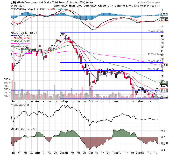
The grains complex (wheat, corn and soy beans) appear to have bounced off a bottom and are looking to hit resistance at the 20 day EMA.  However, the EMA picture is still bearish and the MACD is still in negative territory.  If this is a rebound in anticipation of a strong 2012, expect the next resistance level to be the 20 day EMA followed by the 38.2% Fib level.


The SPYs are still consolidating, and most likely won't break out in either direction until the new year.

Wednesday, December 21, 2011

1950s: The Discount Rate and 1950 Inflation


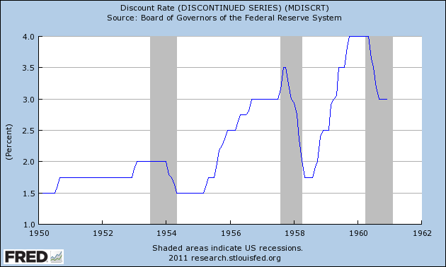
The above chart shows the Federal Reserve's Discount Rate for the 1950s.  Note that in the middle and end of the decade we see the Fed increasing rates to such a degree that they create a recession.  Then we see the Fed lower rates during the recession to spur growth.  This is what most people think of when they think of "recession and recovery."

That being said, let's take a look at inflation in the year 1950, as it explains the increase in the discount rate.


PPI continued to increase on a YOY rate, eventually reaching nearly 15%, while CPI continued to escalate as well, eventually hitting hear 6%.  So -- what caused these price increases?

1.) Massive demand.  PCEs increased at incredibly strong rates for the first three quarters of the year.  This led to a classic case of demand pull inflation.  Food prices were a big reason for the increase (which increased 4.8% from December 1949 to November 1950), as was an increase in house hold furnishings (which increased 9.1% from December 1949 to November 1950).

2.) The Korean War outbreak led to massive increases in raw material prices.  As the ERP notes, 75% of industrial goods had increased in price by mid-October, 44% had risen 10% or more, and 26% were up 20% or more above the pre-Korean war levels.

As an aside, here are the charts from the Economic Report to the President for both Whole
sale and Consumer prices.