Friday, March 31, 2023

Real income in February rises slightly; real spending declines slightly; real total sales in January rose sharply, as expected


 - by New Deal democrat


As I wrote earlier this week, personal income and outlays is one of the two most important data releases at the current time, along with the monthly jobs report. That’s because these are the two sectors of the economy that have most prominently not rolled over, and are keeping us out of recession.

This morning’s February release was the proverbial mixed bag.

Nominally, personal income rose 0.3% and spending rose 0.2%. But because the deflator also rose 0.3%, in real terms income was unchanged, and spending actually declined -0.1%. Here’s what they both look like since before the pandemic (normed to 100 as of 12 months ago):


YoY real spending rose 2.5%, and real income rose 1.1%. For comparison, here is the YoY% change over the past 20 years up until the pandemic:


A 2.5% increase in real spending is about par for the course for the past 20 years, while the 1.1% increase in real income is lower than almost all times outside of recessions (and for 2013, after Social Security withholding was increased by 1%):


Meanwhile, the personal savings rate rose 0.1% to 4.6%, which is a nice rebound from last June’s all-time low:


But on the other hand, a rise in the savings rate is typically seen just in advance of recessions, as consumers grow more cautious.

The personal income and spending release is also important because it feeds directly into 2 of the 4 coincident indicators most relied upon by the NBER to determine if the economy is in expansion or recession.

The first of the 2 is real personal income less government transfer receipts. This rose less than 0.1%, rounding to 0. While this has risen 0.9% in the past 6 months, it has only risen 0.25% for the last three:


In other words, this important coincident indicator could very well be peaking - and indeed, have peaked - in February.

The second of the 2 is real manufacturing and trade sales, which relies in part on the PCE deflator. This increased a sharp 0.5% for January, which sounds good:


But the big January increase was telegraphed by the huge 2.7% January gain in real retail sales (which make up about 1/3rd of the number) that we’ve already known about for the past month and a half. 

Because this economic series lags so much, you may recall that several weeks ago I premiered two systems to estimate it on a more timely basis. At that time I wrote:

“For January 2023 [using CPI rather than the PCE deflator] , the estimate is an increase of 0.8%. … Because “real” manufacturing and trade sales for December were only 0.4% lower than their all-time record in January 2022, the estimate forecasts that when the official result is reported on March 31, more likely than not it will set a new record.”

The second, more timely system is to average industrial production and real retail sales. Using that estimate, I wrote:

“This method is not so accurate as the 2nd estimate I discussed several days ago, but does give us the main thrust. Like the 2nd estimate, for January it forecasts a sharp increase (+1.5% vs. the +0.8% of the 2nd estimate), followed by a -0.4% decrease in February. Like the 2nd estimate, it indicates a new record high for January.”

As shown above, setting a new record for January is exactly what happened, with the early estimate’s +1.5% being not nearly so good as the later estimate’s +0.8%. I’ll be able to update the February estimate in a couple of weeks.

So to summarize: real personal income and spending were slightly positive to slightly negative, with real income and the savings rate both being consistent with a near recession. Similarly, real personal income less transfer receipts has been decelerating significantly, and may even have peaked in February. Finally, real manufacturing and trade sales rose sharply in January on the back of retail sales, but are likely to decline in February; indeed January may also have marked their peak.




Thursday, March 30, 2023

Revisions to Q4 GDP made real final sales worse, a potential portent of near in time recession


 - by New Deal democrat


A month ago, following another blogger, I took a look at real final sales, and real final sales to domestic purchasers, in the GDP - which increased less than 0.5% and just above 0% in Q4, and showed that in the past 60 years, only in the deep slowdowns of 1966 and 1987 were the numbers that low without having been followed within 1-3 quarters by a recession. Here’s a link to the full post from last month.


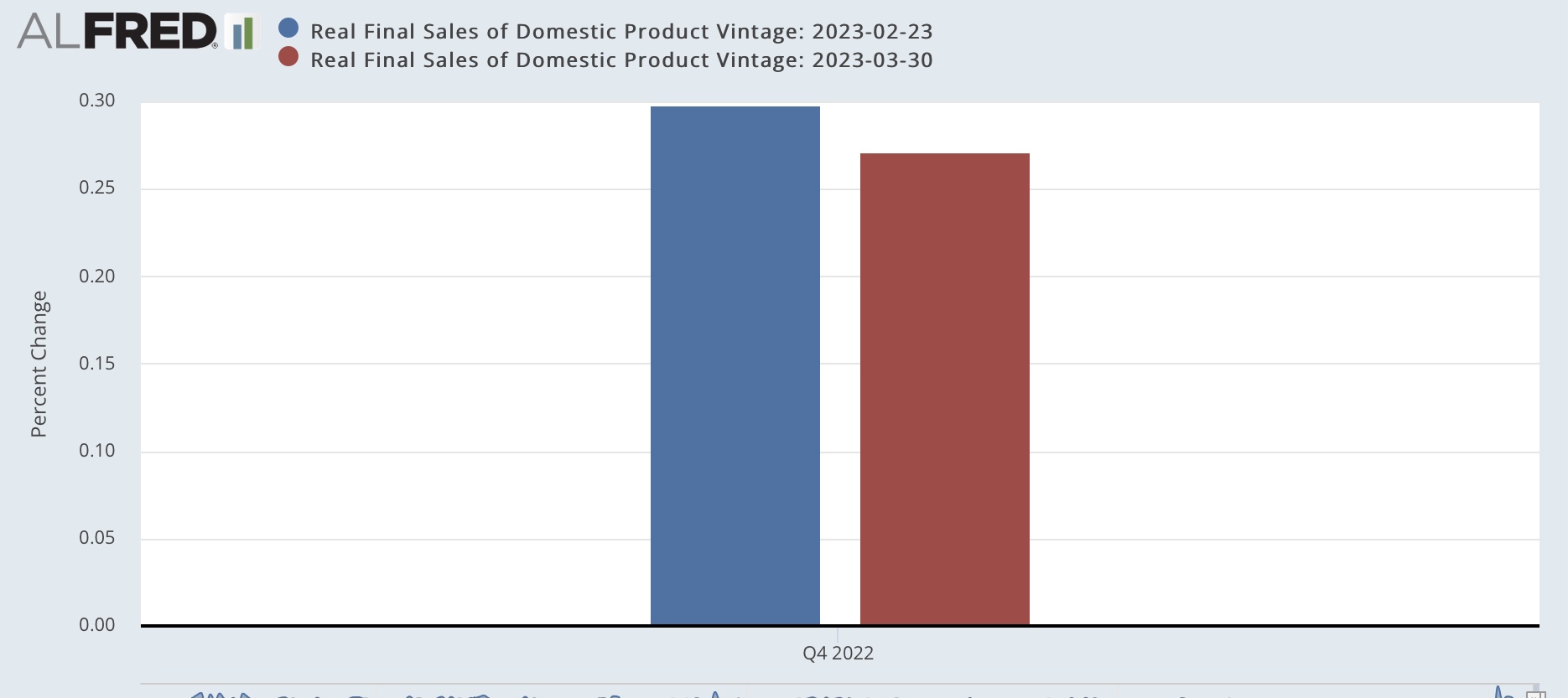
Well, in this morning’s final revision to Q4 GDP, both got revised even lower.

Here is the revision to real final sales:


And here is the revision to real final sales to domestic purchasers:


In the grand scheme of things, these are quite small revisions. But the fundamental point is that Q4 GDP was held up by inventories, which will have to be liquidated at some point. As I pointed out last month, that process of liquidation has typically meant production cutbacks as well as layoffs of some of the workers on those production lines.

With the advent of “just in time” inventories in the 1990s, manufacturers had been doing that quite quickly, which meant without enough disruption to give rise to a recession. But I noted that the pandemic had replaced that with a “just in case” mentality; and wrote that what happened to manufacturers inventories during the months of Q1 would be important.

Well, we did get January inventories several weeks ago, and the news was not good. Inventories increased to just below their high levels of 2022:


Tomorrow we will see if real manufacturing and trade sales - one of the 4 monthly recession indicators most tracked by the NBER - continued their rebound from last June’s lows in January.


Almost nobody is still getting laid off, but this week, it’s not good enough


 - by New Deal democrat


Today and tomorrow update the two remaining positive sectors of the economy: jobs and real personal income. And the first one continued to give excellent historical readings, but relatively speaking suffered in comparison to their all-time best readings from exactly one year ago.


Initial jobless claims rose 7,000 to 198,000, while the more important 4 week average rose 2,000 to 198,250. By any historical measure, these are excellent readings. Continuing claims, with a one week delay, rose 4,000 to 1,689,000 also historically very good:


Note that the “high” readings at the left end of the graph, from November 2021, would have been considered extremely low during any previous economic expansion.

The fly in the ointment, as I wrote above, is that on March 19 of last year initial claims made a 50+ year low of 166,000, and the 4 week average made its all-time low of 170,500 on April 2 of last year. Thus the YoY% change is over 15% for the former, and over 11% for the more important 4 week average:


Per the historical record, if the 4 week average is more than 10% higher for a month or more, that is a yellow flag for a potential recession. If it gets close to 15%, it is a red flag. As I indicated above, next week will be the “worst” comparison week. By mid-May of last year, the average was back over 200,000. So I suspect we won’t get there, unless there is significant deterioration in the next few weeks.

Wednesday, March 29, 2023

More on the sharp deceleration in YoY house price gains, and the Fed’s chasing the phantom menace


 - by New Deal democrat


Since there is no big economic news again today, let me fill in a little more detail on house prices through January, reported yesterday, vs. CPI for shelter.


Here is the monthly % change for the past 18 months for Owners Equivalent Rent in the CPI (blue), vs. the Case Shiller national index (gold) and the FHFA purchase only index (red) (note: both house price indexes /2.5 for scale):


Month over month the Case Shiller index declined -0.2% on a seasonally adjusted basis, while as I noted yesterday the FHFA index increased 0.2%.

But the most important detail is comparing the early 2022 changes with the last 6 months. Owners Equivalent Rent has increased between 0.6% and 0.8% monthly ever since last May. By contrast, both house price indexes started declining sharply m/m beginning last June. In other words, there are still two more months (March and April) where Owners Equivalent Rent will be compared with values below 0.5% in the same months from 2022, meaning that YoY OER is likely to continue to increase at least slightly for several more months.

Meanwhile, as the YoY% graph including the Case Shiller and FHFA indexes indicate, YoY price increases have continued to decelerate sharply, down to +3.8% and +5.3% respectively as of January:


which (after /2.5 for scale) suggest that OER will be well contained by next winter.

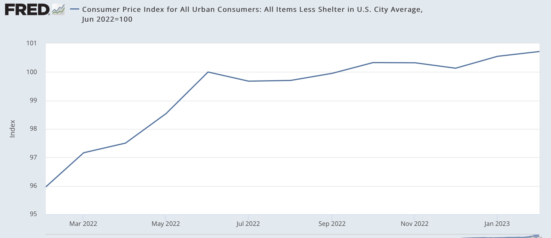
As I wrote several weeks ago, CPI less shelter is only up +0.7% in the 8 months since last June, i.e., at only a 1.0% YoY rate:


In making its case for continued rate hikes, the Fed has ignored this and been hanging its hat on services inflation in the broader measure of. personal consumption expenditures, which will be released on Friday.

Tuesday, March 28, 2023

YoY house price gains continue to decline


 - by New Deal democrat


Today is a travel day so I have to keep this brief. 


On a monthly basis for January, prices rose 0.2% as measured by the FHFA house price index. But because that was far less of an increase in January last year, YoY house prices as measured by the FHFA index declined to +5.3%. This implies that by January next year OER as measured in the CPI will inly be up about 2.1% - well within the Fed’s comfort zone:


Unfortunately we still have at least several months to go before OER starts any kind of meaningful decline. Still, this is further evidence that the Fedcontinues to chase a phantom menace.

Monday, March 27, 2023

3 graphic signs of financial stress


 - by New Deal democrat


The theme of my weekly “high frequency” economic indicators update over the weekend was the sudden deterioration in some measurements of financial stress.


Tomorrow we’ll find out that house prices as measured by both the FHFA and Case Shiller have decline further, and that increases are substantially lower than as measured by the CPI, and on Friday we’ll find out what two of the NBER’s important measurements: real personal income and spending, as well as real manufacturing and trade sales, are, but since today there’s no big news, let’s take a look at those financial stress indicators I mentioned above.

First, the Leverage subindex of the Chicago Fed’s Financial Conditions Index got bigly revised last week (from gold to red in the graph below), to show that leverage is now more restrictive than at any times not shortly before or during recessions (compared with the YoY change in the Fed funds rate, blue, for comparison):


This tells us that credit has actually been pretty tight for the last year, and especially the past few months.

Second, the St. Louis Fed’s Financial Stress index, which had been below zero, i.e., un-stressful as late as one week prior, suddenly shot up to levels not seen outside the last several recessions (see sliver at far right), except for the Long Term Capital Management crisis of 1998:


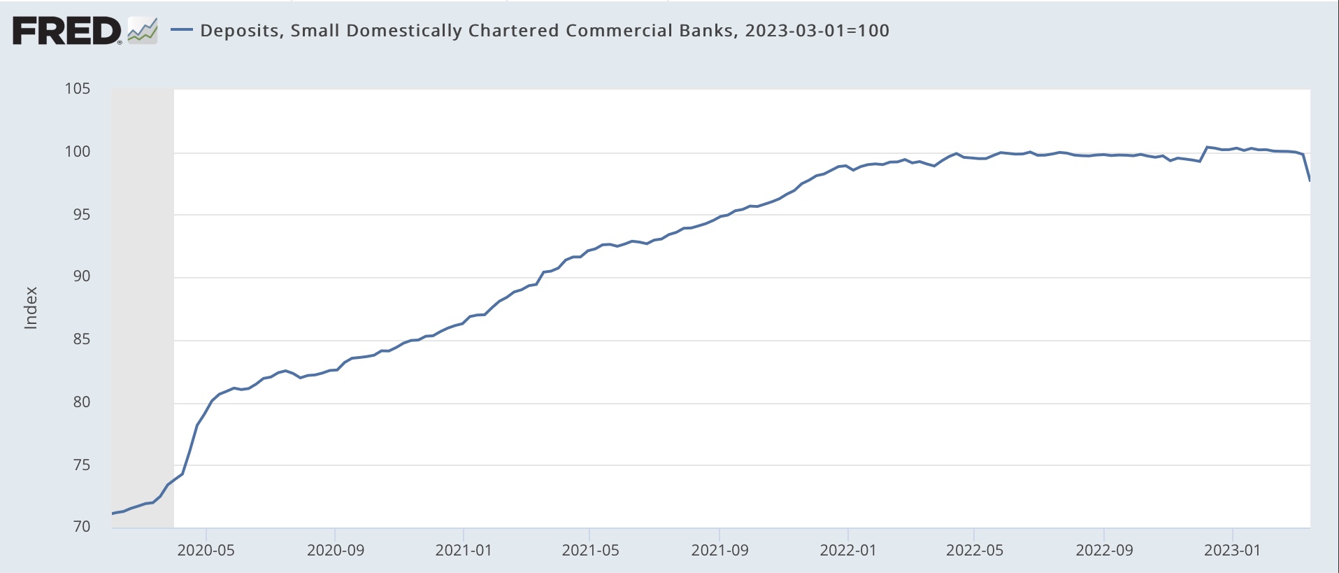
Third, in the past two weeks 2.3% of all deposits have been withdrawn from smaller commercial banks:


The only other time except for the past week that deposits YoY in commercial banks have been negative was in 1985-86:


If you have any significant money on deposit, whether in savings, checking, or money market accounts, you would do well to find out what the highest interest rate a bank in your area is paying for new money, and then march into your current bank and demand that they match that rate, or you will pull your money out. Especially if your bank has been piggish about continuing to pay almost non-existent interest, chances are very good you will get what you want.

It’s getting harder and harder to find any signs outside of employment that are not flashing warning signs of recession in the immediate future, if not already here.

Saturday, March 25, 2023

Weekly Indicators for March 20 - 24 at Seeking Alpha


 - by New Deal democrat


I’ve neglected to put this up for the past several weeks, but by now you know where to find my latest Weekly Indicator post at Seeking Alpha.

Probably unsurprisingly, in the week after the Silicon Valley Bank failure, just about every financial stress indicators suddenly spiked. In other words, credit conditions, which had already tightened by the end of last year, tightened a lot more in the past several weeks.

Like I wrote yesterday, there are only a couple of things still holding up the economy from falling into recession. As usual, clicking over and reading will bring you up to the moment, and reward me a little bit for putting in the effort.

Friday, March 24, 2023

There is now only one significant manufacturing datapoint that is not flat or down - but it’s the one the NBER relies upon


 - by New Deal democrat


I am increasingly of the opinion that at the moment, the only two economic data series that are important are nonfarm payrolls and the personal consumption expenditure deflator. That’s because almost every other important metric of the economy is either flat or declining. But payrolls keep chugging along (as evidenced by yesterday’s initial claims report showing that layoffs are figuratively non-existent). And the PCE deflator, which covers a broader spectrum than the CPI, keeps helping two coincident indicators important to the NBER, namely real personal income and real manufacturing and trade sales, remain in the plus column. 


This morning’s report on manufacturers’ new orders for durable goods for February is evidence of that. The broad measure (blue in the graphs below) declined just shy of 1%, while the core measure (red), which is less noisy, increased by 0.2%:


Both are below their peaks in December and August 2022, respectively. In the past few months the broad measure has been trending down, while the core measure has been basically flat.

New orders for durable goods have long been recognized as a leading indicator. Here’s the longer term view for the past 25 years:


Their record certainly isn’t perfect. The core measure continued to rise well into the Great Recession, and both declined sharply in the industrial recession of 2015-16 (that was not an actual recession because consumers kept spending merrily away, and so employment kept rising as well).

Anyway, in the below graph I’ve also added the value of manufacturers total actual shipments, and shipments for “core” capital goods, as well as *nominal* manufacturers’ sales, all normed to 100 as of October 2022:


The slowdown in growth, followed by an actual downturn in the broad measures of orders and shipments, is apparent, as is the flattening in both “core” measures, up only 0.1% and 0.2% since October, respectively.

Nominally, manufacturers sales (gold) through January are also down -0.8% since October. This is where the PCE deflator comes in. Because while there is no breakout of “real” manufacturers sales only, real manufacturing and trade sales (which also includes wholesale and retail sales, and is relied upon by the NBER) was up 0.6% as of its last reading in December.

In other words, the entire panoply of goods production and distribution in the US economy (including industrial production as well) is either flat or down - with the exception of those two measures (real personal income and real manufacturing and trade sales) which take into account the big deflation in producer prices since June, and the PCE deflator. More on that next week, as we wait for the February PCE report next Friday.

Thursday, March 23, 2023

New home sales for February increase; likely bottomed last July


 - by New Deal democrat


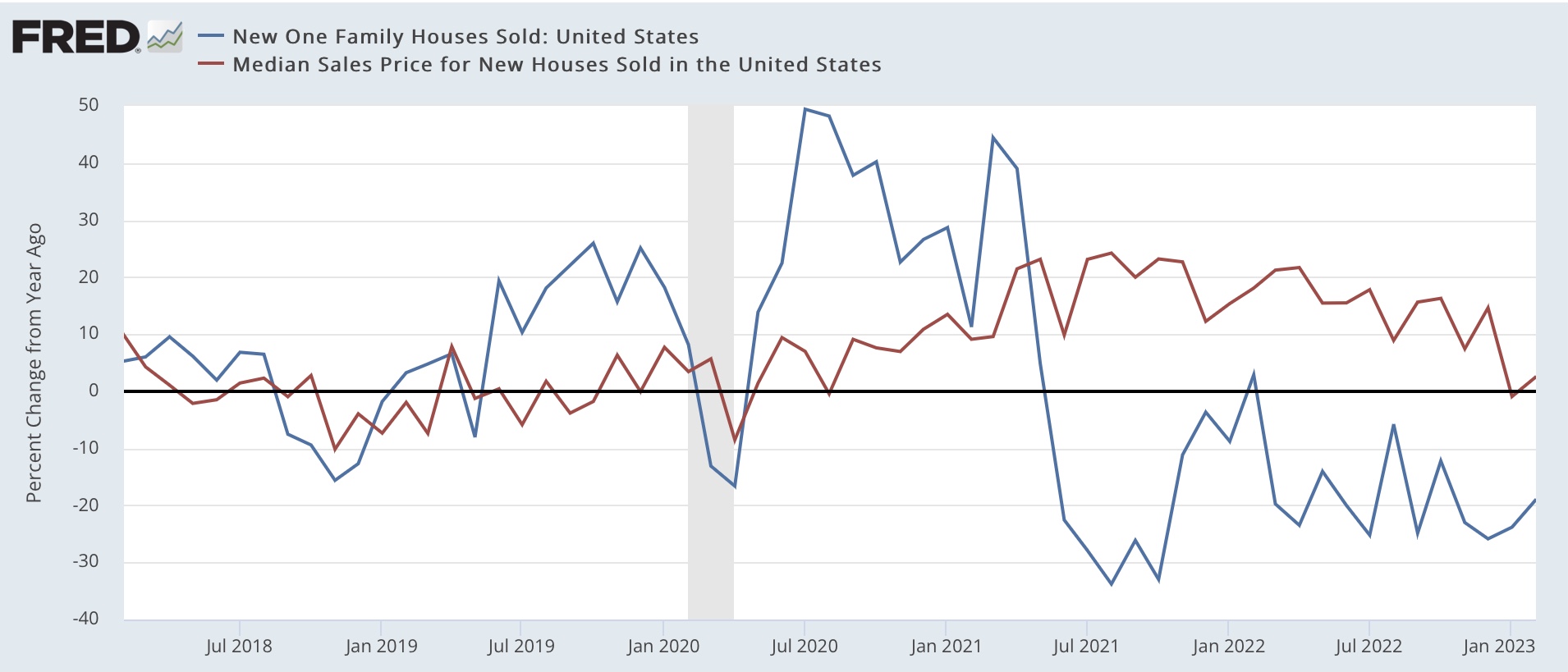
Most of what you probably read elsewhere focuses on new home prices, which after finally declining -0.7% YoY in January, rebounded to +2.5% YoY. As is usual, prices  follow sales YoY with a considerable lag (note since prices are not seasonally adjusted, this is the right way to make the comparison):


In fact if you’ve been reading me and following my rule of thumb, the peak occurred  months ago, once the YoY gains had decelerated by over 50%.

But the most important news was actually in the seasonally adjusted sales, which at 640,000 annualized increased 7,000 from a seriously downwardly revised (by -37,000) January. Big deal, you say? Here’s a graph of the last several years:


While revisions can still be made to the last several months, it is apparent that the bottom for new home sales was last July, at 543,000 annualized. There has been an almost consistent monthly increase since.

This joins existing home sales, which likely bottomed in December; and housing permits and the three month average of starts, both of which possibly bottomed in January. As I’ve written many times before, while new home sales are very noisy and heavily revised, they are frequently the first housing data to turn. And it appears they have. 

Nope; nobody is still getting laid off


 - by New Deal democrat


Initial jobless claims declined -1,000 to 191,000 last week, while the more important 4 week moving average declined 250 to 196,250. Continuing claims, with a one week delay, rose 14,000 to 1.694 million:


All of these remain excellent numbers. In particular, the higher numbers at the left end of the graph would have been considered excellent at any previous time in the past 40 years. So the paradigm that almost nobody is getting laid off remains intact.

The YoY comparisons are against the best numbers of last year, so they look comparatively bad. Weekly claims are up 15.1% YoY and continuing claims are up 9.8%. The more important 4 week average is up 8.6%, still below the 10% threshold for even a yellow flag, and bear in mind that it is only important if it lasts a month or more at that level:


This suggests that the unemployment rate in the March payrolls report will be unchanged or close thereto, and at very least there will not be a “bad” headline jobs number.

Wednesday, March 22, 2023

Updating 3 high frequency indictors: no recession yet, but no paucity of yellow flags


- by New Deal democrat


Aside from the Fed’s rate decision which will be announced this afternoon, it’s a slow economic news week. In general, the punditry which I read seems to be settling on a consensus that we are going to manage to have a soft landing. With the exception of jobs and payrolls, the rest of the indicators I track in sequence continue to indicate a recession is near. Let me update three high frequency indicators I’ve been paying particular attention to.

1.  Redbook consumer spending

This is a weekly update of same store spending, measured nominally YoY. The trend here is pretty self-explanatory:


YoY consumer spending was holding up in double-digits until the middle of last summer. Since then the trend, albeit with some waxing and waning, has been pretty consistent. The average of the last 3 weeks has been just below 3% YoY.

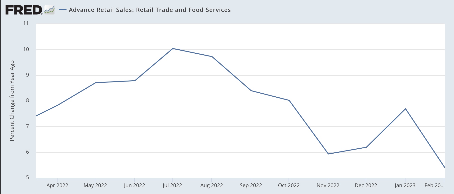
For comparison, here is monthly nominal retail sales YoY since last March:


The trend is similar, but the decline in Redbook has been considerably more pronounced. If the monthly series follows, March nominal retail sales will decline further YoY. And as indicated that’s before consumer inflation is taken into account, which as of February was 6.0% YoY.

Further, if the trend continues, even nominally Redbook will be negative YoY by midyear.

2. Temporary employment

Temporary employment is a leading sector of the jobs market. The American Staffing Association has been posting a “Staffing Index” since 2006. Typically the Index slowly increases during the year, with major seasonal fluctuations around the 4th of July, Thanksgiving, and Christmas-New Year’s. Here’s what it looks like since January 2022, and the onset of the Great Recession, 2006-07, for comparison:


The 6% YoY downturn in February through early March this year has been the biggest since the series was begun. That being said, there was a similar downturn in late 2015 (not shown) without the economy coming close to recession.

For comparison, note that there has been a similar YoY downturn in termporary employment in the official payrolls report:


The last few weeks suggest this downturn in the monthly jobs report will continue.

3. Payroll tax withholding

This is a decent coincident proxy for the total jobs market. Almost everybody pays payroll taxes, and it stands to reason if wages and/or jobs growth stagnate, so will the taxes from those paychecks.

Matt Trivisonno of the Daily Jobs Update keeps track of these graphically, and makes a free graph available with a 90 day delay. Which means that the below graph includes the period up through roughly December 15. By way of further explication, the comparison is taxes paid during the entire previous 365 day period, vs. the entire 365 day period before that:


YoY payroll taxes peaked at about 22% in March 2022. Remember that my rule of thumb for non-seasonal adjusted data is that it probably has peaked if the YoY comparison has declined by more than 50% within the ensuing 12 months.

As of December 15, this had declined to about 8.5% - i.e., more than half, suggesting that, if we could seasonally adjust, we would find that payroll taxes paid had turned negative.

Because the data is public at the Department of the Treasury’s site, I can further report to you that as of March 20, the entire previous 365 day period resulted in 5.9% more payroll taxes paid than the 365 day period between March 20, 2021 and March 20, 2022. This is almost a 75% YoY decline.

But the data is a little more nuanced. During the 1st fiscal Quarter of 2022-23, payroll taxes paid were only 1.2% higher than Q1 of 2021-22. So far in the fiscal 2nd quarter this year, taxes are up 7.1% compared with Q2 of 2022 through March 20. That’s a pretty strong rebound.

And the rebound accords with information provided by California’s Treasury Department, shown below:


After a steep YoY decline in late 2022, there has been no further YoY decline in 2023 so far. Since California includes about 1/8th of the entire US population, and an even bigger share of the economy, this is good information.

Interestingly, the Treasurer’s Office for California indicated that they believed the big shortfall in 2022 was due to the downturn in the stock market, which meant that stock options tied to an increase in share prices could not be cashed. The stock market recovered pretty nicely between November and February, so likely some of those stock options were now in the money and could be cashed.

Probably the closest monthly analog is aggregate payrolls in the jobs report, shown YoY below:


Again, there is deceleration, but no nominal downturn yet.

Put the three data series together, we see that two short leading indicators, temporary help and consumer spending adjusted for inflation (since consumption leads employment) have turned down, but no coincident downturn in overall employment. In short, no recession yet, but no paucity of yellow flags.


Tuesday, March 21, 2023

February existing home sales confirm prices have declined, but bottom in sales and construction may be in


 - by New Deal democrat


There were only two noteworthy takeaways from the February existing home sales report:


(1) like mortgage applications, permits, and starts, existing home sales responded to lower mortgage rates (a decline from just over 7% to just above 6% between last October and January):


(2) As usual, price changes lag sales; for the first time since the pandemic, the median house price actually declined -0.2% YoY from $363,700 to $363,000 (remember: this data is not seasonally adjusted):


This simply confirms the data we have gotten from the more important new home construction data. I do think there is some good news here, in that we may very well have seen the bottom in this metric as well as in permits, starts, and mortgage applications. This does not mean a recession is not going to happen; but it does suggest it will not be prolonged and may not be very deep.

Monday, March 20, 2023

Average and aggregate nonsupervisory wages for February


 - by New Deal democrat


There’s no significant economic news today, so let’s update a couple of income indicators important to average American working households. Namely, because we now have the inflation report for February as well as payrolls, we can update average and aggregate nonsupervisory wages.


Average hourly earnings for nonsupervisory employees increased 0.5% on a nominal basis in February, tied for the strongest reading since last June. But since consumer prices increased 0.4%, real average hourly wages only increased 0.1%:


The good news, as indicated above, is that this is tied for the highest reading since last April (as I’ve noted many times, a $2 decline in gas prices can do wonders for economic statistics). The not so good news is that the above graph is normed to 100 as of January 1973, the record high water mark for nonsupervisory wages prior to the pandemic. Which means that we remain below that level, as we have been for almost a year.

Second, aggregate real nonsupervisory payrolls are an excellent way of viewing the health of the American middle/working class as a whole. Nominal aggregate wages were unchanged in February, but in real terms declined -0.3% in February from January’s record high:


Typically real aggregate payroll growth slows down sharply in advance of recessions, and usually stalls out during recessions. In fact, YoY negative growth is a very good “fundamentals” mark of recession, because when average American households have less money to spend in the aggregate, they cut back. And a cutback in consumption leads to a cutback in jobs.

And the YoY trend in real aggregate payrolls, while not negative, has declerated sharply in the past year, and is currently at 1.4%:


In the below long term graph, I subtract 1.4% from YoY growth so that it shows at the zero line:


As you can see, this level is consistent with a sharp slowdown (e.g., 1967, 1994, 2016) as well as an oncoming recession. *If* consumer inflation continues to ebb, then to indicate a recession, aggregate payrolls will have to decelerate faster than they have so far.

Friday, March 17, 2023

Industrial production ‘meh’ in February, but down sharply since last summer; real manufacturing and trade sales forecast to decline in Febuary


 - by New Deal democrat


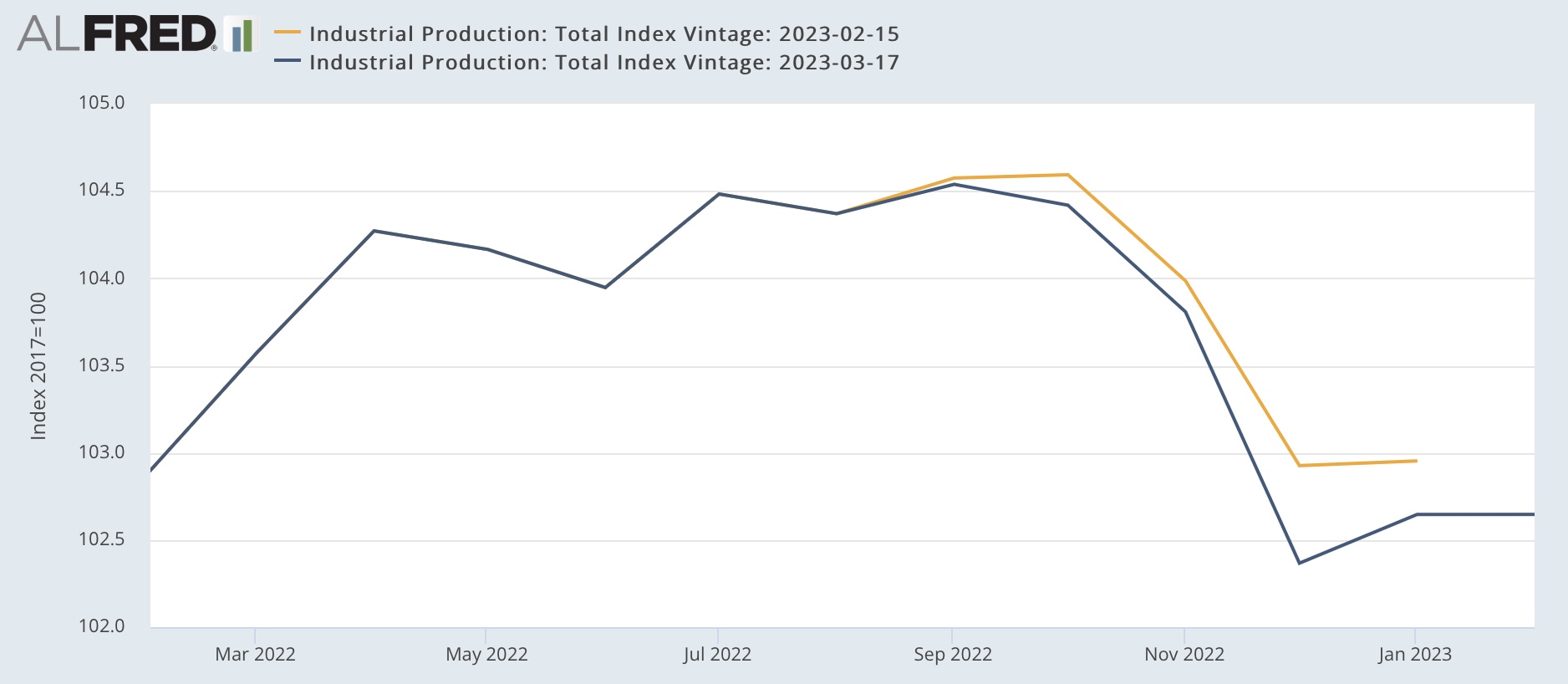
Industrial production was unchanged for the month of February, while manufacturing production rose +0.1%. But the bad news is that both were revised lower for the past 5 months, as shown on the two graphs below:


As a result, industrial production (blue below) is now -1.8% below its September peak, while manufacturing production (red) is -2.0% below its peak from last April:


With the exception of 1966, before 1990 such declines would always have been recessionary. Since then, because manufacturing has shrunk so much as a percentage of the overall economy, both in 2016 and 2019 there were bigger declines without there being a recession. Still, this is one of the 4 main coincident indicators relied on by the NBER in determining if the economy is in recession.

Industrial production is also the missing component I needed to make the first, preliminary estimate of real manufacturing and trade sales for February. 

Recall that we won’t even get the “official” measure for January until the deflators for personal income and spending are reported on the 31st. But we already have real retail sales for February, so what is missing are manufacturing and wholesalers sales for that month, minus the deflator. Industrial production fills in the manufacturing component, with the exception that we don’t know the relative inventory change vs. sales for that month.

Without further ado, here is what the average of industrial production + real retail sales look like for the past 30 years compared with real manufacturing and trade sales:


Both the trend and the typical monthly change are reasonably close.

Now here is the percentage change for the last 22 months:


This method is not so accurate as the 2nd estimate I discussed several days ago, but does give us the main thrust. Like the 2nd estimate, for January it forecasts a sharp increase (+1.5% vs. the +0.8% of the 2nd estimate), followed by a -0.4% decrease in February. Like the 2nd estimate, it indicates a new record high for January.

As I wrote the other day, we’ll see how this forecast plays out on the 31st for January, and at the end of April for February. 


Thursday, March 16, 2023

Housing construction: good news and bad news


 - by New Deal democrat


This morning’s report on housing construction contained both good news and bad news.


First, the good news. Both permits (gold in the graph below) and starts (blue) increased, the former by 185,000 on an annualized rate, the latter by 129,000:


It is very possible that January’s rate of 1.339 million permits annualized and 1.321 starts will be the low for this cycle. That’s because mortgage interest rates (red, inverted), which along with Treasury yields frequently peak before the Fed finishes hiking interest rates, may very well have done so for this cycle at 7.08% in late October and early November. They declined to 6.09% by early February. As is usual, because permits and starts lag interest rates, the decline in mortgage rates showed up in the increase in permits and starts in this report.

As I have noted many times before, single family permits are the least volatile and most leading of the housing construction data, and these also rose by 55,000 to 777,000 annualized:


So much for the good news. The first bad news is that the decline which has already taken place is still consistent with an oncoming recession.

The second, more important piece of bad news is that housing under construction (red in the graph below) was revised lower for December and January, and declined further in February. It is now -1.2% off from its peak:


Since housing under construction is the “real” economic activity, this means that housing is finally putting some downward pressure on the economy as a whole. 

It isn’t that significant yet. Typically housing under construction has called more than 10% before a recession has begun. But this month’s report is confirmation that it has begun. Among other things, expect employment in residential construction, which was still increasing albeit by a very small 1,200 jobs in February, to begin to decline in the next few months.


Jobless claims: nobody is (still!) getting laid off


 - by New Deal democrat


Initial jobless claims declined -20,000 this week, back below 200,000 to 192,000. The 4 week average declined -750 to 196,500. Continuing claims, delayed one week, declined -29,000 to 1.684 million:


For all intents and purposes, it is still the case that “nobody” is getting laid off.

As the above graph shows, we are now almost one year past the lowest level of new jobless claims in history. Needless to say, this affects the YoY comparisons, which are now higher:


On a weekly basis, new jobless claims are 8.5% higher than one year ago, and continuing claims are 5.6% higher. The much more important 4 week average of new claims is 4.1% higher.

None of this is anywhere near signaling a recession warning. I would need to see the 4 week average at very least 10% higher, and lasting for longer than a month at such levels to even raise a yellow flag.

Finally, to pick up further on jobs vs. retail sales, which were reported yesterday, a corollary to the observation that consumption leads jobs is that retail sales tend to grow faster than jobs earlier in expansions, but grow slower than jobs late in expansions. The below graph subtracts the rate of jobs growth from the rate of retail sales growth to show that:


When the line is rising, sales are growing relatively faster than jobs. When the line is declining, jobs are growing faster than sales. The “zero” line in the graph is the rate at roughly the midpoint of the last 3 expansions. 

There was a huge shortfall in jobs growth compared with sales growth due to the pandemic. There has since been huge jobs growth to close that gap in the long-term trend. It is still about 4.4% from closing, historically still very wide, but declining fast. Remember that the gap can be closed by a decline in sales, an increase in jobs, or both.