Monday, August 20, 2018

How "replacement hiring" helps enforce the taboo against raising wages


 - by New Deal democrat

Every month when the JOLTS report comes out, I rail against "job openings" as some sort of hard data, and in particular the notion that the US is at "full employment" because the number of "openings" exceeds the number of "unemployed" in the monthly jobs report. 

For example, here's a graph I ran last week, which strongly suggests that there has been a taboo against hiring at market-clearing higher wages, leading to an increase in quits to find better-paying jobs:


"Job openings" may be firms holding out for the candidate who will accept the job at the rate they want to pay, and/or keeping the listing open just to troll for resumes.

Well, it turns out it's worse than that.

Sushant Acharya and Shu Lin Wee of the New York Fed issued a report last week in June entitled "Replacement Hiring and the Productivity-Wage Gap." (pdf) in which they
 build[ ] a model where firms post long-lived vacancies and engage in on-the-job search for more productive workers. These features improve a firm's bargaining position while raising workers' job insecurity and the wedge between hiring and meeting rates. All three channels lower wages while raising productivity.... The socially efficient outcome features fewer low-productivity jobs and a 10 percent narrower productivity-wage gap.
 What is a "replacement hire"?  It's a hire that is not for a new position (per the Census Bureau), or in other words, to replace a currently occupied position. It could be in anticipation of worker(s) quitting, or it can also be trolling for "better" workers, in which existing workers will be fired. 

Acharya and Wee found that "replacement hiring" increased by over 5% from previous levels in the 2000s expansion, and over 15% in the current one:

 In fact, "replacement hiring" has exceeded 1990s levels during the entirety of this expansion, all the way back to 2009 when there was over 10% unemployment!

Further, it is clear that companies are using "replacement hiring" as a means to decrease wage demands from their current workforce. Acharya and Wee calculated the ratio of "voluntary quits" to "hires" from the JOLTS data, and compared that with the above graph on "replacement hiring:"

Only in the past several years has the ratio of quits to hires increased to the level it was at during the very robust 1990s expansion. But, even though it has narrowed, the level of "replacement hiring" exceeds the level of quits.  In other words, the gap represents the "job openings" that firms have been using to search for new workers to displace existing workers,

And what is the result? From their Conclusion:
[A] larger replacement hiring share, the higher market power of firms, larger job insecurity faced by workers, and lower measured matching efficiency in the labor market allow firms to reap productivity gains from replacing workers while still keeping wages low. Compared to the efficient benchmark, private agents in the decentralized economy do not internalize the rat race externality and tend to create too many low productivity jobs. This in turn raises the incidence of replacement hiring and widens the gap between productivity and wages. 
In plain english, companies who are constantly holding the threat over current employees' heads that the firm has an ongoing quest to replace them, are companies whose workers don't demand increased wages.

Sunday, August 19, 2018

A graph for Sunday: 2012 Obama voters by 2016 vote


 - by New Deal democrat

This is a graph I've been meaning to comment on, that I saw on Vox.com a couple of weeks ago. It breaks down Obama voters from 2012 based on who they voted for in 2016, and adds in Romney voters who voted for Clinton in 2016:


As an aside, note that the graphs measure opinions per group, and definitely *not* their number. Also, it's hardly a complete snapshot of voters, since it doesn't include all the others who voted for Trump. More on that below. But I wanted to make a couple of comments.

First of all, the Obama voters who  then voted for Clinton, a third party candidate, or just stayed home all had a pretty similar worldview with the exception of Obamacare. The disaffected voters who abandoned Clinton almost certainly did so because of their views of the candidate, not their views of the issues. For them, Clinton was a warmonger, or a corporate shill, or a crook (because didn't Comey almost directly say so?), or had some other personal shortcoming.

By contrast, the Romney-Clinton voters were closer to the Obama-Trump voters than to the Obama-Clinton voters on everything except for xenophobia (the two issues furthest to the right on the graph).  In short, Romney-Clinton voters were garden variety GOPers who simply could not stomach Trump personally -- i.e., the "never Trump-ers." If Trump is the GOP nominee in 2020, at least some of them will refuse to vote for him again.

Here's where it's a shame that the bar graphs don't include Romney-Trump voters. Because it would be nice to compare them with Obama-Trump voters. My sense is that Obama-Trump voters had a strong positive reaction to Trump's populism while either not being offended by, or at least not taking seriously, Trump's xenophobia and racism.

The former Obama-Trump voters are the ideological descendants of the old Dixiecrats: nativist-populists who believe in government programs, so long as those programs benefit *them,* and not ethnic or racial "others."  They probably only voted for Obama because the economy was so bad in 2008, and had improved (just barely enough) in 2012.

The latter considered Trump's racist campaign comments as "part of the show." (I read an article about a union official from northeastern Pennsylvania who attended several Trump rallies with his buddies to find out why they were so attracted to him. The "part of the show" line was a direct quote. I wish I had saved the link to the article. Sorry!)

Here's the bottom line I see: if in 2020 the Democrats nominate a reasonably "safe" candidate, the Obama-third party and Obama-nonvoter voters are probably coming back. Depending on the state of the economy, so are some of those who didn't take Trump's racism seriously. (Yes, his racism wasn't a dealbreaker, but imo this group are reachable with reason).

Unless the economy in 2020 is as bad as it was in late 2008, the Dixiecrats are gone, and I see no reason to try to accommodate them.

Saturday, August 18, 2018

Weekly Indicators for August 13 - 17 at Seeking Alpha


 - by New Deal democrat

My Weekly Indicators post is up at Seeking Alpha.

There were 4 long leading indicators that were on the cusp of changing. To see what happened, please  put a penny or two in my pocket by heading on over and reading!

Friday, August 17, 2018

Why don't I see any more Doomish commentary on how commercial and industrial loans are turning negative and ensuring a recession?


 - by New Deal democrat


Oh, that's probably why.

I told you soin July 2017, when I published a graph showing that commercial and industrial loans tend to lag the Senior Loan Officer Survey by about 6 quarters, and concluded:

"in the last three quarters, the Senior Loan Officers have reported a slight loosening of standards, which suggests that commercial and industrial loans will continue to flatline through about the end of the year, and improve in 2018."

Which is, of course, exactly what they did.

My extended take on housing permits and starts at Seeking Alpha


 - by New Deal democrat

My long-form take on housing sales, updated with yesterday morning's housing permits and starts report, is up at Seeking Alpha.

Like my Weekly Indicators posts, I make a penny or two when you decide to read.  So decide to read!

Also worth mentioning: my overall view of housing differs somewhat from that of Bill McBride a/k/a Calculated Risk.  Like Bill, I don't think housing has already peaked.  But unlike Bill, I see inventory as the tail, rather than the (a?) head. "Months' inventory" typically turns up precisely because sales turn down, so doesn't give me any new information. Also, Bill is really focused on the demographic tailwind, and on "pent-up demand."  I'm not sure about the latter, since the bubble years where 2+ million units were added a year, coincided with the demographic *nadir,* i.e., there was a lot of excess housing to be absorbed. As to the former, high enough interest rates and prices will be enough to overcome it. I don't think we're quite there - yet.

Thursday, August 16, 2018

Housing starts turn negative, while permits remain positive


 - by New Deal democrat

NOTE: I'll have a more comprehensive report up at Seeking Alpha later, and will link to it once it is posted.

This morning's report on housing permits and starts was a mixed bag.

Permits, while below their single family peak in February and their overall peak in March, were higher than last month. Their shorter term trend is neutral while the 12 month trend remains positive.

Starts, on the other hand, were lower YoY for the second month in a row. Single family starts had their lowest month since last December.

The data isn't up on FRED yet, so here is the Census Bureau's graph:


Because of their volatility, the best way to view starts is as a 3 month average. But even so viewing, starts made a 7 month low. The last two months are equivalent to the low readings of last summer, and no better than average compared with 2016.

Still, because permits tend to slightly lead starts, and single family permits are the least volatile measure of all, the trend in housing must continue to be counted as a weak positive.

This, by the way, contrasts with the weekly data on purchase mortgage applications, which is now down YoY even as measured over a 4 week average; and is among the lowest readings of the last 18 months.

Wednesday, August 15, 2018

Industrial production cools a bit; retail sales continue strong


 - by New Deal democrat


Both industrial production and retail sales for July were reported this morning. Let's take a look at both.

First, industrial production increased m/m to another all time high (gray in the graph below), as did manufacturing (red):


At the same time, if you zoom in on the inset, you can see that manufacturing growth has slowed down somewhat this year.  It is only up +0.8% in the last 5 months, after having risen 2% in the 6 previous months.

There has been some evidence in both the regional Fed reports and the ISM manufacturing index of a little cooling -- from white hot to red hot -- in manufacturing activity in the past few months. This report is of a piece with that cooling. Tomorrow both the Empire State and Philadelphia Fed regional manufacturing reports will be released, and may (or may not!) give evidence of further cooling this month.

Second, retail sales increased a strong +0.5% in July, but only after a -0.3% downward revision to June. Adjusting for inflation, real retail sales continue to grow on trend:


Real retail sales per capita also continued to grow on trend:


I expect per capita real retail sales to turn about a year before any downturn in the economy as a whole.

Since real retail sales are also a good short leading indicator for employment (red in the graph below), here is growth in both measured YoY:


This suggests continued strong employment growth in the next few months. One thing to watch for is what happens when last September's outsized +1.3% monthly increase drops out of the YoY calculations two months from now.

But the nowcast as indicated by the two reports is continued good growth in both production and consumption.

Tuesday, August 14, 2018

Can the Fed successfully steer between Scylla and Charybdis? An update


  - by New Deal democrat

As I type this, the spread between 2 year and 10 year Treasuries is back to 0.25%, the level below which I switch my rating on the yield curve from positive to neutral. Already the spread is tight enough that, even if it never inverts, it suggests a slowdown in the next 6-12 months, as happened in 1984 and 1995 in the graph below of real YoY GDP growth and the Fed funds rate:


One aspect of what is happening in the bond market is that the 2 to 10 year spread is reaching equivalent levels at higher and higher absolute yields.  Here's a graph I generated last week, where I normed both the 2 and 10 year Treasury yields to zero at a point where the spread between them was 0.30%:


Note that the two lines intersect (meaning the spread between them is 0.30% three times in the past 45 days: first when the 10 year bond was yielding about 2.83%, then when it was yielding 2.87%, and last week when it was yielding 2.98%.

In other words, the dynamic is that the yield on the 10 year bond has to be at higher and higher levels in order not to be too tight.  And the higher those 10 year bond yields, the higher mortgage rates go as well, gradually strangling the housing market.

Can the Fed successfully steer between the Scylla of an inverted yield curve and the charybdis of  a housing market downturn?

Possibly. The San Francisco Fed's staff just published a paper in which they suggested that the "neutral Fed funds rate" was 2.5%, as shown in this graph which they generated:


If the Fed stops after two more hikes, it's at least possible that there could be a tight but not inverted yield curve with 10 year bonds yielding roughly 3%.

But the Fed's own "dot plot" from their meetings suggest that they intend to hike the Fed funds rate to at least 3%. If that happens, I see no way the economy doesn't wind up on the rocks.

Monday, August 13, 2018

Gimme Shelter: the rental affordability crisis has worsened


 - by New Deal democrat

Four years ago HUD warned of "the worst rental affordability crisis ever," citing statistics that
About half of renters spend more than 30 percent of their income on rent, up from 18 percent a decade ago, according to newly released research by Harvard’s Joint Center for Housing Studies. Twenty-seven  percent of renters are paying more than half of their income on rent. 
This is a serious real-world issue. I have been tracking rental vacancies, construction, and rents ever since.  The Q2 2018 report on vacancies and rents was released a few weeks ago, so let's take an updated look. In this post I will look at four measures:

  • real median asking rent, as calculated quarterly using the Census Bureau's American Community Survey
  • two rental measures from the monthly CPI reports
  • HUD's quarterly rental affordability index
  • Rent Cafe's monthly rental index

As we will see, regardless of which measure used, rent increases continue to outpace worker's wage growth, meaning the situation is getting worse. Most likely this is a result of increased unaffordability in the housing market, driving potential home buyers to become or remain renters instead.

Real median asking rent

In the second quarter of last year, median asking rents zoomed up over 5% from $864 to $910. In the two quarters since, they have remained at that level: 


Here is an updated look at real, inflation adjusted median asking rents. The entires prior to 2009 show the interim high and low values from the previous 20 years. Since 2009, real rents have almost continuously soared -- and reached yet another record high in the quarter just ended:

Year Median
Asking Rent
Usual weekly
earnings 
Rent as %
of earnings

198833038286
199240143792
199342245088
200047856884
200254560790
2004 59962995
200968073992
201271776893
2013 73477894
2014  76279196
2015813809100
2016859832103
2017 8968860104
2018 Q1954881108
2018 Q2 951876109

The big increase in unaffordability is unfortunately of a piece with the rental vacancy rate which, after appearing to have bottomed in 2016, tightened again in this report: 


CPI rent

The monhtly CPI report also includes two measures of inflation in rents. The CPI for actual rent (blue) continued an apparent slow deceleration, while owner's equivalent rent (red), the major component of inflation, remains near the highest levels in a decade, at over 3% YoY: 


HUD's Rental Affordability Index

Yet another metric is HUD's  Rental Affordability Index which, similarly to my chart above, compares median renter income with median asking rent. In its  most recent (Q1) uupdate, it, like the median household income data, shows both rents and renters' income bottoming out in 2011-12, but with rents outpacing income ever since:
  

As a result, the trend in "rental affordability index," according to HUD, which had been easing since 2011, has declined in the past year to matchits worst levels:
.


Note that HUD's measure of housing affordability also generally deteriorated in 2017, making home-buying the least affordable since 2008, although better than  during the bubble years. 

But the strong suggestion is that, as housing has become less and less affordable, more households are forced into renting, which has responded by *also* becoming less affordable. 

[Paranthetically, I'm not sold on HUD's method, mainly because it relies upon annual data released with a lag. In other words, the entire last year plus is calculated via extrapolation.]

Rent Cafe's monthly rental index

Finally, there is a monthly rental index calculated by Rent Cafe.  This has the benefit of being much more timely.  Since it is not seasonally adjusted, the index must be compared YoY. While Zumper only includes 12 months of data in their monthly releases, at the beginning of this year they did publish the historical YoY record of their index (blue in the graph below). Rent Cafe's measure of rent shows that a surge to over 5% increases YoY occurred in 2015 and early 2016, and has abated to less than 4% YoY since, in contrast to the CPI measures and also to HUD's and the Census Bureau's data:


Through 2017, their measure of rents was continuing to grow at about 3% YoY. Below are the last 12 months through July:  


Here's the bottom line, from all 4 sources: regardless of which measure we use, rents are growing faster than nominal wages for nonmangerial workers,which have onl increased at 2.7% YoY through last month. 

In particular, this quarter's Census report not only indicates no relief from the "rental affordability crisis," it, like all the other metrics, shows that it is becoming worse, as -- most likely -- more and more households are being shut out of the home-buying market due to 5%+ YoY increases in house prices and increased interest rates, and are forced to compete for apartments instead.

Saturday, August 11, 2018

Weekly Indicators for August 6 - 10 at Seeking Alpha


 - by New Deal democrat

My Weekly Indicators post is up at Seeking Alpha.

Two long leading indicators are within 1% of turning negative. And two short leading indicators are also weakening considerably.

A friendly reminder that not only is the post informative, but I get compensated the more people read it, so by all means please read it!

Friday, August 10, 2018

Real wages decline YoY, while real aggregate payrolls grow


 - by New Deal democrat

With the consumer price report this morning, let's conclude this weeklong focus on jobs and wages by updating real average and aggregate wages.

Through July 2018, consumer prices are up 2.9% YoY, while wages for non-managerial workers are up 2.7%. Thus real wages have actually declined YoY:


In the longer view, real wages have actually been flat for nearly 2 1/2 years:


Because employment and hours have increased, however, real *aggregate* wage growth has continued to increase:


Real aggregate wages -- the total earned by the American working and middle class -- are now up 25.8% from their October 2009 bottom.

Finally, because consumer spending tends to slightly lead employment, let's compare YoY growth in real retail sales, measured quarterly (red), with that in real aggregate payrolls (blue):


Here's the monthly close-up on the last 10 years:


Since late last year real retail sales growth has accelerated YoY, so we should expect the recent string of good employment reports to continue for at least a few more months.

Thursday, August 9, 2018

Four measures of wages all show renewed stagnation


 - by New Deal democrat

This is something I haven't looked at in awhile. Since 2013, I have documented the stagnation vs. growth in average and median wages, for example here and here. I last did this in 2017. So let's take an updated look.

We have a variety of economic data series to track both average and median wages:
Let's start with nominal wages.  The first graph below shows the YoY% growth in each of the four measures:


While each is noisy, the overall trends are clear:
  • First, in this cycle as in the last, wage growth declined coming out of recessions, then rose as the expansion continued.  
  • Second, by most measures nominal growth has picked up somewhat in the last year. 
  • Third, secularly there has been an undeniable slowdown in wage growth, which (while not shown) was 4-6% in the late 1990s peak and 3-4% at the 2000s peak. So far in this expansion it is no better than 2.5%-3%.  I believe this is in part due to how weak the employment situation was for so long into this expansion, but also secularly due to shifts in bargaining power, as employers learn over time that employees can be retained with lower and lower annual increases in compensation.

Now let's turn to the real, inflation-adjusted measures. Our first graph starts out normed to 100 for each measure in the fourth quarter of 2007.  


After a spike during the Great Recession due entirely to the collapse of gas prices at that time, real wage growth declined through 2013 time frame, then rose significantly from late 2014 through early 2016 mainly due to the decline in gas prices. Since that time, 3 of the 4 measures (all except the ECI) have turned flat if not worse.  Further, note the divergence between the mean measure of the average hourly earnings (blue) and median measures in usual weekly earnings (red) and the employment cost index (green), strongly suggesting that gains have been skewed towards the upper end of the income distribution.

Finally, let's look at the YoY% real growth in the four measures:


Here the picture continues to be not good at all.  After growing 2-3% in real terms during 2014-15, in 2016 real wage growth decelerated to only 0.5%-1.5% across the spectrum of measures, and as of the most recent readings is between -0.5% to +0.5% . 

In my last look at this data over a year ago, I concluded that the prospects for further meaningful wage growth for the broad mass of American workers during this cycle was dim. Nothing that has happened since that time has changed this poor result. What little nominal acceleration in gains there has been in any of the four series has been entirely negated by inflation. What gains in income have been made at the household level appear to be due exclusively to declines in the unemployment and underemployment rates. 

Wednesday, August 8, 2018

June 2018 JOLTS report evidence of both excellent jobs market and taboo against raising wages


 - by New Deal democrat

Yesterday's JOLTS report remained excellent, suffering only in comparison to last month:
  • Hires were just below their all-time high of one month ago
  • Quits were just below their all-time high of one month ago
  • Total separations made a new 17-year high
  • Openings were just below their all-time high of two months ago
  • Layoffs and discharges rose to their average level over the past two years
In short, the JOLTS report for June confirmed the excellent employment report of one month ago.

So let's update where the report might tell us we are in the cycle, remaining mindful of the fact that we only have 18 years of data.

Let's start with the simple metric of "hiring leads firing." Here's the long term relationship since 2000, quarterly:


Here is the monthly update for the past two years measured YoY:


In the 2000s business cycle, hiring and then firing both turned down well in advance of the recession. Both are still advancing through the end of the second Quarter this year, and their YoY strength has rebounded.

In the previous cycle, after hires stagnated, shortly thereafter involuntary separations began to rise, even as quits continued to rise for a short period of time as well. Here's what that looks like quarterly through midyear 2018 (note: involuntary separations are inverted, and quits are multipiled *2 for scale):


Unlike the 2000s cycle, it looks like involuntary separations may have already made their low for this cycle, while both hires and quits are still increasing. This in no way looks like a late-cycle report.


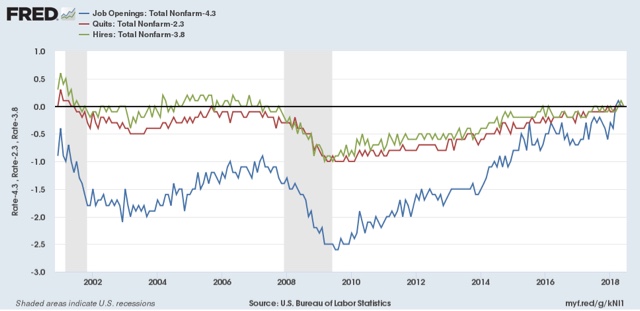
Finally, let's compare job openings with actual hires and quits. As you probably recall, I am not a fan of job openings as "hard data." They can reflect trolling for resumes, and presumably reflect a desire to hire at the wage the employer prefers. In the below graph, the *rate* of each activity is normed to zero at its June 2018 value:


Looked at this way, the data is very telling. While the rate of job openings is at an all time high, the rate of actual hires isn't even at its normal rate during the several best years of the last, relatively anemic, expansion. Meanwhile quits are tied for their best level since 2001 (at the end of the tech boom).

In other words, in econospeak, "wages are sticky to the upside." In everyday language, there is an employer taboo against raising wages. In response, employees are reacting by quitting at high rates to seek better jobs elsewhere.

In short, the June JOLTS report confirms a thriving employment market, but a market that is not in wage equilibrium, as employers are failing to offer the wages that employees demand to fill openings.

Tuesday, August 7, 2018

Gimme credit for Q2 2018: conditions looser, demand improves, but acaution flag for housing


 - by New Deal democrat

The Fed released its quarterly Senior Loan Officer Survey on credit yesterday. This is one of my long leading indicators. Let's take an updated look.

The first graph is of the percentage of banks tightening vs. loosening credit, for larger (blue) and smaller (red) firms. Thus a negative number, showing loosening, is a positive for the economy:


For large firms in particular, credit got very loose in the quarter just past.

Meanwhile, demand for those loans, which -- anomalously -- had been lackluster, picked up in the 2nd quarter:


For comparison purposes, here is credit provision for larger firms (blue below, as in the first graph above) vs. the weekly Chicago Fed National Financial Conditions Index (red):


You can see that the much more timely weekly measure is a good proxy.

Over the past 30 years, the provision of credit to firms has correlated well with corporate profits (both measured YoY in the graph below):


Finally, starting last quarter, I highlighted a few other measures in this survey which unfortunately have changed composition in the last decade. Since I've been watching housing closely, let me just republish the Fed's mashup of measures of tightening vs. loosening mortgage credit (first graph below), and demand for same (2nd graph):


This shows that mortgage conditions have been loosening for the last several years, and continued to do so last quarter. Meanwhile demand for mortgages has been declining in the last year, but if anything improved slightly. 

An interesting comparison to watch in the future is how well this might correlate with consumer loan delinquency, which will be updated for the 2nd quarter next week by the NY Fed:


Delinquencies bottomed in Q1 2006 during the last expansion, a year or more after credit was tightened and demand decreased. They were improving as of the last report. 

The bottom line is that the 2nd quarter Senior Loan Officer Survey continued to be a positive for the economy.

Monday, August 6, 2018

How close are we to "full employment"?


 - by New Deal democrat

As I pointed out Friday, there was a lot of good news underneath the headline jobs gain -- primarily in labor force participation and underemployment. So, how close are we to "full employment," based on the last few expansions?

Let's start with the simple, straightforward unemployment rate of 3.9%. This is already considerably below the best reading of the 2000s expansion, and only 0.1% above the best reading of the 1990s expansion, which was tied two months ago in May:


But of course that isn't the end of it. Much attention has been paid to the U-6 underemployment rate, which reached a new expansion low of 7.5%. 

To begin with, there are actually 6 "alternative measures of labor underutilization" in the jobs report, U-1 through U-6. U-6 consists of total unemployed (U-3, shown below in green) + "discouraged workers" (U-4) + "all persons marginally attached labor force" (U-5, blue) + those "employed part time for economic reasons" (red):


Even a cursory glance shows that U-3 and U-5 seem to move in tandem, with U-6 more variable. To show that better, the below graph takes the same three series and norms them to their  readings at the peak of the 1990s tech boom:


You can see the U-5 is already right in line where it was then. It is only U-6 that remains elevated, i.e., only the percentage of those who are working part time involuntarily, which is about 0.8% higher than in 1999.

In addition to the higher percentage of involuntary part time workers, let's look at prime age labor force participation (first graph below, red is quarterly average) and the prime age employment population ratio (second graph, normed to zero at its current reading of 79.5%):


The prime age employment population ratio in particular is 0.8% below its level at the peaks of both the 1980s and 2000s expansion. It is 2.4% below that of the 1990s tech boom.

I doubt that we have to go all the way to the levels of the tech boom, which was after all only the second real boom of the last 60 years.  Since the population of those age 16 through 64 is 206.5 million, increasing employment by 0.8% will take 1.65 million jobs over and above further population growth. If the prime age employment ratio continues to grow at the 0.9% rate it has in the last year, we should arrive at "full employment" participation levels in the next 10-12 months.

Further, if involuntary part time employment continues to shrink at the -1% YoY level it has in the last 12 months, or about 1.3 million growth in full time vs. part time jobs, we should arrive at "full, full-time employment" in about 9 to 10 months.

I don't know how much longer this expansion lasts before employment begins to fall at the outset of a recession, but based on my most recent long term forecast (slowdown but no recession in the next 12 months), it is a reasonable bet that, for at least some brief period, we will get to the above levels of "full employment."