Wednesday, May 15, 2024

April consumer prices: still an interplay of gas and house prices, with a side helping of motor vehicle insuance


 - by New Deal democrat


First, a programming note: I’ll post about retail sales later today.

Consumer inflation in April continued essentially to be an interplay between shelter and gas prices, with a side helping of auto insurance and repairs. During late 2022 and early 2023, shelter was still accelerating or steady at a high rate of inflation, while gas prices were falling. Beginning in late 2023, the dynamic reversed, as shelter inflation was slowly decelerating, while gas prices had bottomed. That remained the case in April.

So first, let’s look at the month over month change in headline inflation (blue) vs. inflation less energy (red) and inflation less shelter (gold) for the past two years:


All three rounded to +0.3% increases in April, about par for the first two for the past twelve months, and above average for CPI less shelter.

On a YoY basis, the trends become clearer, with the increase in gas prices leading to an increase in all items less shelter, steady headline inflation, but a continued deceleration in CPI less energy - which is another way of saying that energy prices have increased, while shelter price gains have continued to abate:


In particular, shelter has continued to behave as I expected. Here is an update to the 12-18 month leading relationship between house prices (as measured by the FHFA) and Owners’ Equivalent Rent in the CPI:


House prices are currently increasing at about their average pre-pandemic rate, which has translated to OER and the other measures of shelter inflation to continue to decelerate YoY, but at a slower pace than their initial rapid decline. On a YoY basis, OER has increased 5.8%, a -0.1% decline from its YoY rate in March. Rent of primary residence (not shown) has followed a similar trajectory, currently up 5.4% YoY vs. 5.7% YoY in March. I expect this trend to continue in the coming months.

Although I won’t bother with a graph, the former problem children of new and used vehicle prices have reached a new equilibrium. Used car prices have actually declined -6.9%YoY, including -0.4% in April. New car prices are also down -0.4% YoY.

The remaining problem areas of inflation are:

 (1) food away from home (fading), which peaked at 8.8% YoY just over one year ago, and is now down to a 4.1% increase, close to its pre-pandemic average of 2.5%-3.0%;
 (2) electricity, which has followed gas prices higher, rising from 2.2% YoY last August to 5.1% in April, although it declined -0.1% for the month; and 
 (3) transportation services - mainly car repairs (unchanged for the month, but up 7.6% YoY) and insurance (up 1.8% for the month and up 22.6% YoY!) - which has rocketed from its pre-pandemic range of 2.5%-5.0% to as high as 15.2% in October 2022, and is now still up 11.2%.


Although I won’t repeat the graph this month, based on the past inflationary period of 1966-82, it is clear that transportation services lags increases in vehicle prices by 1-2 years and even more, sometimes increasing right through recessions

To summarize: if we exclude the well-documented historically lagging sectors of shelter prices and motor vehicle insurance, consumer inflation continues to be well behaved. To repeat: ex shelter, consumer prices are only up 2.2% YoY. Any surprises in the month ahead will likely be due to changes in gas prices. If gas prices become well-behaved again, headline inflation should go below 3%

Tuesday, May 14, 2024

April producer prices reflect some building pressure from a strong economy with full employment


 - by New Deal democrat


Tomorrow and Thursday a plethora of data will be released, on consumer inflation and spending, production, housing, and jobless claims. In the meantime today we got a chance to look at upstream pressures on inflation.


And those upstream pressures do seem to be building slightly, reflecting a strong economy with full employment.

Commodity prices increased 0.9%. These are very volatile, so this was not particularly out of the ordinary, as shown in the below graph of monthly changes for the past 10 years:


YoY commodity prices are just 0.1% above unchanged (red, left scale in the graph below). They are very well behaved compared with just after the pandemic (blue, right scale):


By the time we get to finished products, we can see some pressures building up particularly as to goods (blue), which increased 0.7% in April and so far this year are up 4.1%. Service inflation (red) for producers rose 0.6%, the second highest monthly increase in two years:


By contrast, as shown in the below graph, in the six years before the pandemic, final demand goods and services typically rose on the order of 0.2% or 0.3% monthly:


Nevertheless, on a YoY basis both producer goods and services inflation is well within its normal range prior to the pandemic:


There is reason to believe, at least when it comes to goods, that the recent bigger monthly increases may not last. Below is the most recent update of the FRBNY’s Global Supply Chain Pressure Index:


Each horizontal line represents one standard deviation from the long term average (including the pandemic).  Since late last year there had been some tightness compared with the pre-pandemic average, but in April this entirely dissipated.

So to reiterate, it looks likely that there is a little producer pressure due to a strong economy and full employment, but nothing out of the range of normal on any significant time frame at this point.

Tomorrow we will see how this plays out with consumer prices. Because gas prices increased 5.4% in April, I am expecting the headline number to come in a little hot as well. Meanwhile I expect shelter inflation to continue to abate but more slowly than in the past 12 months. We’ll see.

Saturday, May 11, 2024

Weekly Indicators for May 6 - 10 at Seeking Alpha


 - by New Deal democrat


My “Weekly Indicators” post is up at Seeking Alpha.

The majority of short leading and coincident indicators continue to show strength rather than weakness. This week it was commodity prices’ turn to show that the global economy is getting stronger.

As usual, clicking over and reading will bring you up to the virtual moment as to the economic data, and reward me with a little pocket change for my efforts.

Friday, May 10, 2024

The Household Survey isn’t the only data series sending up caution flares


 - by New Deal democrat


I’ve written two posts earlier this week delving into the big divergence between the Establishment Survey portion of the Employment Report, which shows moderate growth, and the Household Survey, which is most consistent with a recession already having started.


At any given time, some data will be positive and some will be negative. That’s why I follow a whole series of reports with longer term proven reliability. Most of those at present are positive.

But the Household Survey isn’t the only negative data point. 

Here is a graph from six months ago showing the historical record over the past 25 years of both the ISM manufacturing index and the ISM non-manufacturing index. The former has a 75 year history, but the latter was only started 25 years ago and somewhat revised 10 years later:


Since the China shock in particular following its being accorded normal trade relations in 1999, there have been a number of “false positives” in the manufacturing index. But when it has been paired with the non-manufacturing index, measuring services, and the latter has *also* dipped below the 50 mark dividing expansion from contraction, the economy *has* been in recession - with the sole exception of one month in 2022.

Since then, the manufacturing index has been generally improving, although in April it dipped back below 50 to 49.2:


Also in April, the non-manufacturing index dipped below 50 for the second time post-pandemic, to 49.4:


Again, only one month. But worth paying extra attention to. If the non-manufacturing index gives us several more readings below 50 without further improvement in the manufacturing index, that would spell trouble.

Thursday, May 9, 2024

Initial claims jolted awake from snooze-fest by highest number in almost nine months


 - by New Deal democrat


After several months of snoozing at almost identical weekly levels, initial jobless claims awoke with a bit of a jolt this week, increasing by 22,000 to 231,000, the highest weekly number since last August. The four week average unsurprisingly also rose, by 4,750, to 215,000. With the usual one week delay, continuing claims rose 17,000 to 1.785 million, still one of the lowest readings since last August:


As usual, the YoY% figures are more important for forecasting purposes. The weekly number was higher for the first time in six weeks, by 2.7%. The four week average is still lower by -1.4%. Continuing claims remain higher, by 4.6%, but are still close to their lowest YoY reading in over a year:


Now that we have all of the jobless claims data for April, here’s what the monthly numbers (right scale) look like compared with the unemployment rate (left scale):


To reiterate, we have 60 years of evidence that initial jobless claims in particular lead the unemployment rate. Continuing claims do also with a much shorter lead time, and sometimes they are coincident. With initial and continuing claims close to unchanged YoY, the unemployment rate should move in that direction as well. Now that the last 3.4% reading of the unemployment rate is out of the picture,  and there is only one 3.5% reading left (for July), I continue to expect that the unemployment rate is more likely to decline towards 3.7% than any other direction. As to last week’s renewed 3.9% rate, Paul Krugman has helpfully noted that it was primarily a rounding issue, as one digit further out it rose from 3.83% to 3.87%. In any event, initial claims continue to indicate that the “Sahm Rule” is not going to be triggered in the near future.

A quick scan of this week’s release does not indicate any special issues in any State. Because last year seasonally adjusted claims rose throughout May and remained high during the summer, it is possible there is a residual post-pandemic seasonal adjustment issue. We’ll have to watch and see if this is just a one-off anomaly or the beginning of a longer change of trend.

Wednesday, May 8, 2024

The Establishment survey portion of the jobs report continued to be positive


 - by New Deal democrat


On Monday I wrote that the Household survey portion of the jobs report was recessionary for the second time in three months. But I pointed out that there was a very large divergence in jobs growth in the past 24 months, amounting to 1.7% of the prime age workforce, between that survey and the Establishment survey, one of the largest such divergences on record.


Today let’s take a look at the Establishment survey, which is much more positive.

Every month as part of my look at the jobs report, I look at the leading employment sectors. These are the ones that usually turn down first before the overall jobs market does.

So let’s look at five of those sectors: manufacturing, the sub-sector of motor vehicle manufacturing, construction, the sub-sector of residential building construction, and goods production as a whole.

To begin with, with the exception of the manufacturing data in several months, almost all of these have been positive every month for the entire last year:


That’s pretty positive, especially when we see how this compares with the historical record.

Here’s the YoY% change in each post-pandemic:


Unsurprisingly, per the above, all are positive.

Here is the historical record:


With the exception of 1960 and the two oil shocks of the 1970s, all or at least most of these had turned negative before or just as the recession was beginning. That’s not the case now.

Even before these average hours in manufacturing have turned down, typically by more than -.5 hours YoY. At present, average manufacturing hours are down -0.1:


Here’s the historical record for comparison:


Especially in the past 30 years, there have been about half a dozen times when manufacturing hours have been down more than they are now YoY without a recession occurring.

In short, when we look at the jobs sectors that we would expect to already be suffering before a recession were to start, there are no such signs of distress at present. And since the Establishment Survey is bigger and less noisy than the Household Survey, we should expect the divergence between the two to resolve in the Establishment Survey’s direction.

Tuesday, May 7, 2024

Q1 credit conditions showed no significant change


 - by New Deal democrat


The Senior Loan Officer Survey is a long leading indicator, telling us about credit conditions that typically turn worse a year or more before the economy turns down, and improve just at the economy is ready to turn up.


The big drawback of this series is that the information is only reported Quarterly, and with a one a one month lag. As I indicated in my introductory note yesterday, data for Q1 was released yesterday.

There are two series that have a long enough record to give us a lot of information: whether banks are tightening or loosening standards; and the demand for commercial and industrial loans. 

Let’s look at each in turn.

The first series is the percentage of banks tightening lending standards, meaning that a positive number means more tightening than loosening standards, i.e., positive is worse for the economy. In Q1, there was a slight increase in the percentage of banks tightening credit conditions:


Versus Q4 of last year, in Q1 there was a 1.1% increase to 15.6% in the number of banks tightening standards for large firms, and a 1.2% increase to 19.7% as to small firms. This is similar to what happened in 2002, is not a significant change q/q, and is much lower than the roughly 50% for both metrics back in Q3 of last year. As with Q4, this is consistent with coming out of past recessions.

The story was similar as to the second series, demand for commercial and industrial loans (confusingly, in this one higher does mean better). There was a slight downshift q/q of -1.6% as to large firms and -0.6% as to small firms:


Again, this has been more typical of an economy coming out of a recession than going in to one. 

The Chicago Fed also looks at credit conditions, but their data is weekly and thus much more timely. Here the data has been much more consistently good (these series, again, are ones in which a positive number means “tightening” and so is worse for the economy):


The Index adjusted for “normal” credit conditions has never shown any tightness since the end of the pandemic lockdowns in 2020. The more leading leverage subindex did show tigh contentions after the Silicon Bank failure last year, but has been negative or neutral for the past six months. Note that the leverage index has been more prone to false positives than the adjusted financial conditions index.

Unless for some reason the Fed decides to tighten again, or there is another spate of bank failures, credit conditions are either relatively loose (the Chicago Fed indexes) or “less restrictive” (the Senior Loan Officer Survey), which do not indicate any particular credit stress in the system.

Monday, May 6, 2024

For the second time in three months, the Household jobs Survey was recessionary


 - by New Deal democrat


First, a brief programming note. This week is particularly sparse in the new economic data department. The Senior Loan Officer Survey will be reported this afternoon, and on Thursday as usual we get jobless claims. Aside from that, nada. So I might take a day or two off.


But I want to spend some time looking more closely at last Friday’s jobs report(s). I use the plural, because last Friday there really were two very divergent reports. The Establishment report was decent, but as I say in the title to this post, for the second time in three months, the Household Report was what I would expect to see in a recession.

Let’s start by comparing the employment level (blue) with the unemployment level (red). The former did increase by a paltry 25,000, while the latter increased by 64,000. On a YoY basis, the employment level is up 0.3% (blue in the graph below), while the unemployment level is up 13.6% (red, /15 for scale). The graph adds or subtracts the current change so that both show at the zero line):


The next two graphs give the historical view, with the same adjustment:


At no point in the past 75 years have both metrics been at their respective current levels except during recessions. Only twice - in the 1950s - did they come even close.

A similar story is told by the U-3 unemployment rate (blue) and the U-6 underemployment rate (red)(this latter statistic has only been reported since 1994). Currently the unemployment rate is 0.5% higher than 12 months ago, and the latter 0.8% higher:


Again, here is the historical view:


Neither one has ever been this much higher YoY without a recession having already started.

Note that the above is different from the “Sahm Rule,” which is a three month average increase of 0.5% over the 3 month average low in the past 12 months. That metric currently stands at .37%:


With only 4 exceptions (and one near miss) in the past 75 years, even at this level a recession has already been occurring:


Turning to the employment side of the coin, the YoY change in the employment level is slightly below the YoY change in the prime age population, i.e., the number of people who became employed is less than the number of people who on net entered this prime employment demographic:


Historically only 4x in the past 50+ years has this been the case without a recession already occurring or at least imminent, and one of those times was only for one month:


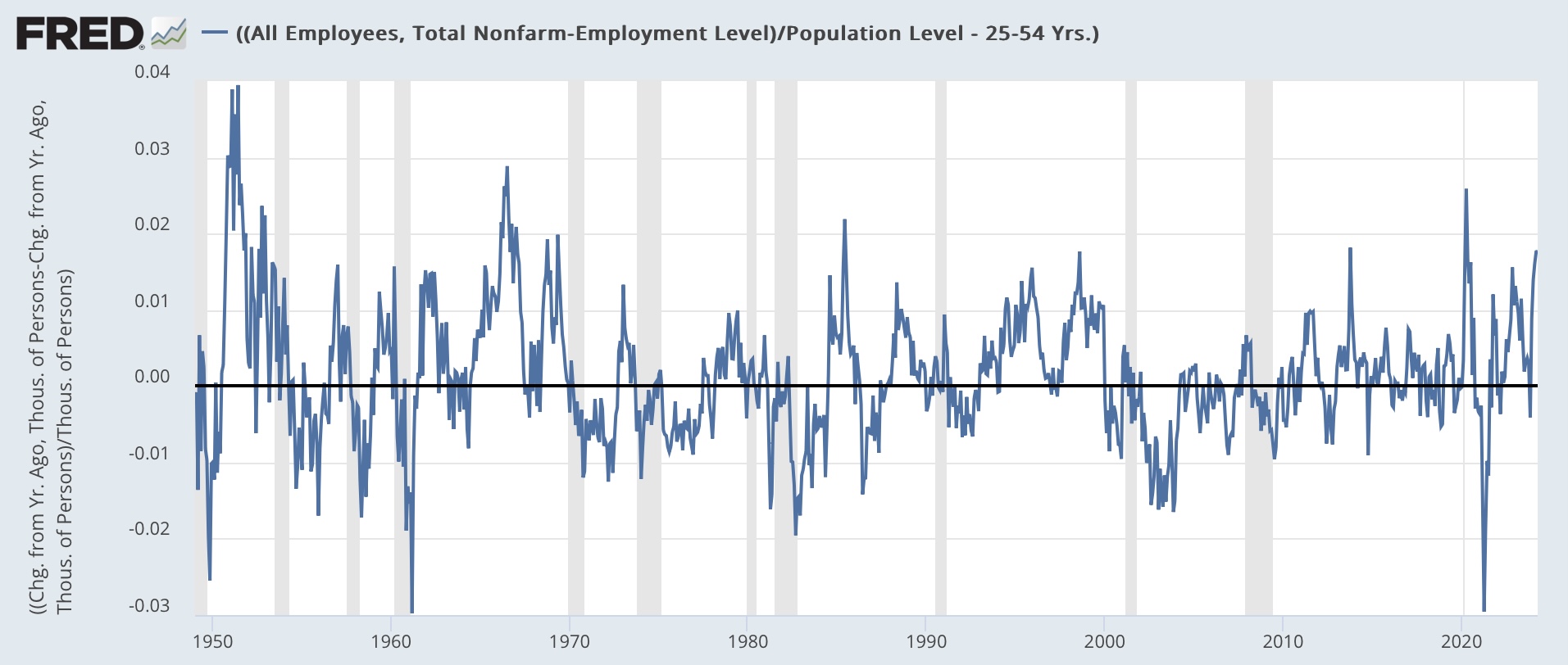
At root the source of this divergence dates back to March 2022. Since then, while the Establishment Survey has indicated that jobs have grown by 4.6%, the Household Survey has indicated only a 2.1% gain:


Indeed this divergence between the two measures, on a YoY population-adjusted basis presently at about 1.7%, has only been matched, and usually only for a month or two, 8x in the past 50+ years:


As the above graph shows, while there is lots of noise, there has always been a reversion to the mean. Normally this is because the noisier Household series converges towards the more stable Establishment survey data. 

I suspect what is going on has to do with the formation and closure of new businesses. There is plenty of evidence that in the immediate aftermath of the pandemic, a record number of new businesses were started. If some of the self-employed at those businesses have attritted back into employment by others, that may explain the disparity. If so, I would expect to see a couple of outsized gains in the Household survey in the months ahead. We’ll see.

Saturday, May 4, 2024

Weekly Indicators for April 29 - May 3 at Seeking Alpha


 - by New Deal democrat


My “Weekly Indicators” post is up at Seeking Alpha.

Very little change this week in any of the indicators, but what there was had everything to do with the frame of reference, because all gas prices under $3/gallon have now dropped out of the three year reference period. Which means that - *relatively* speaking - gas prices are currently cheap!

As usual, clicking over and reading will bring you up to the virtual moment as to the state of the economy, and reward me with some pocket change for organizing it for you in a coherent format.

Friday, May 3, 2024

April jobs report: counterbalancing March’s blockbuster good report, the first significant “ding” to the soft landing scenario in months


 - by New Deal democrat


In the past few months, my focus has been on whether jobs gains are most consistent with a “soft landing,” i.e., no further deterioration, or whether deceleration is ongoing; and more specifically: 
  • Whether there is further deceleration in jobs gains compared with the last 6 month average, vs. a “soft landing” stabilization - and even whether the recent increase in monthly jobs numbers signifies a re-strengthening.
  • Based on the leading relationship of initial and continuing jobless claims, whether the unemployment rate is neutral or decreasing; or whether there is further weakness.
  • Based on the leading relationship of the quits rate to average hourly earnings, whether YoY wage growth would continue to decline slightly. It did continue to decline to a new post-pandemic low - but still at 4%.

All three of these metrics came in negative, in the sense of the lowest gain in jobs since last October, and the 4th lowest in over 3 years. The unemployment rate increased. And average hourly wage growth decreased to its lowest rate in almost 3 years as well.

Here’s my in depth synopsis.


HEADLINES:
  • 175,000 jobs added. Private sector jobs increased 167,000. Government jobs increased by 8,000. 
  •  February was revised downward by -34,000, while March was revised upward by 12,000, for a net decline of -22,000. This continues the pattern from nearly every month in the 16 months of a steady drumbeat of downward net revisions.
  • The alternate, and more volatile measure in the household report, showed a paltry 25,000 increase. On a YoY basis, in this series only 529,000 jobs, or 0.3%, have been gained. This is the lowest YoY increase since the pandemic lockdowns.
  • The U3 unemployment rate rose 0.1% to 3.9%, tying February’s 2 year high.
  • The U6 underemployment rate also rose 0.1% to 7.4%, 0.9% above its low of December 2022.
  • Further out on the spectrum, those who are not in the labor force but want a job now rose 194,000 to 5.637 million, vs. its post-pandemic low of 4.925 million set just over 12 months ago.

Leading employment indicators of a slowdown or recession

These are leading sectors for the economy overall, and help us gauge how much the post-pandemic employment boom is shading towards a downturn. These were very mixed:
  • the average manufacturing workweek, one of the 10 components of the Index of Leading Indicators, declined -0.1 hours to 40.7 hours, and is still down -0.8 hours from its February 2022 peak of 41.5 hours.
  • Manufacturing jobs rose 8,000.
  • Within that sector, motor vehicle manufacturing jobs declined -2,100. 
  • Truck driving declilned -300.
  • Construction jobs increased 9,000.
  • Residential construction jobs, which are even more leading, rose by 2,800 to another new post-pandemic high.
  • Goods producing jobs as a whole rose 14,000 to another new expansion high. These should decline before any recession occurs.
  • Temporary jobs, which have generally been declining late 2022, fell by another -16,400, and are down almost -500,000 since their peak in March 2022. This appears to be not just cyclical, but a secular change in trend.
  • the number of people unemployed for 5 weeks or fewer rose 73,000 to 2,262,000.

Wages of non-managerial workers
  • Average Hourly Earnings for Production and Nonsupervisory Personnel increased $.06, or +0.2%, to $29.83, for a YoY gain of +4.0%. With revisions, the YoY growth in these have been sliding almost relentlessly since 2 years ago. This is the lowest YoY gain since June 2021, vs. its post-pandemic peak of 7.0% YoY in March 2022.

Aggregate hours and wages: 
  • the index of aggregate hours worked for non-managerial workers declined -0.2%, and is up 1.4% YoY.
  •  the index of aggregate payrolls for non-managerial workers rose 0.1%, and is up 5.5% YoY, the second lowest YoY advance since the end of the pandemic lockdowns. This is 2.0% above the most recent YoY inflation rate, and despite the decline in growth remains powerful evidence that average working families have continue to see gains in “real” spending money. On the other hand, most likely once April’s CPI is reported, there will be a month over month decrease.

Other significant data:
  • Professional and business employment declined -4,000. These tend to be well-paying jobs. This series had generally been declining since last May, but in the previous 4 months had resumed their increase; but are still only higher by 0.4% from one year ago.
  • The employment population ratio declined -0.1% to 60.2%, vs. 61.1% in February 2020.
  • The Labor Force Participation Rate remained steady at 62.7%, vs. 63.4% in February 2020.


SUMMARY

After last month’s extremely strong report, it was perhaps inevitable that this month’s report would be relatively disappointing. And disappoint it did, as the Establishment survey was very mixed, and the Household report was *very* weak.

There were some good points, as job growth continued in manufacturing, construction, and goods production in general. I would expect all of these to turn down before.- in the case of the first two, well before - any recession were to hit. And the reason for the relatively poor headline jobs number was the paltry growth in government jobs. Growth in the private sector was actually average for the past 18 months.

But these were overwhelmed by most of the bad points. In the Establishment Survey, auto, trucking, and temporary help jobs declined. Revisions were once again net negative. The manufacturing workweek declined slightly. Worse, the aggregate number of hours worked declined. And aggregate payrolls rose a paltry 0.1%. In the Household Survey, only 64,000 jobs were gained, while unemployment increased by 25,000, driving an increase in the unemployment and underemployment rates. The YoY gain of 0.3% in jobs in this survey historically has been recessionary. 

On net, this report mainly balances last month’s great report. It doesn’t set off any alarm bells, but it’s the first significant ding in the “soft landing” hypothesis in many months.

Thursday, May 2, 2024

The snooze-a-than in jobless claims continues; what I am looking for in tomorrow’s jobs report


 - by New Deal democrat


 The snooze-a-thon in jobless claims continues, as both initial and continuing claims are well-behaved within the narrow range where they have been generally for the past six months.


Initial claims were unchanged least week at 208,000, while the four week moving average declilned -3,500 to 210,00. With the usual one week delay, continuing claims were unchanged at 1.774 million, which is tied for the lowest level in nearly 9 months except for a three week period right at the turn of the year:


Ask per usual, the YoY% change is more important for forecasting purposes. On that basis initial claims were down -2.8%, the four week average down -3.1%, and continuing claims higher by 4.0%, just above last week’s 14 month low point for that metric:


As has been the case for a number of months, since jobless claims lead the unemployment rate with a several month lag, plugging these numbers into the Sahm rule indicates that we should expect the unemployment rate not to rise from 3.8% in tomorrow’s report, and it is more likely to decline to 3.7% or even 3.6% in the next few months:


The forecast is for continued economic expansion.

Turning to several more metrics that guide my thinking on tomorrow’s employment report, here’s a look at the status of the “consumption leads employment” indicator. The YoY% change in both real retail sales and real personal consumption have improved in recent months, but nevertheless I would expect a slow deceleration in the YoY comparisons of monthly job growth to continue:


Since last spring we were running close to 300,000 monthly, I would expect less than that but probably greater than 200,000 tomorrow. Lots of monthly noise! But that should be the trend.

Here is a repeat of yesterday’s graph of the quits rate vs. YoY wage gains:


I expect the trend of deceleration to continue with wage gains as well. I am looking for a range of between 4.1% to 4.4% YoY.

Continuing as to wages, the below historical graph of the YoY% change in wages is what is behind my not being alarmed about the recent monthly upticks in inflation:


Note that with the exception of twice in the 1970s stagflation era, YoY wage growth has always increased as the expansion wears on. If I saw wage growth turn around and start to rise again, I would be alarmed. But that simply isn’t happening.

Finally, earlier this week the Employment Cost Index for Q1 was reported, showing an uptick to 1.1% q/q for wages and 1.2% q/q for all compensation including other benefits:


These series are both a little noisy, and I interpret the quarterly wage increase as being within the normal range of fluctuation. Benefits compensation, on the other hand, definitely jumped. This index is important because, as the BLS’s explanation indicates:

“The Employment Cost Index measures the change in the hourly labor cost to employers over time. The ECI uses a fixed ‘basket’ of labor to produce a pure cost change, free from the effects of workers moving between occupations and industries and includes both the cost of wages and salaries and the cost of benefits.”

In other words, the ECI is not affected by the change in the make-up of the job market (such as we had during the pandemic, when many more low wage workers were laid off in comparison with high-wage workers).

The E.C.I. Is telling us that workers still have a very strong “hand” compared with the past 50 years, if not quite as strong as several years ago.

This is the template of what I will be particularly looking for in tomorrow’s jobs report.

Wednesday, May 1, 2024

March JOLTS report: declines in everything, fortunately including layoffs


 - by New Deal democrat


After almost half a year of general stabilization, or very slow deceleration, the JOLTS report for March featured multi-year lows in almost all of its components. 

Job openings (blue in the graph below), a soft statistic that is polluted by imaginary, permanent, and trolling listings, declined -325,000 to a three year low of 8.488 million. Actual hires (red) declined -281,000 to 5.500 million, the lowest level since the pandemic lockdowns. Voluntary quits (gold) declined -198,000 to a more than three year low of 3.329 million. In the below graph, they are all normed to a level of 100 as of just before the pandemic:


As has been the case for a number of months now, hires are below the level they were at just in early 2020 just before the pandemic hit, and this month they were joined by quits as well.

The reason the above situation has not been bad is that layoffs and discharges (blue in the graph below) also made a fifteen month low, and are still running 20% below the level they were at just before the pandemic, and indeed (not shown), at *any* point before :


The more leading weekly initial jobless claims (red) suggest that layoffs and discharges will remain in this range at least for several more months.

Finally, the quits rate also declined -0.1% to a new 3.5 year low as well. Since, as I have noted for a number of months now, the quits rate (blue in the graph below, right scale) tends to lead average hourly earnings (red) [and here’s the long-term view]:


this suggests that the deceleration in wage growth will continue in coming months as well, as shown in the below post-pandemic close-up:


Needless to say, if such a further deceleration in wage growth coincides with an upturn in inflation, that is going to put a dent in real consumer income and spending. So I will pay even more attention to those two numbers on Friday and later in the month. It also highlights the continuing importance of very low initial jobless claims.