- by New Deal democrat
First, a brief programming note. This week is particularly sparse in the new economic data department. The Senior Loan Officer Survey will be reported this afternoon, and on Thursday as usual we get jobless claims. Aside from that, nada. So I might take a day or two off.
But I want to spend some time looking more closely at last Friday’s jobs report(s). I use the plural, because last Friday there really were two very divergent reports. The Establishment report was decent, but as I say in the title to this post, for the second time in three months, the Household Report was what I would expect to see in a recession.
Let’s start by comparing the employment level (blue) with the unemployment level (red). The former did increase by a paltry 25,000, while the latter increased by 64,000. On a YoY basis, the employment level is up 0.3% (blue in the graph below), while the unemployment level is up 13.6% (red, /15 for scale). The graph adds or subtracts the current change so that both show at the zero line):
The next two graphs give the historical view, with the same adjustment:
At no point in the past 75 years have both metrics been at their respective current levels except during recessions. Only twice - in the 1950s - did they come even close.
A similar story is told by the U-3 unemployment rate (blue) and the U-6 underemployment rate (red)(this latter statistic has only been reported since 1994). Currently the unemployment rate is 0.5% higher than 12 months ago, and the latter 0.8% higher:
Again, here is the historical view:
Neither one has ever been this much higher YoY without a recession having already started.
Note that the above is different from the “Sahm Rule,” which is a three month average increase of 0.5% over the 3 month average low in the past 12 months. That metric currently stands at .37%:
With only 4 exceptions (and one near miss) in the past 75 years, even at this level a recession has already been occurring:
Turning to the employment side of the coin, the YoY change in the employment level is slightly below the YoY change in the prime age population, i.e., the number of people who became employed is less than the number of people who on net entered this prime employment demographic:
Historically only 4x in the past 50+ years has this been the case without a recession already occurring or at least imminent, and one of those times was only for one month:
At root the source of this divergence dates back to March 2022. Since then, while the Establishment Survey has indicated that jobs have grown by 4.6%, the Household Survey has indicated only a 2.1% gain:
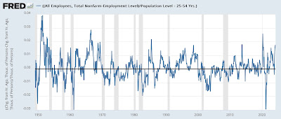
Indeed this divergence between the two measures, on a YoY population-adjusted basis presently at about 1.7%, has only been matched, and usually only for a month or two, 8x in the past 50+ years:
As the above graph shows, while there is lots of noise, there has always been a reversion to the mean. Normally this is because the noisier Household series converges towards the more stable Establishment survey data.
I suspect what is going on has to do with the formation and closure of new businesses. There is plenty of evidence that in the immediate aftermath of the pandemic, a record number of new businesses were started. If some of the self-employed at those businesses have attritted back into employment by others, that may explain the disparity. If so, I would expect to see a couple of outsized gains in the Household survey in the months ahead. We’ll see.


