Tuesday, January 17, 2023

Why the Fed’s present rate hike campaign is almost unprecedented


 - by New Deal democrat


Just how unprecedented is the Fed’s current rate hike policy? Since the Fed started actively managing the Fed Funds rate in the late 1950s, only two other occasions are similar.


The reason the Fed is hiking rates is to combat inflation. But, as I have pointed out in the past, the post-pandemic Boom is very similar to the immediate post-WW2 Boom. In 1947 in the face of 20% YoY inflation, the Fed did - basically nothing. It raised the discount rate from 1% to 1.5%:


Prices stabilized on their own once they reached the limit of ordinary consumers to bear. There was a brief inventory-led recession in 1948, and the economy proceeded to motor right forward.

In 2022, the Fed raised rates by 4% in the last 10 months of the year, one of the most aggressive rate hike regimes in history, as shown in the below graph of the YoY change in the Fed funds rate:


Inflation peaked in June. Since then, the Fed has continued to hike rates by 2.75%:


Not only was the 2022 rate hike regime among the most aggressive, but it was unusual in another way. As shown in the below graph, in all other occasions of significance but two, the Fed raised rates coincident with *rising* inflation. The Fed stopped hiking rates before or at most shortly after inflation peaked:


Indeed, typically once inflation started declining, the Fed started to *lower” rates, generally in the face of a weakening economy. By contrast, last year the YoY change in the CPI peaked in June. Since then, the Fed has hiked rates by another 2.75%.

There have only been 4 other times in the past 60+ years that the Fed has continued to raise rates after inflation peaked. Two of those were barely significant, involved rate hikes of only 0.5%. In 1997, the Fed funds rate increased from 5.25% to 5% as inflation declined from 3.4% to 1.4%. In 2018-19, the Fed funds rate was increased from 2% to 2.5% as inflation declined from 2.9% to 1.5%. Neither of those were associated with a recession (the 2020 recession being caused by the pandemic).

Two other times involved rate hikes 2% to 3% or less that were associated with slowdowns but no recessions. In 1984, the Fed funds rate was hiked over 5 months from 9.5% to 11.75%, as inflation declined from 4.9% to 4.3%:


In 1994-95, the Fed funds rate was hiked from  3% to 6% over 17 months, even as inflation varied only from 2.8% to 2.3% to 3.1%:
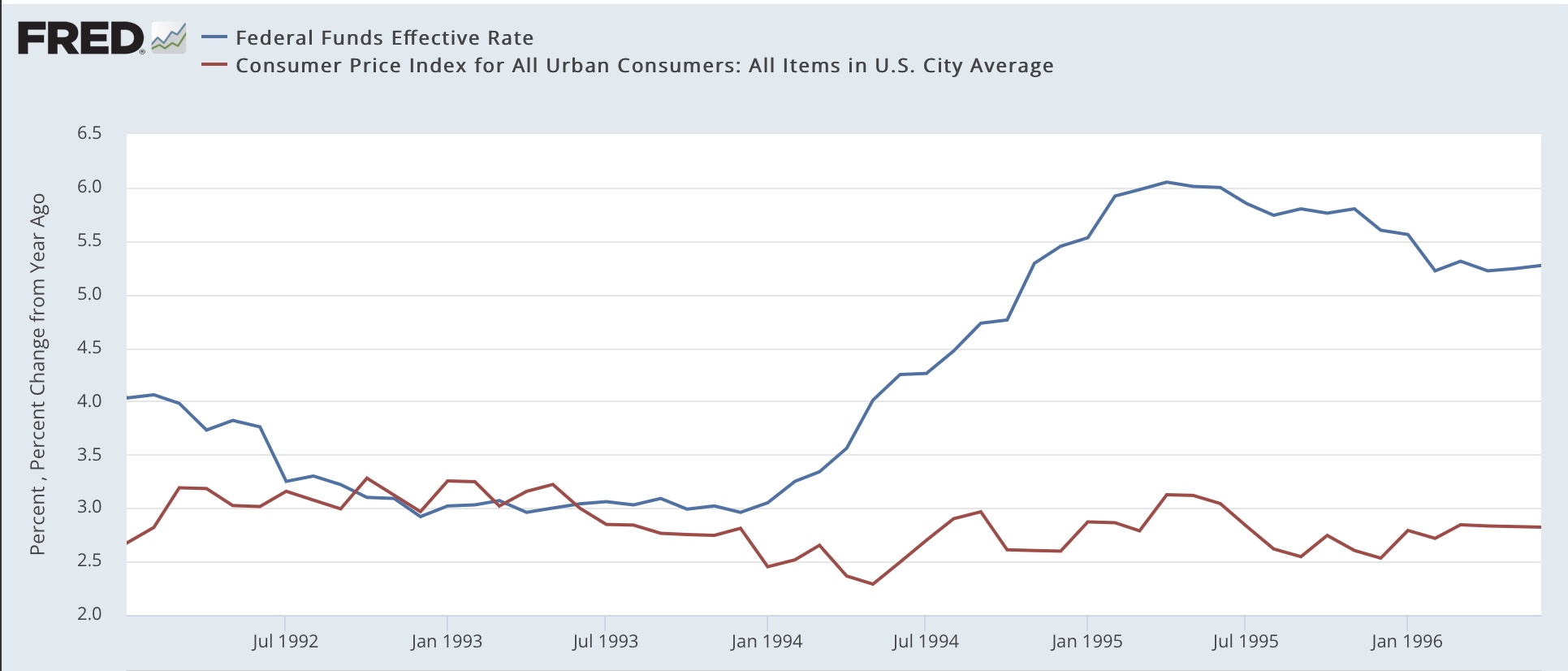


There was a sharp slowdown - enough perhaps not coincidentally to contribute to the GOP obtaining a majority in the House of Representative for the first time since the Great Depression - but no recession.

By far the biggest episode occurred in 1980 and 1981. In April 1980 the Fed funds rate peaked at 17.5% exactly as inflation peaked at 14.6%. Thereafter, despite inflation receding to 13.2%, the Fed under Paul Volcker renewed a rate hike campaign, going from 9% to 19%, even as inflation continued to cool to 9.7%. The deep 1981-82 recession, that saw unemployment rise to over 10% for the first time since the Great Depression, ensued:


The current Fed rate hike campaign is more serious than any but the 1980-81 hikes. And even in 1994 inflation was mainly going sideways, not declining. That leaves only the 1984 episode as the only other one truly comparable.

Using core inflation, the situation is the same, with the exception that inflation has not declined significantly at present, solely due to the prominence of the badly lagging measure of owner’s equivalent rent that makes up 40% of the metric:


And it is similar if I use the core personal consumption expenditure deflator as well, with the exception of 1969, where the Fed continued to raise rates into a recession as the core deflator peaked but stabilized there. In our present situation the core deflator has declined -0.5% from 5.2% last February to 4.7% in November:


To summarize: over the past 60+ years, the Fed has normally only raised rates as inflation was rising, and stopped or reversed course once inflation began to decline. Several of the exceptions are not significant, involving rate hikes of 0.5% as inflation declined. One (1994) involved rate hikes in the face of relatively flat inflation, and of the remaining two, one (1984) contributed to a sharp slowdown in the economy with no recession. The other (1980-81) contributed to one of the two worst recessions since the Great Depression, and was justified by Volcker as being necessary to uproot inflationary expectations and a wage-price spiral.

There is very little evidence of any wage-price spiral or embedded future expectations at present. And yet the Fed has continued to hike rates even as inflationary pressures have ebbed (and outside of Owner’s Equivalent Rent, appear contained).


The important trend in retail sales that Redbook’s weekly report is telling us about


 - by New Deal democrat


This is the first of hopefully two posts I will put up today.


Tomorrow retail sales for December will be reported. In advance of that, I wanted to discuss their comparison with the weekly high-frequency data of Redbook consumer sales, which I have been paying heightened attention to in the past several months.

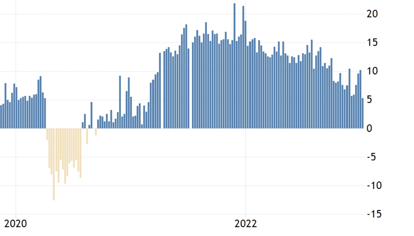
Here is what Redbook YoY sales look like since the beginning of 2020:


After the initial pandemic lockdowns, they returned to positivity by summertime. Then they really took off with the receipt of the 2021 stimulus $$$ in March, peaking at about 18% YoY (on a 4 week average) at the end of the year. During 2022 they maintained strong YoY comparisons, before declining on a 4 week average basis from 14% at the end of July to only 7% in early December. If that trend were to continue, Redbook sales will go negative YoY in roughly April of this year.

Now let’s compare that with retail sales YoY, shown since July 2020 below (blue), compared with YoY CPI (red):


At first YoY retail sales and YoY Redbook do not appear that closely related. But on closer examination there is really only one difference. Retail and Redbook correspond at all times except during the three month March-May period of the 2021 stimulus spending, and again in the YoY comparisons one year afterward. In all other periods the two correspond - and Redbook has the smoother, less noisy trajectory.

I’m not sure what subset of retail sales went nuts in spring 2021 that Redbook wasn’t picking up (the first suspect was e-commerce, but that did not prove to be the case).

The point is that during late 2020, both Redbook at retail were higher about 2-5% YoY, then increased to 15-20% higher YoY in the second half of 2021, and decreased to 5-8% in the second half of 2022 through November. 

Redbook did have several good weeks at the end of December, so I won’t hazard any prediction of what tomorrow will bring for retail sales. but the suggestion is that they, like Redbook, have been deteriorating sharply on a YoY basis since last summer. At present, real retail sales are flat compared with inflation YoY. But if the deterioration continues several more months, I would expect a significant negative real retail sales comparison, which has a history going back over 50 years as being a harbinger of imminent recession.

One final note: here is what real retails sales looked like YoY in the early to mid-1990’s:


Note they deteriorated significantly but did not go negative in 1995-7. I’ll explain the significance in my second post today.


Monday, January 16, 2023

COVID endemicity: 100,000+ (mainly needless) excess deaths per year


 - by New Deal democrat


I suspect these updates are going to be much less frequent from now on; for example, if a significant new wave is evident. 


That’s because, as we start our fourth year of the pandemic, the good news is that it is far less lethal than it was during its first two years. From March 2020 through March 2021, 500,000 Americans died of Covid. Another 500,000 died in the next 12 months. But since last March, only 100,000 have died so far (an average of roughly 400 per day, mainly seniors, and mainly unvaccinated):


The bad news is that any hope that vaccinations would put an effective end to the pandemic - in terms of infections - is long gone. The virus has continually mutated to become more and more infectious, and far more evasive of the defenses erected both by previous exposures and by vaccinations, as the original strains through Delta were replaced by Omicron BA.1, then BA.2, then BA.2.12.1, then BA.5, and now the Alphabet soup featuring BQ.1&1.1 and XBB.1.5:


This is perhaps best shown by the situation in Puerto Rico and Rhode Island, two of the very best jurisdictions for the percentage of people who are vaccinated (thin line). Despite this, both had serious waves of infections throughout 2022:


One thing I considered is that perhaps COVID deaths were merely replacing deaths from influenza among the elderly. This does not appear to be the case.

In 2019, the last year before COVID, the CDC estimated that there were 26,400 deaths from the flu, with a huge range of error from 19,100 to 96,800. This year so far the estimate is 27,600 with a range of error from 16,000 to 48,000.

Further, here’s what flu infection levels looked like during the 2019 season:


This winter, we had an even worse peak, which occurred (so far, anyway) several months earlier:


But as I said at the outset, at least COVID appears to be far less lethal now than in its first two years.

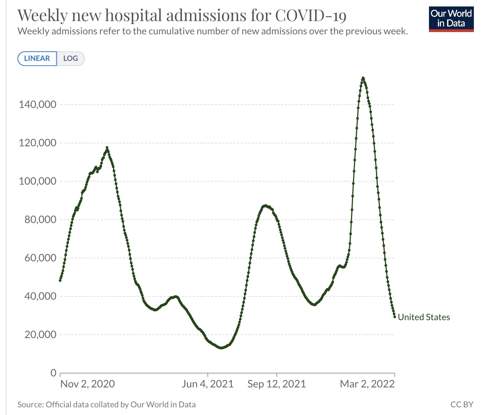
Here’s what hospitalizations looked like from autumn 2020 through the end of winter 2022:


Hospitalizations peaked at 117,700 on January 9, 2021; and then at 154,000 on January 15, 2022.

Hospitalizations appear to have just peaked again on January 3, at 47,600:


Similarly, deaths peaked on January 14, 2021 at 3380; and on February 1, 2022 at 2600:


As shown in the first graph above, this year deaths appear to have peaked on January 11, at 596. This is all in the face of what Biobot waste water levels suggest his been a higher level of infections that has persisted for over half a year, at a rate of roughly 1 in 1000 persons daily +/-200, as shown in the second graph at the beginning of this post.


So, the good news appears to be that, just like during the first two winters of Covid, the waves have peaked as soon as the infections from Holiday social get-togethers have worked through the population. Even the super-infectious XBB.1.5 has not created a wave meaningfully bigger than BA.2.12.1 did late last spring, in terms of “real” infections, hospitalizations, or deaths.

But the bad news is that we appear to be resigned to a future where perhaps 130,000 more people, most of them seniors, die in excess of what otherwise would be the case, each and every year, and most needlessly, as the percentage of the population being vaccinated has all but ground to a halt.


Saturday, January 14, 2023

Weekly Indicators for January 9 - 13 at Seeking Alpha


 - by New Deal democrat

My Weekly Indicators post is up at Seeking Alpha.

One thing that comes with the territory of high frequency indicators is that they can be noisy. And at no time of the year can they be noisier as during and right after the Holiday season. That appears to be the case this week, as a number of coincident indicators in particular displayed volatility.

This should settle down in a week or two. In the meantime, at one end I am paying extra attention to employment and consumer spending data, which should tip over when a recession begins. At the other, if current trends in long term interest rates continue, several such interest rates may soon improve from negative to neutral.

In the meantime, clicking over and reading should bring you up to the virtual moment, and reward me a little bit for the effort I put into aggregating and analyzing the data.

Friday, January 13, 2023

Real average wages and real aggregate payrolls for December 2022


 - by New Deal democrat


Now that we know December consumer inflation, we can see how the American working/middle class is “really” doing.


Nominally, average wages for nonsupervisory workers increased 0.2%, while prices deflated by -0.1%, meaning that “real” average wages increased 0.3% for the month:


While this only returns them to April’s level, and -2.2% below their December 2020 interim peak, they are also 1.5% higher than their pre-pandemic levels, and more importantly 1.3% above their recent June 2022 lows. Essentially all of the volatility in 2022 can be laid at the feet of the huge increase, then huge decrease, in gas prices.

Aggregate real payrolls tell us how much, in full, nonsupervisory workers are earning in “real” terms. As I noted again the other day, in the past whenever YoY inflation has been higher than YoY aggregate payrolls, a recession has either just started or was about to start:


With the addition of December consumer prices, here’s what that graph looks like for the past year and a half:


Since September, YoY aggregate payrolls and YoY consumer inflation have decelerated almost in lockstep, with payrolls growing faster than inflation by 1.0% +/-0.1%. In December it was just below 1.0%.

This is consistent with a very slow expansion.

I don’t have any special tools for divining how the net difference between the two will play out over the coming months, but I do suspect that the big decline in gas prices has ended, for seasonal reasons if for nothing else. If over the next 6 months till July 4 gas prices rise seasonally more in keeping with years’ past, let’s say to $3.75/gallon, that will probably give us a monthly inflation rate of about +0.3%. Here’s what that would look like in comparison with the past year and a half:


Between January and June of 2022, consumer prices rose on average just shy of +0.9%/month. A decrease of -0.6%/month to +0.3% would give us YoY CPI of about 3% at mid-year. It’s a decent possibility that aggregate payrolls remain above that number by then, which would mean we probably skirt a recession.

We’ll see.

Thursday, January 12, 2023

Jobless claims start out 2023 where they left off in 2022 - as positive

 - by New Deal democrat

It took a little while for FRED to post this data today, but with that reason for a delay . . . 

Initial jobless claims started off 2023 where they left off in 2022, with another good print. Initial claims declined -1,000 to 205,000, while the more important 4 week average declined -1,750 to 212,500. Continuing claims also declined, down -63,000 to 1.634 million:


Let me just add a small caution that we are in the time when Holiday season adds the most distortions even to seasonally adjusted data.

For purposes of recession watching, we want to know if claims are higher YoY, the first sign of weakness. And the answer is, they are not:


Initial jobless claims at this point are the last man standing among positive, or at least neutral, significant short leading indicators. And so they remain.

Consumer inflation remains dominated by gas prices (good) and shelter (bad)


 - by New Deal democrat


Declining gas prices continue to do wondrous things for the economy. In December they declined from roughly $3.50 to $3.10/gallon. Meanwhile the phantom menace of Owners’ Equivalent Rent continues to drag “core” inflation higher. Details below.

Total inflation: -0.1%m/m , +6.4% YoY (12 month+ low), +0.9% since June, 1.8% annual rate
Core +0.3%, +5.7% (12 month low), +2.2% since June, 4.4% annual rate 
Energy -4.5%, +7.0%, -15.1% since June (right scale on graph below)
All items less energy: +0.3%, +6.4%, +2.5% since June, +5.1% annual rate


Note importantly that for all of the ballyhoo about how inflation has plunged since June, ex-energy (gold in the graph above) it has barely budged at all. 

Food +0.3%m/m, +10.4% YoY (vs. Aug 2022 +11.4% 40 year high) 


New vehicles -0.1%m/m, +5.9% YoY (in real terms adjusted for wages up 7% since April 2020 vs. September +8.4% peak)
Used vehicles -2.5%, -8.8% (in real terms adjusted for wages up +22% since April 2020 vs. Jan 2022 +45% peak)


Shelter +0.8%m/m (25 year m/m high), +7.5% YoY (40 year YoY high)  


As I’ve been shouting from the rooftops since November 2021, the fictitious “Owners’ Equivalent Rent” has been dragging this metric - and core inflation with it - higher. As shown in the updated graph above, OER lags actual house prices (red) by 12 months or more. House prices are now decisively on their way down, with YoY comparisons plunging. But CPI for shelter is likely to increase for several months more at least before it turns.

Although I claim no special divining abilities, I suspect that oil prices have bottomed for the while, and so the virtuous decline in gas prices that has followed is at an end:


In short, I do not expect the string of excellent CPI reports to continue.

So I am expecting “core” CPI to continue at an elevated rate for some months to come. So far, despite paying lip service to the fact that OER is a badly lagging way to influence monetary policy, the Fed seems inclined to continue lashing the economy with interest rate increases, albeit at a slower pace.

Wednesday, January 11, 2023

An in-depth look at production and sales: evidence of peaking in both


 - by New Deal democrat

Yesterday I took an in-depth look at employment. Today let’s take a look at two other important coincident indicators that are looked at by the NBER for guidance as to whether or not the economy is expanding or in recession: production and sales.

As I’ve mentioned several times in the past month, as of the latest readings it looks like industrial production (blue), and its manufacturing component (red) as well, are either on the verge of turning down, or may have already peaked:


Yesterday I noted that several leading indicators for this, the ISM manufacturing index and its new orders component, and also the manufacturing work week, had already turned down to recessionary levels. It would be unusual if production did not follow.

With regard to sales, the picture is more complicated.

The NBER has indicated it looks to real manufacturing and trade sales for guidance. Here’s what it looks like for the past year:


Like GDP, it turned down during late winter and spring (coincident to gas prices going from $3.40 to $5/gallon), and recovered nicely since then (coincident to gas prices going back down to $3/gallon).

The “real” part means the nominal data is deflated, but unfortunately I’ve been unable to find information as to the method used for the deflator. Also, note that it is reported with a 2 month+ lag; the latest data is for October.

Even so, on a YoY basis through October real sales are up just 1%. In the past that weak a YoY comparison has almost always occurred shortly before or shortly after a recession has begun (but see 2002 and 2016):


Also, we do have real retail sales through November, which have been flat to down for a year:


That leaves the manufacturers and wholesalers components of real sales. Here’s what they, along with retail sales, look like nominally for the 20+ years up until the pandemic (in log terms; manufacturing on right scale):


And here is what they look like since:


Note that both manufacturers and wholesalers sales turned down even in nominal terms before the onset of the 2001 and pandemic recessions. In all cases wholesalers sales turned down in tandem with or slightly after manufacturers sales. Retail sales have been their own animal, and have been much less volatile.

Next, here are nominal manufacturers sales since the pandemic started, normed to 100 as of December 2021, compared with wages (red) and commodity inputs (gold):


It’s pretty easy to see that commodity deflation since June explains the rebound in “real” manufacturers sales.

Now let’s turn to wholesalers, showing their nominal sales, also normed to 100 as of December 2021, compared with wages and final demand producer prices:


Even nominally, wholesaler sales peaked in June. Producer prices have been generally flat since then, and wages higher, strongly suggesting that “real” wholesaler sales have declined more significantly in the past few months.

Finally, here is yesterday’s data comparing wholesalers’ sales (blue) and inventories (red):


In the aggregate, it has always been the case that inventories only turn after sales. As of yesterday, as noted above even nominal sales are down, while inventories are increasing. This is the marker of the onset of a recession.

In summary, two of the three components of sales - retail and wholesale - appear to have turned down. The final component - manufacturing - shows plenty of weakness when it comes to production. The issue will be whether manufacturing’s commodity inputs have continued to decline in price, or whether that too has reversed. If so, real manufacturing and trade sales may already have peaked, although we won’t find out until the data is reported in late February or March.

Tuesday, January 10, 2023

Scenes from the December jobs report: more deceleration


 - by New Deal democrat


The only significant economic data this week will be released on Thursday, with both CPI and jobless claims. In the meantime, let’s take a closer look at the jobs data we got last Friday. As indicated in the title of this post, the theme was “deceleration.”


First, here is the long term YoY look at total employment (blue), employment in goods-producing industries (red), and service providing (gold):


Notice that goods-producing jobs are much more volatile; they decline first, while until the Great Recession, service providing jobs barely declined at all YoY even during recessions.

Here is the close-up of the same since mid-2021:


Service jobs came roaring back as things like restaurants reopened in 2021, while goods-producing jobs increased sharply as well during the Boom. Since spring 2022, there has been a consistent deceleration of YoY growth across the board (but still positive!), to levels that prior to the pandemic would have been consistered excellent.

Now let’s take a look at the leading sectors.

Manufacturers add and subtract working hours before they hire or lay off workers. So it’s no surprise that the manufacturing work week (red, YoY) is one of the 10 components of the Index of Leading Indicators. The number of manufacturing employees (blue) follows:


Notice again that the YoY growth in manufacturing employment now would be considered excellent at any time prior to the pandemic; while the decline in hours in the past has always been consistent with the onset of a recession.

But a look at the monthly change shows a break in the past several months, as employment gains are much lower than previously during the pandemic recovery:


This is consistent with last week’s ISM manufacturing report for December, which showed both the total index and the new orders subindex consistent with the onset of recessions in the past:


And here’s a look at manufacturing hours, employment, and industrial production (gold), all normed to their recent peaks:


While employment is still growing slowly, production possibly peaked in October. It would not be a surprise if the employment gains in November and December were revised away.

Next, construction jobs (blue), and residential jobs in particular (gold) are also leading sectors. It is probably unsurprising that these have continued to grow, as housing units actually under construction (red) have continued to increase (due to the previous difficulty in obtaining construction materials like lumber):


This is one of the definite bright spots in the economy. I do suspect it will roll over shortly, and perhaps fall off a cliff once the backlog is gone.

Temporary help jobs are also a leading jobs sector. They have already rolled over at a pace consistent in the past with the onset of recessions:


On a weekly basis I track the ASA’s Staffing Index, which has weakened considerably since last Labor Day:


This index started in mid-2006. Here is what it looked like in 2007-08:


There have been instances since then of flat or even somewhat negative YoY growth in Staffing without a recession occurring; but the current reading of the index is consistent with a stalling economy, and consistent with the recent downturn in the monthly jobs report.

Next, as I have often pointed out, initial jobless claims (blue) lead the unemployment rate (red) by several months. Here’s the long term YoY view:


And here is the close up since mid-year 2021:


These are not at recessionary levels, but have definitely decelerated. I am currently watching to see if the 4 week average of initial claims moves higher YoY.

Finally, real aggregate payrolls turning negative YoY has been a very good indication of the onset of a recession. Here is the long term look at that, decomposed into nominal YoY payrolls vs. YoY inflation (so the recession signal is red line above blue line):


And here is the close up since mid-year 2021:


Both lines are decelerating, with CPI particularly assisted by the big decline in gas prices since June. As noted at the outset of this post, we’ll get December CPI on Thursday. I expect another good number, as gas prices declined sharply last month. If and when the decline in gas prices ends (quite possibly this month), the comparison is going to become much more challenging.

Monday, January 9, 2023

In which I quibble with Prof. Alan Blinder about the main reason for the decline in inflation since June


 - by New Deal democrat

Alan S. Blinder is getting traction for an opinion piece published in the WSJ concerning the big decline in inflation since June. He acknowledges that“ energy inflation played a meaningful role” but that “the rest of the stunning drop in inflation in 2022 [is] due …  What did change dramatically was the supply bottlenecks. Major contributors to inflation in 2021 and the first half of 2022, they are now mostly behind us.”

While I agree that supply bottlenecks are “mostly behind us,” the phrase “the rest of” in his analysis appears to be doing some heavy lifting.


Here is a graph of total CPI (blue), CPI less food and energy (gold), CPI for food (gray), and CPI for energy (red):


In the 6 months through June, total inflation increased at an 11.1% rate, core inflation at 6.9%, food 12.6%, and energy 58.8%. At an annualized rate, in the past 5 months total inflation has been 2.4%, core 4.6%, food 9.3%, and energy -28.4%.

Put another way, since June annualized total inflation has gone down from 11.1% to 2.4% (a 78% decline), core inflation from 6.9% to 4.6% (a 33% decline), food from 12.6% to 9.3%, and energy from 58.8% to -28.4%. 

An even better way to look at this is to compare total inflation (blue, just as above) with CPI less energy (red). In the first 6 months through June CPI less energy increased at a 7.7% rate, and since then at a 5.3% rate (a 31% decline):


Again, focusing on the most important aspect, the rate of decline in core inflation since June has been 33%, inflation ex-energy 31%, but total inflation including energy 78%. So, in terms of CPI .it’s pretty clear that energy has been the primary reason by far that the rate of inflation has declined.

Measured using PCE, total PCE prices were up 8.0% at an annualized rate, core PCE less food and energy was up 5.3%, and energy was up 62.3%. Since June, at an annualized rate, total PCE costs were up 2.4%, core PCE prices up 3.6%, and energy costs down -29.8%:


Unfortunately, there’s no “PCE cost index less energy” on FRED, but the pattern as compared with CPI inflation is the same. Comparing the first 6 months of this year with the last 5 on an annualized basis, core PCE cost increases declined 32%, but total PCE costs including energy and food declined  70%. Presumably if we stripped out food, the decisive impact of energy price declines would be even more clear.

So, while the abatement of supply bottlenecks is surely a factor, by far the decisive factor in the decline in inflation is the huge decline in the price of gas.

Finally, a note that I nevertheless come to the same ultimate conclusion as Professor Binder, which is that the Fed ought to declare victory and go home, but mainly because so much of the remaining part of core inflation that is problematic is tied up with the badly lagging “owner’s equivalent rent,” whereas actual house price increases are on track to be completely unchanged YoY by the middle of this year.  

Sunday, January 8, 2023

Weekly Indicators for January 2 - 6 at Seeking Alpha


 - by New Deal democrat

My Weekly Indicators post is up at Seeking Alpha.

No big changes from the past month or so. The overall economic picture continues to be driven by the effects of the price of gas.

As usual, clicking over and reading will bring you up to the virtual moment as to the trends in the economy, and reward me a little bit for my efforts.