Wednesday, September 29, 2021

Coronavirus dashboard for September 29: the demographics of disease and death


 - by New Deal democrat

First, let’s start with the good news. The Delta wave continues to roll out just about as swiftly as in rolled in. Cases are down almost 33% nationwide, including in all 4 regions: 


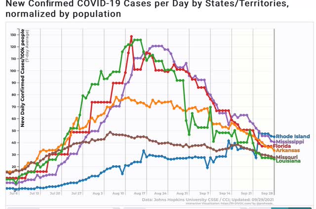
And all 5 States that were the worst hit at the outset - AR, FL, LA, MO, and MS - are all continuing to decline. Below I show them, plus RI, which is #25 among the 25 lowest States + DC. In other words, all the early poster children for Delta are now in the bottom half of all States for new infections:

Only 5 States are in any kind of uptrend at all - AK, MI, MN, ND, and NE:


Note that all of them are near or at the northern border with Canada, and 3 of them are also among the Trumpiest. To drive the point home, here is Canada itself, plus MI and MN:
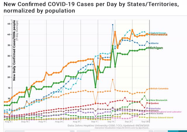

Alberta in particular is likened by Canadians to Texas in the US. So you have two of the (even) colder provinces, which are also the “libertarian” conservative provinces, having the worst records.

In other words, Delta continues to migrate north, and continues to hit the least vaccinated areas the hardest.

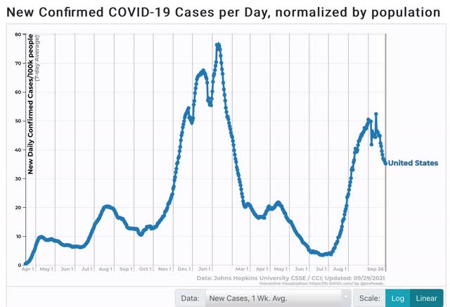
I hasten to add, however, that even with this relatively “good” news, the number of case is still far higher than at any point during the worst of the spring or summer 2020 waves:

 Now to the demographics issue. Let me start with this graph of mortality by age for COVID vs. the Spanish Flu:
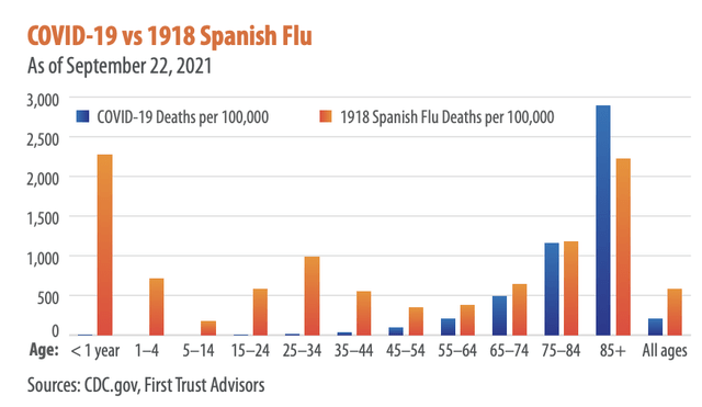

The graph comes from Brian Wesbury, a financial analyst whose twitter feed strongly indicates he is a devotee of Hayek and Ayn Rand. But don’t dismiss it - I went to the CDC site itself to verify the numbers for COVID, and here they are:
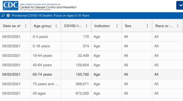

As of one week ago, there had been only 544 deaths from COVID among children since the beginning of the pandemic.

In other words, measured per capita, COVID (so far) has caused only 1/3rd the percentage of deaths compared with the 1918 Flu; and among the young, it has been far, far less deadly (so far, according to one graph I have seen, it is roughly equivalent to the number of children who die from influenza each year).

But haven’t we heard that Delta has been attacking the young at a much higher rate than the original strain of the disease? Yes, we have, and yes, according to the below graph it is true:
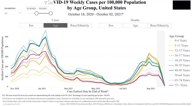

You can see that, per capita, Delta has attacked those two ages the most, followed right behind by the 12-15 demographic, and then the 5-12, 18-29, and 30-39 demographics virtually in a tie.  Note that by contrast, children were among the least hit by the original strain last autumn and winter.

Now let’s turn to deaths. And it’s a completely different story:
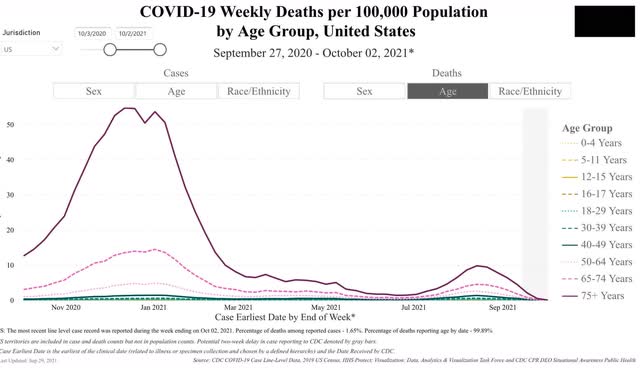

Delta continues to kill at the highest rate the oldest demographics in reverse chronological order. But because there are far fewer people over age 75, and also fewer in the 65-74 demographic, the raw *number* of people under 65 killed by Delta is larger, giving us fatalities of about 2000/day.

But this is still a vaccine success story, because over 80% of people over 65 are fully vaccinated. Deaths among the 65-74 demographic are only about 1/3rd of what they were last winter, and deaths among those over 75 are less than 1/5th what they were!

Tuesday, September 28, 2021

House prices continue to surge. But maybe . . .


 - by New Deal democrat

Both the FHFA and Case-Shiller house price indexes for July were released this morning. Both showed a continued surge in house prices, with one difference that may be of importance.


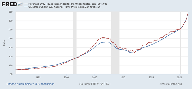
First, here are both indexes normed to 100 as of January 1991, when the FHFA index began:


Both are currently within 2% of an identical 250% increase since then.

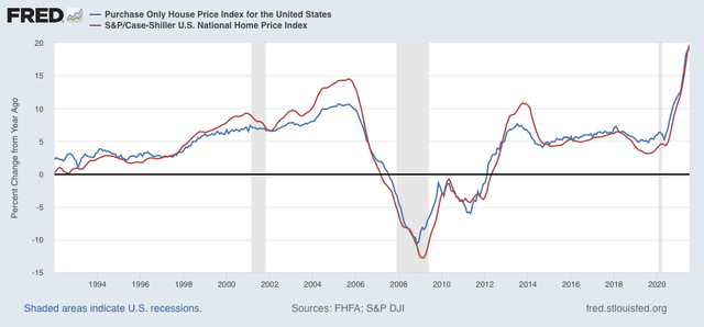
Further, YoY gains in both continued to accelerate, with the FHFA index now up 19.2% YoY, and Case Shiller up 19.7%:


BUT, note that usually the FHFA index has decelerated, and made a peak or trough a month or two before the Case Shiller index (note for example, 1994, 2006, 2009, 2010, and 2013). 

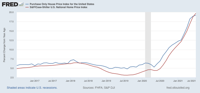
With that in mind, here is the same data zoomed in on the last 5 years (again, note that the FHFA index turned slightly ahead of the Case Shiller index in 2018 and 2020):


While the Case Shiller index shows no signs of decelerating, the FHFA index has decelerated to a 1% increase in YoY gain in each of the last two months. This may just be noise, but I suspect it is signal, indicating that price gains are beginning to slow (but not reverse).

Monday, September 27, 2021

The producer portion of the economy continues to do well


 - by New Deal democrat

First, a little blogging note. This week is light on data. House prices tomorrow, jobless claims Thursday, then a bunch of month end/beginning data on Friday. In other words, don’t be surprised if I take a day off.


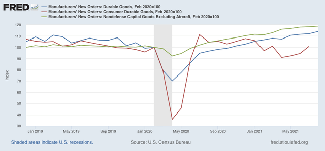
This morning the report on durable goods orders for August was released. Manufacturing is a leading sector of the economy, and new orders both for manufacturing and consumer goods are short leading indicators. Both the total and the “core” capital goods less transportation (i.e., Boeing plane orders) were positive for the 15th time in the past 16 months:


In short, manufacturing continues to do quite well.

Although they weren’t part of this morning’s release, I also included consumer durable goods in the above graph as well (red). These have been increasing since April, after a sustained decrease last fall and winter.

In short, although there are many bottlenecks, in particular in transporting materials to factories, and goods from factories to sellers, orders for goods that will last a (relatively) long time continue to get better. There is simply no downward pressure on the producer sector of the economy at this time.

Saturday, September 25, 2021

Weekly Indicators for September 20 - 24 at Seeking Alpha


 - by New Deal democrat

My Weekly Indicators post is up at Seeking Alpha.

With Delta definitely receding, it appears it had no meaningful impact on the consumer economy. What *is* continuing to happen, however, is that transportation bottlenecks are continuing to drive up related prices to levels not seen in a decade or more.

As usual, clicking over and reading should bring you up to the virtual moment, and reward me a little bit for the effort I put into amalgamating the data.

Friday, September 24, 2021

New home sales continue rebound in August, as price increases continue slight deceleration


 - by New Deal democrat


Housing is a long leading sector of the economy, and new home sales, while very noisy and heavily revised, tend to lead all of the other housing indicators. [Note: FRED hasn’t updated its charts with this morning’s information, so graphs below do not show this month].


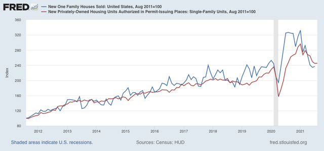
So this morning’s m/m increase in new home sales was good news. It was an 8 month high, and at 740,000 was an increase of 14,000 from July and 39,000 from the trough in June (blue in the graph below):


This confirms what single family permits (red), which are much less noisy, suggested in last week’s report on starts and permits.

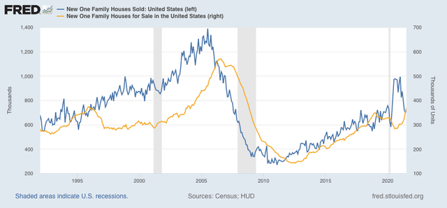
The number of houses for sale (which lags the number sold) also turned up, to 378,000, the highest level since October 2008 (gold in the graph below):


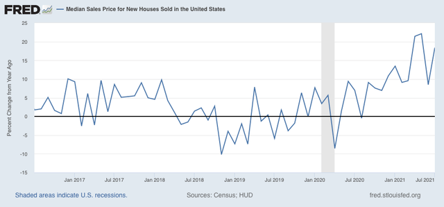
Meanwhile, the median price of a new house was 390,900, a 20% increase YoY:


This was a YoY increase from July, but below the 22% pace of April and May.

Although I pay much less attention to existing home sales, which were released Wednesday, because they have much less of an effect on the economy, there is a special issue in that data because inventory collapsed in 2020 as few people were willing to put their houses on the market. 

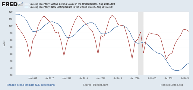
New listings in August were actually higher than one year ago, while total listings are still almost 25% lower than in August 2020. A more important comparison is with 2019, the year before inventory collapsed. In that regard, new listings in August were only -8.7% below two years ago, while total listings were less than 1/2 of that level. Below are total and new listings for existing homes, both normed to 100 as of that month:


As mortgage interest rates declined from their early year spike, new housing sales and construction have bottomed and have begun to increase. Meanwhile price increases, which lag sales, are decelerating albeit still at a very high level due to lack of inventory of existing homes. Finally, that inventory issue is slowly correcting itself. We can expect new listings of existing homes to be higher YoY within several months, and then the issue becomes how long until inventory increases all the way back to 2019 levels.

Thursday, September 23, 2021

Jobless claims hold steady, as the Delta wave continues to roll out


 - by New Deal democrat

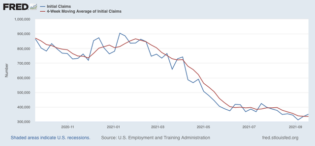
Every day brings a bit more evidence in support of the forecast that the Delta wave is rolling out, at roughly the same rate as it rolled in. Meanwhile, this week’s report on  jobless claims pulled back a bit from last week, but kept the low trend intact.

Initial claims rose 16,000 to 351,000, while the 4 week average declined 750 to 335,750, the latter yet another pandemic low:


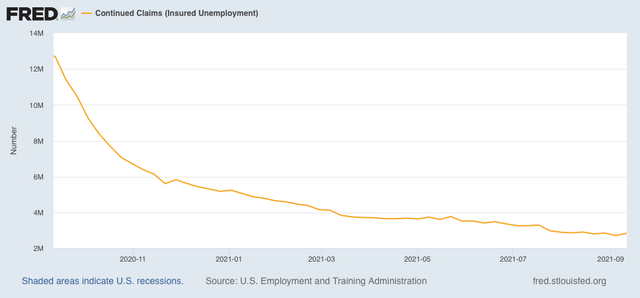
Continuing claims rose from last week’s pandemic low by 131,000 to 2,845,000:


Now that all emergency pandemic assistance programs have ended, watch to see if continuing claims decline precipitously in the next several weeks. Obviously they didn’t this week.

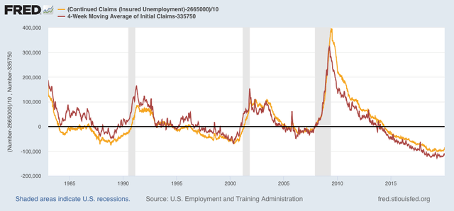
Here are both the 4 week average of initial claims and continuing claims from 1983 through the end of 2019 (both normed to zero as of this week’s numbers) for comparison:


As is easily seen, both numbers continue in typical mid-expansion ranges. 

If the 4 week average of new claims drops below 325,000 - I.e., if the numbers drop into completely normal strong expansion territory - I  may discontinue weekly pandemic coverage of this metric. If Delta rolls out as sharply as I increasingly suspect it will, that may happen within the next two months.


Wednesday, September 22, 2021

Coronavirus dashboard for September 22: the Delta wave rolls out?


 - by New Deal democrat

At last it appears that the Delta wave may be receding, as for now the US is on a definite downslope in cases. As of yesterday the US recorded 135,000 cases, a 31,000 decrease from the peak only 20 days before:


Deaths have continued to rise, but may peak out below the 2400 level I identified previously as the low end of the range for a likely top by the end of this month.

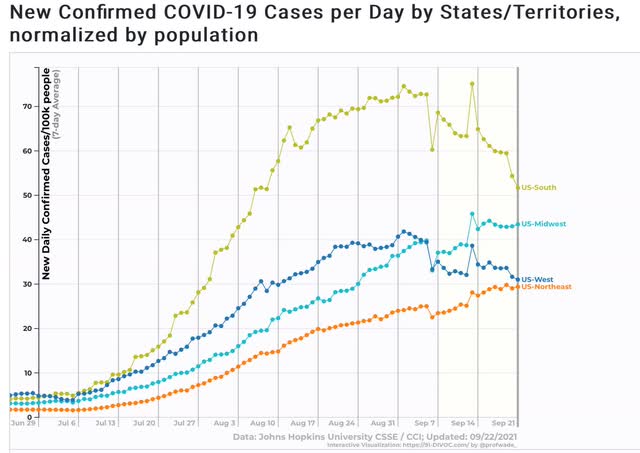
A look at the regional breakdowns shows that the Northeast and Midwest have continued to rise, albeit slowly, and may or may not be peaking. The West has declined, mainly driven by California. But the big news is that in the South, where Delta hit early and severely, cases have declined by 30%:


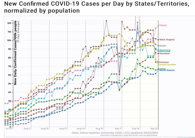
Further, when we look at the 10 worst jurisdictions for cases, only South Carolina is from the Deep South. Aside from Guam, we have 3 States - KY, TN, and WV - from the Appalachians, and 5 - AK, ID, MT, ND, and WY - sparsely populated States in the northern West:


Needless to say, all of these States are among the lowest vaccinated.

An issue is whether the opening of the school year in the North will drive cases to a new peak. Since schools have been open over 2 weeks, and given the fast transmissibility of Delta, we ought to be seeing not just an increase, but an acceleration of that increase, within the next week, if school spread is enough to cause a renewed Delta wave.

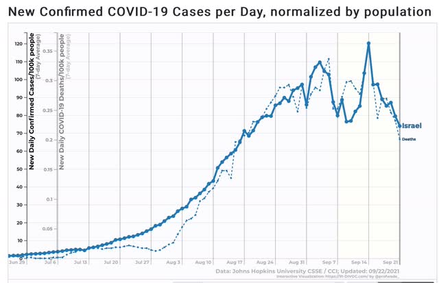
In that regard, let me just show cases and deaths in Israel, which has a similar vaccination profile to the US, with a similar anti-vaxx religious component:


Cases and deaths are both down about 1/3rd from their recent peak there, even with schools open.

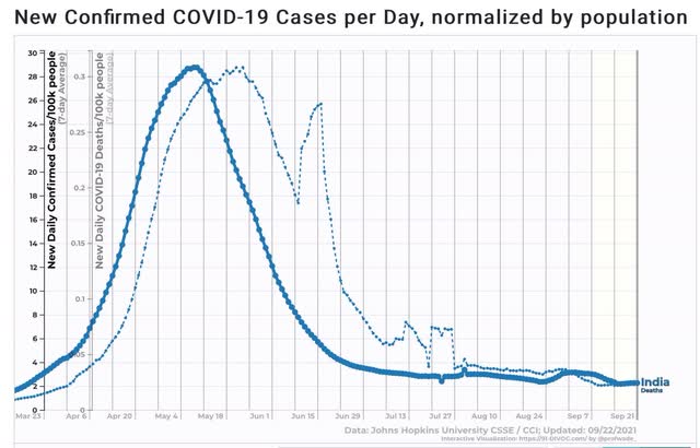
An even better example is India, where the Delta variant first struck:


Cases and deaths have totally reverted to background rates, declining by more than 90% from peak - and I hear tell that there are schools in India, so that doesn’t seem to have precluded the decline.

If by the end of this month we don’t see a big increase from the reopening of schools in the North, then I expect the Delta wave to continue to ebb until cold weather arrives.

Tuesday, September 21, 2021

August housing construction shows stabilization, following interest rate moderation


 - by New Deal democrat

This morning’s report on August housing permits and starts shows that the stabilizing of mortgage rates in the past few months has now stabilized housing construction.


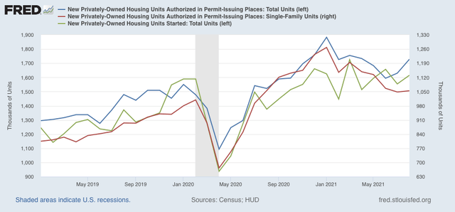
Housing starts increased 3.9% m/m, and total permits increased 6.0%. The less volatile single family permits increased 0.6%. As a result, the overall trend for all three metrics for the past several months is sideways:


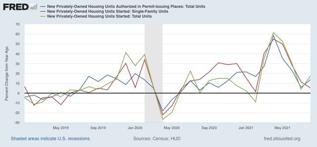
Last month I noted that the YoY comparisons were going to become much more challenging, given the boom in construction late last year. With the stabilization of construction, both measures of permits as well as starts remained above their levels of one year ago:


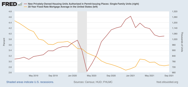
Normally I show the changes in mortgage interest rates YoY and compare them with housing construction. This month let me show you the raw mortgage interest rate number (gold), left scale vs. the absolute number of single family permits (right scale):


As mortgage rates declined from 3.7% to 2.7% throughout 2020, single family housing permits increased over 30% from roughly 950,000 annualized to 1,270,000. After the increase early this year in mortgage rates to 3.2%, housing cooled, but in the past 4 months rates have settled in the 2.85%-3.0% range, and housing can be expected to resume a moderate increasing trend in response. This in turn suggests that the economy, which tends to follow housing with a 1 year+ lag, after a period of cooling early next year, will also stabilize later on.

Monday, September 20, 2021

Median household income and housing affordability


 - by New Deal democrat

Let’s take a look at the affordability (or not!) of housing, since there is no economic news of note today.


Last week the Census Bureau released their annual report on median household income for the US, covering 2020. Since this is the best measure to gauge housing affordability, rather than average wages or income, this is a good time to update this information.

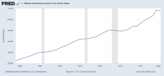
Median household income declined in the US last year due to the pandemic, and the tsunami of unemployment that accompanied it. Still, at $67,521 it was still 40% higher in nominal terms than it was at the peak of the housing bubble in 2006, when it was $48,201:


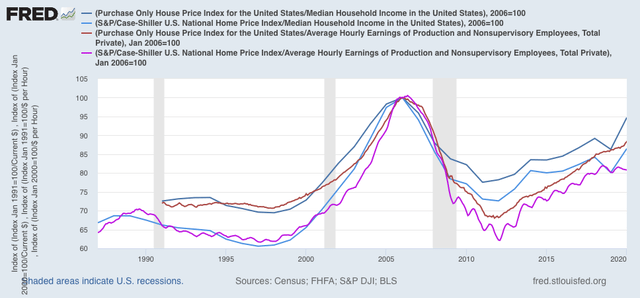
Below I compare house prices measured by the FHFA house price index and the Case Shiller national index, deflated by median household income (dark and light blue) and by average hourly wages (red and violet) as a monthly proxy. The results are normed to 100 as of the peak of the housing bubble in 2006:


Note that, because “average” wages are skewed higher than “median” wages, house prices appear more affordable in average hourly wage terms than in median household income terms. Specifically, in 2020 FHFA prices deflated by median household income were only 5.3% below their peak in 2006, and similarly deflated Case Shiller prices were 13.5% below theirs.

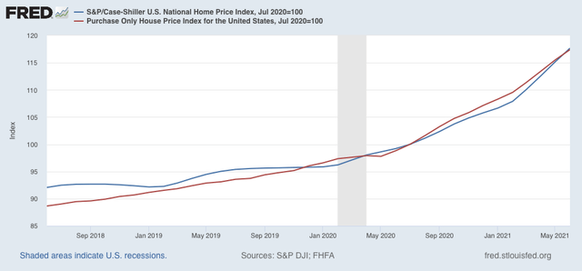
While median income for 2021 won’t be reported for another year, we do have both house price indexes through June of this year, and they are up a further 17.4% and 17.7% since mid year of 2020:


 If median household income from 2020 were held constant (it won’t be, there will be an increase this year because of the big gains in employment), in both cases “real” house prices would be higher than their bubble peak!  But even if nominal median income increases this year back to where it was in 2019 just before the pandemic, house prices would at least be very close to their all time record as a multiple of household income.

But if house prices compared with household income are close to or at an extreme high, the situation is quite different when we look at monthly mortgage payments, because interest rates have declined so much in the past 15 years.

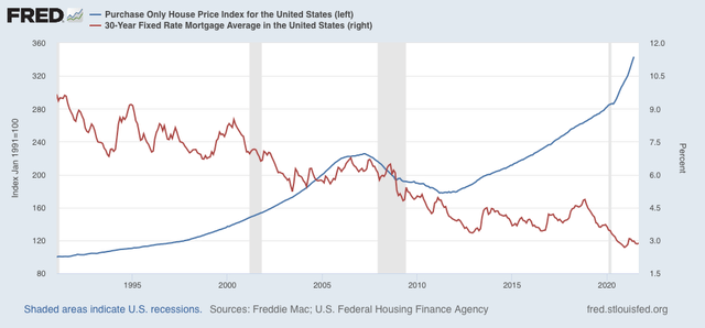
At the peak in July 2006, mortgage rates were 6.76%. In June they were only 2.98% (red, right scale):


 While house prices as measured by the FHFA index have gone up 54.6% in that time, the monthly mortgage payment to finance that house increase went up less than 1%! And remember, the median household has had a 40% increase in income to finance that less than 1% increase in mortgage payments.

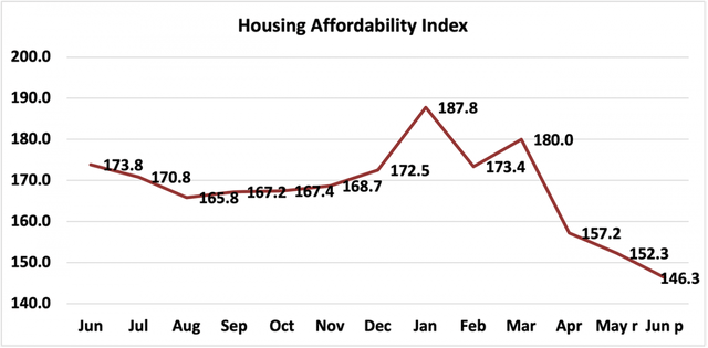
The bottom line remains that, if you can afford the down payment on a house, even at these extreme levels, the monthly mortgage payment is not near an extreme at all. This is probably while the “affordability index” of the National Association of Realtors is equivalent to its poorest level in the past 10 years, it is still nowhere near as low as it was at the peak of the housing bubble (when it was below 100, not shown):


I think seriously derailing the housing market to where it might spark a recession is only going to take place if there is another year of huge price increases, or else a hike of 1% or more in interest rates, or both.