Friday, June 11, 2021

The spike in inflation is not a concern - yet


 - by New Deal democrat

By now you’ve probably already read a fair amount of commentary on yesterday’s consumer inflation report for May. I’m going to cut to the chase as to my take right off the bat:


1. The primary driver of this inflationary spike is supply bottlenecks rather than increased demand.
2. The inflationary spike has wiped out any “real” wage gains during the past 10 months.
3. The inflationary spike is not a concern - yet. If this continues about 3 more months, it becomes a real concern and I would expect the Fed to act at that point.

To the graphs ...

1. Here’s a look at retail sales (blue) and personal consumption expenditures (gold) since the beginning of 2020:
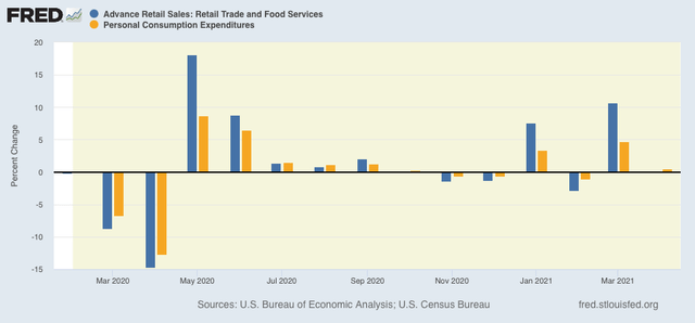

Just as with last year’s stimulus, the effect of this year’s stimulus has petered out after a few months. Demand has stabilized.

On the contrary, YoY commodity prices have spiked in a fashion last seen when gas prices hit $4.25/gallon in the early part of the Great Recession:
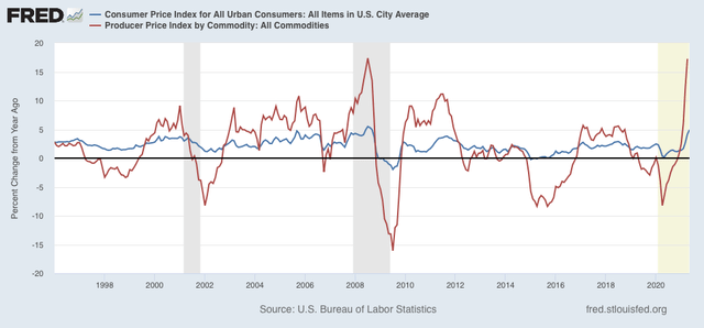

This *can* be a great concern, but note that there have been other spikes approaching 10% YoY in the past 25 years that did not cause recessions or even major slowdowns. Note that those spikes only lasted a few months.

2. Here are average real hourly wages for nonsupervisory workers for the past 3 years, normed to 100 as of February 2020:
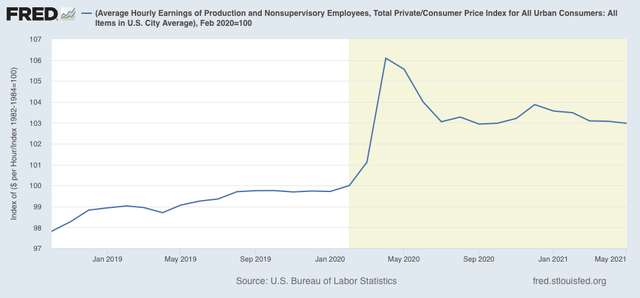

As of May, these are up 3% since just before the recession - and not at all since last July. The inflationary spike this year has actually caused them to decline slightly. This will create a problem for consumer spending (70% of the economy) if it continues too much longer.

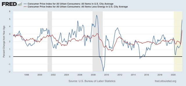
3. As I’ve said many times before, typically inflation has not been a concern over the past 25 years unless CPI excluding energy (gas) is up 3% YoY or more. As of May, we crossed that threshold:

Another way to look at this is to compare our current trajectory with that which was in place leading up to the pandemic. In the latter part of the last expansion, consumer prices were increasing at the smoothed rate of 2.65%/year. Had that trend continued after February 2020, prices would be up roughly 2.9% since then. With the inflationary spike of the past several months, they are instead up 3.8% since February 2020:
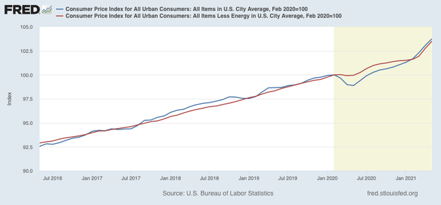

Here’s the bottom line: this is not a big deal if it only lasts another month or two. But if the trend continues longer than that, it will begin to impact consumer spending, and it will get the Fed’s attention. Unfortunately I have no special insight into supply chains; all I know is that it is important that the supply chain bottlenecks be promptly resolved. 

Thursday, June 10, 2021

New jobless claims continue downward trend towards near-normalcy, while continuing claims, well, continue


 - by New Deal democrat

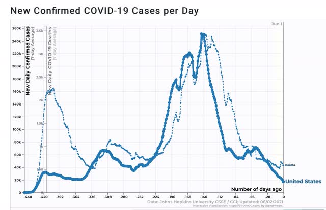
New jobless claims continue to be the most important weekly economic datapoint, as increasing numbers of vaccinated people and outdoor activities have led to an abatement of the pandemic, with both new infections and deaths at their lowest point since the onset of the pandemic in March 2020.

We have already hit my objectives for claims to be under 500,000 before Memorial Day, and to be below 400,000 by Labor Day. My new, final objective is for claims to average 325,000 or below, which would signify a return to normal expansion levels in the past 30 years.

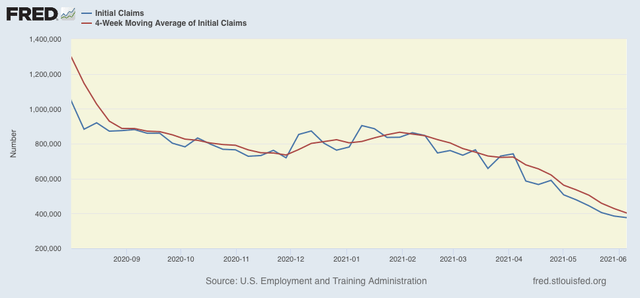
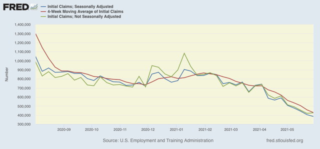
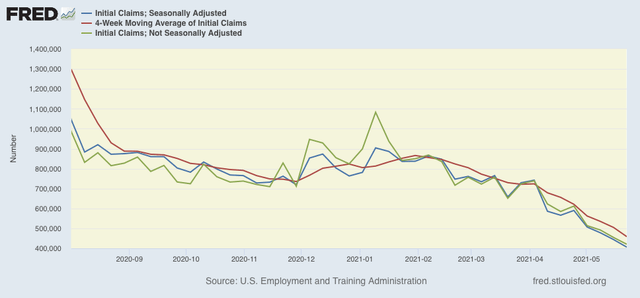
Turning to this week’s report, new jobless claims declined 9,000 to 376,000. The 4 week average of claims declined by 25,500 to 402,500. Both are new pandemic lows. (Note that I have discontinued comparisons of non-seasonally adjusted claims, as the period of lockdown distortions YoY has passed.)


At the peak of the pandemic lockdowns, new claims were running 6 million to 7 million per week. Here is the trend since the beginning of last August:


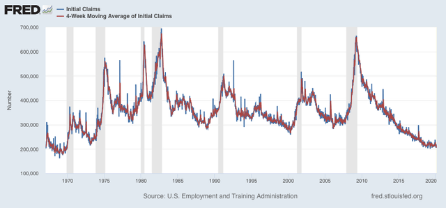
For the past 3 months, claims had trended down an average of roughly 100,000 per month. In the past several weeks, this has slowed to a rate of decline of roughly 50,000 per month, indicating that the “opening” of the economy is getting nearer to an endpoint. This also implies a slowing down of net job creation from the last 3 months’ levels. At their current level, claims are consistent with early mid-expansion levels in the past:


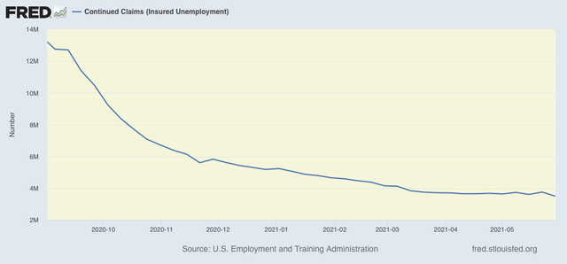
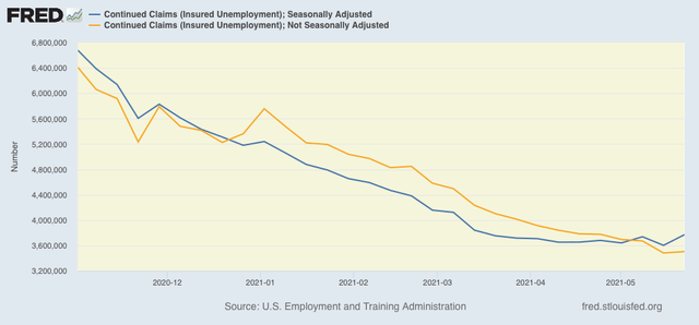
Continuing claims, which are reported with a one week lag, and lag the trend of initial claims typically by a few weeks to several months, declined 258,000 to a new  pandemic low of 3,499,000. Still, over the past 2 months these have only declined about 7% from roughly 3,750,000:


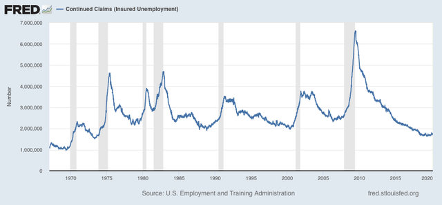
The long term perspective again shows that these are equivalent to the worst levels of most previous recessions, or early in the expansions, versus at 2,000,000 or below later in strong expansions:


I am not sure if the recent strong declines in new jobless claims will continue from here, as we approach past levels of full or nearly full employment; but the news is definitely good, as we are at least approaching more “normal” expansion levels.

The issue with continuing claims has become more complex, as this week they finally - slightly - broke out of a flat trend since the beginning of March. The picture has become much more clouded as half of the States have announced early terminations of supplemental pandemic benefits. The picture is further clouded by the sputtering rate of new vaccinations, with the Appalachian, Deep South, and Interior West sections of the country showing low vaccination rates, and an ongoing pandemic that is *not* coming to an end. I think we are going to see two tracks going forward from here, as near-normalcy does return to the more vaccinated parts of the country, while attempts to return to normalcy fail in the laggard regions. 

Wednesday, June 9, 2021

Coronavirus dashboard for June 9: the high correlation between partisan lean, vaccination rates, and new cases


 - by New Deal democrat

No big economic news today, so I wanted to follow up on Monday’s post, in which I described the correlation between the number of new COVID cases and States in which there were high vaccination rates vs. ones with low rates. 


The both sad and maddening point is, vaccination rates correlate strongly with partisan lean, and so do the present level of COVID cases.

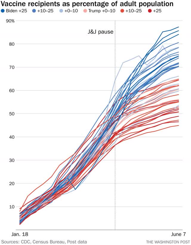
First, here is a graph of vaccination rates by partisan lean (via the NYT):


This is pretty compelling: States with strong Democratic leans almost all have higher vaccination rates than almost all States with GOP leans.

Now let’s break out new infection levels.

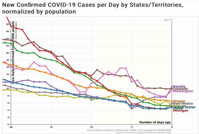
First, here are those States which Biden won but which have higher rates of new infections than the US average (as of this morning, Pennsylvania is no longer one of them):


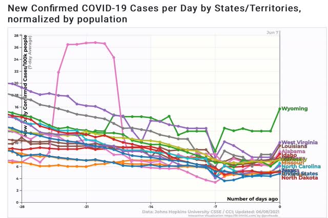
And now here are the States that Trump won that high higher rates of new infections:


As you can see, there are only 8 States that Biden won that have above-average new infections, and all but 2 are under 8 per 100,000. On the other hand, there are 15 States that Trump carried that have above-average new infections, and 5 of them are above 8 per 100,000.

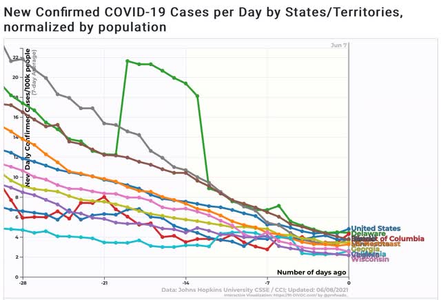
Now, here are the States that Biden won that have below-average rates of new infections:


Including the entire US Northeast, these amount to 18 States plus the District of Columbia.
 
Here are the States that Trump won with below-average rates of new infections:


There are only 9 of these.

The simple fact is, while the correlation isn’t perfect, it’s clear that States that Biden won have significantly higher rates of vaccinations, and significantly fewer new cases of COVID. And by and large, the Biden-won States are showing continued declines, while many of the Trump-won States are only showing slight declines, and in a few cases no declines at all.

Tuesday, June 8, 2021

April JOLTS report: evidence of a huge disconnect in the jobs market


 - by New Deal democrat

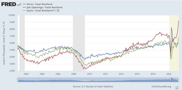
This morning’s JOLTS report for April confirmed anecdotal evidence that there have been a huge amount of unfilled job openings, and a comparatively weak level of actual hiring. Job openings soared to a level over 20% higher than at any point in the series before March. Meanwhile actual hires are less than 1% above their pre-pandemic high. Voluntary quits increased to an all-time high, while layoffs declined to a new all-time low. Total separations also increased.

This report has only a 20 year history, and so includes only two prior recoveries. In those recoveries: 
  • first, layoffs declined
  • second, hiring rose
  • third, job openings rose and voluntary quits increased, close to simultaneously
The recovery from the worst of the pandemic almost one year ago at first followed this script, but the winter surge, which led to a few month of flat, or worse, jobs reports, disrupted that trend, and now there is yet another new pattern.

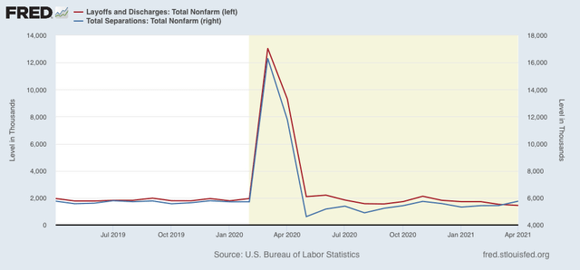
Let’s start out with layoffs and discharges (red) and total separations (blue), showing that these have followed their past patterns, as layoffs rapidly declined to a normal rate after last March and April. As noted above, this month’s report made yet another new series low:


Next, here is the series-long record of hiring (blue), quits (green, *1.75 for scale), and job openings (red):


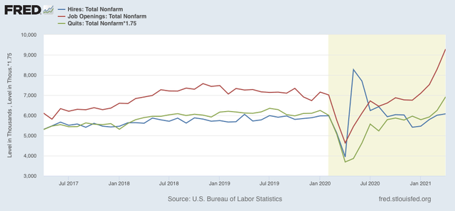
Here is the zoomed-in look at the past several years:


What has been different this time around is that, after rapidly improving, hires declined again until bottoming in December and January, and have risen only tepidly since.


Two months ago I flagged the issue of whether “hires reassert themselves, as in the past two recoveries, or whether openings without actual hiring continue to soar as they did starting in 2015.” In March both happened, but in April, as I anticipated given the relatively subpar April employment report, the increase in actual hires is definitely lackluster.

Yesterday I read a news article (sorry, didn’t bookmark it) that appeared to anticipate all of the trends we saw in this report. Of people who lost jobs early in the pandemic, many of the older workers have chosen simply to retire (hence the record in voluntary quits). Others cited, in roughly equal percentages, (1) problems with child care, (2) job offers unattractive compared with continued enhanced unemployment benefits, and (3) that the jobs on offer paid significantly less than the jobs they had before the pandemic.

It is pretty obvious there is a disconnect in the jobs market, and all 3 of the above items are going to have to be addressed in some fashion.

Monday, June 7, 2021

Coronavirus dashboard for June 7: a Tale of Two Pandemics: the Vaccinated States vs. the Idiotic States


 - by New Deal democrat

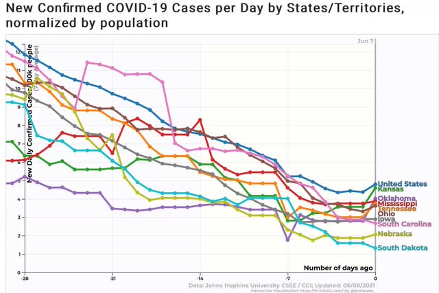
The drive towards “herd immunity” via vaccination has slowed to a crawl. The slowing is almost entirely driven by Trump-voting States in the South and West. Those Idiotic States are continuing to suffer from an ongoing pandemic, while in the Biden-voting States of the Northeast, Midwest, and California, the pandemic has all but ended.

Here are the details.
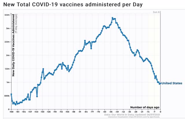
Daily vaccinations have declined precipitously in the past 7 weeks, and are now only about 1 million per day:


If the US were to stay at 1 million per day, it would take the rest of the year to get everyone vaccinated. And unfortunately there is no reason to believe that the rate of new vaccinations won’t continue to decline.

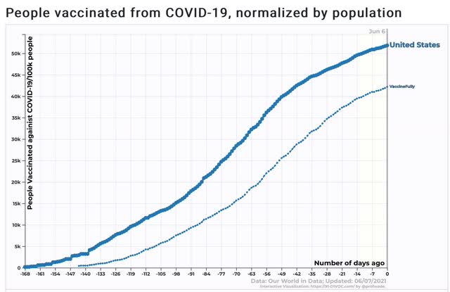
As a result, as shown in the graph below, there is every reason to believe that the US will tip out at roughly 60% of the population having received at least one dose, and only 50% fully vaccinated (note this includes all children including those under 12 for whom the vaccines have not been approved). (For the record, I still think we will achieve 70%+ of all adults having immunity between vaccinations plus those previously infected with antibodies).


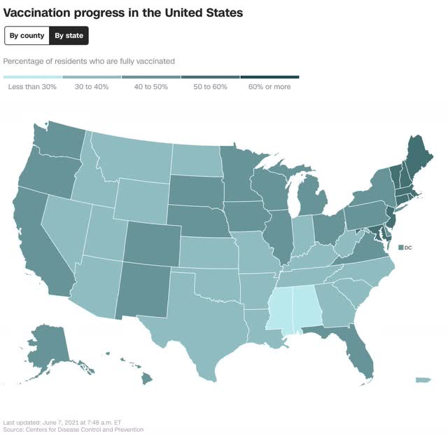
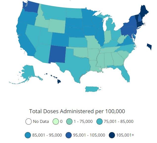
The distribution of the population who have been vaccinated vs. unvaccinated is hardly random. As shown in the below map, the South and interior West almost uniformly have lower vaccination rates than the Pacific Coast, Midwest, and Northeast:


And this completely non-random pattern is very apparent when we break down new COVID cases by region.

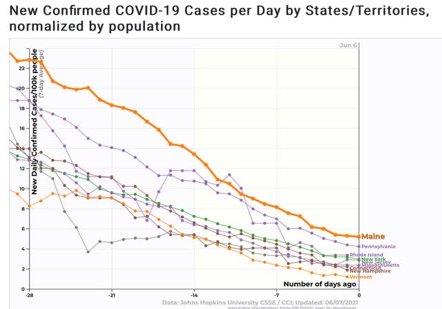
The best region is the Northeast:


All States except for Maine and Pennsylvania are below an average of 40 cases per 100,000 per day, and the worst State - Maine - is at 5.2. Half of the States are close to or under 2 per 100,000 per day, which is a pandemic that is well under control.

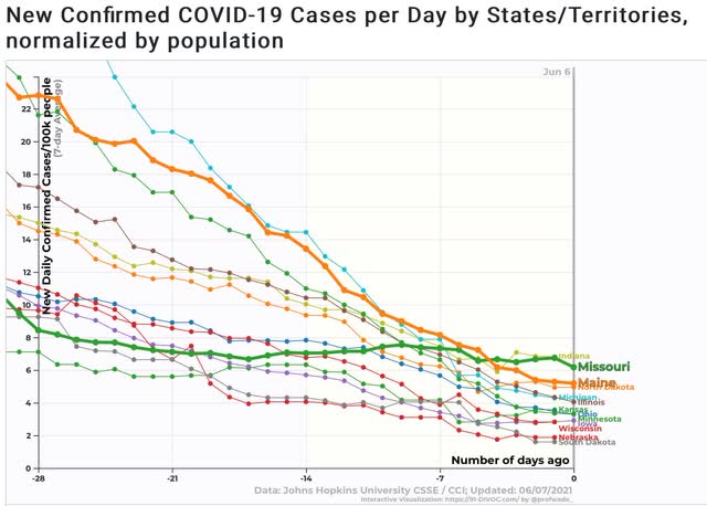
The next best region is the Midwest, plus Maine for comparison:


Nebraska and South Dakota are also under 2 cases per 100,000 per day. I suspect herd immunity via the large number of already infected people comes into play in those States. Only Missouri and Indiana have a higher rate of cases than Maine. And all of the States, except for Missouri (also highlighted) continue on a downward trajectory.

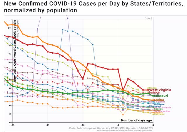
The next best region is the South, plus Maine and Missouri for comparison:


Maryland and Virginia are close to or under 2 per 100,000 per day. About half of the remaining States in the region show a *slowly* declining trajectory, but have fewer cases per capita than Maine. The other half, including the large State of Florida, show a pandemic that is ongoing. I have also highlighted West Virginia, which aside from the last observation, is the worst of the lot.

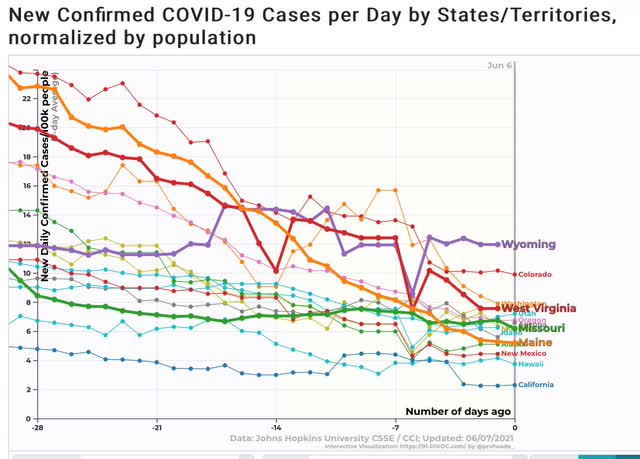
Finally we come to the West, which is the worst performing region, plus Maine, Missouri, and West Virginia for comparison:


California is very close to 2 per 100,000 per day. Several other States are lower than Maine. But most are worse than Missouri, and 3 - surprisingly including Colorado (which is nevertheless clearly in a declining trend) and Washington State (which may finally be declining) - are worse than West Virginia. Wyoming is the worst of all States, with 11.9 cases per 100,000 per day, a pandemic that continues to rage, and with no sign of any decrease at all.

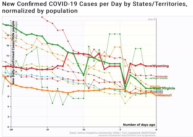
Finally, here is a graph of the 10 worst States together, plus Missouri which is slightly below that level:


Just to emphasize the point, here are the 10 lowest States by rate of those fully vaccinated:

MS 28%
AL 29%
WY 32%
LA 32%
AR 32%
TN 32%
ID 33%
UT 33%
GA 33%
OK 34%

All 10 of these States are in the South and West. Four of them are among the 10 worst States for new infections. By contrast, all of the 6 New England States are above 50% for those fully vaccinated, and of those only Maine is at a problematic level, although clearly declining.

“Those who cannot see must feel.” Those regions with populations who refuse to get vaccinated will continue to see the pandemic spread through the unvaccinated until they reach “herd immunity” the hard way. Those regions whose populations have embraced vaccinations are likely to achieve “herd immunity” and the de facto end of the pandemic within the next 45 days.

Saturday, June 5, 2021

Weekly Indicators for May 31 - June 4 at Seeking Alpha


 - by New Deal democrat

My Weekly Indicators post is up at Seeking Alpha.

On the one hand, it’s amazing just how positive the indicators are almost across the board - including long term Treasuries getting relaxed about the inflation scare.

On the other hand, the surge in commodity prices looks like it’s about to bite corporate profits in the rear quadrant.

Also, I’ve tried out a new summary spreadsheet format which should make the concluding information easier to read.

As usual, clicking over and reading will bring you up to the virtual moment on the economy and the forecast. And it will reward me with my lunch money for next week.

Friday, June 4, 2021

May jobs report: almost all positive, but not good enough


 - by New Deal democrat

HEADLINES:
  • 559,000 jobs added: 492,000 private sector plus 67,000 government. The alternate, and more volatile measure in the household report indicated a gain of 444,000 jobs, which factors into the unemployment and underemployment rates below.
  • The total number of employed is still 7,629,000, or 5.0% below its pre-pandemic peak.  At the rate jobs have grown this year, it will take another 12 months for employment to completely recover.
  • U3 unemployment rate declined -0.3% to 5.8%, compared with the January 2020 low of 3.5%.
  • U6 underemployment rate declined -0.2% to 10.2%, compared with the January 2020 low of 6.9%.
  • Those on temporary layoff declined -291,000 to 1,823,000.
  • Permanent job losers declined -295,000 to 3,234,000.
  • March was revised upward by 15,000, while April was revised upward by 12,000, for a net gain of 27,000 jobs compared with previous reports.
Leading employment indicators of a slowdown or recession

These are leading sectors for the economy overall, and will help us gauge how strong the rebound from the pandemic will be.  These were mainly positive: 
  • the average manufacturing workweek increased 0.1 hour to 40.5 hours. This is one of the 10 components of the LEI.
  • Manufacturing jobs gained 23,000. Since the beginning of the pandemic, manufacturing has still lost -509,000, or 4.0% of the total.
  • Construction jobs declined -20,000. Since the beginning of the pandemic,  -225,000 construction jobs have been lost, or 2.9% of the total.
  • Residential construction jobs, which are even more leading, rose by 4,400. Since the beginning of the pandemic,  32,400 jobs have been gained in this sector, or 3.9%.
  • temporary jobs rose by 4,400. Since the beginning of the pandemic, there have still been -294,100 jobs lost, or 10.0% of all temporary jobs.
  • the number of people unemployed for 5 weeks or less declined by -391,000 to 2,023,000, which is  -59,000 *less* than just before the pandemic hit.
  • Professional and business employment increased by 35,000, which is still -708,000, or about 3.3%, below its pre-pandemic peak.

Wages of non-managerial workers
  • Average Hourly Earnings for Production and Nonsupervisory Personnel: rose $0.14 to $25.60, which is a 2.4% YoY gain. This contrasts with the 5%+ YoY gains recently seen, and reflects the rehiring of low-wage workers in sectors like food and beverage serving. 

Aggregate hours and wages:
  • the index of aggregate hours worked for non-managerial workers rose by 0.2%, which is a  loss of 4.3% since just before the pandemic.
  •  the index of aggregate payrolls for non-managerial workers rose by 0.7%, which is a gain of 2.2% since just before the pandemic.

Other significant data:
  • Leisure and hospitality jobs, which were the most hard-hit during the pandemic, increased 292,000, but is still -2,538,000, or 15.0% below its pre-pandemic peak.
  • Within the leisure and hospitality sector, food and drink establishments gained 186,000, but is still -1,480,400, or 12.0% below its pre-pandemic peak.
  • Full time jobs increased 223,000 in the household report.
  • Part time jobs increased 178,000 in the household report.
  • The number of job holders who were part time for economic reasons rose by 28,000 to 5,271,000, which is an increase of 873,000 since before the pandemic began.

SUMMARY

This was a very positive report, but still one which shows how far we still have to go.

Negatives were almost non-existent, consisting of declines in nonresidential construction jobs and temporary jobs (but the latter may be temps transitioning to permanent employment).

The more consistent theme, though, was that while there were gains, they weren’t nearly of the order we need for a quick recovery to pre-pandemic levels. Overall jobs are still 5% below where they were in February 2020, and the hard hit leisure and hospitality sector is 15% below its pre-pandemic peak! The upward revisions in March and April were tepid, confirming my suspicion that March may have been as much as or more of an outlier than April. This month’s number was close to the combined March and April average.

Further, the YoY gains in hourly wages have been more than eaten up by inflation. As the stimulus payments wear off, I suspect we are going to see a faltering in sales, which would not be good.

The brightest spot was the new low in short-term unemployment, which was even lower than before the pandemic, and among the 10 lowest months in the past 10 years. 

In essence, this report showed that there are very few new layoffs, but not enough new hires to keep the new expansion growing robustly.

Thursday, June 3, 2021

New jobless claims continue strong decline, consistent with ongoing recovery, while continuing claims continue mixed


 - by New Deal democrat

New jobless claims continue to be the most important weekly economic datapoint, as increasing numbers of vaccinated people and outdoor activities have led to an abatement of the pandemic - deaths are at their lowest point in over a year, and new infections at their lowest points since the onset of the pandemic. 

Several weeks ago we hit my objective for claims to be under 500,000 before Memorial Day, and this week  we hit second objective, for claims to be below 400,000 by Labor Day. 

REMINDER: Because of the unprecedented number of layoffs during the April and May 2020 lockdowns, for the last year I have given heightened importance to the non-seasonally adjusted numbers. This will be the last week I include them.

New jobless claims declined 20,000 to 385,000. On a unadjusted basis, however, new jobless claims rose 6,014 to 425,450. The 4 week average of claims declined by 30,500 to 428,000. Both seasonally adjusted numbers were new pandemic lows.


At the peak of the pandemic lockdowns, new claims were running 6 million to 7 million per week. Here is the trend since the beginning of last August:


In the past 3 months, claims have trended down an average of roughly 100,000 per month. If this continues for just 3 more weeks, new claims will be at levels which in the past have been consistent with full or nearly full employment deep into expansions. At their current level, claims are consistent with early to mid-recovery levels in the past:


Continuing claims, which are reported with a one week lag, and lag the trend of initial claims typically by a few weeks to several months, rose 169,000 from their revised pandemic low of 3,602,000 last week to 3,771,000. On an unadjusted basis (gold), they also rose 22,860 from their revised pandemic low of 3,504,163 last week to 3,504,163:


The long term perspective again shows that these are equivalent to the worst levels of most previous recessions, versus at 2,000,000 or below during strong expansions:


I am not sure if the recent strong declines in new jobless claims will continue from here, as we approach past levels of full or nearly full employment. The issue with continuing claims has become more complex, as unadjusted claims show a slowly declining trend, while after adjustments they have essentially been flat since the beginning of March. The picture has become much more clouded as half of the States have announced early terminations of supplemental pandemic benefits for ideological reasons. 

Finally, as I wrote two weeks ago, March’s employment gains may have been more of an outlier than April’s. If we simply averaged the 2 months together that would be an average jobs gain of 518,000, then the continued big decline in initial claims would give us a May jobs gain of over 500,000 when that report is issued tomorrow. There may also be big revisions to March and April’s numbers as well. We’ll see.

Wednesday, June 2, 2021

Coronavirus dashboard for June 2: most of US approaches herd immunity threshold; COVID still spreading among the remaining idiots


 - by New Deal democrat

In the past week new COVID-19 cases declined almost 30%, by about 7,000 to 17,289/day; however, deaths actually increased by about 10% to an average of 589/day, mainly due to a data dump by California 5 and 6 days ago - thus I expect a new low in deaths within the next several days:


Total deaths are 595,213. Over 60% of all adults have received at least one dose, and over half are fully vaccinated. Slightly over half of the US population, including all children, has received at least one dose.

But the overall situation masks a large divergence between States where there have been the most vaccinations vs. States with the least. Here is the map of vaccination administration by State as of one week ago:


In the Northeast, only NY, at 67.9%, is slightly below 70% of all adults who have received at least one dose of vaccine. California also is over 70%.

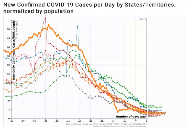
And here are the results: cases in the Northeastern States have rapidly declined to their best levels since the beginning of the pandemic. Only Maine and Pennsylvania, while still showing sharp declines, are lagging:


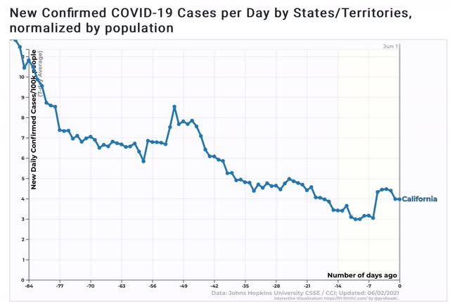
Meanwhile California has also seen over a 95% decline in cases since winter, when they averaged over 110 new cases per 100,000 population daily:


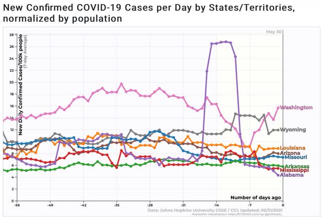
At the other end, there are 8 States which have seen *no* meaningful declines in cases over the past 8 weeks:


Four of them - WA, WY, LA, and AZ - are among the 10 worst States for new cases, which MO close behind. AR, MS, and AL are roughly in the middle of the pack. Note that with the exception of Washington State*, all of them are among those with the lowest rate of vaccinated population.

*A perusal of news sources in Washington State suggests that the recent increase in new cases is due to the admission of unvaccinated new residents to long term care facilities. When the disease is re-introduced into the facility, with close quarters and recirculated air among the most immune-compromised population, the disease spreads even among the vaccinated (although there is no indication of increased deaths among that group). 

Basically, most of the US is at least very close to achieving herd immunity, while the disease continues to spread among those with recalcitrant populations, and if the new cases are all or virtually all among those who have voluntarily decided not to get vaccinated, then the disease is spreading among them at rates similar to last spring and summer, with little decline at all.

Tuesday, June 1, 2021

May manufacturing continues white hot; April construction spending shows signs of being constrained by materials and costs


 - by New Deal democrat

It’s the first of the month, which means we get our first look at May data in the form of the ISM manufacturing index, as well as April construction spending. The questions we are looking for information to answer from these two leading sectors of the economy, manufacturing and residential construction, are: (1) is the Boom still ongoing, and is it likely to continue in the coming few months; and (2) is there evidence that inflation is creating a bottleneck on growth?

The answers for the two sectors appear to be different.

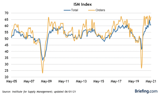
First, the May ISM manufacturing index increased slightly from 60.7 to 61.2. The new orders component of the index, which is the most leading, increased even more, up 2.7 from 64.3 to 67.0, very close to its December and March highs:

The boom in manufacturing is continuing, with no evidence of a slowdown in the near future.

Residential construction spending is not quite as leading as new home sales or permits, but it has the virtue of having very little noise and almost all signal. But there is a quandary, because for the first time in 20 years, the direction of this indicator differs sharply depending on whether or not one factors in the prices of construction materials.

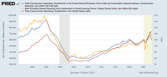
The below graph shows residential construction spending unadjusted for inflation (red), which made another all-time high in April; compared with the same but adjusted for the cost of building materials (blue), which has turned down by 11.5% since December (red); and single family permits (gold), which have turned down by 9.5% since January:


This looks like a bottleneck putting the brakes on growth. Spending is growing, but only because the price of materials has gone up sharply. That the downturn in construction permits and spending adjusted for the cost of materials occurred nearly simultaneously and by similar percentages looks like it is the cost of materials which is decisive - I.e., costs - due to shortages in materials - are driving the numbers.

Monday, May 31, 2021

Memorial Day 2021


 - by New Deal democrat

Memorial Day is that most somber of national observances, in which we remember all those, of whatever race, creed, color, or nationality, who gave their lives so that government of the People, by the People, and for the People shall not perish from the Earth.

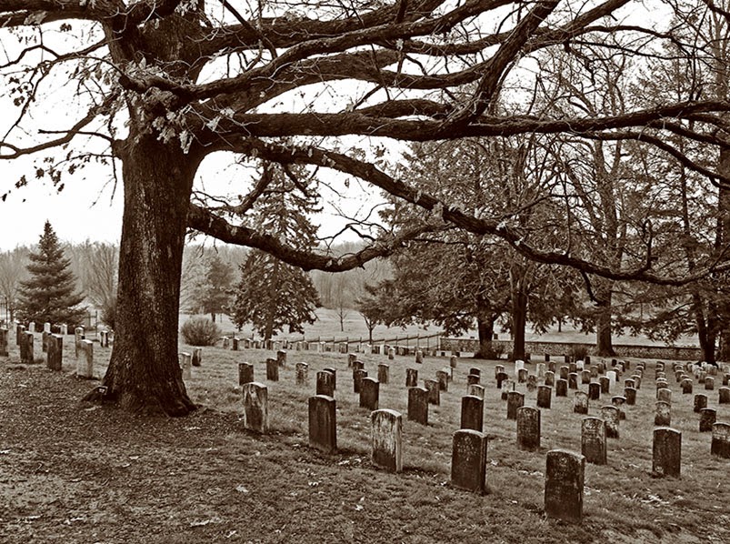
Here are some of their resting places:


Gettysburg National Cemetery


Antietam National Cemetery


Arlington National Cemetery

Normandy, France:


May they Rest In Peace, and may our generation be worthy of their sacrifice by maintaining the Republic that they bequeathed to us.

Weekly Indicators for May 24 - 28 at Seeking Alpha


 - by New Deal democrat

There was a delay over at Seeking Alpha in posting my latest Weekly Indicators note, but it is now up.

The underlying strongly bullish fundamentals of the economy have not changed.

This week, in conjunction with Robert Dieli of the No Spin Forecast, I initiated coverage of a metric that he and the late Jeff Miller initiated called the “C-Scorre,” essentially a weekly estimate of the trade off between inflation and unemployment (the Philips curve) on the one hand, and the yield curve on the other hand. Jeff Miller passed away early in May, so I am now continuing the series.

As usual, clicking over and reading will bring you up to the virtual economic moment, and reward me with some lunch money.

Friday, May 28, 2021

Real personal income has completely made up its recession losses, now exceeds pre-recession peak


 - by New Deal democrat

The last of the 4 monthly coincident markers for whether the economy is in recession vs. expansion was reported this morning for April. Let’s take a look.


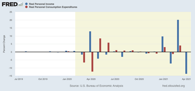
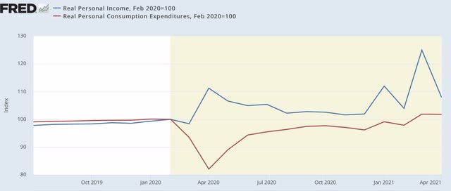
In nominal terms, personal income declined -13.1%, taking back most, not by no means all, of March’s big 20.7% gain. After taking inflation into account, in real terms it declined -13.7%. Meanwhile nominal personal spending increased 0.5%, but in real terms declined -0.1%, barely touching March’s 4.0% gain:


An issue came up at Seeking Alpha about why I believe that demand-driven inflation will be transitory. The above graph shows why. After 2020’s big stimulus package, real personal spending increased sharply and then the effect completely dissipated over a few months. It appears that the same is already happening this year. Which would only leave supply-side temporary bottlenecks in production as sources of continued inflation.

Below I’ve take then same data as above and normed both to 100 as of February 2020:


Both real income and spending are above their pre-recession levels. Simply put, in this crisis decisive action by the government to put cash in consumers’ hands has worked.

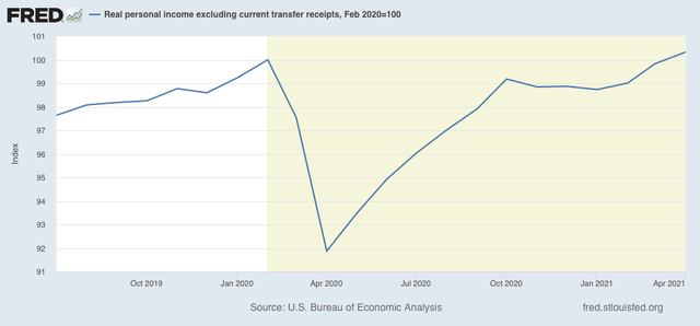
But the “official” recession vs. expansion metric is real personal income less transfer receipts (things like unemployment insurance), shown below:


This too is now above its pre-recession levels. Although I won’t post a graph, this joins real sales making up all of its lost recession ground. But the two most important metrics - industrial production and employment - still have a ways to go.

Thursday, May 27, 2021

New jobless claims continue to decline at rate of 100,000 per month, while continued claims stall at elevated level


 - by New Deal democrat

New jobless claims continue to be the most important weekly economic datapoint, as increasing numbers of vaccinated people and outdoor activities have led to an abatement of the pandemic - both new infections and deaths are near their lowest points in a year. 

We have hit my objective for new claims to be under 500,000 by Memorial Day. Even better, we are already approaching my second objective, which is for them to be below 400,000 by Labor Day. 

REMINDER: Because of the unprecedented number of layoffs during the early lockdowns, for the last year I have given heightened importance to the non-seasonally adjusted numbers. After May is over, their importance recedes and I expect to discontinue tracking them.

New jobless claims declined 38,000 to 406,000. On a unadjusted basis, new jobless claims declined 34,131 to 420,472. The 4 week average of claims also declined by 46,000 to 458,750. All of these were new pandemic lows.


At the peak of the pandemic lockdowns, new claims were running 6 million to 7 million per week. Here is the trend since the beginning of last August:


In the past 3 months, claims have trended down an average of roughly 100,000 per month. If this continues for just 1 more month, new claims will be at levels which in the past have been consistent with full or nearly full employment deep into expansions. At their current level, claims are consistent with being very early in a recovery in the past:


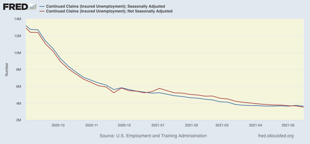
Continuing claims, which are reported with a one week lag, and lag the trend of initial claims typically by a few weeks to several months, declined 96,000 to 3,642,000, (blue), 2,000 above their pandemic low from two weeks ago. On an unadjusted basis (red), they declined 149,996 to 3,521,314:


The long term perspective again shows that these are equivalent to the worst levels of most previous recessions, versus at 2,000,000 or below during strong expansions:


As I wrote last week, March’s employment gains may have been more of an outlier than April’s. If we simply averaged the 2 months together that would be an average jobs gain of 518,000, then the continued big decline in initial claims would give us a May jobs gain of over 500,000 when that report is issued next Friday.

I continue to think initial jobless claims will continue their recent strong decline, while the failure of continuing claims to make meaningful new lows in the past 2 months is a genuine concern that the pace of new hiring has not been picking up.

Wednesday, May 26, 2021

Comprehensive April housing report: beware the inventory and price boomerang!


 - by New Deal democrat

Now that we have all of the April housing data, my comprehensive look at this long leading sector is up at Seeking Alpha.

It’s pretty clear that sales and new construction have peaked in the short term. So, what happens when all of those people who would have put their houses on the market in 2020, but didn’t because of the coronavirus, decide to put them on the market later in 2021 or in spring 2022?

As usual, clicking over and reading puts a penny or two in my pocket to reward me for my efforts.

Tuesday, May 25, 2021

New home sales decline in April, revised sharply lower for March; prices continue to skyrocket, while inventory increases


 - by New Deal democrat

This morning both new home sales and two price indexes for houses were released for April, completing our view of that important long leading sector.


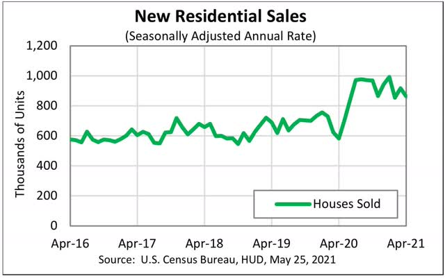
As anticipated, not only did new home sales decline for the month, but March was also hugely revised to the downside ( over 10%!):


With these revisions, the peak for new home sales becomes the December-January period, exactly as is the case for housing permits, starts, and existing home sales.

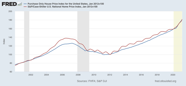
But if sales are down, prices are continuing to skyrocket:


As measured by the FHFA, prices increased 1.4% seasonally adjusted just in the past month! YoY they are up 13.9%.  For the Case Shiller national index, the monthly change was +2.0%, and the YoY change was +13.2%.

Housing inventory is increasing again, up about 3% m/m and now only down about 2% YoY, vs. a trough of being down over 12% YoY.

I’ll have more later at Seeking Alpha.

Monday, May 24, 2021

Coronavirus dashboard for May 24: 3 weeks to 0 new cases?


 - by New Deal democrat

No, that won’t happen. But, even so, that is the current trajectory. Let’s start with the overview:


Total *confirmed* cases: 33,117,737
Total deaths: 589,893

Note that there are many more cases that we don’t know about because the people were never tested. Since about half of cases appear to be only mildly or non-symptomatic, an additional 10% of the population having been infected seems like a reasonable guess. And excess deaths for 2020 ran closer to 900,000, so we may also be missing many deaths.

Before I go further, let me address an article that appeared over the weekend in the Wall Street Journal suggesting that an “intelligence source” had confirmed that it was likely that the virus escaped from a lab in Wuhan. That report seems to have convinced both Nate Silver and Matt Yglesias.

A pretty good takedown of that article appears here:

Essentially, somebody associated with an intelligence agency in the Trump Administration authored a report - but not an actual official intelligence report - in the closing weeks of that Presidency making the claim, possibly for political reasons, based on a document that is never disclosed or identified, and the document itself disclaimed that “additional corroboration” was needed. The same “information” likely was the basis of similar reports last April, one by the BBC which subsequently had to walk back its claims.

Oh.

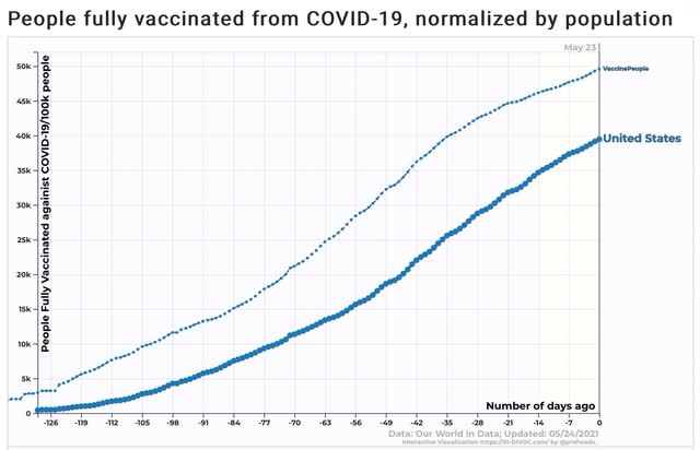
Turning to the updated data, we are within a few days of 50% of the entire US population having received one dose. with 50% of the adult population and nearly 40% of the total population being fully vaccinated:


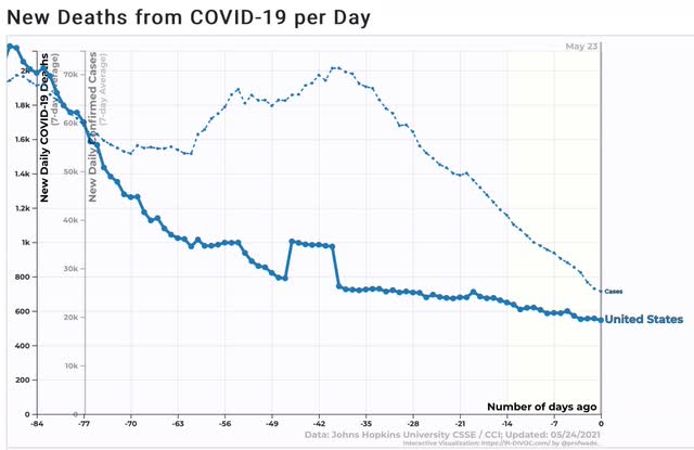
Deaths declined by about 7% in the past week to an average of 546/day, while cases declined almost 25%, by about 8,000 to 25,270/day:


If this decline of nearly 1,200/day, which has been going on for the past 7 weeks, were to continue for just 3 more weeks, we would arrive at 0 cases per day! The slow pace of the decline in deaths is of some concern as, if anything, I would expect that to accelerate and decline faster than new cases. So it will have to be watched.

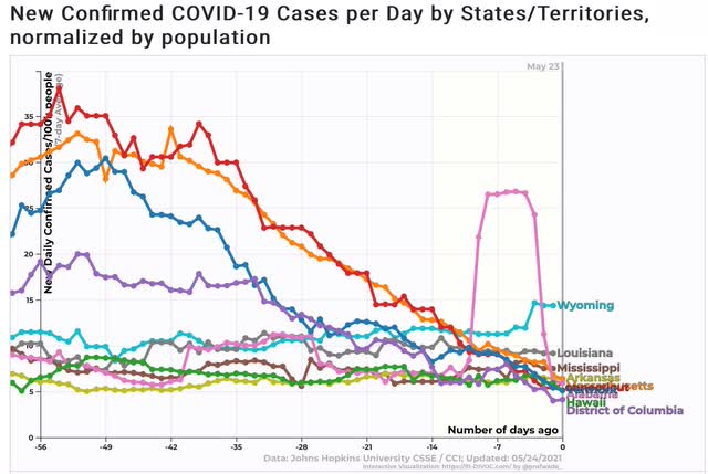
Finally, below is a comparison of new cases over the past 8 weeks for the 5 States that have administered the fewest vaccinations per capita (MS, AL, LA, AR, and WY) vs. the 5 jurisdictions that have administered the most (VT, MA, HI, CT, and DC):


The only overlap is that of Alabama. The other 4 States with few vaccination are in the top 1/2 for new cases, while the 5 jurisdictions with the most vaccinations are in the bottom 1/2. At some point soon, the federal government may have to step in directly to administer vaccinations to willing people (probably among the minority Black population) in those States in the Deep South that have been recalcitrant.