Friday, May 4, 2018

April jobs report: excellent in almost all respects


- by New Deal democrat

HEADLINES:
  • +164,000 jobs added
  • U3 unemployment rate fell -0.2% from 4.1% to 3.9%
  • U6 underemployment rate fell -0.2.% from 8.0% to 7.8%
Here are the headlines on wages and the chronic heightened underemployment:

Wages and participation rates
  • Not in Labor Force, but Want a Job Now:  up +19,000 from 5.096 million to 5.115 million   
  • Part time for economic reasons: down -34,000 from 5.019 million to 4.985 million
  • Employment/population ratio ages 25-54:  unchanged at 79.2%
  • Average Weekly Earnings for Production and Nonsupervisory Personnel: rose $.05 from  $22.46 to $22.51, up +2.6% YoY.  (Note: you may be reading different information about wages elsewhere. They are citing average wages for all private workers. I use wages for nonsupervisory personnel, to come closer to the situation for ordinary workers.)      
Holding Trump accountable on manufacturing and mining jobs

 Trump specifically campaigned on bringing back manufacturing and mining jobs.  Is he keeping this promise?  
  • Manufacturing jobs up +24,000 for an average of 12,000/month in the past year vs. the last seven years of Obama's presidency in which an average of 10,300 manufacturing jobs were added each month.   
  • Coal mining jobs up +700 for an average of 100/month vs. the last seven years of Obama's presidency in which an average of -300 jobs were lost each month
February was revised downward by -2,000. March was revised upward by +32,000, for a net change of +30,000.   

The more leading numbers in the report tell us about where the economy is likely to be a few months from now. These were positive.
  • the average manufacturing workweek rose +0.2 hours from 40.9 hours to 41.1 hours.  This is one of the 10 components of the LEI.
  •  
  • construction jobs increased by +17,000. YoY construction jobs are up +257,000.  
  • temporary jobs increased by +10,300. 
  •  
  • the number of people unemployed for 5 weeks or less decreased by -172,000 from 2,287,000 to 2,115,000.  The post-recession low was set over two years ago at 2,095,000.
Other important coincident indicators help  us paint a more complete picture of the present:
  • Overtime rose +0.1 hours from 3.6 hours to 3.7 hours.
  • Professional and business employment (generally higher-paying jobs) rose by +54,000 and  is up +518,000 YoY.

  • the index of aggregate hours worked in the economy rose by 0.5%.
  •  the index of aggregate payrolls rose by 1.1%.     
Other news included:            
  • the  alternate jobs number contained  in the more volatile household survey increased by  +3,000 (!)  jobs.  This represents an increase of 2,020,000 jobs YoY vs. 2,280,000 in the establishment survey.      
  •      
  • Government jobs fell by -4,000.       
  • the overall employment to population ratio for all ages 16 and up declined -0.1% to 60.3  m/m  and is up +0.1% YoY.          
  • The labor force participation rate declined -0.1% to 62.8  m/m and is down -0.1% YoY  
 SUMMARY   

All of the good news I expected in last month's employment report (but was probably negated by  the weather) showed up in this month's report. In particular, both the unemployment and underemployment rates declined to new expansion lows. Aggregate hours and payrolls also improved strongly, and hourly wages for nonsupervisory workers tied their expansion high at +2.6% YoY. Involuntary part time employment also fell further, while employment in all significant services and industries rose.

About the only flies in the ointment were the pathetically weak +3,000 improvement in the very volatile household number, the declines in both the employment-population ratio and the labor force participation rate, and the slight decline in YoY payroll growth (consistent with my expectation that this will restart its late cycle slow fade).

But, all in all, an excellent report.

Thursday, May 3, 2018

Gimme shelter Q1 2018 update: rents and house prices all at or near new extremes


 - by New Deal democrat


This post is a comprehensive update as to the cost of new and existing homes vs. renting, all measured compared with median household income. As such it is epistolary in length. So here is the TL:DR version:
  • as a multiple of median household income, new home prices are at an extreme beyond even the peak of the housing bubble, while existing home prices are about 5% under theirs
  • but unlike then, when apartment vacancies were high and rents cheap, now rents are *also* at an extreme as compared with median household income
  • even with their recent increase, interest rates are still lower now than during the housing bubble, so the median monthly mortgage payment adjusted for median household income is even still about 10% less than it was at the peak of the housing bubble
  • if the trends of rising prices and interest rates continue, at some point they will overcome the demographic tailwind of the large Millennial generation having reached typical home-buying age. At that point there may be another deflationary bust
_____________________


Half a year ago I wrote a long post discussing "the real cost of shelter," by which I meant not just the downpayment on a house, but the monthly carrying cost for a mortgage, and comparing both of those with median rent. 

That comparison showed that, while the "real" cost of a house downpayment was at a new high, the "real" cost of median asking rent was even higher. By contrast, the monthly carrying cost of a mortgage was quite moderate. This meant that, if a buyer could find a way to put together a downpayment, home-owning was a bargain compared to renting.

As I'll show below, six months of price and interest rate increases later, there is even more stress on both homebuyers and renters.

By way of a quick recap, I wrote six months ago that I had never seen a discussion of the relationship between the relative cost of homeownership vs. renting, particularly as a function of the household budget. The choice (or ability) to live in the residence one desires isn't a matter of its cost by itself, but also the relative cost of the type of residence.  What is the cost of a house compared with the cost of an apartment? How expensive are each of them compared with a household's income?  If both are too expensive, maybe the choice is made to live with mom and dad as an extended family.

So, here are the three relationships I'll look at again in this post

1. the "real cost" of a downpayment on a house.
2. the "real cost of renting
3. the "real monthly carrying cost" of a mortgage

The best metric for calculating these "real" costs on a household is median household income


1. The "real cost" of a downpayment on a house

In order to generate the "real cost" of buying a house, the best way is to compare the median household income with the median house price. 

One drawback is that the Census Bureau only publishes median household income annually in September -- so there is as much as a 21 month lag. Here's what the most recent data -- through 2016! -- looks like:


The good news is that Sentier Research published monthly estimates based on the Household Survey into 2017. The bad news is that they discontinued this service a year ago.

The renewed good news is that the website Political Calculations has picked up the mantle and continued to estimate the monthly change in median household income. Here's what that looks like as of their most recent update through February:


After I engaged in some correspondence with them, last week they updated their metric on "real" house prices making use of their monthly median household income estimates (NOTE: here nominal values are used for both median income and median prices):


While they use new home sales for their median house prices, we get the same result if we use the FHFA house price index:


Meanwhile, the median price for an existing home, which peaked at $230,000 in summer 2005, has continued to appreciate at nearly 6% a year this year:


If that pace continues, by this summer the median price will be about $280,000, 22% above the bubble peak. Since nominal median household income has increased about 25% over that same period of time, they will be only aabout $7500, or about 3% below their "real" bubble peak.

In short, no matter how you measure, in real terms house prices are at or near their most expensive ever, even including the peak of the housing bubble.

So, why haven't home sales rolled over? Part of the reason is the demographic tailwind I discussed last week. Because Millennials of peak first-home-buying age now number about 15% more than the Gen Xers of 2005, a build-up that has grown year after year for the last decade, it presumably takes even more financial stress to overcome that tailwind.

But there are two other reasons why home sales haven't turned negative yet: the relative (un)attactiveness of renting, and the monthly carrying cost of mortgage payments. Let's look at each of them in turn.

2. The "real cost" of renting

Here is the median asking monthly rent for an apartment in the US since 1995 (note: the series goes back to 1988):


In 1988 the median rent averged $343 per month. In the first quarter of this year it was $954.

Now, here is what it looks like in comparison with median household income:


If house prices have risen to new highs several times since the turn of the Millennium, so have apartment rents -- almost relentlessly. 

In percentage terms, in 1988, the median rent for an apartment was 14.5% of median household income. That rose to slightly over 16% in the mid 1990s before falling to the series' low of 13.7% in 2000. It had risen to a record 18.4% of median household income in the 2nd quarter of 2017, the last available data when I first published this piece.

Since then, the situation has only gotten worse. In Q3 median asking rent was 18.7% of median household income. In Q4 it was 18.6%. And in the first quarter of 2018 it rose to 19.3%!

Note, by the way, that even if we make use of the metric of "rent of primary residence" from the monthly CPI report, which I think has been underestimating rent increases (because both Zumper and Rent Cafe, two private measures, are much more in accord with the surge in "median asking rent"), we see that rent increases have outpaced median household income, which over the same period of time has risen about 220% nominally:


So one very big difference between the present situation and that at the peak of the housing bubble is that renting was a *much* more attractive option 12 years ago than it is at present.

3. The "real monthly carrying cost" of a mortgage

A second big difference between the present and the housing bubble is that mortgage interest rates generally ranged between 5.5% and 7% then, but quickly fell below 5% in this expansion, all the way to a low of 3.3% in 2013:


Recently they have risen significantly.

With that in mind, let's take a look at the monthly cost of living in a house. The below graph shows the median monthly mortgage payment for a house  (blue) compared with median household income (red). Median monthly mortgage payment is calculated by using the median house price and the 30 year mortgage rate for each quarter, and consulting an amortization table using those values. This is done by showing the percentage of median monthly income (1/12 of the annual) that one month's mortgage payment consituted (note: I am assuming a 10% down payment, with 90% mortgaged to be consistent. Using a different down payment does not change the shape of the comparison at all, only the nominal values)::


Last year, when I first posted this metric, the monthly payment for the median house wasn't extreme at all, but rather very moderate in terms of the long term range. 
  • Going back to 1988, the median mortgage payment was slightly over 40% of median monthly household income. 
  • This fell back under 28% at the end of 1998 before rising to 32% in 2000. 
  • After falling briefly, at the peak of the housing bubble in 2005 it had risen to 31.4%, and actually reached a secondary peak in Q2 of 2006 of just over 35% of median monthly income.
  • At the bottom of the bust at the end of 2011 it made a new low of 23%.
  • As of Q2 of last year, the median monthly mortgage payment was still less than 24% of median household income.
  • BUT, with the increase in both house prices of over 5% YoY, and the increase in mortgage interest rates to 4.28% as of Q1 2018, that has now risen to 29.5%

Mortgage payments for new buyers in 2018 and not nearly so moderate as they had been earlier in this expansion.  But they are not yet at the extremes they were in 2005 and 2006.

4. Comparing rent  and mortgage payments

In our final comparative graph, let's see how median monthly rent compares with median monthly mortgage payment:


The overall trend in the last 30 years has been that monthly mortgage payments have fallen from over 3 times median rent to about 1.5 time median rent now. Put another way, even at the peak of the housing bubble, the monthly carrying cost of a house was about 2.3 times the median cost of renting an apartment. At the bottom of the bust, that fell to 1.4 times the cost to rent. For the last five years, monthly mortgage payments have hovered near 1.5 times the median asking rent.

What is particularly noteworthy is that *even with* the recent big increase in mortgage payments, rents have also increased so much so that the 1.5 ratio still holds.

CONCLUDING REMARKS

By comparing the "real" cost of housing to renting, both in terms of down payments and monthly mortgage payments, we can make sense of some of the biggest trends in the market for shelter.

Record down payments are keeping an increasing number of prospective buyers, especially first time buyers, shut out of the market for buying a house. An enormous number are living in apartments instead. This explains both the multi-decade lows in the homeownership rate as well as the recent 30 year lows in the apartment vacancy rates, as a disproportionate number of adults are forced out of home ownership and into apartment dwelling.

But even with the recent increase in mortgage payments, in relative terms they are still lower than they were at the peak of the housing bubble, and a relative bargain compared with their historical multiple of rental payments. In short, if one can get past the down payment, home ownership still looks like the better choice. 

Along with the demographic tailwind, the *relative* inexpensiveness of monthly mortgage payments vs. rental payments goes a long way towards explaining why single family home construction has continued to increase in the face of higher mortgage rates. 

That being said, with increasing financial stress showing up across the board in the costs of both buying and renting, we can only expect to see even more involuntary extended family households and involuntary unrelated housemates. Further, *if* interest rates and housing costs increase much further -- most importantly, if home builders continue to focus on only the most expensive segment of the market --  at some point they will overwhelm the increased numbers of home-buying age Millennials who have been buoying up the market. Sales will turn down, followed by home values, leading to another deflationary bust. 

[Special thanks to Mike KImel for preparing the customized comparative graphs used in this article.]

Wednesday, May 2, 2018

Residential construction, ISM new orders, vehicle sales show decelerating growth


 - by New Deal democrat

Yesterday and today we got a bunch of leading economic data for both March and April. Last month the short term news was good, while the longer term construction spending data portended a slowdown (but not a downturn). Let's take an updated look.

Residential construction spending

To recap, in terms of their order in leading the economy, the housing data I track runs in this order:
  • new home sales (but these are very volatile and heavily revised, so the signal to noise ratio is low)
  • permits (much less volatile)
  • single family permits (even less volatile - signal to noise ratio is high)
  • housing starts (more volatile than permits, but have the advantage of being "hard" economic activity)
  • residential construction spending (the least volatile of all of the data, even though less leading)
  • residential fixed investment (part of quarterly GDP, so the last reported)
There is also the weekly mortgage applications report, which has just made new highs for the expansion, and which recently has tracked new home sales better than the other series, but has had compositional issues in the past.

Residential spending declined significantly in March, but only taking back outsized gains in the several previous months:


Next, here are the two least volatile series, single family permits (red) vs. inflation-adjusted private residential construction spending (blue), measured YoY% q/q for the last 15 years: 


You can see the relative advantages of each. Single family permits are more leading, but somewhat more noisy, while residential construction spending is not noisy at all, but follows a few months after permits.

That there has been a recent slowdown in growth becomes more apparent when we look at the m/m percent change in nominal construction spending focused on the last several years:


As of March, both single family permits and private residential construction spending have increased by about 5% YoY. While we had slowdowns even more than this in 1994, 1996, and 2010 without recessions following, actual downturns in 1999 and 2006-07 did presage the recessions.

ISM manufacturing new orders

The ISM index has  a 70 year history of being a good short leading indicator, and in particular the new orders subindex. In April it remained very strong, backing off just a bit from March's reading (h/t Briefing.com):


At the same time, in the last two months it has declined from the torrid levels of last autumn and winter.

April motor vehicle sales

Because GM is no longer reporting on a monthly basis, this metric must be taken with large grains of salt. The best way to get around the issue would be to measure vehicle sales ex-GM, and compare with sales ex-GM last month and one year ago. Instead, the services appear to be estimating GM's sales at anywhere between flat and -8% (!!!). This is a recipe for missing a change of trend.

With that very big caveat, April sales were reported at over 17 million:


Sales tend to plateau for long periods of time during expansions. At this point it is quite clear that there has been a slight decline in trend since late 2016, akin to the slight declilne we say in 2006.

The bottom line is that, while manufacturing production should remain strong over the next few months, as with so much other data the slowdown in residential construction growth and vehicle sales are markers of a late cycle slowdown in growth, without any imminent danger of an outright downturn.    

Tuesday, May 1, 2018

A change of seasons in the financial markets? May Day update


 - by New Deal democrat

An era of generally rising bond yields is more likely than not starting, changing the way that the stock and bond markets relate to one another, a point I made after the spike in bond yields in January caused a correction in the stock market.

Have the last few months strengthened or weakened that case?  I update my observations over at XE.com.

Monday, April 30, 2018

March 2018 personal income and spending


 - by New Deal democrat

Programming note: I've been working on a mega-post about housing, that is now complete except for a few graphs. So, please excuse the brevity otherwise.

March 2018 real personal income and spending were both positive. So far, so good.

The personal saving rate fell slightly:


Again, this is consistent with a late cycle dynamic where consumers are more stretched than they were earlier in the expansion.

Real personal spending continues to outstrip real retail sales (quarterly to reduce noise, through Q1 in the graph below):


This is also a typical late cycle dynamic (a relationship that holds for 10 of the last 11 expansions).  But since neither shows signs of significant declines, there is no imminent danger of a downturn.

As has been the case for the last several years.

Saturday, April 28, 2018

Weekly Indicators for April 23 - 27 at XE.com


 - by New Deal democrat

My Weekly Indicators post is up at XE.com.

A number of indicators which had been positive have either now turned neutral or are on the cusp of turning neutral.

Friday, April 27, 2018

Q1 2018 GDP downshifts slightly; long leading indicators mixed


 - by New Deal democrat

This morning's preliminary reading of Q1 2018 GDP at +2.3%, down from the previous quarter's +2.9%, was generally in line with forecasts.  As usual, my attention is focused less on where we *are* than where we *will be* in the months and quarters ahead.

There are two leading components of the GDP report: real private residential investment and corporate profits. Because the latter will not be released until the second or third revision of the report, I make use of proprietors' income as a more timely if less reliable placeholder.

So let's take a look at each.

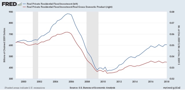
Real private residential fixed investment was flat (blue). Measured by the more precise method of its share of the GDP as a whole (red), residential investment actually declined:


According to Prof. Edward Leamer, this typically peaks about 7 quarters before the onset of a recession. As it has not made a new high since four quarters ago, and must be considered a signficant leading indicator of recession at this point.

Proprietors' income, on the other hand, rose again in the first quarter. The below graph compares it with the less timely but more accurate corporate profits:


Remember that the big decline in corporate profits in Q4 of last year had to do with accounting for repatriation of overseas earnings in the recent tax bill, so right now proprietors income is probably giving us the more accurate, positive, signal.

While the economy is very likely to continue to grow through 2018, together this most recent data suggests a more questionable picture heading in 2019. In particular, this is the first important housing metric to roll over to negative.

This confirms a note I made when discussing Q4 2017 GDP three months ago, At that time I indicated that I wasn't expecting any big positive breakout.  This goes back to the relative flatness or restrained growth in housing.  The below two graphs show the leading relationship between housing permits (using the less volatile single family measure) and GDP broken up into two roughly 30 year periods:


Since the YoY% change in permits for 2015-17 was roughly 10% (divided by 4 for purposes of scale in the above graphs shows a number of ~2.5%), I wrote that a continued roughly 2.5% YoY growth of GDP for the next few quarters is a reasonable projection. 

One final very positive note: the employment cost index was also reported this morning, at a strong  +0.8% q/q. It was up +2.7% YoY, the highest rate in almost 10 years:


[Note: I'll update with a better graph when available]
UPDATE: And, here's the better graph, showing the YoY% change for the life of the series:


There are two particularly good things about this: (1) it is a median metric; and (2) unlike other wage measures, it tracks pay for the same job over time. This tells us that the growth in pay for doing the same job has begun to rise significantly (UPDATE: and is clearly in an uptrend), a big plus in what has otherwise been a mediocre wage picture.

Thursday, April 26, 2018

Don't sweat the Q3 2017 job losses


 - by New Deal democrat

Yesterday the BLS issued its report on Q3 2017 Business Employment Dynamics. This has gotten some notice because, for the first time in 7 years, it showed a net loss last summer of -140,000 jobs.

As an initial matter, this is a good time to remind you that the data is the data is the data. It's not partisan. I've seen some of the same people who were touting "It's still Obama's economy" all last year (and I agree with that) now suddenly saying that the Q3 BED job losses show that "the Trump/GOP economy is tanking" No,  they don't.

The big flashing red neon sign is in this state by state map (h/t Bloomberg):


While job losses in Michigan and Ohio might not be so unexpected, for major job losses to happen in Florida sticks out in the data like a sore thumb.

While hurricanes and wildfires occur every summer, last year was a particularly bad one.  And a look at the three states most directly involved -- Florida, Texas, and California -- tells us exactly what happened. The BLS appended a note expressly stating that they did not adjust for this.

Here's a chart of the net job gains and losses over the last 5 quarters for each of the 3 affected states. The last line is the net change compared with the previous quarter:

Quarter   FL          TX       CA
Q3 2016  112.9     76.2   110.0
Q4           42.0       50.1    70.0
Q1 2017  35.9       61.0    90.3
Q2           37.8       48.9    45.3
Q3          (-133.5)   16.0    24.3
NET        (-171.3)   (-32.9) (-21.0)

The net loss of -171,300 jobs in Florida alone compared with the previous quarter exceeds the net nationwide loss of -140,000.  Add in the other two states affected by unusually severe disasters and you get a net loss of -224,200 jobs.

Does anyone seriously think the Florida economy suddenly went to hell in Q3 of last year in any cyclical manner? Of course it didn't.

So I'm not putting too much stock in this report. 

By the way, remember that initial claims shot through the roof for a month after the hurricanes:


This morning they made a new 48 year low, at 209,000. Wow!

When The End is really Near, I'll tell you. If my systems are right, hopefully about a year in advance. If the economy is left to its own devices, The End is not Near now.


Wednesday, April 25, 2018

Demographics, housing, and the economy


 - by New Deal democrat

Way back during the Great Recession, I first noted that demographics were about to become a tailwind for the housing market. The argument, in its simplest terms, is that the median age of first time home buyers is about 30, and the nadir of the "baby bust" was 1973-76. That means that the demographic nadir of the population of first time home buyers who ultimately drive the market (since everybody else just moves up from one house to another) was in the 2003-06 period.

Yesterday I started looking into quantifying that tailwind. Without getting into too much detail, my suspicion is that it has amounted to an increase in the pool of potential first buyers on the order of roughly 250,000 households per year since 2010 -- i.e., the increase of each year over the year previous, continuing year after year. That's just a back of the envelope approximation.

Lo and behold, Bill McBride a/k/a Calculated Risk posted on a similar subject yesterday, opining that the demographic tailwind was likely to continue for years for both housing and the economy generally, concluding that "My view is this is positive for both housing and the economy, especially in the 2020s. "Then Mike Shedlock a/k/a Mish responded with regard to housing, opining that "On the surface, the demographic trends may appear neutral or slightly favorable.... [but] For now, and the next five years, attitudes and affordability are the key issues. They far outweigh any potential demographic benefit, if any."

Who's got the better argument? Because historically we've been around this block before, in a pretty big way. You may have heard of it: it was something called the "baby boom."

In my opinion that history gives us a pretty definitive answer.

Let's start with the demographic history. Here's a graph of live births for each year since 1900:


Between 1900 and 1945, live births averaged about 2.75 million a year -- more during the prosperous 1910s and 1920s, followed by a bust during the hard times of the 1930s.

Then, in the 20 years from 1945 to 1965, live births averaged 3.75 million a year. Officially, it has been estimated that there were 76 million "baby boomers" by the end of this period. This was a huge, huge increase unlike anything before or since over the entire 120 year period.

 The US population as a whole increased from 140 million in 1945 to 195 million in 1965. The median age of the US population was 28 years old. When we consider that about 75 million of that 195 million population had been born during that period, that means that almost 40% of the entire US population were legally children (21 being age of majority at the time) in 1965!

Like I said, huge. Just huge. Even the slightly numerically larger Millennial generation, nor the post-Millennial iGeneration have come remotely near that kind of percentage.

The "baby boom" was demographically nicknamed "the bulge in the belly of the python" as will be apparent in the shape of the graphs below. 

Let's start with the economy.  While I normally agree with Bill McBride, in the case of the economy in general the historical evidence from the baby boom is that demographics -- at least in terms of the YoY% change in the prime working age population from ages 25-54 (red in the graphs below) is "not* well correlated with economic growth (green):


While the demographic "bulge in the belly of the beast" is indeed obvious (!), real GDP growth YoY has generally been in a persistent downtrend for the last 70 years. There is simply no evidence of economic acceleration during the period that the large Boomer demographic dominated the prime age workforce. The correlation of the economy and prime age workforce demographics is entirely an artifact of the years since 2000, and falls apart upon longer-term historical examination.

But with housing, it's a different story entirely.

The first three graphs below are presented to show that the median age of first time home-buyers has historically been about age 30, with almost 2/3's of all first time buyers being age 37 or lower:


g

With that in mind, let's again compare the YoY% growth in the prime age population demographic (red again) with building permits (blue, /10 for scale):


There are huge surges and declines between 1965 when the oldest Boomers reached age 20, and 1985, when the youngest did, and the oldest reached age 40. 

When we divide permits into those for single family houses (blue) vs. multi-unit residences (green), the progression is even clearer:


Permits for multi-unit residences surged first, beginning in 1965, as the oldest Boomers entered their 20s, while single family permits, relatively speaking, began to surge in the early 1970s, and reached their peak in the early 1980s. This is exactly what we would expect to see as the young demographic moves from apartments and condominiums into single family homes. By 1986, there gradually became  more Boomers exiting the prime first time home-buying age demographic than there were younger persons entering that demographic.

Note that we've seen an echo of this pattern with the entry of Millennials into adulthood. During the housing bust, single family permits fared much worse than multi-unit permits, and multi-unit permits initially surged more than single family permits -- but since 2010, both have surged more than at any time since 1985.

The peak in Millennial births was in 1990, after which live births leveled off. If a similar historical pattern is followed, the strong demographic tailwind in the housing market should continue through 2020, and thereafter, while not turning into a headwind, gradually subside through roughly 2025.

Tuesday, April 24, 2018

Housing: it's Godzilla vs. Mothra!


 - by New Deal democrat

LADIES AND GENTLEMEN!

In this corner, I give you Godzilla -- the large generational tailwind of Millennials entering the market!

And in this other corner, I give you Mothra -- increasing interest rates that have now broken a 30 year trendline together with price increases of over 5% a year!

Pull up a chair (at a vary safe distance), because we don't know yet who is going to win -- but you don't want to get caught in between them.

This post, with monstrous graphs, is up at XE.com.

Monday, April 23, 2018

The consumer edges closer to the precipice


 - by New Deal democrat

In addition to my "long leading/short leading" model adapted from the work of Profs. Geoffrey Moore and Edward Leamer, and the "high frequency" weekly variation on the same, I also have several "alternate" recession forecasting models. The most noteworthy model is really a consumer nowcast. It turns on consumers running out of options to to continue increasing purchases (i.e., no interest rate financing, no wage real wage increases, and no increasing assets to cash in). When that happens, and consumers turn more cautious by saving more, a recession begins.

I first posted the model 10 years ago under the title, "Are Hard Times Near?  The great decline in interest rates is ending."  The history is straightforward.  Since the 1970s, real average hourly earnings had declined.  Average Americans coped by spouses entering the workforce, by borrowing against appreciating assets, and by refinancing as interest rates declined.

By 1995 the spousal avenue peaked.  Borrowing against stock prices ended in 2000.  Borrowing against home equity ended in 2006.  When interest rates failed to make new lows, the consumer was tapped out, and began to curtail purchases.  A recession began - and its effects lingered for a long time. "Hard Times" had indeed begun.

What does the consumer model show now? I haven't updated it in about two years, and there have been noteworthy developments. Let's take a look.

Real hourly wages haven't increased since last July, are up only 0.1% YoY and barely more in the past two years:


According to Ironman at Political Calculations, real median household income has declined slightly  for nearly two years:


Mortgage rates haven't made a new low since 2013, and if anything are trending up, on the verge of breaking a 30 year trendline:


As a result, refinancing at lower mortgage rates is dead (shaded line):


In terms of cashing in assets, the stock market hasn't made a new high in nearly 3 months:


Of course, there's nothing to preclude it making new highs later this year, but for the moment, that method of freeing up cash is stalling.

The one asset that is still very much appreciating, of course, is housing:


Unsurprisingly, home equity withdrawals have been increasing over the past 12 months (h/t Bill McBride a/k/a Calculated Risk):


Meanwhile, the personal savings rate declined sharply over the last 18 months:


So consumers are more stretched than earlier in the expansion. 

The recent upturn in the savings rate would be more concerning, except that household debt obligations as of Q4 2017 were still rising:


For this model to signal recession, consumer debt obligations would have to start to fall.

Put this all together, and we have consumers in a more precarious position than they have been at any previous point in this expansion. But on the other hand, home equity withdrawals are still an option and are being used. The most recent available data does not show consumers becoming more focused on paying down debt. As with my primary forecasting model, the lynchpin looks like the housing market. 

Sunday, April 22, 2018

A better name for The Kids Today: iGeneration


 - by New Deal democrat

You know the drill. It's Sunday so I get to ruminate about all stuff that isn't dry economics.

The oldest member of the Millennial generation is 38. Not only do I not think that The Kids Today would want to be lumped with that age group, but their uncool parents are probably precisely members of that group!

So what to name the generation that came after the Millennials? both "post-Millennials" and "Gen Z" are condescending and probably don't cut it with The Kids Today. Remember, "Gen X" was originally called "the baby bust," and Millennials were originally called "Gen Y" or "the echo boom," before catchier names were found.

A good dividing point is whether or not you remember 9/11. If you do, and were born after 1980, you're a Millennial. If you don't, you're not. Most studies seems to agree with this, using 1996 or so as the cut-off year after which you are not a Millennial. A similar if less apocalyptic marker is the Columbine school shooting of 1999. If you remember it, you're a Millennial. If your schooling always included "active shooter" drills, you're not.

But while the War on Terror or mass shootings have always been in the background for The Kids Today, everyday life has been dominated by something else.  If you were born after 1996, iPods were always around -- and there's a good chance you owned one. So were cell phones. For most of your youth -- *always* for the younger part of this cohort -- iPhones and flat screen TV's have been around, and you probably have had one (or another smart phone) since junior high school. In fact you may spend most of your time glued to one! The term "iGeneration" captures this perfectly.

I'm not the first person to think this is a better name. From Wikipedia:
iGeneration (or iGen) is a name that several persons claim to have coined. Demographer Cheryl Russell claims to have first used the term in 2009. Psychology professor and author Jean Twenge claims that the name iGen "just popped into her head" while she was driving near Silicon Valley, and that she had intended to use it as the title of her 2006 book Generation Me about the Millennial generation, until it was overridden by her publisher. In 2012, Ad Age magazine thought that iGen was "the name that best fits and will best lead to understanding of this generation". In 2014, an NPR news intern noted that iGeneration "seems to be winning" as the name for the post-Millennials.
So henceforth when I examine demographics issues, I am going to use the term "iGeneration," the earliest polling as to which indicates that they hate Trump even more than their Millennial predecessors do!