Thursday, September 14, 2017

Hurricane adjusted initial claims for week of Sept. 2: 239,000


 - by New Deal democrat

Last week I promised I would repeat an exercise I first undertook in 2012 when Superstorm Sandy disrupted the initial claims data: estimating what the initial jobless claims would have been, but for the hurricane.

In 2012 I created that adjustment by backing out the affected states (NY and NJ) from the non-seasonally adjusted data.  That gave me the number of initial claims filed in the other 48 states.  I compared that with the same metric one year earlier, and multiplied by the seasonal adjustment.

What that does is give me the number if the affected states had the same relative number of claims during the given week, as all of the unaffected states.  In 2012, it showed that Sandy was not masking any underlying weakness in the economy.

The state by state data is released with a one week delay.  So what follows is the analysis for the week of September 2, the number for which was reported one week ago. This week I only had to back out Texas.  Next week I will undoubtedly have to back out Florida as well.

Here is the table for the Week of September 3 in 2016 vs. September 2 this year:

Metric                              2016                   2017
Seasonally adjusted:       257,000              298,000
Adjustment for total:       1.18%                1.19%
Not seasonally adjusted: 217,715              250,621 
Texas claims:                     15,707                63,788
NSA claims ex-TX           202,008              186,833
TX as % of total:              7.2%                   n/a
2017 w/ TX adjustment:  n/a                      201,405

If we use the 2016 weekly seasonal adjustment of 1.18% for the adjusted 201,405 total, this gives us ~238,000.

If we use the 2017 weekly seasonal adjustment of 1.19% for the adjusted 201,405 total, this gives us ~240,000.

Thus the hurricane-adjusted initial jobless claims number for the week of September 2, 2017 is 239,000.

The underlying national trend in initial jobless claims remains very positive.

Tuesday, September 12, 2017

More JOLTS hard data weakness in July


 - by New Deal democrat

I have been a dissenter about the JOLTS reports for over a year (although, perusing the intertoobs yesterday, it looks like a few more observers have joined the chorus). The typical commentator has focused on job openings (blue in the graph below), which have been trending higher strongly (as they did in yesterday's report for July): 


But openings are the one aspect of the report that are not "nard" data. They can just as easily be skewed by employers trolling for resumes, perhaps laying the groundwork for visas for cheap immigrant labor, or simply refusing to offer the wage or salary that would call forth enough actual applicants to hire. 


Hence the disconnect between "openings" and "hires," (red in the graph above), which have been barely above stagnant for the last year.  Here is the YoY trend for hires:


Thus I prefer to focus on the "hard" data series such as hires, quits, and layoff, where the story hasn't been nearly so strong.

Let me start by comparing hires to total separations (averaged quarterly to cut down on noise):


We only have one full business cycle to compare, but since the outset of the series at the start of the Millennium, the trend has been for hires to slightly lead separations. In the quarterly view, hires have been stagnant for going on 2 years.  Here is the monthly view of the last few years:


In the last three months, hires have picked up somewhat - although not to new hiighs, unlike separations, which *are* at new highs.

Let's further compare historical hires with voluntary quits and also layoffs and discharges. Here we see that in the last cycle, hires stagnated, and shortly thereafter involuntary separations began to rise, even as quits continued to rise for a short period of time as well:


Next, here is the current cycle, quarterly through June:


Significantly, even while quits have continued to rise, involuntary separations bottomed a year ago, and have risen on a quarterly basis ever since.  Here's the monthly view of the last several years: 


The recent surge in layofs and discharges is actually similar in scale to that just before the last recession.


In short, just like the slowly decelerating YoY change in payrolls:


JOLTS shows an employment situation that, while still positive, is slowly decaying.

Housing (un)affordability: an unholy triad


 - by New Deal democrat

What is the problem with the housing market?  Is it unaffordable house prices? Rents?  Maybe both!

Which leaves only one other alternative.

This post is up at XE.com.

Monday, September 11, 2017

The Chicago Fed revises its Adjusted Credit Conditions Index


 - by New Deal democrat


Last week the Chicago Fed announced backdated revisions to its Adjusted Financial Conditions Index. Since this changes their interpretation somewhat, I wanted to flesh this out.

The Chicago Fed has a "Financial Conditions Index" which is self-explanatory, as well as several sub-indexes, one of which, the "leverage" subindex, it has identified as leading.  It also has an "Adjusted Financial Conditions Index," which is supposed to calibrate how loose or tight credit conditions are *relative to* background economic conditions --i.e., are financial conditions more or less tight than they have typically been given the data background.

Because the Adjusted Index appeared to track, and somewhat lead, the Senior Loan Officers Survey, and because it is reported weekly rather than quarterly, I report this Index every weekend.

The "updates" to the Index change its values considerably.  First of all, the new Adjusted Index is much less volatile, but also somewhat less leading:


Secondly, it no longer leads the un-adjusted index at all in terms of peaks or troughs, although it does appear to have higher (i.e., more tight) values in the several years leading up to recessions:


If we add +0.5 to the value of the updated Adjusted Index, and average it over a quarter, it does appear typically to lead the Senior Loan Officer Survey by one or two quarters, although note the exception from 2014-16:


With that modification (i.e., adding +0.5 to the Adjusted Index as the line between "loose" and "tight" credit conditions, I will continue to track it weekly as a long leading indicator of promise.

Saturday, September 9, 2017

Weekly Indicators for September 4 - 8 at XE.com


 - by New Deal democrat

My Weekly Indicators post is up at XE.com.

Harvey and Irma are going to wreak havoc with some of the numbes.

Friday, September 8, 2017

Are consumers on the cusp of rolling over?


 - by New Deal democrat

We can divide the long leading indicators into producer, consumer, and financial.

When we look at just the non-financial indicators, almost all of them are down.

This post is up at XE.com.

Thursday, September 7, 2017

A note on Hurricane Harvey and unemployment claims


 - by New Deal democrat

Initial jobless claims for last week were reported at 298,000 this morning, a jump of over 50,000 from recent levels.

As most people probably already know, this huge jump had everything to do with Hurricane Harvey shutting down southeastern Texas, including the entire 7 million Houston metro area. Undoubtedly, the effect will last for weeks.

Fortunately, if we want to know what jobless claims would be ex-Harvey, there is a way to figure that out.  Although I haven't felt the need to dwell on weekly claims for several years now, I'll start to calculate this again next week.

I did this before, in 2012, after Superstorm Sandy.  Here's how I described the process then: 
I wanted to try to find out how much of this morning's initial claims number was still due to Sandy. To do so, I checked the BLS breakdown of initial claims by states, which gives the unadjusted state-by-state initial claims numbers. I deducted NY and NJ, the two states most hit by Sandy, and compared the number as deducted with the unadjusted number minus NY and NJ this week one year ago. Since the seasonal adjustment should be almost identical, that should give me the "real" ex-Sandy initial claims number, assuming NY and NJ would, ex-Sandy, have layoffs at a similar rate to all the other states. 
To do the same thing for Harvey, I'll simply calculate the number for all states except Texas.  Because the state by state data is reported with a one week delay, that won't be until next week.

Of course, I might have to account for Irma and maybe even Jose in the next few weeks as well.  But, one bridge at a time . . . .

Tuesday, September 5, 2017

Comparing motor vehicle sales vs. real retail sales per capita


 - by New Deal democrat

I know, real clickbait-y headline, right? 

This week is about the lightest for economic data I've ever seen, with the discontinuance of the Labor Market Conditions Index, and JOLTS not due until Tuesday next week. So - hint - probably light posting.

But there are several trends that bear writing about, including the state of the consumer.  Consider this post a prequel to that broader subject.

In the past, I've identified motor vehicle sales and real retail sales per capita as somewhat long leading indicators. Motor vehicle sales can peak several years before a recession, and real retail sales per capita perhaps 12 months before, each with a lot of variation.  Of course, motor vehicle sales are a component of real retail sales, and have tended to "plateau" for lengthy periods in expansions, but is there any rhyme or reason as to which peaks first?  That's what I wanted to check.

Real retail sales data, in its current and prior iterations, goes back 70 years! That's a pretty rich monthly data source. Unfortunately, motor vehicle sales, by contrast, started to be reported in the late 1970s, and so includes only 5 complete business cycles. Thus any relationship has to be very lightly weighed. But it's still worth looking at.

Both can be noisy on a month to month basis, so I have averaged each quarterly. Below are real retail sales per capita (blue, left scale), and motor vehicle sales (red, right scale) divided over the last 40 years:


On a quarterly basis, in the last 5 business cycles, real retail sales per capita have never peaked before motor vehicle sales. Both peaked together twice, and twice motor vehicle sales peaked two quarters before.  In one case (the 1980s), motor vehicle sales peaked about 3 years before real retail sales per capita!

Here's a look at the monthly data for the last few years through July (so the 16.1 million August motor vehicle sales number isn't included):


If motor vehicle sales have made their peak for this business cycle (I think they have), that at least is consistent with the last five cycles. Should the three month moving average of real retail sales per capita decline for several months, I would consider that of more significant importance now (vs. earlier in this cycle) concerning the state of the consumer.

Monday, September 4, 2017

The single most important fact this Labor Day


 - by New Deal democrat

On Labor Day, highlighting the single most important secular problem in the US economy:


If there is a silver lining, it is that the hemorrhaging has stopped since the end of the last recession.

But we are long past the point where we need another corporate tax cut. We desperately need to increase Labor's share of our $17 Trillion economy.

Happy Labor Day!

-----

On a lighter note, in honor of Labor Day's end of summer cookouts, here is my nomination for best hot dog anywhere in the USA, from my hometown Niagara Frontier. Ted's Hot Dogs:


Charcoal grilled and properly blackened and made with high quality Sahlens weiners, not like those wussy boiled downstate NY abominations, or the salad-ified Chicago messes.

If you visit the Falls, after your obligatory stop for the original chicken wings, make sure you sample these hot dogs (and stop for some Beef on Weck as well).

Saturday, September 2, 2017

Weekly Indicators for August 28 - September 1 at XE.com


 - by New Deal democrat

My Weekly Indicator column is up at XE.com.

Interest rates have improved, while there are several cracks in transport.

Friday, September 1, 2017

The August jobs report smacked of late cycle deceleration


 - by New Deal democrat

As promised, here is my abbreviated and late take on this morning's employment report.

While the additions to temporary positions (a leading indicator for jobs overall), and construction, and manufacturing jobs were welcome, this report sure looked like late cycle deceleration.

The YoY% growth in jobs - a very un-noisy metric - declined again slightly:


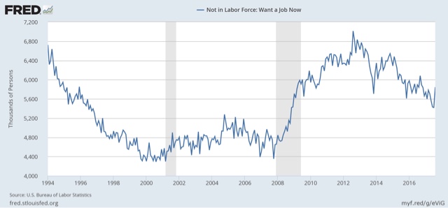
The number of people not in the labor force who want a job shot back up:


Those who are involuntarily part-time went sideways:


On the (relatively) bright side, when we adjust both of these metrics by the working age population, the comparisons with the last two expansions aren't quite so weak:


Finally, what on earth is it going to take to get wage growth for nonsupervisory workers?


And, although I won't bother showing the graph, we didn't make any progress on either the unemployment or underemployment rate.

So while the good news is, I still don't see any actual downturn anywhere near in time, this employment report was another sign of late cycle deceleration.

Housekeeping note on the employment report.


 - by New Deal democrat

I will be running an errand when the employment report comes out at 8:30.

I will put something up at about 10:30 to 11 eastern time. It will be a little truncated, but I will hit the high (or low) points, and try to highlight a few things that are overlooked in other commentators' posts.

Thursday, August 31, 2017

Trickle-down, with the emphasis on "trickle"

Since the turn of the Millennium, a torrent of corporate tax cuts has resulted in a trickle of investment growth.
 - by New Deal democrat
This morning Dean Baker objects to:
the argument ... that reducing corporate taxes will lead to more investment and thereby greater wage growth in the future. The data from the last seventy years show there is no relationship between aggregate profits and investment.

As can be seen, there is no evidence that higher corporate profits are associated with an increase in investment. In fact, the peak investment share of GDP was reached in the early 1980s when the after-tax profit share was near its post war low. Investment hit a second peak in 2000, even as the profit share was falling through the second half of the decade. The profit share rose sharply in the 2000s, even as the investment share stagnated. In short, you need a pretty good imagination to look at this data and think that increasing after-tax profits will somehow cause firms to invest more
I was a little puzzled why Dean didn't differently scale the two series so it would be easier to see any leading/lagging relationship.  Further, since corporate profits are a long leading indicator, and nonresidential fixed investment is more of a coincident indicator, I was pretty sure that there would be a correlation.

To take a better look, I compared the YoY% changes in each, so that they would scale more equally.  Here's what that looks like divided into 1948-86, and 1986-present:


Sure enough, there is a leading/lagging relationship between the two. That doesn't mean that an increase in corporate profits *causes* more investment, it just means there is a correlation with a lag.

But also notice that, in the post-WW2 era, the two series move in similar scales: a 40% increase in profits tends to lead to something close to a 40% increase in investment.  From the 1980s to the present, a 40% increase in profits leads to a much smaller increase in investment on the order of 10%.

In other words, even if we take the strong case, and assume there is a causative relationship, when we scale the two series more equally, we see that there is a big difference between the post-WW2 era, and the era that began with Ronald Reagan's presidency:


Simply put, particularly since the turn of the Millennium, a torrential increase in corporate profits only leads to a teaspoonful of investment.

The same is true of wage growth. Since wage growth is pro-cyclical, it tends to peak at the end of expansions, well after corporate profits peak.  So there is a leading/lagging relationship on a *cyclical* basis. But *secularly,* corporate profits have increased while wage growth has gradually deflated:


At this stage of the economic expansion, under counter-cyclical policy, if anything we should be trying to run a fiscal surplus. As we have seen above, a corporate tax cut now will do next to nothing for ordinary Americans, and will recklessly blow out the budget at the exact wrong time.

Bottom line: we don't need even more profits for corporations.  We need to increase the share of wage growth relative to corporate profit growth.

Wednesday, August 30, 2017

A Quick update on Bonddad


 - by New Deal democrat

I had a long conversation with Hale Stewart this morning.

He says he has been incredibly lucky. He, his spousal unit, and his pooches are all fine.  They have had no flooding at all.

On the other hand, he says that metro Houston in general is a complete mess. It sounds like, once the water has finally receded, Houston 2017 might resemble New Orleans 2005.

Tuesday, August 29, 2017

Comparing the 2014 and 2017 housing slowdowns


 - by New Deal democrat

We  had an interest rate spike late last year similar to the spike in mid-2013.  In 2014 the resulting housing slowdown resolved positively.  Will it do so again this year?

This post is up at XE.com.

Monday, August 28, 2017

Notes on Harvey: if Karma could bring her litter to visit the Texas GOP


 - by New Deal democrat

First of all, as many of you already know, the M.I.A. proprietor of this here blog, Hale Stewart, resides in the Houston area.  I traded messages with him on Saturday, and as of then, he was doing OK.

Secondly, when Superstorm Sandy hit New Jersey and New York, Texas Republicans were prominent among those who opposed aid.  Ultimately aid was provided -- but not until 75 days after the storm. 

There were two Sandy-related aid bills.

The first bill granted FEMA a $9.7 billion increase to borrow for the National Flood Insurance Program. It passed the Senate on a voice vote, but the following Texas GOP Members of Congress voted against the aid:

Mike Conaway (Midland) 
Bill Flores (Bryan)
Louie Gohmert (Tyler)
Kenny Marchant (Coppell)
Mac Thornberry (Clarendon)
Randy Weber (Pearland)
Roger Williams (Austin)

The second bill provided $17 billion emergency funding to the victims and to affected NY and NJ communities.  Both Texas Senators Ted Cruz and John Cornyn voted agains the bill.  In addition to all of the above Representatives, the following Texas GOPers also voted against this aid:

Ted Poe (Humble)
Sam Johnson (Plano)
John Ratcliffe (Heath)
Jeb Hensarling (Dallas)
Joe Barton (Arlington)
Kevin Brady (The Woodlands)
Michael McCaul (West Lake Hills)
Kay Granger (Fort Worth)
Lamar Smith (San Antonio)
Pete Olson (Sugarland)
Michael Burgess (Lewisville)
Blake Farenthold (Corpus Christi)
John Carter (Round Rock)
Pete Sessions (Dallas)

Now that it is Texas suffering a catastrophe, of course some of these same politicians will be at the front of the line braying for help. While with the GOP in control of the entire federal government, Karma will not be paying a visit with her litter, in a just world aid would be provided immediately -- on the same day they all visit NY and NJ, apologize, and abjectly beg forgiveness.

Of course, the "better angels" will prevail this time. But rest assured, the next time a disaster befalls anywhere in the Northeast, these same Texas politicians will once again vote against aid. In the meantime, above is the Roll Call of Shame for posterity.

Saturday, August 26, 2017

Weekly Indicators for August 21 - 25 at XE.com


 - by New Deal democrat

My Weekly Indicators post is up at XE.com.

There was no eclipse of the positive tone this week.

Friday, August 25, 2017

An economy on autopilot between Scylla and Charybdis


-  by New Deal democrat

Interest rates are a vital determinant of longer term growth. While the economy has remained on autopilot for the last several years, with almost no political stimulus or disruption -- though that may well change next month -- the Fed has to steer a course between the Scylla of an interest rate spike and the Charybdis of an inverted yield curve.  The Presidential election spike in long term interest rates has been enough to cause growth in the housing market, whether measured by permits, starts, new or existing home sales, to stall out. Meanwhile the several hikes in the Fed funds rate has cause a slight flattening of the yield curve.

So while it is somewhat welcome that longer term interest rates have fallen back below 2.20%f and mortgage rates below 4%:


that just means that there is less of a spread between longer term and shorter term yields.

Almost any inversion in yields out further than 3 months is a warning sign. The below graph shows that 3 month rates (green) have been lower then the Fed funds rate (red) almost consistently since the early 1980s:


Meanwhile 1 year treasury yields (blue) typically only fell below the Fed funds rate later in the expansion.

Here's a close up on what that looks like since just before the Fed started this tightening cycle:


So far the 1 year treasury yield remains higher than the Fed funds rate, but the spread is tighter.

For now autopilot is keeping us off the rocks, but there is a significant risk of "controlled flight into terrain" before September 30. Even if we escape that, another Fed rate hike could finally create a yield curve inversion near the shorter end.

Thursday, August 24, 2017

New and existing home sales show stall is continuing


 - by New Deal democrat

The stall in the housing market brought about mainly by the post-Presidential election spike in interest rates continued in July, based on both new and existing home sales.

This post is up at XE.com.


Tuesday, August 22, 2017

Free Trade, the Primrose Path, and the Blinkered Blindness of macroeconomists


 - by New Deal democrat

Here's what I learned today: the origin of the phrase "being led down the primrose path." 

It turns out that in medieval times, one meaning of the word "primrose" was the "prime," or first or loveliest, rose.  Thus taking the primrose path was a particularly lovely journey. At least by the time of Shakespeare's "Hamlet," where Ophelia speaks of the "primrose path" to Laertes, the connotation developed of the use of a lovely and seductive experience to lure a mark to their misfortune or doom.

The doctrine of free trade is macroeconomists' primrose path.  Today's example comes from Tim Haab's blog "Environmental Economics," in the below post entitled "Quote of the Day: Both sides win from free trade . . . sheesh," which I am reproducing in full:

That moment you realize the Chinese administration understands economics better than the U.S. administration...
"In reality, China and the United States' long term cooperation has brought about real benefits for both countries' peoples, any unbiased person will clearly see this fact," [Chinese Foreign Ministry spokeswoman Hua Chunying] told a daily news briefing in Beijing.
"We have also said before, a trade war has no future. A trade war does not serve the interests of any party, as fighting a trade war will not produce a winner. We hope that relevant parties can stop viewing issues of the 21st century with a 19th- or 20th-century mentality."
 Hua's quote is in reaction to Steve Bannon's claim that the U.S. is losing the trade war with China:
"It's in all their literature. They're not shy about saying what they're doing. One of us is going to be a hegemon in 25 or 30 years and it's gonna be them if we go down this path," he was quoted as saying.
"If we continue to lose it, we're five years away, I think, 10 years at the most, of hitting an inflection point from which we'll never be able to recover."

Now, I am no fan of Steve Bannon, but alas in this case it is economist Tim Haab who has the worse argument. Here's why.

Let's assume that Haab is completely right in what he says: that free trade in the aggregate absolutely benefits both countries which engage in it.  End of story?

No, and here is where macroeconomists' blinkered blindness to human behavior is on full display.

Wealth is, generally speaking, not accumulated for its own sake, but rather to be spent of stuff that you really want. So Country A and Country B can use the increased wealth from free trade to fund the stuff they really want.  

So let's suppose that while both Countries benefit from free trade, Country A's wealth increases by an additional 5% a year, while Country B's wealth increases by an additional 1% a year. By the magic of compounding, over 10 years Country A's wealth increases by 63%, and over 20 years by 265%. Meanwhile Country B's wealth has only increased by 10% in 10 years and 22% in 20 years.

Suppose further that what Country A really wants to do with this wealth is invade and take over Country C, which alas is an ally of Country B, meaning that Country B will have to go to war to defend it.

Is Country B's 22% increase in wealth worth the loss of life and destruction it will incur defending Country C?  This calculation nowhere appears in any of the arguments by free traders.

Meanwhile, if I am the leader of Country A, I am more than happy to lead Country B down the primrose path of free trade, knowing what I have in store at the end.

What's worse, we have already been through this exercise  once before, with calamitous results,  In 1909, Norman Angell's "The Great Illusion," argued that countries that trade with one another would never go to war, because it was so illogical.  At the time, free trade had burgeoned among the countries of Europe.

But it turns out that wasn't the priority of Kaiser Wilhelm or other European monarchs.  Only 5 years later, all of that wealth was poured into a catastrophic war.

Even though the historical facts devastatingly rebut the macroeconomic theory, macroeconomists ignore the facts. Since the uses to which ocountries might put the increased wealth obtained by trade lays outside their theory, they are blinkered and blind to it, and assuming that it does not exist. That World War I rebuts their argument is waved away as ancient history, even though human nature has not changed one wit.    In their blinkered blindness, macroeconomists fail to see that  free trade can be used as the primrose path.

Monday, August 21, 2017

Revisiting the Apartment Boom


 - by New Deal democrat

The entry of the large Millennial generation into the housing market should have generated more permits and starts in condos and apartment complexes than we have seen.

What's going on?  Factoring in the number of units under construction appears to give us at least a partial answer.

This post is up at XE.com.

Saturday, August 19, 2017

Weekly Indicators for August 14 - 18 at XE.com


 - by New Deal democrat

My Weekly Indicators post is up at XE.com.

If you are looking for DOOOOOM, you are looking in the wrong place.

Thursday, August 17, 2017

Industrial production: once again, the hard data fails to confirm the sof ... ofertheluvofgaud


 - by New Deal democrat

This morning's report on industrial production confirms that the economy remains on autopilot, and that's a good thing.

Overall production increased again, and the trend of rising production since spring of last year is clear:


When we break it down by manufacturing (blue, left scale), mining, and utilities (red and green, right scale), we get pretty much the same picture:


While it's true that the manufacturing subindex is below its April peak, I am not terribly concerned. There were very volatile readings in March, April, and May, and if we smooth the readings out via a three month moving average, July is only slightly below June, and both June and July are above every other 3 month average reading.

So the Doomers will have to move on from their "soft data/hard data" argument to something else.

Housing is still going sideways


 - by New Deal democrat
.
Although June got revised higher, July housing permits and starts continue to fail to impress

This post is up at XE.com.

Wednesday, August 16, 2017

On the erection of Confederate memorials: in which I have to get this off my chest


 - by New Deal democrat

Below is a photograph of the World War Two Memorial on the National Mall in Washington, D.C.


Keep it in the back of your mind. I'll return to it. 

I am a data nerd, and leaping to conclusions about data is a pet peeve of mine. I really hate it when anyone, and particularly my own side, falls for groupthink, jumping to instant conclusions which then become the only acceptable opinion. In the last 48 hours, without consideration of other possibilities, or looking for contrary vs. corroborating data, it seems that just about everyone on the center and left has become an instant expert on the fact that Confederate statues were erected because of Jim Crow.

In support of that, a number of graphics, such as this one, have been used:


So, has it occurred to nobody that there might be a more straightforward reason why there would be a huge spike in Memorials (cough, cough, hint, hint) ***50*** and ***100*** years after the Civil War?

Yes there were a number of racial incidents that occurred in the 1910s.  But before the last 48 hours, the general consensus was that there was a resurgence in violence associated with white supremacy in the 1920s, not the 1910s.

But 1910-1915 marked 50 years sine the Civil War, and those 20 year old soldiers who fought it  had dwindled to a band of 70 year old men, who did not want themselves or their cause to be forgotten after their generation had passed.

For (huge) example, on July 2-4, 1913, on the 50th anniversary of the Battle of Gettysburg, there was a reunion of both northern and southern armies who camped out at the site. That reunion was commemorated by the Eternal Light Peace Memorial erected on the 75th anniversary during another encampment of the last few survivors:


In our own time, we have had a demonstration of the exact same psychology: the World War Two Memorial shown at the beginning of this piece was championed as the 50th anniversary of the war approached, as a monument to the "Greatest Generation," particularly by veterans such as Bob Dole who did not want their sacrifice  to be forgotten after they shuffled off to the Last Great Muster in the sky.   Bill Clinton signed the authorizing Act for the memorial in 1993.

I am sure speeches were made lionize Jim Crow when the statues were dedicated, and none of this affects the debate on what should become of them. But can our side please not succumb to leaping to conclusions?

Here's a good test: when were monuments to Union soldiers and leaders erected? I haven't found any information onlline on that subject. Was there a similar spike in the vicinity of the 50th anniversary of the Civil War? If there wasn't, then there was something "special" about what the South did. But if there was, then the more straightforward explanation is probably the correct one.

Thank you for letting me get that off my chest.

UPDATE: Oh, good, I'm not the only one.  Here's a data analyst and neurocognitive researcher replying to Kevin Drum: 


Tuesday, August 15, 2017

Real retail sales disappoints . . . the Doomers


 - by New Deal democrat

This morning's report on July retail sales once again belies the claim that "hard data" and "soft data" are divergent..

Not only did July come in at a strong +0.6% (+0.5% ex-autos), but June was revised up as well. Given basically non-existent inflation, this means that real retail sales made two more new records for this expansion:


In fact, real retail sales look like they are right in line with a multi-year trend.

Real retail sales per capita tend to turn down well in advance of the onset of a recession, so here is real retail sales per capita:


Again, the upward trend is continuing .

Finally, although the relationship is noisy, YoY growth in retail retail sales tends to correlate with YoY growth in employment during the ensuing months:


.So this suggests that recent stronger monthly jobs reports will continue.

Doomers will once agin have to find a new place to hang their hats.

Monday, August 14, 2017

One tiny little ray of hope


 - by New Deal democrat

After the Charlottesville, VA white supremacy violence, and his failure to explicitly condemn it, Donald Trump's Gallup approval rating has fallen to a new low of 34%, and his disapproval to a new high of 61%:


This puts him below the lowest ratings during their entire term of Lyndon Johnson, Ronald Reagan, and Bill Clinton. Only Truman, Ford, Carter, and George W. Bush ever scored lower.

So far, alas Rasmussen has not followed suit.

Measuring full employment by actual hires vs. job openings


 - by New Deal democrat

How close are we to full employment? One method that is sometimes touted is the Beveridge curve.  The Beveridge curve (invented by a British economist named, you guessed it, Beveridge, compares the level of job openings with the level of unemployment. Generally speaking, if there are as many job openings as there are unemployed, then the economy is running at full employment (since everyone who wants a job ought to be able to get one).

As we saw last week, job openings as measured by the JOLTS report are at an all-time high.  This gives us a Beveridge curve that suggests that the US is close to full employment:


The unemployment rate, at 4.3%, is only 0.3% above the job openings rate, at 4.0%. Of course, another way to look at the data is that it has taken many more job openings to get us down to 4.3%, compared with the last expansion at least.

But as I have frequently noted, this assumes that job openings are offered in good faith.  If employers are just trolling for resumes, or laying the groundwork for H1-B slave labor visas, then job openings aren't offered in good faith.  I think we have to measure employers not by their words (advertising openings), but by their deeds (actual hires).

So I put together a graph to compare labor market tightness by the ratio of openings to the unemployment rate (blue line) vs. the ratio of actual hires to the unemployment rate (red line):


Note that at the end of the late 1990s boom, we really were at full employment. The ratio of both openings and hires to the unemployment rate was close to  1:1. Pretty much everyone who wanted a job could be matched with one. The 2000s economy never got to that point. While the current economy looks like it is at full employment measured by openings, measured by actual hires there is still slack, as there are only 8.5 hires for every 10 people who are unemployed.

For completeness' sake, I did the same thing with the U6 underemployment rate. Here's what that shows:


Here the relative comparison is considerably worse.  While the ratio of job openings to the underemployed is close to its 1990s boom level, the ratio of actual hires to the underemployed isn't even close -- and hasn't reached the peak of the 2000s economy either.

Needless to say, I think the most reliable measure is based on deeds rather than words, and measured by deeds, we aren't at full employment, let alone a boom.