Tuesday, February 21, 2017

Wages and household income vs. housing: which leads which?


 -  by New Deal democrat

Sometimes I look into a relationship that doesn't quite pan out, but it's still useful to flesh out the process. That's the story of real wage growth vs. housing.

In the last few months I 've pointed out that real wage growth has been slowing. In January, it went negative YoY.  Since, all else being equal, having less money to save for a downpayment, or to pay the montly mortgage ought to lead to fewer new housees being built, So has that been the case historically?

Well, first of all, here are real wages (blue, left scale) vs. housing permits (red, right scale): 


It's hard to see any consistent relationship.  If anything, it might be that housing permits turn before real wages.  So leet's look at the YoY relationship, below:


Since the series started in the 1960s through the mid 1980s, permits appear to have led real wages.


But since the mid-1980s, the relationship if any is less clear, with coincident turns until 2001, and then if anything wages appearing to lead permits.

But a better measure might be real median household income, since as we know women entered the workforce in large numbers in the 1970s through the 1990s. Since household income is only measured annually, I've used that unit of comparison below:
   

Again, if anything, permits seem to lead household income by about 2 years.

Finally, it occured to me that normalizing for labor force participatioin might give me a more granular look.  So below is a comparison of median household income (red) vs. real wages normalized by labor force participation, both series set to a value of 100 in 1993:
    

The 1980s do not appear to correlate at all.  Since 1990, there is a broad correaltion, but with income ahead of wages by a year or two.

Just to fl esh this out, let's take a look at wages adjusted by labor force participation vs. housing:
  

Here is the same relatinship YoY:
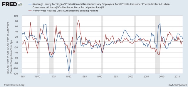
  

This at last does seem to give us a reasonably consistent relationship whereby the YoY change in real wages adjusted by partication either are coincident with or slightly lag housing, with the exception of ths housing bubble and bust.  If this is true, then we should expect the recent slowdown in YoY growth in the housing market to give rise to  a stagnation at least of participation as well as real wage growth.

Monday, February 20, 2017

Rents are still too d@*# high! (but may be abating a little)


 - by New Deal democrat

[This is a post that got sidetracked for a few weeks. Sorry!]

Three years ago HUD warned of "the worst rental affordability crisis ever," citing statistics that
About half of renters spend more than 30 percent of their income on rent, up from 18 percent a decade ago, according to newly released research by Harvard’s Joint Center for Housing Studies. Twenty-seven  percent of renters are paying more than half of their income on rent. 
This is a serious real-world issue, and big increases in rent may have completely eaten up the savings from gas prices among lower-income Americans. I have been tracking rental vacancies, construction, and rents ever since.  The Q4 2016 report on vacancies and rents was released several weeks ago, so let's take an updated look.

Rent increases continue to outpace overall inflation, while there is some evidence that they may have peaked as a share of wages.  Median asking rent rose from $842 to $864 in the last quarter of 2016, but is only up $14 from $850 YoY, an increase of 1.6%.  At the same time, he entire year of 2016 averaged a 5.3% increase from all of 2015. 

Below is the graph of nominal median asking rents by the Census Bureau.  As you can see, after a big spike in 2015, in the last 3 quarters of 2016 rents stabilized: 


Here is an updated look at real. inflation adjusted median asking rents, which similarly show that after setting an all-time record in Q1 2016, rent pressures on household budgets have abated just a bit:

Year Median
Asking Rent
Usual weekly
earnings 
Rent as %
of earnings

198833038286
199240143792
199342245088
200047856884
200254560790
2004 59962995
200968073992
201271776893
2013 73477894
2014  76279196
2015813809100
2016  Q1870823106
2016 Q2847828102
2016 Q3842835101
2016 Q$864843102

The bad news is that vacancies remain extremely tight.  The good news is that the vacancy rate appears to have been bottoming over the last two years, meaning that while there is still stress, the level of stress isn't increasing:


Despite the big increase in rents in the last several years, the building of multi-unit housing has not realy risen to the demand (at least not yet). When the large Boomer generation hit adulthood 50 years ago, note how multi-unit construction quickly shot up to 1,000,000 a year, and remained above 400,000 almost continuously for 20 years thereafter, until the last Boomer hit adulthood:


Now here is the comparable look for the similarly large Millennial generation:

The increase has only been to the 400,000 level, and has been stuck in that neighborhood for going on 3 years. I expected the "apartment boom" to continue, with increased building of multi-family units.  That didn't happen.

Meanwhile the CPI for owner's equivalent rent has continued to accelerate, and is now just over 3.5% YoY, one of the highest rates in two decades:


Renters are typically from the lowest 2 quintiles of the income distribution.  As of the end of 2015, these two quintiles have had the poorest record of income changes since the recession as measured by real median household income (h/t Doug Short):


 and that hasn't changed as of the latest update from the Consumer Expenditure Survey released several months ago:


Rent increases probably sucked up much of the windfall lower income consumers got from declining gas prices.  Now that gas prices are increasing again, I expect the consumer to start showing signs of distress.

There are two other median measures in addition to median asking rent from the HVS:   the American Community Survey and the Consumer Expenditure Survey.  Unfortunately both are only current through 2015.  The below table shows their YoY increases, compared with median asking rent:

SURVEY: ACS        CES      HVS
2009 --------  (817)    -------     ------  (708)
2010  +2.9%  (841)   +1.4%   +2.6% (698)
2011  +3.6% (871)    +4.4%   -0.6%  (694)
2012  +2.1% (889)    +5.2%  +3.3% (717)
2013. +1.7% (904)    +4.3%  +2.4% (734)
2014  +1.8% (920)    +9.2%  +3.8% (762) 
2015  +0.9% (928)    +4.3%* +6.7% (813)
*June 2014-June 2015 all shelter

HUD recently premiered a Rental Affordability Index, using the ACS data.  Similar to my chart above, it compares renter income with median rent.  Here are the premiere graphs:


Like the median household income data, this shows renters' income bottoming out in 2011-12, and rising since relative to rents as calculated by the ACS. That gives us the "renatl affordability index" shown below:
.
 

I'm not sold on HUD's method, mainly because it relies upon annual data released with a lag. In other words, the entire last year plus is calculated via extrapolation.  I suspect we could get much more timely estimates using Sentier's monthly median household income series, compared with the monthly rental index calculated by Zumper.

But regardless of which method we use, it certainly appears that apartment rents as a share of renter income are quite high -- but the crisis probably has abated at least a little.

Saturday, February 18, 2017

Weekly Indicators for Februrary 13 - 17 at XE.com


 - by New Deal democrat

My Weekly Indicators post is up at XE.com.

Tax withholding is having a rocky February so far.

Friday, February 17, 2017

The shallow industrial recession is fading in the rear view mirror


 - by New Deal democrat

A year ago the "shallow industrial recession" induced by the strong US$ and imploding oil patch was bottoming.  At that time I described the historical pattern:
Typically new orders turn positive first (red, left scale in the graph below), followed by sales (green, right scale), and finally inventories (blue, right scale):

At that time I concluded:

If this is an incipient recession, then I would expect inventories to follow sales, which means that ISM new orders are giving a false signal.  On the other hand, if this is simply a slowdown, like 1998 (far left in the first graph), then sales should turn positive, and like 1998 inventories will not decline, in which case it is elevated inventories that are giving the false signal.
Since then, ISM has withdrawn permission for the St. Louis FRED to republish its data. Fortunately, the overall ISM index tends to follow the new orders component with a slight lag, and Doug Short keeps track of that:


And Doug's 3 month trailing average of the regional Fed indexes shows the same thing:


So, what has happened with total business sales (including manufacturer, wholesaler, and retailer) and inventories?  Here's the graph:


Exactly like 1998, sales have taken off again, while inventories did not decline. Since one year ago, they have risen, but slightly.

As a matter of course, the total business and wholesaler inventory to sales ratios have declined.  (I include the latter because it has been less influenced by secular "just in time" inventory issues):


The model worked just as I expected. The shallow industrial recession is fading in the rear view mirror.

Thursday, February 16, 2017

January was a good month for housing permits and starts

 - by New Deal democrat

I wanted to make a brief comment on this morning's report on housing permits and starts.  Bottom line: this was a very good report.

Here's why:
  • 3 month rolling average of single family permits at a new post-recession high
  • 3 month rolling average of starts at a new post-recession high
  • 3 month rolling average of total permits less than 1% off post recession high from 18 months ago that was caused by a NYC-induced spike
Total permits improved while single family home permits declined slightly from last month's post-recession high for a single month, due to a big jump in multi-family permits.

I do expect housing growth to slow down and possibly stop by about mid-year due to both higher interest rates and negative YoY real wage growth. But in the meantime, housing is doing well, and this will contribute to good general economic growth throughout this year.

Industrial production: We're DOOO .... oh, wait, it's the global warming hoax


 - by New Deal democrat

At first blush yesterday's negative industrial production print gives the lie to the proposition that the economy has left last year's "shallow industrial recession" behind, as it looks to be going mainly sideways:


But a closer examination shows that is not the case.  Industrial production is broken up into three groupings: manufacturing (by far the biggest), utilities, and mining (including oil and gas).  

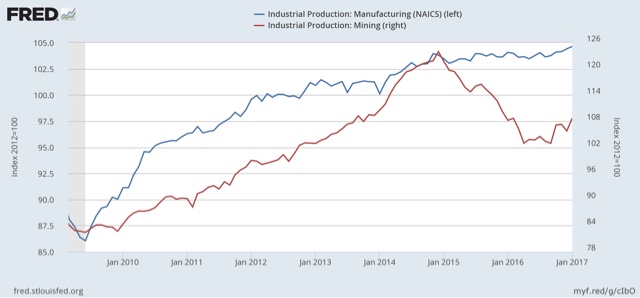
So here is the information for manufacturing (blue. left scale) and mining (red, right scale):


Although the trend is modest, manufacturing has broken out to new highs.  And the energy patch is clearly seeing a rebound.

Which means that the *entire* reason for the decline is utilities:


Note this graph is seasonally adjusted.  But whenever most of the country has an unusually warm winter -- as is the case this year -- it shows up as a decline in energy (i.e., heat) production.

So you can blame the downturn in industrial production on the Great Global Warming Hoax.

Wednesday, February 15, 2017

Bad news: real nonsupervisory wages have actually DECLINED over the last year

 - by New Deal democrat

This morning's inflation news was even worse than I expected based on the increase in gas prices.

On a monthly basis prices rose +0.6%. Core prices rose +0.3%.

More importantly, YoY CPI was up +2.5%.  Core YoY CPI was up+2.3%:


This means real nonsupervisory wages are now actually *down* -0.1% YoY for the last year.


Here is the actual level of real nonsupervisory wages for the last 3 years:


Note that real wages rose due to the steep declined in gas prices in 2014-15, and have actually fallen -0.6% since their peak half a year ago.

Meanwhile even though nominal retail sales had their a good month, up +0.4%, and December waas revised higher, due to the jump in inflation, real retail sales declined slightly:  


How is it possible that people are spending more even though they are earning less, and interest rates are up since last July?  They are saving less:


The personal savings rate has been declining slightly for nearly a year.  It's not bad compared with the last 25 years, so there's no danger sign at this point.

In any event, inflation has already blown past the Fed's anticipated trajectory. Now we see if 2% is a target, or actually a ceiling.  I say ceiling.

One thing to watch over the next week is how short and long term bonds react.  Do long bond yields go up? (relatively good news) or down (bad news). Does the yield curve remain intact or start to compress?

Tuesday, February 14, 2017

The state of the American consumer as 2017 begins


 - by New Deal democrat

Along with monthly and quarterly long and short leading indicators, and the high frequency weekly indicators, the fourth primary method I use to forecast the US economy is to monitor the health of the American consumer.  It is the system I used to forecast the 2007 recession way back in my early Daily Kos days.

My update as of the beginning of 2017 is up at XE.com.

Sunday, February 12, 2017

A thought for Sunday: No, Trump isn't imploding -- but the opposition is broad and intense


 - by New Deal democrat

[You know the drill: it's Sunday, so I can eschew wonky economics and speak my mind freely.]

My post from two weeks ago, "No, Trump isn't Imploding" got picked up by a few other sites within the past few days, and I wanted to follow up because we have a fuller picture of public opinion now.

Basically, Trump still isn't imploding. He is holding his base. In fact, there is a little economic evidence that they are putting their wallets where their mouths have been. BUT, on the other hand, the opposition to Trump is revealing itself as broad-based and intense, in a way that hasn't been seen in America since at least the 1960s (if not the 1930s or 1860s).

Here's Gallup's Presidential approval polling through yesterday:


Three weeks after the start of his Presidency, Trump's last approval rating was 41%, down from 45% on his Inauguration Day. He has been between 41% and 43% for the last two weeks.

That's simply not an implosion.  And his GOP base stands behind his controversial Executive Decrees.  For example, here's the breakdown on support for his Muslim exclusion decree:


While Democrats are almost universally opposed, the support by GOPers is similarly almost universal.

But while Trump isn't imploding, the opposition to him is broad, as shown in the increase of disapproval ratings shown above from 45% on Inauguration Day to 53% in the past week.

Moreover, the opposition is intense, as shown by the 45% support for Trump being impeached as evidenced by a PPP poll several days ago:


In short, the mushy "bipartisan-y" center so worshiped by the likes of the late David Broder has all but disappeared. Red and blue America are at complete loggerheads.

There is some evidence, by the way, that the optimism of GOPers, as shown in Gallup's economic confidence survey:


is showing up in real consumer spending. January is typically the month in which consumers spend the least.  Two weeks ago I noted that so far spending was lackluster.  Well, that has changed.  In the last 21 days, consumers are spending close to 25% more than they did one year ago:


This spending is at the highest level since before the 2008 recession.  I have no way of knowing whether this spending is motivated in part by Trump's presidency, but the coincidence is there.

In the short term, notice that the Congressional GOP has largely gone silent.  No big statements by Paul Ryan or Mitch McConnell, and no big Congressional legislation being shepherded to Trump's desk so far. I think they are in a wait-and-see mode.  There is nothing for them to gain with their base by opposing Trump now.  But if he does implode, they don't want to be associated with that implosion.

In the longer term, for Democrats, Trump and the GOP are going to be judged on whether or not they deliver the goods to a majority of Americans, and do it in a way that does not appear mean-spirited. That means, for example, deporting Illegals who have engaged in violent crimes or theft. It does not mean splitting up families by deporting the working parents of American children who have been here for several decades and whose only wrongdoing was using a false Social Security number.  It also means delivering on jobs and wage growth -- something that I doubt very much Trump of the GOP will be successful in doing.

While a number of statistical analyses of the 2016 election have pointed to the primacy of racial attitudes, as for example, shown in this graph:


there is not a 100% correlation between that and Trump votes.  In other words, while it may not have been the most common motivator, there were a significant percentage of white voters who did not take Trump's remarks about Muslims or Mexicans seriously, or for that matter that he was really going to repeal ObamaCare.  This last group are the swing voters who can be persuaded back into the Democratic camp by candidates who reject Wall Street and embrace economic progressivism.

Saturday, February 11, 2017

Weekly Indicators for February 6 - 10 at XE.com


 - by New Deal democrat

My Weekly Indicators post is up at XE.com.

Two leading indicators, one long, one short, turned a little more to the dark side this past week.

Friday, February 10, 2017

Four measures of wage growth: prospects for further meaningful wage growth are dimming


 - by New Deal democrat

In the last several years, I have written a number of posts documenting the stagnation in average and median wages, followed by their improvement due to the steep decline in gas prices, for example here and here.  Since bottoming a year ago, gas prices have turned positive YoY, most recently up about 25%. Q4 2016 data on wages has been released, giving us a chance to take an updated look.

We have a variety of economic data series to track both average and median wages:
Let's start with nominal wages.  The first graph below shows the YoY% growth in each of the four measures:


While each is noisy, the overall trends are clear. First, in this cycle as in the last, wage growth declined coming out of recessions, then rose as the expansion continued.  Second, secularly there has been an undeniable slowdown in wage growth, which was 4-6% in the late 1990s peak, 3-4% at the 2000s peak, and so far in this expansion is no better than 2-3%.  I believe this is in part due to how weak the employment situation was for so long into this expansion, but also secularly due to shifts in bargaining power, as employers learn over time that employees can be retained with lower and lower annual increases in compensation.

Next, let's zoom in on the last 5 years:


Again, through the noise you can see that YoY wage growth was about 0.5%-2% in 2011-12, but has slowly improved to 2-3% in 2016.  That's the good news.  The bad news is, none of these measures of wage growth show any accretion of the gains during the entire last year: despite a tighter job market, nominal wage growth *remained* at the +2% to +3% YoY level throughout the year.

Now let's turn to the real, inflation-adjusted measures. Our first graph starts out normed to 100 for each measure in 2001.  


With the exception of real compensation per hour (purple), none of the measures made any real improvement during the 2000s expansion. After a spike during the Great Recession due entirely to the collapse of gas prices at that time, real wage growth declined into the 2013 time frame, and rose significantly since -- again having much to do with the late 2014- early 2016 decline in gas prices.  Note the divergence between the mean measure of the average hourly earnings (blue) and median measure in the employment cost index (red), showing that gains have been skewed towards the upper end of the income distribution.

Finally, let's look at the YoY% real growth in the four measures:


Here the picture is not good at all.  After growing 2-3% in real terms during 2014-15, in 2016 real wage growth decelerated to only 0.5%-1.5% across the spectrum of measures.  Since gas prices were still declining in Q1 2016, it is likely that real wage growth YoY as of the end of this quarter will have almost completely stalled.

In summary, our broad measures of wages showed continued nominal and real growth in 2016, but nominally failed to show any further acceleration despite a tightening job market, and in real terms decelerated sharply and are on the verge of stalling altogether.  If my read on the labor market is correct -- i.e., we are in late cycle and YoY job gains will continue to decelerate -- and if inflation driven by gas prices and housing continues, the prospects for further meaningful wage growth for the broad mass of American workers during this cycle are dim.

Thursday, February 9, 2017

A closer look at the Senior Loan Officer Survey report on credit conditions


 - by New Deal democrat

The Senior Loan Officer Survey for Q4 was released on Tuesday.  I take a close look at what it shows in a post up at XE.com.

Wednesday, February 8, 2017

JOLTS survey continues to unimpress, showing more late cycle deceleration


 - by New Deal democrat


I continue to be unimpressed with the JOLTS Survey. Too many observers are, in my opinion, focusing on the soft, least important metric, "job openings," and paying too little attention to the hard numbers of actual hires and quits. Why? Because it is well-known now that many companies use phantom openings as a means to chum the waters looking for resumes.

To explore, let's look at job openings compared to the Undereemployment rate.  As the rate of job openings increases, we would expect to see a correlative decrease in underemployment.  

There does appear to be a broad correlation between the two, when we measure the rate of change in each YoY:  


But while the direction may be the same, in this expansion there have been a lot more job openings than there have been actual hires from the ranks of the underemployed.  To show you, in the below graph I've normed the data to show that in the last cycle, when the Underemployment rate was at 10%, job openings were at a 2.5% rate:


Now, even with job openings 1.1% above that level - higher than they ever got in the last expansion, the Underemployment rate is still languishing.  If there are so many unfilled job openings, why do we still have a high 9.4% underemployment rate? Shouldn't the gap have closed by now?

Turning to the specifics of the just-released December report, here are job openings (blue),  hires (green), and quits (red) since the inception of the series:


What should jump out at you is the flattening peak over the last year.  This is made more evident when we look at the same data YoY (averaged quarterly to cut down on noise):


All three metrics show deceleration,  and one - hires - is actually *down* YoY.  This is equivalent to what the JOLTS survey looked like in early 2007, 9-12 months before the onset of the last recession.

To be fair, when we focus on monthly data over the last year, it is clear that as to Quits, at least, the negative number may have been the result of an outlier reading in December:


In the one and only complete cycle since the series began, hires and quits peaked first, while YoY job openings held up until nearly the end.  This time around, it appears openings may have turned before quits.

Bottom line: hiring increasingly shows late cycle deceleration, and now quits *may* be following, although that has not translated into increased discharges yet. 
 Indian Summer continues for now.

Tuesday, February 7, 2017

Gas prices and likely January inflation to continue the stall in real wage growth


 - by New Deal democrat

A big relatively unnoticed concern over the last year has been the end of deflation due to the end of the decline in gas prices.  Coupled with really tepid wage growth, this is going to affect consumers, who are 70% of the US economy.

Gas prices aren't a headwind yet.  They have increased about 25% YoY.  In the past, it has taken a 40% or more spike YoY to create real downward pressure on the economy:


Now that January is over, I can estimate the inflation rate based on the increase in gas prices.  I take the percentage increase for gas, divide it by between 10 and 16 to account for its volatility, and that gives me the non-seasonally adjusted monthly inflation rate.  In the graph below, covering the last 12 months, the % change in gas prices is the blue bar, the NSA inflation rate is the red bar, and the seasonally adjusted inflation rate is the green bar:


In January 2016, gas prices declined by about 4%, whereas this year they increased by about 3%.  This tells me that the NSA change in consumer prices should be about +0.3%, and the SA change about +0.1%.  That will bring the YoY change in the inflation rate to 2.3%.


Since nominal nonsupervisory wages are up 2.5% YoY (red in the graph above), this means that they likely have only increased about +0.2% in the entire last 12 months. The graph for real wages through December is below:


That real wages have stalled does not mean that the economy is on the cusp of rolling over, since consumers have other methods of coping, which will be the subject of another post.  But it isn't helpful at all.

Monday, February 6, 2017

Economic Uncertainty Is Spiking

Above is a chart of the "economic uncertainty index.  Here is a link to its components and methodology.  


On one hand, it's not surprising that we're seeing a spike in this indicator.  The U.S. has a new president who is very unconventional.  But he also ran as an outsider who could spur the creation of 25 million jobs in 8 years.  Yet so far, it appears his actions are causing economic friction.  For example, today the Washington Post reported that 97 tech companies have filed a brief against Trump's travel ban.  Think about the uncertainty the travel ban injects into business decision making.

From business' perspective, there are several positive policy developments.  Trump is gutting Dodd-Frank, which will lower the cost of complying with regulations for financial companies.  And there is continued talk of a corporate tax code revamp, which, at the very least, will increase net income at the macro level.  

But considering what a wild card the president is, I have to wonder if we'll continue to see this index at high levels for the foreseeable future.