Monday, February 16, 2015

Weekly jobless claims as forecasts of job growth and unemployment


 - by New Deal democrat

I've found that the weekly new jobless claims reports are useful in forecasting that month's employment number, and also the unemployment rate several months later.  Since I haven't done that in a while, I thought this would be a good time to update each of those metrics.

First, here is a spreadsheet that was prepared for me by Craig Eyermann at Political Calculations, showing the relationship between the monthly average of initial jobless claims at that month's subsequently reported jobs number during this expansion:


Roughly, this shows that for every 20,000 decrease in initial jobless claims, there has been a similar 20,000 increase in the monthly jobs report =/-80,000. This graph was published last October.  So how well has the past trend forecast the last four months of jobs?  Here's the predicted value (left), and the actual report (right), both in thousands:

Oct 260. 221
Nov 248.  423
Dec 252.  329
Jan 248.  257

Three of the four months have been within that range, with November obviously much higher. Still, the results show that the average actual jobs numbers in the last four months has been higher than predicted by the trend.  Or, put another way, the trend in new job creation is accelerating.

Next, here's a graph I haven't updated in awhile.  This shows the leading relationship of jobless claims to the unemployment rate a month or two thereafter:


This relationship completely blew out in 2009, but after that returned:


 The question recently has been, with initial jobless claims at near record lows as a percent of the population, would the unemployment rate stall, or make up the ground it lost in 2009? So far the answer is the latter.

Finally, the longer term rate of new jobless claims also leads the longer term unemployment rate.
First is the graph covering the last 50 years:


Based on both of the above trends, I am expected further declines in the unemployment rate, although perhaps at a slower rate.

Saturday, February 14, 2015

US Equity Market Week in Review: Upside Break-Out Edition

This is over at XE.com

International Week in Review: Hope for the EU and Concern About Australia Edition

This is over at XE.com

Weekly Indicators for February 9 - 13 at XE.com


 - by New Deal democrat

My Weekly Indicator post is up at XE.com.

While the overall tone is positive, negatives in the coincident indicators increased considerably this week.  With inventories high, we may be starting a correction.

Thursday, February 12, 2015

"It's just a recovery in low wage jobs." Not anymore


 - by New Deal democrat

Here is something I've been meaning to post for the last 6 months!  Over the last 5 years, from time to time the National Employment Law Project has posted periodic updates on the types of jobs created since the bottom for jobs in the beginning of 2010.  Each graph is cumulative, i.e., each graph includes the time frame included in the previous graph.  Note what happens over time, in particular with higher paying jobs.

The first update covered the period only through July 2010:


Note that only about 5% of all jobs created in the first few months after the bottom were in the top 2 quintiles.

The next update extended the period through January 2011, and divides into 3 rather than 5 wage brackets:


Note that now, 179,000 of 1,270,000 jobs, or 14% of all jobs created, are in the top 1/3.

The next update was in August 2012:


According to the NELP report accompanying the graph, high wage jobs accounted for 20% of all recovery growth, while mid-wage jobs accounted for 22%, and low wage jobs accounted for 58%.

The next update was February 2014:


By now, according to the NELP, 30% of all jobs created since the bottom in February 2010 were high wage jobs, 26% were mid-wage jobs, and 44% were low wage jobs.

Finally, in August 2014, the NELP published the following graph which covered only the period from July 2013 through July 2014:


According to their report, 33% of all jobs created in that period were high wage jobs, with only 26% mid-wage jobs, and 41% low wage jobs. In an accompanying footnote, they stated that 38% of all jobs created in the first 7 months of 2014 were high wage jobs.

In case it isn't already clear, here is the percentage of high wage jobs created over each time frame:

2/10 - 7/10* 5%
2/10 - 1/11 14%
Q1 2010 - Q1 2012 20%
2/10 - 2/14 30%
7/13 - 7/14 33%
1/14 - 7/14 38%

*(measured by top 2 quintiles)

Since all but the last two measures are cumulative, that means that the most recent job growth in each was even better than reported.  For example, the figures from February 2010 through January 2011 and through February 2014 make it easy to calculate the period from January 2011 to February 2014, which I've calculated for the list below:

1/11 - 2/14:
High wage jobs (2.424 million) 33%
Mid-wage jobs  (1.814 million) 24%
Low wage jobs  (3.211 million) 43%

While low wage jobs in this period predominated over mid-wage jobs, high wage jobs were created at a normal rate.

On the other hand, it is fair to say that since the NELP calculated that higher paying  jobs were disproportionately lost during the Great Recession - chiefly in manufacturing and government - the net change including both the recession and the recovery has still been from high paying towards low paying jobs.

One of my theories has been that this jobs recovery isn't so much different in kind from past job recoveries, but rather different in scale. The limited data I have been able to access suggests that lower wage jobs always come back first, with higher wage jobs increasing later in a recovery. The Great Recession was so deep that it took a long time for lower wage jobs to come back on for higher wage jobs to begin filling in.

On a similar note, here is Prof. Menzie Chinn at Econbrowser posting a graph from Torsten Slok of Deutsche Bank questioning whether it has been a low wage recovery at all:


Discusing Slok's work, Shane Ferro at Business Insider wrote:

What's the difference here? It's all in the methods. 
In the NELP analysis, the division of low, medium, and high jobs is made by lining up each industry's median wage, then dividing that into three equal groups. . . . . 
On the other hand, Slok's buckets aren't equal. He breaks down high, medium, and low wage jobs by occupational groups . . . . 
This delineation means that Slok puts far fewer workers in the low wage bucket than the other two, therefore the number of jobs created in that bucket is necessarily going to be smaller. It's not perfect, but breaking it down by occupation, rather than industry, gets a little more granular about how incomes correlate to each bucket.
I mentioned last week that median wage growth in the fourth quarter, as measured by the Employment Cost Index, outpaced average (mean) wage growth as measured in the monthly jobs reports.  That might just be an anomaly, or it might be the relative increase in higher wage jobs showing up in the official data.


Weak retail sales are a gas


 - by New Deal democrat

I have a new post up at XE.com about this morning's retail sales report.

Strip out gas, and retail sales have basically been flat for 3 months. So far, it looks like consumers are saving the money they have saved at the gas station.

The Remarkable Depth and Breadth of Deflation

This is over at XE.com

Wednesday, February 11, 2015

Gas having typical February rebound so far


 - by New Deal democrat

I have a new post up at XE.com.

So far, gas prices are behaving as they have in the past coming off bottoms.

Ugh!


 - by New Deal democrat

I'm going through a bout of blogger ennui. Not much dramatic is happening, and there's no big, changed insight into the immediate future.

I suspect retail sales will disappoint tomorrow, because the weekly numbers for January weren't very strong - it looks like consumers are saving a lot of their gas money.

The latest Eurocrisis is playing out as anticipated. Germany and the Euro institutions are squeezing Greece like a boa constrictor squeezes prey.  They will succeed unless Greece has the will to actually leave the Euro.  If so, then there will be a collective gasp from the rest of the EU as it sinks in that the Euro might actually fracture. That is the point at which a deal might be made.  From the US viewpoint, the Eurocrisis isn't enough to derail our economic expansion, although it will have an impact. The US interest is that there not be a disorderly dissolution of the Euro. An orderly dissolution might even be preferable to the continuation of an intact Euro in its present form.

Almost nobody except for the permabears is calling for a US recession this year.  Mish ridiculously based his call on residential construction, even though residential construction lags permits and starts by about a year. So we know where construction is going to go this year, and it isn't to recessionary levels.

The rest of the usual Doomer crew has moved on to other topics. Since jobs aren't cooperating, the best they've been able to come up with to whine about a scarequote "recovery" is the stagnation in wages (except, of course, we made a 35 year high in average real hourly wages in December).

 Politically, the Democrats aren't going to bother proposing anything serious. So far, the Republicans have accomplished exactly zero - which is the best we can hope for there. Obama has shown no sign of being willing to lift a finger to sign an order raising the maximum pay subject to overtime rules (entirely within his power). So, unless the Supreme Court decides to hold the 20th century unconstitutional (for which, let's face it, there are at least 4 votes),  the economy will probably follow its course undisturbed by Washington.

Which leaves me with nothing big to report to you. I'm still trying to get a better leading indicator for wage growth - without much success.  Aside from that, I've got a bunch of little things I can update, so I will probably inundate you with them.


Just How Sick Is the EU?

This is over at XE.com

Monday, February 9, 2015

Five graphs to watch in 2015: first update


 - by New Deal democrat

At the end of last year, I highlighted 5 graphs to watch in 2015.  Now that we have the January jobs report, and some significant developments in gas prices and mortgage rates, let me update them.

#5.  Mortgage refinancing

The Mortgage Bankers Association reported that refinancing applications soared by about 50% in the last month, as mortgage rates reached new 18 month lows.  Bill McBride has the graph:


Refinancing is coming back to life.  This puts more money in the pockets of the homeowners who get lower monthly mortgage payments.

#4 Gas prices

Here is a graph of gas prices (blue) compared with average hourly earnings (red) since the turn of the Millennium:


With the exception of a few months in the worst of the Great Recession and late 2001 through 2003, an hour's wage now buys more gas than at any time in the last 15 years.  Again, this puts more money in the pockets of virtually all consumers.

#3 Part time employment for economic reasons

This is a graph of part time workers for economic reasons expressed as a percentage of the labor force:


In January this ratio improved slightly, bringing us equivalent to its levels in 1988, but still 2% (about 3 million) above the boom level of 1999 and about 1.5% (2.25 million) above the level of 2007.

#2 Not in Labor force but want a job now:


This also moved in the right direction in January, although it is still about 600,00 above its post-recession low of November 2013 (just prior to Congress's cutoff of extended unemployment benefits) and some 1.9 million above its 1999 and 2007 lows.

#1 Nominal wage growth

After an anomalous decline in average hourly wages in December, between revisions and a big increase in January we have seen the best reading for real average wages since 1979, but nominal wages came in at 2% or less for the second month in a row:


This is the only metric among the 5 I think are most important this year, that has moved in the wrong direction.  The decline in the last 5 months is frankly troubling.

 Here is the same graph, but normed so that this month's YoY% wage growth and unemployment rate = 0:  


Compare our present expansion with the previous three.  In the 1980s and 1990s, by the time we improved to 5.7% unemployment, nominal wage growth was approaching 3% YoY.  On the other hand, the 2000s expansion had similar numbers to the present - in fact, YoY growth in nominal wages was still declining. Nominal wage growth only approached 3% YoY as the unemployment rate fell to 5%.  If that is the pattern we are following, then even with if the declining trend in the unemployment rate continues, we won't see a marked improvement in wage growth until the second half of this year.

Saturday, February 7, 2015

Weekly Indicators for February 2 - 6 at XE.com


 - by New Deal democrat

My Weekly Indicator post is up at XE.com.

Low gas prices and low interest rates, and their effect on housing, are still the big story.

US Equity Market Review For the Week of February 2-6; Minor Upside Breakout Edition

This is over at XE.com

     The market is still facing incredibly strong headwinds coming from several different directions, starting with a strong dollar.  Depending on you source, S&P 500 companies get between 40%-55% of their earnings from overseas trade.  Even at the low end of the exposure spectrum, (40%), we’ve still got some pretty major headwinds on the currency front.  And, on that topic, international markets are weak; Japan is coming out of a technical recession, Australia has some underlying issues, Canada has to deal with weak oil prices, China is clearly slowing and the EU is limping along.  Tying these two elements together, profits from weaker overseas economies have to be converted into a strengthening currency, creating a negative double-whammy.  And then there is the negative impact of oil, as that is destroying the earnings of an entire economic sector.  The sum total of these events is to put a tremendous amount of downward pressure on the markets. 
     But, as was shown last week, the US economy is in good shape, providing a solid backdrop for continued earnings growth.  Last week, that was strong enough to overcome bearish sentiment.  But in this environment, it's certainly no guarantee that we'll see continued upward price movement.       


International Economic Week in Review: A General Malaise, Edition

This is over at XE.com

Two economies – Australia and Canada – have recently seen a drop in rates, caused by an overall weakness in their respective economies.  Neither are heading toward a recession, but both are clearly suffering from a certain level of malaise.  Both are also dependent on raw material exports, meaning the drop in commodity prices is seriously harming both.  Japan may be making a slight comeback – at least based on this week’s numbers – but they are hardly out of the deflationary woods yet.  The US and the UK are both showing some really strong results.  And, the EU is also showing some signs of life.  Germany is still growing and Spain is really starting to come alive.  France is slowing, but their numbers have been just barely negative.  Overall, it could be argued that we’re beginning to see positive signs from the EU QE announcement, but we certainly don’t have enough data to make a definitive call.


Friday, February 6, 2015

Nominal and real wages: the agony and the ecstasy


 - by New Deal democrat

Among all of the strong data in today's jobs report, probably the most significant on both the upside and the downside were wages.

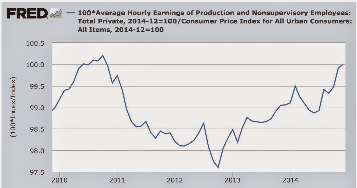
First, the ecstasy.  Here is real, inflation-adjusted earnings for production and nonsupervisory personnel (thus taking out the top 10% or so of wage earners) for the last 10 years:

Note this only goes through December, since January inflation hasn't been reported. December set a new high, exceeding by less than $.01 the previous high in 2010.

Here's the longer term view:


Real average wages are now higher than they have been at any time since late 1979.

But here's the agony.  This is the YoY% change in nominal, (i.e., actual) wages:


Not only is there no sign whatsoever of any wage pressures, but YoY% growth in nominal wages has actually decreased.  This is an actual bad sign. With the unemployment rate under 6%, nominal wages growth should be increasing, not decreasing.  Instead, all of the real growth in wages is coming from the collapse in the price of gasoline.


January 2015 jobs report: almost a blowout, wages still a relative weak spot, but real wages make 35 year high


- by New Deal democrat

HEADLINES:

  • 257,000 jobs added to the economy
  • U3 unemployment rate up 0.1% to 5.7%
Wages and participation rates
  • Not in Labor Force, but Want a Job Now: down 87,000 from 6.445 million to 6.358
  • Part time for economic reasons: up 20,000 from 6.790 million to 2.810
  • Employment/population ratio ages 25-54: up 0.2% to 77.2% 
  • Average Weekly Earnings for Production and Nonsupervisory Personnel: up $.07 (or 0.3%) from $20.73 to $20.80, up 2.0%YoY. In real, inflation-adjusted terms, with revisions December's number was a 35 year high, and unless inflation was more than +0.2% in January, which is unlikely, January probably made another 35 year high. 
November was revised upward by 65,000 from 358,000 to 423,000, and December was revised from 252,000 to 329,000. The net revision was +147,000.

Since the economic expansion is well established, in recent months my focus has shifted to wages and the chronic heightened unemployment.  The headline numbers for January show a surge in employment over the last few  months, and also rebounded off of the decrease in wages from December.


Those who want a job now, but weren't even counted in the workforce were 4.3 million at the height of the tech boom, and were at 7.0 million a couple of years ago.  Since Congress cut off extended unemployment benefits over one year ago, they have risen to 600,000 higher November 2013 post recession low of 5.6 million.

On the other hand, the participation rate in the prime working age group has come back almost half from its post-recession low towards its pre-recession high.


After inflation, real hourly wages for nonsupervisory employees from December to January probably rose by +0.4% or more, in part because because lower gas prices will again show deflation. The  nominal YoY% change in average hourly earnings is +1.9%.


The more leading numbers in the report tell us about where the economy is likely to be a few months from now. These were mixed by with a positive bias.

  • the average manufacturing workweek rose 0.1to 41.0 hours.  This is one of the 10 components of the LEI, and will be a positive.

  • construction jobs increased by 39,000. YoY construction jobs are up 308,000 YoY.  

  • manufacturing jobs were up 22,000, and are up 228,000 YoY.
  • Professional and business employment (generally higher-paying jobs) up 39,000 and is up 715,000 YoY.

  • temporary jobs - a leading indicator for jobs overall - decreased by -4,100.

  • the number of people unemployed for 5 weeks or less - a better leading indicator than initial jobless claims - increased by 25,000 to 2,318,000, compared with December 2013's low of 2,255,000.

Other important coincident indicators help us paint a more complete picture of the present:

  • Overtime declined by 0.1 hour to 3.5 hours

  • the index of aggregate hours worked in the economy rose 0.2 from 102.7 to 102.9.

  • The broad U-6 unemployment rate, that includes discouraged workers increased from 11.2% to 11.3%
  • the index of aggregate payrolls rose by 0.7% to 121.5.
Other news included:
  • the alternate jobs number contained in the more volatile household survey increased by 759,000 jobs.  This represents a 2,994,000 million increase in jobs YoY vs. 3,207,000 in the establishment survey. 

  • Government jobs decreased by -10,000.
  • the overall employment to population ratio for all ages 16 and above rose 0.1% from 59.2% to 59.3%,  and has risen by +0.5% YoY. The labor force participation rate rose 0.1% from 62.5% to 67.2%, but is down -0.1% YoY  (remember, this includes droves of retiring Boomers).
SUMMARY:

This was pretty close to a blowout report, particularly with the upward revisions to the prior 2 months.  For the last three months we are averaging over 300,000 jobs per month.  The employment to population ratio in the prime working age group has risen significantly for the second month in a row, and has now made up almost half of its recession decline.  Most of the internals, including the leading internals, were positive.  Wages rebounded, completely taking back their December decline and then a little.  There is a reasonable chance that, in real terms, the average real wages for nonsupervisory employees made a 35 year high.

The relative negative still remains wages.  Nominal wage growth isn't accelerating at all.  All of the real wage growth is coming from a decline in inflation due to gas prices.


Thursday, February 5, 2015

Trends in per capita real adjusted gross income: updated through 2013


 - by New Deal democrat

On Monday personal income and spending for December were reported, with the most noteworthy monthly news being that it confirmed the prior retail sales report that consumers primarily saved rather than spent their gas price savings (although December was higher than every other month except November).

Secondly, real personal income finally rose above the December 2012 spike (just prior to the "fiscal cliff") to set a new record:


Now let's adjust by population (blue) and by the civilian labor force (red), on an annual basis:


Whether we adjust by population as a whole, or by just the labor force, per capita real personal income has generally grown throughout the last 20 years.

Although it is not nearly as broad a measure as the Bureau of Economic Statistics' "personal income" metric, another way in which per capita income might be looked at is as real per capita adjusted gross income, i.e., the income reported to the IRS on tax forms.

While this is not kept graphically by either the IRS or the St. Louis FRED, I have created the following table showing real adjusted gross income from 1993 through 2011 (the last year available at the IRS site), adjusted per capita both by population, and by the size of the civilian labor force (+those not in the labor force but who want a job now).  The second measure is not perfect, but does make a reasonable approximation of taking into account the wave of Boomer retirements (all figures in $Trillions):

YearPop adjusted CLF adjustedYearPop adjusted CLF adjusted 
19934.8134.35620016.0086.014
19944.8644.48620025.6825.699
19955.0154.72620035.6765.680
19965.2145.01020045.9505.974
19975.5205.53420056.2316.345
19985.8545.72120066.528
6.495
19996.1236.04820076.7086.685
20006.3656.36520086.3226.295
avg 1993-20005.4715.258avg 2001-08 6.1386.148


20095.6285.62520136.1036.420
20105.8245.887


20115.8235.911


20126.1946.388avg 2006-136.1416.213

As with other measures, I suspect that shifting income forward from 2013 to 2012 due to concerns about tax law changes at the time of the "fiscal cliff" largely explains the decline shown in the IRS data in 2013 from 2012.  Since part-timers as well as full-timers are included in the number of people who reported wages and salaries, I also suspect that the big increase in the percentage of part-time workers beginning with the onset of the Great Recession is largely responsible for why the result for years 2009-13 is almost uniformly lower than that of years 2004-08.

Since the IRS separately breaks out the reporting of wages and salaries, another interesting way to slicing their data is to divide the total amount of wages and salaries reported, divide by the number of returns, and then adjust for inflation.  The resulting figure gives us the average real wage or salary of all persons reported to the IRS.

In theory this should be identical or nearly identical to the BLS's  "aggregate wages paid" index from the monthly jobs report, adjusted for inflation. Aggregate wage information is only available on the St. Louis FRED site from 2007 on, but here's what that looks like:


Now let's compare real average wages reported to the IRS (first column below) with real aggregate wages from the monthly jobs report (second column):

2004   $54,373            
2005   $54,514            
2006   $55,187 (high)
2007   $54,850               112.4
2008   $54,315               110.3
2009   $53,462               105.8
2010   $53,504               106.0
2011   $52,969 (low)     107.4
2012   $54,370               109.8
2013   $53,791               112.8
2014   n/a                       115.8

Based on the aggregate wages data from 2014, I expect the IRS data to show a significant increase in real per capita wages in 2014 when they are reported a year from now.

 That being said, there is no doubt that overall the results are consistent with longer term stagnation in real wages.


Tuesday, February 3, 2015

Real median wages surged in Q4 2014


 - by New Deal democrat

Something that hasn't gotten much attention from last Friday's GDP report is the brisk increase in real median wages during the 4th quarter of last year.

While the monthly jobs report gives us average wages, median wages aren't reported monthly.  There are several quarterly measures, including usual weekly earnings (which will be the subject of a separate post), and the Employment Cost Index, which is reported as part of GDP.

Here is the quarterly % change in the ECI for wages since the inception of the series in 2001:


In the 4th quarter, we had nearly a 1% increase, the best showing since the last time gas prices plummeted in late 2008.  The other two times the ECI grew by 0.5%+ in a quarter, in 2001 and 2006,  also coincided with substantial declines in the price of gas.

What is perhaps most noteworthy is that median wages grew more than average wages during the fourth quarter.  Here's a graph comparing average wages on a quarterly basis, with median wages from the ECI, normed to be equal at the end of the Great Recession:


As a result, median wages are now also within 0.5% of their highs.  Average wages are only 0.2% below their 35 year high.

That median wages grew faster than average wages suggests that higher wage jobs grew significantly relative to lower wage jobs, a long-awaited boon.


Why Did Australia Cut Rates 25 BPs?

This is over at XE.com

Monday, February 2, 2015

We probably hit bottom in oil and gas prices last week


 - by New Deal democrat

I have a new post up at XE.com.

I have been looking for the bottom in oil and gas prices, which tend to be very seasonal.  I think we saw it late last week.

We'll see!

Saturday, January 31, 2015

Weekly Indicators for January 26 - 30 at XE.com


 - by New Deal democrat

My Weekly Indicator post is up at XE.com.

The US housing market is enjoying a rebound, courtesy of the flight to safety to US Treasuries created by the latest Euro-crisis.  Thank you, Syriza!

Us Equity Market Review For the Week of January 26-30; We're Getting Defensive, Edition

This is over at XE.com

So, what’s the conclusion to draw from all this information?  First, global headwinds caused by the higher dollar, cheaper oil and slower global growth are clearly having a negative impact.  In fact, the effect is so strong that it’s preventing a meaningful upward move to new highs.  This also means that we’re moving from a “you can throw a dart at a dartboard and pick a winner” market to very much a stock-pickers market.  And, as upward growth has more or less stalled for the time being, adding an income component to any purchase is a good idea.

Friday, January 30, 2015

International Economic Week in Review: Just How Strong is the US Economy?

This is over at XE.com

The general conclusion regarding the US economy is everything is moving in the right direction.  Consumers are spending and businesses are investing.  This is helping to keep the job market on an improving path.  However, we're still waiting for wage growth to catch-up.  But so long as this overall trend continues, that should occur.  The conclusion is the US economy is pretty darn healthy right now.

Thursday, January 29, 2015

Real median weekly earnings rose slightly in Q4, and in 2014


 - by New Deal democrat

Every quarter the BLS reports usual weekly earnings, a median measure of wages (the monthly jobs report includes average wages rather than median).

In real, inflation-adjusted terms, usual weekly earnings peaked in 2008 at $342. The yearly low was set one year ago, in 2013, at $333. Last week Q4 2014 was reported, and the 2014 as a whole, usual weekly earning increased slightly to $334.

Here's what happened on a quarterly basis, beginning one year ago:

2013 Q4  $334
2014 Q1  $336
2014 Q2  $330
2014 Q3  $335
2014 Q4  $336

Nominally, the YoY increase was +1.7%.  Since YoY inflation was +1.2%, that means real median weekly earnings increased +0.5% in 2014. The second quarter of 2014 was the post-recession quarterly low, although I suspect that was simply a bad sample.

An improvement definitely, but certainly not good enough.

Wednesday, January 28, 2015

A timely quote about measles; an ironic one about national health insurance


 - by New Deal democrat

 I am currently reading John M. Barry's 2004 book, "The Great Influenza," about the Spanish Flu pandemic of 1918, which is said to have killed more people worldwide than any other plague (including a great- aunt and/or uncle of mine).

Two quotes seem particularly timely.

About measles:
[S]ome diseases depend upon civilization for their own existence.  Measles is one example.  Since a single exposure to measles usually gives lifetime immunity, the measles virus cannot find enough susceptible individuals in small towns to survive; without a new human generation to infect, the virus dies out.  Epidemiologists have computed that measles requires an unvaccinated population of at least half a million people living in fairly close contact to continue to exist.
 - p. 369.

In other words, a thorough enough worldwide campaign of vaccination could wipe out measles, like smallpox, forever.

About national health insurance:
"There are unmistakable signs that [national] health insurance will constitute the next great step in social legislation."
 - Rupert Blue, address as President of the American Medical Association, 1916.
 - p. 309

Real incomes: comprehensive 2013 tax data shows continuing huge disparity, and suggests slight improvement in 2014


 - by New Deal democrat

Berkeley Professor Emmanuel Saez has updated his comprehensive tax return data through 2013, showing real average incomes of the bottom 90% vs. the top 10%, 5%, and 1%.  From Justin Wolfers in the New York Times:
[With regard to t]he income share of the richest 1 percent of American families[,]  Emmanuel Saez, the economics professor who crunches these numbers based on data provided by the Internal Revenue Service, has just released preliminary estimates for 2013. The share of total income (excluding capital gains) going to the top 1 percent remains above one-sixth, at 17.5 percent.
....
[Because of income shifting from 2013 to 2012 due to the "fiscal cliff," it is f]ar better instead to focus on the average of the past two years. That average supports the narrative that the economic recovery so far has only boosted the incomes of the rich, and it has yielded no improvement for the bottom 99 percent of the distribution. After adjusting for inflation, the average income for the richest 1 percent (excluding capital gains) has risen from $871,100 in 2009 to $968,000 over 2012 and 2013. By contrast, for the remaining 99 percent, average incomes fell by a few dollars from $44,000 to $43,900.

Here's a link to the critical spreadsheet.  This is income for tax units (similar to but not identical to households). The real average income for all tax filers is the first column. The real average income for the bottom 90% is the 8th column of data. I've listed the most critical years below (first column is all tax units, the second is the bottom 0-90%):

2000   $63,649   $37,053
2007   $65,228   $36,426
2009.  $53,860   $32,019
2013.  $55,470   $31,652

Remember this is real, inflation-adjusted data.  It is the average rather than the median.

The bottom line here is the same as for just about every other study since 2009.  Wages have stagnated, and due to the increase in gas prices from $1.60/gallon in 2009 to nearly $4/gallon in 2011-13, real incomes declined slightly during that time, while due to a soaring stock market, the wealthy, who disproportionately own stocks, saw their income soar as well. 

Saez' research is exhaustive, compiling tax return data.  A drawback, however, is that now in January 2015, we are only able to see the data for calendar year 2013. Here's Saez's graph of annual real average income from 1913 through 2013 of the bottom 99%:


Thus it is noteworthy that Saez' data is very similar to that in the monthly updates starting from the late 1990s through last month by Sentier Research, and eloquently graphed by Doug Short.  Here's Sentier's graph:


So it is a fair supposition that a year from now, Saez's more comprehensive update for 2014 will show a similar increase to that we have seen in the Sentier Research.  That's good news.  The bad news, of course, is that even so, income inequality is the worst in nearly a century.

Tuesday, January 27, 2015

Consumer confidence: it's a gas, gas, GAS!


 - by New Deal democrat


This is what $2/gallon gasoline does:


via Doug Short.  This is a 7 year high in consumer confidence, and well in line with economic expansions prior to the Great Recession.

Gallup's daily economic confidence index also continues to be positive, after 7 years of being negative.

Of a piece, there used to be a site called "Professor Pollkatz" which chronicled the high correlation between George W. Bush's approval ratings and the price of gasoline.  Obama's ratings show a similar pattern.

(Btw, for you young whippersnappers, the tag line comes from an ancient Rolling Stones tune).


Oil prices and global recession: which is the cart, and which is the horse?


 - by New Deal democrat

I have a new post up at XE.com.

It seems that a poll of investment analysts showed that a majority believe that a further drop in Oil prices will signal the onset of a global recession.  To the contrary, history shows that, if there is a recession, then a steep drop in Oil prices signals that the bottom is near.

Russia Continues to Deteriorate

This is over at XE.com

A credit downgrade to junk, a falling currency and depleting central bank reserves, oh my!

Monday, January 26, 2015

A comment about the Syriza election victory in Greece


 - by New Deal democrat

As he indicates in the last post, Bonddad has an article up at XE.com describing the economic situation in Greece.  His conclusion is straightforward:
          Looking at these simple numbers, the real question that should be asked is why did this take so long to happen?
 Bill McBride a/k/a Calculated Risk, made a similar point last night:
[I]n a democracy, austerity will eventually fail at the ballot box. The people will not tolerate 25% unemployment forever - with no hope in sight.
While I disagree with many of her Doomish posts,  Yves Smith at Naked Capitalism has a very good article this morning gaming out the possibilities.  Like her, I see no reason for Syriza not to take a Maximalist approach (for examples, see GW Bush, Scott Walker in Wisconsin).  Syriza has nothing to gain by starting out with a milquetoast, let's-meet-halfway approach.  On the contrary, they have everything to gain by starting out by saying to every agent of their creditors:  "We're leaving the Euro, and we're unilaterally writing down our debts in Drachma.  If you don't like it, screw you.  If you don't want us to do that, make us an offer."
The simple fact is, the Euro states, and the European Union itself, have as much at stake as Greece.  Everybody on both sides knows that Italy and Spain, and maybe several other countries as well, are waiting in the wings.  If similar parties come to power in those countries, the sustainability of the Eurozone, and the Euro itself, are very much called into question.  No further significant European integration has happened in the 15+ years since the Euro was adopted.  Reversing EMU strikes at the heart of the European project itself:  the binding together of mortal enemies to put an end to centuries of war.  Thus every reason for both sides to put on their poker faces and play and extremely high-risk game of chicken.

A more fundamental point is about human nature.  In any economic downturn, the powerful elites are going to try to deflect all of the suffering on the powerless masses.  In a representative democracy, eventually the majority will rebel at the ballot box and elect a party which promises to end their suffering.  That's what happened in Greece, and what may happen shortly in other European countries.

In an authoritarian state, however, no such safety valve exists.  That's why, per my studies long long ago in a galaxy far far away of European history, revolutions don't happen in an era of rising expectations.  They happen when rising expectations are dashed.  So long as China's economy continues to expand stoutly, expect no meaningful turbulence.  But someday China will have a recession, and then, dear reader, is when world history will get interesting.


The Failure of Austerity, Greek Edition

This is over at XE.com

Saturday, January 24, 2015

US Equity Market Week In Review For the Week of January 19-23: The Consolidation Continues

     One of my favorite themes in looking at charts -- one that I return to fairly often -- is perspective.  While one time frame may offer little to no meaningful analysis, another has information that is clear as day.  So it is with the current market; while the short term is a technical mess, the long-term charts provide solid analysis.  So, let's start with the weekly SPYs:


The market is clearly in an uptrend, with a trend line connecting the lows of 2012 and 2014.  There are several different sell-offs, all of which use one weekly EMA for technical support.  However, two important technical indicators -- the weekly MACD and RSI -- are weakening, and have been for the better part of the year.  This means that momentum and price strength is declining, lowing upside momentum.  Overall this plays into the shorter-term dynamic that the market continues to consolidate:

   
The daily chart shows that since the beginning of the year, prices have been trading between the ~99-100 and 105 level.  The market is technically in an uptrend, as a trend line does exist that connects the lows of early April and mid-October.  But, it's a very unsatisfying trend as there is a great deal of action above that line.  And starting in December we see a clear decline in momentum and negative readings from the CMF combined with an uptick in volatility.  All of this furthers the consolidation argument.

Also consider that underneath the surface there is clearly a move to safety, as seen in these two charts:


The top chart shows the year-to-date performance of the SPYs relative to the IEFs, with the treasury market clearly outperforming.  And within the market, the defensive sectors of utilities, health care and staples are the winners.  But a change may also be afoot:


The IEFs (top chart) broke a 30-day upward trend line last week .  And the SPYs (bottom chart) not only broke through the upper trend line of their consolidation, but are also in a 5-day rally.


And the more aggressive sectors clearly outperformed the more defensive last week, with technology and industrials catching a strong bid.

     So, what does all this mean?  At the macro-economic level, the US economy is doing well, but the other developed economies are facing headwinds, as highlighted by last week's central bank action: the ECB finally started a QE program, the UK is backing off potential rate hikes and Canada cut rates.  These developments are creating headwinds.  But the US economic uptrend is clearly supporting a decent bid for US equities. 

Weekly Indicators for January 19 - 23 at XE.com


 - by New Deal democrat

My Weekly Indicator post is up at XE.com.

Simply put, you don't have a recession risk when people are bidding up prices on corporate bonds to 50+ year highs - recessions being, you know, bad for corporate balance sheets - despite an air pocket in coincident indicators.

Friday, January 23, 2015

International Economic Week in Review; Big Week For Central Bank's Edition

This is over at XE.com

To sum up this week’s central bank actions:
  • The Bank of England is now a bit less likely to raise interest rates as oil’s fall has given them a bit more maneuvering room regarding inflation.
  • Canada is concerned about overall growth, and they are acting accordingly.  As an aside, this may give the Bank of Australia an intellectual justification for action as well, given some of the underlying similarities between the economies
  • Brazil’s problems are deepening.  Growth is stagnant, but inflation is becoming more and more entrenched.  The central bank may have to engage in far more aggressive policy actions to finally take inflation out of the equation.
  • The BOJ is in a policy bind.  They are already flooding the market with yen, yet inflation’s Y/Y growth is clearly moving lower.  It’s logical at this point to ask if they’re at or very near the end of their viable policy responses.
  • The ECB FINALLY did something about inflation.  While the size of their policy response has caught some by surprise, the fact it took nearly a year into their deflationary experience is very concerning, and leads to the question of “is this occurring too late.”

Tuesday, January 20, 2015

Real wages close in on 35 year high in December


 - by New Deal democrat


The huge decline in gas prices has had a dramatic effect on consumer confidence.  As of last week, it is Near 40 year highs, ex-tech boom and 1984:


The big -0.4% decline in the CPI also means that real wages actually rose +0.1% in December, and they are only -0.2% off their 2010 peak:


With gas prices continuing to decline so far this month, there is a decent chance that real wages will make a 35 year high:


 Still under the entire 1970s period, and about 8% under their peak.  But there is no denying that the decline in gas prices is having a real effect.  In fact, both significant prior advances in real wages since 2000, in late 2006 and especially in late 2008, have occurred when gas prices declined, and they are now as well.


Monday, January 19, 2015

I'm turning more bullish on housing


 - by New Deal democrat

I have a new post up at XE.com.

Lower interest rates should help the housing market - and should subsequently feed through to the economy as a whole.  Good news.

John "Trillion Dollar Loss" Hinderaker Begins The Year Stupidly

Ol' Trillion Dollar Loss is back, ladies and gentlemen.  And, once again, he's proven that despite having a pretty impressive resume, he really don't know much about what's happening in the economy.

In writing about the Obama proposal for a tax increase, we have this gem:

Economic growth is what really matters; everything else is mostly distraction. And if there is one thing we know for sure, it is that the Democrats’ recipe of ever-higher taxes, cronyism, stifling regulations, New Class hostility to actual wealth creation (as opposed to, say, app development), and concentration of unprecedented power in government is poison to economic growth.

I have an idea.  Let's go over the St. Louis Federal Reserve's FRED data base and look at GDP growth since 2001:


No growth there.  Nope.  None at all.  And let's not forget that the Clinton economy was absolutely terrible.  Just terrible .... NOT.

This is not to say growth has been great.  But also remember that we're recovering from a debt-deflation recovery, which by definition leads to slower economic growth.

It looks like the boys at Powerline are beginning the year by continuing their now long-standing tradition of being 100% wrong about everything economic.  For a recap of the depth of their incompetence, read here.