Given the turmoil in the markets, I'm putting this up early and will leave it up overnight. I hope it helps to at least explain what is happening.
Let's start with the equity markets:
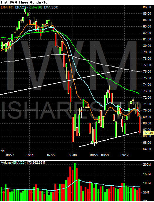
As I mentioned in yesterday's post, the IWNs were already on technically poor ground. Today, they closed right at key support around 65. The QQQs -- which were above the 200 day EMA -- moved through that technical bell weather and are now below an upward sloping trendline started about a month ago. The SPYs moved through the 112 area during the session, but rallied just a bit to close above. In short, today we saw a lot of technical damage done to the market. Most importantly, going into tomorrow (which is Friday), we have a nervous market that probably won't want to hold positions over the weekend. Don't be surprised to see more selling.
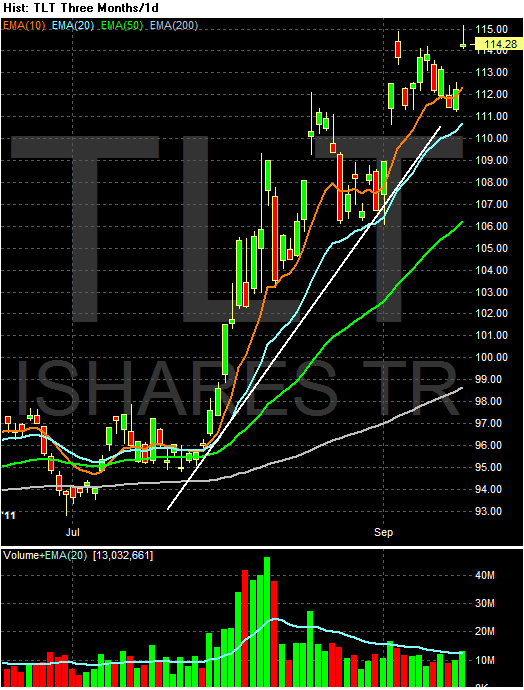
In contrast, we have a treasury market that is rallying. The IEFS and TLTs have both moved through upside resistance on very strong volume -- especially for the treasury market. Both have bullishly aligned EMAs and are clearly catching a safety bid based on the equity sell-off, the fed's move into a longer portfolio and a general risk off trade.
The dollar rallied hard, but formed a spinning top on high volume. My guess is we'll see the dollar pull back to support right around the 200 day EMA -- or at least the 10 day EMA -- before we see a possible move higher.
Let's recap:
Equities: the IWMS (risk based trade) closed right around key support. The QQQs broke support and the SPYs hit support and then pulled higher. All printed gaps lower (The SPYs was very large) on high volume. This is clearly a flight from the market in a big way. Here is a chart of the weekly SPYs with important Fib levels:
Notice prices are currently at key levels and that there is additional support at the 110 level.
Notice the IEFs and TLTs are now at higher levels than during the recession. That is a very ominous sign.
Bottom line: this is a terrible week; it does not bode well.
Thursday, September 22, 2011
No, Regulation is Not The Issue
From Pro-Publica:
Hat tip to Barry over at the Big Picture.
We asked experts, and most told us that while there is relatively little scholarship on the issue, the evidence so far is that the overall effect on jobs is minimal. Regulations do destroy some jobs, but they also create others. Mostly, they just shift jobs within the economy.Also consider this:
“The effects on jobs are negligible. They’re not job-creating or job-destroying on average,” said Richard Morgenstern, who served in the EPA from the Reagan to Clinton years and is now at Resources for the Future, a nonpartisan think tank.
Almost a decade ago, Morgenstern and some colleagues published research on the effects of regulation [PDF] using ten years’ worth of Census data on four different polluting industries. They found that when new environmental regulation was applied, higher production costs pushed up prices, resulting in lost sales for businesses and some lost jobs, but the job losses were also offset by new jobs created in pollution abatement.
That’s supported by recent data from the Bureau of Labor Statistics, which shows employers attributing a small fraction of job losses to governmental regulations. In the first half of 2011, employers listed regulations as the cause of 0.2 to 0.3 percent of jobs lost as part of mass layoffs. But the data doesn’t track the other side of the equation: jobs created.So, no, it's not the huge issue people are making it out to be.
Hat tip to Barry over at the Big Picture.
On Fisher's Dissent, or, Why the "Regulation is Killing Business" Argument is Wrong.
Once again, Fred president Fisher dissented from the Fed's decision. Here is his logic:
I have posited both within the FOMC and publicly for some time that there is abundant liquidity available to finance economic expansion and job creation in America. The banking system is awash with liquidity. It is a rare day when the discount windows―the lending facilities of the 12 Federal Reserve banks―experience significant activity. Domestic banks are flush; they have on deposit at the 12 Federal Reserve banks some $1.6 trillion in excess reserves, earning a mere 25 basis points―a quarter of 1 percent per annum―rather than earning significantly higher interest rates from making loans to operating businesses. These excess bank reserves are waiting on the sidelines to be lent to businesses. Nondepository financial firms—private equity funds and the like―have substantial amounts of investable cash at their disposal. U.S. corporations are sitting on an abundance of cash―some estimate excess working capital on publicly traded corporations’ books exceeds $1 trillion―well above their working capital needs. Nonpublicly held businesses that are creditworthy have increasing access to bank credit at historically low nominal rates.So -- in short, there is already ample cash in the system which is not being lent. Let's take a look at the underlying data he is relying on.
I have said many times that through the initiatives we took to counter the crisis of 2008–09, and the dramatic extension of the balance sheet that ensued, the Fed has refilled the tanks needed to fuel economic expansion and domestic job creation. Though I questioned the efficacy of the expansion of our balance sheet through the purchase of Treasury securities known as “QE2,” I have come to expect that the Federal Open Market Committee would continue to anchor the base lending rate at current levels and also maintain our abnormally large balance sheet, now with footings of almost $2.9 trillion, for “an extended period.”I do not believe it wise to commit to more than that, or to signal further accommodation, when the cheap and abundant liquidity we have made available is presently lying fallow, and when the velocity of money remains so subdued as to be practically comatose. At the FOMC meeting, the committee announced that it “currently anticipates that economic conditions … are likely to warrant exceptionally low levels for the federal funds rate at least through mid-2013.” In monetary parlance, that is language designed to signal that we are on hold until then.
First -- there are plenty of excess reserves:
The above charts show that since the beginning of our current economic problems, banks have been massively increasing their excess reserves. This indicates there is ample liquidity from which to make loans. The last chart is best, largely because the recent experience is so disproportionate to the historical experience. However:
We're still seeing very weak to non-existent loan growth. From the top down, commercial and industrial loans are growing weakly, consumer loans are moving lower (the spike was caused by technical factors, not actual loan growth) and real estate loans are still decreasing.
I find it very interesting that he notes the incredibly low levels of monetary velocity in the system right now -- something I've highlighted several times (most recently, here). Just to reiterate, here are the relevant charts:
In short, there are simply a dearth of transactions occurring right now; people have hunkered down and are spending as little money as possible. This is a big reason for the increase in personal savings we've seeing over the last few years as well as the high cash balances at corporations.
At this point, I think it's fair to characterize Governor Fisher's argument as, "we've already done all we can do and it's not helping. We've not going to reverse our decision -- we're not going to start depleting these excess reserves -- but we can only do so much."
First, in reporting my views to the committee, I noted my concern for the fragility of the U.S. economy and weak job creation. It might be noted by the press here today that although I am constantly preoccupied with price stability―in the aviary of central bankers, I am known as a “hawk” on inflation―I did not voice concern for the prospect of inflationary pressures in the foreseeable future. Indeed, the Dallas Fed’s trimmed mean analysis of the inflationary developments in June indicated that the trimmed mean PCE turned in its softest reading of the year. The trimmed mean analysis we do at the Dallas Fed focuses on the price movements of personal consumption expenditures. It is an analysis that tracks the price movements of 178 items that people actually buy, such as beer, haircuts, shoe repair, food and energy prices. In June, the trimmed mean came in at an annualized rate of 1.3 percent, versus 2.1 percent for the first five months of the year. The 12-month rate was 1.5 percent.For more on the Dallas Fed's trimmed mean PCE tool, see this link. What is important to recognize is that -- despite Fisher being an inflation hawk -- inflationary concerns are not the reason for his dissent. This is an important point -- and one that I don't think has been made with enough emphasis in the press.
My concern is not with immediate inflationary pressures. Core producer prices are still increasing at a higher than desirable rate. But I have suggested to my colleagues that while many companies have begun and will likely continue to raise prices to counter rising costs that derive from a range of factors—including the run-up of commodity prices in 2010 and increases in the costs of production in China—weak demand is beginning to temper the ability of providers of goods and services to significantly raise prices to consumers.
My concern is with the transmission mechanism for activating the use of the liquidity we have created, which remains on the sidelines of the economy. I posit that nonmonetary factors, not monetary policy, are retarding the willingness and ability of job creators to put to work the liquidity that we have provided.
I have spoken to this many times in public. Those with the capacity to hire American workers―small businesses as well as large, publicly traded or private―are immobilized. Not because they lack entrepreneurial zeal or do not wish to grow; not because they can’t access cheap and available credit. Rather, they simply cannot budget or manage for the uncertainty of fiscal and regulatory policy. In an environment where they are already uncertain of potential growth in demand for their goods and services and have yet to see a significant pickup in top-line revenue, there is palpable angst surrounding the cost of doing business. According to my business contacts, the opera buffa of the debt ceiling negotiations compounded this uncertainty, leaving business decisionmakers frozen in their tracks.I would suggest that unless you were on another planet, no consumer with access to a television, radio or the Internet could have escaped hearing their president, senators and their congressperson telling them the sky was falling. With the leadership of the nation―Republicans and Democrats alike―and every talking head in the media making clear hour after hour, day after day in the run-up to Aug. 2 that a financial disaster was lurking around the corner, it does not take much imagination to envision consumers deciding to forego or delay some discretionary expenditure they had planned. Instead, they might well be inclined to hunker down to weather the perfect storm they were being warned was rapidly approaching. Watching the drama as it unfolded, I could imagine consumers turning to each other in millions of households, saying: “Honey, we need to cancel that trip we were planning and that gizmo or service we wanted to buy. We better save more and spend less.” Small wonder that, following the somewhat encouraging retail activity reported in July, the Michigan survey measure of consumer sentiment released just recently had a distinctly sour tone.Importantly, from a business operator’s perspective, nothing was clarified, except that there will be undefined change in taxes, spending and subsidies and other fiscal incentives or disincentives. The message was simply that some combination of revenue enhancement and spending growth cutbacks will take place. The particulars are left to one’s imagination and the outcome of deliberations among 12 members of the Legislature.Now, put yourself in the shoes of a business operator. On the revenue side, you have yet to see a robust recovery in demand; growing your top-line revenue is vexing. You have been driving profits or just maintaining your margins through cost reduction and achieving maximum operating efficiency. You have money in your pocket or a banker increasingly willing to give you credit if and when you decide to expand. But you have no idea where the government will be cutting back on spending, what measures will be taken on the taxation front and how all this will affect your cost structure or customer base. Your most likely reaction is to cross your arms, plant your feet and say: “Show me. I am not going to hire new workers or build a new plant until I have been shown what will come out of this agreement.” Moreover, you might now say to yourself, “I understand from the Federal Reserve that I don’t have to worry about the cost of borrowing for another two years. Given that I don’t know how I am going to be hit by whatever new initiatives the Congress will come up with, but I do know that credit will remain cheap through the next election, what incentive do I have to invest and expand now? Why shouldn’t I wait until the sky is clear?”Based on past behavior of fiscal policy makers, businesses understandably regard the debt ceiling agreement and the political outcome of negotiations between Congress and the president with the suspicion akin to how the British humorist P.G. Wodehouse regarded his aunts: “It is no use telling me there are bad aunts and good aunts,” he wrote. “At the core they are all alike. Sooner or later, out pops the cloven hoof.”[2]It will be devilishly difficult for businesses to commit to adding significantly to their head count or to meaningful capital expansion in the United States until clarity is achieved on the particulars of how Congress will bend the curve of deficit and debt expansion and the “cloven hooves” are revealed. No amount of monetary accommodation can substitute for that needed clarity. In fact, it can only make it worse if business comes to suspect that the central bank is laying the groundwork for eventually inflating our way out of our fiscal predicament rather than staying above the political fray—thus creating another tranche of uncertainty.
In short, Fisher's primary argument is uncertainty is the primary issue retarding borrowing growth. At this point, I would like to add my comments to this analysis.
1.) In my business dealings, I have heard some of the same arguments, especially related to the actual implementation of the health care law. A friend who is an attorney that works for a third party health care provider spent the better part of a year working through the regulations; they are dense and confusing. If this was a non-core benefit -- that is, if the legislation impacted an area ancillary to traditional benefits provided by employers -- I would let it slide. However, this is a core issue, meaning the complexity is an issue. Let me also add -- I'm not arguing against the law (in fact, I actually know very little about it and so can't comment on its substance). But, anytime there is a change of this magnitude (and this is a big and confusing change), it will have a negative effect on sentiment.
2.) Is this regulatory uncertainty enough to add downward pressure on sentiment to such a degree as to seriously hinder hiring? No. I still think the main issue facing the economy is lack of demand. While retail sales are increasing, they are still below pre-recession peaks. Real PCEs have moved higher, but just recently. And the
- low levels of monetary velocity,
- high levels of personal savings,
- high unemployment,
- very low consumer sentiment and
- continued decrease in the household debt ratio
indicates people are just not spending at high enough rates to get the economy moving. In an economy where 70% of growth is consumer driven, this is nearly fatal to the idea of strong growth.
3.) At this point, let me briefly address an underlying assumption to Fisher's argument: that of Ricardian Equivalence, or, more specifically:
An economic theory that suggests that when a government tries to stimulate demand by increasing debt-financed government spending, demand remains unchanged. This is because the public will save its excess money in order to pay for future tax increases that will be initiated to pay off the debt. This theory was developed by David Ricardo in the nineteenth century, but Harvard professor Robert Barro would implement Ricardo's ideas into more elaborate versions of the same concept.
Some will look at the high rate of current savings and say the above theory is true; people are saving to deal with their anticipated high level of taxes coming down the pike. To this, I would respond with, "why did the savings rate decrease during the 1980s when the government also ran massive deficits?" Put another way, during another time of incredibly high government deficit spending, consumer savings dropped, blowing a fairly large hole in this argument.
4.) We are in a period of massive upheaval caused by a myriad number of issues, but with the largest factor being the worst recession since the great depression (overall, I think the best explanation of where we are now is provided by Barry Ritholtz's book Bail Out Nation). The only way to prevent this situation from occurring again is through a massive regulatory overhaul. Additionally, there are incredibly large systemic problems in the economy (such as health care) which can only be dealt with through big changes. In short, the "regulation is killing business" argument can just as easily be characterized as, "we received massive benefits from the old way of doing things and may not get those same benefits from the new system, so we're going to complain loudly about the changes."
In conclusion, I do believe there is statutory/legislative uncertainty right now. But, I also think a massive pick-up in demand would tamp that level of concern down in a big way. In short, if businesses were making more money, the "regulatory uncertainty" argument would go out the window.
Morning Market
After the Fed's statement, the equity markets tanked hard, largely because of the Fed's extremely downbeat economic analysis. Here are the daily charts to see where we are:
As mentioned above, all the markets sold off in reaction to the Fed's statement. Most importantly, the IWMs are a tad below support, with level EMAs. A strong move below their trend line would probably drag the other averages down as well. Depending on what trend line you use, the SPYs have a bit of room to run. The best news is the QQQs are still about the 200 day EMA. However, if the weight of the markets keeps moving lower, this won't hold or last.
The TLTs rallied strongly on the Fed release on increased volume. Note the remainder of the chart is very bullish -- the EMAs are all moving higher, the shorter are above the longer and prices are using the EMAs for technical support. Also note that prices spend about a week and a half consolidating gains before the Fed meeting, giving the market some room to run.
The dollar -- after consolidating around the 200 day EMA for the last week in reaction to the EU situation, broke higher yesterday in strong fashion. The reason for the gain is the overall expected effect of operation Twist -- in selling short term securities, the Fed will probably see a slight increase in short-term rates which is slightly dollar positive.
As mentioned above, all the markets sold off in reaction to the Fed's statement. Most importantly, the IWMs are a tad below support, with level EMAs. A strong move below their trend line would probably drag the other averages down as well. Depending on what trend line you use, the SPYs have a bit of room to run. The best news is the QQQs are still about the 200 day EMA. However, if the weight of the markets keeps moving lower, this won't hold or last.
The TLTs rallied strongly on the Fed release on increased volume. Note the remainder of the chart is very bullish -- the EMAs are all moving higher, the shorter are above the longer and prices are using the EMAs for technical support. Also note that prices spend about a week and a half consolidating gains before the Fed meeting, giving the market some room to run.
The dollar -- after consolidating around the 200 day EMA for the last week in reaction to the EU situation, broke higher yesterday in strong fashion. The reason for the gain is the overall expected effect of operation Twist -- in selling short term securities, the Fed will probably see a slight increase in short-term rates which is slightly dollar positive.
Wednesday, September 21, 2011
Bonddad Linkfest
- Copper, oil and the S&P 500
- Stymied by the 50 day EMA
- Full text of Republicans' letter to Bernanke
- Food prices at risk of spike higher
- IMF cuts growth forecast
- Major economies should be ready with more stimulus
- Latin America well placed to survive slowdown
- Narrowing yield curve could mean an approaching recession in Japan
- South Korea tries to avert capital flight
- Copper continues to fall
Can you get a recession if housing doesn't play along?
- by New Deal democrat
While it appears to me that in the last 30 days the economy may have actually contracted slightly, a short period of contraction doesn't necessarily lead to or mean that we have begun a recession. As I have said many times, simply projecting current coincident trends into the future is a common mistake, and an excellent way to be wrong.
I've also pointed out that one of the big reasons for the lackluster jobs and income recovery in the last two years has been that housing basically hasn't participated. Instead, the recovery was led by manufacturing and exporting - a sector that commands ever less a supply of human workers. The flip side of that issue is the question, can you have a meaningful contraction if housing remains flat? As Dean Baker has pointed out:
First of all, here is housing permits (blue, let scale) and private residential construction spending (red, right scale):

Both of these made a bottom in early 2009 and have moved generally sideways with perhaps a slight upward drift since. Housing permits have been over 600,000 on an annualized basis for the last 4 months straight - the first time since just before the expiration of the $8000 housing credit in early 2010.
It's also worth noting that permits went sideways with a small downward bias in the two years before the 2001 recession - a "just barely" recession that probably would not be labeled such except for the renewed decline due to the September terrorist attacks.
Next, let's look at total construction spending (blue) and total construction employment (red) (the BLS does not break out residential construction employment. These are indexed to 100 in April 2006 better to show the trend):

Note that construction employment has stabilized and even increased slightly. Total construction, including the lagging commercial sector, has also ticked up. This is best shown on the next graph, which tracks the YoY% change in the same data series:

Both are finally showing no YoY declines (and remember that YoY comparisons lag turning points).
Finally, here are the 10 and 20 city Case-Shiller housing price series. Previously I have pointed out that in the last 6 months these have varied within an ~1% range. In the below graph, I have divided these prices by average hourly earnings:

Note that the entire bubble in prices has disappeared. Note that while prices have gone sideways this year, measured by how much labor it takes to buy those houses they continue to get cheaper. Cheaper prices mean more demand.
To sum up: not all of these series are leading indicators, but permits certainly are -- and they lead by about 12 to 15 months. Housing permits have gone sideways for the last 2+ years, and the slight downturn at the end of the $8000 housing credit is 16 months ago and is therefore receding as a factor. Private construction spending and employment have stabilized. Home prices as a share of income earned continue to get cheaper, while nominally stabilizing (meaning no increased pressure on existing homeowners). [Bill McBride a/k/a Calculated Risk, made a related point yesterday. The unemployment rate correlates highly with housing starts, with a 12 to 18 month lag. With housing in the last year or so going sideways to slowly higher, it is unlikely that the unemployment rate will significantly worse even if we technically enter a recession.]
Housing isn't playing along with a recession scenario, and thus even though at the moment we seem to have entered slight contraction, it is very unlikely that it can be anything more than shallow.
While it appears to me that in the last 30 days the economy may have actually contracted slightly, a short period of contraction doesn't necessarily lead to or mean that we have begun a recession. As I have said many times, simply projecting current coincident trends into the future is a common mistake, and an excellent way to be wrong.
I've also pointed out that one of the big reasons for the lackluster jobs and income recovery in the last two years has been that housing basically hasn't participated. Instead, the recovery was led by manufacturing and exporting - a sector that commands ever less a supply of human workers. The flip side of that issue is the question, can you have a meaningful contraction if housing remains flat? As Dean Baker has pointed out:
a recession requires some component of spending to go into reverse and turn negative. In the past, it had always been housing and car buying which fell at double-digit rates at the start of a downturn. With these categories of spending already very low, there are few obvious candidates.And flat housing is. Let's look at the most important graphs:
First of all, here is housing permits (blue, let scale) and private residential construction spending (red, right scale):
Both of these made a bottom in early 2009 and have moved generally sideways with perhaps a slight upward drift since. Housing permits have been over 600,000 on an annualized basis for the last 4 months straight - the first time since just before the expiration of the $8000 housing credit in early 2010.
It's also worth noting that permits went sideways with a small downward bias in the two years before the 2001 recession - a "just barely" recession that probably would not be labeled such except for the renewed decline due to the September terrorist attacks.
Next, let's look at total construction spending (blue) and total construction employment (red) (the BLS does not break out residential construction employment. These are indexed to 100 in April 2006 better to show the trend):
Note that construction employment has stabilized and even increased slightly. Total construction, including the lagging commercial sector, has also ticked up. This is best shown on the next graph, which tracks the YoY% change in the same data series:
Both are finally showing no YoY declines (and remember that YoY comparisons lag turning points).
Finally, here are the 10 and 20 city Case-Shiller housing price series. Previously I have pointed out that in the last 6 months these have varied within an ~1% range. In the below graph, I have divided these prices by average hourly earnings:
Note that the entire bubble in prices has disappeared. Note that while prices have gone sideways this year, measured by how much labor it takes to buy those houses they continue to get cheaper. Cheaper prices mean more demand.
To sum up: not all of these series are leading indicators, but permits certainly are -- and they lead by about 12 to 15 months. Housing permits have gone sideways for the last 2+ years, and the slight downturn at the end of the $8000 housing credit is 16 months ago and is therefore receding as a factor. Private construction spending and employment have stabilized. Home prices as a share of income earned continue to get cheaper, while nominally stabilizing (meaning no increased pressure on existing homeowners). [Bill McBride a/k/a Calculated Risk, made a related point yesterday. The unemployment rate correlates highly with housing starts, with a 12 to 18 month lag. With housing in the last year or so going sideways to slowly higher, it is unlikely that the unemployment rate will significantly worse even if we technically enter a recession.]
Housing isn't playing along with a recession scenario, and thus even though at the moment we seem to have entered slight contraction, it is very unlikely that it can be anything more than shallow.
Is Inflation Running Too Hot, Part II; CPI
Yesterday, I looked at PPI and wrote the following:
Total CPI is approaching levels that are high by historical standards for the last 25 years (the post Volcher years). Looking back over the last 10-20 years, we see the bulk of the reported levels in the 2%-3% range, whereas the latest YOY percentage change is coming in at 3.8%. This is hotter than we would like. However,
Core is running at 2%. In addition, some of the recent bump can be attributed to CPI being at low levels over the last few years. This tells us commodity price pressures are not bleeding into core prices.
However, let's take a look at two important sub-sets of prices: food and energy.
Food prices are running extremely hot; they are printing near their highest levels of the last 20+ years. Some of this spike is due to the low levels seen over the last two years. But, there have still been some very large price spikes as well. Also note these are levels associated with recession; when food prices have been at these levels in the past, a recession has followed. There are only two other historical data points to reference regarding this, so the evidence is not conclusive (ideally, we'd like to have more data to draw such an important conclusion).
Energy prices are also very high. However, the economy weathered YOY price spikes similar magnitude in the last expansion and did fairly well.
While the ability of middle men to absorb price increases and not pass them on is admirable, the bottom line is total CPI -- especially food prices -- is concerning. At 3.8% YOY it's running at higher than desired levels. In addition, the current trend is for more increases -- obviously not good. The good news is oil prices are lower and food prices (futures) have been moving sideways for the last 9-12 months. But there is ample reason for concern at the point.
So -- the bottom line is total PPI is at uncomfortable levels in and of itself. However, while there is some bleed through to CPI, CPI is still lower, indicating that PPI can run at these levels without causing inflationary concern -- yet. But, these are figures that we have to keep an eye on going forward.Put another way, if we think of PPI as the first set of prices that lead into CPI, then we see that initial prices (the prices paid to manufacturers) are running hot, but there isn't as much bleed through into CPI as there could be. This cushion limits the impact of higher then desired PPI. Now let's turn to CPI, which the BLS recently reported thusly:
The Consumer Price Index for All Urban Consumers (CPI-U) increased 0.4 percent in August on a seasonally adjusted basis, the U.S. Bureau of Labor Statistics reported today. Over the last 12 months, the all items index increased 3.8 percent before seasonal adjustment.Looking at the graphs, we get the following data:
Total CPI is approaching levels that are high by historical standards for the last 25 years (the post Volcher years). Looking back over the last 10-20 years, we see the bulk of the reported levels in the 2%-3% range, whereas the latest YOY percentage change is coming in at 3.8%. This is hotter than we would like. However,
Core is running at 2%. In addition, some of the recent bump can be attributed to CPI being at low levels over the last few years. This tells us commodity price pressures are not bleeding into core prices.
However, let's take a look at two important sub-sets of prices: food and energy.
Food prices are running extremely hot; they are printing near their highest levels of the last 20+ years. Some of this spike is due to the low levels seen over the last two years. But, there have still been some very large price spikes as well. Also note these are levels associated with recession; when food prices have been at these levels in the past, a recession has followed. There are only two other historical data points to reference regarding this, so the evidence is not conclusive (ideally, we'd like to have more data to draw such an important conclusion).
Energy prices are also very high. However, the economy weathered YOY price spikes similar magnitude in the last expansion and did fairly well.
While the ability of middle men to absorb price increases and not pass them on is admirable, the bottom line is total CPI -- especially food prices -- is concerning. At 3.8% YOY it's running at higher than desired levels. In addition, the current trend is for more increases -- obviously not good. The good news is oil prices are lower and food prices (futures) have been moving sideways for the last 9-12 months. But there is ample reason for concern at the point.
Morning Market
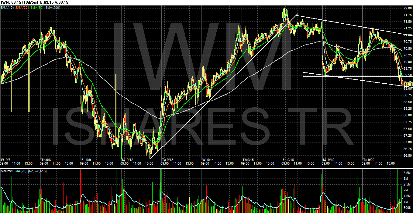
I wanted to start with the IWMs today, because they highlight the need to look at multiple markets to get an idea for what is happening overall. The Russell 2000 is the riskiest of the markets. Therefore, it often leads higher and lower. Notice the IWMs broke an uptrend three days ago and have been moving lower in a channel ever since. This trend break was a harbinger of yesterday's action in the SPYs:
The SPYs took longer to break their uptrend, but they have done so. Also note it's possible to argue prices have also formed a double top over the last 4 trading days.
While the TLTs moved higher yesterday, the daily charts shows they are still stuck below resistance. Also note the IEFs are having a hard time making significant upward progress as well. What's interesting is the dollar has now taken over safe haven bid status in the markets, being the "least dirty shirt in the hamper."
The total of these charts is still one of an economic slowdown or recession.
Tuesday, September 20, 2011
Bonddad Linkfest
- Lenders harden their stand against Greece
- Possible fed actions at their meeting
- S and P downgrades Italy
- Commodities not exactly inflation looking
- S and P dividend yield tops treasuries
- West coast exports increasing
- Retail stocks are very vulnerable
- Percentages of sector stocks below the 50 day EMA
- Boehner rejects Obama plan
- Obama proposes new plan
Did the debt debate debacle disrupt the economic cycle?
- by New Deal democrat
The only reason to qualify the typical leading/coincident/lagging indicator paradigm, in my opinion, is significant immediate government action. A decline in important foreign trading partner economies will show up in manufacturing data here first, as well as stock prices (as future earnings of companies with exposure are downgraded). An outright decline in those economies should also show up as decreased cash to invest in our bonds, and hence bond yields should rise. In other words, the importation of foreign weakness should show in leading indicators first.
But imagine for example an immediate 50% tax increase on everything enacted by the government. Virtually every economic indicator would decline in unison. No leading/coincident/lagging steps there.
The question is, was the confidence shattering debt ceiling debacle in Washington -- in which House Republicans even at the end could not muster a majority to vote in favor of paying our bills, even after Barack Obama offered up the crown jewels of the 20th century, Social Security and Medicare, as an enticement -- such an event? Only 174 House Republicans voted for the debt deal. They had to be rescued by Nancy Pelosi's democrats, otherwise the deal would not have passed and the US would have defaulted on its debts.
Gallup's daily consumer confidence poll plummeted between July 5 and August 3:

The Euro crisis was in the headlines before, and intensified after that period, without any effect on the poll results. The S&P debt downgrade didn't happen until August 4, so is also not responsible. So what happened specifically in that period?
Over the 4th of July weekend Barack Obama explicitly offered up Social Security and Medicare for sacrifice in a "grand bargain," and the sausage making over how to gut the fundamental social contract continued until the debt ceiling deal, which did not include cuts - for now - was passed on August 2. As mentioned above, even at the end the deal did not have enough GOP support to pass the House. The result was, as Gallup reported, that Upper Income Americans' Economic Confidence [was] Shaken. The economic confidence of Americans with disposable income plummeted abruptly beginning during this period, to a bottom not seen since the depths of the recession. And when the affulent (roguhly the top 25%) cut back spending, the economy suffers immediately. The report is short but hard hitting, and I highly recommend you click throough and read it in its entirety.
Since that time, we have seen July and August real retail sales turn negative, and same store sales for at least one service - Shopertrak - were totally flat YoY in the first full week of September.
Bonddad and I had a number of conversations during and after that period, and both of us felt that something profoundly unnerving had occurred. Washington was truly under the thumb of lunatics, and the crown jewels had been offered up for potential evisceration. Is that itself sufficient to disrupt the normal progression of the economic cycle? Apparently we will find out together.
More tomorrow.
The only reason to qualify the typical leading/coincident/lagging indicator paradigm, in my opinion, is significant immediate government action. A decline in important foreign trading partner economies will show up in manufacturing data here first, as well as stock prices (as future earnings of companies with exposure are downgraded). An outright decline in those economies should also show up as decreased cash to invest in our bonds, and hence bond yields should rise. In other words, the importation of foreign weakness should show in leading indicators first.
But imagine for example an immediate 50% tax increase on everything enacted by the government. Virtually every economic indicator would decline in unison. No leading/coincident/lagging steps there.
The question is, was the confidence shattering debt ceiling debacle in Washington -- in which House Republicans even at the end could not muster a majority to vote in favor of paying our bills, even after Barack Obama offered up the crown jewels of the 20th century, Social Security and Medicare, as an enticement -- such an event? Only 174 House Republicans voted for the debt deal. They had to be rescued by Nancy Pelosi's democrats, otherwise the deal would not have passed and the US would have defaulted on its debts.
Gallup's daily consumer confidence poll plummeted between July 5 and August 3:
The Euro crisis was in the headlines before, and intensified after that period, without any effect on the poll results. The S&P debt downgrade didn't happen until August 4, so is also not responsible. So what happened specifically in that period?
Over the 4th of July weekend Barack Obama explicitly offered up Social Security and Medicare for sacrifice in a "grand bargain," and the sausage making over how to gut the fundamental social contract continued until the debt ceiling deal, which did not include cuts - for now - was passed on August 2. As mentioned above, even at the end the deal did not have enough GOP support to pass the House. The result was, as Gallup reported, that Upper Income Americans' Economic Confidence [was] Shaken. The economic confidence of Americans with disposable income plummeted abruptly beginning during this period, to a bottom not seen since the depths of the recession. And when the affulent (roguhly the top 25%) cut back spending, the economy suffers immediately. The report is short but hard hitting, and I highly recommend you click throough and read it in its entirety.
Since that time, we have seen July and August real retail sales turn negative, and same store sales for at least one service - Shopertrak - were totally flat YoY in the first full week of September.
Bonddad and I had a number of conversations during and after that period, and both of us felt that something profoundly unnerving had occurred. Washington was truly under the thumb of lunatics, and the crown jewels had been offered up for potential evisceration. Is that itself sufficient to disrupt the normal progression of the economic cycle? Apparently we will find out together.
More tomorrow.
Is Inflation Running Too Hot? Pt. 1 PPI
Last week, the BLS released PPI and CPI. Both of these numbers came in pretty hot, so it seems appropriate to look into the reports in some depth to see what's going on. Let's start with PPI, which is
Let's go to the report:
The above chart shows the YOY percentage change in PPI. Right now it's running pretty hot -- it's near the highest levels seen in the last 25 years.
In addition, core PPI is still at very manageable levels.
A family of indexes that measure the average change over time in selling prices received by domestic producers of goods and services. PPIs measure price change from the perspective of the seller. This contrasts with other measures that measure price change from the purchaser's perspective, such as the Consumer Price Index (CPI). Sellers' and purchasers' prices may differ due to government subsidies, sales and excise taxes, and distribution costs.In other words, we're looking at this from the seller's perspective.
Let's go to the report:
The Producer Price Index for finished goods was unchanged in August, seasonally adjusted, the U.S. Bureau of Labor Statistics reported today. Finished goods prices advanced 0.2 percent in July and declined 0.4 percent in June. At the earlier stages of processing, prices received by manufacturers of intermediate goods decreased 0.5 percent in August, and the crude goods index moved up 0.2 percent. On an unadjusted basis, prices for finished goods increased 6.5 percent for the 12 months ended August 2011, the smallest year-over-year advance since a 5.6- percent rise in March 2011.
The above chart shows the YOY percentage change in PPI. Right now it's running pretty hot -- it's near the highest levels seen in the last 25 years.
In addition, core PPI is still at very manageable levels.
However,
the above chart of PPI and CPI show that while PPI is having a general
effect on CPI, PPI is running hotter than CPI. In other words, the
level of bleed-through between PPI and CPI exists, but not in an extremely detrimental way. This relationship does need to be monitored, however.
While there has been considerable debate (and at times consternation) regarding the use of core and total PPI (and CPI), it's important to realize why this is done. Commodity prices are in part seasonal and also deeply effected by supply and demand. As such, they can vacillate wildly. But serious upswings are the standard remedy for the following downswing -- or, more specifically, the cure for high commodity prices is high commodity prices. By using two different measures -- total and core -- we can see if high commodity prices are in fact bleeding through to core prices, to see if high commodity prices are taking root in the overall price structure that exists throughout the economy.
The above chart shows the YOY percentage change between crude, intermediate and final goods. The red line -- show shows crude goods -- is moving around a lot, while intermediate and final prices aren't. This tells us that huge swings in crude goods (raw material inputs) are being absorbed in later stages of production. This is further reason why economists note the difference between core and non-core prices.
So -- the bottom line is total PPI is at uncomfortable levels in and of itself. However, while there is some bleed through to CPI, CPI is still lower, indicating that PPI can run at these levels without causing inflationary concern -- yet. But, these are figures that we have to keep an eye on going forward.
The above chart shows the YOY percentage change between crude, intermediate and final goods. The red line -- show shows crude goods -- is moving around a lot, while intermediate and final prices aren't. This tells us that huge swings in crude goods (raw material inputs) are being absorbed in later stages of production. This is further reason why economists note the difference between core and non-core prices.
So -- the bottom line is total PPI is at uncomfortable levels in and of itself. However, while there is some bleed through to CPI, CPI is still lower, indicating that PPI can run at these levels without causing inflationary concern -- yet. But, these are figures that we have to keep an eye on going forward.
Morning Market
Yesterday, the market opened sharply lower, but then rallied several times with the most impressive being the end of the day rally on increased volume that hit resistance about 20 minutes before the close. As the daily chart shows, prices moved between the 20 and 50 day EMA. However, overall remember that prices are still in weak technical shape, essentially in a bear market pennant pattern.
The longer end of the Treasury curve is still having difficulty making a strong advance. Earlier in the day, treasuries were up on extremely (what is for Treasuries) bullish news; serious questions about the viability of the EU situation. But prices simply could not maintain the rally -- and this after a large gap higher on the TLTs at the open.
The above 5-minute chart adds important clarity to the treasury picture. After gapping higher at the open, prices moved sideways until they hit the 10 minute EMA. They followed the EMAs higher, but then sold off as the close approached. In other word, this was not a strong, day-long rally, but instead a gap higher at the open with little follow-through.
The dollar moved higher today, advancing through the 200 day EMA and moving through key resistance levels. However, notice the declining volume tallies over the last week. My guess is we're seeing a consolidation of the dollar after a sharp move higher.
Monday, September 19, 2011
Bonddad Linkfest
- EU/IMF demand faster Greek reforms
- Pressure Mounts on Greece
- Emerging market currencies fall
- Crude drops to 1-week low
- Effort on home loans stalls
- Fed Ponders Job and Inflation targets
- Fed Runs Risk of Doing Less Than Expected
- Obama unveils $3 billion plan
- Budget battle lines emerge
- Global recovery skidding off course
The NBER recession criteria - current status
- by New Deal democrat
My Weekly Indicator column is an excellent way of marking opinions to market, or reality. Instead of a snapshot from one or two months ago, or even the last quarter, weekly indicators are fully up to date.
On Saturday I concluded my Weekly Indicator piece with the following: "The NBER dating committee is known to watch at least 5 indicators: nonfarm payrolls, aggregate hours worked, industrial production, real retail sales, and real income. Two of these have now turned negative, one is flat, and two remain positive. Should the negative trends continue - and I emphasize that there is no guarantee that they will - at some point the NBER could date a new recession from this month, September 2011."
Let's look at the most current data on the 5 series mentioned above:
Real retail sales turned down in July and August. This almost has to be laid at the shattering effect of the debt ceiling debacle on consumer confidence, although the lagged effect of increasing gas prices documented by Prof. James Hamilton probably also played a role:

At least one of the members of the committee is known to look at aggregate hours worked. These declined in August:

Nonfarm payrolls is perhaps the single quintessential indicator of turning points. After 3 pathetically positive months, zero jobs were added in August:

Despite contracting regional manufacturing reports, and just barely positive ISM manufacturing reports, Industrial Production continues to increase:

Finally, real income is also still increasing:

Through July, the data do not support recession. August income will not be reported for another week.
I want to emphasize that there is absolutely no validity to simply projecting declining trends forward. Hence the crucial qualifier of IF those trends do continue, and if second derivative declines in payrolls and income translate into actual declines. We had declines in several of these indicators in 2006 and 2007 for exmaple without tipping into recession.
My Weekly Indicator column is an excellent way of marking opinions to market, or reality. Instead of a snapshot from one or two months ago, or even the last quarter, weekly indicators are fully up to date.
On Saturday I concluded my Weekly Indicator piece with the following: "The NBER dating committee is known to watch at least 5 indicators: nonfarm payrolls, aggregate hours worked, industrial production, real retail sales, and real income. Two of these have now turned negative, one is flat, and two remain positive. Should the negative trends continue - and I emphasize that there is no guarantee that they will - at some point the NBER could date a new recession from this month, September 2011."
Let's look at the most current data on the 5 series mentioned above:
Real retail sales turned down in July and August. This almost has to be laid at the shattering effect of the debt ceiling debacle on consumer confidence, although the lagged effect of increasing gas prices documented by Prof. James Hamilton probably also played a role:
At least one of the members of the committee is known to look at aggregate hours worked. These declined in August:
Nonfarm payrolls is perhaps the single quintessential indicator of turning points. After 3 pathetically positive months, zero jobs were added in August:
Despite contracting regional manufacturing reports, and just barely positive ISM manufacturing reports, Industrial Production continues to increase:
Finally, real income is also still increasing:
Through July, the data do not support recession. August income will not be reported for another week.
I want to emphasize that there is absolutely no validity to simply projecting declining trends forward. Hence the crucial qualifier of IF those trends do continue, and if second derivative declines in payrolls and income translate into actual declines. We had declines in several of these indicators in 2006 and 2007 for exmaple without tipping into recession.
Copper Continues to Weaken; Another Bad Market Omen
From the Financial Times:
Prices are below the 200 day EMA. The 10 and 20 day EMA have moved through the 200 day EMA and the 50 is about to; all the shorter EMAs are moving lower. The MACD is already negative and has given a sell signal. Prices had found support at the 3.9 area but have now moved through that level, printing a strong downward bar.
Copper is a bell weather commodity; this does not bode well for the economy as a whole.
Copper prices fell to their lowest level of 2011 on Monday as cautiousness over the inability of the eurozone to resolve its debt crisis and concerns about tighter monetary conditions in China hit sentiment on commodities markets.
Demand for the red metal is closely correlated to global economic growth as well as liquidity levels in China, which represents 40 per cent of total copper demand.
Prices are below the 200 day EMA. The 10 and 20 day EMA have moved through the 200 day EMA and the 50 is about to; all the shorter EMAs are moving lower. The MACD is already negative and has given a sell signal. Prices had found support at the 3.9 area but have now moved through that level, printing a strong downward bar.
Copper is a bell weather commodity; this does not bode well for the economy as a whole.
Morning Market
Let's review where the markets are:
1.) With the exception of the QQQs, the markets are below 200 day EMAs and consolidating in slightly upward sloping channels. However, the QQQs are above the 200 day EMA and have broken through upside resistance.
2.) The shorter ends of the yield curve are moving sideways, probably because of the negative, post inflation return. Both the IEIs and IEFs have broken shorter, upward sloping trend lines and are now moving sideways. The TLTs are right at trend support
3.) Oil -- like equities -- is consolidating below the 200 day EMA in an upward sloping trend line. It is in the middle of a six month donwtrend.
4.) The dollar -- having rallied in reaction to the euro -- is now falling back a bit and has found technical support at the 10 day EMA. It has sold off a bit, but this could be considered a standard, profit taking sell-off that occurs after a strong rally.
Let's take a look at some charts:
The QQQs have moved through the 200 day EMA on increased volume. The 10 day EMA has moved through the 200 day EMA, and the 20 is about to follow suit. The question now becomes -- will the QQQs pull the other averages higher or will the other averages pull the QQQs lower again?
A good place to look for the answer to that question is the Russell 2000 -- the equity average with the riskiest profile. Unlike the QQQs, the IWMs have not rallied in a meaningful way through the 200 day EMA -- which is this case is moving lower and has been for about a month and a half. And, in comparison to the QQQs, the latest IWM "rally" is composed of very small candles that show a distinct lack of upward momentum in the market. The above chart does not say "follow-through;" instead, it says stuck (at best). So, I wouldn't not expect to see the other averages move significantly higher in the current environment; instead, I'd be looking for shorting opportunities.
Oil is in the middle of a six month down trend. After peeking in April, it moved lower using the200 day EMA for technical support. At the end of July and beginning of August it moved lower again and has since been moving higher, but in an upward sloping pennant pattern. However, the 200 day EMA is moving lower indicating the long term trend is down. While the MACD is rising it is still in negative territory. Fundamentally, both the IEA and OPEC have lowered their demand projections for the next year. And prices have hit resistance in the 90/price area. Also consider the dollar has recently rallied and should continue to benefit from the EU situation. In short, any upward move in oil should be contained.
The dollar has rallied strongly, rising to just above the 200 day EMA before moving lower and using the 10 day EMA as technical support. After the sharp move higher, the 10, 20 and 50 day EMA are following suit. I think the dollar will stay at these levels to "catch its breath" which will allow traders to reconsider the rally in relation to the EU situation. The dollar does not have the fundamentals to back up a rally at this point -- the economy is slowing and interest rates are low. It's rallying because it's the last "safe" currency without a strong intervention policy backing it.
1.) With the exception of the QQQs, the markets are below 200 day EMAs and consolidating in slightly upward sloping channels. However, the QQQs are above the 200 day EMA and have broken through upside resistance.
2.) The shorter ends of the yield curve are moving sideways, probably because of the negative, post inflation return. Both the IEIs and IEFs have broken shorter, upward sloping trend lines and are now moving sideways. The TLTs are right at trend support
3.) Oil -- like equities -- is consolidating below the 200 day EMA in an upward sloping trend line. It is in the middle of a six month donwtrend.
4.) The dollar -- having rallied in reaction to the euro -- is now falling back a bit and has found technical support at the 10 day EMA. It has sold off a bit, but this could be considered a standard, profit taking sell-off that occurs after a strong rally.
Let's take a look at some charts:
The QQQs have moved through the 200 day EMA on increased volume. The 10 day EMA has moved through the 200 day EMA, and the 20 is about to follow suit. The question now becomes -- will the QQQs pull the other averages higher or will the other averages pull the QQQs lower again?
A good place to look for the answer to that question is the Russell 2000 -- the equity average with the riskiest profile. Unlike the QQQs, the IWMs have not rallied in a meaningful way through the 200 day EMA -- which is this case is moving lower and has been for about a month and a half. And, in comparison to the QQQs, the latest IWM "rally" is composed of very small candles that show a distinct lack of upward momentum in the market. The above chart does not say "follow-through;" instead, it says stuck (at best). So, I wouldn't not expect to see the other averages move significantly higher in the current environment; instead, I'd be looking for shorting opportunities.
Oil is in the middle of a six month down trend. After peeking in April, it moved lower using the200 day EMA for technical support. At the end of July and beginning of August it moved lower again and has since been moving higher, but in an upward sloping pennant pattern. However, the 200 day EMA is moving lower indicating the long term trend is down. While the MACD is rising it is still in negative territory. Fundamentally, both the IEA and OPEC have lowered their demand projections for the next year. And prices have hit resistance in the 90/price area. Also consider the dollar has recently rallied and should continue to benefit from the EU situation. In short, any upward move in oil should be contained.
The dollar has rallied strongly, rising to just above the 200 day EMA before moving lower and using the 10 day EMA as technical support. After the sharp move higher, the 10, 20 and 50 day EMA are following suit. I think the dollar will stay at these levels to "catch its breath" which will allow traders to reconsider the rally in relation to the EU situation. The dollar does not have the fundamentals to back up a rally at this point -- the economy is slowing and interest rates are low. It's rallying because it's the last "safe" currency without a strong intervention policy backing it.
Subscribe to:
Posts (Atom)