Friday, February 18, 2011

Thursday, February 17, 2011

Are home sellers in 2011 throwing in the towel?

- by New Deal democrat

There is a really interesting article by Scott Sambucci today, Housing: Why are new listing [prices] down so sharply?.

It's a really interesting articles with great explanatory graphs. I recommend you go over and read the whole thing. His basic conclusion: unlike prior years since the onset of the housing bust, people (or banks) listing houses for sale for the first time this year are underpricing houses already on the market. In other words, they are throwing in the towel.

Will Gas Prices Choke Off Recovery?

From Marketwatch:

Treasurys pared an early loss after a report showed U.S. retail sales rising 0.3% last month, less than analysts expected. The Commerce Department said that excluding autos, sales rose 0.3% as well on the month — also disappointing analysts. See story on retail sales.

“Weather is likely to have taken its toll on some areas of spending,” said economists at RDQ Economics. “One theme, however, is evident in this report: Rising gas prices are taking a bite out of consumer spending power, judging by the fast rate of increase in gas-station sales.”

I think last months retail sales report was more of a weather related event than an oil prices event. But that doesn't mean we won't see gas prices start to retail spending at some point.

Consider that in conjunction with this chart of gas prices:


Interestingly enough, oil prices are down this week, despite the turmoil in the Middle East. However, how long will that lack of correlation last? In addition, we're a few months out from the summer driving season, when oil prices naturally rise.

I would add that I would rather have gas prices increases slowly but consistently (for example, a few cents every two weeks) rather than a sharp increase, as the former allows a slow absorption of the price increases and prevents the shock associated with a massive price spike.

A Closer Look At the Labor Force Participation Rate


The above chart of the labor force participation rate is very important and highlights several important cultural and societal trends.

The labor participation rate is defined thusly:
The labor force as a percent of the civilian noninstitutional population.
The labor force "includes all persons classified as employed or unemployed in accordance with the definitions contained in this glossary" while the civilian non-institutional population includes "persons 16 years of age and older residing in the 50 States and the District of Columbia who are not inmates of institutions (for example, penal and mental facilities, homes for the aged), and who are not on active duty in the Armed Forces."

Let's simplify the above terms.

The civilian non-institutional population is the biggest possible pool of labor and basically includes everybody in the US. A subset of this population is the labor force, which is everybody who is employed or unemployed. The participation rate is simply a ratio that shows what percentage the labor force (everybody who is employed or unemployed) is of the total population.

The participation rate increased from a little after 1960 until 2000 and then started to decrease. The question for this decrease is "why?"

There are two fundamental reasons. The first is that women as a percentage of the labor force increased and stagnated over the same time period. As women entered the workforce starting in the early 1960s the labor force participation rate (the percentage of the population either employed or unemployed) increased in sympathy. However, women as a percentage of the labor force plateaued in 2000 and dipped slightly thereafter, leading the labor force and therefore the participation ratio to decline.

Secondly, there is the issue of the baby boomers or "someone born during the demographic birth boom between 1946 and 1964.[9]" Someone born in 1946 would turn 60 in 2006 and be 65 in 2011. As these people have retired, they have left the labor force (they are neither employed or unemployed). Hence, we have the second reason for the decrease in the labor force participation rate -- retiring baby boomers.

Expect to see the participation rate continue to decline as the underlying dynamics of the labor force change.

Yesterday's Market

Click on all images for a large image


Wednesday, February 16, 2011

The Misnomer of the "Global Currency Wars"

From Jeff Frankel's blog:

“The Fed is firing a volley in a destructive international currency war.” This is the criticism that has come from some of our trading partners: in particular, China, Germany and Brazil. I don’t generally do “My country, right or wrong.” But my country is right on this one. Monetary easing is not a beggar-thy-neighbor policy. The colorful phrase “currency wars“ seems to have confused some people. The current situation is precisely the point of floating exchange rates: when some countries feel that their high unemployment calls for monetary expansion (US) at the same time that others feel that their overheating calls for monetary tightening (Brazil, India, Korea, China…), an appreciation of the latter currencies against the former is precisely the way that floating rates accommodate the differences. This is why Milton Friedman favored floating rates, so that each country could pursue its own desired policies independently. I realize that the pressure which US monetary easing puts on countries like China to allow appreciation is unwelcome. China is finding it increasingly difficult to cling to its exchange rate target by means of controls on capital inflows and sterilized foreign exchange intervention. But capital flows are a far more legitimate way to let China feel the pressure than the alternative: Congressional threats to impose WTO-inconsistent tariffs on Chinese imports if it won’t allow faster appreciation of the yuan.

This is a topic I have wanted to tackle for some time.

When Brazil first made the allegation that the Fed's Quantitative Easing program was creating a "global currency war" certain financial bloggers picked up on the idea and ran with the "we're all going to die" meme. Unfortunately, nothing could be further from the truth.

Brazil's currency is rising for several reasons.

1.) High interest rates. Brazil's interest rates are over 11% -- a rate of interest that will attract currency traders to the Real because these rates are some of the highest in the world. Brazil will be increasing their rates going forward, largely because of domestic inflationary pressures.

2.) A growing economy. Brazil was remarkably untouched by the recession. In fact, it has been growing at strong rates for some time, making it a natural magnet for investment, which causes its currency to appreciate in value.

3.) Brazil is a natural resources economy -- especially after the Brazilian oil company announced it made a major find off the coast of Brazil -- which will also attract investment.

All three of these factors are a prime reason for the Real's appreciation, which means the argument that we're in the middle of a "currency war" is misplaced.

Retail Sales Up .3%

From the WSJ:
Retail sales grew at a glacial pace last month, as winter storms kept shoppers snowbound.

Sales rose 0.3% in January from the previous month to $381.57 billion, the Commerce Department said Tuesday. That was the smallest gain since June.

"If you take the numbers literally, they imply a slowing of consumption [growth], but I think inevitably the numbers reflected snowstorm effects," said MF Global economist Jim O'Sullivan.

.....

Paul Dales, an economist at Capital Economics, said it would be hard to know how much of the slowdown in sales growth was due to weather until next month, when February figures come out. If those show a big sales jump, it will be clear that January's weakness was caused largely by the snowstorms.

"That said, I think even stripping out those weather effects there might be a slowdown in consumption [growth] going on," said Mr. Dales. Sales growth has decelerated for each of the past three months, he noted—a sign that, with unemployment still high and many household balance sheets still in need of repair, consumers may not be able to increase their spending by very much for very long.

Let's take a look at the data.

Retail sales rose strongly in the spring of 2010, leveled off during the summer and have been rising strongly since. A high savings rate (which is currently at about 5%) is helping were fuel consumption.


On a five year chart of real retail sales, notice that sales bottomed during most of 2009 but have been rising since.

Looking at the specifics, auto sales increased .5% and have been increasing at solid rates for the last year:

Housing issues played a large negative role. Furniture and home furnishing sales decreased .3% while building material and supplies decreased 2.9%. This second figure led many to conclude that weather played a significant role in the decline. After all, who wants to build or fix a home in freezing weather?

Some economists argued we're seeing a slowing in retail sales. I don't think there is enough data yet to make that call conclusively. The slower increase could simply be a natural slowing down from a robust Christmas.

Overall, this is still a decent report that indicates the consumer is more willing to spend, helping to push the economy forward.

Plenty of Reasons To Be Hopeful

Over at the streetlight blog, Kash makes four observations why he is hopeful for this recovery.

He first notes that U.S. Manufacturing is performing very well. This is an observation that we've been making for quite some time. In fact, manufacturing was one of the first areas of the economy to turn around after the recession.

Next, Kash notes exports have been increasing. Thanks to growth in emerging markets, this trend should continue for the foreseeable future.

Businesses have also been investing in their infrastructure. For the last four quarters, business investment has grown at very large rates. While the pace of increases is slowing, there is no reason to think it will slow to a negative pace.

Finally, households have been paying down debt. This is an observation that new deal democrat has made repeatedly for the last 6 to 9 months. By lowering their total amount of debt, households are increasing their ability to participate in the recovery.

I would encourage you to read the entire article.

Yesterday's Market

Click on images for a larger image


Tuesday, February 15, 2011

Climate Change and Food Prices

From Bloomberg:

Global food supplies will face “massive disruptions” from climate change, Olam International Ltd. predicted, as Agrocorp International Pte. said corn will gain to a record, stoking food inflation and increasing hunger.

“The fact is that climate around the world is changing and that will cause massive disruptions,” Sunny Verghese, chief executive officer at Olam, among the world’s three biggest suppliers of rice and cotton, said in a Bloomberg Television interview today. “We’re friendly to wheat, corn and soybeans and bearish on rice.”

.....

Corn futures surged 90 percent in the past year, while wheat jumped 80 percent and soybeans advanced 49 percent as the worst drought in at least half a century in Russia, flooding in Australia, excessive rainfall in Canada, and drier conditions in parts of Europe slashed harvests.

.....

Sales and shipments of wheat by the U.S. to Egypt, the world’s biggest buyer, jumped to 2.9 million tons since June 1, more than six times higher than the same period a year earlier, according to USDA figures dated Feb. 3.

Algeria bought 2.95 million tons of wheat from Dec. 16 to Jan. 26, according to crops office FranceAgriMer. That was “probably” the most the country had ever bought in a five-week period, said Xavier Rousselin, the office’s head of arable crops. Loadings of French soft wheat destined for Morocco more than tripled to 1.16 million tons from 350,000 tons a year earlier, the company said.

Hoarding of agricultural products will intensify, although it will have limited impact on prices because supplies are sufficient, Goldman Sachs Group Inc. analysts including Jeffrey Currie said in January.


The Budget Issue

Over the last few weeks we've seen the basic wrangling between the Republicans and the Democrats on the budget. However, neither party is addressing the issues, which means the Washington Lobotomy factory is still in high gear.

Let's start with a a few charts, courtesy of information from the CBO:


Over the last 40 years, mandatory and discretionary spending as a percentage of the total federal budget have dramatically changed their overall positions. Mandatory spending now accounts for 60% of the budget while discretionary spending now accounts for 40% of the budget.

In addition, medical spending is the primary reason for the increase in mandatory spending:


Notice that over the last 40 years, medicare spending has increased from 10% of mandatory spending to a little over 20%. In addition, Medicaid spending has also increased from about 4%-5% to a little over 10%. At the same time, Social Security spending as a percentage of mandatory spending has decreased from a little under 50% to a little over 30%.

The point of these two graphs is to illustrate the following points.

1.) The percentage of the US budget over which we have some degree of control is decreasing at an alarming rate. If we are going to deal with this part of the issue, Congress will have to fundamentally change aspects of a major part of US expenditures. Politically, this proposition is incredibly dangerous.

2.) Note that the primary issue is medical spending, not Social Security.

Finally, the budget issue is occurring at a time when the tax burden is the lowest its been in 40 years:

Federal, state and local income taxes consumed 9.2% of all personal income in 2009, the lowest rate since 1950, the Bureau of Economic Analysis reports. That rate is far below the historic average of 12% for the last half-century. The overall tax burden hit bottom in December at 8.8.% of income before rising slightly in the first three months of 2010.

"The idea that taxes are high right now is pretty much nuts," says Michael Ettlinger, head of economic policy at the liberal Center for American Progress. The real problem is spending,counters Adam Brandon of FreedomWorks, which organizes Tea Party groups. "The money we borrow is going to be paid back through taxation in the future," he says.

Individual tax rates vary widely based on how much a taxpayer earns, where the person lives and other factors. On average, though, the tax rate paid by all Americans — rich and poor, combined — has fallen 26% since the recession began in 2007. That means a $3,400 annual tax savings for a household paying the average national rate and earning the average national household income of $102,000.

And yet, at no point in the "conversation" have we heard any mention of raising taxes.

More than anything, this entire "debate" has illustrated the ridiculous nature of the American political debate and system.

$300/BBL Oil by 2020?

From this week's Barron's

What's the current capacity for global oil production?

We are producing about 87 million to 88 million barrels a day, and I would put global capacity at another five million barrels on top of that. So our capacity is about 92 million to 93 million barrels a day, and I see our capacity as reaching perhaps as much as 95 million barrels a day at the peak in about four or five years, probably around 2015. But I think production will go very modestly above that point, if at all, and, in effect, we will reach a plateau. It will be a little bumpy in 2015, 2016, 2017 and 2018. But by 2020, the first signs will become very evident that we can't go any higher than that in production. So we will begin to settle very slowly and gradually in a world in which we need more oil each year, but we can't get more.

How high will the price of oil go?

By 2020, I'm looking for about $300 a barrel, which is closer to $225 a barrel in today's dollars. So it reaches a production plateau around 2015 or 2016 and stays flattish on a bumpy plateau until about 2020, at which point output starts to recede slowly.

.....

At what point do those price increases start to put too much pressure on the world economy?

Strangely enough, I don't think that it would bring the economy down. Rather, it is the suddenness of change that does that. That rise we saw three years ago, where in one year it went from $62 a barrel on average to $100, created a huge amount of economic damage. On a more gradual scale, and giving the effect of inflation its due, we will probably simply walk away from two-tenths or three-tenths or four-tenths of a percentage point of potential gross-domestic-product growth, which we will give up by being caught in this energy vise. But the world economy will advance, and it won't be brought down by this. However, it will touch off a huge effort to change the cars and the aircraft engines—and to use a greater amount of substitutes for oil, such as coal and natural gas. And, of course, this has a lot of positive aspects as well, because in the longer term, we would have to begin making these changes anyway. But it seems that we can't be asked to do that. We must be forced to do that, and price is the means by which that force is applied.

I can't speak to the veracity of peak oil -- that is, the idea that we're currently, or soon will be, producing oil at peak capacity, only to be followed by a gradual decline in oil production. What I do know is that at some time we'll run out of oil; as to when that is, I'll leave it to the experts.

There are two things I find telling about the above cited excerpts. The first is the observations of an individual who has been in the energy business since 1957 -- this is someone who's opinion should more than count. When he says oil will increase, to $300/bbl that's important.

But more importantly, there is the issue of how markets work. When the price of one good increases to the point of economic pain (oil increasing to a certain level), we start to change our ways. Then we start to utilize other, cheaper alternatives and adapt our goods and services to that new model. As those increase in price, we adapt again.

He also notes that we have to be forced to adapt in most areas. Why that is, I don't know. But that does seem to be human nature in action.

Yesterday's Market


Monday, February 14, 2011

The Howling you hear is not the Wind

- by New Deal democrat

From CNN:

President Obama's budget for 2012 takes a sharp knife to government spending, with proposed cuts that will reduce deficits by hundreds of billions of dollars over 10 years.

The cuts hit far and wide: airports, heat subsidies for the poor, water treatment plants and Pell grants are just some of the targets.
At some point in the next month or two, as you walk or drive past a cemetery, you may hear the sound of howling. The howling you hear is not winter storms nor March gales. No, the howling you hear is not the wind.

What you are hearing is the howls of 100,000,000 ghosts: those Americans whose experience of the Great Depression and the New Deal was not in history books or revisionist screeds, but was real, firsthand, heartfelt and known to the very marrow of their bones in life. They are not just howling at the nihilism of the GOP; they always knew about that. They are howling at an Administration whose budget turns its back on the very lives of the neediest at their most desparate hour in seventy years even as it extended profligate tax cuts for the wealthy, and yet still calls itself "democratic."

They are howling in anger and disbelief at an American public which has scorned and forgotten the history that they actually lived. They are howling at you.

Interest Rates, GDP Growth and the Dollar

Let's start with these relationships

1.) The dollar's value increases when interest rates increase. The reason for this relationship is currency traders -- after purchasing a currency -- park their holdings in the new currency in an interest bearing account. While U.S. short term rates are still some of the lowest in the developed world, long-term rates are among the highest.

2.) The dollar's value increases as the economy improves. The reason for this is a growing economy attracts foreign investment -- outside investors want to invest in a winner. In addition, consider this story for the WSJ:

A newly resilient economy is poised to expand this year at its fastest pace since 2003, thanks in part to brisk spending by consumers and businesses.

In a new Wall Street Journal survey, many economists ratcheted up their growth forecasts because of recent reports suggesting a greater willingness to spend.

3.) It's also important to note the dollar is still a store of value in the commodities market and a safe harbor currency in times of trouble.

Given these three facts, it's important to remember that going forward, the dollar may have a floor underneath prices. This has bearish ramifications for the commodities markets.


The January Jobs report: the Unemployment rate II.

- by New Deal democrat

This is the third and last post in which I dissect the January jobs report. As you recall, there was a lot of head scratching initially because employment only rose 36,000, and yet the unemployment rate fell 0.4% to 9.0%. Among the more ignorant or conspiracy minded observers, this was deemed impossible.

In my first post, I explained that the 36,000 employment number is likely to be revised significantly higher. In my second, I showed that, based on past relationships of initial jobless claims vs. unemployment going back almost half a century, the drop in the unemployment rate was no fluke. In this installment I am going to argue that the substantive reasons for the drop in the unemployment rate were:

1. population effect.
2. seasonality effects.
3. aging boomers.

1. Population effect

The important thing to remember is that the EMployment number comes from the establishment survey, in which businesses are polled. The UNemployment RATE comes from the entirely separate household survey, in which a smaller sample of households are polled. While over time the two surveys correlate very well, in any given month they can give wildly different results. After taking into account the size of the sample, in this case, businesses told one set of surveyors that they had only hired 36.000 new workers . But households told the other set of surveyors that 589,000 of their members had started new jobs in January!

So, without the annual population adjustment, here is what the BLS report on the Household Survey Data would have read like:
The civilian noninstitutional population grew to 239,051,000 in January. The civilian labor force remained constant at 153,690,000. Civilian employment increased sharply by 589,000, and the number of unemployed declined by 590,000. The unemployment rate declined to 9.07% (rounded to 9.1%) and so declined by 0.3%.
But the BLS does one, annual population adjustment for this survey, in January, and thus the entire effect is captured in one month rather than spread throughout the year. Because of that, the official report instead showed that population had declined by 185,000, employment had only gone up 117,000 (which is still considerably higher than the establishment survey), unemployment had decreased by 622,000, and so the unemployment rate was 9.04%, rounded to 9.0%.

All of this information is contained in the very simple, easy to read Table C of the Employment Situation Report for January. (BTW, in recessions there is less immigration, and couples put off having children, hence population tends not to increase as much as otherwise).

2. Seasonality effects

There is a lot of temporary holiday season hiring in October through December, and generally those people are then let go in January. You may recall that in 2008 and 2009, holiday season hiring - and subsequent firing - was abysmal. I suspect that there was a different holiday season hiring and firing pattern in 2010 than in prior years, which resolves most of the conundrum as to why unemployment rose so much in November and dropped so much in January.

Why do I believe this was so? First of all, because the surprise decrease of 0.4% in the unemployment rate in January is the mirror image of the similarly surprising INcrease in the unemployment rate from 9.4% to 9.8% in November. (BTW, I did a little search, and the people who are sure that the sudden drop in the unemployment rate last month was a canard, had no problem at all with the sudden increase in November. Fancy that.).

To get a better look at what I am discussing in this part and part 3, consider the following graphs, from the BLS report:


This is the same information, broken down by gender as well as age:


First, compare the steepness of the November-January decline with the corresponding steepness of the increase from October to November. With a few exceptions, age group by age group, and comparing by gender as well, the comparisons are mirror images.

Second, notice that teenagers didn't participate in the conundrum at all. In fact their unemployment rate generally increased.

Third, age group 35-44 was relatively unaffected by the conundrum. Their unemployment rate remained much more stable.

Fourth, notice that age group 45-54's experience was similar to that of age 55 and up. That means it isn't simply a matter of early retirement applications for social security (more on that in part 3).

Fifth, notice that age group 20-24 had the steepest decline, followed by age group 25-34. That certainly opens up the idea that the conundrum is explainable by younger workers giving up and moving back home. Paul Krugman put up an excellent post this weekend on the plight of this group, entitled Failure to Launch.

Sixth, notice that the conundrum was much more evident among men than women. There is a large difference in the change in the unemployment rates by sex. In fact, married men almost totally explain the conundrum.

For some reason the Census Bureau's seasonality adjustment seems to have undercounted hires in November, and undercounted fires in January. I think there were two primary drivers: first, the Census Bureau overestimated its seasonal adjustment generally. When holiday hiring didn't live up to the adjustment in November, there was a spike in the unemployment rate. When those workers were let go in January, the seasonal adjustment made the opposite error. It expected a lot more fires than actually happened. Further, if the age and gender of holiday workers was different this season than the seasonal adjustment anticipated, it would undercount that group in one month, and overcount in another. Remember, this was the first relatively robust holiday hiring season in 3 years. In short, the seasonal adjustment may have been fooled in November into thinking that some categories of workers for some reason weren't hired for holiday season jobs in 2010 - and then didn't get fired in January.

3. Aging Boomers

[I wish to thank Fladem and SilverOz for the analysis that went into drafting this part of the post]

Two subgroups where there isn't a mirror image between November and January is in age groups 45-54 and 55-64. In fact age group 55-64 is the place where the participation rate is falling most steeply. It appears that aging boomers, especially men, are putting in disability claims if they have a case, and are filing for early retirement at an accelerated rate. At least some of these people may have been on unemployment benefits and decided to switch over to disability or retirement if prospects of returning to the work force before expiration of their benefits were grim.

The Social Security Administration publishes statistics for annual social security disability and retirement claims. These statistics show thatin this recession as in prior ones there is an increase in such claims, that abates when the economy improves. Comparing the numbers from the mid-90's to now shows a dramatic increase in such recipients since the onset of the "Great Recession." There were 1.5 million more beneficiaries in 2010 than in 2009.

Here are the averages for SS disability and retirement for recent years:
2005 277,497
2006 291,598
2007 331,582
2008 546,029
2009 1,020,929
2010 867,978

Prediction if growth rate from 2005 to 2007 had held for 2008 to 2010:
2008 335,213
2009 340,780
2010 351,888

Difference: 1,407,978

Of this, only 2/3's of the increase is retirees. The remaining 1/3 is a dramatic increase in filings for SS disability.

In summary, there are double the amount of SS disability recipients now vs. less than 20 years ago. That can't be explained by population increase, it has to be either looser standards or filings by boomers whose bodies have been beaten up by blue collar labor. That appears to also explain some of the 45 and up increase in people leaving the labor force (and not just in the 55 and up metric, as noted in part 2 above), and also explain why it seems to be disproportionately men.

On the similar note, over the weekend Calculated Risk passed on a research note by Sven Jari Stehn at Goldman Sachs, and concluded that
the key point is most of the recent decline in the participation rate is due to demographics and not because of cyclical effects - although there will probably be some small bounce back of the next couple of years.
Whether aging boomers are filing in part *because* of poor prospects for re-entering the work force, or simply because they have reached the age where they can, the simple fact is that aging boomers (and secondarily 20-somethings who have "failed to launch")- along with the annual population adjustment and unusual seasonal effects - explain the unemployment rate conundrum in the January jobs report.

Yesterday's Market


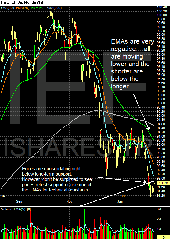
The above three areas of the markets give us the following points.

1.) Equities continue to move higher, although the rate of participation is decreasing.

2.) Bonds have started to sell-off and are at important technical levels. This market segment was probably over-bought over the last few years and is now returning to a price level more in line with the current economic situation. However, this sell-off should provide some fuel to the equity market rally.

3.) The dollar is consolidating after a sell-off. I'll discuss the dollar in more detail in the next post.

Sunday, February 13, 2011

The Inter-relatioinshp of Interest Rates, the Dollar and Commodities

Let's start with these relationships

1.) The dollar's value increases when interest rates increase. The reason for this relationship is currency traders -- after purchasing a currency -- park their holdings in the new currency in an interest bearing account. While U.S. short term rates are still some of the lowest in the developed world, long-term rates are among the highest.

2.) The dollar's value increases as the economy improves. The reason for this is a growing economy attracts foreign investment -- outside investors want to invest in a winner. In addition, consider this story for the WSJ:

A newly resilient economy is poised to expand this year at its fastest pace since 2003, thanks in part to brisk spending by consumers and businesses.

In a new Wall Street Journal survey, many economists ratcheted up their growth forecasts because of recent reports suggesting a greater willingness to spend.

3.) It's also important to note the dollar is still a store of value in the commodities market and a safe harbor currency in times of trouble.

Given these three facts, it's important to remember that going forward, the dollar may have a floor underneath prices.


Friday, February 11, 2011

Weekly Indicators: Some dishes are best served cold edition

- by New Deal democrat

Patience is said to be a virtue. So you must be a little patient with me until I get to my promised third installment discussing last week's employment report. I'll put it up early next week. This week I've been engaged in a kind of audit that I decided really needed to be finished before tonight, although the final result requires patience on my part as well.

There really was little monthly data this week - consumer confidence edged up. So let me take this opportunity for a reminder that I first started looking at high frequency indicators to see if the recovery had "legs." Then last summer they accurately and in real time showed that the economy was experiencing a slowdown but no double-dip. Now I am mainly watching for sings of re-acceleration (initial jobless claims) vs. the choke collar of Oil prices.

Speaking of cold, it appears the succession of bad winter storms last week really played havoc with this week's high frequency data:

The BLS reported initial jobless claims of 383,000, and the 4 week moving average fell to 416,000. While I'd love to be able to do a happy-dance, and I hope that this result is "the real thing, " the fact is that initial claims have been very erratic due to the weather. The 457,000 reading a few weeks ago was due to delayed filing of claims, and I suspect we will see another spike next week. The 4 week average is a much better "read" and that has been generally moving in a range for over a month. In short, take this week's reading with an extra grain of salt.

The Mortgage Bankers' Association reported an decrease of 5.5% in seasonally adjusted mortgage applications last week, which maintains this series generally in a flat range since last June. Refinancing decreased 7.7%, and remains near its lowest point in a year. Higher mortgage rates have really bitten these two series. A decline in refinancing in particular means slower consumer deleveraging.

Gas at the pump made a new post-recession high at $3.13 a gallon, while Oil ended the week at about $86.50 a barrel. Gasoline usage was significantly lower than last year - over 200,000 barrels a day, or 2.6%. This is the second consecutive negative YoY reading, and is more evidence that gas prices are beginning to "bite" - but again the unusually stormy winter weather could be the culprit.

The American Staffing Association Index remained at 90 for the week ending January 30. This was 13% higher than a year ago, and remains only about 9% below the peak January levels from 2008. This is equal to the closest so far the index has come to pre-recession levels.

Railfax, for the first time in a long time, showed total rail shipments were -0.6% lower in the week ending February 5 than during the same week last year. Shipments of waste and scrap metal were actually below last year's levels, as was intermodal freight, and food and grains. At this point, then the slowdown cannot be dismissed, but again it is possible that an unusually stormy winter is playing a role, as municipalities devote resources to plowing rather than recycling and trash. Since Canadian railroads were particularly hard hit, it may be that there is a unique Canadian factor impacting these results.

The ICSC reported that same store sales for the week of February 5 increased 2.5% YoY, and 2.2% week over week. Shoppertrak reported that sales rose 1.1% YoY for the week ending February 5, and also increased 1.2% from the week before. These are very tepid compared with recent readings.

Weekly BAA commercial bond rose +.09% to6.17%. This is at the top end of its range over the last two months. This compares with a 0.14% increase in the yields of 10 year treasuries, which have also been in a tight range for over a month. This certainly does not imply relative weakness for corporate bonds.

M1 was up 2% w/w, up 1.2% M/M and up a strong 9.0% YoY, so Real M1 is up 7.6%. M2 was up 0.4% w/w, up 0.2% M/M and up 4.3% YoY, so Real M2 is up 2.9%. Both of these are now in ranges where economic expansion has always taken place.

Adjusting +1.07% due to the recent tax compromise, the Daily Treasury Statement showed adjusted receipts for the first 7 days of February of $54.4 B vs. $57.7 B a year ago, for a loss -6.0% YoY. For the last 20 days, $148.3 B was collected vs. $138.6 B a year ago, for a gain of $6.5%

In short, one of two things happened in the first week of February: (1) the economy went into a sudden nosedive; or (2) the winter storms caused a decline in almost all activities - including layoffs. I vote for (2), but we'll see in a few weeks.

In the meantime, have a good weekend!

Bernanke on the Economy

From his recent testimony:

The economic recovery that began in the middle of 2009 appears to have strengthened in the past few months, although the unemployment rate remains high. The initial phase of the recovery, which occurred in the second half of 2009 and in early 2010, was in large part attributable to the stabilization of the financial system, the effects of expansionary monetary and fiscal policies, and the strong boost to production from businesses rebuilding their depleted inventories. But economic growth slowed significantly last spring and concerns about the durability of the recovery intensified as the impetus from inventory building and fiscal stimulus diminished and as Europe's fiscal and banking problems roiled global financial markets.

More recently, however, we have seen increased evidence that a self-sustaining recovery in consumer and business spending may be taking hold. Notably, real consumer spending rose at an annual rate of more than 4 percent in the fourth quarter. Although strong sales of motor vehicles accounted for a significant portion of this pickup, the recent gains in consumer spending appear reasonably broad based. Business investment in new equipment and software increased robustly throughout much of last year, as firms replaced aging equipment and as the demand for their products and services expanded. Construction remains weak, though, reflecting an overhang of vacant and foreclosed homes and continued poor fundamentals for most types of commercial real estate. Overall, improving household and business confidence, accommodative monetary policy, and more-supportive financial conditions, including an apparently increasing willingness of banks to lend, seem likely to result in a more rapid pace of economic recovery in 2011 than we saw last year.

While indicators of spending and production have been encouraging on balance, the job market has improved only slowly. Following the loss of about 8-3/4 million jobs from 2008 through 2009, private-sector employment expanded by a little more than 1 million in 2010. However, this gain was barely sufficient to accommodate the inflow of recent graduates and other new entrants to the labor force and, therefore, not enough to significantly erode the wide margin of slack that remains in our labor market. Notable declines in the unemployment rate in December and January, together with improvement in indicators of job openings and firms' hiring plans, do provide some grounds for optimism on the employment front. Even so, with output growth likely to be moderate for a while and with employers reportedly still reluctant to add to their payrolls, it will be several years before the unemployment rate has returned to a more normal level. Until we see a sustained period of stronger job creation, we cannot consider the recovery to be truly established.

On the inflation front, we have recently seen increases in some highly visible prices, notably for gasoline. Indeed, prices of many industrial and agricultural commodities have risen lately, largely as a result of the very strong demand from fast-growing emerging market economies, coupled, in some cases, with constraints on supply. Nonetheless, overall inflation is still quite low and longer-term inflation expectations have remained stable. Over the 12 months ending in December, prices for all the goods and services consumed by households (as measured by the price index for personal consumption expenditures) increased by only 1.2 percent, down from 2.4 percent over the prior 12 months. To assess underlying trends in inflation, economists also follow several alternative measures of inflation; one such measure is so-called core inflation, which excludes the more volatile food and energy components and therefore can be a better predictor of where overall inflation is headed. Core inflation was only 0.7 percent in 2010, compared with around 2-1/2 percent in 2007, the year before the recession began. Wage growth has slowed as well, with average hourly earnings increasing only 1.7 percent last year. These downward trends in wage and price inflation are not surprising, given the substantial slack in the economy.


Every 4-6 weeks we get some statement from the Federal Reserve which provides a good comprehensive overview of the economic situation. This is incredibly important, as it allows us to continually reevaluate where the economy is at the macro scale, analyzing a large swath of important data, rather than concentrating on a few data points out of context.

Simply put, we're in much better shape now. The latest GDP report and latest Beige Book (see here, here, and here) all show a far better economic picture. Consumer spending has rebounded, manufacturing is very strong, services are improving and we're finally seeing a little inflation. The sum total of these factors is -- as Bernake notes -- "increased evidence that a self-sustaining recovery in consumer and business spending may be taking hold."

We have two problem areas: real estate and jobs. While commercial real estate is doing better residential real estate is still dogged by a massive inventory overhang which won't clear up anytime soon. The employment situation is also poor with the unemployment rate still high. The real issue is the last of meaningful job creation. As I noted this week, the real issue here isn't that we're not creating jobs; we're not creating enough of them. I'm still not sure what the issue is here, or whether it's a combination of these issues.

However, the bottom line is clear: we're doing pretty well right now.

Yesterday's Market


Thursday, February 10, 2011

Chinese Drought Will Add to Food Inflation

From the WSJ:

A United Nations agency said this year's wheat crop is at risk in at least five Chinese provinces, echoing continuous warnings from China that its major northern wheat growing areas are facing an epic drought.

In a rare special early warning global alert, the U.N. Food and Agriculture Organization said north China's "ongoing drought is potentially a serious problem." The Rome-based FAO, which based its notice partly on a stream of warnings from Beijing about the wheat crop, said the provinces primarily affected include Shandong, Jiangsu, Henan, Hebei and Shanxi, which together represent about two-thirds of China's national wheat production.

For weeks, Beijing officials have underscored their concern about risks to the wheat crop, with the state-run Xinhua news agency reporting on Tuesday that the production base in Shandong province "is bracing for its worst drought in 200 years."

.....

Global wheat producers, including in the U.S., have been attentive to the possibility China will import wheat this year at a time when a half-year-old Russian export ban is in place after wildfires there and when Australian producers have faced weeks of adverse weather. On Tuesday, U.S. wheat futures surged to a 30-month high.

Initial Claims Fall Below 400,000

From Bloomberg:

The number of Americans filing first-time claims for unemployment insurance fell to the lowest level since July 2008 last week, showing further strength in the labor market after the jobless rate declined to a 21-month low.

Applications for jobless benefits decreased by 36,000, more than forecast, to 383,000 in the week ended Feb. 4, Labor Department figures showed today. Economists forecast claims would fall to 410,000, according to the median estimate in a Bloomberg News survey. The total number of people receiving unemployment insurance fell, while those collecting extended payments increased.

A slowdown in firings means U.S. companies may begin creating enough jobs to keep unemployment going down after the rate’s biggest two-month decline since 1958. Federal Reserve Chairman Ben S. Bernanke yesterday said the jobless rate will likely stay high “for some time” as companies remain reluctant to add to payrolls.

“The first indication that we’re going to see strength falling into the labor market is a sustainable decline in initial claims,” Lindsey Piegza, an economist at FTN Financial in New York, said before the report. “This is a step in the right direction, signaling that, on the margin, businesses will begin to take on new employees.”

Over the last few weeks, we've seen spikes in this number which were supposedly caused by the weather. Now we know those claims were pretty much true.

Jobless Recoveries, Redux

Over the last three days, I've normalized the employment numbers for the last three jobless recoveries to compare and contrast the performance of the employment numbers. Here are the links to the posts; part 1, part 2 and part 3. All the data compared points 20 months into the recovery.

Here are the summary points.

By 20 months, the 1990s recovery was in full on growth mode. The unemployment rate was dropping, and initial unemployment claims were decreasing, after spiking the first 10 months of the recovery. Both the private sector the the government were creating jobs. In the private sector, service sector growth was strong, while manufacturing employment -- after dropping for the first 10 or so months -- was rebounding.

In contrast, the early 2000s recovery was languishing. After 20 months of recovery, the unemployment rate had increased and initial unemployment claims were still elevated. Total employees had decreased, with the decrease coming entirely in the private sector. While the service sector was creating some jobs, the manufacturing sector was still bleeding jobs.

Despite having higher absolute levels, the relative performance of both initial unemployment claims and the unemployment rate for the current recovery are in fact the best of the three recoveries. Overall job growth has increased slightly; while government jobs spiked due to the census hiring, their totals after 20 months of recovery are in fact noticeably lower than the previous two recoveries. Private sector employment is responsible for all the job gains, with both the service sector and manufacturing contributing to overall growth.

It's a misnomer to call the early 90s recovery jobless after 20 months; that recovery was seeing good growth across a variety of sectors by this time.

By 20 months, the 2000s recovery was bleeding jobs, primarily in the manufacturing sector. It was seeing some job growth in the service sector, but not really a meaningful amount.

The current recovery is seeing job growth in both service and manufacturing; the central problem is degree; considering the massive bleeding that occurred in 2008 far brisker job creation is needed going forward.

Yesterday's Market


Click on all images for a larger image


Wednesday, February 9, 2011

Another Day, Another Journalist Embarrasses Himself

It appears that each day we can find some website publishing an intellectually embarrassing screed from someone who tries to pretend they actually know something about economic or statistics. For today, I would like to highlight this piece by Charles Hugh Smith that is featured on CNNFN. Not only (as I will show) does Mr. Smith have no idea what he is talking about, but his conclusions show that he was much more interested in pushing his (wrong) worldview than pursuing any actual academic rigor with this opinion piece (it has to be called an opinion piece because it is almost completely bereft of facts).

Let us begin with Mr. Smith's complete misunderstanding of the Household Survey , which is exactly as the name implies, a survey of households (60,000 to be precise) from which the BLS gets the numbers for the labor force, unemployed, employed, the unemployment rate, etc. Mr. Smith states:
"This ongoing adjustment of who gets counted as part of the labor force leads statisticians to lower the unemployment rate -- even though the number of employed people has barely ticked up."

Of course, this statement is completely wrong, as those surveyed determine whether they are in the labor force or not, not some magical BLS adjustment. Mr. Smith then goes on to state:

"Given this substantial increase in population every year, we might reasonably expect the civilian labor force to expand proportionally, as students graduate and new immigrants enter the workforce."

Of course, what Mr. Smith misses completely is that while we do have an increasing population, we also have an aging one, with about 10,000 people a day turning 65 in this country and retired people are not counted in the labor force (again they have to self select as being retired age alone doesn't put them in this category). And when we couple the number turning 65 with all those turning at least 62 (the point at which one can take early social security benefits), we may (and I say may) have some explanation of why the labor force could be shrinking.

Now, for the most glaring error that Mr. Smith makes, which showcases that he neither understands how the Household Survey works nor has any desire to do so:

"When unemployed people stop looking for jobs at their local unemployment office, the government no longer counts them as unemployed. That's how the number of unemployed can drop from 15 million in November 2010 to 13.8 million in January 2011, a decline of 1.2 million, even though the economy created only about 400,000 jobs in those three months."

Anyone who has even remotely studied the Household Survey knows that unemployment insurance/benefits have absolutely nothing at all to do with determining the number of unemployed for purposes of the Household Survey. The Household Survey is exactly that, a survey and so long as you say you are currently looking for work you count as unemployed (regardless of benefit status). Also, we must note that even those who are no longer looking, but would still like to have a job are broken out from the generic "not in the labor force" category and this breakout category actually decreased (by a little) last month, which means that while the number not in the labor force jumped a lot in January, the number of those who would still like a job did not (which pretty well flushes Mr. Smith's thesis down the toilet). But we aren't done here just yet.

The final error Mr. Smith makes is in his chastisement of the infamous birth/death adjustment about which Mr. Smith states:

"Depending on what the "black box (he is referring to the birth/death adjustment - SilverOz)" issues every month (the BLS does not reveal its methodology), the government may report that the economy has created hundreds of thousands of new jobs -- that are often revised away in estimates a few months later."

I want to just say that it took me less than 30 seconds to find the methodology for the birth/death adjustment on the internet, again showcasing Mr. Smith's research skills. I also want to point out that the BLS has always made adjustments for the birth and death of businesses just that prior to the publication of the birth/death adjustment as a separate number, they were simply included (unattributed) in the normal data/seasonal adjustments.

Finally, I would like to point out the extreme flaw with the basis for Mr. Smith's article: that the unemployment rate cannot really be going down because all we are seeing is a decline in the labor force and number of unemployed, but not job creation. To which, I point Mr. Smith back to December-March of 1982-83. Between December and March of 82/83 the unemployment rate fell .5%, while the labor force lost 496,000 people (the number "not in the labor force" grew by 953,000 during that period), the number of unemployed shrank by 643,000, yet the number of employed only went up by 147,000. And somehow, that recovery seemed to end up being fairly decent if my memory serves me correctly.


The January Jobs report: the Unemployment rate I.

- by New Deal democrat

This is the second of three posts in which I dissect last Friday's jobs reports. On Monday I showed that, even after the BLS benchmark revisions, there was gradual improvement in the jobs reports, and that "the disappointment syndrome" caused almost everybody to overlook that final revisions two months after the original reports showed most monthly jobs reports in line with estimates. As usual, it is always best to average these reports over a 2 or 3 month period to deal with anomalies such as mid-January's unusual southern snowstorm.

But the big head-scratching Friday was how to square the meager 36.000 jobs created as shown in the establishment report with the big drop in unemployment from 9.4% to 9.0% in the household report.

To begin with, you may recall that several months ago I showed that, over the last 45 years, the rate of initial jobless claims (new claims divided by population) almost always could predict within 2% the unemployment rate about 3 months later. The exceptions were during the big recessions of 1974 and the double dip 1980 and 1981 recessions (in which the new claims rate overpredicted unemployment), and this recovery (in which the new claims rate underpredicted unemployment by about 4% as of November!) Here's the graph I ran then:


Take a look at the same graph updated through January:


The big decline in the unemployment rate still puts it about 3% above predicted rates, but supports the correlation's continued viability whereby the initial jobless claims rate is a leading indicator for the unemployment rate.

I also ran a graph, courtesy of Thumbcharts, that compared the 6 month average of new jobless claims with the same data from the year before, and similarly compared the average unemployment rate for the last 6 months with that of a year before. Here is that graph from two months ago:


The graph showed that in every case except for the 1980-1982 "double dip," a decline of 10% as measured of initial jobless claims was followed within 10 months by a similar decline in the unemployment rate

Here is the same graph now:


In this series too the leading relationship between initial claims and the unemployment rate is continuing to manifest itself.

These two series suggest that the decline in the unemployment rate is no fluke. While based on fundamental analysis of the economy, many forecasters were predicting that the unemployment rate would not get down to 9% until the end of 2011, instead it hit that rate in the first month. Further, since the historical relationship between these two series has not fully been resolved (i.e., the unemployment rate is still significantly higher than that predicted by initial jobless claims), one place to look for an economic surprise in the coming months is whether the unemployment rate continues to decline much more quickly than had been anticipated.

Finally, while the leading relationship described above suggests that the surprise decline in the unemployment rate is no fluke, it doesn't tell us *why* the unemployment rate declined as it did, and if the reasons are good news or bad. There are probably three main factors at work. That will be described in my next post.

Jobless Recoveries, Part III

Let's continue our look at jobless recoveries by looking at another way to divide the total establishment jobs report into distinct parts: service and manufacturing employment. Remember, all of the charts below are on a scale of 100 to normalize the performance, thereby allowing us to compare the performance of the sectors.

First, note that by 20 months, the 1990ss recovery had rebounded, while the early 2000s recover was still losing jobs. The latest recovery is standing still, having dropped a bit, but then rebounding.


Manufacturing jobs had dropped in the early 1990s recovery, but had started to recover by the 20 month mark. In contrast, the early 2000s recovery was still losing manufacturing jobs at a steep pace. The current recovery has seen a drop in manufacturing jobs, but has also seen a slight rebound.


In comparison, the early 1990s recovery was responsible for a huge increase in service jobs by 20 months. In comparison, neither the 2000 or current recovery is really doing much in terms of service sector job creation.