- by New Deal democrat
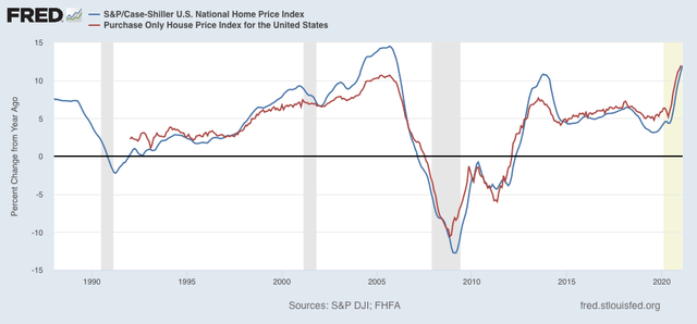
The boom - and maybe insanity - in house price gains continued in February, as both the Case Shiller and FHFA house price indexes increased roughly 1% just since January! The YoY increase for both was almost exactly 12%, as shown in the graph below:

While the YoY increase in house prices match those of the bubble peak, and are, to say the least, not sustainable, they aren’t quite the crisis that they appear at first glance.
That’s because mortgage rates over the 12 month period declined, which makes the affordability of monthly mortgage payments considerably less intense. And in real terms compared with income mortgage payments are still well below their level at the peak of the housing bubble.
Since the peak of the housing bubble in roughly September 2005, house prices increased roughly 33% as of February 2020. With the 12% further increase in the past 12 months, they are now almost 50% higher than in September 2005.
But what is *very* different is mortgage rates.
Here is the average rate for a 30 year mortgage in each of the 3 months:
9/05 - 5.77%
2/20 - 3.47%
2/21 - 3.08%
That means that in nominal, not-inflation-adjusted terms, the monthly mortgage payment in February 2020 as only 2% higher than in September 2005. In February 2021 it was only about 8% higher, even taking the big appreciation of house prices into account.
Over the same period of time - since September 2005 - average hourly wages are up 55%. As of 2019 (the last available measure), median household income was up 48%.
In other words, home buyers in the aggregate have about 50% more income to pay a mortgage bill less than 10% higher than it was in 2005.
In sum, although monthly mortgage payments have increased by about 7% since December, when rates averaged 2.68%, even with the huge price increases that continued through February, housing remains much more affordable than it was in 2005 at the peak of the bubble.