- by New Deal democrat
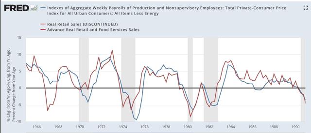
One relationship I have consistently flogged for the past decade is that consumer spending leads employment. That’s still true. Here is one of the graphs on that score going back over 50 years, the YoY% change, averaged quarterly, in real aggregate payrolls (blue) vs. real retail sales (red):
1965-90:
1991-2019:
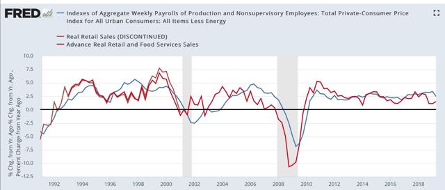
It is absolutely crystal clear that sales have consistently led total payrolls by one to two quarters. (And yet I still see people making this mistake. The other day I read an article on Seeking Alpha that claimed that consumer spending was going to do well because employment was still doing well. NOT TRUE!)
In fact, as shown on the graphs above, a decline below zero in the YoY% change of real retail sales on a quarterly basis has been a short leading harbinger of every single recession in the past 50+ years, with only two false positives (1966 and 2002).
But, in view of the current situation, in which the long leading indicators are strongly hinting at a steep slowdown or recession ahead, what best leads consumer spending?
Over the weekend, Prof. Brad DeLong linked to the twitter thread of Fed economist Prof. Claudia Sahm in which she highlighted the role of household income expectations as measured by the University of Michigan consumer sentiment survey: Unfortunately, there’s no easy graph to look at for those, but here is the data is broken out in chart form:
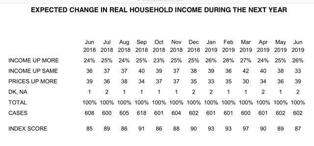
[The data can be found here.]
But is this just a case of “animal spirits?” Or are consumers reacting to real, hard data in deciding that their financial position is likely to improve, remain static, or decline in the coming months?
While there is no silver bullet, I think that consumers in the aggregate are reacting rationally to changes that they see affecting their pocketbooks. Among those changes are:
- interest rates charged on loans
- the tightening or loosening of lending standards
- an increase or decrease in the underlying inflation rate that is not seen as short-term
- the improvement, stagnation, or decline of the “hiring” component of the jobs market (as opposed to the “firing” or overall job-leaving component)
I’ve probably downloaded about 100 graphs going through these components and more, most of which would bore you to tears. But I’ll go through some of the more salient relationships I’ve found in future posts.