- by New Deal democrat
Three months ago when the poor February jobs report came out, I was just about the only commentator who saw it as a harbinger rather than an outlier. On Friday the naysayers got silenced.
Let’s see how the more leading aspects of the employment report played out, with an eye towards the near future. To cut to the chase, expect more lackluster total payroll gains in the coming months, and further, it is a near certainty that there will be layoffs in manufacturing, probably totaling at least 50,000.
Let’s see how the more leading aspects of the employment report played out, with an eye towards the near future. To cut to the chase, expect more lackluster total payroll gains in the coming months, and further, it is a near certainty that there will be layoffs in manufacturing, probably totaling at least 50,000.
But first, let’s take a quick look at wage growth, which has pulled back slightly from the beginning of this year. Nominal wage growth is significant because employers do not give out inflation-indexed wage increases, and the pattern is that, as underemployment decreases below about 9%, wage growth increases:
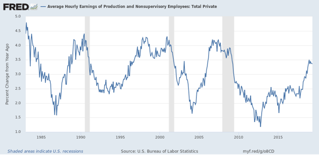
That isn’t cause for concern yet, given the noise in the series, including at least two prior temporary downturns in this expansion alone. But on the other hand, note that an extended period of a slowdown or flatness in growth has tended to occur in the final stage of expansions. This is best shown when we track the YoY change in percent of wage growth itself (i.e., the second derivative), averaged quarterly in the graph below:
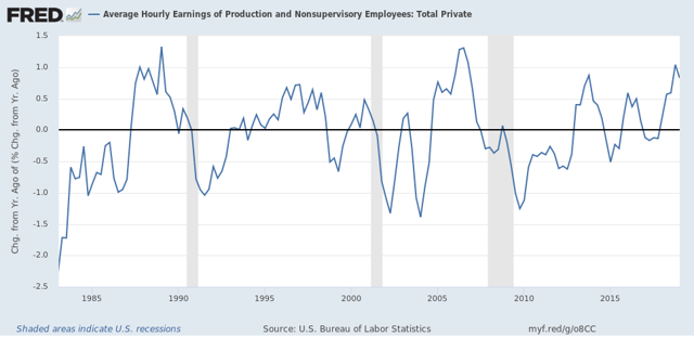
After a mid- to late-cycle acceleration in wage growth, there has been a sharp deceleration to near or past zero in each of the last three cycles. So far there is no significant such deceleration, but if growth-in-the-growth falls to 0.5% or below, that would be a yellow flag for wages and for an oncoming downturn in the economy.
Now let’s turn to the “leading” metrics in the report. Here is the alternate household report jobs number (blue) vs. the establishment report jobs number (red):
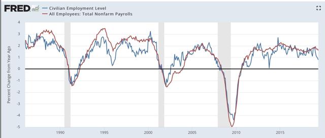
While the headline establishment report is much less noisy, it is thought that the household report may lead at turning points. If that is so at present, we can expect more poor headline jobs numbers in coming months to “resolve” the disparity.
Next, here’s an update on the m/m% change in manufacturing, residential construction, and temporary employment:
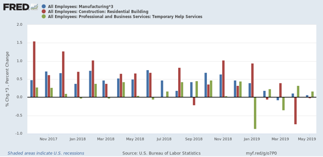
The sharp slowing since the beginning of this year is apparent. Still, manufacturing and temporary jobs held on to positive numbers in May. Earlier this year when I took a lengthy look at those sectors, I suggested that gains of less than 0.2% m/m were a yellow flag, while negative numbers by at least two sectors over a number of months were a red flag. For now, we have a slowdown, but no imminent sign of recession.
Here is the broader goods sector of which manufacturing and construction are big parts vs. the service sector:
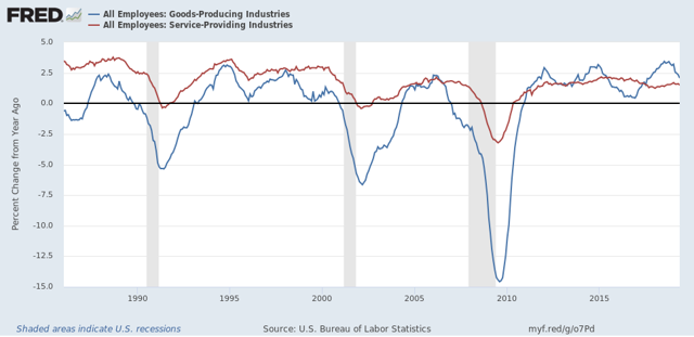
Note that goods-production jobs are much more cyclical, and have turned negative YoY before each of the last three recessions. They are still well into positive territory now.
Finally, expect significant layoffs in manufacturing.
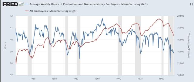
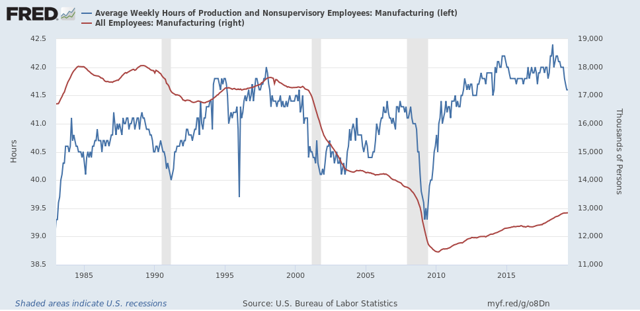
The most leading metric of all is the manufacturing workweek. This turns down before manufacturing jobs themselves turn down (I.e., hours are cut back before jobs are cut back). These are now down -0.8 hours from peak (blue). The below graphs compares them with manufacturing employment (red):
That isn’t cause for concern yet, given the noise in the series, including at least two prior temporary downturns in this expansion alone. But on the other hand, note that an extended period of a slowdown or flatness in growth has tended to occur in the final stage of expansions. This is best shown when we track the YoY change in percent of wage growth itself (i.e., the second derivative), averaged quarterly in the graph below:
After a mid- to late-cycle acceleration in wage growth, there has been a sharp deceleration to near or past zero in each of the last three cycles. So far there is no significant such deceleration, but if growth-in-the-growth falls to 0.5% or below, that would be a yellow flag for wages and for an oncoming downturn in the economy.
Now let’s turn to the “leading” metrics in the report. Here is the alternate household report jobs number (blue) vs. the establishment report jobs number (red):
While the headline establishment report is much less noisy, it is thought that the household report may lead at turning points. If that is so at present, we can expect more poor headline jobs numbers in coming months to “resolve” the disparity.
Next, here’s an update on the m/m% change in manufacturing, residential construction, and temporary employment:
The sharp slowing since the beginning of this year is apparent. Still, manufacturing and temporary jobs held on to positive numbers in May. Earlier this year when I took a lengthy look at those sectors, I suggested that gains of less than 0.2% m/m were a yellow flag, while negative numbers by at least two sectors over a number of months were a red flag. For now, we have a slowdown, but no imminent sign of recession.
Here is the broader goods sector of which manufacturing and construction are big parts vs. the service sector:
Note that goods-production jobs are much more cyclical, and have turned negative YoY before each of the last three recessions. They are still well into positive territory now.
Finally, expect significant layoffs in manufacturing.
The most leading metric of all is the manufacturing workweek. This turns down before manufacturing jobs themselves turn down (I.e., hours are cut back before jobs are cut back). These are now down -0.8 hours from peak (blue). The below graphs compares them with manufacturing employment (red):
While a downturn of -0.8 hours is significant, there have been six prior occasions (1952, 1966-68, 1978, 1985, 1996, and 1998-99) when there were declines of at least as much for more than one month without a recession ensuing. Unsurprisingly, these have usually coincided with economic slowdowns and yield curve flatness and inversions.
On the other hand, as you can see (if you squint a little!) all of these occasions, including those that did not result in recessions, have coincided with an actual decline in manufacturing employment. The smallest of these was a loss of -85,000 jobs in 1995 vs. for example, a loss of -170,000 in the 2002-03 slowdown.
This is a warning that manufacturing jobs, which have not turned down yet, are likely to do so in the months ahead. Since only about 2/3’s as many people work in manufacturing as in the 1990s, an equivalent loss to the 1995 loss would be a little less than 60,000 jobs.
Another way to look at the same relationship is the YoY% change in each (averaged quarterly to cut down on noise, hours*2 for scale):
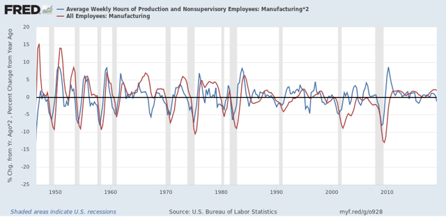
Going back 70+ years, every time there has been a cumulative YoY decline of 2% in hours, a YoY decline in manufacturing jobs has followed, on all but two occasions between zero and two quarters after YoY hours turned negative. [In 2015-16, there was a cumulative -1.9% decline in hours, and just barely a YoY loss of manufacturing jobs four quarters later.] If there is no improvement in the manufacturing workweek in June, that 2% threshold will have been reached. In that case we should expect at least about 30,000 job losses in manufacturing by the end of this year.
To sum up, Friday’s jobs report showed us multiple signs of present weakness in leading sectors, suggesting continued and more widespread weakness to come, and while there are no signs of an imminent actual downturn in the economy, if past patterns are followed, there will be significant losses in manufacturing employment in the months to come.
To sum up, Friday’s jobs report showed us multiple signs of present weakness in leading sectors, suggesting continued and more widespread weakness to come, and while there are no signs of an imminent actual downturn in the economy, if past patterns are followed, there will be significant losses in manufacturing employment in the months to come.