Saturday, April 15, 2017
Weekly Indicators for April 10 - 14 at XE.com
- by New Deal democrat
My Weekly Indicators post is up at XE.com.
There is a major disconnect between now much retailers report they are selling and consumers report they are buying. I am calling it the Amazon.com effect.


Friday, April 14, 2017
Stallling gas prices --> March deflation --> higher real indicators
- by New Deal democrat
There were a number of important indicators that were nominally lower or flat for March that were up in real terms (including a big pop in wages), thanks to the effects of stalling gas prices on the consumer price index for March.
This post is up at XE.com.
Thursday, April 13, 2017
Five graphs for 2017: Q1 update
- by New Deal democrat
At the beginning of the year, I identified 5 trends that bore particular watching, primarily as potentially setting the stage for a recession next year. Now that we have the first 3 months of data, let's take a look at each of them.
#5 Gas Prices
One potential pressure point on the economy is gas prices, which appear to have made a long- bottom in January of 2016. As they began to rise, consumer inflation has increased from non-existent to almost 3%.So the issue is, will they rise even further and drive inflation even higher?
So far this year, that has not been the case. Typically it has taken a 40% YoY increase in gas prices to shock the consumer. While gas price increases did briefly approach that point, they have backed off considerably:

#4 The US$
Another potential pressure point on the economy is a big increase in the relative value of the US$, which was part of the shallow industrial recession of 2015. The $ started to rise again after the November election. Here the story is more mixed:

Against all currencies, the US$ has not risen too much, while against major currencies, it has risen just enough to have some negative effect.
#3 Residential construction spending vs. mortgage rates
Another data point which rose sharply after the November election was interest rates. Generally speaking, home building changes in the opposite direction of interest rates. So would the increase in interest rates (e.g., mortgages) cause new residential construction to back off?
Not yet:

The resilience of the housing data has been the most positive surprise of the year.
#2 The Fed Funds rate vs. consumer inflation
If consumer inflation rose past the magic 2% Fed target, would the Fed chase it? The Fed's preferrred measure is personal consumption expenditures, but consumer inflation YoY as of March was up +2.8%. The Fed did duly hike interest rates:

The expectation seems to be that unless there is some surprising slowing, several more interest rate hikes are in store. So far the yield curve (left graph below) isn't misbehaving (light red is last August, dark red is now):

But it will be difficult to avoid a compression if not an inversion in interest rates should the Fed stay on its current course with several more hikes.
#1 Real retail sales vs. real average hourly earnings
The final graph comes from my "alternate" recession forecasting model which turns on consumers running out of options to to continue increasing purchases (i.e., no interest rate financing, no wage real wage increases, and no increasing assets to cash in). The long term relationship has been that sales lead jobs, and jobs lead nominal wage increases, but real sales vs. wages are somewhat more nuanced. In the inflationary era, through the early 1990s, YoY wareal wage growth actually slightly led sales. In the deflationary era that dates from the alter 1990s, if anything the two are a mirror image, but in every case but 2001 (where real wage growth just decelerated rather than declined), both have been negative going into recessions:

Focusing on the last 20 years makging the deflationaary era, at present with inflation up, real wages are actually down YoY at this point:

I would expect to see both sales and wages stall out before the onset of the next recession. So far, sales are holding up.
Bottom line: with the exception of the US$ against major currencies, and the consumer inflation rate, for now the signals from the data series I have highlighted are all still green.
Wednesday, April 12, 2017
Labor Market Conditions Index and JOLTS: late cycle, but no imminent downturn
- by New Deal democrat
Time for the monthly update of the Labor Market Conditions Index and JOLTs report. Both of these give more in-depth data on the jobs market. The reported lags one month, so this week's reports were for February. While both of these have some merit as leading indicators, the former is recently constructed and back-fitted, so this is the first "real-time" business cycle it is reporting on. The latter is less than 20 years old, and covers only one complete labor market cycle. Bottom line: while both are useful, have grains of salt handy.
First, let's take a look at this morning's JOLTs report. While most people focus on openings (blue in the graph below), it is not really "hard" data, since companies can advertise openings solely for the purpose of collecting resumes. They might also not be receiving applicants because the pay they are offering is too low. Thus, I prefer to focus on actual hires (red). Anyway, here are both:

Both have trended up in the last couple of months, although not strongly. Overall, the trend in both has been sideways for about the last 18 months, reminiscent of 2005-06. Like so much else, late cycle but not indicative of any imminent downturn.
The trend in quits looks a little more positive:

So that's good.
Turning to the Labor Market Conditions Index, this has been weakly positive or even slightly negative since the beginning of 2016:

As constructed, it has typically had negative values for about a year before any recession, and usually at least to -5 before one is imminent. So no recession this year is indicated.
Oddly, FRED only shows the value of the m/m "change" in the index. Doug Short has the history of the absolute values:

Note in the 1980s and 1990s, there were brief downturns without there being any recessions. This coincided with Fed tightening and loosening within an expansion. What we've been seeing from this index looks once again like late cycle, but with no downturn imminent.
Tuesday, April 11, 2017
If Hot Air Had Any Journalistic Integrity, They'd Be Printing a Retraction
Jazz Shaw of the Blog Hot Air has routinely campaigned against the minimum wage. Like most non-educated commentators, he uses a simple supply and demand model to support his assumption. His logic works something like this: increasing the minimum wage means the cost of labor increases; increasing cost = declining demand.
Unfortunately, this model does not fully capture all the nuances of the minimum wage. Alan Krueger was one of the first economists to note that increasing the minimum wage has macroeconomic benefits, the most of important of which is to increase income. And consumers in the lower range of income are far more likely to increase spending in proportion to an increase in their wages. (BTW: this is Keynesian 101: it assumes the marginal propensity to consume among lower incomes is higher). You can read the full study here.
Now we have yet another study -- this time from the National Employment Law Project -- that finds the same thing. The entire study is here. But the following fact drives a stake through Mr. Shaw's argument:

If Hot Air had any policy regarding retractions or corrections, they would print one. Or, they would print their research that contradicts the above referenced papers. But they won't do either because they have no ethics nor supporting research. And while they have opinions, those opinions are clearly not supported by data.
Monday, April 10, 2017
Prime working age employment up, participation up (finally) - now how about wages?
- by New Deal democrat
The March jobs report finishes the first quarter, which make it easier to update some labor participation trends, which, along with wages, has really lagged in this nearly 8 year old expansion.
In order to eliminate the issue of the huge Baby Boom generation retiring, and to a lesser extent college and graduate students, we have some good data on the prime age 25-54 demographic.
Historically, labor participation continues to decline after a recession ends, and picks up after the employment to population ratio does. Put another way, people come off the sidelines and enter the workforces once the unemployment rate declines significantly. Here's the long term trend, comparing the YoY% change in each:

Now let's zoom in on this expansion:

Here's the actual percentages:

As you can see, the employment-population ratio for prime age workers bottomed in 2010-11 while participation continued to decline until 2015! Meanwhile the YoY change in the prime age employment to population ratio, shown in the first graph above, bottomed out near the end of the recession in 2009, while the labor force participation rate continued to decline until early 2011, almost 2 years later.
In order to eliminate the issue of the huge Baby Boom generation retiring, and to a lesser extent college and graduate students, we have some good data on the prime age 25-54 demographic.
Historically, labor participation continues to decline after a recession ends, and picks up after the employment to population ratio does. Put another way, people come off the sidelines and enter the workforces once the unemployment rate declines significantly. Here's the long term trend, comparing the YoY% change in each:
Now let's zoom in on this expansion:
Here's the actual percentages:
As you can see, the employment-population ratio for prime age workers bottomed in 2010-11 while participation continued to decline until 2015! Meanwhile the YoY change in the prime age employment to population ratio, shown in the first graph above, bottomed out near the end of the recession in 2009, while the labor force participation rate continued to decline until early 2011, almost 2 years later.
While participation has picked up a lot, it remains about 2% below its 2006 peak, and more than 3% below its 1999 peak:

It is disconcerting that so long after the end of the Great Recession, participation is still lagging.
But if participation has been lagging (but finally improving) wages have lagged even more.
But if participation has been lagging (but finally improving) wages have lagged even more.
Let me start with a reminder that there appears to be a complex interaction between participation and wages. In general, wages pick up a little after participation. BUT, if participation increases unusually rapidly, it will tend to drive down wage growth, as it did in the later 1970s and 1980s:

We have had a more rapid increase in participation in the last two years than at any time since 1989 with the exception of 1996 (red in the graph below), and that has tended to keep wage growth depressed:

It's counter-intuitive, but the history of the last half century suggests that wage growth will pick up as this increase gets absorbed. We'll see whether, at long last, labor finally gets a significant share of the increased wealth during this expansion.
We have had a more rapid increase in participation in the last two years than at any time since 1989 with the exception of 1996 (red in the graph below), and that has tended to keep wage growth depressed:
It's counter-intuitive, but the history of the last half century suggests that wage growth will pick up as this increase gets absorbed. We'll see whether, at long last, labor finally gets a significant share of the increased wealth during this expansion.
Saturday, April 8, 2017
Weekly Indicators for April 3 - 7 at XE.com
- by New Deal democrat
My Weekly Indicators post is up at XE.com.
The thesis that trouble in the brick and mortar retail sector means We're DOOOMED!!!! is not borne out by the wider array of indicators.
Hot Air "Econ" Bloggers: Still Dumber Than a Box of Rocks
Thanks to a very busy work schedule, I've had less time to monitor and write about the "analysts" at Hot Air. But, now that I've got some time, let me play a bit of catch-up.
First, we have Ed's latest on the employment report, which contains this lovely observation:
The loss in retail jobs is curious, too. Consumer confidence hit a new high in March, part of an upward trend that started in … October 2016. We’ll get the 2017 Q1 GDP report at the end of the month, but the trend on personal consumption expenditures was good for the last three quarters of 2016, finishing with a 3.5% annualized quarter-on-quarter increase in Q4. Some big-box chains are struggling at the moment — JC Penney, Sears among them — so perhaps it’s more of an adjustment within the sector.
Actually, it's more than an "adjustment" within the sector. This may have escaped Ed's vast reading spindle, but there is a little outfit called "Amazon" that has completely upended the retail environment. It's led to several bankruptcies and numerous other store closings. In short -- it's not an "adjustment," it's a complete rethinking of the retail sector. Also observe what Ed doesn't note -- the 53,000 drop in construction jobs and the 50,000 decline in education and and health employment. It's almost as it he can't read a simple table or do simple math.
And then there's Jazz Shaw, the man who relentlessly crusades against increases in the minimum wage. How does his simple (and very incorrect) supply and demand analysis of a resource market jibe with this chart of the Seattle unemployment rate:

Despite raising the minimum wage to $15, Seattle's unemployment rate continued to drop and is now at 2.9%. Once again, the research of Alan Kreuger is born out at the expense of idiots like Jazz.
I realize that picking on the economic skills of Ed and Jazz is unfair. Neither have any formal training in the topic, so they're bound to get basic points wrong. But they continue to write horribly misguided analysis under the erroneous belief that they have meaningful analysis to offer. And that makes them fair game.
Once again, reality -- as in facts and data -- have intruded into Hot Air's little economic world to disprove their basic theories. Will they print retractions or corrections? No -- those are only required for the liberal press. Conservative bloggers have no such code of ethics.
Friday, April 7, 2017
March jobs report: participation up, unemployment down, wage growth miserly
- by New Deal democrat
HEADLINES:
- +98,000 jobs added
- U3 unemployment rate down 0.2% from 4.7% to 4.5%
- U6 underemployment rate down 0.3% from 9.2% to 8.9%
Here are the headlines on wages and the chronic heightened underemployment:
Wages and participation rates
- Not in Labor Force, but Want a Job Now: up +284,000 from 5.597 million to 5.781 million
- Part time for economic reasons: down -151,000 from 5.704 million to 5.553 million
- Employment/population ratio ages 25-54: up +0.2% from 78.3% to 78.5%
- Average Weekly Earnings for Production and Nonsupervisory Personnel: up $.04 from $21.86 to $21.90, up +2.3% YoY. (Note: you may be reading different information about wages elsewhere. They are citing average wages for all private workers. I use wages for nonsupervisory personnel, to come closer to the situation for ordinary workers.)
January was revised downward by -22,000. February was also revised downward by -16,000, for a net change of -38,000.
NOTE: Beginning next month, I will begin keeping track in the headlines of both manufacturing and mining job growth. Better news in these numbers was a central part of Trump's campaign, and after a 3 month grace period, I think it is fair to begin to see how well - or poorly - he is keeping that promise.
The more leading numbers in the report tell us about where the economy is likely to be a few months from now. These were positive with one exception.
- the average manufacturing workweek was fell from 40.8 hours to 40.6 hours. This is one of the 10 components of the LEI.
- construction jobs increased by +6,000. YoY construction jobs are up +177,000.
- manufacturing jobs increased by +11,000, and after being down YoY for a year, in the last two months have now turned up.
- temporary jobs increased by 10,500.
- the number of people unemployed for 5 weeks or less decreased by -232,000 from 2,566,000 to 2,324,000. The post-recession low was set nearly 18 months ago at 2,095,000.
Other important coincident indicators help us paint a more complete picture of the present:
- Overtime fell 0.1 from 3.3 to 3.2 hours.
- Professional and business employment (generally higher- paying jobs) increased by +56,000 and are up +639,000 YoY.
- the index of aggregate hours worked in the economy rose by 0.1 from 106.3 to 106.4
- the index of aggregate payrolls rose by 0.3 from 132.6 to 132.9.
Other news included:
- the alternate jobs number contained in the more volatile household survey increased by +472,000 jobs. This represents an increase of 1,699,000 jobs YoY vs. 2,185,000 in the establishment survey.
- Government jobs rose by +9,000.
- the overall employment to population ratio for all ages 16 and up rose +0.1% from 60.0% to 60.1 m/m and is up +0.2% YoY.
- The labor force participation rate was unchanged month m/m and YoY at 63.0%.
SUMMARY
While the headline for most summaries of this report will probably be the miss in the headline jobs number, the deeper trends appear to be a continuation of what we have seen for the last few months: significant declines in both the unemployment and underemployment rates, a continuing sharp increase in labor force participation (the biggest in nearly 30 years), but continuing wage growth stagnation. These trends are probably linked. The big move from people off the sidelines into the labor market is probably helping keep a lid on wage growth.
The only other negatives in the report is the stubborn high number of people outside of the labor force who want a job now, and the decline in the manufacturing workweek and overtime.
All in all, this was a quite positive late cycle jobs report, as the YoY% gain in jobs continues to decelerate, but remain positive.
Thursday, April 6, 2017
The return of the Doomers: OMG it's a slight pullback!
- by New Deal democrat
There finally was enough of a soft patch in the data for the Doomers to raise their heads out of the peepholes. They're still wrong.
This post is up at XE.com.
Wednesday, April 5, 2017
Jamie Dimon on labor force participatioin and disability
- by New Deal democrat
First of all, sorry for the light posting this week. I've had some urgent business I need to attend to irl.
But I wanted to post this for future reference. Via Business Insider, this is from Jamie Dimon's letter to stockholders:
If the work participation rate for this group [men ages 25-54] went back to just 93% – the current average for the other developed nations – approximately 10 million more people would be working in the United States. Some other highly disturbing facts include: Fifty-seven percent of these non-working males are on disability ....I don't know where he got the 57% statistic from, but if it is true it is potent evidence that the main factor behind the 60 year long decline in prime age labor force participation by men is an increase in those on disability, probably due to both the expansion of the program, and better longevity and diagnostics -- and probably also tied in to opiate addiction as well.
Sunday, April 2, 2017
Saturday, April 1, 2017
Weekly Indicators for March 27 - 31 at XE.com
- by New Deal democrat
The vast majority of all indicators remain very positive. This post is up at XE.com
Friday, March 31, 2017
Positive Q4 2016 profits help long term outlook
- by New Deal democrat
Corporate profits are a long leading indicator, but they are reported with a long lag. So Q4 2016 profits were finally reported yesterday. This post is up at XE.com.
Thursday, March 30, 2017
Does productivity growth lead to wage growth? "Not really, no."
- by New Deal democrat
I've seen a few articles recently claiming that low wage growth is because productivity by workers has been stalling. A convenient way to absolve the oligarchy.
Except, if the theory were true, we should see bigger wage gains in the sectors of the economy with the most productivity growth.
Well, some British researchers studied that, and here is what they found:
Does productivity growth help predict wage growth at an industry level? Not really, no. The distribution of productivity growth across industries is positively correlated with subsequent wage growth – industries with higher productivity growth now will tend to have higher wage growth in subsequent quarters. However, productivity growth has little additional value in predicting wage growth over and above univariate models....
The real conclusion is buried in the prior discussion:
These correlations may also tell us something about how an increase in productivity in a particular industry feeds through into real wages. Rather than bidding up relative nominal wages (and therefore, the relative RCW in that industry), an increase in productivity leads to lower relative prices for the output of that industry, increasing RPW for given nominal wage. This boosts the real consumption wages of workers in all industries.
So, productivity gains lead to a deceleration in consumer inflation, *not* better nominal wage growth.
Oops!
Ultimately, wage growth isn't about productivity. It's about bargaining power. And bargaining power is the biggest blind spot of most macroeconomic theory.
Wednesday, March 29, 2017
Wage growth and labor force participation: a Big Picture summation
- by New Deal democrat
The jobs and wages of average Americans is a major focus of my blogging, since they are a major component of Americans' well-being.
Recently I've written quite a bit about the labor force participation rate, especially about prime age individuals. In addition to the big secular influx of women into the workplace between roughly the mid-1960s into the early 1990s, there has been an almost remarkably steady slow decline averaging about -0.3% a year in prime age male participation, going all the way back to the 1950s!
A major element of the participation rate is comparison with other alternatives to being in the labor force.
Two alternatives to labor participation appear to have had a significant effect on the rate.
First, the cost of child care, which has soared over the last 15 years, compared with subdued (or paltry) wage growth has caused many women and some men as well in the prime age demographic to leave the labor force completely and instead raise their children as homemakers.
A second alternative, which appears to be a major determinant of the decline in male participation at least over the last 60 years is the expansion of disability insurance. This increase in disability has been mainly due to neck and back conditions, and together with improved longevity, has increased the incidence of long-term disability dramatically.
It has also been suggested that the huge increase in the incarceration rate from roughly 1980 through 2000 has also played an important role in depressing participation.
In several posts over the last week, I've suggested that the traditional Phillips curve which posited a relationship between lower unemployment and higher wage growth and inflation, is best seen as a special variant of a broader relationship between the labor force participation rate (i.e., the total of those both employed and unemployed). For 46 of the last 52 years it has been true under first a high inflation regime and secondly a low inflation regime that an increase in labor force participation has been correlated with more wage growth.
But on a secular basis, the correlation does not reflect direct causation. Rather, increased labor force participation (blue in the graphs below) appears to lead an improvement in wage growth (red) by about one year. Here's the high-inflation, high labor bargaining power 1960s and 1970s:

and there is the low inflation, low bargaining power era since 1988:

In both of these eras, generally participation led wage growth by about one year.
For completeness purposes, here is the transitional Reagan Administration:
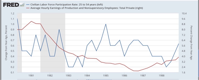
In this transition period, labor bargaining power was curtailed sharply as was inflation. Even so, the leading/lagging relationship appears intact, as lower participation led lower wage growth by about a year.
A more nuanced cyclical feedback mechanism appears to be that too rapid an increase in participation will lead either to higher inflation (the 1960s and 1970s) or lower short term wage growth (the 1980s to present. To show that, below is a variation on the misery index. The "misery index" came out of the 1970s and added the inflation rate to the unemployment rate. In the graph below, I have double-weighted inflation. the only major departures between this "misery index" and labor force participation are the Oil shocks of 1974, 1979, 1990, and 2008:

Let me wrap up this compendium on labor force participation by applying this to our present situation. In the last 1 1/2 years, there has been one of the two biggest surges in participation in the last 30 years, meaning that wage growth has stalled out:

If this increase in the labor force is successfully absorbed into the economy, improved wage growth ought to resume as early as later this year.
Tuesday, March 28, 2017
Variations on the Phillips curve: labor force participation and wage growth
- by New Deal democrat
Over the last month or so, in a few posts I have looked at the relationship between labor force participation, wages, and unemployment. Last week I looked at several variations on the Phillips Curve -- the proposed relationship between inflation and the unemployment rate. While over a single business expansion the relationship seems to work, i.e., lower unemployment rates correlate with higher inflation, that hasn't been true over a longer term secular basis, and it specifically reverses during and after severe recessions, where higher (but declining) unemployment rates have been correlated with higher (and declining) inflation.
But a much tighter relationship appears to exist between the labor force participation rate (the total employed plus unemployed as a share of population) and wage growth:

We have two secular regimes where higher participation is correlated with higher wage growth separated by a brief transition where higher participation was correlated with a sharp decline in wage growth.
Let's break it down. First, here are the inflationary 1960s and 1970s, where there was also a great deal of labor bargaining power due to strong unions:

Here is the low inflation late 1980s to the present, where there has been very little labor bargaining power:

In both of these cases, for a total of almost 45 of the last 50+ years, higher wage growth has been correlated with higher labor force participation.
Here is the brief transition period during the 1980s Reagan Administration, where both inflation and labor bargaining power sharply declined:

The bottom line is that, once we take into account labor bargaining power, there appears to be a very good and durable relationship between changes in prime age labor force participation and
growth in wages.
But of course, correlation is not causation, and I have suggested in prior posts that if anything, wage growth may lag labor force participation, with some complex mutual causation. I will wrap this thought process up in one final post later this week.
Sunday, March 26, 2017
A thought for Sunday: Thank You, Freedom Caucus!!! Plus, Democats should offer a plan to "Reform and Improve" Obamacare
- by New Deal democrat
First of all, thank the Great Flying Spaghetti Monster for the GOP's Freedom Caucus!!! They have been the best friends Progressives like myself could have hoped for.
Every time the mainline GOP or corporatist Democrats wanted to move the country back to 1929, the Freedom Caucus has insisted that nothing short of 1859 will do. By refusing to take "yes" for an answer, they have again and again -- in the Debt Ceiling Debacle of 2011, in the "Fiscal Cliff" of 2012, and again with TrumpRyancare this past week -- single-handedly kept the US in the late 20th Century.
Secondly, I hope the Democratic Party does not slip back into passivity on Obamacare simply because they have won this battle. I strongly suspect that the main reason Trump is implacably against "Obamacare" is because Obama humiliated him at the White House Correspondents' Dinner once upon a time, and he is nothing if not vengeful. He wants to obliterate Obama's legacy.
So Democrats need to make a big stink any time the Trump Administration undercuts Obamacare provisions to try to make it fail (as they have already done in several respects, e.g., state waivers).
Beyond that, Obamacare does have some significant problems. The individual mandate is hated, and the penalty isn't big enough. More young people need to buy in. Further, some of the Exchanges and health care provider networks are too narrow, and in a few states they are in big trouble. Complacency is not a winning strategy.
If Democrats truly care about making this country better for the vast majority of its population, now that most people are finally of the opinion that health care ought to be reasonably available to everybody, not just if their employer offers it, Democrats should respond to the GOP's deplorable "repeal and replace" efforts with a promise to "reform and improve" Obamacare should they gain a Congressional majority.
How would a plan to "reform and improve" Obamacare work? There is renewed talk of "Medicare for All" and if the public can be sold on that, I certainly have no problem. But I suspect the public is not interested in "Medicare for All." So what is a viable Plan B?
The goals ought to be:
1. universal coverage. Obamacare still leaves about 10% of the population uncovered.
2. better plans. Too many of the Bronze and Silver plans have sky-high deductibles and copays, making them little more than "junk insurance."
3. administrative efficiency. There are too many potential side-by-side bureaucracies: Medicare, Medicaid, SCHIP, private exchange providers, employer-provided insurance, auto and homeowner medical coverage, and potentially a "public option" provider. The less redundancy among providers, the more the cost savings which can be plowed into cheaper premiums and better coverage.
Two elements of a viable Plan B are well-known: the "public option" and age 55+ (or at least age 62+) Medicare buy-in. These will ensure wider choices, more competition, and to the extent older workers choose to retire early with the Medicare buy-in, lower premiums and a healthier risk pool in the Exchanges.
Additionally, Plan B ought to include a reform to abolish the individual mandate and penalty and replace them with automatic enrollment in a basic health care plan.
Here's how I envision it would work. Just like SS, Medicare, unemployment and disability deductions to paychecks, establish a Health Care automatic deductible. If your employer offers healthcare, the deductible is reduced by the amount of the premium, all the way to zero if applicable.
If your employer doesn't offer healthcare, if you are under age 40, you are automatically enrolled in the least expensive Bronze plan in your state. If you are 40 or older, you are automatically enrolled in the least expensive Silver plan in your state.
The deductible would also include a small contribution towards Medicaid. Then, if you are unemployed, you are automatically enrolled in Medicaid, but can continue with the silver or bronze plan as above if you choose.
The Kaiser Foundation estimated that in 2015, the average worker paid about $1200 per year for their employer provided health care, and the employer picked up another $4800 for a total of $6000 per year. This out of an average annual salary of about $30,000. This boils down to roughly a 4% deduction from worker wages, with the employer kicking in 16% more.
So, just for example, let's make the automatic deduction the following:
2% for a 20 year old + another 0.1% for the unemployment medical coverage.
3% plus 0.15% for a 30 year old
4% plus 0.2% for a 40 year old
5% plus 0.25% for a 50 year old
6% plus 0.3% for a 60 year old
Employers would pick up the rest up to a total of $6000. The self-employed pick up both the employer and employee share, with subsidies as per existing Obamacare.
Remember that if the employer is already providing coverage, that is counted against the payroll deduction. and the deduction ought to kick in gradually, e.g., 1% a year, so that employees do not sustain any acutal nominal losses.
Now you have a social insurance program that provides universal coverage. And we know that social insurance programs like Social Security, etc., are very popular.
Now you have a social insurance program that provides universal coverage. And we know that social insurance programs like Social Security, etc., are very popular.
Dems could turmpet such a plan to "Reform and Improve" Obamacare, and campaign on pushing for it if they get a Congressional majority. Heck,call it Trumpcare and President Caligula might even sign on!
Subscribe to:
Posts (Atom)