Wednesday, April 30, 2025

Real personal income and spending tell us the consumer economy was expanding nicely in March


 - by New Deal democrat


Aside from the long leading indicators I discussed in that post, GDP is a look in the rear view mirror, because it includes January and February. Personal income and spending for March, although it is part of that GDP report, is therefore more current.


Like the housing data we got earlier this week, income and spending told us that the economy was in reasonably good shape through March. The deflator declined by less than -0.1%, rounding to unchanged. Thus both nominal and real readings for income, at +0.5%, and spending, at +0.7%, were the same.

Here is real personal income and spending normed to 100 since the onset of the pandemic, showing the former up 12.3%, and the latter up 15.8%:


An important issue has been whether personal consumption would actually decline in Q1, which was answered in the GDP report. For March, it was an important increase.

Typically it is real spending on goods which declines before recessions, while real spending on services can increase throughout all but the most severe of them. In March both increased to new post-pandemic highs:


Another important but mixed reading was the personal saving rate, which declined -0.2% to 3.9%. This generally indicates consumer confidence, but the downtrend in the past several years makes this rate among the lowest ever. Although not shown, the average between 200 and 2019 was 5%:


Finally, there are several important coincident indicators used by the NBER in recession dating in this report.

First is real personal income less government transfer payments. This increased 0.7% in March:


Second is real manufacturing and trade sales, which are calculated with a one month delay. In February they increased 0.9%, but remain -0.1% below their December 2024 high:
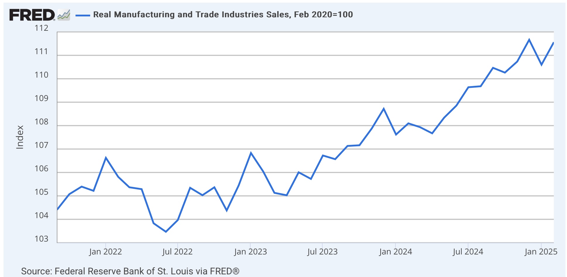


In sum, real personal income and spending in March tells us that despite the negative GDP print, mainly caused by front-running tariffs via a surge in imports, the consumer portion of the US economy remained in expansion.

Despite negative headline, Both long leading indicators in the Q1 GDP report as well as consumer spending, were positive


 - by New Deal democrat


The big headline takeaway in today’s advance report on Q1 GDP, besides the -0.3% number, was that imports deducted about -5.0% on an annualized basis, overcoming a fairly strong 3.0% contribution in real terms from consumer spending. Here’s the breakout graph from the BEA:


The graph tells the story; both real consumption and investment together increased almost 5% in real terms annualized, but were overbalanced by an even bigger surge in imports (counted as a negative). In other words, it is compelling evidence for massive front-running of tariffs by both producers and consumers. That contributed to the on-trend increase in real final sales to domestic purchasers, the typical core of the economy:


But as usual, my focus is on the leading indicators contained in the report. And this quarter, they were both sharply negative.

The first of the two is residential fixed investment, particularly as a percentage of GDP. This is a proxy for housing.

In nominal terms, residential fixed investment rose 1.3%. Because the GDP deflator increased 0.9% quarterly, it rose 0.4% in real terms. Whether measuring in nominal or real terms, it rose as a share of GDP:


Nevertheless both remain below their recent peaks in Q1 2024. Still, the general trend of the past several years has been a slow increase. Since on average this number peaks 7 quarters before the onset of a recession, in normal times it would be consistent both with a recession starting in the second half of this year, but also if there were to be a further increase above Q1 2024 levels, a continued expansion throughout.

The second long leading indicator is corporate profits, which won’t be reported for another month. Fortunately there is a very good proxy in the form of proprietors’ income, which tends to peak simultaneously with or one quarter later than corporate profits.

In Q1, nominally proprietors’ income rose 1.2%. Since the deflator increased 0.9% on a quarterly basis, translated into real terms it increased by a rounded 0.3%:


In ordinary times, the bottom line would be that,  in Q1 both long leading economic indicators contained in the GDP report indicated continued expansion through the rest of this year. Unfortunately, because of the tariff situation, these are not ordinary times, and indeed much of this report, both in positive and negative terms, was confounded by likely massive front-running of same.

Tuesday, April 29, 2025

JOLTS report shows that the “soft landing” was intact - through March


 - by New Deal democrat


The JOLTS survey, which decomposes the employment market into openings, hires, quits, and layoffs, was reported this morning for March. The question over the past year has been whether they best describe a “soft landing,” or “hard” one ending in recession, and that concern has been greatly exacerbated by the actions of the new Administration.

Additionally, several components are slight leading indicators for jobless claims, unemployment and wage growth.

In March the news remained mainly good, as the only measure which did not improve was the “soft” metric of openings.

To begin with, here are openings, hires, and quits all normed to 100 as of just before the pandemic:


Openings, which are “soft” data and have generally uptrended going all the way back to the turn of the Millennium, remain above their pre-pandemic levels, but this is not terribly significant. Both hires and quits fell below their pre-pandemic levels at the beginning of 2024. But the past 12 months of data show stabilization - a good sign of a “soft landing” in process:


Openings did show some deterioration this month, but are well within the zone of noise over the past 12 months. Meanwhile hires have been very stable since last July, and Quits rose to close to a 12 month high this month, although they too are within their range of noise.

Last month one item of concern was layoffs and discharges, which increased to their highest level in almost two years excluding last September. This month that completely reversed, as quits fell to nearly a 12 month low:


This is of a piece with the downtick in new jobless claims in April. (red, right scale), which typically follow with a short lag.

Finally, here is the update on the quits rate (left scale) vs. the YoY% change in average hourly wages for nonsupervisory workers (red, right scale) which it tends to lead:


Although the quits rate improved in March from 2.0% to 2.1%, it did downshift during 2024. Since average hourly wages tend to follow, but have not yet reflected that downshift, despite this month’s increase in Quits, the likelihood is that wage growth will decelerate further on a YoY basis over the next few months.

The message of this morning’s JOLTS report is that the “soft landing” was intact through March, with the likely attenuation in future wage gains its only (slightly) negative component. Unfortunately since then we have endured Tariff April.


Repeat home sales confirm deceleration of prices for existing homes


 - by New Deal democrat


Last week I noted that the deceleration in YoY prices in the existing home sales report was indicative of the ongoing rebalancing of the housing market, and I would be looking for confirmation in the repeat home sales reports this week.

This morning, we got it.

On a seasonally adjusted basis, in the three month average through February, according to the Case-Shiller national index (light blue in the graphs below), prices rose 0.3%, and the somewhat more leading FHFA purchase only index (dark blue) rose 0.1%. This is welcome news, because in late 2024 the trend was one of re-acceleration. In particular, this is the second month in a row of tame increases in the FHFA index. [Note: FRED hasn’t updated the FHFA data yet]:


Both indexes also decelerated on a YoY basis, as the Case Shiller index fell by -0.2% to a 3.9% gain, and the FHFA index by -0.9% also to a 3.9% YoY increase:


Because house prices lead the measure of shelter inflation in the CPI, specifically Owners Equivalent Rent by 12-18 months, despite the good news this month the recent acceleration in sales prices is likely to lead to an even slower deceleration in the official CPI measure of shelter. On the other hand, this month’s report adds to the evidence that OER will trend gradually towards roughly a 3.5% - or even 3.0% - YoY increase in the months ahead.

This is particularly the case as the most leading rental index, the Fed’s experimental all new rental index, was updated several weeks ago for Q1, and indicated a median YoY *decrease* in new apartment rents of -2.2% YoY, with all rents including existing rentals increasing at a rate of +3.3% YoY in Q1:


As a result, here is the updated calculation of the house prices vs. the YoY% change in Owners Equivalent rent:


Note that the last time the Case-Shiller and FHFA Indexes were in this range YoY (2019), Owners Equivalent rent gradually declined in the 12-24 months thereafter to the +2% YoY level. So this morning’s reports were good news for the rebalancing of the existing vs. new homes markets.

Monday, April 28, 2025

Regional Fed manufacturing indexes average in April is recessionary; services on the cusp [UPDATE: Dallas Fed services survey tanks]


 - by New Deal democrat


This month the economic surveys by the five regional Feds which conduct them - New York, Philly, Richmond, Kansas City, and Dallas - have assumed additional importance as among the likely first warnings of impacts from T—-p’s trade wars. 

This morning the last manufacturing survey for the month, from Dallas, was released, and declined sharply. Below is the April update of the new orders component of all five:

  • Empire State up +6.1 to -8.8
  • Philly down -42.3 to -34.2
  • Richmond down -9 to -13
  • Kansas City up +1 to -11
  • *Dallas down -19.9 to -20.0
  • Month-over-month rolling average: down -18 from +1 to -17

Some other observers have also been keeping track of these surveys. Here’s a graph of the above new orders indexes including all of them except for this morning’s update from Dallas:


The average now is as bad as it was at its worst at the end of 2022. 

I’ve also been keeping track of the same regional Feds’ non-manufacturing service sector surveys. Dallas will not report until tomorrow. Here are the other four:

  • Empire State down -0.5 to -19.8
  • Philly up +1.3 to +6.9
  • Richmond down -16 to -30
  • Kansas City up +3 to +3
  • [UPDATE] Dallas down -8.1 to -19.4

The average for service so far this month is -7 [UPDATE -12]. Here is a similar graph of those surveys:


Again, the average is about where it was at its worst in 2022 [UPDATE: Now worse]. But then global supply chain pressures were easing post-COVID; now they are almost certainly rapidly worsening. 

In general the regional average for the Fed surveys is more volatile than the corresponding ISM index, but usually correctly forecasts its month-over-month direction. Last month I closed my report on the average of the two ISM surveys with the comment that

For March alone, the economically weighted headline average was 50.4, but the new orders weighted average fell into contraction at 49.1. The three month economically weighted average for the manufacturing and non-manufacturing indexes combined is 51.8 for the headline, and 50.9 for new orders.


“Because it is only one month in the new orders component that has fallen below 50, we aren’t quite in the yellow caution zone yet. But if next month’s readings duplicate this month’s, the new orders component will give at very merit the yellow caution flag.”

The regional Fed reports suggest that yellow caution flag is very likely to be hoisted when the April reports come out. And in case you haven’t seen this elsewhere, here is what is coming with trans-Pacific contained shipping to the West Coast:


We could be in a recession in a month.

Coronavirus dashboard: five years on


 - by New Deal democrat


Covd-19 has now been with us for over five years. The first reliable statistics started to be kept at the end of March 2020. On Friday the CDC issued the final update for deaths ending the week of March 29, 2025, which means we now have five full years of documentation. So this is a good time to take a look back, and to update where we stand.

To cut to the chase, it appears the original Omicron variant was a watershed. All variants that have come and gone since then have been descended from that one.Between widespread, probably near universal infections from that line over the past three years, and vaccinations targeted at that variant line, it very much looks like the virus is now facing a wall of resistance.

Here is the CDC’s wastewater particle graph. This graph started at the time Omicron was rampant, so it only covers the last 3+ years:


You can see that Covid particles in wastewater have never gotten close to their Omicron levels, and there has been a general decline over the past year.

Even more significant is what has happened to deaths. Here is the full five year long weekly chart of deaths:


Basically, there was an awful first two years, followed by a sharp and continuing decline thereafter.

Here is the same chart, but just for the last three years (note difference in scale):


Even confined to just this time period, the pattern of ever decreasing fatalities is clear.

Not only have deaths declined, but they have declined by far more than can be explained simply by the prevalence of the virus in circulation. Below I show particles per milliliter for each significant peak beginning with Omicron (1st column), deaths in thousands (second column), and number of fatalities per virus particle (3rd column):

12/21 24.6. 21.3. 866
6/22. 10.5. 3.4. 324
12/22. 11.3. 3.9. 345
12/23. 14.0. 2.6. 186
6/24. 9.0. 1.4. 156
12/24. 5.5. 1.0. 182

On a per particle basis, lethality declined by more than half in 2022, and then by about another half from the end of 2023 on. This is due to a combination of better treatments for the disease, more and repeated vaccinations, and nearly universal exposure with resulting varying levels of resistance.

To drive the point home, here is the number of deaths for each 52 week period beginning April 1 of each of the past five years:

4/1/20-3/31/21 504,000
4/1/21-3/31/22 433,000
4/1/22-3/31/23 128,000
4/1/23-3/31/24 64,500
4/1/24-3/31/25 36,400. 

One year ago I closed this update with the following:

“Finally, how does this compare with the flu? Well, the typical flue season gives rise to about 35,000 deaths +/-10,000. So even at 64,000 COVID is presently the equivalent of a very bad flu season. If the trends of the past several years continue, then in 1 or 2 years we will be down in the vicinity of 35,000 deaths per year.”

And here we are, one year later, extremely close to that 35,000 benchmark. Covid has become like a second flu. If this trend continues for another year, we could be down to about 20,000 deaths. 

Infectious disease modeler JP Weiland recently wrote that for another significant outbreak, a new line of variants not descended from the original Omicron would probably have to develop. Let’s keep our fingers crossed that it does not happen.

Saturday, April 26, 2025

Weekly Indicators for April 21- 25 at Seeking Alpha


 - by New Deal democrat


My “Weekly Indicators” post is up at Seeking Alpha.

Another important indicator - corporate profits - tipped into negative territory this week, as Q1 profits look to be substantially below those of Q4 of last year. On the other hand, real money supply from the Fed has tipped back into positive territory.

As per most of my posts in the past few weeks, the real crux of the matter at present is whether producer and consumer durable goods spending, and consumer spending in general, turn negative. So far they have not.

As usual, clicking over and reading will bring you up to the virtual moment as to the state of the economy, and reward me with a penny or two for my efforts.


Friday, April 25, 2025

March existing home sales continued the slow process of rebalancing in the housing market


 - by New Deal democrat


Existing home sales are not that important for forecasting purposes, since they have much less economic impact than new home sales, because the main effect is simply a change in ownership. But there has been an ongoing shortage of housing for over a decade, which was only exacerbated by the pandemic. So I mainly look at this data for evidence of a rebalancing of the market.


And in March there was further evidence of that rebalancing.

Like new home sales, existing home sales have been rangebound for the past 2 years, in reaction to mortgage rates remaining in the 6%-7% range. In February they were near the top of that range at 4.26 million annualized. In March they retreated towards the bottom of that range, at 4.07 million, so the rangebound trend continued:


But as indicated above, the main issue has been a chronic lack of inventory. As shown in the graph below, this trend has been going on for at least 10 years, well predating the pandemic. Unlike sales, this series is not seasonally adjusted, so it must be looked at YoY. In March inventory continued its slow climb from its 2022 Covid lows, at 1.330 million units, a 19.8% increase, and the highest March reading since 2020:


Nevertheless inventory remains well below its pre-2014 levels (not shown), which typically were in the 1.7 million to 1.9 million range, which means that the shortage still exists.

This shortage is still creating upward pricing pressure, but that pressure is abating somewhat. Like prices, this data is not seasonally adjusted and so must be looked at YoY. Here is what the last 10 years look like:


In the immediate aftermath of the pandemic in 2021-22, prices increased as much as 15% or more YoY. After the Fed started its sharp hiking regimen, prices briefly turned negative YoY in early 2023, with a YoY low of -3.0% in May of that year. Thereafter comparisons accelerated almost relentlessly to a YoY peak of 5.8% in May of 2024, before decelerating to 2.9% in September.

Here are the comparisons since:

October 4.0%
November 4.7%
December 6.0%
January 4.8%
February 3.6%

In March this deceleration continued, with a YoY% gain of 2.7%, the lowest such gain since September 2023.

This is good news, but as indicated above pricing pressures will remain until the shortage of inventory is resolved.

The bottom line is that existing home sales continued the slow rebalancing of the housing market. Next week we will see if the repeat sales indexes buttress this evidence.


Thursday, April 24, 2025

More front-running in March, for durable goods orders; but more manufacturing contraction in April


 - by New Deal democrat


This morning we got more hard data on manufacturing, one from March, one for this month.

In March new durable goods orders (blue in the graph below) soared higher by 9.2% to an all-time high. This was all about front-running tariffs, because excepting motor vehicles they were unchanged (not shown). Meanwhile core capital goods orders (red, right scale) increased only 0.1%, -0.2% below their January peak:


Since this pulled orders forward from future months, there must inevitably be a giveback in the months ahead. But this does tell us that Q1 was not negative for manufacturing at least.

Meanwhile the Kansas City Fed reported on manufacturing in its district for this month declined slightly further into contractionary territory again, at -4:


Note that this is still above its average reading for the past several years.

The new orders subindex rose +1 to a still very contractionary -11.

The average for the four regional Feds reporting manufacturing so far is -13. For new orders the average is -17. Needless to say, this is consistent with a recession in the manufacturing sector.

The Kansas City Fed will update its general business conditions survey, that includes services, tomorrow.


Jobless claims remain well behaved


 - by New Deal democrat


Jobless claims remained well behaved last week, as they increased 6,000 to 222,000. The four week moving average declined -750 to 220,250. With the typical one week delay, continuing claims declined -37,000 to 1.841 million, at the low end of its range over the past 10 months:


As usual, the YoY% changes are more important for forecasting. There, initial claims were up 6.2%, the four week average up 3.0%, and continuing claims up 4.0%:


These are all consistent with a slowly expanding economy.

Since initial claims lead the unemployment rate by several months, here’s our updated look at that, including initial plus continuing claims:


There is no indication of upward pressure on the unemployment rate in the next several months.

Finally, although I won’t bother with a graph this week, after several days being negative YoY, for the past week the stock market has rebounded to higher YoY, finishing yesterday up +6.0%. Thus the “quick and dirty” recession forecasting model indicates continuing expansion for now.

Wednesday, April 23, 2025

And now, for some decent economic news: new home sales steady, prices slowly deflating


 - by New Deal democrat


In ordinary times, new home sales are important because while they are very noisy and heavily revised, they are the most leading of all housing metrics. They remain important even presently because they can tell us about the underlying upward or downward pressure on the economy going forward one year or more. 

By way of background, remember that housing responds first and foremost to mortgage rates, and since those have been rangebound generally in the 6% - 7% range for 2.5 years, so have new home sales in the range of 611,000-741,000.

In March, new home sales increased 7.4% from a slightly downwardly revised February, to 724,000 units annualized, continuing the rangebound behavior. As per usual, the below graph compares with with single family permits (red, right scale), which lag slightly but are much less noisy:


.

Both demonstrate the recent range bound behavior. 

Over the same 2.5 year period of time, prices at first stalled, and then began a very slow deflation. This continued last month, as on a non-seasonally adjusted basis, the median price of a new single family home declined -7,900 to 403,600, with the exception of last November the lowest price in three years:


Although I won’t bother with a graph this month, on a YoY basis, the median price of a new home is continued to decline, down -7.5%.

Builders are much more able to respond to market pressures, and - tariffs aside for the moment - this continues to make new homes relatively much more attractive than the constricted existing homes market, with its continuing upward price pressure.

Finally, recessions have in the past happened after not just sales decline, but the inventory of new homes for sale - which also consistently lag - also decline (as builders pull back:


So it is good news that last month’s slight downward tick was revised away, and the inventory of new homes for sale rose 3,000 to a new 17 year high of 503,000 annualized:


Because manufacturing has been flat to declining in the past three years, construction has been important in the continued expansion of the economy. This month’s report tells us that while new home construction is not increasing significantly, it is not meaningfully decreasing either, and is not showing any sign of any imminent recession.

Tuesday, April 22, 2025

Regional Feds so far on general business conditions in April: the worst since July 2022


 - by New Deal democrat


Three of the five regional Feds that report on their region’s state of the economy have now reported for April. With one exception in the data, everything is negative.


On the manufacturing side, the NY Fed reported last week that now orders had gotten “less bad,” improving +6.1 to -8.8, which is actually in line with most of the monthly readings from the NY Fed since the beginning of 2022:


The Philly Fed, on the other hand, reported that new orders collapsed to -34.2, which is the worst reading of the past 10 years except for the two Covid lockdown months in 2020:


And this morning the Richmond Fed reported that new orders had declined -11 to -15. Aside from last summer, this is in line with the worst readings since the Covid lockdowns as well:


The average of the three for April is -19.3.

Since manufacturing is now far less important to the economy than services, to gauge the impact of T—-p’s economic moves, I am now also following the services indexes as well.

Last week the NY Fed reported that services deteriorated very slightly, by -0.5 to -19.8:


This morning the Philly Fed reported *positive* general business conditions, up +1.3 to +6.9. This is the sole positive report for any regional Fed this month:


And the Richmond Fed also reported this morning that business conditions declined -16 to -30 (note below graph is not updated yet):


The average of the three for April is -14.3.

In general the three regional Fed’s are suggesting that the broader services economy is in the worst shape since 2022, when inflation was at its worst post-pandemic. Since that even did not quite spill into recession territory, we shouldn’t get too far over our skis at this point.


Monday, April 21, 2025

Will this be the week the hard data turns down?


 - by New Deal democrat


Typically this is a week where I pay the most attention to incoming housing data in the form of both new and existing home sales, but because we live in “interesting times,” this week it’s different.


The Sword of Damocles hanging over the entire economy is policy uncertainty, for unfortunately obvious reasons. In case you haven’t seen this elsewhere, there actually is a “policy uncertainty index” that is updated daily. Below I show its entire history, both daily (dotted line) and biweekly (solid blue):


On a biweekly basis, there has been more policy uncertainty in the past month than there has ever previously been in the history of the Index, including in the middle of the Covid lockdowns and even more surprisingly, more than during the near financial freeze-up of the economy in autumn 2008.

Needless to say, this is not conducive to undertaking big new projects. Further, because of the incipient trade war, there has been front-running of tariffs that will reverse - and may already have started to do so.

Which means that this Thursday’s durable goods orders report for March, although hardly up to the minute, will assume added importance. Here’s what new orders for durable goods (blue), durable consumer goods (gold), and core capital goods (red) look like since the pandemic:


Most importantly, core capital goods orders have been rising in the past six months. We’ll see on Thursday if front-running caused a further increase in March.

The other big data points will be coming throughout the week from the regional Feds.

On Tuesday, Richmond will report both manufacturing and services conditions for this month. Philadelphia will also report on services. 

On Thursday, Kansas City will report on manufacturing, and on Friday it will report on services for this month.

Because a downturn in manufacturing, unless particularly severe, is not enough anymore to cause a broader downturn in the economy, the coincident measures of business conditions including services for April from the various regional Feds assume additional importance. The Philly Fed’s manufacturing report last week was horrible, and the NY Fed’s reports on both manufacturing and services also indicated contraction.
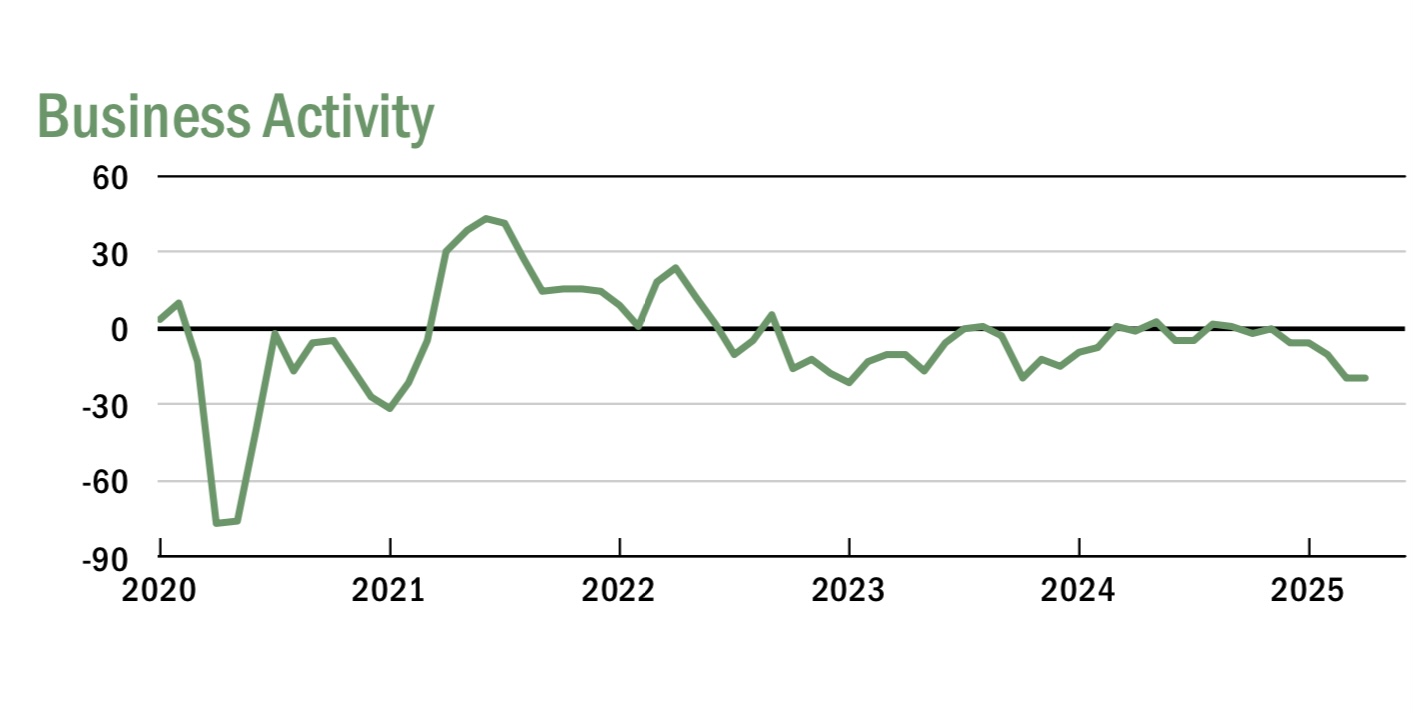
Finally, it will be worth paying additional attention to the AAR’s weekly rail carloads week report on Thursday, because there are indications that trans-Pacific shipping from China has already declined by more than half. If so, the next effect will be on rail shipping out of the West Coast.