Monday, September 23, 2024

Disaggregating the Big Picture: the Fed *still* wants to make your recession forecast wrong


 - by New Deal democrat


This is Housing Week, but there is no significant data today, and I’m going to wait for new home sales to be reported on Wednesday before commenting on how existing home sales fit in. In the meantime, let me unpack a Big Picture look.


Since the Fed began actively managing interest rates over 60 years ago, expansions and recessions have followed a typical pattern. The unemployment rate decreases until ultimately inflation increases. Real wages and income ultimately fall behind inflation. At the same time, the Fed hikes interest rates to fend off the higher inflation. Consumers react by cutting back, unemployment increases, and the economy topples into recession. The Fed reacts by cutting rates while Inflation decreases, consumer spending, mainly on durable goods financed by loans, increases again, and the cycle repeats.

We can capture most of this paradigm by comparing the YoY change in the Phillips curve, i.e., the inflation rate minus the unemployment rate (blue in the graph below) with the Treasury yield curve, as represented by the 10 year minus 2 year spread (red):


As the economy gets “tight,” i.e., lower unemployment and higher inflation, represented by peaks in the blue line, the Fed tightens, causing the yield curve to invert, i.e., the red line goes below zero. The blue line plummets below zero, more or less coincident with the onset of a recession, and the responding Fed interest rate cuts cause the yield curve to re-normalize, i.e., head back above zero. The economy responds to easy money and lower inflation by starting back into recovery, as unemployment declines towards the inflation rate.

Now let’s zero in on the post-pandemic expansion:


The economy was at its tightest in 2022. The Fed reacted by raising interest rates sharply, causing the yield curve to invert. The YoY change in unemployment now exceeds the inflation rate. The yield curve has just begun re-normalization with the Fed’s first rate cut.

If you go back and look at the historical record, this is typical of an economy just tipping into recession.

But when we disaggregate the two curves, some important differences appear.

First of all, as I and others have noted, the increase in the unemployment rate appears to be much more a historically high spike in new entrants to the labor force, rather than existing workers being knocked out of jobs.

Now let’s disaggregate inflation (blue in the graphs below) and unemployment (red):


In every expansion except for the two immediate post-WW2 ones, inflation has always risen significantly in the year or more before the ensuing recession. The unemployment rate follows higher with a delay, usually because the Fed has begun hiking rates. 

Importantly, during this period of increased inflation, it has almost always exceed YoY average wage gains (light blue), and always exceeded aggregate payroll gains (dark blue):


Inflation declines sharply during recessions, setting the stage for the next expansion.

Now let’s look at this disaggregation for the present expansion:


Inflation has decelerated sharply - and as of the last report, has continued to decelerate, while the unemployment rate is only modestly higher YoY. This looks much like the pattern in a number of mid-expansion corrections, most notably 1966, 1986, and 1995. In those cases inflation declined, the Fed eased up, and there were no recessions.

Now that we’ve disaggregated the Phillips curve, let’s do the same thing with the yield curve, and superimpose Fed rate moves (black):


The point here is fairly straightforward. Interest rates, especially shorter term interest rates, move close to in lockstep with Fed funds interest rates. In other words, the inversion and re-normalization of the yield curve has an awful lot to do with Fed interest rate hikes and decreases.

Now let’s superimpose consumer inflation (red) on those Fed interest rate changes (black):


Virtually 100% of the time before the pandemic, the Fed reacted to a decline in the inflation rate by lowering interest rates. One notable exception, 2006, is explained by the post-Katrina gas price spike which immediately abated. Thus the YoY CPI reading declined sharply for 12 months and then resumed its higher trajectory.

Again, here is out post-pandemic expansion:


The Fed maintained very high interest rates vis-a-vis inflation ever since mid-2023, a nearly unique situation. Which means it has a lot of room to cut now. Which means that interest rates could renormalize at lower levels fairly quickly.

Let me sum up here with some comments. I read a piece several years ago entitled “The Fed wants to make your recession forecast wrong.” There is no “free market” in Fed interest rates. Rather, the Fed is a human actor, like a dictator or monopolist, whose single human decisions, whether right or wrong, greatly impact the other markets. And as a human actor, the Fed has had the capacity to *learn* over time from past successes and failures. As I have repeated a number of times, human systems are inherently chaotic, because when you observe human behavior (like in job and consumer markets, or Presidential election polling), the humans always observe back, changing their behavior accordingly.

The Fed wants to avoid a recession. Unlike the 1960s and 1970s, over time it has tended to make interest rate cuts earlier. At present, we do have a weakening jobs market, but some of that weakness appears to be a false positive caused by the above-discussed spike in labor force participation. As measured by average real wages and aggregate real payrolls, consumers are in pretty good shape, as YoY growth in both continues to exceed the inflation rate:


If the Fed continues to move aggressively as consumer inflation (ex-fictitious shelter) remains fairly subdued, the housing market in particular should turn around. This is what we would expect if this is only a mid-cycle correction rather than the cusp of a recession.

Sunday, September 22, 2024

Weekly Indicators for September 16 - 20 at Seeking Alpha


 - by New Deal democrat


My “Weekly Indicators” post is up at Seeking Alpha.


The Fed rate cut had the unsurprising effect of boosting both stock prices and decreasing bond yields. The broader general trend of gradually improving activity also remains intact.


As usual, clicking over and reading will bring you up to the virtual moment as to the state of the economy, and bring me a little pocket change in reward for my efforts.

Friday, September 20, 2024

The quick and dirty economic indicator says: not even close to recession


 - by New Deal democrat


There are some economic and financial indicators that aren’t classic leading or lagging indicators. Rather, they are “over-sensitive” in one direction or another. Two good examples are heavy truck sales and the unemployment rate: they are over-sensitive to the downside: they lead going in to recessions, but lag coming out.


The S&P 500 stock market index fits in this category as well. The classic aphorism is “the stock market has predicted 9 of the last 4 recessions.” 

But the converse is not true. With the stellar exception of 1929, when stocks themselves were in a bubble, if the market makes a new high, it’s almost a sure bet that the economy is not in a recession.

Here is the (almost) 100 year graph of the S&P 500 showing that, broken down into three 30+ year increments:


Outside of 1929, the market has always peaked at least 2 months before a recession has begun (those occasions were 1990 and 2007), and usually well before that.

Which of course makes it noteworthy that the S&P 500 made a new all time high yesterday:


Not only does that make it a virtual certainty that we’re not in a recession now, contra some DOOOMers, but it is very unlikely for one to start in the next few months.

Another way to look at that is to update my “quick and dirty” economic indicator of the YoY% change in stocks and the inverted YoY% change in initial jobless claims. Here’s what that looked like in the five years before the pandemic, showing that stock prices were lower YoY several times with no recession occurring (showing how they are over-sensitive to the downside):


And here is what they look like up through yesterday:


Typically coincident with or near to the onset of a recession, the market is down YoY, and initial claims are higher by 10% or more. Needless to say, neither of those is even remotely the case at present.

There are some caution signals out there, as I have highlighted earlier this week (real retail sales, housing units under construction), but lots that is flashing green and nothing significant that is flashing red.

Thursday, September 19, 2024

Important mixed messages from jobless claims this week


 - by New Deal democrat


You may recall that last week I wrote that beginning this week and for the next 6+ months, initial claims would be up against some very tough comparisons from 2023, and would be the ultimate true test of whether there has been unresolved post-pandemic seasonality in the numbers.


Well, this week’s numbers suggest the unresolved seasonality hypothesis is still with us, but with considerable ambiguity.

Initial claims did decline -12,000 to 219,000, the lowest number since May 18. Similarly, the four week moving average declined -3,500 to 227,500, the lowest since June 8. And continuing claims, with the typical one week delay, declined -14,000 to 1.829 million, its lowest since June 15:


All well and good. But when we look at the YoY% comparisons, which are more important for forecasting purposes, initial claims were up 4.3%, the four week average up 1.2%, and continuing claims up 2.0%:


The good news is that the YoY comparison for continuing claims is it second lowest in 18 months (after last week). But the higher numbers YoY move initial claims and its four week average to neutral.

In order to warrant a “yellow flag,” the numbers would have to be higher by 10% or more. If they are higher YoY by 12.5% or more, and that poor comparison persists for at least two months, that would be a recession signal.

But here’s the thing. With a few exceptions, or the next 6 months, the comparisons for initial claims are going to be against numbers lower than 217,000. For the four week average it will be against numbers lower than 220,000. For continuing claims, the comparison range will be between 1.780 million and 1.820 million.

All three numbers are currently above that range. Because we drifted by a couple of calendar days this year, unresolved seasonality could easily mean we will get to that range next week. But of course, we don’t know that yet. On the other hand, any initial claims numbers over 235,000 and any four week average above 242,000 will be causes for concern, as will any continuing claims numbers above about 1.975 million.

We’ll see.

Finally, here is the comparison so far with the unemployment rate:


Under normal circumstances, the unemployment rate should be at 3.8% or even below. Above that number is almost certainly a result of the outsized entry into the labor force of recent immigrants.

Wednesday, September 18, 2024

Housing sector enters yellow flag “recession watch” territory


 - by New Deal democrat


Residential construction permits and starts bounced back from their July Hurricane-Beryl affected decline, but housing units under construction declined below the threshold for hoisting a yellow “recession watch” flag for this sector. At the same time, I continue to suspect that we are rising from lows in the most leading metrics, and no “recession warning” is warranted.

To begin with, the most leading metric, housing permits (gold), rose by 69,000 to 1.475 million, the highest level since March. Single family permits (red), which are just as leading and have very little noise, rose 26,000 to 967,000, the highest since April. Housing starts (blue), which tend to lag permits by a month or two, and are much more noisy, rose 119,000 to 1.356 million, also the highest since April:


That’s the good news, and it is what I have been expecting, given the downturn in mortgage rates.

But units under construction is the measure of real economic activity in this sector. While it is not so leading as permits and starts, it has always turned down, typically by more than -10% before a recession begins (the average is -15.1% and the median is -13.4%).  Here is the long-term graph comparing total permits (blue, left scale) with housing units under construction (red, right scale):


And in August housing units under construction continued to decline, by another -29,000, to 1.509 million units, a decline of -11.8% from their 2022 peak. There is simply no valid reason to withhold raising the yellow flag at this point.

There had been a long time after single family construction turned down while multi-unit construction continued to increase and then plateaued. But this year both have declined:


So that is the bad news. But, mortgage rates red, left scale in the graph below) have been declining sharply in the past two months, and as of this morning are within .02% of their two year low of 6.09%:


And if the Fed cuts interest rates this afternoon, which seems almost certain, I expect a further decline. As a result, as I said one month ago, “we can expect permits to rise in the next several months, followed by starts,” for the simple reason that for 60+ years, mortgage rates have always led housing permits. Here is the YoY% change view of the past 10+ years (with mortgage rates inverted so that lower rates YoY show as above the 0 line), with which may be clearer:


This clearly suggests that permits are likely to turn higher YoY soon.

Last month I concluded: “That the most leading metric, single family permits, as well as mult-family permits, appear to be stabilizing, plus the likely effect of lower mortgage rates, plus the probable effect of Beryl on units under construction, together cause me to believe that raising the yellow caution flag for housing would be premature based on this month’s report. It’s very close, but I don’t think we’ve crossed the threshold yet, and there are still good reasons to believe we may not cross it at all.”

Well, contrary to my earlier belief, we have indeed crossed the threshold. But as shown in the second graph from the top above, the long historical view of housing units under construction and permits, with one exception (the tech producer-centered recession of 2001), in the case of recessions, permits continued to decline sharply even after housing units under construction crossed the -10% threshold and well after recessions had begun. In our present situation, if I am correct that permits have bottomed and are starting to increase again, then housing units under construction will not decline too much further before bottoming as well. 

In other words, although there are some increasing warning signs that I have written about recently, including with real retail sales just yesterday (and stay tuned for jobless claims tomorrow), my base case is that this period of weakness is likely to turn around without a recession occurring. That’s why at this point there is only a housing sector “recession watch,” meaning a heightened possibility, and not a “warning,” meaning one is more likely than not.

Tuesday, September 17, 2024

And now, some good news: industrial and manufacturing production rebounded strongly in August


 - by New Deal democrat


In the past, industrial production has been the King of Coincident Indicators, since its peaks and troughs tended to coincide almost exactly with the onset and endings of recessions. That weighting has faded somewhat since the accession of China to the world trading system in 1999 an the wholesale flight of US manufacturing to Asia, generating several false recession signals, most notably in 2015-16. But it is still an  important coincident measure in the economy. 

As with last month, there were significant downward revisions, but the story this month was a strong rebound.  Total production was reported higher by 0.8%, and manufacturing production by an even stronger 1.0% (graph normed to 100 as of pre-pandemic high water mark):


On a YoY basis, total production is unchanged, while manufacturing production has risen 0.2%:


In the above graph, I also show the updated YoY real retail sales YoY data (gold), which shows that both, in accord with their short leading status, real sales have anticipated the downward trend in production followed by two years of more or less treading water. 

Finally, here is the long term look at industrial and manufacturing production vs. real GDP (gold):


During the 20th century all the way up to the 1980s, when industrial and manufacturing production growth had declined to 0% YoY, the economy was entering or in a recession about twice as often as not. Thereafter right up until the pandemic while there was a marked deceleration in real GDP, a recession did not necessarily occur, most especially in 2015-16.

Here is the post-pandemic view:


With total and manufacturing production trending slightly higher in recent months (per the first graph above) compared with last year, this forecasts a steady real GDP somewhere in the neighborhood of 3% annualized this quarter.

The string of negative YoY real retail sales continues, confirming yellow flag


 - by New Deal democrat


One of my favorite bits of economic data, retail sales, did no better than treading water in August.


On a nominal basis, retail sales in August rose 0.1%, but after an upwardly revised blowout 1.3% in July. Which means, after adjusting for inflation, they declined -0.1%. The below graph norms both real retail sales (dark blue) and the similar measure of real personal consumption of goods (light blue) to 100 as of just before the pandemic:


Since the end of the pandemic stimulus in spring 2022, real retail sales have been trending generally flat to slightly declining, while real personal consumption expenditures on goods have continued to increase.

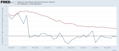
On a YoY basis, real retail sales continue to be negative, at -0.4%, which remains problematic as it has all this year:


That’s becuase, although I won’t bother with the graph, a negative YoY comparison in real retail sales over the past 75 years has usually meant recession. As I said last month, obviously that wasn’t the case in 2022 and 2023, but at some point the historical relationship is likely to be valid again.

Finally, since real sales are a good if noisy short leading indicator for employment, here is the above YoY graph adding YoY payroll gains (red):


This forecasts continued weak job reports in the range of 75,000 to 175,000 in the months immediately ahead.

Three months ago I wrote for the first time that real retail sales had to be regarded as raising a caution flag for the economy. Two months ago I amplifyied that to say “The yellow caution flag is up,” especially in conjunction with the negative ISM manufacturing and non-manufacturing numbers. And last month I concluded by saying that “the longer real retail sales go without posting a positive YoY number, the more concerned I will be.”

At the beginning of this month, the economically weighted ISM indexes came within a hair’s breadth of warranting a “recession watch.” This real retail sales report puts even a little more weight on the scale, and really puts the pressure on initial jobless claims, which have remained assiduously positive, but from this Thursday forward for the next half year will turn neutral or even negative to the extent they are above 220,000.

Monday, September 16, 2024

On the un-inversion of the 10 minus 2 year Treasury spread


 - by New Deal democrat

In the past couple of weeks, the spread between the 10 year and 2 year Treasury has normalized; that is to say, the interest rate on the 10 year once again is higher than the interest rate on the 2 year. A number of articles have claimed that this portends a recession in the next few months.


Not so fast! Says I. When you look at the entire history of that interest rate spread, and you consider other, similar Treasury interest rate spreads, a much more complex, even contradictory signal appears.

This article is over at Seeking Alpha. As usual, clicking over and reading will hopefully be enlightening as to the value of this economic indicator, and reward me a little bit for my analysis.

Saturday, September 14, 2024

Weekly Indicators for September 9 - 13 at Seeking Alpha


 - by New Deal democrat


My “Weekly Indicators” post is up at Seeking Alpha.


The imminent likelihood of a Fed rate cut has continued to drive rates down to new 12 month lows (which is good for things like mortgages in particular). Meanwhile consumer spending as measured weekly is also near 12 month highs, which is also very good.

As usual, clicking over and reading will bring you up to the virtual moment as to all the categories of economic data, and put a little lunch money in my pocket for organizing and presenting it to you.

Friday, September 13, 2024

UPDATE: Real median household income for < sigh > 2023


 - by New Deal democrat


I’m a little late to this, since FRED took its time updating, but the annual report of median household income for the US was released on Tuesday for 2023. 


This is an important statistic about the well being of, well, the median American household, so one of my pet peeves is that it is only released annually, and with a 9 month delay at that. So Tuesday’s release tells us about where an important metric was about 18 months ago. Yeah, that’s a problem in my book.

In any even, median household income rose a hair under 4.0% in 2023, to a level only exceeded - by 0.7% - in 2019:


That compares very favorably with the average annual gain in the previous 10 years which was 0.7%. On an annual basis, it was only exceeded by 2015 and 2019 in the previous 10 years.

I really wish the Census Bureau would update this statistic at least quarterly, since it is based on the monthly employment report. But since it doesn’t several private research companies have estimated it on their own. Most recently, the mantle has been taken up by Motio Research, which I have highlighted in several previous posts. Here’s their most recent update:


To see how accurate they were in real time, I went back and compared their monthly 2022 and 2023 updates with the official figures. On an average basis, they had real median household *declining* -0.1% in 2023 YoY. But they had 2022 and 2023 exceeding 2019 by 1.6% and 1.5%, respectively. Even on a year-end vs. year-end basis, they only had 2023 exceeding 2022 by 0.9%.

Obviously the private estimates have been missing the mark.

But stay tuned, one year from now we will find out how well households made out this year.

Thursday, September 12, 2024

Initial claims still positive, moving into very challenging YoY comparisons (plus a note about the PPI)


 - by New Deal democrat


If residual post-pandemic seasonality has been affecting jobless claims statistics, the real acid test is going to begin next week, as for the next 7+ months, any number higher than 220,000 is almost always going to be higher than one year ago.


In the meantime, for this our last week of the seasonal downtrend, initial jobless claims rose 2,000 to 230,000. The four week moving average rose 750 to 230,750. Continuing claims, with the typical one week delay, rose 5,000 to 1.850 million:


Turning to the more important YoY comparisons for forecasting purposes, initial claims were unchanged, the four week moving average was down -0.8%, and continuing claims were higher by 2.2%:


This YoY comparison for continuing claims was the lowest in the past 1.5 years.

Needless to say, these are all positive results which forecast continued economic expansion in the next few months.

Since we are only one week into September, there is not much to say about the implications for the unemployment rate in next month’s report, but here is the updated graph:


Finally, a quick note about the producer price index which was also released this morning. Like employment, goods prices are far more volatile than prices for services, which tend to rise throughout good times and bad. Here is the YoY% look at each:


PPI for services YoY is higher by 2.6%, about average for the past 10 years. For goods it is unchanged YoY, which is not uncommon and is generally a good thing for downstream consumer inflation. On a monthly basis, PPI for goods was also unchanged; for services it rose 0.4%.

Perhaps more significant is that raw commodity prices fell -0.7% in August, and on a YoY basis are down -0.8%:


Such a decline more often than not telegraphs present or short term weakness, but also is a positive coming out of recessions.

An important consideration, therefore, is whether this weakness is a supply side issue (e.g., lower gas prices) or a demand issue (weak global demand at the producer level). 

Both of these may be in play at present. On the one hand, oil prices declined in the past month to the low end of their last two year range. On the other, it appears that China has begun a genuine deflationary spiral, as not only have consumer prices declined there, but there is evidence that in at least some sectors wages have declined as well. This is definitely not good for China, but it may be a boon to the US, since we mainly benefit from the lower prices that are likely to make their way through to consumers without any negative effect on wages. An interesting global situation, with all that implies.

Wednesday, September 11, 2024

August CPI: further important progress towards 2% YoY level, marred (only) by a surprise uptick in shelter


 - by New Deal democrat


August CPI, with the conspicuous exception of shelter, continued to come in tame. And the list of other “problem children” decreased by 1, as only food away from home (restaurants) and transportation services (motor vehicle insurance and repairs) remain.

Let’s get the headlines out of the way:
 - Headline CPI continued increased 0.2% for the month, and decelerated to 2.6% YoY, its best showing since February of 2021. 
 - energy inflation remains non-existent
- there was no inflation at all excluding shelter, as prices were unchanged, and are up 1.1% YoY, the 16th month in a row the YoY change has been below 2.5%.
 - shelter inflation was the only negative surprise, as it remained very elevated, up 0.5% for the month and 5.2% YoY, the highest YoY change in three months.
- core inflation, which includes shelter but excludes gas and food, therefore remained elevated, up 0.3% for the months and 3.2% YoY.

Let’s break this down graphically to better show the trends.

Here are headline (blue), core (red), and ex-shelter (gold) inflation YoY:


To repeat what I have said for months, the only reason for the Fed not to treat inflation as well within its target zone is shelter.

Turning to the big remaining issue of shelter, the upside surprise appears to be due to an upward spike in owners equivalent rent (red), which spiked higher by 0.5% in the month, vs. actual rent (blue), which increased 0.37%, and so was rounded up to 0.4%:


As a result, shelter on a YoY basis increased YoY, here shown vs. the FHFA Index YoY (blue), which has rolled back over:


This was an unpleasant surprise, but may be a quirk of unresolved post-pandemic seasonality or a one-month wonder, as the leading indicators for shelter inflation all continue to point towards continued deceleration.

With gas prices down for the month, energy showed -0.8% *deflation* and is down -4.0% YoY:


The former problem children of new (dark blue) and used (light blue) vehicle prices were unchanged and down -1.0% for the month, are are down -1.8% and -10.4% YoY respectively (shown as the change since right before the pandemic, below). I also show average hourly nonsupervisory wages (red) for comparison, showing that wage growth has actually outpaced vehicle prices (meaning the remaining problem there is interest rates for financing):


Note that used vehicle prices have given back over 50% of their post-pandemic gain.

Electricity (gold) also ended its run as one of the remaining problem children, as it declined -0.7% for the month and is up 3.9% YoY. That leaves food away from home (blue), up 0.3% and transportation services including vehicle maintenance, repair, and insurance (red), up 0.9%. On a YoY basis they remain up 4.0%, and 7.9% respectively, although even those two items are trending downward:


As I have previously pointed out, the last item is a typical delayed reaction to the previous big increase in vehicle prices.

Finally, the CPI release allows me to update the very important metric of real aggregate nonsupervisory payrolls, which once again made a new record high:


Ordinary workers have more spending money, in real terms, than they have ever had before. There has *never* been a recession without that turning down first.

In conclusion, the Fed has really had all the ammunition it has needed to cut interest rates for months. With the sharp YoY deceleration in the headline rate in August, it has even more. If we remove shelter from the core index, that too is only up 1.8% YoY. The outstanding question is whether the Fed has waited too long, and a recession will occur before lower interest rates turn around the now-tepid labor market.

Monday, September 9, 2024

Leading indicators from Friday’s jobs report: not too bad, not bad at all


 - by New Deal democrat


There’s no big economic news today or tomorrow, so let’s take a more detailed look at the leading indicators from Friday’s jobs report. It turns out, the news wasn’t nearly as bad as the headline employment number.


Let’s start with the negative stuff. The simple story is, manufacturing is in a funk. Employment in manufacturing declined -24,000, which is tied for a two year low. Meanwhile, trucking employment declined -1,400  (in the graph below, both numbers are normed to 100 as of their post-pandemic peak):


The big decline in trucking last August was the Yellow Trucking bankruptcy. What is interesting is not only that other firms did not pick up any apparent slack, but that employment has declined again back to that low.

Manufacturing, and the trucking transportation used to deliver those goods, are both leading sectors, although the former in particular is less important than it was before the turn of the Millennium (hello, normalized trade with China).

But if manufacturing was bad news, the other leading sector of construction employment, including total (dark red), residential (light red), and nonresidential (gold) all continued to increase:


And not even all news from the manufacturing sector was bad, as average weekly hours - one of the 10 “official” leading economic indicators - increased 0.1 hour:


After a steep decline from late 2021 through early 2023, the manufacturing workweek has stabilized for over a year. Although I won’t put up the graph, there is evidence that since the 1980s, an important inflection point is the 40.5 hours level. Above that, a decline has usually meant only a slowdown, not a contraction. And as you can see, we are above that level.

Both manufacturing and construction are components of the goods-production sector of the economy, and that headline number also continued to increase, albeit more slowly than before:


I would expect total goods-producing jobs to turn down before any recession begins (because services employment almost never turns down except late in deep recessions).

Turning back to some negative news, consistent with the general trend in the unemployment rate, the number of short term employed (blue) rose to a new 2+ year high last month. Because people file for unemployment after they get laid off, I also include the monthly average for initial jobless claims (red). Both series are normed to their post-pandemic lows. In the case of short term unemployment, I have used the 3 month average because the series is so noisy:


Here is the historical comparison of each. Initial claims are more volatile on a cyclical basis, but the trend is much less noisy in the shorter term, making them a much better short leading indicator:


As I have been noting consistently every week, jobless claims, unlike the unemployment rate, are *not* forecasting any recession.

Finally, although most of the revisions to June and July were negative, that wasn’t the case with one of my favorite fundamentals-based leading indicators, real aggregate nonsupervisory payrolls. July’s reading was revised upward, meaning we set yet another record:


On Friday we found out that *nominal* aggregate payrolls increased 0.4% in August. Barring the very unlikely event of a nasty upside surprise in consumer inflation on Wednesday, we set another record for real aggregate payrolls in August as well.

Basically, outside of the manufacturing sector, the leading elements of employment remain positive and forecast continued growth through the end of this year.