Tuesday, January 10, 2023

Scenes from the December jobs report: more deceleration


 - by New Deal democrat


The only significant economic data this week will be released on Thursday, with both CPI and jobless claims. In the meantime, let’s take a closer look at the jobs data we got last Friday. As indicated in the title of this post, the theme was “deceleration.”


First, here is the long term YoY look at total employment (blue), employment in goods-producing industries (red), and service providing (gold):


Notice that goods-producing jobs are much more volatile; they decline first, while until the Great Recession, service providing jobs barely declined at all YoY even during recessions.

Here is the close-up of the same since mid-2021:


Service jobs came roaring back as things like restaurants reopened in 2021, while goods-producing jobs increased sharply as well during the Boom. Since spring 2022, there has been a consistent deceleration of YoY growth across the board (but still positive!), to levels that prior to the pandemic would have been consistered excellent.

Now let’s take a look at the leading sectors.

Manufacturers add and subtract working hours before they hire or lay off workers. So it’s no surprise that the manufacturing work week (red, YoY) is one of the 10 components of the Index of Leading Indicators. The number of manufacturing employees (blue) follows:


Notice again that the YoY growth in manufacturing employment now would be considered excellent at any time prior to the pandemic; while the decline in hours in the past has always been consistent with the onset of a recession.

But a look at the monthly change shows a break in the past several months, as employment gains are much lower than previously during the pandemic recovery:


This is consistent with last week’s ISM manufacturing report for December, which showed both the total index and the new orders subindex consistent with the onset of recessions in the past:


And here’s a look at manufacturing hours, employment, and industrial production (gold), all normed to their recent peaks:


While employment is still growing slowly, production possibly peaked in October. It would not be a surprise if the employment gains in November and December were revised away.

Next, construction jobs (blue), and residential jobs in particular (gold) are also leading sectors. It is probably unsurprising that these have continued to grow, as housing units actually under construction (red) have continued to increase (due to the previous difficulty in obtaining construction materials like lumber):


This is one of the definite bright spots in the economy. I do suspect it will roll over shortly, and perhaps fall off a cliff once the backlog is gone.

Temporary help jobs are also a leading jobs sector. They have already rolled over at a pace consistent in the past with the onset of recessions:


On a weekly basis I track the ASA’s Staffing Index, which has weakened considerably since last Labor Day:


This index started in mid-2006. Here is what it looked like in 2007-08:


There have been instances since then of flat or even somewhat negative YoY growth in Staffing without a recession occurring; but the current reading of the index is consistent with a stalling economy, and consistent with the recent downturn in the monthly jobs report.

Next, as I have often pointed out, initial jobless claims (blue) lead the unemployment rate (red) by several months. Here’s the long term YoY view:


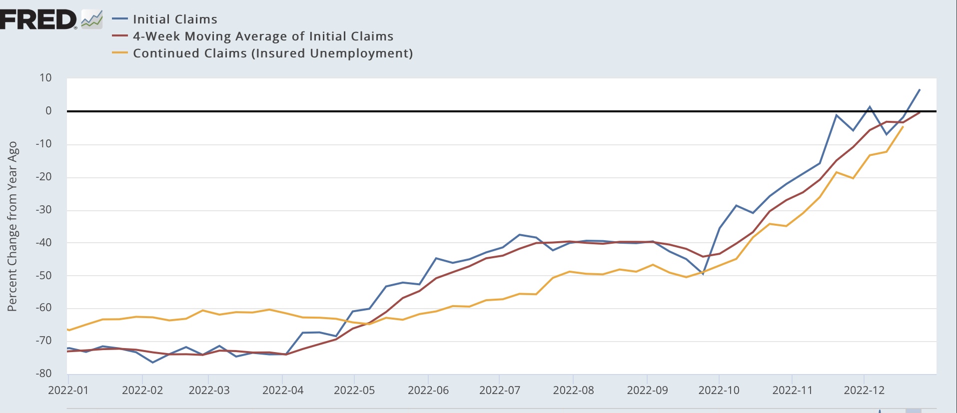
And here is the close up since mid-year 2021:


These are not at recessionary levels, but have definitely decelerated. I am currently watching to see if the 4 week average of initial claims moves higher YoY.

Finally, real aggregate payrolls turning negative YoY has been a very good indication of the onset of a recession. Here is the long term look at that, decomposed into nominal YoY payrolls vs. YoY inflation (so the recession signal is red line above blue line):


And here is the close up since mid-year 2021:


Both lines are decelerating, with CPI particularly assisted by the big decline in gas prices since June. As noted at the outset of this post, we’ll get December CPI on Thursday. I expect another good number, as gas prices declined sharply last month. If and when the decline in gas prices ends (quite possibly this month), the comparison is going to become much more challenging.

Monday, January 9, 2023

In which I quibble with Prof. Alan Blinder about the main reason for the decline in inflation since June


 - by New Deal democrat

Alan S. Blinder is getting traction for an opinion piece published in the WSJ concerning the big decline in inflation since June. He acknowledges that“ energy inflation played a meaningful role” but that “the rest of the stunning drop in inflation in 2022 [is] due …  What did change dramatically was the supply bottlenecks. Major contributors to inflation in 2021 and the first half of 2022, they are now mostly behind us.”

While I agree that supply bottlenecks are “mostly behind us,” the phrase “the rest of” in his analysis appears to be doing some heavy lifting.


Here is a graph of total CPI (blue), CPI less food and energy (gold), CPI for food (gray), and CPI for energy (red):


In the 6 months through June, total inflation increased at an 11.1% rate, core inflation at 6.9%, food 12.6%, and energy 58.8%. At an annualized rate, in the past 5 months total inflation has been 2.4%, core 4.6%, food 9.3%, and energy -28.4%.

Put another way, since June annualized total inflation has gone down from 11.1% to 2.4% (a 78% decline), core inflation from 6.9% to 4.6% (a 33% decline), food from 12.6% to 9.3%, and energy from 58.8% to -28.4%. 

An even better way to look at this is to compare total inflation (blue, just as above) with CPI less energy (red). In the first 6 months through June CPI less energy increased at a 7.7% rate, and since then at a 5.3% rate (a 31% decline):


Again, focusing on the most important aspect, the rate of decline in core inflation since June has been 33%, inflation ex-energy 31%, but total inflation including energy 78%. So, in terms of CPI .it’s pretty clear that energy has been the primary reason by far that the rate of inflation has declined.

Measured using PCE, total PCE prices were up 8.0% at an annualized rate, core PCE less food and energy was up 5.3%, and energy was up 62.3%. Since June, at an annualized rate, total PCE costs were up 2.4%, core PCE prices up 3.6%, and energy costs down -29.8%:


Unfortunately, there’s no “PCE cost index less energy” on FRED, but the pattern as compared with CPI inflation is the same. Comparing the first 6 months of this year with the last 5 on an annualized basis, core PCE cost increases declined 32%, but total PCE costs including energy and food declined  70%. Presumably if we stripped out food, the decisive impact of energy price declines would be even more clear.

So, while the abatement of supply bottlenecks is surely a factor, by far the decisive factor in the decline in inflation is the huge decline in the price of gas.

Finally, a note that I nevertheless come to the same ultimate conclusion as Professor Binder, which is that the Fed ought to declare victory and go home, but mainly because so much of the remaining part of core inflation that is problematic is tied up with the badly lagging “owner’s equivalent rent,” whereas actual house price increases are on track to be completely unchanged YoY by the middle of this year.  

Sunday, January 8, 2023

Weekly Indicators for January 2 - 6 at Seeking Alpha


 - by New Deal democrat

My Weekly Indicators post is up at Seeking Alpha.

No big changes from the past month or so. The overall economic picture continues to be driven by the effects of the price of gas.

As usual, clicking over and reading will bring you up to the virtual moment as to the trends in the economy, and reward me a little bit for my efforts.

Friday, January 6, 2023

December jobs report: good headlines, but deceleration continues


 - by New Deal democrat

If the long leading indicators all last year, and the majority of the short leading indicators from the past few months are to be believed, a recession is near. And if that is the case, we ought to see the leading elements of the jobs report begin to roll over. One of them, the average manufacturing workweek, clearly has. Arguably so has temporary employment. Residential construction employment may have peaked. But total construction and manufacturing employment continued to increase through November’s report.

So my focus as of this report is on those remaining leading components, as well as whether the deceleration in the 3-month moving average of jobs growth is continuing.

As described below, the deceleration continues, also including wages, but the leading sectors have not materially deteriorated from the past few months.

Here’s my in depth synopsis.

HEADLINES:
  • 223,000 jobs added. Private sector jobs increased 220,000. Government jobs increased by 3,000. The three month moving average of growth declined further to 247,000.
  • The alternate, and more volatile measure in the household report had its best month in quite awhile, increasing by 717,000 jobs. The above household number factors into the unemployment and underemployment rates below.
  • U3 unemployment rate declined -0.2% to 3.5%.
  • U6 underemployment rate also fell -0.2% to 6.5%.
Leading employment indicators of a slowdown or recession

These are leading sectors for the economy overall, and will help us gauge whether the strong rebound from the pandemic will continue.  These tilted to the negative:
  • the average manufacturing workweek, one of the 10 components of the Index of Leading Indicators, declined -0.3 hours to 40.6, and is down -1.0 hours from its February peak last year of 41.6 hours. This is recessionary.
  • Manufacturing jobs increased 8,000, and are at a level higher than before the pandemic.
  • Construction jobs increased 28,000, also at a level higher than before the pandemic. 
  • Residential construction jobs, which are even more leading, increased by 3,100.
  • Temporary jobs, which until several months ago had been rising sharply, declined again, by 35,000.
  • the number of people unemployed for 5 weeks or less declined by 11,000 to 2,233,000, about 100,000 above its pre-pandemic level.

Wages of non-managerial workers
  • Average Hourly Earnings for Production and Nonsupervisory Personnel, which was recorded at $28.10 in November, was revised downward by $-.09, and increased $.06 from that to $28.07, a 0.2% gain m/m, and up 5.0% YoY, vs. its 6.7% peak at the beginning of 2022.

Aggregate hours and wages: 
  • the index of aggregate hours worked for non-managerial workers declined for the second month in a row, by -0.2% which is still above its level just before the pandemic.
  •  the index of aggregate payrolls for non-managerial workers was unchanged, and is up 7.4% YoY. This metric has been decelerating nominally almost consistently for the past 16 months.  Compared with inflation through November, it is up only 0.2% YoY (recessions typically start when it crosses zero).

Other significant data:
  • Leisure and hospitality jobs, which were the most hard-hit during the pandemic, rose 67,000, but are still about -6% below their pre-pandemic peak.
  • Within the leisure and hospitality sector, food and drink establishments added 26,300 jobs, but are still about -4% below their pre-pandemic peak. 
  • Professional and business employment declined -6,000, the second poor reading in a row after last month’s measly increased of 1,000.
  • Full time jobs decreased -1,000 in the household report.
  • Part time jobs increased 689,,000 in the household report.
  • The number of job holders who were part time for economic reasons rose 190,000.
  • The Labor Force Participation Rate increased 0.2% to 62.3%, vs. 63.4% in February 2020.
  • Those not in the labor force at all, but who want a job now, declined -352,000 to 5.176 million, compared with 4.996 million in February 2020.
  • October was revised downward by -21,000, and November was also revised downward by -7,000, for a net decrease of -28,000 jobs compared with previous reports. This is at least the second such downward revisions in a row.

SUMMARY

This report was mixed. There were many positive elements, including the unemployment and underemployment rates, labor force participation rate, and the absolute number of gains in jobs. The gains in the household report were the best in months. The leading sectors of manufacturing and construction employment continued to gain. It is nearly impossible to envision a recession beginning while that is still happening.

On the other hand, the manufacturing workweek declined to recessionary levels (suggesting job cuts will be close behind), and temporary employment continued to decline. Aggregate hours worked declined for the second month in a row, and aggregate payrolls were stagnant. There were again downward revisions to previous months’ data. Wages increased at the lowest pace in nearly two years.

This does not suggest to me that a recession is imminent, but it does suggest that deceleration in that direction has continued.

Thursday, January 5, 2023

New jobless claims end 2022 on a positive note; preview of tomorrow’s jobs report


 - by New Deal democrat

Initial claims started off the year - or ended last year if you are technical about it - on a positive note, declining 19,000 to a 3 month low of 204,000. The more important 4 week moving average declined 6,750 to 213,750, a two month low. Continuing claims for the prior week also declined by 24,000 to 1,694,000 (due to either a software or human entry glitch, FRED recorded the entries as December 31, 2023! Which leaves a one year gap, so I have omitted this week’s data on the graph below):


All three numbers also remained lower YoY. The most important leading indicator, the YoY% change in the 4 week moving average of new claims, is 3.2% lower than its level one year ago (due to the same glitch, this week’s data is omitted on the below graph):


Although seasonal distortions can be at their maximum right now, this is a very good weekly report.

Tomorrow we get the much more important monthly jobs report. Because initial claims lead the unemployment rate, and have remained low, I expect the unemployment rate to remain unchanged +/-0.1%. As to payrolls themselves, I expect the three month average of 272,000 to continue to slowly decline, which suggests a monthly number below 250,000. Because tax withholding came in negative YoY for the second month in a row in December, I will be on particular alert for a downside outlier compared with recent reports.

Additionally, I will be looking to see if there is deterioration in some leading employment metrics that haven’t rolled over yet; specifically construction and manufacturing employment. Since the weekly Staffing Index has also weakened in the past month, I will also be looking to see if temporary employment continues to decline. 


Wednesday, January 4, 2023

November JOLTS report consistent with a continued “hot” labor market


 - by New Deal democrat 

The JOLTS report for November showed both continuing decelerating trends in some series, but overall a picture of a labor market that continued “hot.”

Here’s the graph I ran one month ago of job openings, hires, quits, and total separations:


Now here is an update for the past 2 years of all four series:


Three of the four series - openings, hires, and total separations - show a pattern of continued deceleration since the beginning of this past spring, although only hires made a new 12+ month low is this report. Only quits appear consistent with a stabilizing market - although they too could be read as decelerating.

At the same time, both openings and hires continue at levels above any month that predated the pandemic.

In the eight years before the pandemic, layoffs and discharges averaged 1800 +/-100 monthly, with a low of 1500. Since the end of the pandemic lockdowns, they have averaged 1400 +/-100. At 1350 in November, they continue right in that range:


Taken as a whole, the JOLTS data for November implies a hot labor market; just not as hot as before.


December manufacturing, new orders both decline further, to readings even more on the cusp of recession


 - by New Deal democrat

I described last month’s ISM manufacturing reading as being one “on the cusp of recession.” Well, this month’s reading was even cusp-ier.

To recapitulate, this index has a very long and reliable history. Going back almost 75 years, the new orders index has always fallen below 50 within 6 months before a recession. Recessions have typically started once the overall index falls below 50, and usually below 48.


This is the second straight month that the index was below 50, declining another -0.6 to 48.4. As noted above, per the ISM itself, typically recessions have not begun until this index falls below 48, and as you can see below it came close in 2012 and 2015 without a recession happening. 

Meanwhile the new orders subindex declined another -2 to 45.2, a new expansion low and the 6th time in the past 7 months that it has been below 50:


Like I said, cusp-ier.

Note that industrial production, the King of Coincident Indicators, has declined in the past two months and looks very much like it has been in the process of peaking (blue the graph below), while manufacturing employment (red) has still been rising as of last month’s jobs report:


I don’t think a recession will start until we see those manufacturing employment numbers starting down. We’ll see in two days.

Tuesday, January 3, 2023

2023 data begins with another lesson: the remedy for high prices is - high prices


 - by New Deal democrat

And so, another year begins. And kicks off with a look at the leading housing sector. And furthermore, there is even some good news.


Total construction spending in November rose 0.2% for the month, while the more leading residential construction spending declined -0.5%. While total construction spending is only down 0.6% from its recent high in July, residential construction spending is down -8.1% from its recent peak last May:


This is in line with the steady drumbeat of negative news in the housing sector for the past year.

Generally speaking, residential construction spending comports with the number of housing units under construction. But in 2022, like in 2018-19, spending (blue) has declined while the number of units under construction (red) has risen slightly:


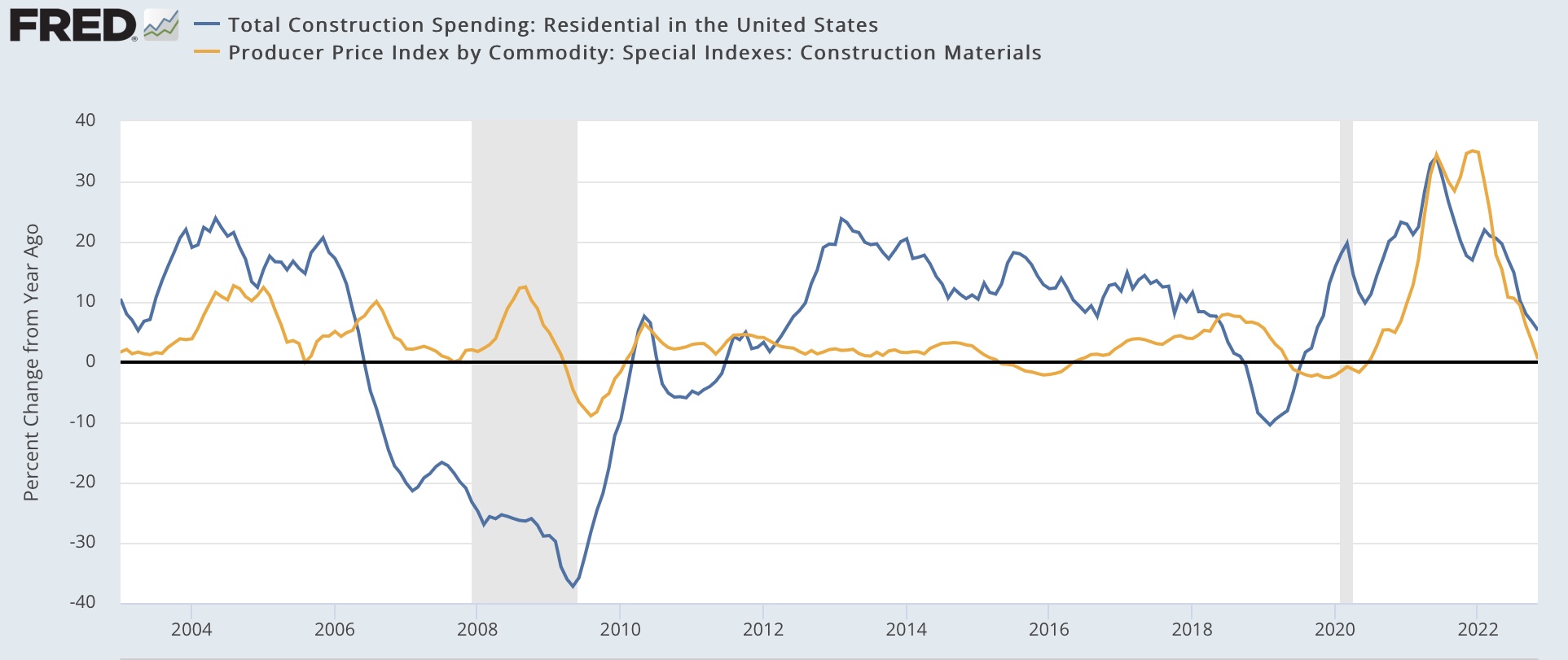
The answer probably lays in the costs of construction materials, for which there is a special inflation index, shown in gold YoY below compared with the YoY% change in residential construction spending:


The cost of materials increases and decreases with a lag once there is a boom or bust in construction. This is what happened in 2018-19, and it happened in 2022 as well. The cost of construction materials, which was up as high as 35% YoY one year ago, as of November was only up 0.6% YoY!

The remedy for high prices is - high prices. The good news is, with the complete abatement in the rise in the price of construction materials, some of the pressure is taken off of construction sales. 

As I’ve already mentioned several times, while I am watching for coincident indicators like employment and consumer spending to turn down, I am already on the lookout for a positive turn in some long leading indicators. And the abatement of construction costs increases in the housing sector is one such sign. 

Saturday, December 31, 2022

Weekly Indicators for December 26 - 30 at Seeking Alpha


 - by New Deal democrat

My Weekly Indicators post is up at Seeking Alpha.

The volatile coincident consumer numbers bounced higher this week, while another recession indicating system flashed red, suggesting a recession is most likely to start during the 2nd Quarter of 2023.

As usual, clicking over and reading will not only bring you up to the virtual moment as to the economy, but will bring me a little pocket change for my efforts.

Best wishes for a happy, healthy, and prosperous new year to all readers!

Friday, December 30, 2022

Coronavirus dashboard for year end 2022: becoming endemic, and still an important threat to seniors


 - by New Deal democrat

As we close out 2022, let’s look back at the overall picture for COVID.


The best historical measure of actual infections is Biobot, which samples wastewater. This is because the advent of easy home testing one year ago meant that far fewer people have had “confirmed” cases this year in comparison to “actual” infections. The solid line in the graph below is the level of particles (left scale) from which actual case levels can be inferred (right scale):


Current levels are now higher than any other wave peak except for last winter’s Omicron.

Regionally the Northeast is faring the worst, although its current outbreak is not yet at the level of its first, disastrous, wave. The South is also increasing sharply, while for now the West remains in relatively good shape:


As you can see, this contrasts with “confirmed” cases, which while they have increased, are well below all previous waves:


But hospitalizations and deaths are much more reliable, since cases have always generally been confirmed. 

Hospitalizations have increased 50% from their recent lows, but are well below all prior waves of infections at this point:


The same is true of deaths, which since March have varied between 300-500/day, well below their levels at any previous times during the pandemic:


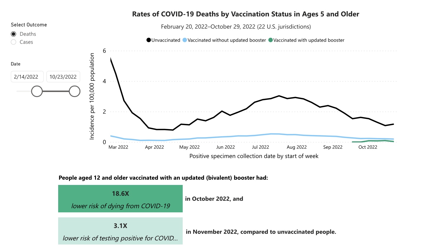
Deaths continue to be concentrated among the unvaccinated or not-fully vaccinated:


And they also skew much higher with age:


Even fully vaccinated seniors should probably remain on guard, and in particular mask up whenever indoors in public places. Altogether, non-fully vaccinated people over age 50 account for nearly 3/4’s of all COVID deaths.

Vaccinations in the US hit a wall this year, only increasing from about 65% to 70% of the population fully vaccinated, and only increasing from 75% to 80% even partially vaccinated during the entire year:


Total deaths from Covid  have increased by 100,000 in the past 9 months (i.e., at a 133,000 annual rate), to 1.1 million:


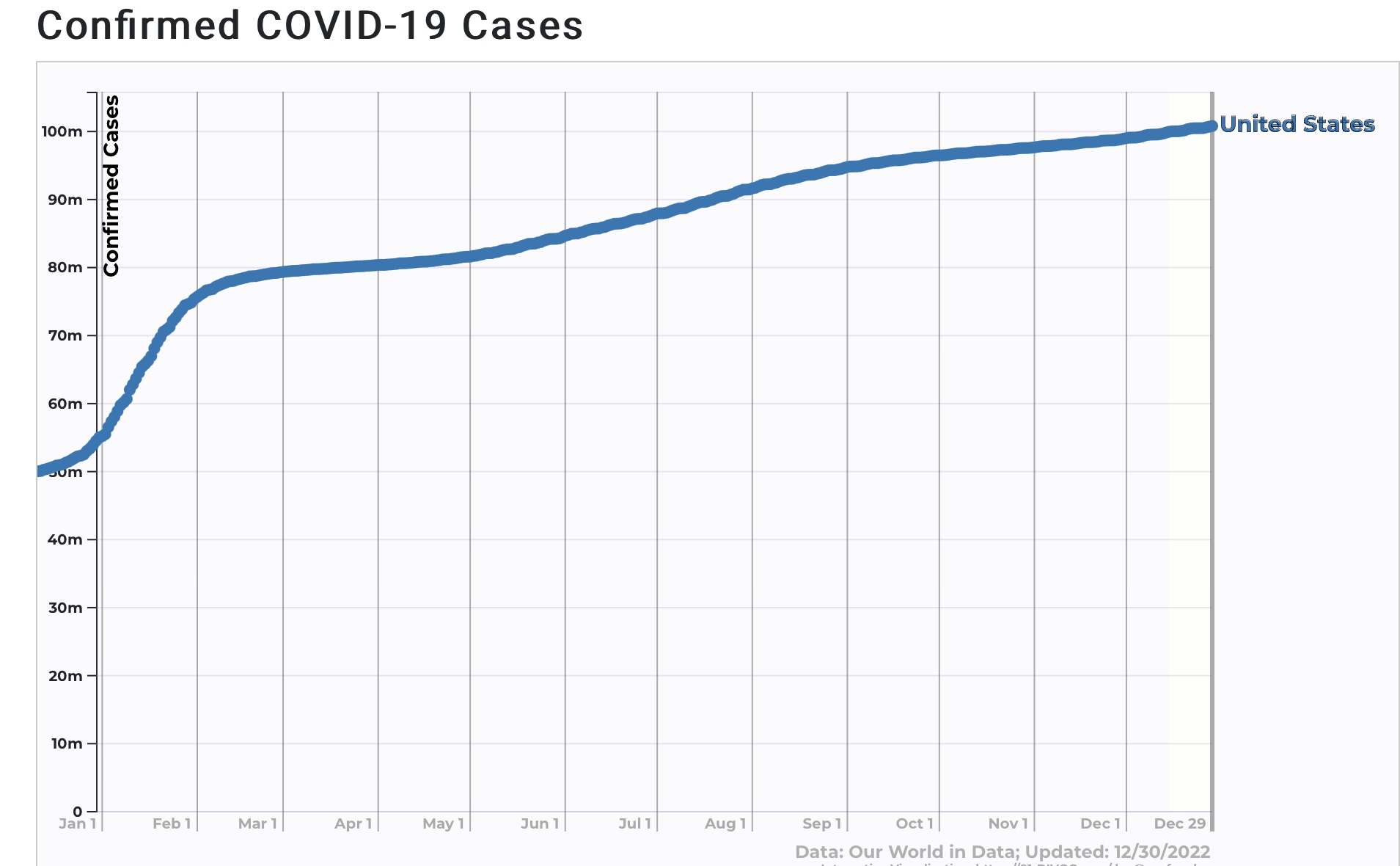
Total *confirmed* cases in the US have just topped 100,000,000, about 20,000,000 of which have been during the last 9 months:


Because *actual* cases were at least double confirmed cases before this year, and at least triple the number of confirmed cases this year after home testing became widely available, probably about 240,000,000 or more Americans (or about 75%+ of the population) have at one point or another been infected.

Finally, here is the what the prevalence of the Alphabet soup of newer variants looks like at the moment. XBB and its subvariant XBB.1.5 make up 44% of all cases, BQ.1&1.1 another 45%, with BA.5 down under 4% and the remaining variants in the soup 7%:


The biggest regional outbreaks showed by Biobot correspond with the highest prevalence of variant XBB:


Note that XBB%1.5. Is most prevalent, at 75%, the Northeastern regions, followed by roughly 20% in the Southern regions, and less in the Midwest and West, corresponding almost exactly to the Biobot data referenced at the beginning of this article.

Between previous infections and vaccinations, probably only 5%or less of the population is totally “naive” to the Covid virus, with no resistance whatsoever.

This, along with improved medical care, probably explains why Covid has become much less deadly on a per capita basis this year. It is well on its way to becoming endemic. 

The bottom line is, we keep seeing ever more easily transmissible variants, with low hospitalizations and even lower deaths. In the last 9 months, deaths have tranistioned from 500,000/year to 133,000/year. The lion’s share of deaths skew to the under-vaccinated and the elderly. If people over age 50 were all fully up to date in their vaccinations and always masked in indoor public spaces (yes, this means *no* indoor restaurant dining), deaths would probably be down to about 35,000/year or about 100/day, a true flu-like comparison.


Thursday, December 29, 2022

Initial claims close out the year still positive


 - by New Deal democrat

This morning we got the final economic news of the year, as initial claims for the week rose 9,000 to 225,000. The 4 week moving average declined 250 to 221,000. Continuing claims rose 41,000 to 1,710,000, a 10 month high:


The weekly number was actually 14,000 higher than one year ago, but that is not significant. The 4 week average and the continuing claims numbers both remained below their levels from the end of last year:


So this series closes out the year still positive.

At the same time, beginning next week the YoY comparisons get more challenging. To reiterate, I’ll raise a “yellow flag” caution if the 4 week moving average turns higher YoY. I won’t raise a recessionary “red flag” unless and until the average is higher by 10% or more YoY. 

I plan on posting my final “Covoravirus dashboard” for the year tomorrow, and my normal “Weekly Indicators” over the weekend, before we start the new year.

Wednesday, December 28, 2022

Three graphs which defined the economy in 2022; a look back at my forecasts


 - by New Deal democrat

In the summer of 2021, looking at the long leading indicators, I wrote:


“while the long leading indicators confirm a firm, even strong expansion through the remainder of 2021, by spring of 2022 they are neutral, suggesting a much softer economy, although not a recession before the midyear limit of this forecast.”

By the beginning of this year, the long term outlook transformed into the short term outlook, which was:

“The short leading indicators now confirm the positive trend through the first half of this year, with very little evidence of softening at this point.“

Meanwhile I took my first look at the longer leading outlook for the 2nd half of this year 

“ If 6 months ago the long leading index forecast a weakening, but still positive, economy by roughly midyear this year, they forecast an outright stall by year end 2022.”

As we know now, we got the complete stall - perhaps even a mini-recession - in the first half of this year, and growth picked up in the second half.

So what happened? This brings us to the three graphs that defined the economy this year.

By far the most important is this first one, showing oil and gas prices:


Prices had already been gradually heading higher, outside of the 2020 lockdown period, for about 5 years. Then, with the Russian invasion of Ukraine in February, oil prices, immediately followed by gas prices, rose by over 50%, peaking in early June. As the situation there stabilized, and Europe’s dependency on Russian gas was successfully decoupled, prices fell almost as quickly. As we end the year, gas prices are at the same level as they were 18 months ago.

This was a textbook oil shock. It took an economy which was already slowing, and threw it briefly into reverse (albeit a minor one). Then, as the shock reversed, economic activity, especially by consumers, picked up again.

The second graph is one I have run many times for over a year, comparing house prices with owners’ equivalent rent in the CPI:


Just as I first forecast over a year ago, the big increase in house prices started showing up in the fictitious owners’ equivalent rent, with a one year delay, dragging core inflation higher along with it, even as house prices slowed down and then peaked during the summer. As we end the year, house prices are declining, but owners’ equivalent rent has yet to peak.

Which brings us to the third graph, which is the YoY change in the Fed funds rate:


As it chased inflationary pressures that were manifest in 2021, the Fed raised interest rates by over 4% in just 9 months, the fastest rate of increase since Volcker’s recession of 1981. These interest rate increases have created recessionary sales numbers in the housing industry, caused banks to tighten lending standards, and to some extent countered the expansionary effect of the declines in the price of gas.

As we end 2022, gas prices are likely to stop declining soon, if not already now, while the effects of even the first of the Fed rate hikes last spring has not fully made their way through the economy. Industrial production and retail sales have stalled, while real manufacturing and trade sales and personal income less transfer payments are still below their peak levels earlier this year. Only jobs and wider consumer spending have not rolled over. These will likely be the big focus in the earlier part of next year.

As to which, my short term and long term forecasts for 2023 will be posted at some point during the next month.


Tuesday, December 27, 2022

House price indexes decline, unchanged in October; further evidence of real declines since summer


 - by New Deal democrat

The Case Shiller national house price index declined another -0.3% in November, and is now up 9.2% YoY, compared with a peak of +20.8% YoY in March (note that is in line with my rule of thumb that a decline of 1/2 or more in YoY growth over the past 12 months indicates a series has peaked and rolled over).


The FHFA purchase only house price index was unchanged for the month, and is up 9.7% YoY (vs. its peak of +19.7% in February, so also is in decline per my rule of thumb):


Here’s an update of the FHFA house price index YoY (/2 for scale) vs. Owners’ Equivalent Rent in the CPI:


Because OER follows house prices with roughly a 12 month lag, I expect OER to continue to increase YoY for a few more months before declining steeply probably beginning next spring. Note also that the most recent FHFA and Case Shiller report is for Octobe,, so this month’s YoY change is probably closer to about 6%.