Monday, January 24, 2022

A historical note on US Treasury interest rates and stock prices


 - by New Deal democrat

Over the weekend I was asked by two people what is going on in the markets. That’s usually a sign that there has been a sudden downside move, and people are getting emotional.


Back 5 and 10 years ago, when I was doing perpetual battle with the DOOOMers, several times I was able to call a market bottom to the day - and once within an hour in real time - by how triumphantly the DOOOMers were trumpeting. Most of them have long since disappeared, but it’s well to keep in mind that while emotional moves in the stock market may be brutal, they are typically very short, and reverse quickly. That’s because there are always some cold-blooded sharks in the water, and at some point they see values as compelling and pile in buying.

As I draft this, the market is down 10%, which is “officially” a “correction.” (Most people define a bear market as requiring a 20% down move). I’m not interested in insta-calling a turning point, or speculating on “why” a particular daily move has taken place. In particular I don’t see any reason why anything having to do with the crypto-currency crazed would have a significant effect on the US’s $20 Trillion economy as a whole. Rather, let’s take a look at a few longer-term relationships that are fact-based and have been reliable.

Corporate profits are a long leading indicator, typically turning over 12 months before the economy as a whole. The stock market is a short leading indicator, typically turning 3-8 months before the economy as a whole. Which means corporate profits turn first; the stock market only reacts later. On Thursday the first estimate of Q4 2021 will be reported, and that will include “proprietors’ income,” a proxy for corporate profits, which won’t be reported until the “final” GDP report in two more months. That will give me what I need to make a long term forecast of the US economy through the end of this year. Last week I noted that the short leading indicators forecast the expansion would continue through mid year. 

In the meantime, because it is widely believed that the Fed is going to start raising interest rates in a few months in order to deal with inflation, let’s examine the yield curve in the US Treasury market, also a long leading indicator, and the Fed funds rates themselves, for their relationship to stock prices.

Since the 1960s, an inversion in the US Treasury yield curve, where 2 year interest rates are higher than 10 year interest rates, has preceded every single recession, typically by 12 to 18 months. The first two graphs below show that yield curve in blue, and compare it with the YoY% change in stock prices (red, /20 for scale), for the past 40+ years:
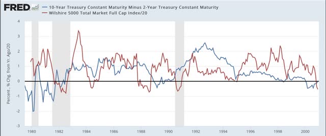
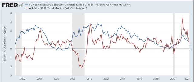

Again, notice that the yield curve has inverted roughly a year or more in advance of every single recession during that period. It even did so briefly in August 2019, although the 2020 recession was an anomaly caused by the near complete stoppage of the economy in the first several months of the pandemic. Further, aside from one month in 1998, it never inverted without a recession following. In other words, it has a near perfect record.

Now look at the red line. Stock prices turned lower YoY during every recession except for the brief 1980 one. But they also turned down a number of times when traders expected an economic slowdown (1984, 1994, 2002, 2016) - but these downturns were very brief. The only more extended YoY decline was the exact 1 year period following the crash of 1987. Also, note that stock prices typically continued higher YoY even after there was a yield curve inversion - each and every time believing “it’s different this time.” Only after an oncoming recession was obvious did stocks turn lower YoY.

Now let’s take a look at the same information zoomed in over the past 2 years:
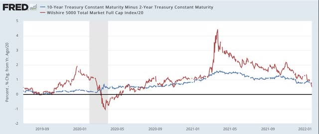

The yield curve is not as positive as it was 1 year ago. But on the other hand, it has certainly not inverted. At roughly +0.8%, it is more or less in the middle of its range for the last 40 years. Quite simply the yield curve is not forecasting any imminent economic downturn.

But what about the Fed raising rates. Below are two graphs showing the same 40 year period, with the same YoY% change in stocks represented; this time being contrasted with the actual Fed funds rate (black, right scale):
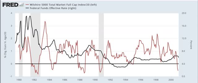
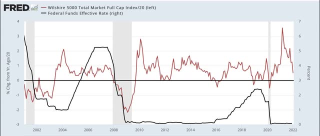

Don’t squint too hard, because the point is that there is no strong relationship between the two. In the 1980s and 1990s, YoY stock prices moved somewhat opposite to Fed funds, i.e., an increase/decrease in the funds rate correlated with a downturn/upturn in the YoY% change in stock prices. Since 2000, in the era of zero or near zero Fed funds rates, there has been very little correlation at all, and indeed during most of the time that the Fed funds rate was increasing in 2005-07 and 2016-19, there were continued YoY gains for stock prices.

The bottom line is, there is nothing fundamental happening that justifies a major revaluation downward in stock prices for any extended period. A brief emotional - and emotionally jarring - move to negative YoY comparisons, with a swift rebound would hardly be surprising. And it would be emotionally jarring, because stock prices increased 25% last year:
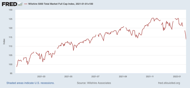

So a YoY decline would mean giving that all back. But it would likely be the kind of move that the late St. Jack Bogle of Vanguard Funds fame would categorize as almost certainly being “V” shaped. Of course, it could always “be different this time.” But that has historically been the wrong conclusion.

Saturday, January 22, 2022

Weekly Indicators for January 17 - 21 at Seeking Alpha


 - by New Deal democrat

My Weekly Indicators post is up at Seeking Alpha.

A few months ago, in the midst of the Boom, virtually every indicator across all time spectrums was positive. In the past months, we have begun to see the deterioration in that situation, as every week one or two more indicators in one or another part of the time spectrum have shifted to neutral or negative.

This doesn’t mean that the situation is negative; more like that it is normal, with some negatives and neutrals, put still a majority of positives.

As usual, clicking over and reading will bring you up to the moment on the relevant leading and coincident economic data, and will bring me a little cash for my grocery shopping.

Friday, January 21, 2022

Coronavirus dashboard: Omicron has peaked; now what?


 - by New Deal democrat

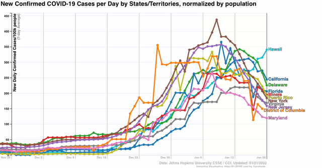
Let’s start out with the good, or at least less catastrophic news: it’s almost certain that the Omicron wave has peaked in the US. In fact, the only Census region it is still up week over week is in the Midwest:


In almost all of the areas hit hard early - Puerto Rico, and the NYC and DC metro areas - cases are down sharply since peaking. Additionally cases are down substantially in California, Florida, and Illinois:


Only Hawaii, anomalously, has continued to increase.

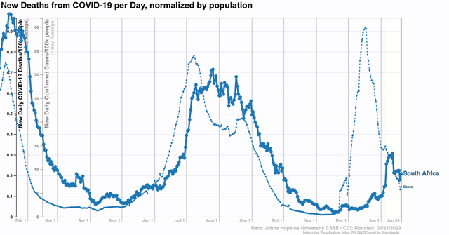
This follows the pattern set in South Africa, where cases are now down over 80% from their peak, and deaths have plateaued after a 5 week lag:


Note that deaths have increased less than cases in each of the last two waves, and only increased about 30% as much as cases during Omicron.

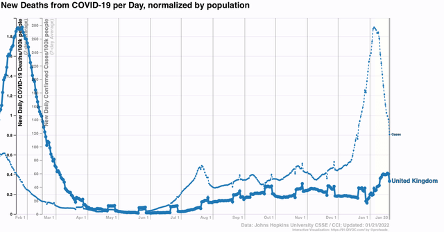
The situation is similar in the UK:


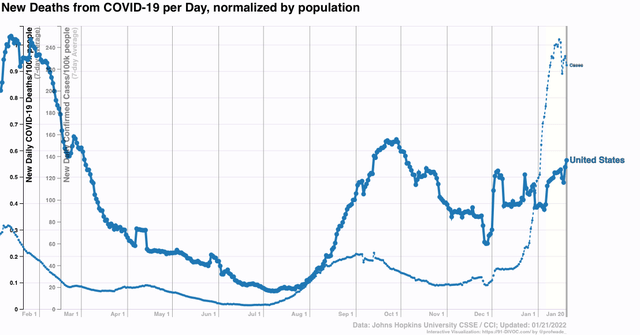
It appears the US will follow a similar trajectory with deaths, which probably will peak at under 2500 per day in late February:


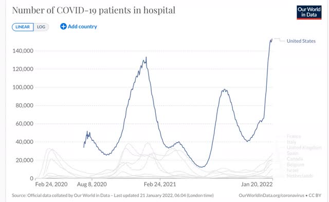
Returning to the US, although I won’t bother with a graph, cases are only up 10% or more in the past week in the States of AK, AL, AZ, HI, ID, KS, MT, KY, LA, NE, NV, NM, ND, OK, SC, TN, UT, WV, and WY. Hospitalizations have peaked simultaneously with cases, which suggests either a capacity or triage issue, and/or people are reluctant to seek treatment there. ICU admissions are still slowly increasing:


Because of the capacity/triage/reluctance issue, it is unclear the extent to which hospitalizations rose less steeply than cases,  Hospitals will remain under severe strain for several more weeks.

If cases in the US decline roughly as a mirror image of how they rose during Omicron, what next?

Trevor Bedford, the biostatistician whose work has been invaluable throughout the pandemic, has a guess: 


“We estimate that as of Jan 17 the US as whole has had a cumulative ~15M confirmed cases of Omicron, or approximately 4.5% of the population recorded as confirmed cases. The large majority (>90%) of these accumulated since Dec 14

Assuming between a 1 in 4 and 1 in 5 case reporting rate suggests that between 18% and 23% of the country was infected by Omicron by Jan 17, with the large majority infected in a span of just ~4 weeks.

“There may be a longer tail of circulation after the peak (as seen in South Africa), but a rough expectation would have an equivalent number of cases in the next 4 weeks on the other side of the peak. This would suggest 36-46% of the US infected by Omicron by mid-Feb. 

“My big question now is to what extent will Omicron-like emergence events characterize "endemic" circulation of SARS-CoV-2? Given it occurred once, having it occur again would not be at all surprising, but I don't know whether to expect this every year or every ten.”

Note the big assumption that only 20% to 25% of all COVID cases under Omicron have been “confirmed,” with the rest flying under the radar.

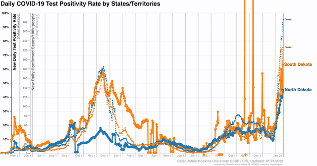
My own rule of thumb has been a ratio of 2:1 or 2.2:1. The reason for this is the experience of North and South Dakota one year ago, where there were massive outbreaks - the biggest of any States before Omicron - one year ago, with 60% of all tests being positive. That hasn’t prevented both States from having Omicron outbreaks more than 50% higher than the worst of that wave:


If North and South Dakota’s previous wave, with 10% of their populations having *confirmed* cases and 60% test positivity strongly suggesting a huge number of unconfirmed cases, didn’t lead to sustained resistance to reinfection, is a 10% *confirmed* outbreak in the US as a whole, with 45%+ test positivity, going to have a different result?

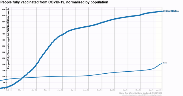
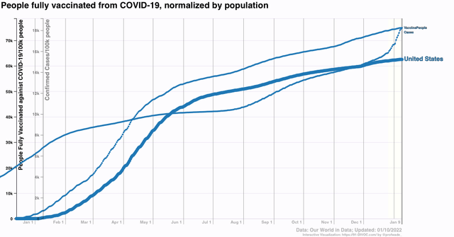
In other words, the situation going forward very much depends on whether and when the next unusual variant hits, and how much resistance has been obtained by the vast unvaccinated idiot population in the US. As the below graph shows, only 15% more of the US population got vaccinated in the past 7 months, despite both the Delta and Omicron waves:


If “real” cases are 2.2x confirmed cases, then about 45% of the US population has had COVID since the pandemic started, with the distribution presumably skewed with a greater percent among the unvaccinated during the past 7 months.

With COVID circulating freely among wild mammal populations (and domesticated cats as well), there are going to be more variants. Our best hope is that Trevor Bedford is right, and in general most succeeding waves of COVID from here on exact less and less of a toll, with occasional bigger spikes. For my part, I continue to be hopeful that there will be a big respite in spring.

Thursday, January 20, 2022

Omicron and seasonality bedevil new jobless claims


 - by New Deal democrat

It is likely that the effects of Omicron as well as quirks of seasonality were behind this week’s big jump in new jobless claims.

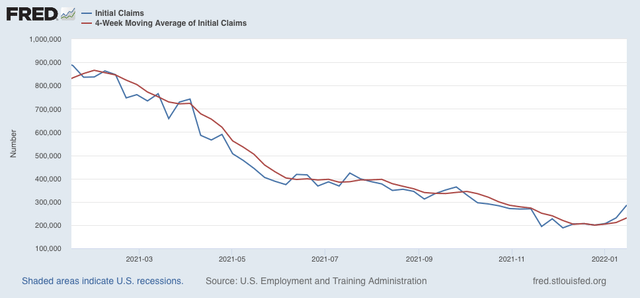
New claims jumped 55,000 on a seasonally adjusted basis last week to 286,000. The 4 week average of new claims increased 20,000 to 231,000:


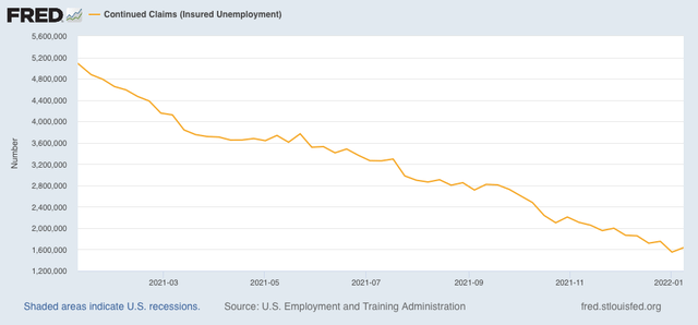
Continuing claims for jobless benefits rose 84,000, to 1,635,000, which is still very close to a 50 year low (not shown):


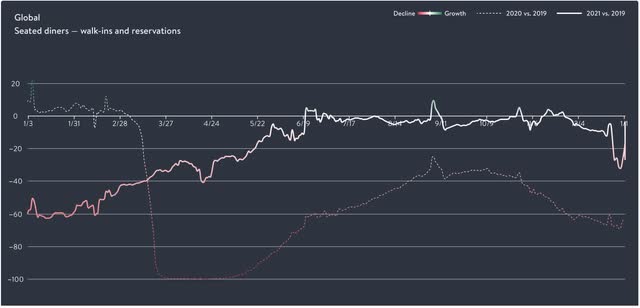
There are probably two reasons for the big jump in new claims. The first is Omicron. We won’t have the State by State breakdown for one more week, but it would hardly be surprising if the big increases were most profound in those States hardest hit by Omicron in the previous weeks (generally, the NYC and DC metro areas). Certainly in the last several weeks Omicron has hit restaurant reservations, which have declined by 25% or more compared with a year ago (graph shows global reservations, but US reservations are nearly identical):


Layoffs in the service industries as a result of gigantic rises in infections would not be a surprise at all.

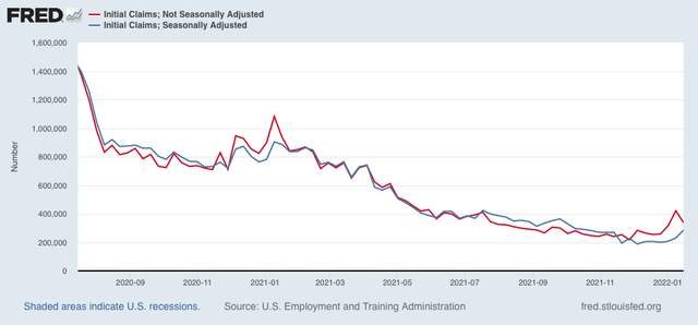
Secondly, here is a comparison of seasonally adjusted (blue) vs. not seasonally adjusted (red) claims in the past 18 months:


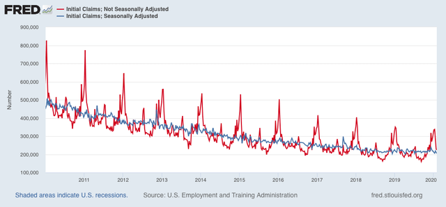
Note that in the corresponding week last year non-seasonally adjusted claims were no higher than seasonally adjusted. This year they failed to decline to that level. More generally, non-seasonally adjusted claims typically are below the seasonally adjusted number from August through November, and then rise to a peak in the second full week of January, as shown above, and also below in this graph of the 10 years just before the pandemic:


The past 6 months have resulted in levels of new claims equivalent to the range of those  during 2016 and 2017, except that typically claims rise slowly during autumn from a low point in August, and in 2021 they declined slowly through autumn. Because of the typically sharp declines from peak in new claims in mid-January, something as simple as the creep of the days of the week for equivalent dates can make a big difference. In other words, next week there may be a much bigger drop than there was for the equivalent week in 2016 and 2017.

The effects of Omicron are going to continue for at least a few more weeks. The quirks of seasonality should resolve after another week. Until I see more going on, I do not see any reason to overreact to the last two weeks’ big increase in claims.

Wednesday, January 19, 2022

Housing ends 2021 with a bang


 - by New Deal democrat

Housing ended 2021 with a bang, as housing starts (blue in the graph below, left scale) increased to 1.702 million annualized, and permits (gold) to 1.873 million annualized, in both cases the highest level since 2006 with the sole exception of last March / January, respectively. Single family permits (red, right scale), which are the least noisy, increased to 1.128 million annualized, the highest reading since May, but well below the 8 months previous to that:


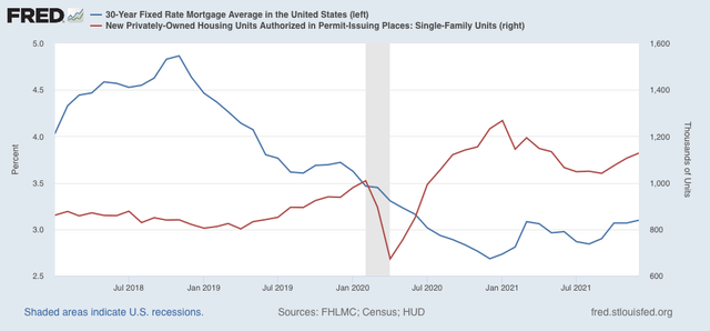
Because this is December data, even though it is seasonally adjusted, it may still be affected by Christmas seasonality, as exacerbated by the pandemic (right scale below). To some extent it may also be a reaction to the recent increase in mortgage rates (blue, left scale) off their bottom:


We have seen this dynamic before, where prospective homeowners, seeing an increase in mortgage rates and expecting more, “lock in” purchases before they become more expensive. 

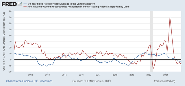
Below is the same data on mortgages and single family permits, but presented YoY:


This makes it easier to see that housing permits have historically followed mortgage rates (inverted), with a 3 to 6 month lag. Mortgage rates have turned higher than they were 1 year ago, and permits have turned lower than one year ago.

According to Mortgage News Daily, mortgage rates yesterday averaged 3.7%, the highest in over a year. Should these higher rates continue, we can expect a significant decline in new housing permits and starts in the next few months.

In the meantime, because housing permits and starts are an important component of the long leading indicators, this data will play an important role in my long term forecast, which will be determined after data for Q4 GDP is reported next week.

Tuesday, January 18, 2022

Short term economic forecast through mid year 2022


 - by New Deal democrat

My short term forecast for the first half of this year is up at Seeking Alpha.

This forecast is based on the same system I have successfully used since before the Great Recession. Most forecasters, deliberately or not, cherry pick data points to fit a previously arrived at intellectual point of view, and simply project the current trend ahead (or else default to the inevitable “We’re DOOOMED!). The short leading indicators, in contrast, forecast a change in the trend before the lion’s share of the data is affected.
Clicking through and reading will give you a good idea of what is ahead from now till the 4th of July, and will pay for some bourbon and firewood to help get me through the cold winter nights still ahead.

Monday, January 17, 2022

Fox News and white grievance


 - by New Deal democrat

In his recent book “Kill Switch,” Adam Jentleson, a former aide to the late Senator Harry Reid, persuasively argues that the Senate filibuster arose by accident, when a rule revision in 1805 failed to include the “previous question” resolution, which would require a vote on the issue pending, because it was thought superfluous. He also shows by overwhelming evidence that for the past 200 years, by far the single most common use of the filibuster was to defeat civil rights legislation benefiting Blacks.


And in the past week, it has become apparent that Senators Manchin and Sinema would join GOPers to uphold a filibuster against voting rights legislation once again. 

Which brings me to a couple of recent graphs posted by Kevin Drum. He is the sort of commentator I read, even though I frequently disagree with him, because his arguments are worthy of thinking through, and sometimes he finds genuine gold nuggets.

An example of the former is when he argues,  as he did today  , that “the progressive wing of the party [“blew it” by] insist[ing] on pushing voting rights laws that had zero chance of passing. Biden knew this from the start and said so. Then Bernie Sanders insisted on an insane BBB bill that would have been unprecedented in the history of the country,” and as a result is responsible for “Joe Biden's disastrous approval rating and the chaotic shape of the Democratic Party.”

I am trying to think of the counterfactual situation where the progressive wing of the Democratic Party simply allowed the infrastructure bill to pass and then sat back somnolently while nothing else happened. Somehow I fail to see that Joe Biden’s approval rating would be any better. Hmmmm . . . I rather think that, whether they articulate this blame or not, the public is really pissed off at being governed by John Roberts’ reactionary 6 on the Supreme Court, with an assist by co-Presidents Manchin and Sinema, and that the attempt by progressives to get more done has not worsened this perception.
But, as an example of the latter, Drum has shown very persuasive data many times showing that the decline in the crime rate since the early 1990s correlates really well with the abatement of lead paint beginning 20 years before. Less lead poisoning in boys leads to less crime in young men 20 years later. Q.E.D. And it really does seem to be true.

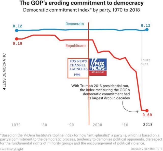
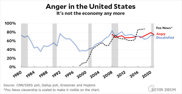
Anyway, that brings me to the point of today’s post. Because recently Drum has also been arguing that the main source of the US’s turn to proto-fascism has overwhelmingly been Fox News (much moreso than even Facebook). Below are a couple of graphs he has posted over the past several months to that point.

First, commitment to democracy in the US by political party:


Second, anger or dissatisfaction with the direction of the country in the United States:


While correlation is not causation, it is certainly true that Fox News’s almost entire worldview of white grievance overlays quite well with both the collapse of commitment to democratic institutions by GOPers, and anger at the direction of the country.

Saturday, January 15, 2022

Weekly Indicators for January 10 - 14 at Seeking Alpha


 - by New Deal democrat

My Weekly Indicators post is up at Seeking Alpha.

In addition to Omicron, commodity prices and interest rates are having an impact across the board on the long and short term forecasts and the nowcast. (Just for spite, two weeks ago some RW nut jobs had a fit about my including a meteor as the image for the article, so this week I including an even more graphic representation of the Giant Flaming Meteor of Death).

As usual, clicking over and reading will not only bring you fully up to date, but will pay my pizza tab for the week.

Friday, January 14, 2022

December real retail sales tank; industrial production also declines; consumer slowdown seems nearly certain


 - by New Deal democrat

Two days ago, in connection with consumer inflation, I reiterated that “we certainly are at a point where a sharp deceleration beginning with the consumer sector of the economy is more likely than not.”

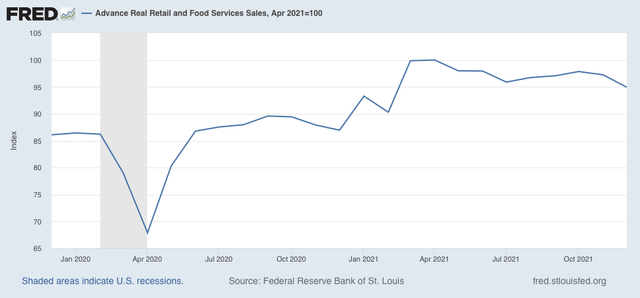
I didn’t expect to have it show up so soon! Retail sales, one of my favorite “real” economic indicators, took a nosedive in the month of December, declining -1.9% for the month even before inflation. After inflation, “real” retail sales declined -2.4%. Ouch! 
Thus real retail sales are down -5.1% from their April peak: 


Recall that real retail sales rose 1.8% in October. So I suspect a large part of the decline is that, fearing shortages on the shelves at Christmastime, many consumers advanced their purchases of Christmas gifts by several months. Still, the net decline since September has been -2.2%

Nevertheless they remain 9.2% higher than one year ago. In the past 70+ years before the pandemic hit, real retail sales were only higher YoY briefly in the early 1980s, as well as for about 16 months during the 1940s, 50s, and 60s.

Next, let’s turn to employment, because real retail sales are also a good short leading indicator for jobs.

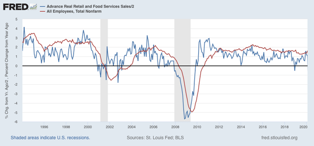
As I have written many times over the past 10+ years, real retail sales YoY/2 has a good record of leading jobs YoY with a lead time of about 3 to 6 months. That’s because demand for goods and services leads for the need to hire employees to fill that demand.  The exceptions have been right after the 2001 and 2008 recessions, when it took jobs longer to catch up, as shown in the graph below, which takes us up to February 2020:


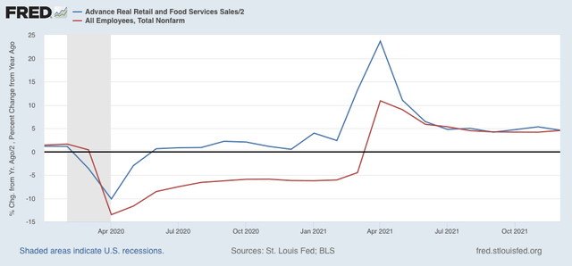
Now here is the same graph since just before the pandemic hit:


Note the two have been right in line for over half a year. I have written for the past several months that this “argues that we can expect jobs reports in the next few months to average out about even with those from one year ago, which averaged about 500,000 per month.” Although the last two jobs reports started out poor, November followed the pattern of upward revisions, and I expect more such revisions when next month’s jobs report is released. But comparisons will be very difficult YoY beginning in March, which means - to be consistent - that a big slowing of employment growth seems likely by about summer this year.

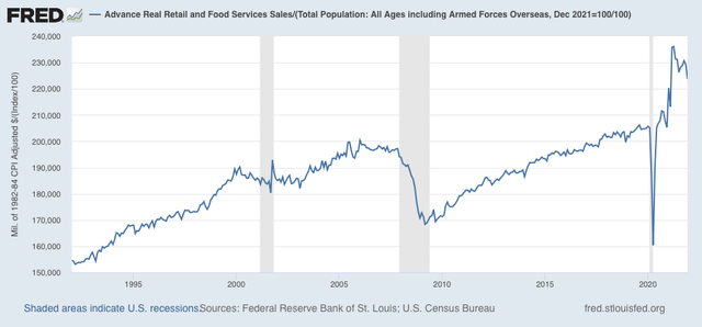
Finally, real retail sales per capita is one of my long leading indicators. Here’s what it looks like for the past 30 years:


With a -5.3% decline since April, this is a decidedly negative signal. Frankly, it’s recessionary looking out to midyear and beyond. Since it is only one indicator among the array, it isn’t a big concern yet. But it absolutely adds to the evidence that a big consumer slowdown as we go forward this year looks likely.

—-

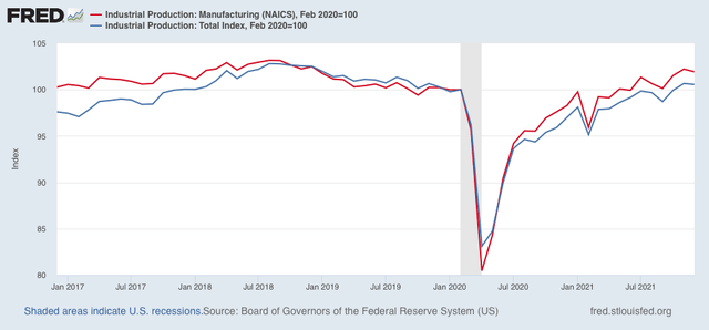
Before I go, let’s also briefly take a peek at industrial production, which also declined, by -0.1%, this morning. Manufacturing production declined -0.3%. Additionally, November was revised downward for both total and manufacturing production. Here’s the current view:

Both are still higher than they were just before the pandemic. While this isn’t good news, it is within the range of noise, but on the other hand, it is one more bit of evidence for a slowing expansion.
Thursday, January 13, 2022

Continuing unemployment claims make new 45+ year low


 - by New Deal democrat

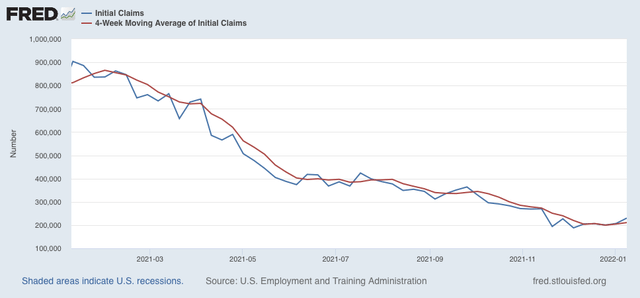
New claims increased 23,000 last week to 230,000. The 4 week average of new claims increased 6,250 to 210,750:


The big increase is likely affected by seasonality. It’ll be another week or two before we can tell if there is any real change in trend. If there is, it is likely to be a flattening in new claims rather than any significant increase. 

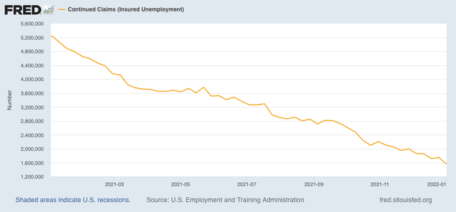
Continuing claims for jobless benefits, meanwhile, declined by 194,000, to 1,559,000:


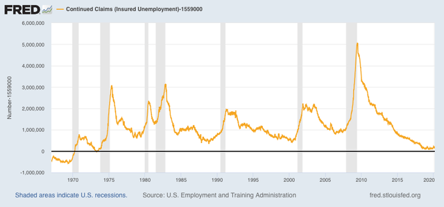
This is a new 45+ year record low. There haven’t been continuing claims this low since 1974, when the US population was half of what it is now, as shown in the graph below that subtracts 1,559,000 from the actual number:


Last week I wrote: “I don’t know if initial claims will go any lower, but I suspect continuing claims will continue to decline to or even below their 2018-19 levels.” Wow! Only one week later and the forecast is already correct. I expect even further declines in continuing claims, until the extreme tightness in the labor market brought about by the pandemic starts to loosen its hold.

Wednesday, January 12, 2022

Consumer inflation lessens in December; real wages increase, but a consumer slowdown remains likely


 - by New Deal democrat

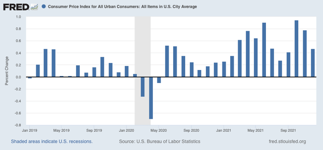
Consumer prices increased 0.5% in December, a deceleration from the past several months. But this is still well above the typical monthly increase in prices pre-pandemic: 


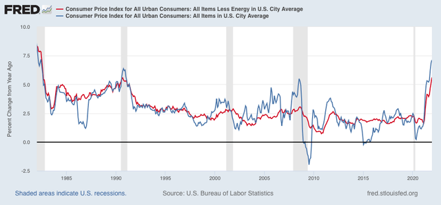
On a YoY basis, at 7.1% consumer inflation is the highest since the big Reagan recession of 1981-82. My favorite measure, CPI ex energy, is also up 5.6% YoY, and tied for the worst since the 1981-82 recession as well:


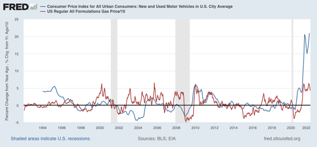
Inflation in new and used vehicle prices has risen again to over 20% YoY; and gas prices YoY are still up at levels that in the past have been associated with economic slowdowns or recessions:


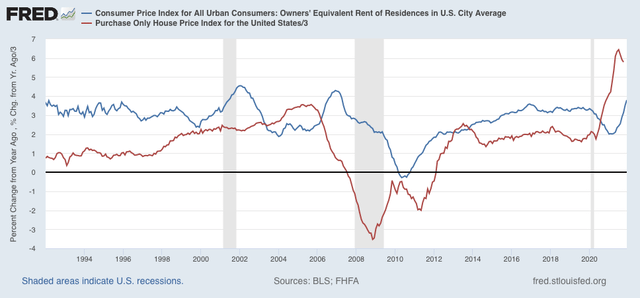
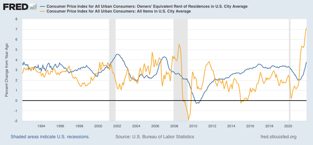
As I have been forecasting for months, house price increases have fed through into rents and “owners equivalent rent,” which has continued to increase:


Interestingly, in both prior cases where owners equivalent rent surged after house prices did - 2001 and 2006 - the surge in overall consumer prices (gold in the graph below) quickly ended and went into reverse:


In both cases, however, the Fed had aggressively raised interest rates in the meantime, helping to cause a slowdown (2006) or recession (2001), which in turn led to lower inflation.

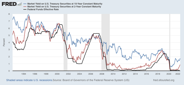
The bond market fully expects the Fed to do the same thing this year. Below I show the yield on the 10 year Treasury (blue), 2 year Treasury (red), and Fed funds rate (black):


Note that in recent decades bond market investors have almost always anticipated the Fed’s move, bidding up yields on the 2 year bond in advance of Fed interest rate hikes. There have been some false positives (1996, 2002, 2011) but more often the bond market has been right.

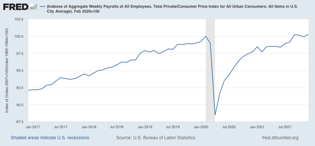
Now let’s talk about “real” wages. To cut to the chase, this month the news was positive.

Average real hourly wages increased in December by 0.2%, although they are still -1.2% below their interim peak last December:


Additionally, real aggregate payrolls, an overall measure of consumer health, also increased 0.3% in December, and returned to equal their peak from September:


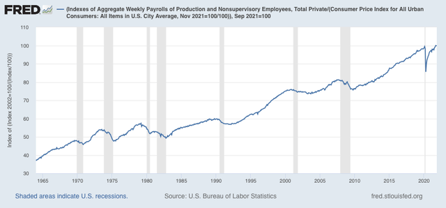
For the past 50+ years, when aggregate real wages have retreated from peak for 3 to 9 months, a recession has typically followed:


To sum up, while real wage growth has slowed down or halted, depending on which measure we use, they have not gone into reverse. This is consistent with taking a near term recession off the table for now. On the other hand, as I wrote last month, “we certainly are at a point where a sharp deceleration beginning with the consumer sector of the economy is more likely than not.” While perhaps I would modify that by dropping the descriptor “sharp,” a deceleration in the consumer sector remains supported by December’s inflation report.

Tuesday, January 11, 2022

Coronavirus dashboard for January 11: good news and bad news


 - by New Deal democrat

With no new economic releases today, let me give you a brief update on the fast-moving Omicron wave.


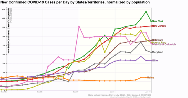
First, the good news: as I pointed out yesterday, several States that were hit hardest first by Omicron look like they are hitting or have already hit peak:


This is an increase from just several days ago. In fact, right now the only early hit State that has not peaked is Hawaii (not shown).

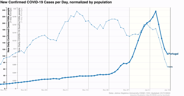
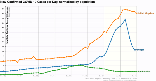
Several other countries that were hit hard early by Omicron also appear to have peaked: the UK and Portugal, in addition to South Africa, where the strain was identified first:


If the Omicron wave peaks in 30 to 45 days after onset, then the US as a whole is likely to peak between this coming weekend and the end of this month.

That’s the good news.

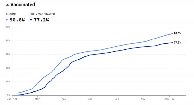
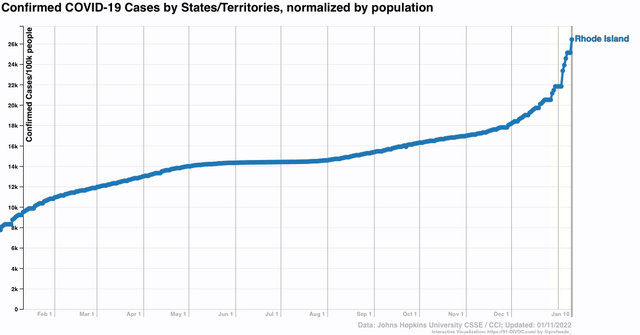
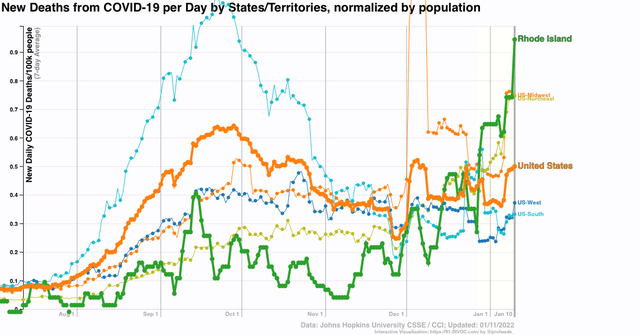
The question becomes, what happens next? I have been hopeful that between vaccinations and prior infections, we would reach a point where any subsequent wave would be much less in severity. The State that has been the best candidate for a bellwether of this hypothesis is Rhode Island, which has both a very high vaccination rate (1st graph below), and a very high rate of previous infections (2nd graph below).


Despite the fact that over 75% of Rhode Island’s population was fully vaccinated, and perhaps 40% or more of its population having been infected even before December, Omicron hit it hard, with over 8% of the entire State’s population having *confirmed* infections in the last 45 days. That in itself is not such a big deal. Portugal, with 90% of its population fully vaccinated, also got hit hard by Omicron infections.

The problem is the next graph, which shows deaths:


Rhode Island has had a higher death rate in the past month than the US as a whole, or any Census Region. In fact, it is in the top 10 States for rate of deaths at the moment.

I should point out this has not been true of Portugal, which has not had any increase in deaths at all during the Omicron wave - at least not so far:


But if prior infections do not build up appreciable resistance to reinfection, at least over the medium term, then with about 1/4 or more of its population dead set against being vaccinated, the US is in some real long term trouble.

Monday, January 10, 2022

Coronavirus dashboard for January 10: how “mild” Omicron is depends upon how much you lag the data


 - by New Deal democrat

So, how “mild” or not, is Omicron? It depends on whether you lag the data on hospitalizations and deaths or not.


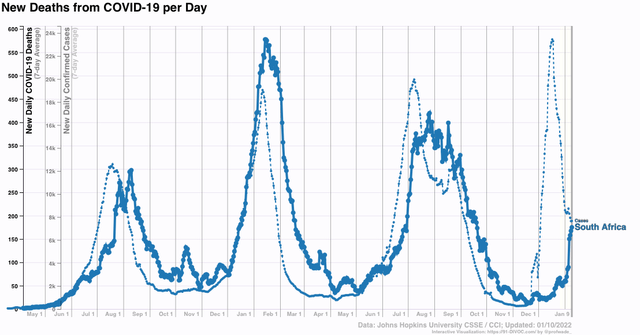
The original story out of South Africa was that Omicron was extremely mild. Despite a huge spike in infections, deaths barely budged. As Omicron took hold in Europe and the US, South Africa disappeared from the picture.  Which is too bad, because here is what has been happening with deaths: 


In the past week, deaths in South Africa tripled. Mind you, deaths - so far, anyway - at 13x their pre-Omicron low, are nowhere near the 80x+ increase in cases. But the point is, deaths lag cases, and until you wait about a month to see how deaths play out, you really don’t know how “mild” Omicron is.

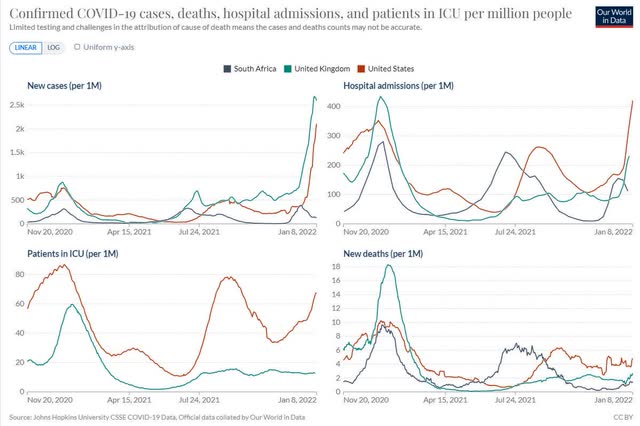
And the bad news for the US is, compared with South Africa and even the UK, Omicron hasn’t been as “mild” so far, as shown in the below set of graphs comparing cases, hospitalizations, ICU admissions, and deaths (again, so far):


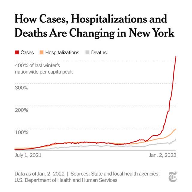
A week ago, the story in the US was still how “mild” Omicron has been, as shown in this graph of cases, hospitalizations, and deaths from New York City (perhaps the earliest hard hit metro area):


There’s just one problem with the above graph: hospitalizations and deaths aren’t shown with any sort of lag. Deaths on January 2 are compared with hospitalizations on January 2 and new cases on January 2.

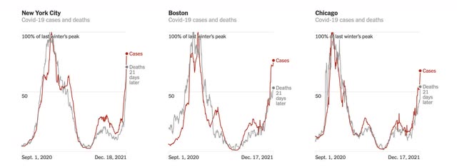
But when you put in an appropriate lag, the situation looks much different, as in the below graph in which deaths are lagged 21 days for NYC and two other metros:


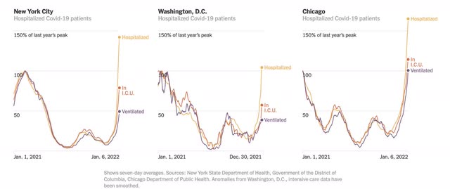
Or the below graph, including ICU patients with a 14 day lag compared with infections:


All of a sudden, Omicron doesn’t appear that much milder at all.

This is something I’ve been following since the onset of the Omicron wave. Since hospitalizations started to spike about 10 days after the onset of the wave, i crunched data with a 10 day lag. While I don’t have a graph to show you, I can tell you that each time I have done this, it gives me a result of hospitalizations increasing at a rate of between 65% to 80% of cases. ICU admissions lag hospitalizations by only a day or two, and have gone up at about 50% of the rate of cases. Because the Omicron wave only started in earnest on December 15, 3 1/2 weeks ago, we are only beginning to see the trend in deaths.

But we already have more hospitalizations for COVID than we have ever had before in the US, and the system is beginning to break down - and we haven’t even reached the peak yet. As a society, the US seems to have just given up.

Since I hate only passing on gloom and doom, let me give you a few rays of daylight.

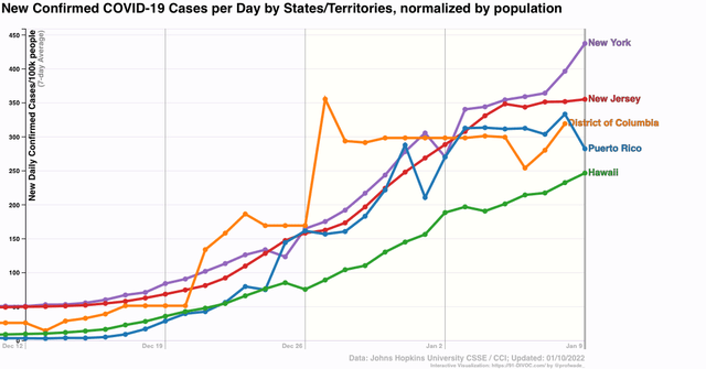
First, the Omicron wave seems to have already peaked in several places where it hit early: Puerto Rico, DC, and New Jersey. In two other places, New York and Hawaii, it hasn’t peaked yet:


Finally, Omicron is infecting so many people that within a month or two it is going to be difficult for COVID to find a victim who doesn’t have at least some resistance via vaccinations or prior infection:


About 62% of the US population has been fully vaccinated (but only about 36% being boosted as well, according to the CDC). Another 12% have received at least one dose. And over 18% have had *confirmed* cases. The likelihood is that, including asymptomatic infections or infections of people who didn’t bother to get tested, at least double that percentage, somewhere on the order of 40% of all Americans, have been infected.

If we just randomly assign that 40% of infected people among all those vaccinated and unvaccinated, that’s roughly 85% of the US population that should have at least *some* resistance to renewed infection. Another month of Omicron is probably going to take that up to 90%.

It’s possible there is a doomsday variant out there, but it’s more likely that, as COVID becomes endemic, each wave displays less and less virulence, not because they are inherently “milder,” but simply because the vast majority of the population has some, increasing, level of immune resistance.