Tuesday, April 23, 2024

The range-bound new home sales market continues


 - by New Deal democrat


As per my usual caveat, while new home sales are the most leading of the housing construction metrics, they are noisy and heavily revised. 


That was true again this month, as sales (blue in the graph below) increased almost 9% m/m to 693,000 annualized, after February was revised downward by -25,000 to 637,000. As the five year graph below shows, after the initial Boom powered by 3% mortgage rates, sales declined almost 50% in 2022, but have stabilized in the 650,000 +/-50,000 range for the past 16 months. For comparison I also include the much less noisy, but slightly less leading single family housing permits (red), which as anticipated appear to have started to follow sales down from their peak:


Here is a re-run of the graph I posted last week, showing the differing trajectories of new vs. existing home sales, showing that existing home prices remained elevated longer, and have taken longer to decline, by 40% vs. 50%:


Because mortgage rates have risen somewhat in the past few months (from 6.67% to 7.10%, I expect this range in new home sales to continue, with a slight downward bias in the immediate months ahead.

Also unlike existing home sales, where inventory is being constrained by would-be sellers trapped in 3% mortgages and thus prices remain near all-time highs, the median price of new homes declined as much as -16% from peak at their lows last year, and are still down -13.3%:


But, like sales, on a YoY basis prices have stabilized, and are only down -1.9%.

As I almost always point out, sales lead prices. Thus as shown above the range-bound sales for the last 16 months are leading to more stable prices.

The bottom line is that I expect this range-bound behavior in sales and prices, as well as the bifurcation between the new and existing home markets to continue until such time as the Fed moves significantly on interest rates.

Monday, April 22, 2024

Real median wage and income growth through March continued the recent increasing trend


 - by New Deal democrat


This is an update of some information I last posted several months ago.

Real median household income is one of the best measures of average Americans’ well-being, but the official measure is only reported once a year, in September of the following year.

So right now the most recent official measure is for calendar year 2022 (when you might remember gas prices surged to $5/gallon). In other words, it’s hopelessly out of date.

There are several ways of approximating real median household income on a more timely basis available in the public data. 

For this purpose, wages are a very imperfect proxy, because income includes things like stimulus payments or debt relief during the pandemic, and also because - especially during the pandemic - layoffs were concentrated among low wage workers, thus distorting the averages higher.

The best proxies make use of personal income. We can also get information from total payrolls. The below graph shows both real personal income (blue) and real aggregate payrolls (red), both divided by population. Here’s the data starting before the pandemic:


And here is the close-up after the end of pandemic related stimulus payments:


The big difference between the two is that real payrolls only include wages and salaries, while real incomes includes all sources of income, including stimulus payments and things like social security. Thus real per capita payrolls declined sharply during the fist months of the pandemic, and did not recover until late 2022, while incomes soared due to the pandemic related programs. Further, real payrolls stalled during 2022, while real incomes per capita actually declined.

Since late 2022, both measures have consistently increased. 

Additionally, a few private services have been able to use monthly data from the survey that gives rise to the jobs report to create a far more timely and illuminating monthly update. The best of these that I know of is Motio Research.

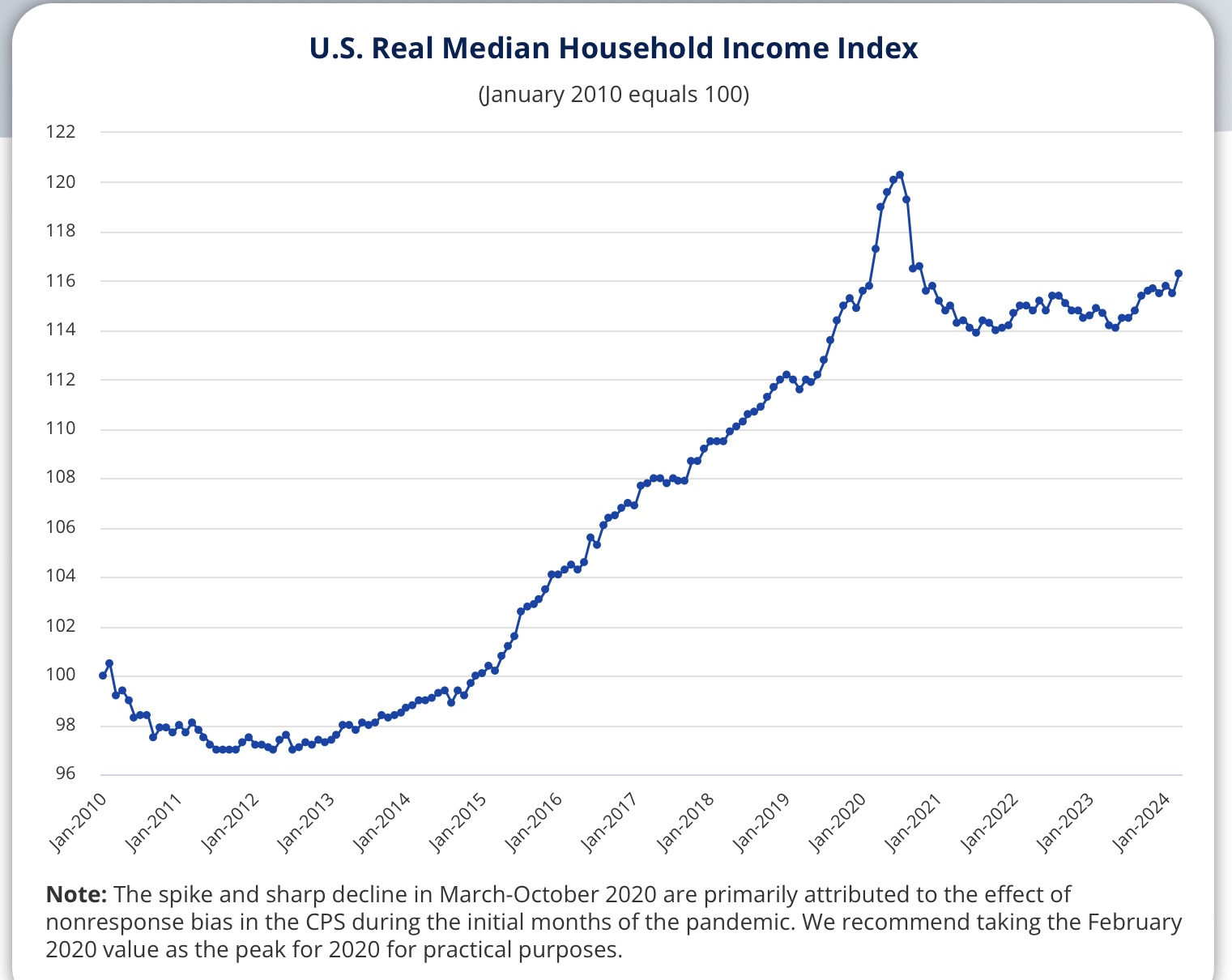
Here’s their most recent update, through March:


Like personal income, household income really spiked with the pandemic relief programs in 2020. It then went nowhere for almost three years, stuck at the same level it had been in 2019. Again, like personal income, that’s because of the spike in inflation, and the fact that jobs and real payrolls didn’t return to their pre-pandemic levels until 2022 and 2023 respectively.

The one remaining puzzle is why real *median* household income declined again into mid-2023, vs. *average* personal income, which increased.  One explanation might be the expiration of pandemic stimulus and relief programs, although I would expect that to show up in the broader income measure.

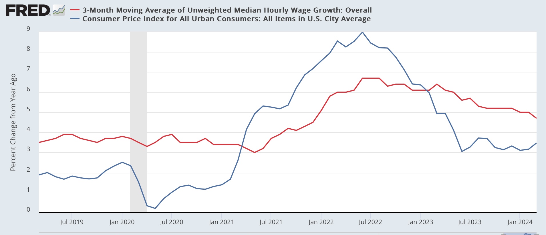
Some light can be shed by looking at *median* wage growth, as documented by the Fed:


Note that, compared with inflation, median (rather than average) wages continued to decline until early 2023. 

Another important explanation is likely that income growth has been concentrated among the the lowest quintile of households. In connection with the latest annual update, US News and World Report wrote:
 
While overall household wealth in America fell from the end of 2021 through the first three quarters of 2022, the bottom 20% of households by income saw their wealth grow.

“In total, household wealth for the lowest-income quintile rose by nearly 10% while wealth in all other income quintiles fell, according to figures from the Federal Reserve and nonpartisan data center USAFacts.

Here is the accompanying graph:


This very much helps explain why Biden’s approval ratings have been so poor throughout 2022 and 2023.

But, to return to the Motio Research graph, note that since last June, the trend has been rising again, and in March real median household income reached its highest level ever except for the 2020 stimulus months. What this means is that, if real household income growth had been concentrated among the lowest quintile through 2022, by mid-2023 it had spread upward to include the median group as well, and with some fits and starts this growth has continued.

Which is good news for the average American household.

Sunday, April 21, 2024

Weekly Indicators for April 15 - 19 at Seeking Alpha


 - by New Deal democrat


I neglected to pt this up yesterday, so here it is now. My “Weekly Indicators” post is up at Seeking Alpha.


There continues to be a fair amount of churn and noise in the short leading and coincident time range. Nevertheless, the underlying theme is one of positivity. Aside from the swoon in the stock market this past week, the other big move was in industrial commodities, which spike higher late in the week. This is the first time they have been positive YoY in well over a year.

Typically that is because of higher demand straining against current supply, which means an expanding economy (with inflationary pressure building up).

As usual, clicking over and reading will bring you up to the virtual moment on all of these trends, and reward me with a little pocket change for organizing the data and bringing it to you.

Friday, April 19, 2024

The bifurcation of the new vs. existing home markets continues


 - by New Deal democrat


The bifurcation of the new vs. existing home markets continued in March, per the report on existing home sales and prices yesterday. Remember that, unlike existing homeowners, house builders can vary square footage, amenities, lot sizes, and offer price and/or mortgage incentives to counteract the effect of interest rate hikes.

On a seasonally adjusted basis, existing home sales declined from 438,000 to 419,000 in March. But this is well within the seasonally adjusted range of the past 16 months (gray, right scale in the graph below){also, note I am using Trading Economics graphs due to restrictions put on FRED by the Realtors; also note difference in scales):


At their worst seasonally adjusted levels last year, existing home sales were down over 40% from their 2021 peak. Meanwhile new home sales (blue, left scale), at their low in July 2022 down almost 50% from their 2021 peak, responded to mortgage rates by rebounding during much of last year before fading again in the past few months. They are presently down 35% from peak.

Some of the difference in trajectories between new and existing home sales can be explained by prices. Because so many homeowners have been frozen in place by their existing 3% mortgages, the inventory of existing homes for sale remains low, and that has driven prices higher almost consistently since the onset of the pandemic:


Although I can’t show you a graph, similar to the trajectory of the FHFA and Case Shiller repeat sales indexes, the median price for existing homes briefly turned negative in early 2023, troughing at -3.0% YoY in May. Thereafter YoY comparisons increased to a peak of higher by 5.7% in February. In March median prices were higher by 4.8%, which may or may not just be a pause.

Meanwhile the median price for new houses was down by -7.6% YoY in February. The below graph shows actual median prices for the last 5 years of new homes vs. the last 12 months (all that Realtor.com allows FRED to publish) of existing homes:


Median existing home prices are currently about 40% higher than their immediate pre-pandemic level, while new home prices are about 30% higher. 

Ultimately both the new and existing home markets are driven by mortgage rates. With a diminished supply of existing homes (because of prospective sellers being frozen in place by their current mortgage rates), their relative scarcity has driven prices comparatively higher than for new homes, especially as builders have moved aggressively to bring the purchase price of new homes down. This bifurcation will continue until the Fed moves significantly on rates.

Thursday, April 18, 2024

Initial jobless claimZzzzzzzzzz . . . .


 - by New Deal democrat


For the last 8 months, initial and continuing claims have been remarkably consistent. Initial claims have varied between 194,000 and 228,000, and continuing claims have with the exception of three weeks right at the new year varied between 1.787 million and 1.829 million.


That rangebound trend continued this week as initial claims were unchanged at 212,000, and the four week average was also unchanged at 214,500. With the usual one week delay, continuing claims rose 2,000 t0 1.812 million:


Indeed, with the exception of last spring, initial claims have been essentially rangebound for the entire last 2 years!

For forecasting purposes, the YoY% change is more important. There, initial claims are down -5.5%, the four week average down -3.8%, and continuing claims are higher by 4.3% — still the lowest YoY reading for continuing claims in the past 13 months:


Needless to say, this suggests continued economic expansion in the next few months.

A reader over at Seeking Alpha several weeks ago asked what these looked like compared with population, since that is a more true measure of the tightness of the jobs market. Here’s the post-pandemic look:


The 4 week average of initial claims is 0.13% of the entire civilian labor force, while continuing claims are 1.1%.

Let’s compare that with the entire pre-pandemic record:


The 4 week average of initial claims is tied with the lowest ever pre-pandemic reading it had in 2019, while continuing claims are lower than the entire 50+ year pre-pandemic period except for 2017-19.

This in short remains a very tight labor market, where finding a new job is easier than at almost any time ever before the pandemic.

Finally, let’s update the Sahm rule implications with the first two weeks of April under our belt. Remember that both initial and continuing claims lead the unemployment rate, the former by more than the latter:


As per form, the unemployment rate followed jobless claims higher last year. Initial claims are now lower again, and continuing cliams remain flat. This suggests no further upward pressure on the unemployment rate in the months ahead, and likely some downward pressure towards 3.7% or 3.6%. In short, the Sahm rule is not going to be triggered.

Tuesday, April 16, 2024

Industrial production for March is positive, but the overall trend remains flat


 - by New Deal democrat


Industrial production, one of the premier series the NBER has historically used to declare recessions vs. expansions, has faded in importance since China was admitted to regular trading status in 1999. As you can see in the first graph below, both total and manufacturing production peaked in 2007. Further, manufacturing has continued to fade, as its post-pandemic peak has not equaled its 2010’s peak either:


In March, total production increased 0.4% from an upwardly revised, by 0.2%, February; but it is still down -0.6% from its September 2022 post-pandemic peak. Manufacturing production increased 0.5%, but is also down, by -0.2% from its post-pandemic peak as well:


Before the “China shock,” a YoY downturn in industrial production almost always meant recession. As the YoY graph below shows, there was a significant “industrial recession” in 2015-16 without any generalized economic downturn:


Whether the 2019 downturn would have resulted in a recession by itself had the pandemic not intervened will always remain an unanswered question. But again in 2023 production was again down YoY with no recession. As of March, manufacturing production is flat YoY, while total production is now up by 1.0%.

Bottom line: while March was positive, the overall trend remains generally flat.

Simultaneous declines in housing permits, starts, and units under construction in March suggests seasonality glitch, not a change in trend


 - by New Deal democrat


There was a big decline in housing starts last month, and a smaller but significant decline in permits. Whether that signifies a change in trend or just noise is the issue. I lean towards the latter. To wit, in reaction to both January and Feburary’s housing construction report I wrote, “To signify a likely recession, units under construction would have to decline at least -10%, and needless to say, we’re not there. With permits having increased off their bottom, I am not expecting such a 10% decline in construction to materialize.” I also indicated that I expected to see more of a decline in the actual hard-data metric of housing units under construction.

That is still the case.

To recapitulate my overall framework: mortgage rates lead permits, which lead starts, which lead housing units under construction, all of which lead prices. Of those metrics, the least noisy one that conveys the most signal vs. noise is single family permits.

In response to inflation data which generally stopped declining towards the holy 2%, mortgage rates have risen about .25% since the end of last year. For March as a whole, they averaged 6.82%. This is about average for the past 18 months, in which overall they have varied between 6.1% and 7.8%. In response permits have stabilized in the range of 1.42 million to 1.52 million units annualized. In March they declined -65,000 to 1.458 million annualized:


The relationship shows up even better when we compare the two series YoY:


With mortgage rates higher by a slight 0.25% YoY, permits went slightly positive YoY and are still higher by 1.5%.

As per usual, starts (light blue in the graph below) are the noisier of the metrics, declining 228,000 to 1.321 million annualized in March. Permits (dark blue) declined -65,000 to 1.458 million, and single family permits (red, right scale) declined -59,000 to 973,000:


These are among the poorest numbers for each in the past 12 months, but the simultaneity of the downturn (as opposed to a 1-2 month lag in starts) makes me suspect there may be a seasonal adjustment issue in play, perhaps having to do with Easter. Still, there isn’t enough there to break out of their range, and as discussed above mortgage rates have not suggested one is coming.

Next, to reiterate: housing units under construction (red in the graph below) are the best measure of the actual economic activity in the housing market. Here’s the long term historical view:


Those also declined, by -15,000, to 1.646 million units annualized:


Once again note the synchronicity of the downturn, making me suspect a seasonality glitch. Further, they are only down -3.7% from their peak, nowhere near the historical -10% most consistent with the onset of a recession.

Below I have broken out single vs. multi-family construction. Because, in response to record high house prices, builders turned to higher density, lower cost apartment and condo construction. Hence the record high last year in that metric. Last month multi-family construction faded slightly, while single family units under construction actually continued their slightly increasing trend:


As I wrote last month, I do expect a further gradual decline in total housing units under construction in the months ahead, to catch up with the decline in permits that bottomed one year ago. Here’s the post-pandemic view of starts, permits, and total units under construction:


But, as shown above, I doubt we will cross the -10% threshold that it would normally take to signal a recession, given the general stabilization of both permits and starts over the past 16 months.

Monday, April 15, 2024

Real retail sales rebound, forecast a continued “soft landing” for jobs growth


 - by New Deal democrat


As per usual, real retail sales is one of my favorite indicators, because it gives so much information about the consumer, and since consumption leads employment, it helps forecast the trend in the latter as well.


And the news this morning was good, as nominally retail sales increased 0.7% in March, while February’s number was revised higher by 0.3% to 0.9%. After accounting for 0.4% inflation in March, real retail sales increased 0.3%, and February was revised up to 0.5%.

To the extent there was bad news, it was that January’s -1.2% decline has still not been completely erased.

To the graphs: first, below I show the historical record for the past 15+ years of both real retail sales (dark blue) and real personal spending on goods (light blue), a similar but more comprehensive measure. The two metrics tend to trend together over time, although the latter has tended to increase more (hence I adjust to bring the trends more in line):


Here is the close-up post-pandemic view:


Real retail sales are still -2.9% below their April 2022 peak, and also about -1% below their nearer term August 2023 peak. Real spending on goods has been more positive. More importantly for the long term trend, real spending on goods has now completely caught up with real retail sales. The bigger picture is that real retail sales have trended neutral, while real spending on goods has trended higher.

Turning to the effect on employment, here is the longer term YoY% gains in both spending measures /2, which is the best match to forecast the near term trend in jobs (red):


Employment doesn’t respond to every noisy move in spending, but does tend to peak and trough about 6 months after spending, and responds to the longer term trend. If FRED allowed 6 or 12 month moving averages, the correspondence would be much closer.

With that caveat, here is the post-pandemic close up:


Historically negative YoY comparisons in real retail sales have usually meant recession, while positive comparisons have almost always meant continued expansion. Needless to say, that didn’t happen in 2022-23. The overall trend since mid year 2023 has been “less negative” to neutral, while real spending on goods has remained positive.

And as those YoY comparisons in consumption have improved, we have seen the decelerating trend in employment shift to a more consistent “soft landing” scenario. Thus real retail sales are forecasting continued growth in the neighborhood of the last few months’ numbers going forward through most of this year.


Saturday, April 13, 2024

Weekly Indicators for April 8 - 12 at Seeking Alpha


 - by New Deal democrat


My “Weekly Indicators” post is up at Seeking Alpha.


There has been a lot o churn in both the short leading and coincident indicators in the past few weeks, but the overall tone is towards a more positive economic environment.

As usual, clicking over and reading will bring you up to the virtual moment on the data, and reward me just a little bit for my efforts.

Friday, April 12, 2024

March consumer price inflation was still mainly about the dynamics of shelter and gas prices


 - by New Deal democrat


The one advantage of not reporting on the March CPI results for two days is I’ve had the opportunity to look at more data in depth and mull things over.


And I’ve decided that there really wasn’t much change from the pattern we’ve seen for about the past 9 months. Basically the month to month variation in inflation is a function of the interplay between shelter and gas prices. During late 2022 and early 2023, the latter were still accelerating or steady at a high rate of inflation, while the latter were falling. Beginning in late 2023, the dynamic reversed, as shelter inflation was slowly decelerating, while gas prices had bottomed.

The big takeaway for the last several month has been a renewed increase in gas prices, while the deceleration in shelter inflation has slowed. There have been a couple of other players in the process that I’ll also discuss below.

First, let’s look at the month over month change in inflation for shelter as a whole (dark blue) vs. rent of primary residence (light blue) and owners’ equivalent rent (red) for the past 6 years:


In the years prior to the pandemic, the three averaged +0.3% growth +/-0.1% each month. After the pandemic, they peaked at roughly .75%, and in the past 12 months have slowly declined from an average of +0.5% per month to +0.4% per month. 

On a YoY basis, the various measures of shelter have decelerated from roughly +8% to just over 5.5%:


Because house prices lead shelter inflation with a 12-18 month lag, here’s the update of that metric:


Since house prices are presently increasing at 2.5% YoY, about average for the pre-pandemic period, I expect OER and the other measures of shelter inflation to continue to decelerate YoY, but probably at a slow pace compared with their initial rapid decline, because they will be compared with +0.5% monthly increases 12 months before vs. 0.7% at their peak.

Now let’s take a look at monthly gas prices (dark blue in the graph below) vs. energy prices generally (light blue). On a monthly basis, these had mainly declined beginning in mid-2022, but in the last two months have increased at more than their pre-pandemic average:


On a YoY basis, both are now higher, by 1.3% and 2.1% respectively:


This contrasts with their negative YoY readings for almost the entirety of the previous 16 months. 

So, to summarize: the deceleration in shelter inflation has slowed, while gas prices have reversed higher. This explains most of the increase in monthly inflation in the past several months, as is shown in the graph below comparing energy inflation (grey), headline (blue), core (gold), and inflation ex-shelter (red) YoY:


The reversal in gas prices has caused a similar, albeit smaller, reversal higher in both headline inflation and inflation ex-shelter. But it is noteworthy that, simply by excluding shelter, inflation is still only higher by 2.3%. 

In other words, it remains the case that, except for shelter, US consumer inflation is well-behaved.

As noted above, let me also take a look at several other sectors of note. Although I won’t bother with a graph, the former problem children of new and used vehicle prices have reached a new equilibrium. New car prices have actually *declined* -0.1% YoY, while used vehicles are down -2.2% YoY.

The remaining problem areas of inflation are:


 (1) food away from home, which peaked at 8.8% YoY one year ago, and is now down to 4.2%, close to its pre-pandemic average of 2.5%-3.0%;
 (2) electricity, which has followed gas prices higher, rising from 2.2% YoY last August to 5.0% in March; and 
 (3) transportation services - mainly car repairs and insurance - which has rocketed from its pre-pandemic range of 2.5%-5.0% to as high as 15.2% in October 2022, and is now still up 10.7%.

I’m not sure if there is more to the electricity story than the price of gas-powered turbines. But car repairs are up 8.2% YoY, and motor vehicle insurance is up a whopping 22.2%! Based on the past inflationary period of 1966-82, it is clear that transportation services lags increases in vehicle prices by 1-2 years and even more, sometimes increasing right through recessions:


So while I expect food away from home to continue to revert to its prior average, and perhaps electricity as well, price increases in transportation services may remain a problem for quite some time.

Real average wages and aggregate payrolls signal continued growth


 - by New Deal democrat


On Wednesday I was traveling so I didn’t get around to writing about the important CPI release. Let me start my delayed response by updating real wages and payrolls for non-supervisory employees.


Historically, as I have pointed out a number of times, real aggregate payrolls (red in the graph below) have a flawless record over the past 50+ years of peaking in the months ahead of a recession (Note: I show the last 30 years below. From the late 1960s through early 1990s, real wages declined almost relentlessly as the combination of the huge Baby Boom generation plus women entering the workforce applied potent downward pressure on wages, but increased aggregate payrolls and household income as there were many more two wage-earner households):


and turning negative YoY close to simultaneously with its onset. Real nonsupervisory wages (blue) have a less stellar record, but have almost always sharply decelerated or turned negative before or shortly after the onset of a recession, because inflation typically has accelerated faster than wage growth late in expansions, while the Fed has raised rates to tamp down demand:


Last Friday we found out that wages rose 0.2% for the month and 4.2% YoY, continuing their pattern of slow deceleration. Aggregate payrolls rose a strong 0.7% for the month and 6.1% for the year. With Wednesday’s 0.4% increase in consumer prices, real wages actually declined by -0.1% for the month, while real aggregate payrolls rounded up to 0.4%. On a YoY basis, real wages are up 4.2%, and real aggregate payrolls rose 6.1%:


Here are the real absolute numbers, norming inflation to “1” as of last month:


Real wages have declined in the past several months, but they have not broken trend yet. Meanwhile real aggregate payrolls set yet another all time record high. With this new high, and with real aggregate payrolls up close to 2% in the past year, continued expansion in the immediate future remains almost certain. 

Thursday, April 11, 2024

Initial claims continue to be rangebound, and a positive for the near term forecast


 - by New Deal democrat


[NOTE: After traveling all day yesterday, I decided to put off any comments on the CPI upside surprise until later today. Short version is that shelter continues its slow decent, gasoline picked up, and services are accelerating as one might expect in a strong economy with the supply chain tailwind having dissipated.]


Initial claims continued to be rangebound this week, declining -11,000 to 211,000. The four week moving average declined -250 to 214,250. With the usual one week delay, continuing claims increased 28,000 to 1.817 million:


On the YoY% basis more important for forecasting purposes, weekly claims were down -4.1%, the four week average down -4.4%, and continuing claims up from last week’s 12 month low to 7.1%:


While continuing claims are a negative, they are much less so than they were during the last nine months of 2023. The more leading initial claims remain firmly positive.

One week of data doesn’t give me enough information to make it worth updating the Sahm rule forecast, but here is the YoY% comparison through the end of March:


For the month, initial claims were down -5.9% YoY, while the unemployment rate was up 5.6% (note this is a ‘percent of a percent’). Because the YoY comparisons in both initial and continuing claims have improved since late last year, I expect the YoY comparison in the unemployment rate to follow suit, meaning a slight decline in that rate is more likely than a return to its recent peak of 3.9%.

Tuesday, April 9, 2024

Travelin’ man: Weekly Indicators for April 1 - 5 at Seeking Alppha


 - by New Deal democrat


I neglected to post this over the weekend, so I will post it now….


My “Weekly Indicators” update is over at Seeking Alpha.

There was lots of churn under the surface last week, but it continues to point towards general improvement.

As usual, clicking over and reading will bring you up to date through last Friday, and reward me with a little lunch money as well.

Also, tomorrow morning the CPI for March will be reported. I’ll be on the road, so I won’t be able to do any in dept post, but I’ll try to give you a quick paragraph or two covering the high (or low) points as I can.

Monday, April 8, 2024

Scenes from the robust March jobs report


 - by New Deal democrat


As I wrote Friday, the news from the employment report was almost all good. Let’s follow up on the most important points today.


First, the thre month average of new jobs added rose to a 12 month high, meaning Q1 of this year was the best quarter since Q1 of last year (dark blue, below, vs. monthly jobs light blue):


And the unemployment rate ticked down 0.1%, meaning that the three month average is 3.8%, or 0.3% higher than the 12 month low of 3.5% set one year ago:


This means that the Sahm rule is not close to being triggered.

And while average hourly wages for nonsupervisory personnel decelerated further to 4.2%, this remains very high by the standards of the past 40 years:


Remember that typically inflation increases faster than wages in the year heading into a recession. So with inflation at 3.1% YoY, this is not in play.

As I wrote last month, real aggregate payroll growth has a flawless record going back over 50 years of distinguishing expansion from recession. At 6.1% growth YoY, this is 3.0% higher than the last CPI reading:


It also made a new all-time high in real terms (not shown). Further, the monthly trend has been increasing in the past few months, so unless there is a big spurt in inflation, we are going to set yet another new record high this month:


All of this is simply potent evidence of an employment economy that is humming along.

Last month I wrote that the Household survey contained some numbers that were simply recessionary. Let’s update that.

In contrast to the Establishment survey, which showed 1.9% growth YoY, which is healthier than almost all times during the past 25 years, the Household survey remained stuck at 0.4% growth YoY. Here’s the longer term graph, normed to the current YoY numbers:


This metric does remain recessionary, but I expect it to resolve in the direction of the Establishment survey.

As indicated, the unemployment rate was 0.3% higher than one year ago. The U6 underemployment rate was higher by 0.6%:


Over the 30 year history of the U6 rate, this has heretofore meant recession. In the case of the U3 rate, there have been a number of instances where it just meant slow growth, although it too more often than not meant a recession was on the way.

Unless we start seeing weekly unemployment claims heading higher, I expect the unemployment rate to remain stable or even decline slightly in the months ahead. This will make the YoY comparisons better, removing that metric from one of any concern.

So while some poor spots remain, as I wrote on Friday, this employment report made the “soft landing” scenario the default setting going forward.