Monday, July 20, 2020

Coronavirus dashboard for July 20: decisive evidence that deaths have increased since the beginning of July


 - by New Deal democrat

Total US cases: 3,773,260
Last 7 days’ average: 66,903
Total US deaths: 140,534 
Last 7 days’ average: 761

I have been waiting to see if the death rate remained elevated once the 4th of July week was completely out of the 7 day average (because there was an additional “slow” day caused by the holiday, followed by 4 “compressed” weekdays rather than 5. Those last 4 days continued to affect the 7 day average for, well, another 7 days. That period is over as of this past weekend, and here is the result:


There were 2.32 deaths per million Saturday and 2.31 deaths per million yesterday, the highest (excluding the NJ data dump several weeks ago) since June 11.

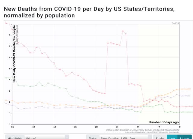
Regionally, in terms of cases, the South continues to be the worst, followed by the West, with the Midwest having a significant increase as well, and the Northeast a very slight increase:
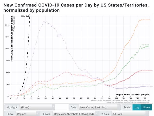
In terms of deaths, the Midwest and Northeast continue at their low levels, but only the Northeast has recently improved:

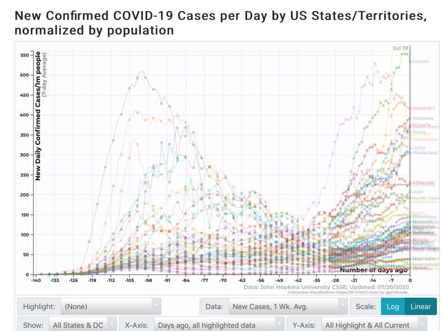
Turning to the States, in terms of cases, Florida has made an all-time high per capita, even exceeding NY’s old record, with Arizona, Louisiana, and Alabama close behind:

In terms of deaths, however, even Arizona, at 10 per million on average for the last 7 days is nowhere near the levels of NY, NJ, and several other States early in the pandemic:
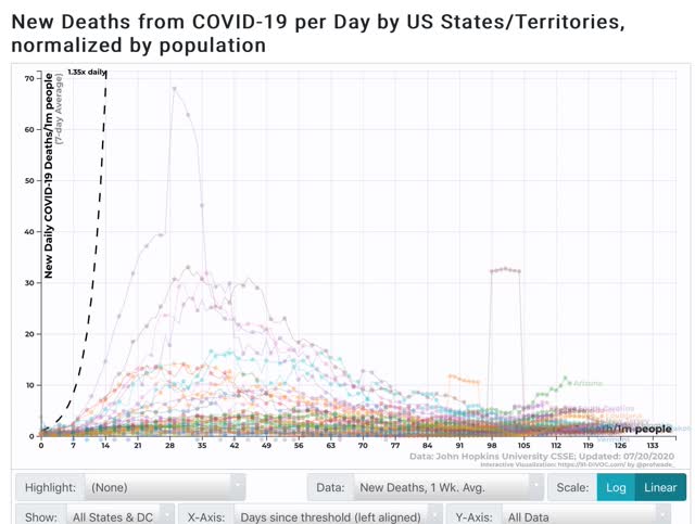

This is most likely demographics at work. Remember that 1/3 to 1/2 of all deaths in the first several months were at nursing homes and other assisted living centers, full of elderly people in poor health, together 24/7 with recirculated air. The pandemic went through them like dry tinder. More recently it has been younger people, with lower death rates, at bars, restaurants, gyms, and private parties who have been spreading the disease.

But the bottom line is that the evidence is now overwhelming that the increased infections that began at Memorial Day weekend have finally flowed through into deaths since the beginning of July.

Sunday, July 19, 2020

The 2020 Presidential election nowcast based on State polling: Trump support deteriorating even in red States


 - by New Deal democrat

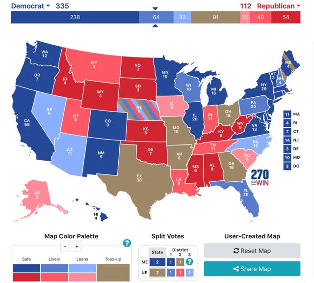
For the past four weeks I have posted a projection of the Electoral College vote based solely on State rather than national polls (since after all that is how the College operates) that have been reported in the last 30 days.

Here’s how it works:
- States where the race is closer than 3% are shown as toss-ups.
- States where the range is between 3% to 5% are light colors.
- States where the range is between 5% and 10% are medium colors.
- States where the candidate is leading by 10% plus are dark colors.

Before I proceed further, let me emphasize that polls are *not* forecasts, only nowcasts. They tell us the likely result if the election were held today. Since voters, campaigns, and decision-makers respond to the polling, it is inherently fluid. The only true “forecasts” are those which make us of leading indicators, which forecast where the data will be in a few months. One model, based on the Q1 Index of Leading Indicators, already forecasts a bad Trump loss. Another model, based on real disposable personal income through Q2, will be locked in when June’s data is reported in two weeks. Tomorrow or Tuesday I will look at the status of the short leading indicators, which will give a forecast “locked in” through Q3.

With that said, here is the updated map through July 19:


In the past two weeks, 6 red States have been downgraded to “lean” or toss-up for Trump, and two Congressional districts in Maine and Nebraska have flipped to Biden. Only Iowa has moved from toss-up to lean Trump. As of now, only 10 States, none of which has more than 9 Electoral votes, are “solid” Trump. In several of them - the Dakotas, Idaho, West Virginia, and Wyoming - there has not been any new State polling in months, so there could well be more Electoral votes and GOP Senators at risk who we simply don’t know about.

As has been the case for the past three weeks, if Biden simply wins the States in which he leads by 5% or more in the polling, he would win the Electoral College, without even winning a single “toss-up” or “lean Biden” State as shown on the map.

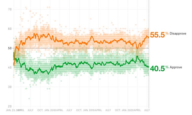
The only thing not working against Trump right now, is that his (dis)-approval rating, as has been the case for four years, is slowly drifting back to its “natural” level:


This is probably because he has been more “competent” at appealing to his base, by demonizing Black Lives Matter and provoking police confrontations in Portland.

To reiterate what I said last week, Trump has about 6 weeks to turn around the pandemic. If Labor Day comes and goes and the pandemic is still raging anywhere near as bad as it is now, Trump is going to lose the popular vote, and lose it badly, making an electoral college victory virtually impossible. The odds of him pulling off that miracle are slim, to say the least.

I would very much like to see more State polling in the red States, because there are GOP Senators who should be targeted that we don’t even know are vulnerable as of this point.

Saturday, July 18, 2020

Weekly Indicators for July 14 - 18 at Seeking Alpha


 - by New Deal democrat

My Weekly Indicators post is up at Seeking Alpha.

With the coronavirus beginning to rage out of control again in a majority of US States, improvement in the coincident and short leading indicators has generally halted.

As usual, clicking over and reading will bring you up to the moment, and bring me a penny or two.

Friday, July 17, 2020

Improvement slows in initial claims; expect recent job growth to slow as well


 - by New Deal democrat

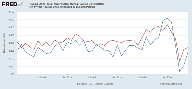
A preliminary note: this morning’s report on housing permits and starts showed improvement across the board in June, although the absolute levels are no better than the low points of 2017 and late 2018-early 2019:


I’ll have more at Seeking Alpha later.

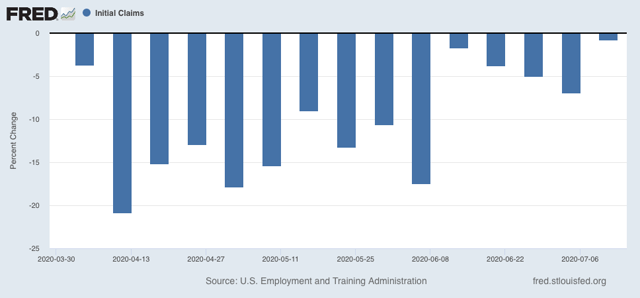
Now let’s turn to yesterday’s report on initial and continuing claims, which have been giving the most up-to-date  snapshot of the continuing  economic impacts of the coronavirus on employment. This week continued the trend of slight improvement to “less awful,” as shown in the below graph of the week over week % change:


There were 1.300 million new claims, only 10,000, or -0.8%, less than one week ago. This is the smallest weekly decline since the peak in claims in early April.

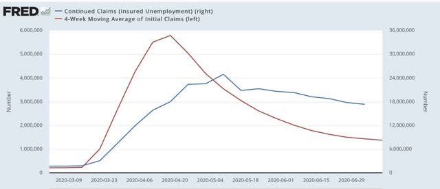
As for continuing claims for the previous week, they declined to 17.338 million, 422,000 less than one week prior (blue in the graph below, vs. red for initial claims):


Although there is slight improvement, this is frankly discouraging, as close to 1% of the workforce is still being laid off and filing for unemployment every week, four months after the onset of the crisis. With special pandemic benefits expiring this month, the economy is set to take a further gigantic hit unless an extension is passed by Congress (which means clearing the GOP Senate). In short, the damage is continuing, and it is continuing to spread out, even if at a slower rate.

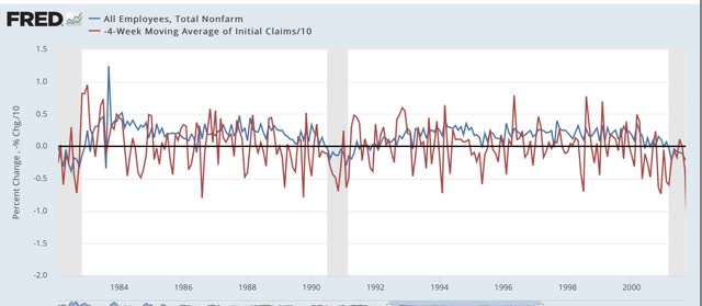
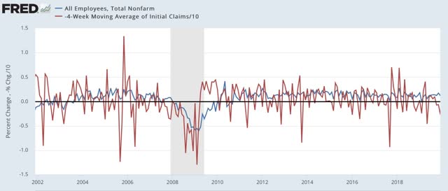
Back in the “regular” pre-coronavirus era, one of the ways of forecasting future employment was by tracking the moving average of initial claims, as the trend in initial claims has a lengthy track record of leading overall jobs. Although the claims data is noisy, even averaging over a month, here is the record in two graphs going back 50 years:


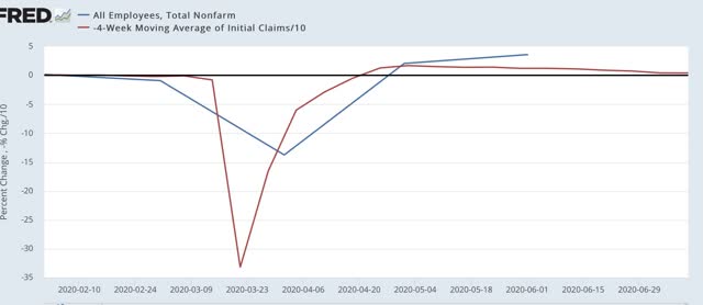
Now here is the past few months:


Note that the typical improvement in initial claims during the past 50+ years has almost never been better than +5% (divided by 10 in the graphs). In the past several months, it has been up to 50% (again, divided by 10 in the graphs). But that has now slowed to about 25% (2.5% in the last graph).

We are probably going to get another big positive number in the jobs report for July, for which the survey week is this one. On the other hand, the slowdown in gains in the initial claims numbers means that job gains are likely to slow in the next several jobs reports. And that does not take into account any large-scale re-closing of portions of the economy in many States.

Thursday, July 16, 2020

June retail sales: some actual good news; the entirety of the pandemic decline has been reversed


 - by New Deal democrat

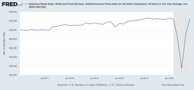
Retail sales are the third report for June out of the four main coincident indicators that show whether the economy is in recession or expansion. And they were the third that grew again for the month. In fact, in real, inflation-adjusted terms they were higher than in February, the last month before the coronavirus pandemic hit:


They were also only 0.4% lower than their all-time high set last August.

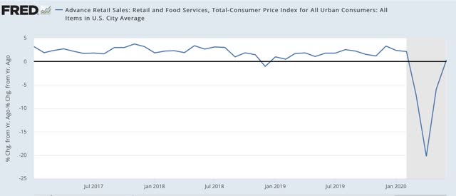
And they were also slightly *higher* YoY (0.4%), as shown in the below graph:


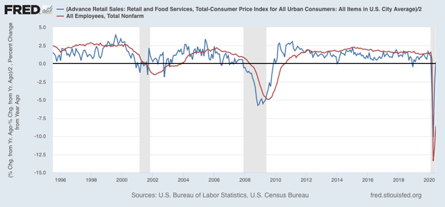
Beyond that, over the long haul, real retail sales have been a good if noisy short term leading indicator for job growth:

(Note that real retail sales are divided by 2 for scale in the above graph).

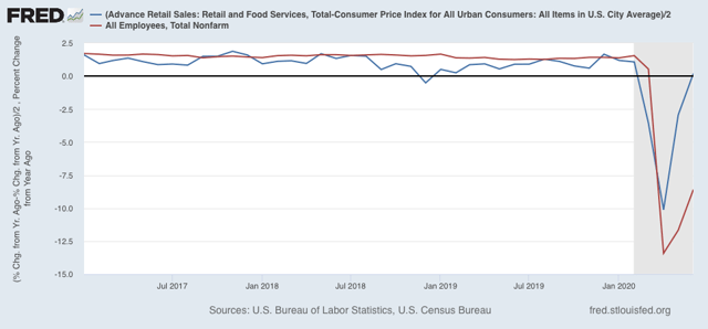
Here’s a close-up of the same since Trump took office:


This is a good omen for the July jobs report. In the past two months, jobs have regained about 1/3 of their pandemic losses. It’s at least within the realm of reasonable possibility that most of the pandemic job losses could be made up within the next two months, even if many States at least partially “re-close”  - although brick-and-mortar sales jobs might be replaced by more warehouse and deliver order-fulfilling jobs. And I don’t see how restaurant and bar jobs come back intact for many months to come.

Wednesday, July 15, 2020

Industrial production rebounds, but will manufacturing employment continue to do so?


 - by New Deal democrat

Industrial production is the King of Coincident Indicators. The NBER almost always identifies month of the end, and frequently the beginning, of recessions based on the top and bottom of this statistic. This morning it was reported to have risen for the second month in a row in June. Let’s take a little deeper look.

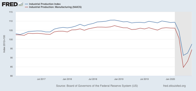
First, here’s the graph of both overall (blue) and manufacturing (red) production since Trump was inaugurated in January 2017:


Both rose by a total of 5% or more until December 2018. In that month both peaked, and both have been in declines since then, first shallow, and then collapsing when the coronavirus hit in March. As of this morning’s report, overall production has regained about 1/3 of its loss since December 2018. Manufacturing has regained about 1/2 of its loss.

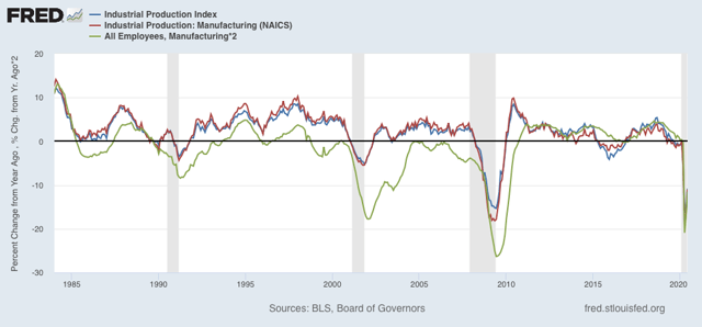
Manufacturing employment (green in the graphs below) has historically followed manufacturing production with a lag of several months. Here’s the long term YoY look since 1984 (employment x2 for scale):


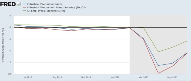
The sudden stop forced on the economy by the pandemic has meant that there has been virtually no lag this year:


But unless manufacturing quickly returns to its February level, I expect that job losses in manufacturing will be more permanent. I.e., employers will not be so quick to rehire all of their laid-off workers.