- by New Deal democrat
Jason Furman is out today with an article in the WSJ that the Fed should not be in any rush to lower rates, arguing that “the last mile” to 2% inflation is likely to be the hardest. While the article is behind a paywall, the illustration (and his endorsement of it) as well as his past positions indicate that he is largely relying on the Phillips Curve, which holds that there is a trade-off between inflation and unemployment:
Paul Krugman put out an immediate rejoinder on X, that “core inflation has been higher than headline. But this is NOT because volatile food and energy are drivers of disinflation. It’s because excluding food and energy raises the weight of shelter. Over the past year headline ex-shelter is 2.1[%], core ex-shelter 1.9[%].”
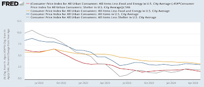
Krugman does not include a graph, but one is not too difficult to reconstruct on FRED, which already includes everything except core ex-shelter. Since that is roughly 45% of total core CPI, all we have to do is subtract it using an appropriate weighting (I’ve taken it out one further decimal point to 45.4%), and we find that Krugman is correct. To wit: the below graph includes YoY headline (blue), core (gold), headline ex-shelter (gray), and core ex-shelter (red) for the past two years:
While it’s true that core inflation has been falling more slowly and remains slightly higher than headline, headline and core inflation ex-shelter are lower than both of them, and core ex-shelter is the lowest of all. My calculation to one further decimal point actually rounds to 1.8% rather than Krugman’s 1.9%.
In other words, the “last mile” is difficult only because shelter costs have been so slow to disinflate. And as I argued several weeks ago (and others have argued as well), that in turn is because higher mortgage rates, caused by the Fed’s rate hikes themselves, have created a severe shortage in existing homes for sale, driving *up* their prices.
Further, as I argued last Friday, the most likely cause of the recent upturn in unemployment is not a reflection of the Phillips curve, but rather largely a function of a sharp increase in the labor force due to a similarly sharp spike in immigration. To briefly recap that argument: on average in the decade before the pandemic, the US saw something like 0.5% annual population growth. Call it 1.7 million to be generous. But after slumping during the pandemic, beginning in 2022 an additional 2 million immigrants each year entered the U.S. over their pre-pandemic average. Here’s the relevant graph from the CBO:
This has added something like an additional 3+ million prime employment age adults to the population over and above the usual previous level beginning in 2022. The US economy simply could not handle that big an influx once the initial white hot recovery of 2021-22 began to cool off. This has increased the number of unemployed, and the unemployment rate, even as the economy has continued to grow.
Since these unemployed new arrivals did not previously hold jobs, it also explains why the unemployment rate rose even as initial jobless claims declined and continuing claims remained stable. It is also supported by the fact that the unemployment rate for Hispanics fell especially fast in 2021, but has risen almost as fast as the Black unemployment rate beginning in 2023.
Further, this isn’t the first time that a sharp increase in the labor force has occurred, with similar effects on unemployment, inflation, and wages.
Beginning in the late 1960s, the roughly 75 million (out of a total US population of about 160 million) Baby Boomers first reached prime employment age. The last Boomer reached that age just before 1990. At the same time, women began to enter the labor force in massive numbers.
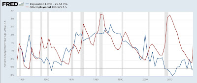
This created a huge surge in the prime age labor force that peaked in the mid-1980s and finally abated in full in the 2000s (blue in the graph below). During that time, while there was cyclical waxing and waning of the unemployment rate, on a secular time scale it increased with the surging of the labor force (red), and gradually abated as the prime age population group did as well:
Not only did the unemployment rate correlate with the pace of the rise in the prime age labor force population, but real wages peaked shortly thereafter, in 1973, and declined until the surge, particular of new women entrants, ended in the mid-1990s:
Now here is an update of the prime age population and the pace of the increase in the participation rate that includes the present post-pandemic period (and note, this comes from the Household Survey, which is likely undercounting new immigrants severely):
If past is prologue, so long as the prime age labor force disproportionately increases, so will - relatively speaking - the unemployment rate. If that coincides with a further deceleration in inflation, it won’t be because of the magic of the Phillips Curve, but rather because of the lagging nature of shelter costs. And it is likely to a cooling of wage increases as well.


