- by New Deal democrat
The lion’s share of the employment news recently has been very good. But not all of it. In particular, several of the annual revisions to the Household jobs Survey, and several other measures of employment and unemployment have been downright gloomy.
Since I haven’t discussed them at any length, I thought I would collect them all here.
First, there’s been a marked divergence between the Establishment jobs survey (red in the graph below) and the smaller, noisier Household survey (blue) ever since March of 2022. In the latter, about half of all the growth in jobholding was recorded in the two months of December 2022 and January 2023. For the entire 21 month period, jobholding has only increased by 1.9%, far below the payroll employment pace:
Some of this has to do with the annual revision, which is entirely included in the January number each year, rather than revising each of the past 12 months. For example, without the population revision, the month over month gain between December and January this year would have been +239,000 rather than -31,000.
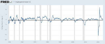
But that issue disappears when we measure YoY% changes, and in the Household survey, jobholding is only up 0.6% YoY in January. The below graph subtracts that to show January at the 0 level, to easily compare earlier times when the YoY growth has been the same:
With the exception of single months during 1996 and 2013, YoY jobholding growth has never been this slow since the 1950s without occurring shortly before or after a recession.
My suspicion is that the current downward spike will prove to be like the two above, but there is other, similar information that gives me pause.
Both the Establishment and Household survey numbers are estimates based on sampling. By contrast, the QCEW survey, which is released quarterly with a 6 month lag, is not a survey but rather the actual number of jobs gained or lost based on employer tax withholding, which must be reported to the government, and includes about 97% of all establishments. The most recent update, for Q2 2023, was reported in early December. Here it is, shown in comparison to both the Estabslishment and *adjusted* Household job numbers (via Menzie Chinn at Econbrowser):
Like the Household survey, the QCEW showed a nearly complete pause in job growth in 2022 after Q1, although it increased more strongly in the first half of 2023. We won’t get the Q3 update until the end of this month, but for Q2 of last year it was up 2.2% YoY vs. the Establishment jobs gain which averaged 2.5%.
And further reason to worry that the Household survey may have been giving a better but more pessimistic reading on jobs growth comes from withholding tax payments. Again, these are not surveys but rather the total amount of income tax withheld for all employees nationwide.
Matt Trivisonno of the Daily Jobs Update has been updating the YoY changes for the full 365 days compared with the previous 365 days the year before, updated every workday. Here’s what his long term graph (minus the last 90 days) shows:
In October and early November of last year, tax withholding payments for the previous 365 days were only averaging about 0.75% more than they were for the 365 day period ending in early November 2022. With the exception of the year following the 2018 tax law changes, and the 2002-03 near “double-dip” recession, since the beginning of the Millennium this has only occurred during recessions.
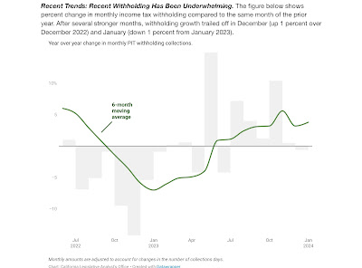
Similarly, the State of California’s Treasury Department updates its withholding tax payment information once or twice a month. At the end of January, they showed that December’s payrments were only 1% higher than in 2022, and January’s were -1% *lower:*
And the Department of the Treasury updates their income statement daily. While I can’t show you a graph, their Statement for January 31 of this year shows $1,122.1 Billion withholding tax payments collected since the beginning of the fiscal year on October 1 vs. $1,112.6 Billion collected over the same 4 month period the year before, an increase of only 0.9%.
While there may be other issues going on, e.g., a decline in the aggregate $ amount of stock options exercised, or the effect of a 7% increase in tax brackets due to inflation, this 0.9% is a paltry gain, even if we were to treat it as indexed to inflation rather than nominal.
In addition to the above issues with employment gains, there are several components of un- and under-employment which are contrary to the dominant narrative.
Every Thursday recently I have been pointing out that continuing employment claims (dark blue in the graph below) are running at a higher YoY% rate (presently about 11% higher YoY) vs. the better YoY comparisons in initial claims (light blue), the 4 week average of which is only about 5% higher (note - graph ends at 2019 to avoid the huge spike during the pandemic; both series subtract their current YoY comparison so that it shows at the 0 line):
Contra the story with initial claims, continuing claims have only been 10% or more higher YoY in the past 60 years when a recession is beginning.
A similar story is told when we compare the U6 underemployment rate (dark blue below) to the U3 unemployment rate (light blue). While the latter is at the same level it was a year ago, the U6 rate is 0.5% higher (again, graph subtracts this to show both current levels at the 0 line for easier historical comparison):
With the exception of the 2002-03 near “double-dip” recession scare, the U6 rate has only had this increase since its inception 30 years ago at the onset of recessions.
To reiterate: all of the above data runs counter to most of the jobs-related data I track, in addition to the very positive income, spending, and much improved real sales data that dominate the economy. But all of them - especially the tax withholding and QCEW data - are worth keeping an eye on, to see if they continue to suggest that the economy is weaker than the most popular survey series have been showing.


