- by New Deal democrat
I want to spend some time commenting on the broader issue of why the public perceives that inflation is still rampant, even though almost all official measures show it rapidly decelerating, and even completely absent on a YoY basis currently by a few measures. A big part of that has to do with housing, and since I’ve discussed several facets of that issue in discussing the data releases this week, I wanted to pull that together into a “Big Picture” summary. I do that in 3 simple graphs below.
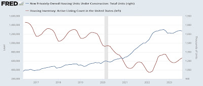
Graph #1: Active listing counts of existing homes (red, left scale) vs. new housing under construction (blue, right scale):
The average mortgage on an existing home is something like 3.5%. Huge numbers of people either bought or refinanced when mortgage rates were 3%, and now those people are locked in. For example, a $1000 monthly interest payment at 3% is a $2333 monthly interest payment at 7%. Those people are locked into their existing home for the foreseeable future.
As a result, the existing home market has collapsed. As I showed yesterday, sales are near 25 year lows. The active listing count above, which averaged 1.3 million in the years prior to the pandemic, even with a modest recovery in the past year is still only about 700,000, a -600,000 decline.
Meanwhile the number of new homes under construction has risen from about 1.125 million annualized in the years before the pandemic to about 1.725 annualized, a mirror image +600,000 increase.
In other words, the seizing up of the existing home market has diverted people to the new home market.
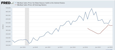
Graph #2: median price of existing (red) vs. new (blue) homes:
The NAR only lets FRED publish the last year of their price data, which is not seasonally adjusted, but that is fine for today’s purposes, so the above graph compares it with the not seasonally adjusted price data for new homes.
The lack of inventory of existing homes means that prices got bid up, and remain bid up. Builders responded by building lots of new units, and unlike existing homeowners, they can respond to market conditions by varying their price point, which the above graph shows they have done. The median price for a new home went down -$100,000, or 20%, a few months ago, and is still down about -15% from its peak last year.
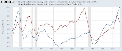
Graph #3: Single vs. multi-family units under construction:
The Millennial generation and the first part of Gen Z are well into their home-buying years. But because they have been priced out of large parts of the market, due to both the aforesaid big rise in mortgage rates, but also the post-pandemic increase in prices, they have had to downsize their target from single family homes to the less expensive condos or apartments.
As part of their adjustment described above, apartments and condos are being built hand over fist, and builders are offering price or financing concessions. Single family houses under construction have declined by about 20% from summer 2022, while multi-family units soared to a new all-time record, about 20% higher than their level in summer 2022.
It’s the housing version of shrinkflation, since - although the data isn’t easily available - I think we can take notice of the fact that apartment and condo units are considerably less expensive on average than single family detached houses.
[As an aside, note that a very similar thing happened in the 1970s when the Baby Boom generation was well and truly into their first home-buying years. While the Millennial generation is slightly bigger numerically than the Boomers, since the total US population was only 50% of its current size back in the 1960s, proportionately the Boomers had an even bigger impact on the market.]
That’s the Big Picture of the almost complete bifurcation of the current housing market. The “shrinkflation” I’ve described above is very much a part of why the public continues to believe that inflation remains a big problem.


